Judging IDEA(s): The International Design Excellence Awards
| Written by | Bernie Brooks |
|---|---|
| Published | 1/26/2022 |
Judging IDEA(s): The International Design Excellence Awards
| Written by | Bernie Brooks |
|---|---|
| Published | 1/26/2022 |
Every year, The Henry Ford partners with the Industrial Designers Society of America (IDSA) on their International Design Excellence Awards (IDEA). The Henry Ford receives and processes the entries, and then hosts dozens of jurors—including The Henry Ford’s own Vice President of Historical Resources and Chief Curator Marc Greuther. Those products that win become part of the permanent collections of The Henry Ford.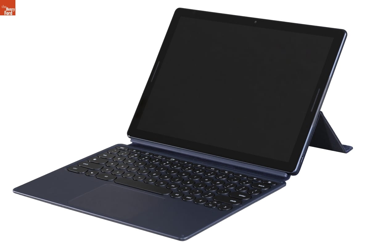
Google Pixel Slate, IDEA bronze award winner in the consumer technology category, 2019. / THF185319
While asking Greuther and IDSA Executive Director Chris Livaudais about the relationship between the two institutions, we also took the opportunity to ask them about the judging process. In addition, Greuther shared the rationale behind some of his “Curator’s Choice” award picks from previous years.
Do you think the concerns of the IDEA jury have shifted over the years? If so, how?
Chris Livaudais: The IDEA jury rotates each year, but it is always composed of designers who are at the top of their field. In many cases, their work is what drives our profession forward and sets the bench other designers follow. As such, the interests of the jury do tend to shift with current trends or conversations within the industry. Sustainability and circular design are huge areas of interest right now, for example. To counter this, IDEA uses the same core judging criteria [see box below] each year. This consistency helps keep things rigorous, while still providing a little room for interpretation and influence from current forces impacting design.
| IDEA Judging Criteria |
| Design Innovation: How new is the product or service? What critical problem is it solving? How clever is the solution? Does it advance a product category? Benefit to User: How are users’ lives improved through this design? Can they accomplish things not previously possible? Benefit to Client/Brand: What is the business impact of this design? How has leveraging design proven to be a key market differentiator? Benefit to Society: Does the solution consider social and cultural factors? Is it designed/manufactured with sustainable methods/materials? Appropriate Aesthetics: Does the form of the design adequately relate to its use/function? Are the colors/materials/finishes used befitting its purpose? |
From your perspective, what are IDSA jurors looking for?
Marc Greuther: I think over time, I’ve seen two distinct lenses that get played out in the jurying process. One is rooted in “good design is good business” and responsibility. So it’s about utility, user interface, user experience. It’s about effectiveness, about durability. It’s about the use of appropriate materials.
The other has got much more to do with industrial design as a discipline and a certain kind of design purity, and it gets to how well-finished something is. Where are the part lines on there? How do dissimilar materials join in a way that’s pleasing? If you’re in the wrong mindset, you can start looking at it as being incredibly fussy and overly judgmental, but it’s really the design discipline’s roots in craft.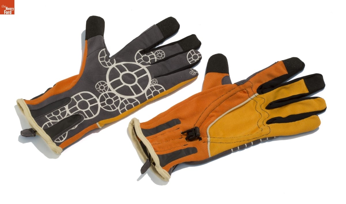
NordicPul: all-weather women's work gloves, IDEA bronze award winner in the student designs category, 2010. / THF154924
Part of what IDSA’s done well is put together a jury that has a wide range of backgrounds. People who know about assistive technology, the medical arena, gamers, and all the rest of it. That’s part of the secret of its effectiveness—ensuring that such a wide range has got a presence.
How do you approach the Curator’s Choice?
Marc Greuther: I’ve never tried to take it on as a kind of contrarian, but I’ve definitely seen things where I’ve felt like, “Holy cow, that’s been disregarded or knocked out of the spotlight for pretty poor reasons, and it needs to be rendered visible.”
I have the great advantage of not having to ask permission for the ones I award. I just try to ensure that my winners are thinking about the use of good materials and the appropriate deployment of objects: their sustainability, their usability, their understandability. It’s an interesting motley crew of things.
IDEA Curator’s Choice Award Selections
Hydropack Self-Hydrating Drink Pouch
Photo courtesy Hydration Technology Innovations LLC
Year: 2011
Description: Water-filtering pouch that becomes a flavored drink rich in electrolytes
Designed by: HTI Water
Why Greuther picked it: “This was for use in disaster situations to purify water. It hadn’t been given the recognition I thought it deserved. There were some designers who said it wasn’t designed. That, to me, was of interest, because sometimes you don’t need to design any more. Why? It was that notion of design almost getting out of the way. It’s about exercising restraint. Less is better in this instance.”
EzyStove
Photo courtesy of McKinsey Design
Year: 2012
Description: Wood-burning stove for use in developing countries as a replacement for cooking over an open fire
Designed by: Ergonomidesign, Mårten Andrén, Håkan Bergkvist, Jonas Dolk, August Michael, Stefan Strandberg and Elisabeth Ramel-Wåhrberg for Creative Entrepreneur Solutions
Why Greuther picked it: “This was about cleaner, more efficient use of existing resources in places where people would be improvising all manner of ways of cooking or heating. It wasn’t trying to be the complete solution. It was partially reliant on charity and the local skills of the users. I liked that it seemed hackable and that people could bootleg this thing. It was about effecting change.”
Sonos SUB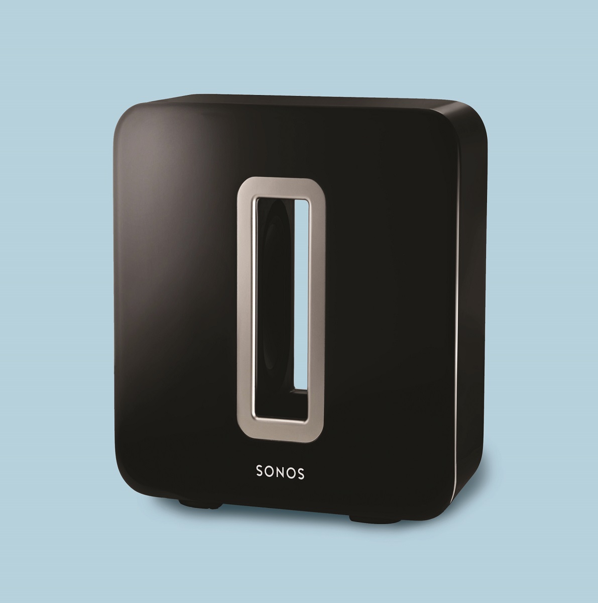
Photo by Dave Lauridsen
Year: 2013
Description: Wireless subwoofer
Designed by: Mieko Kusano and Rob Lambourne of Sonos Inc., and Wai-Loong Lim of Y Studios LLC for Sonos Inc.
Why Greuther picked it: “Sonos had committed themselves to backwards compatibility, and they were building things that had enough redundancy in them that new functionality could play out in them. The SUB sounds really good. It’s a very enigmatic looking thing, and it was designed to work with their earliest equipment. It’s got kind of a Kubrick-like quality to it.”
Pillpack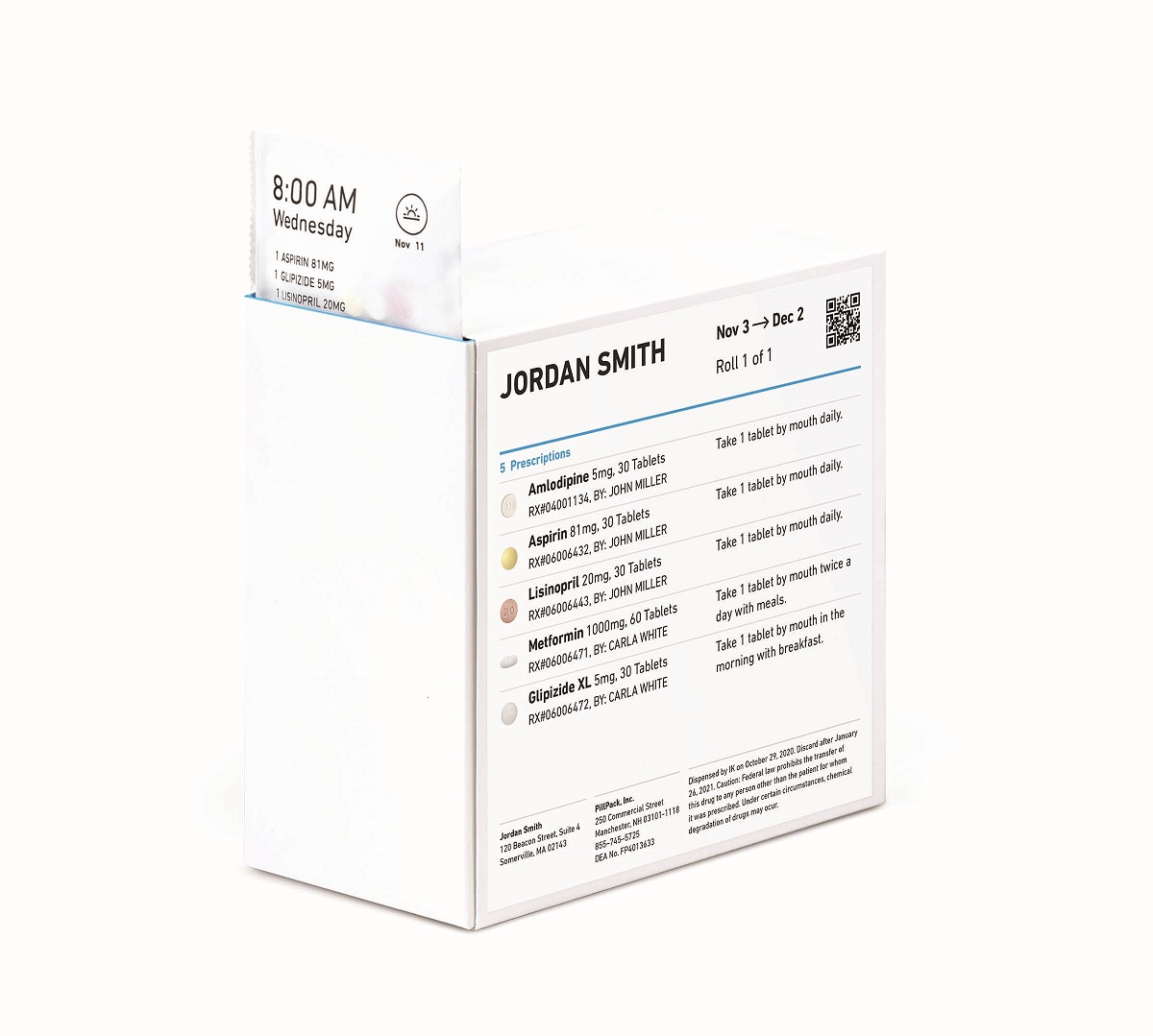
Photo courtesy of Pillpack
Year: 2014
Description: Delivery and management service for people with multiple medications
Designed by: TJ Parker and Elliot Cohen of PillPack, and Jennifer Sarich-Harvey, Sophy Lee, Katherine Londergan and Gen Suzuki of IDEO
Why Greuther picked it: “This is rooted in my sense that as medications have proliferated as conditions become treatable in one way or another, the complexities of managing those medications almost exponentially increase, and the chances of missing a dose or peculiar interactions increase as well. This was a way of managing that complexity. It’s almost infrastructural.”
Flip Reel by Squiddies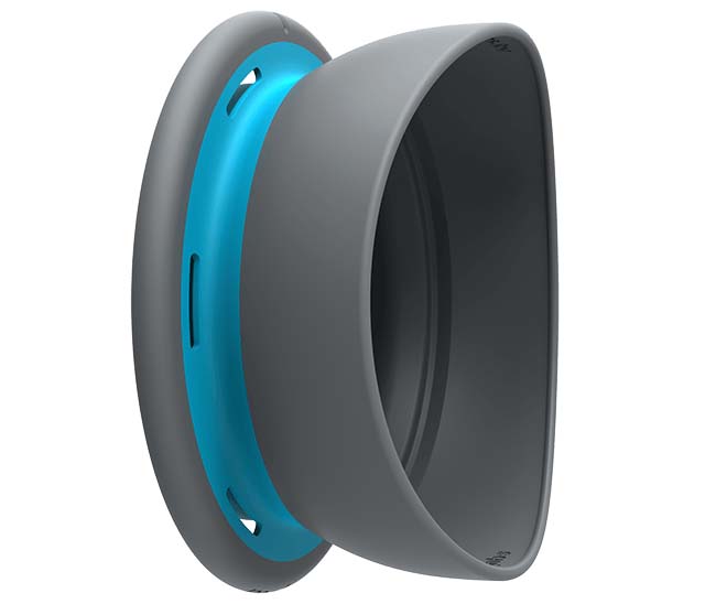
Photo courtesy of Tiller Design
Year: 2015
Description: Handline fishing reel
Designed by: Brandon Liew, Robert Tiller and Lisa Gyecsek of Tiller Design for Squiddies Pty. Ltd.
Why Greuther picked it: “This was an interesting use of new materials. It was very minimal. The irony for me is that I don’t fish. I’ve never fished. I never intend to. But I did like the idea that this was something that could be easily pocketed, casually used. I like that notion of design that just slips into its place, because it’s so usable and so readily apparent in its usage.”
SNOO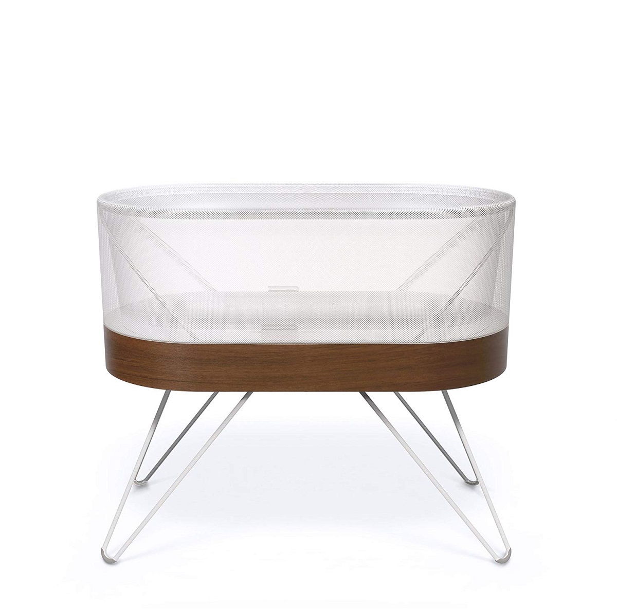
Photo by Travis Rathbone
Year: 2018
Description: Robotic bassinet
Designed by: Yves Béhar, Qin Li, Michelle Dawson and fuseproject design team, and Dr. Harvey Karp of Happiest Baby
Why Greuther picked it: “It’s a beautiful object. Part of what I liked about it was that it was robotic. When you look at robotics from a cultural standpoint, it’s almost always very threatening. This is robotic technology, but it’s designed to take care of newborns, something incredibly vulnerable, so the robotic element is appropriately stated and deeply camouflaged. I thought that was an interesting kind of paradox.”
Bernie Brooks is Collections Specialist at The Henry Ford. This post was adapted from an article first published in the June–December 2020 issue of The Henry Ford Magazine.
Keywords | |
|---|---|
Themes |
