
Monthly Archives: December 2024
Lillian Schwartz (1927-2024) was a unique cultural figure as one of the American pioneers in digital art. Her work is immediately identifiable through her artistic flare. Her pieces tend to be visually jarring in a delightful way, compelling the viewer to look at them from all angles. Schwartz’s early digital art is important because it chronicles significant changes in the computer science field – from the beginnings of software to support creativity to the development of current-day tools such as Adobe Photoshop.
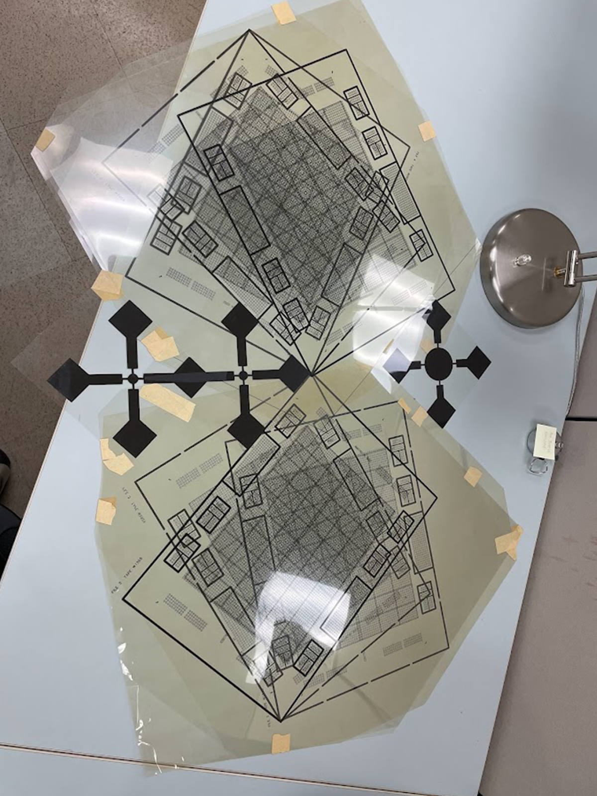
Geometrical Project with Lines, in process, 1970. Acc. 2021.14 / Photo by Regina Parsell
For Schwartz in the early 1970s, a lot of the creative process involved with her 2D works on paper took place after the pieces were printed. For example, when she designed the work Geometrical Project with Lines (1970) she broke the piece down into nine different elements and printed them individually on clear plastic (see above image). These pieces were then arranged and taped together before being copied to create the final image (see below image). Both the assembled version of the work and the copy of it were then kept, but only one displayed. In the same way that math teachers request that students show their work, so that they can follow the student’s thought process, Schwartz preserved part of her artistic genius in keeping these assembled variations, therefore allowing the researcher to better understand her process. This window into her artistic methodology is further illustrated in other works as well.
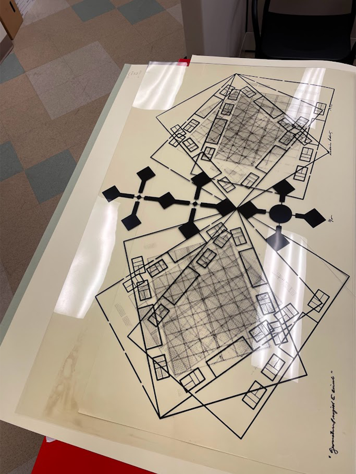
Geometrical Project with Lines, 1970. Acc. 2021.14 / Photo by Regina Parsell
Schwartz viewed the computer as the extension of the artist and would use whatever resources she had available to create her pieces, often imagining multiple versions of a piece rather than a singular resulting image. This can be seen in the two works Variation on a Night Scene and Architecture Test, both are variants made from her works titled Day Scene and Night Scene (all created between 1970-1976). Night Scene itself is a negative of Day Scene, but by taking the central industrial style building at its center, and expanding out, Schwartz created the base image for her next two pieces (see below images).
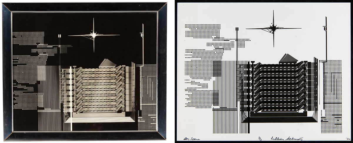
(Left) Night Scene by Lillian Schwartz, 1986 (which were originally created in 1970-1976). Acc. 2021.14 / THF188523
(Right) Day Scene by Lillian Schwartz, 1972. Acc. 2021.14 / THF628901
Then, taking it one step further, she used tape to black out a few of the clear horizontal lines along the bottom of the composition, and in each corner, before copying the image to make Variation on Night Scene (see below image).
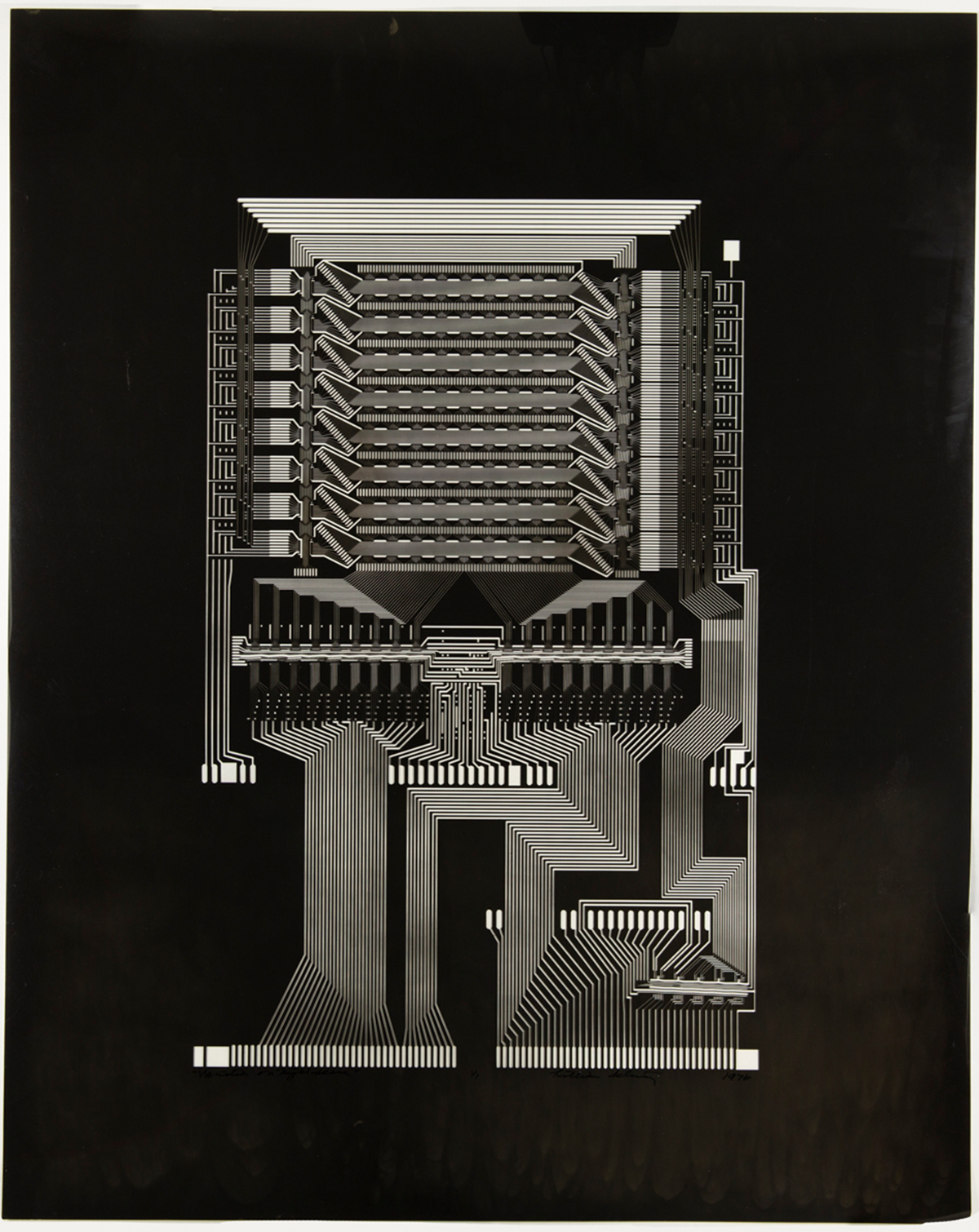
Variation on Night Scene by Lillian Schwartz, 1976. Acc. 2021.14 / THF628890
She then took that same blueprint, and flipped it upside down before copying it again, to create Architecture Test (see below image). When viewed together each composition informs the next, creating an inspired ouroboros effect.
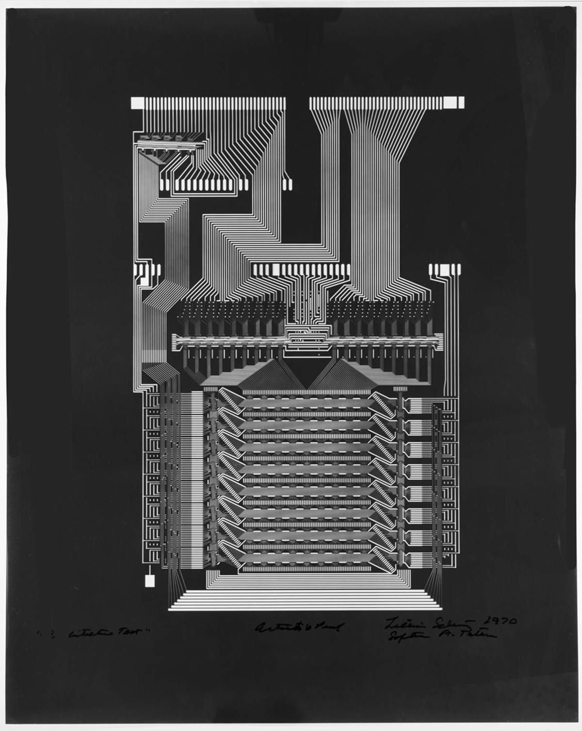
Architecture Test by Lillian Schwartz, 1970. Acc. 2021.14 /THF719821
But it is exactly this iterative practice that can also pose a challenge for the archivist, and one of the key elements to ensuring that Schwartz’s artistic process is preserved is by arranging her archive in a way that makes sense both intellectually and artistically. While Schwartz is a unique artist,it was beneficial to explore the archives of other artists who were also exploring digital art around the same time that she was. To determine the best approach for arranging her collection, we began by reviewing established artist archives. For example, contemporaries of Schwartz include Stan VanDerBeek (1927-1984) and Vera Molnár (1924-2023), who also worked in the mediums of computer films, animation, and computer-generated and born-digital work.

Tree, Tif, by Lillian Schwartz, 2000. Acc. 2021.14 / Photo by Regina Parsell
To capture the integrity of the artists’ methodology, art collections are often arranged by project. This means that all materials related to one piece are kept together and cataloged accordingly. Before we could arrange the Schwartz collection, we had to inventory the artwork and confirm the locations of the pieces within various storage areas of The Henry Ford. The Schwartz collection is close to 400 cubic feet of materials (including research notes, ephemera, publications, project notes), of which the artwork itself is just shy of 30 cubic feet of material. Inventorying just the 2D artwork has taken about a year to complete. Now that this step is complete, the next step is to arrange the materials by using a spreadsheet to find commonalities in the pieces' descriptions and titles. A collection of this size will take several weeks to physically arrange, so there needs to be a clear plan for where the pieces are going to reside in archival storage. Once that plan has been approved, then the process of moving the materials and updating their locations in the cataloging system and inventory sheets can begin.
Drive by Lillian Schwartz, undated, and previous inventory of artwork located in flat files. Acc. 2021.14 / Photo by Regina Parsell
Archiving artist work and materials is important but challenging work. It asks us to think not only about how the artist intended for us to see their work, but also how the researcher will use these materials. As we expand and develop our understanding of cataloging non-traditional media, we continue to think outside the box in order to preserve their iterative process and artistic innovation. Our work with the Schwartz collection is far from complete, and while it has been complex, it has also been incredibly rewarding. One of the greatest parts of being an archivist is learning about the person from their own notes and works, and it has been a pleasure to get to know Lillian Schwartz and her work throughout this process.
Regina Parsell is a processing archivist at The Henry Ford.
Archeological evidence suggests that ice skating began as early as 4,000 years ago in northern Europe. Travelling on foot in winter across snowy, icy landscapes for trade, hunting, and community gatherings was slow and exhausting. People first used sharpened animal bones attached to footwear by leather strips, along with poles, to propel themselves across frozen rivers, ponds, and lakes – faster and less taxing during harsh winter months.
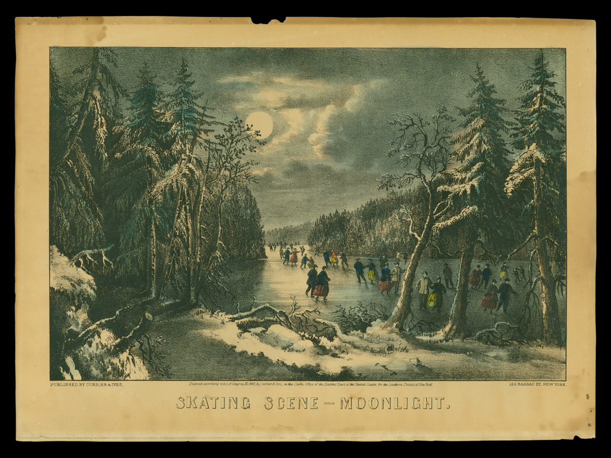
Currier & Ives published this lithograph in 1868 of skaters on a frozen lake or pond at night, skating by moonlight. / THF118602
As a pastime, ice skating became popular in the United States in the mid-19th century. Initially, people skated on frozen local rivers and ponds, but as artificial ice-making improved, skating moved indoors to purpose-built rinks. Temperature-controlled buildings and artificial ice technology made it possible for ice skating to spread south and west from New England and the Upper Midwest. Skating clubs started forming across the country as early as 1849, and these clubs hosted evening skating events with live musical accompaniment .
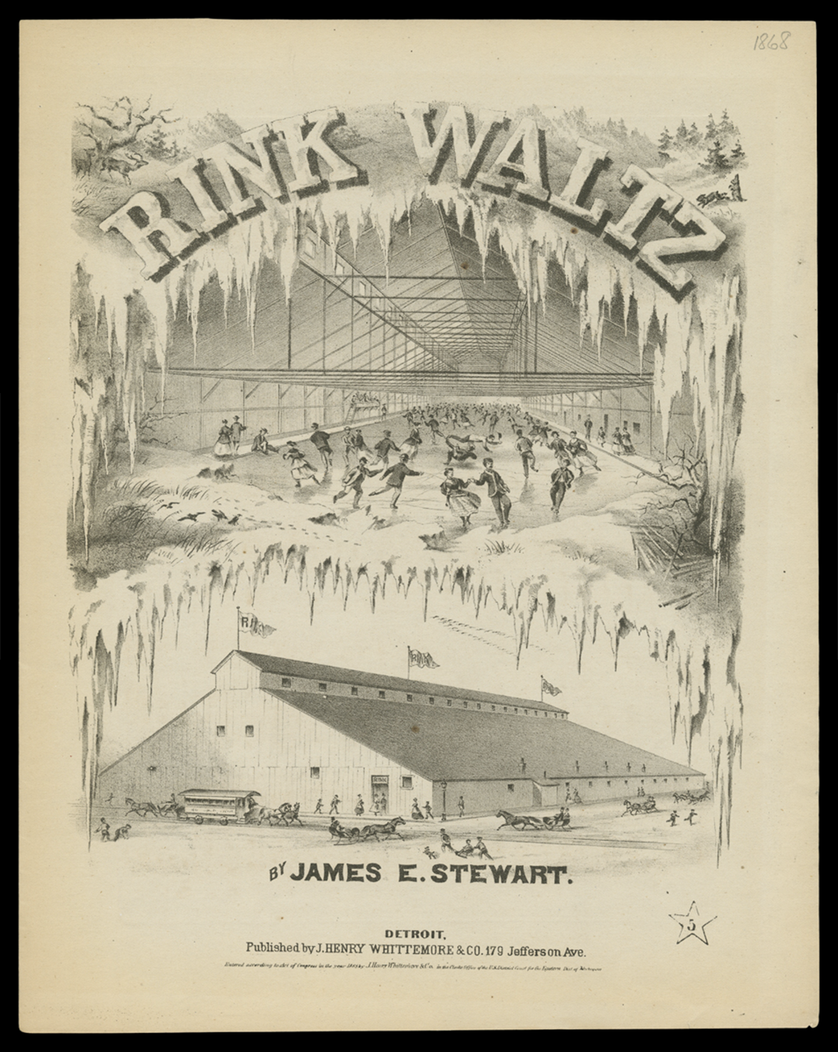
The song Rink Waltz was written and published in Detroit in 1868. Its cover has interior and exterior renderings of the Detroit Skating Rink, which opened in 1866. / THF720452
Ice skating’s popularity peaked in the 1860s and 1870s. During this time, many patents for skates were issued to ice skate manufacturers. Publications on skating skills and safety, along with songs about skating, became widespread. Other products, such as handheld kerosene lanterns to illuminate outdoor skating at night, also show how ingrained skating had become in American culture. Women in particular embraced ice skating, which was promoted as healthy exercise and one of the few athletic activities socially acceptable for women at that time.
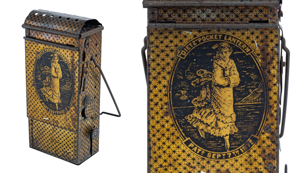
Lighting companies such as R.E. Dietz patented small kerosene lanterns for nighttime skaters, particularly women. / THF802186 (left), THF802187 (right, crop)
Improving Skate Technology
Early skates were made using animal bones. In the 13th and 14th centuries, craftspeople started to fabricate metal blades, which were inserted into wooden platforms. Straps, ropes, or ties secured the platform to skaters’ everyday footwear. These early blades were long and curled up in front of the toes, helping the skater navigate uneven and rough ice on frozen waterways. This type of skate was likely the kind first imported into the United States from Europe in the late 18th and early 19th centuries. Blacksmiths and carpenters in northern American towns and cities also produced skates, and some skaters even made their own.
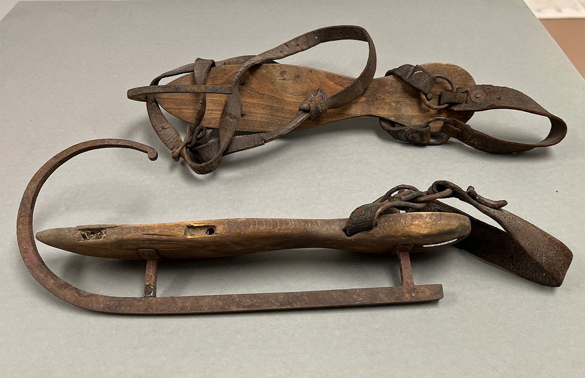
Ice skates with crude wood platforms, curled metal blades, and leather straps. / 29.1871.2, From the Collections of The Henry Ford. Photo by Aimee Burpee.
Unfortunately, ties or straps were often unreliable. They did not secure the foot and shoes firmly in the skates, as the foot could slide side to side or even slip off the platform. To improve the attachment, manufacturers and craftspeople added a metal spike on the top of each wooden platform, which went into the heel of the shoe, and occasionally small spikes in the forefoot for additional attachment.
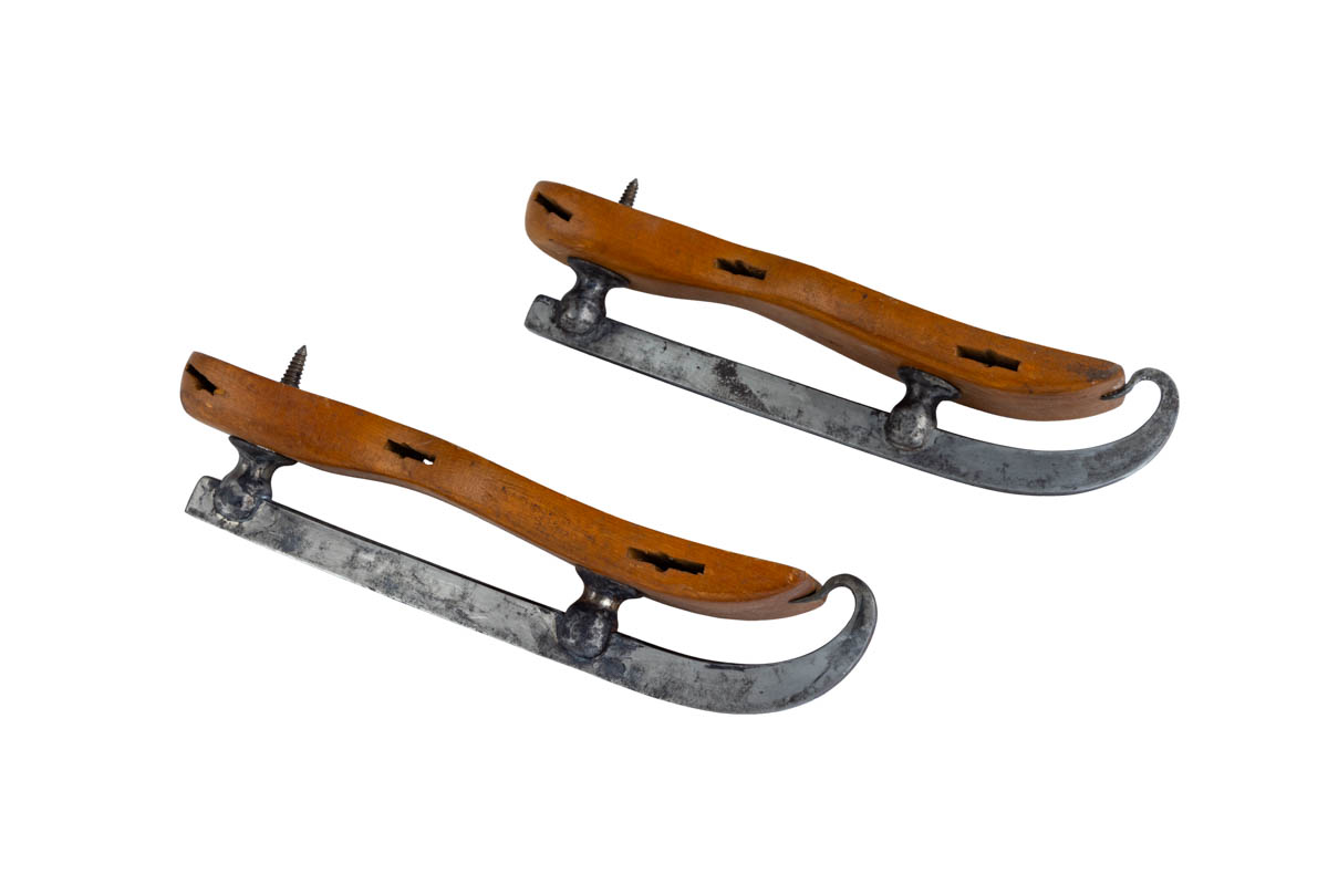
These Douglas, Rogers & Co. skates with 1863 patent date have a spike in the heel to attach the shoe to the platform, and tempered metal blades. Straps went through the holes in the sides of the platforms / THF802180
Eventually metal platforms replaced wooden ones, which cracked or splintered and required frequent repairs. The earliest metal platform skates still used ties and straps, but eventually switched to keys and clamps that more securely attached and tightened the skates to the wearer's shoes. By the 1890s, fully metal skates allowed people to simply “step into” the skate, with automatic clamps securing the skate around the shoes. These metal skates were stronger and more dependable, making them especially appealing to the rapidly growing market of hockey players and early figure skaters.
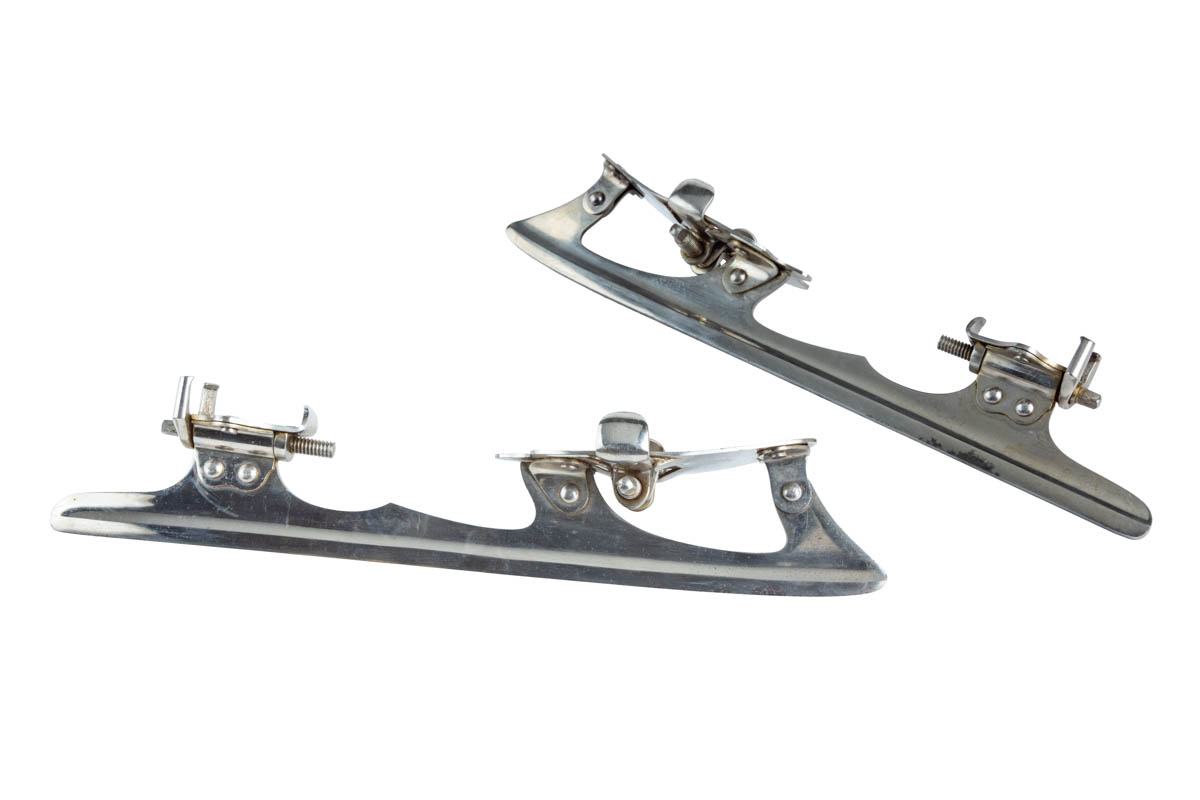
Barney & Berry patented these skates 1896, with clamps that hooked around the shoe when you stepped into them, no fiddling with straps or tightening with a skate key was necessary. / THF802173
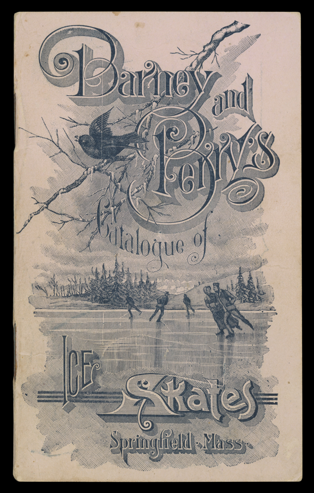
Barney & Berry was one of the top innovators and manufacturers of ice skates. Hardware, sporting goods, and toy stores could choose models and styles from this 1894-1895 wholesale catalog to sell to customers. / THF720461
In the late 19th and early 20th centuries, ice skates became one-piece boots, resembling the skates we use today. These skates provided greater support and stability, with the blade attached to a steel sole and integrated into a boot. While earlier skates started the development of specialized skates for figure skating, hockey, and speed skating, the one-piece boot skate further refined these specializations.
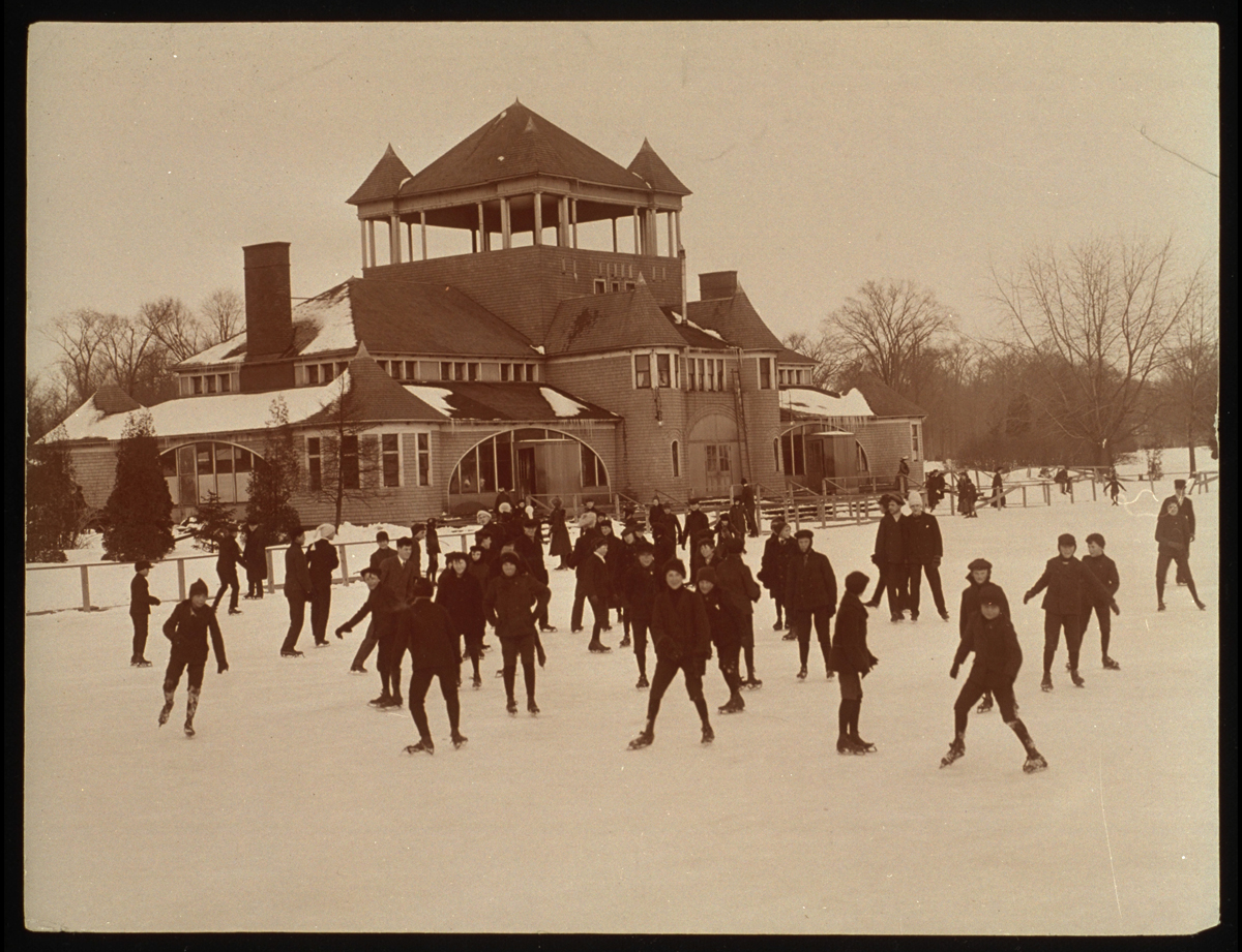
Children and adults could rent skates from the Belle Isle Pavilion and skate on adjacent Lake Takoma on Belle Isle in Detroit, Michigan, around 1900. / THF119081
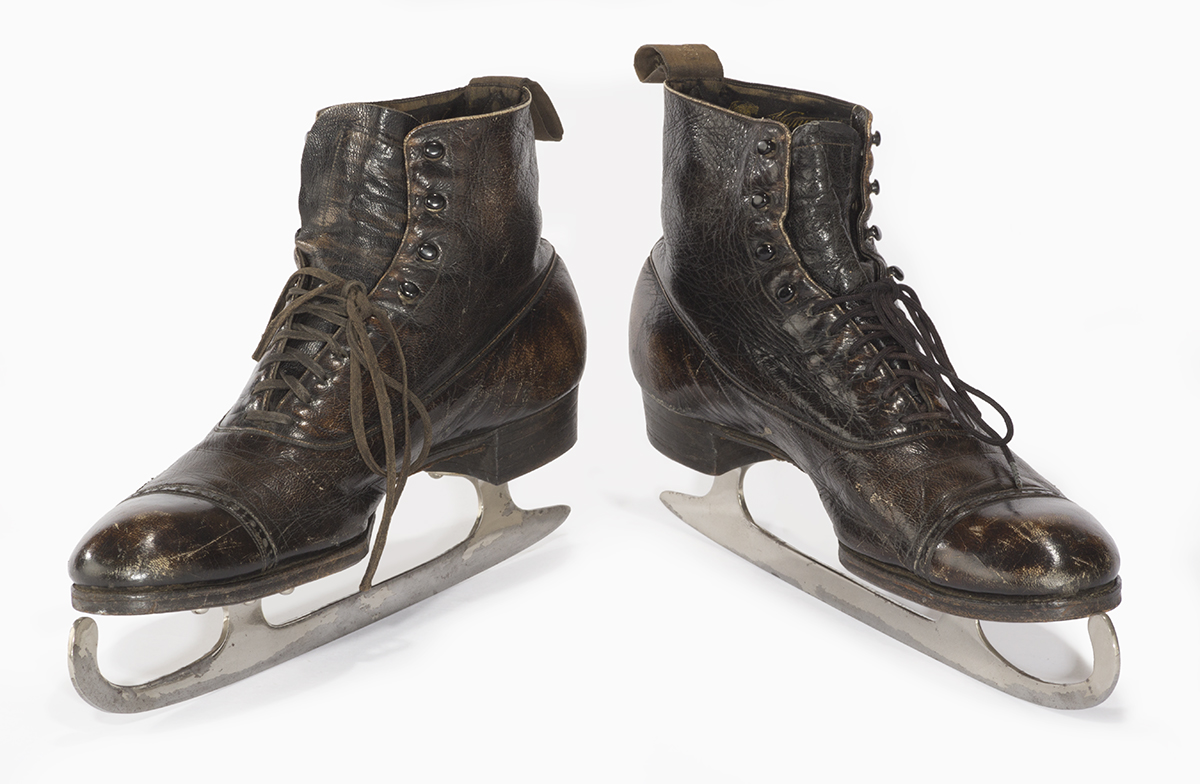
These all-in-one boot skates belonged to Henry Ford. He enjoyed skating on a frozen pond on his Fair Lane property in Dearborn, Michigan / THF166350
Today, figure skates combine slim leather boots with toe picks for spins and jumps. Hockey skates have shorter blades for quick maneuvering, with padded foot and ankle protection. Speed skates feature longer blades and a more streamlined boot profile to decrease wind resistance.
The skates of the past led to the skates of today. And the skates of the future will continue to evolve as innovative technologies, designs, and materials are developed and implemented.
Aimee Burpee is Associate Curator at The Henry Ford
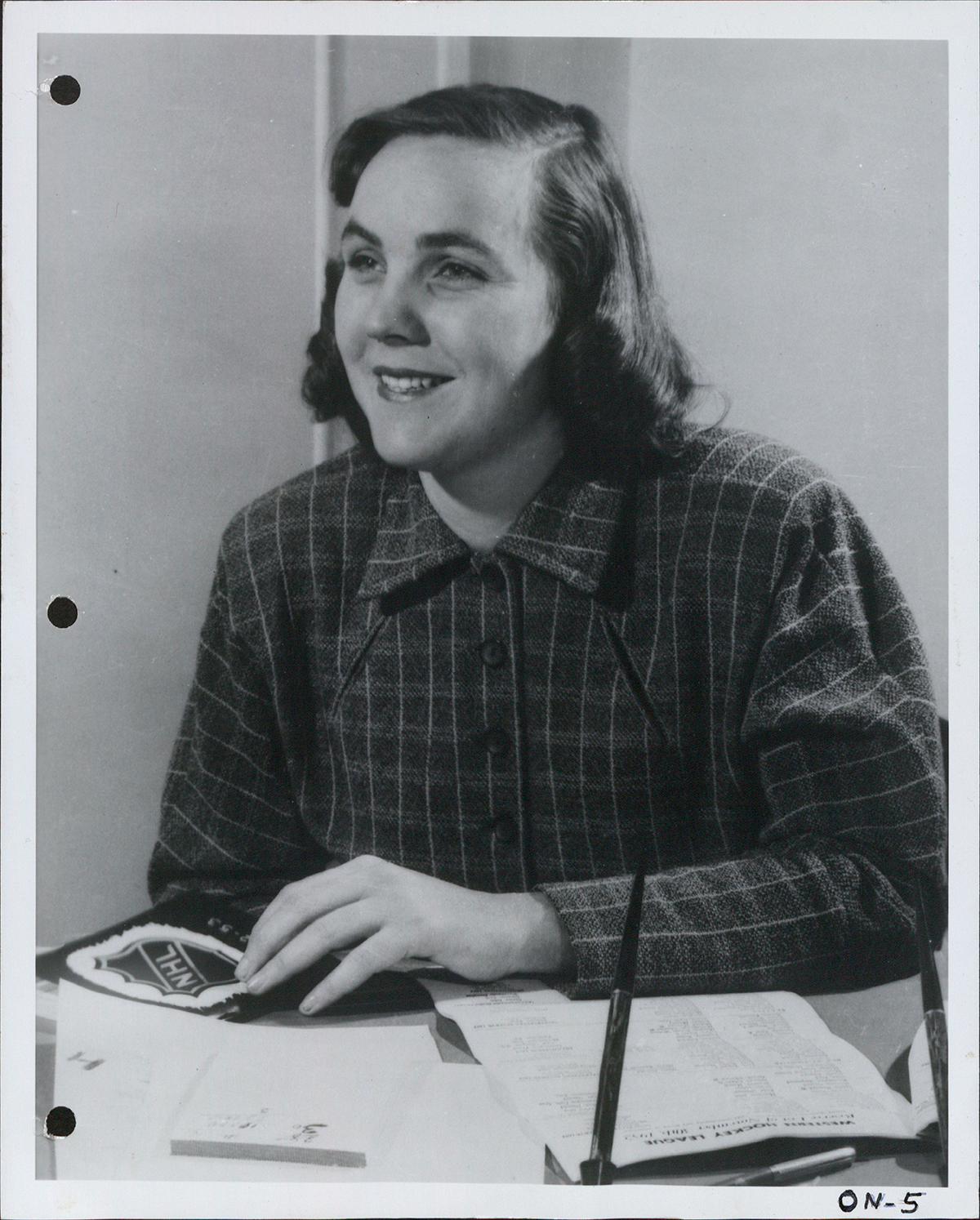
Marguerite Norris, circa 1950s. Credit: Photograph source unknown. Image provided courtesy of Detroit Red Wings.
Marguerite Ann Norris was no stranger to hockey. Growing up in a hockey environment, she was often made goaltender for her three older brothers to practice against. "Since I was the youngest of the kids, I was left with no choice: I had to be goalie," Norris said to the Associated Press in 1952. "I was the target, and it was a while before I found out that goalies wear shin pads. They never told me!"
She was a graduate of Smith College in Massachusetts and received training at Dun & Bradstreet, a business consulting firm based in New England at the time. With her keen business acumen, she learned the ins and outs of the hockey world from her father, James E. Norris. In 1932, James Norris purchased the Detroit Falcons, changed their name to the Red Wings, and brought the franchise to solid financial ground.
Excerpt from the Detroit Free Press article "Norris' Daughter Wings' New President," December 14, 1952.
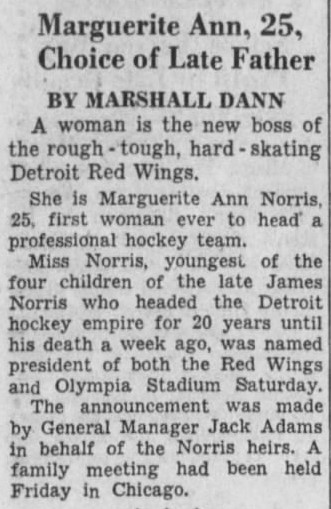
After her father died in December 1952, 25-year-old Marguerite Norris became president of the Detroit Red Wings. General Manager Jack Adams announced that Norris was selected by her father prior to his death to succeed him as president, making her the first female chief executive in the history of the National Hockey League (NHL).
In her first meeting with the press, she was surrounded by hockey reporters, fashion reporters, and photographers. On December 15, 1952, in Norris' first game as president, the Red Wings played against the Montreal Canadiens. Montreal's Maurice Richard, who had a firm policy of not "fraternizing with the enemy," was selected by his head coach to present Norris with flowers before the game. Years later, Elmer Lach, Richard's teammate, recalled that "after making the presentation, [Richard] was so mad that he got six minor penalties in the first period alone."
Shortly after her takeover, reports emerged that Olympia Stadium, the home of the Red Wings, was cleaner and freshly painted. A wire screen was put in place to protect fans from flying pucks. Throughout her tenure, Norris also advocated for arenas to be more female fan friendly.

Marguerite Norris (first row, far left) with the 1952-53 Detroit Red Wings. Notable players pictured include Gordie Howe (back row, fourth from left), Captain Ted Lindsay (middle row center), General Manager Jack Adams (front row, center), and goaltender Terry Sawchuk (front row, far right). Credit: Photograph source unknown. Image provided courtesy of Detroit Red Wings.
During her tenure with the Red Wings, Norris saw the team finish first in the league three consecutive seasons and win the Stanley Cup in 1954 and 1955 — the team's sixth and seventh championships. As per custom, alongside the names of the players, coaches, and managers, the winning team's president also gets their name engraved on the Stanley Cup. The 1954 championship made Norris the first woman to ever have her name engraved on the Stanley Cup.
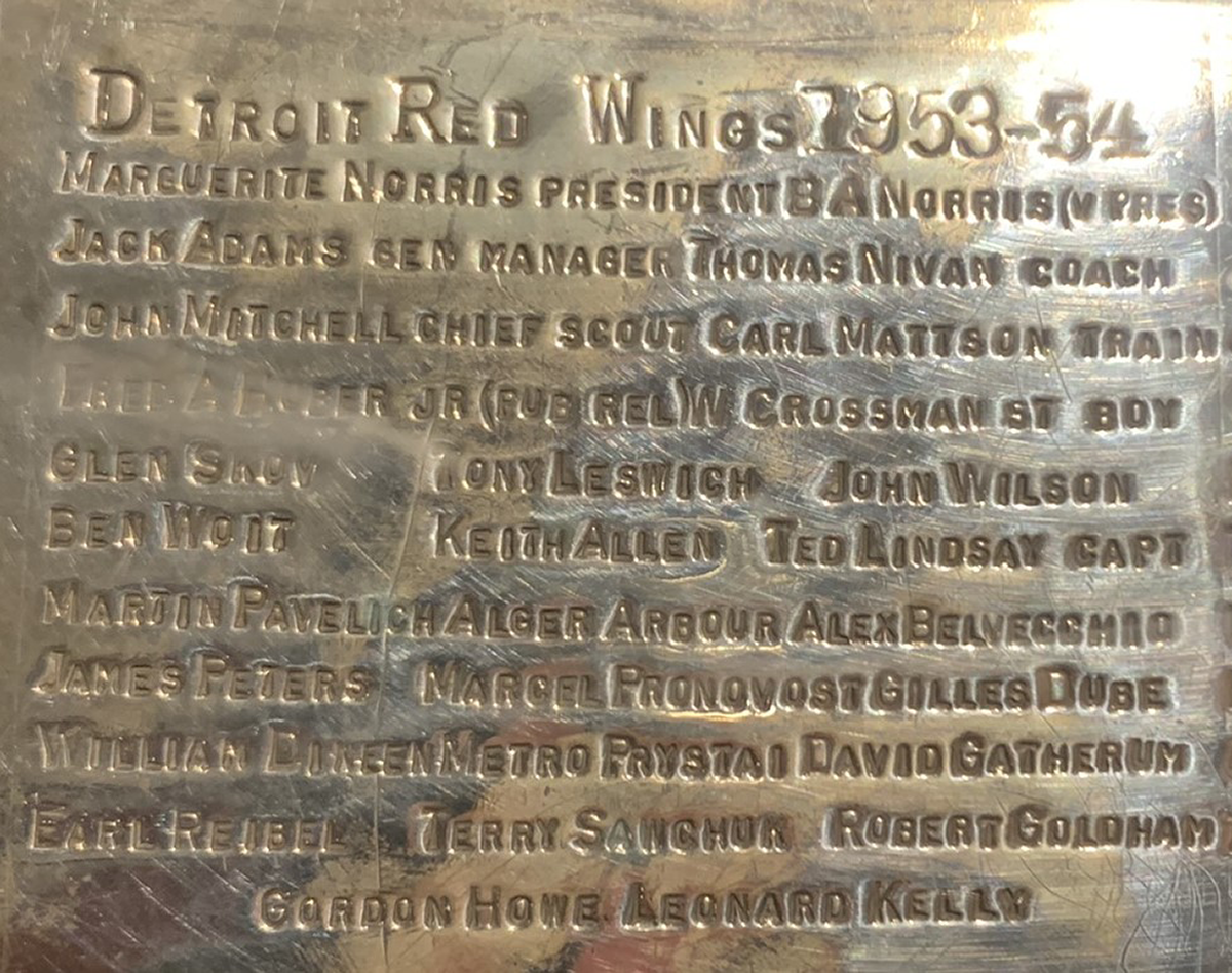
1953-54 Stanley Cup ring featuring Marguerite Norris' name first on the second line. Photograph courtesy of author.
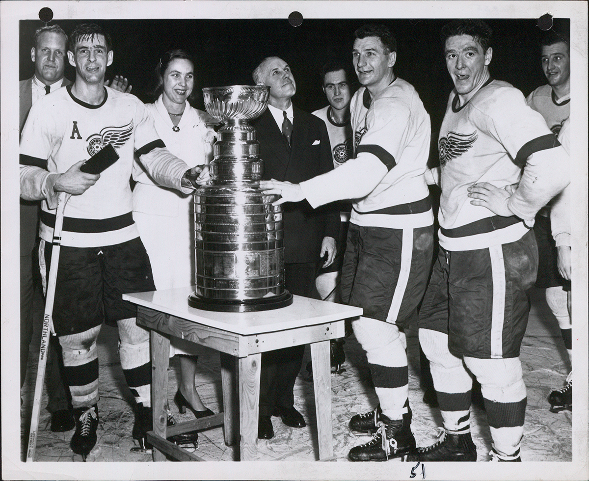
The 1953-54 Detroit Red Wings celebrating their Stanley Cup win. Marguerite Norris is pictured on the ice with the team, to the left of the Cup. Credit: Photograph source Foremost. Image provided courtesy of Detroit Red Wings.
Despite her success, Norris still faced significant discrimination. She was forbidden to serve on the NHL Board of Governors by Conn Smythe, then-principal owner of the Toronto Maple Leafs. The Board of Governors, the ruling and governing body of the NHL, exists to establish the policies of the League and to uphold its constitution. Each team appoints a governor to serve as a representative. In her place, General Manager Jack Adams represented the Red Wings with Norris secretly voting through him using a series of hand gestures.
Although Adams was more than willing to serve as Norris' proxy, he often resented working for her. In his 2016 book, The Red Kelly Story, former Red Wings forward Red Kelly said, "I don't think Jack Adams liked having to answer to a woman, quite frankly…I'm sure he thought women shouldn't be in an executive position in hockey, especially his hockey team. Marguerite was more than capable in our eyes. She was a great lady."
Following the Stanley Cup win in 1955, Norris' brother Bruce Norris appointed himself as team president and demoted her to vice president. In his 2014 autobiography Mr. Hockey: My Story, hockey legend Gordie Howe said, "I found her to be both smart and capable. Others I talked to felt the same way. She was good for the club, but unfortunately she didn't stick around for as long as anyone would have liked. I don't think it's a coincidence that Marguerite's time in charge coincided with some of the greatest years in franchise history…It's hard to say how many Stanley Cups we might have won if she had stuck around longer."
Howe continued to say that Bruce Norris' hockey acumen was "no match for his sister's," and Red Kelly echoed Howe's sentiments stating, "Marguerite was great as far as we were concerned. She treated us very well…There was never any doubt that she always appreciated our effort on the ice and never hesitated to tell us so, even when we lost."
A few days after the change in presidency, Adams had all but dismantled the 1955 championship team, trading away eight players who had formed its core. The Red Wings would not win another Stanley Cup for 42 years.
Though she clearly loved hockey and the Red Wings, Norris served as president for only three seasons. Following her departure from the team, she focused on business interests in New York City. On October 26, 1960, Norris married John J. Riker in New York. Together they had four children — two daughters and two sons. They co-owned the Westenhook Farm, now Willow Creek Farm, a renowned equestrian farm in Southbury, Connecticut.
Norris died at age 67, in 1994, at her Connecticut home. Today her legend continues, inspiring women and girls around the world that hockey is, indeed, for everyone.
Don't miss the HOCKEY: Faster Than Ever exhibition at Henry Ford Museum of American Innovation now through January 5, 2025.
Written by Cory Nummer, Curator, Curation & Collections, Ilitch Companies.
Eames Kiosk from the 1964 NY World’s Fair: A Collaboration and Case for its Missing Finials
In 1961 Charles and Ray Eames began working with Eero Saarinen on concepts for IBM’s pavilion at the 1964 New York World’s Fair. While the final design—a vast ovoid structure containing a multi-screen experience perched on tree-like supports—was distinct architecturally and theatrically, the experience for visitors sauntering through the pavilion at ground level was intended to be free-flowing and experiential. The result incorporated elements that the Eames Office had created for their Mathematica exhibits in Los Angeles and Chicago, plus new presentations and hands-on elements, all spread out beneath colorful purpose-built kiosks whose design leaned more toward a carnival or bandstand aesthetic—a perfect foil for the advanced technologies being premiered in the pavilion.
In 2013, The Henry Ford acquired one of the kiosks that was originally installed in the IBM Pavilion at the 1964 New York World’s Fair. You can learn more about the kiosk’s installation and construction here:
- https://www.thehenryford.org/explore/blog/welcome-eames-kiosk
- https://www.thehenryford.org/explore/blog/video-building-the-eames-kiosk
The Henry Ford’s kiosk has been on exhibit since 2014—that is, except for a subtle but ultimately glaring omission: it was missing the two elaborately turned decorative finials that were positioned at the peak of its roof. Luckily the one other surviving kiosk—in the Vitra Design Museum’s collections—had retained its finials. Vitra generously provided measurements and photographs of their kiosk’s finials, enabling us to fabricate replacements—via a collaborative effort between 3D printing technology company Desktop Metal, Inc. and conservation staff at The Henry Ford.
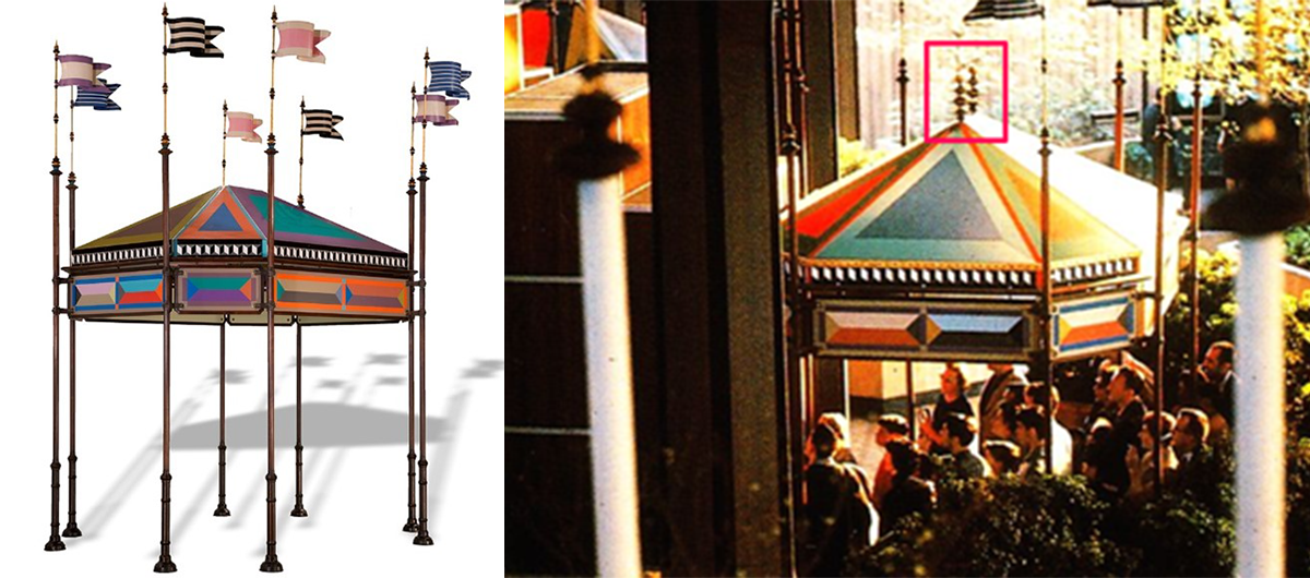
Left image: The kiosk at The Henry Ford. Right image: The two finials are present during the 1964 New York World’s Fair.
To re-create the two finials, binder jet manufacturing was selected as the method of fabrication. The finials were modeled by conservator Cuong Nguyen using a CAD program and measurements taken from an image of one of Vitra Design Museum’s finials.
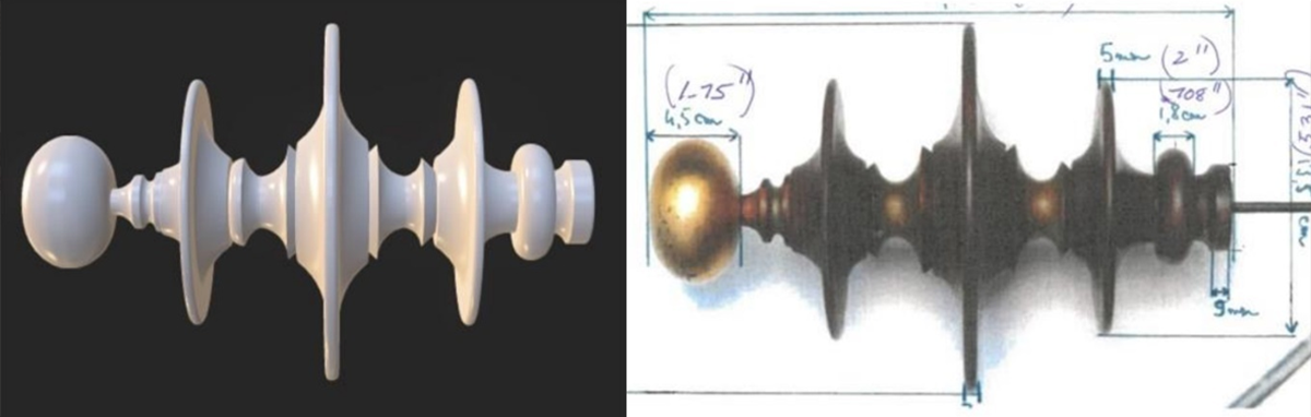
Left image: CAD model of the finial. Right image: Reference photograph of the finial.
Forust, a subsidiary of Desktop Metal, Inc. provided the philanthropic support and technology to implement a sustainable 3D additive manufacturing approach using a high-speed single-pass printer engine and recycled sawdust held in a bio-epoxy resin print medium. This technology was featured on an episode of The Henry Ford’s Innovation Nation with Mo Rocca.
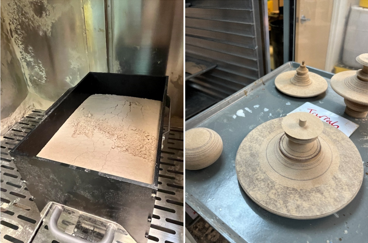
The left image shows a bed of sawdust that covers printed components of the finials that can be seen uncovered in the right image. Images from Desktop Metal, Inc.
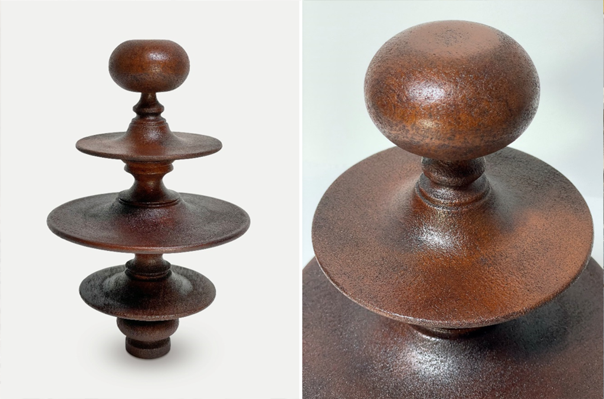
Photographs of the printed finials after the application of a stain. The images were provided by Desktop Metal, Inc.
The parts provided by Desktop Metal, Inc were then re-toned to match the existing wood surfaces and gilded with 23.4K gold leaf. A dowel was inserted at the base as a fastener.
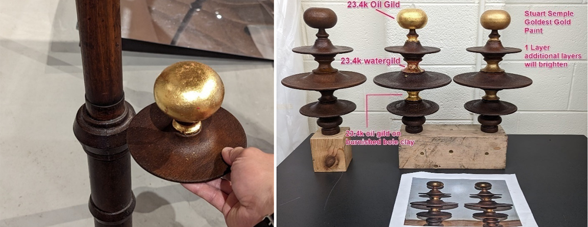
The surface finish of the printed parts was compared and matched to the original finish on the kiosk. The above images show several types of gold finishes.
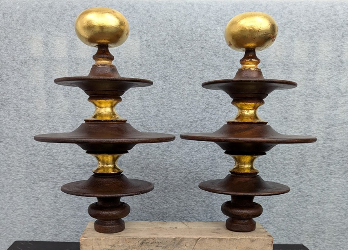
The finished pair of finials before the installation on the kiosk.
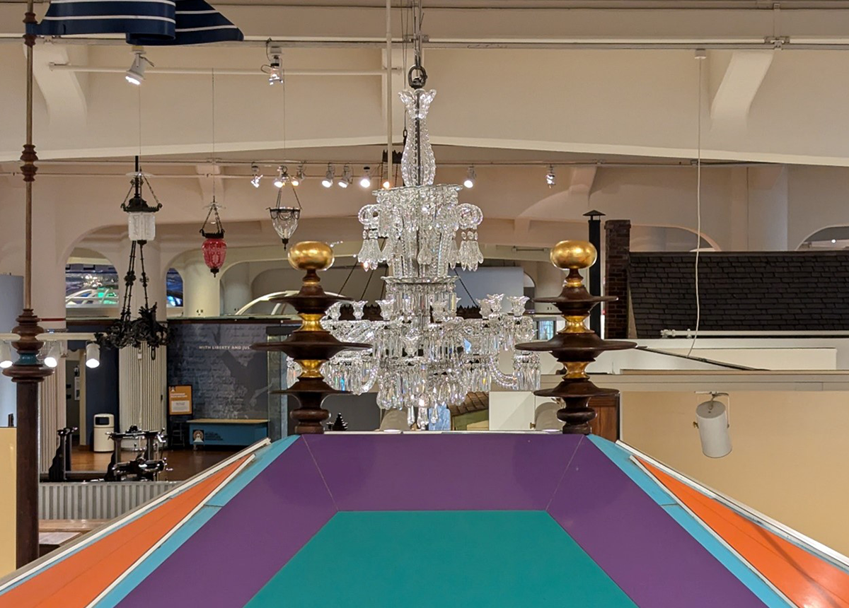
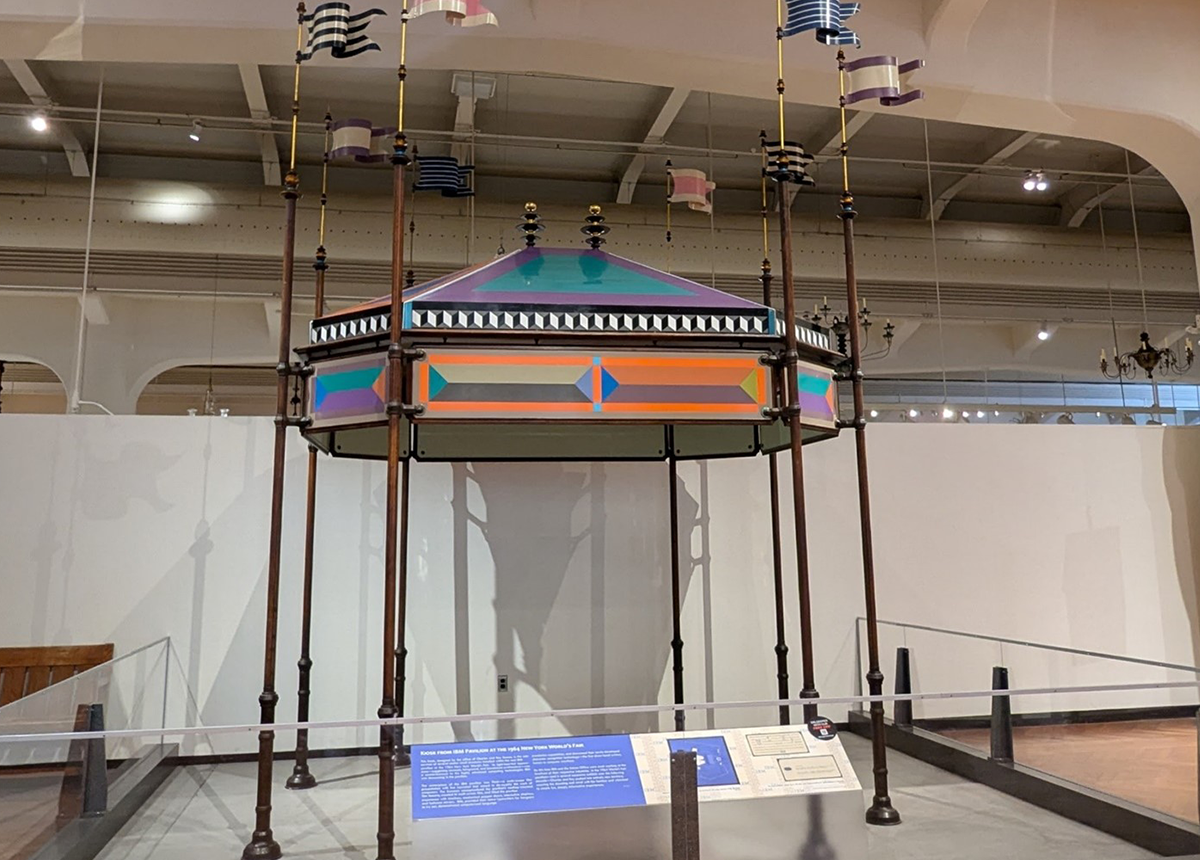
Above Images: The kiosk was complete with two fabricated finials.
Special thanks to Desktop Metal, Inc. (Kristal Kilgore, Soniya Patel, Benjamin Leone, Sarah Webster)
Cuong T. Nguyen is senior conservator (objects & functional artifacts) at The Henry Ford.
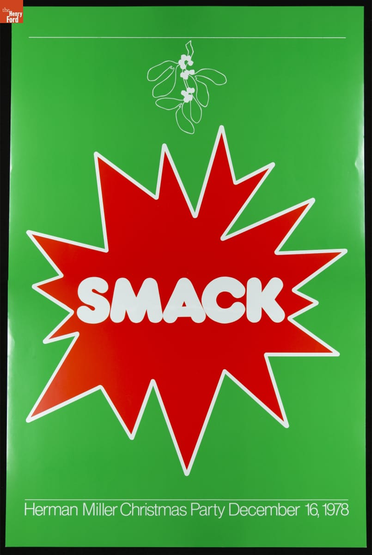
Herman Miller Christmas Party Poster, "Smack," December 16, 1978 / THF626909
In 1976, Linda Powell was hired as a graphic designer at the Herman Miller Furniture Company in Zeeland, Michigan. A recent graduate of Western Michigan University in nearby Kalamazoo, Michigan, she received a bachelor's degree in graphic design and a master’s degree in education. For Herman Miller, Powell designed a dizzying variety and amount of material, including internal magazines, holiday cards, annual reports, invitations, product packaging, environmental graphics, posters, and more.
Powell’s supervisor, Steve Frykholm, was Herman Miller’s first internal graphic designer and his poster series for the company’s annual summer picnic became an immediate and resounding success. This success sparked a tradition of the company’s internal graphic designers producing posters and other materials for internal employee events. In the spirit of Frykholm’s Picnic Posters, Powell was asked to design a poster for the 1976 employee Christmas party. She continued to create posters for each Christmas party until 1979.
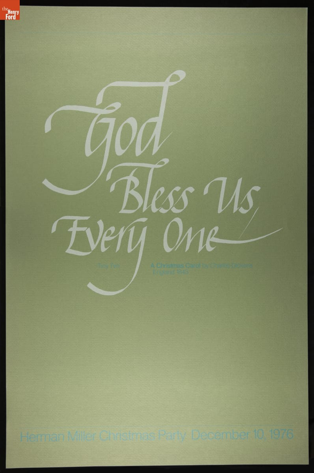
Herman Miller Christmas Party Poster, "God Bless Us, Everyone," December 10, 1976 / THF626900
The 1976 Christmas party theme was “English Christmas.” Powell’s poster invokes the words of Tiny Tim Cratchit, a major character from Charles Dickens’ 1843 novella, A Christmas Carol. At the end of the story, the ailing Tiny Tim announces, “God bless us, every one!” after his father raises a toast at the Christmas dinner table. It is also repeated as the final line of the story and symbolizes protagonist Ebenezer Scrooge’s change of heart. Powell’s poster was produced in different colorways, including this green stock, as well as a brown and blue, but the focus is always Tiny Tim’s message.
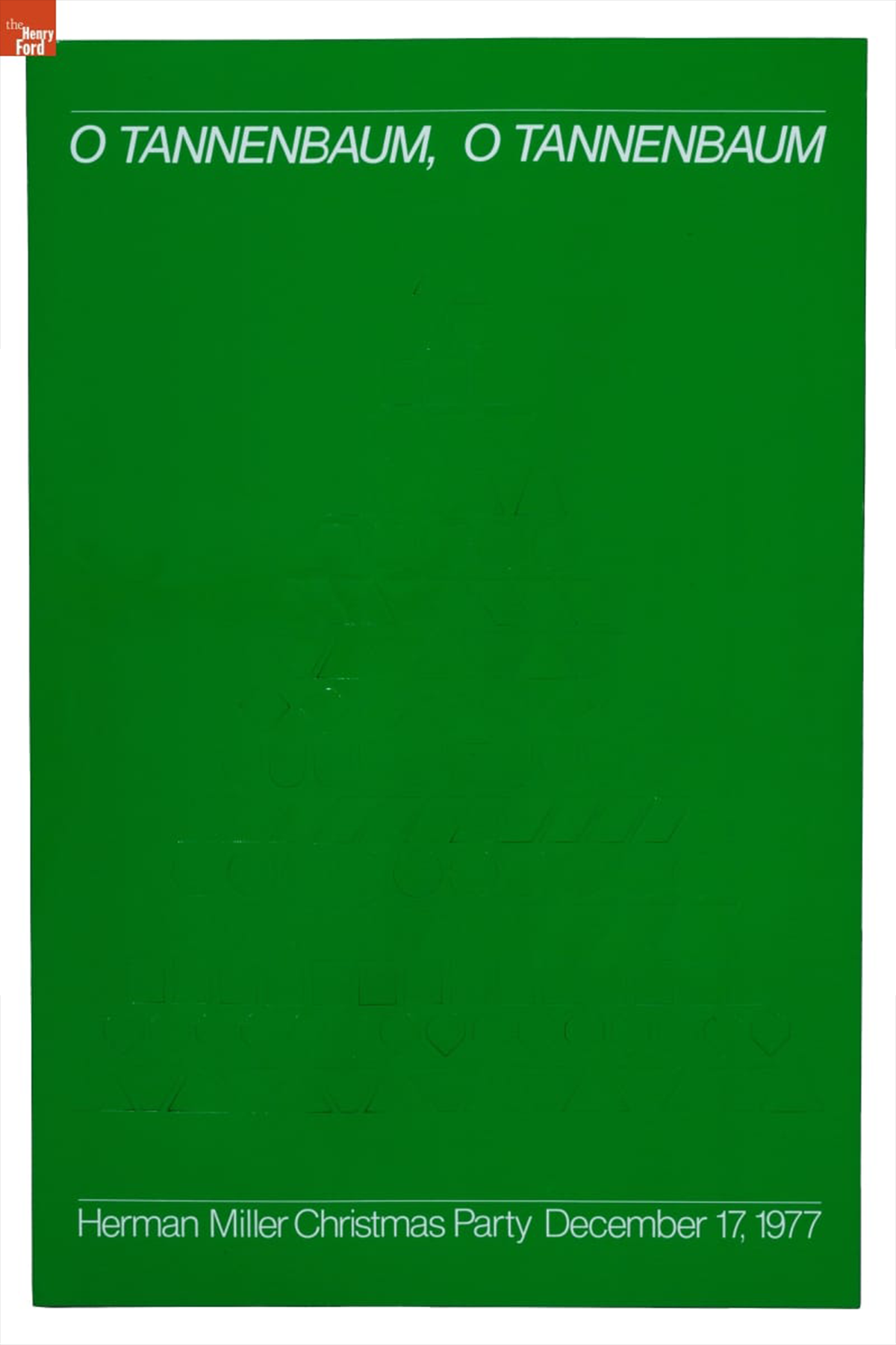
Herman Miller Christmas Party Poster, "O Tannenbaum," December 17, 1977 / THF189135
The 1977 theme was “German Christmas.” Powell’s poster design features die-cut Christmas ornaments. The die-cut ornaments are difficult to see in this image as the ornaments have not been popped out and creased, but the same poster held at the West Michigan Graphic Design Archive showcases the three-dimensionality of this poster quite well. “O Tannenbaum,” references the German Christmas folk song, known in English as “O Christmas Tree.”
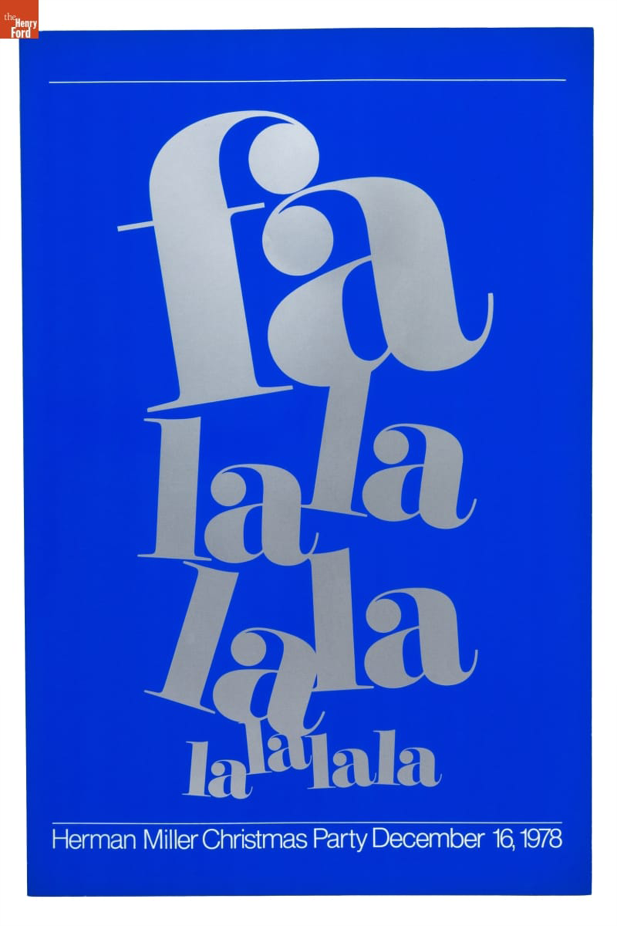
Herman Miller Christmas Party Poster, "Fa La La La La," December 16, 1978 / THF189136
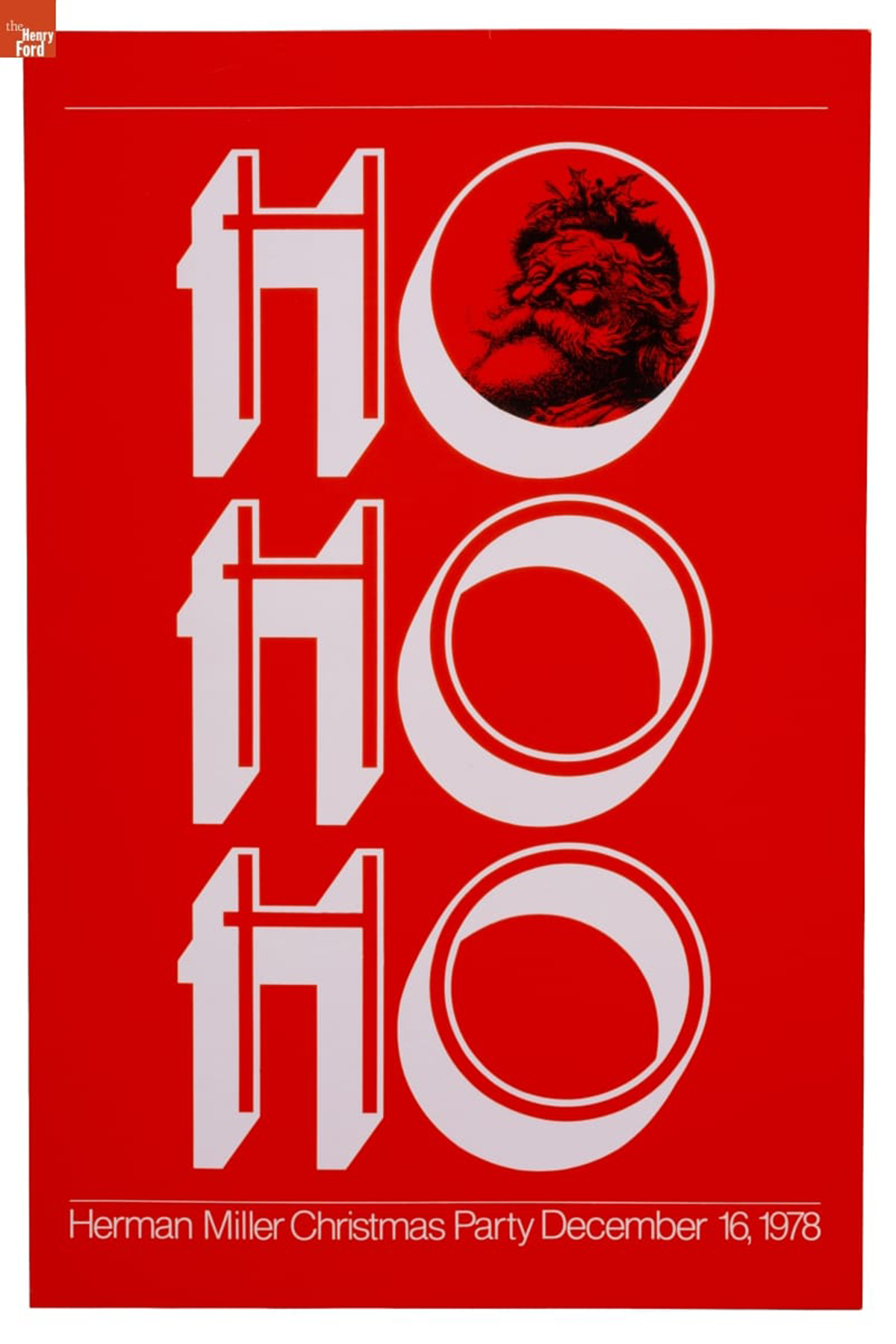
Herman Miller Christmas Party Poster, "Ho Ho Ho," December 16, 1978 / THF189137
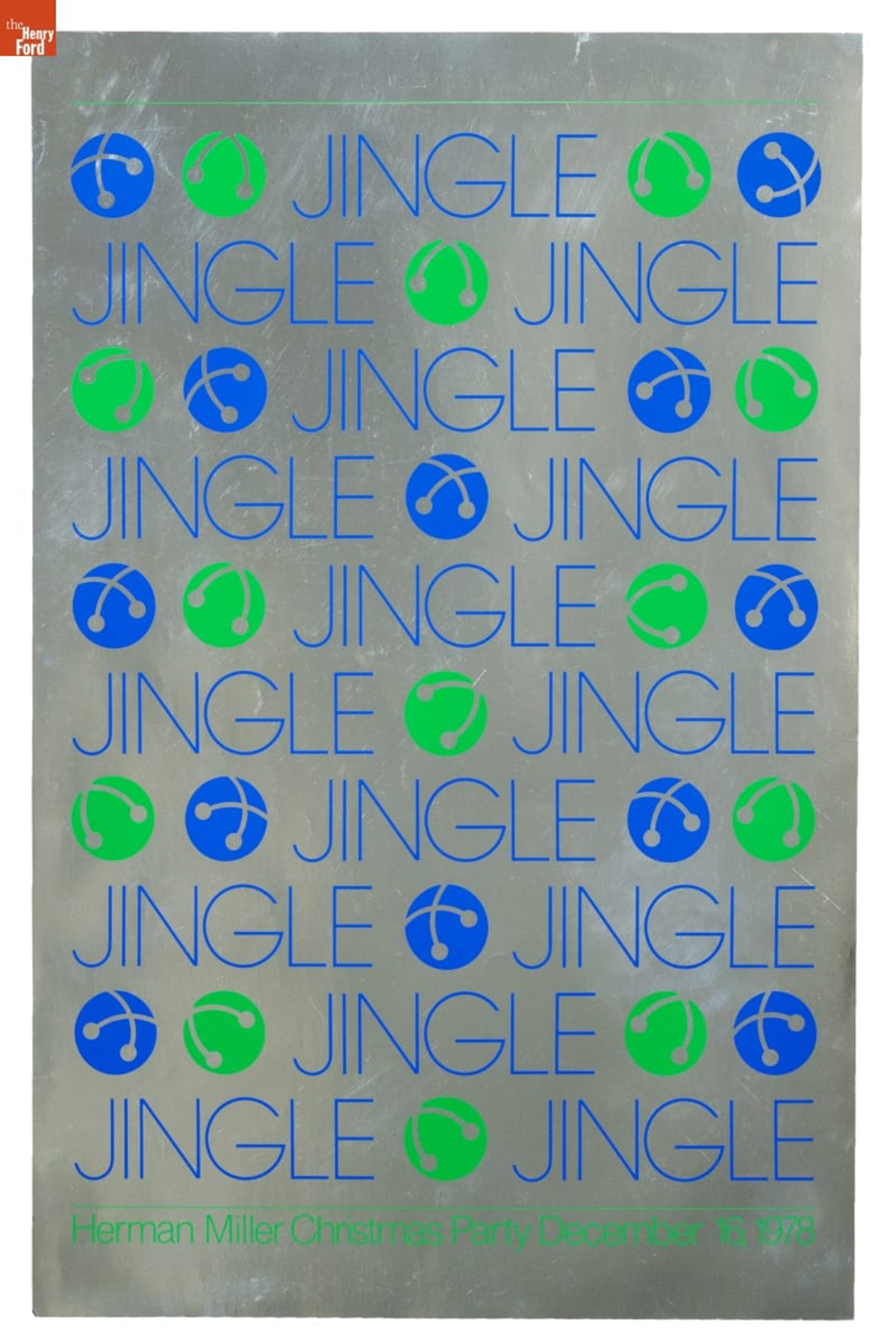
Herman Miller Christmas Party Poster, "Jingle," December 16, 1978 / THF189138
In 1978, Powell designed four unique posters for the “sounds of Christmas” themed party, instead of attempting to address the multitudes of holiday audio in one design. These high saturation, high contrast posters each foreground one sound. “Smack” (shown as the cover image to this blog) references the sound of a kiss under the mistletoe. A jolly Santa Claus peeks through the first “O” in the “Ho Ho Ho” to ensure one imagines his laughter. The final two posters reference the sounds of classic Christmas songs: “Fa La La La La” invokes “Deck the Halls” and “Jingle,” of course, refers to “Jingle Bells.”
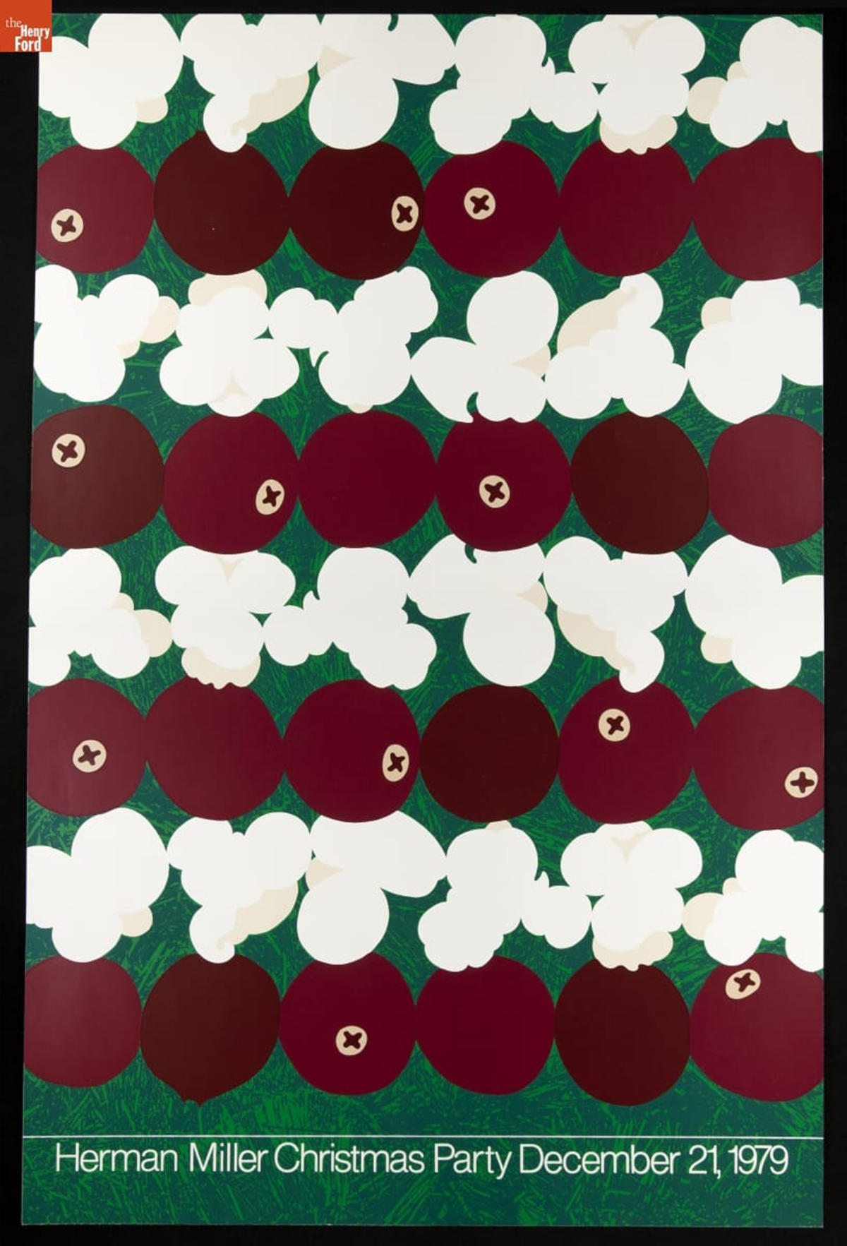
Herman Miller Christmas Party Poster, "Popcorn and Cranberries," December 21, 1979 / THF626905
The final Christmas Party Poster designed by Linda Powell was undertaken in 1979. Taking clear inspiration from Steve Frykholm’s food-focused Picnic Posters, she features alternating rows of popcorn and cranberries hung on a Christmas tree. This zoomed-in, micro perspective encourages attention paid to details of the holiday.
After fifteen years at Herman Miller, Powell resigned in 1991 and began a career in academia as a professor at Ferris State University in Big Rapids, Michigan. Alongside Herman Miller colleague Barbara Loveland, she developed a robust design program at the university. Since retiring from Ferris State University, Powell co-founded the West Michigan Graphic Design Archive, held at the archive of her alma mater, Western Michigan University, and continues to advocate for preservation of graphic design originating in western Michigan.
Further reading:
- Check out the Fall 2023 issue of The Henry Ford Magazine for a spotlight on Steve Frykholm’s Picnic Posters for Herman Miller.
- Read about Kathy Stanton, colleague of Linda Powell, in the “Women Design: Kathy Stanton’s Picnic Posters for Herman Miller” on The Henry Ford’s blog.
Katherine White is curator of design at The Henry Ford.
In the 1930s and especially after the Second World War, American greeting card companies began hiring well-known artists and illustrators to design Christmas cards. Artist-designed cards enticed customers to purchase a company's cards, sometimes sold at a slightly higher price. For the artists, creating holiday cards expanded their artistic expression and provided an avenue for greater name recognition. Designing Christmas cards also supplemented incomes for artists and illustrators when other work became unpredictable. A ready pool of artists found success as production designers, animators, and illustrators in the West Coast film and movie industry — notably at Walt Disney Studios. Along with this studio talent, Walt Disney hired other well-established artists to work on his animation projects. Not only did these artists create classic animated films, but they also designed memorable holiday greeting cards.
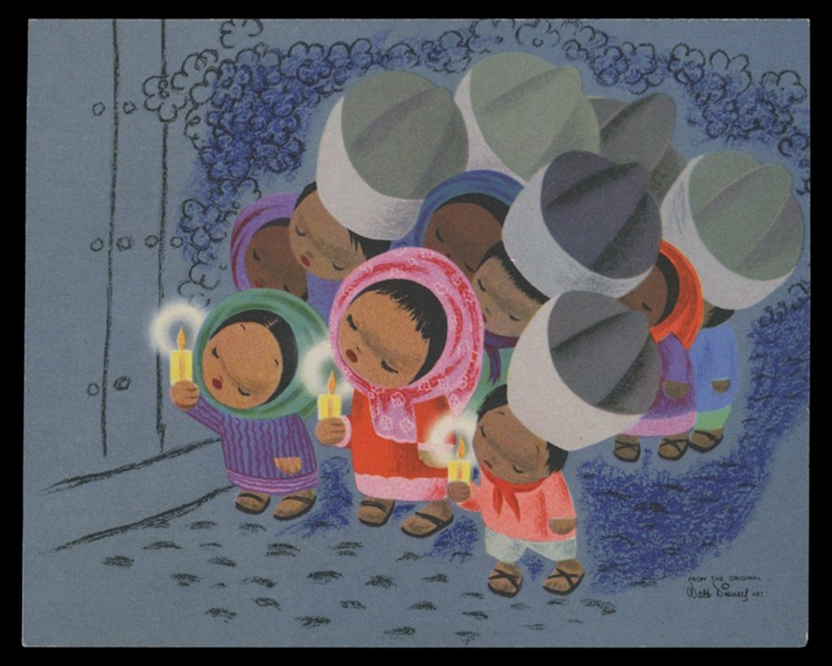
Christmas card, 1945. Procession of Children with Candles — "Los Posadas." Artwork by Mary Blair from the Walt Disney Film The Three Caballeros. / THF715961
Mary Browne Robinson [later Mary Blair] (1911-1978) was born in McAlester, Oklahoma. Her family moved to California in the early 1920s, and she attended San Jose State College, where she majored in fine art. A gifted and talented young artist, Blair received a scholarship to the prestigious Chouinard Art Institute in Los Angeles in 1931, where she aspired to be an illustrator. During the 1930s, she became one of the few women members of the California Water Color Society and exhibited her works throughout the country. She married fellow artist Lee Blair in 1934. As the Great Depression lingered, both turned to Southern California's animation industry to augment their incomes, working for Ub Iwerks, Hugh Harman, Rudolf Ising, and, most notably, Walt Disney.
Mary Blair went to work for Walt Disney in 1940, following her husband Lee, who had joined the studio a few years earlier. At Disney, Blair created watercolor concept art for new films but was not happy working in animation — she had the artistic ambition of working in commercial illustration. Blair left the company in 1941, only to be rehired to accompany her husband on a research trip Walt Disney planned to Latin America for a Good Neighbor policy tour sponsored by the United States. She flourished on the tour, and Walt took notice of her work. Over the next twelve years, Blair would research and create concept artwork for numerous Disney projects, including The Three Caballeros (1944), Make Mine Music (1946), Cinderella (1950), Alice in Wonderland (1951), and Peter Pan (1953). Blair left the company again in the mid-1950s and returned to the work she loved — illustration and advertising design. Her diverse accomplishments encompassed clothing and textile design, children's book illustrations, commercial advertisement and greeting card design, high-end department store window displays, and Broadway and Hollywood film industry projects. Disney never forgot Blair, eventually hiring her to create special project murals and designing "It's a Small World" — a ride experience for the 1964 World's Fair, which later was moved to Disneyland.
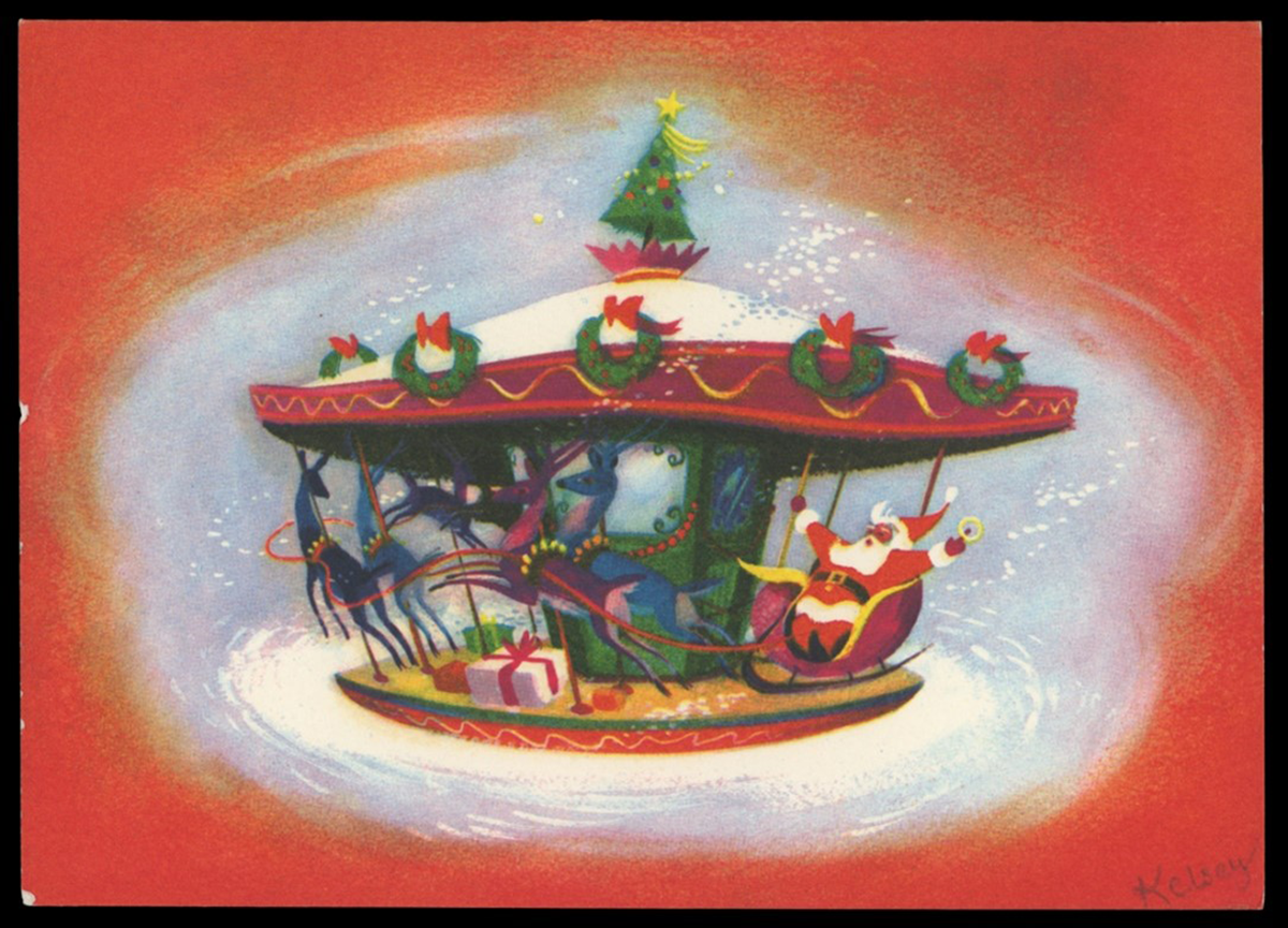
Christmas card, 1952. "Christmas Carrousel." Artwork by Richmond "Dick" Kelsey. / THF702987
Dick Kelsey
Richmond "Dick" Kelsey (1905-1987) was born in San Diego, California, and studied art at the Otis Art Institute and the Art Center School in Los Angeles. Kelsey, a noted watercolorist in the 1930s, had works exhibited at the Smithsonian Institute and the 1935 California-Pacific International Exposition in San Diego. He was a member of the American Watercolor Society and California Watercolor Society.
In 1938, Kelsey began working for Walt Disney Studios on several of their animated films: Pinocchio, Fantasia, and Bambi. As one of the art directors for Disney, Kelsey worked closely with the directors, helping to establish the mood, staging, and color of the animated production. He left to serve in World War II but returned after the war and worked on other Disney projects, as a writer for Alice in Wonderland and as a background artist for Bedknobs and Broomsticks. Among his other works, Kelsey assisted in the design of Disneyland, illustrated children's books based on Disney characters and stories, and designed holiday greeting cards. Kelsey, a mentor to other Disney artists, encouraged others to pursue Christmas card design. One artist was Tyrus Wong, whose atmospheric backgrounds for Bambi captured the spirit of the forest that inspired the film's visual style — a style later translated into Christmas cards.
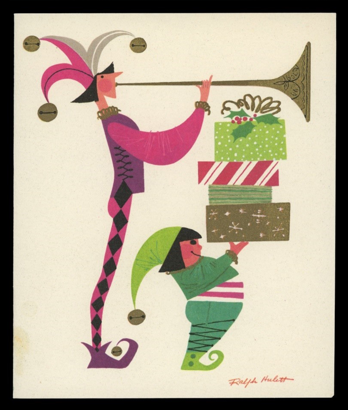
Christmas card, 1955. "Christmas Herald." Artwork by Ralph Hulett. / THF703002
Ralph Hulett
Ralph Hulett (1915-1974) attended high school in Glendale, California, after his family had moved from Illinois, where he was born. The artistically talented student received a four-year scholarship to Chouinard Art Institute in Los Angeles. Like many who attended Chouinard, Hulett became a member of the California Watercolor Society, exhibiting and selling his works through local galleries. Many of his works depict scenes of California and Mexico. Hulett also was a member of the American Watercolor Society and exhibited in its annual New York City shows.
Walt Disney Studios hired Ralph Hulett to work on Snow White and the Seven Dwarfs while he was still attending Chouinard, which became a full-time role after his graduation. Throughout his lifelong career at Disney, Hulett created backgrounds for several of the Studio's famous animated shorts and features, including Pinocchio, Dumbo, Bambi, Peter Pan, Lady and the Tramp, Sleeping Beauty, and The Jungle Book. In the 1940s, Hulett began creating Christmas cards for greeting card companies — notably Designers Showcase and California Artists — turning out hundreds of holiday designs over the next thirty years.
Eyvind Earle
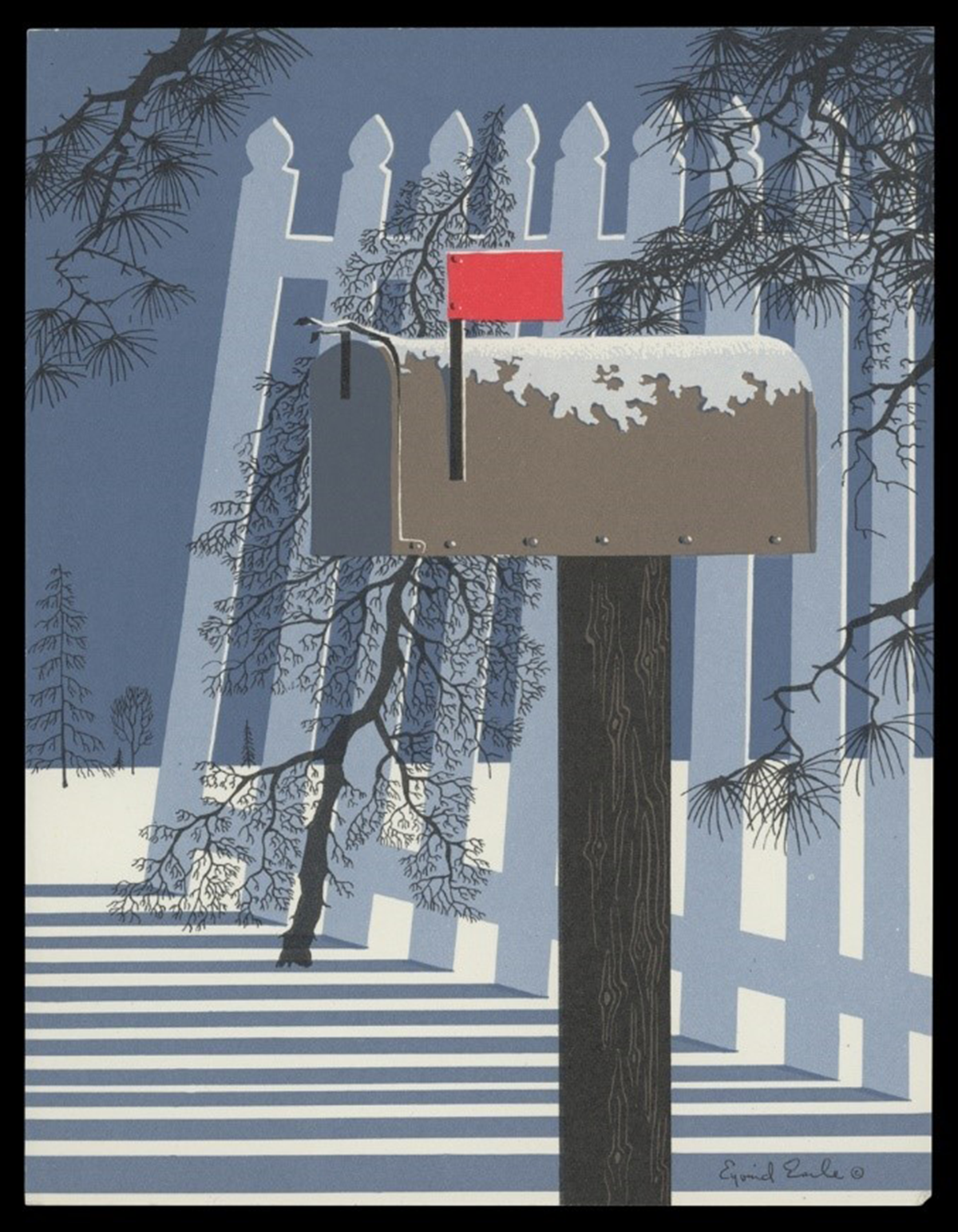
Christmas card, 1955. "Mailbox in the Snow." Artwork by Eyvind Earle. / THF703008
Eyvind Earle (1916-2000) began working for Walt Disney Studios in the early 1950s as an assistant background painter, designing static backdrops for animated films. His first project was Peter Pan, and he later created some concept art for other films, including Lady and the Tramp. But Earle's lasting impact came when Walt Disney tapped him for the overall production design for Sleeping Beauty, including its styling, background, and color. The film's backgrounds were lush, detailed, and enchanting — a departure from previous Disney projects — and are now a highly acclaimed animation achievement.
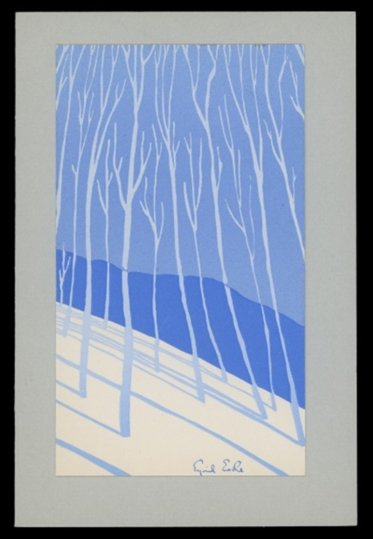
Christmas card, 1942. An early card design by Eyvind Earle for Earle and Ball, Inc. / THF702955
Earle, however, was a recognized artist and Christmas card designer well before he went to work for Walt Disney — and remained so after he left the company in the 1960s. When Earle was ten, his father challenged him to read fifty pages of a book or create a painting a day; Earle did both. His artistic skill developed, and by fourteen, Earle had his first one-artist show. During the Depression, at twenty-one, he biked and painted his way across the United States. In 1939, New York's Metropolitan Museum of Art purchased one of his works for its permanent collection. It was also in the late 1930s, during the lingering Depression, that Earle began creating artwork for holiday cards. Earle and his mother printed the cards by hand for the first year. Over the next few years, he teamed up with friends and formed companies to sell his holiday design products — first Monroe and Earle, then Earle and Ball. His design relationship with the later company lasted until he was drafted into the Navy in 1943. By then, producing Christmas cards had become a passion — Earle would create more than 800 designs over the rest of his life.
Andy Stupperich is an associate curator at The Henry Ford.
