The Office of George Nelson & Co.
| Written by | |
|---|---|
| Published | 6/23/2021 |
The Office of George Nelson & Co.
| Written by | |
|---|---|
| Published | 6/23/2021 |
In 1947, George Nelson opened his eponymous design office on Lexington Avenue in New York City. George Nelson & Co., as the first iteration of the office was named, was located on the second floor of a narrow building; the ground floor was a health food restaurant. In the introduction to Nelson’s collection of 26 essays called Problems of Design, Museum of Modern Art curator Arthur Drexler recalled that the restaurant had a loyal customer base, even though it “smelled funny.” Drexler observed an “unnerving contrast between the solemnity on the ground floor and that haphazard urbanity on the floor above.” George Nelson’s tendency to do many things simultaneously would have created a sometimes chaotic but always exhilarating environment that perhaps occasionally featured a pungent reminder of its downstairs neighbor.
Over the next four decades, the office would change names, move around New York City, employ many of the best and brightest designers, and complete a dizzying number of projects for a variety of clients. Constant through these changes was George Nelson’s emphasis on the importance of the design process. Even late nights at the office, sometimes saturated with drink, could be productive. Concepts imagined the night before might find their way to the drawing board in the bright light of the morning to be refined, altered, and honed further.
Sometimes, Nelson was more involved with the ideation and later refinement of an idea than with its realization—the office’s staff designers tended to that. A one-time employee of the office, architect and designer Michael Graves, reminisced that Nelson “would come in and touch down his magic dust on somebody and then leave.” While Nelson’s “magic dust”—and the powerful brand that his name symbolized—was vital to the office’s success, Nelson’s own hand in the development of a product or design was sometimes exaggerated. It has taken many years for certain designs to be accurately attributed—and surely there are many more that have not been and may never be. This problem is not unique to Nelson’s office, however, and was often the price designers paid to gain experience and contacts in the field. Hilda Longinotti, the office’s long-time receptionist, reflected on this: “As the years went by, George with all of his intelligence, did not do one thing he should have done and that is make the most talented designers partners in the firm. He gave them titles, but he didn’t give them a piece of the business. As the years went by, they left to form their own offices…”
The hundred-plus people employed by George Nelson over the course of his career—some for a short time and others much longer—include Lance Wyman, Ernest Farmer, Tomoko Miho, Irving Harper, Michael Graves, Don Ervin, Lucia DeRespinis, George Tscherny, and many others. The Henry Ford’s collections feature graphics and products designed by Nelson himself as well as some confirmed to be designed by the office’s staff. Below, we will focus on three of these designers: Irving Harper, George Tscherny, and Tomoko Miho.
Irving Harper
For many of the years that George Nelson was Herman Miller’s design director, Irving Harper was the director of design at George Nelson’s office. George Nelson hired Harper in 1947, and Harper did a little bit of everything in his tenure there—industrial design, furniture, and, eventually, graphics. Although he didn’t have much experience in graphic design, Harper quickly excelled. Herman Miller’s sweeping red “M” logo was one of Harper’s first forays into graphic design, and, 75 years later, the logo is still beloved and used by the company. Harper also designed many of the Nelson Office’s notable products, including many of the clocks for Howard Miller and the iconic Marshmallow sofa.
Born in New York City in 1916, Harper trained as an architect at New York’s Cooper Union and Brooklyn College. He soon began designing interiors. At the age of 19, Harper was hired by Gilbert Rohde, Nelson’s predecessor at Herman Miller, to work on projects for the 1939 World’s Fair, including renderings and production drawings. Harper worked for George Nelson from 1947 until 1963, when he left to start his own firm, Harper+George, which primarily designed interiors for commercial clients. Harper began to create incredibly intricate paper sculptures in the early 1960s as a stress relief measure, turning him into a proper sculptor as well as designer. The paper sculptures bridged his active design years into his retirement in 1983, when his sculpting output greatly increased. Harper died in 2015 at his long-time home in Rye, New York.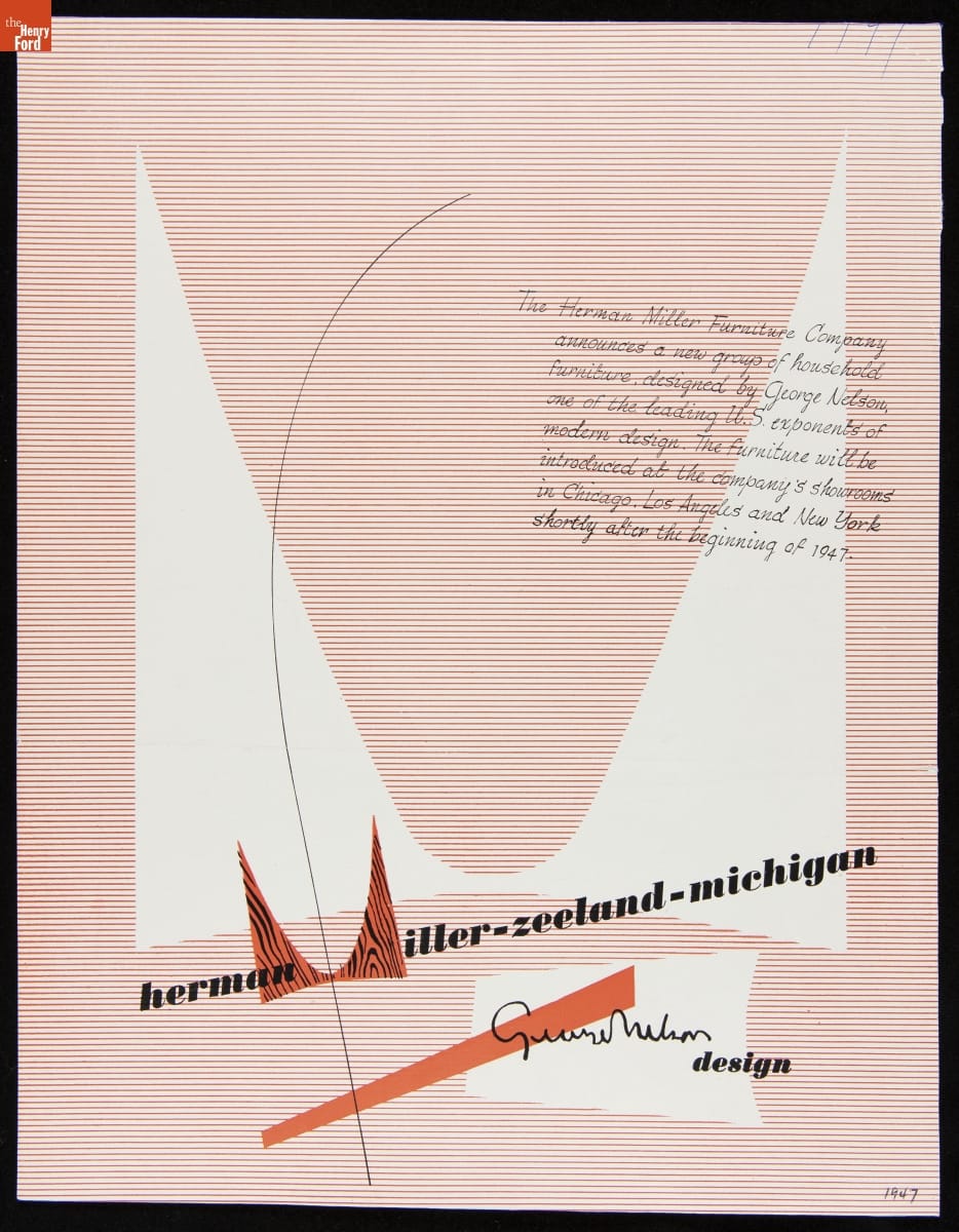
This 1947 advertisement features Herman Miller’s sweeping new “M” logo, which was designed by Irving Harper in one of his first forays into graphic design. / THF623975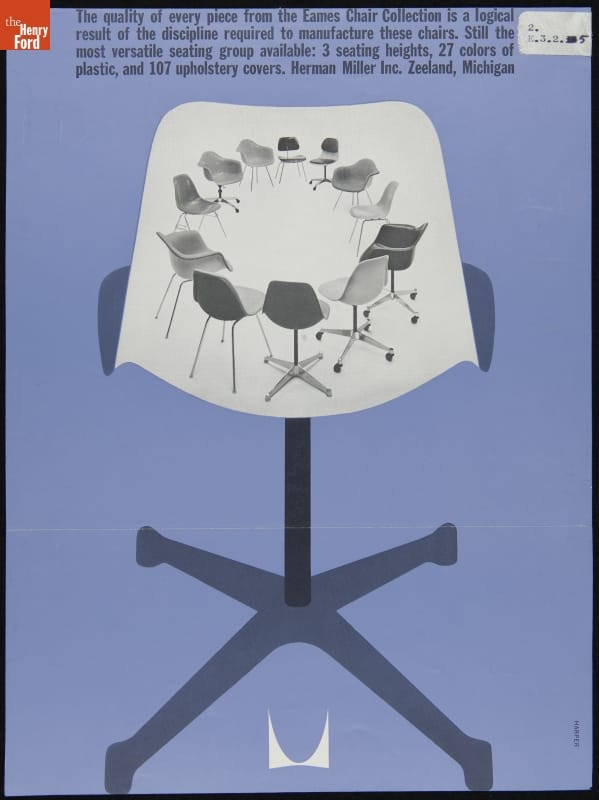
Irving Harper designed this 1961 Herman Miller advertisement for the “Eames Chair Collection.” / THF266918
George Tscherny
George Tscherny began working at George Nelson & Co. in 1953. Nelson hired Tscherny specifically to design print advertisements for the office’s largest client, Herman Miller, under the direction of Irving Harper. Nelson reportedly had a hands-off approach. Tscherny recalled, “He had no pressing need to involve himself in my area. That meant I could do almost anything within reason.” Tscherny was able to expand and hone his graphic style, which stresses the inherent nature of objects and is always human-centered—even when a human isn’t visible.
Tscherny, born into a Jewish family in 1924 in Budapest, Hungary, grew up in Berlin, Germany. The rise of the Nazi Party and, specifically, the evening of Kristallnacht (“The Night of the Broken Glass”) on November 10, 1938, led Tscherny to believe “there was no future for us in Germany.” The following month, George and his younger brother Alexander escaped to the Netherlands, where they spent the following years moving between refugee camps and Jewish orphanages. Their parents, Mandel and Bella (Heimann) Tscherny, obtained visas and emigrated to the United States in 1939. It wasn’t until June of 1941 that George and Alexander finally joined their parents in New Jersey, after numerous close calls with the Nazi Party. In 1943, George Tscherny enlisted as a soldier in the U.S. Army to fight in World War II and went back to Europe, using his language skills as an interpreter. After the war, Tscherny used the G.I. Bill to fund his study of graphic design, attending the Pratt Institute in Brooklyn, New York; he would leave just weeks before graduation to work for designer Donald Deskey. In 1953, he was hired by George Nelson.
Although Tscherny only worked for Nelson until 1955, numerous advertisements he designed for Herman Miller during his short tenure became iconic of the era. Tscherny left the office to start his independent design studio, which designed graphics for major corporations. He also taught at the School of the Visual Arts in New York City for over half a century. Tscherny says he attempted to teach his students, as Nelson taught him, “not to have preconceptions, but rather to be receptive to new ideas.” Tscherny, currently 96 years old, lives in New York City with Sonia, his wife of over 70 years.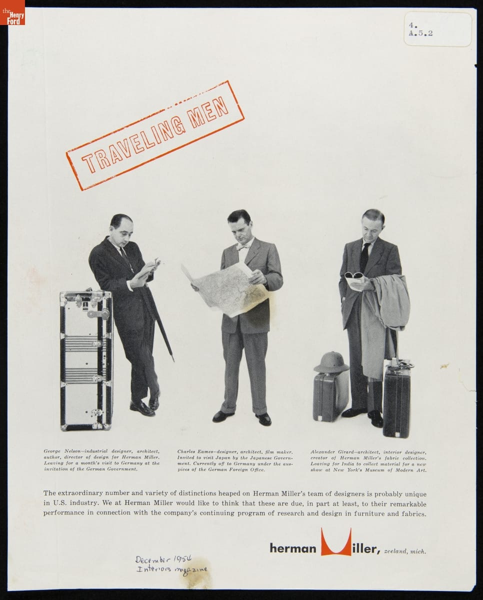
The famous "Traveling Men" advertisement for Herman Miller was designed by George Tscherny in 1954. / THF624755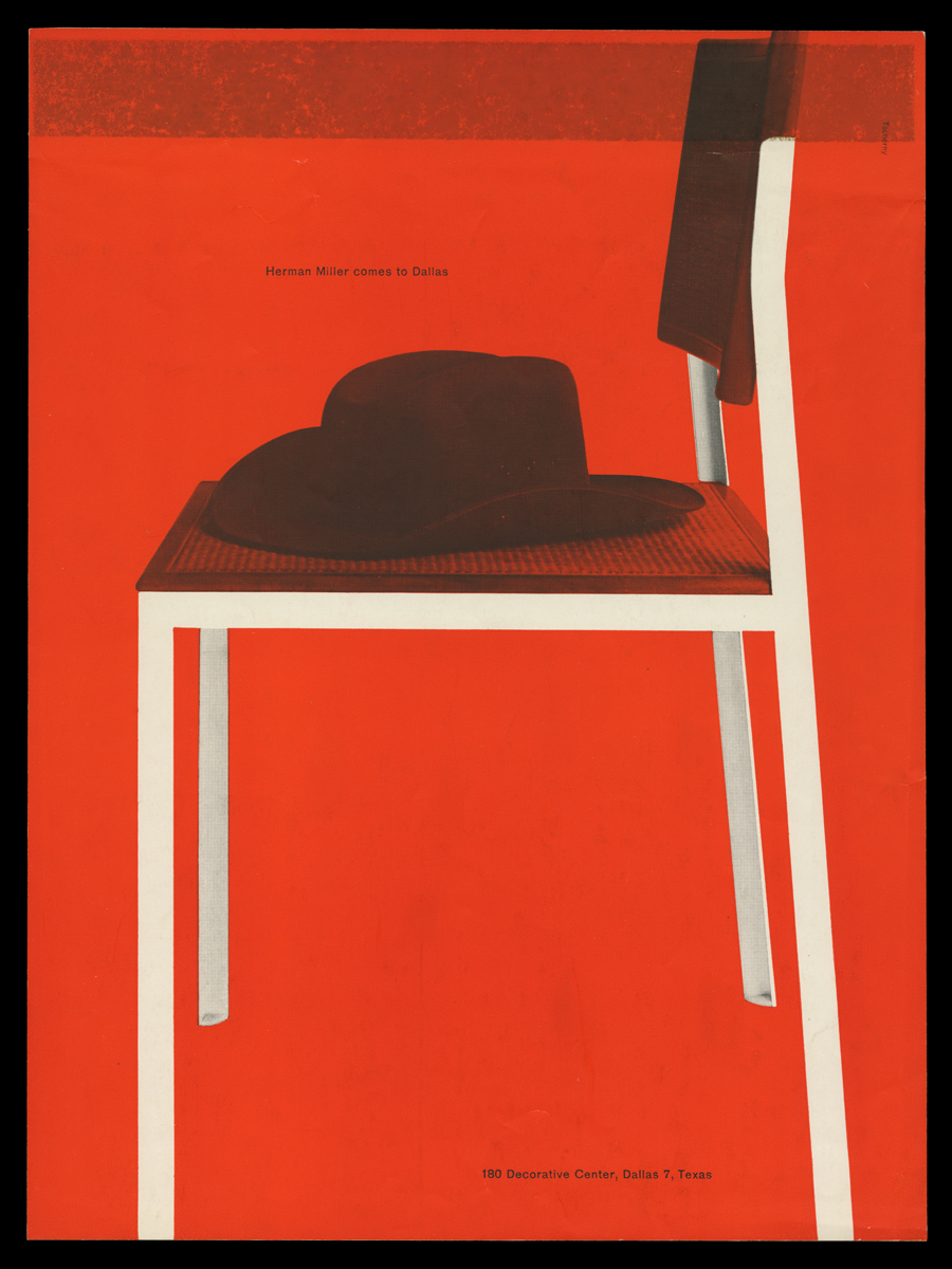
George Tscherny’s 1955 “Herman Miller Comes to Dallas” advertisement implies a human presence through the inclusion of a cowboy hat. / THF148287
Tomoko Miho
Tomoko Miho was one of a few women that George Nelson hired to design for his office. Miho is not very well-known today, both due to a societal tendency to ignore contributions of women working in the mid-century period and to her private and reserved nature. Although her name may be unfamiliar, this is not due to a lack of talent—Miho’s skill in graphic design and art direction were extraordinary. Once you identify her clean, minimalist, architectural style, it becomes distinct from the others working in the Nelson office.
Born Tomoko Kawakami in 1931 in Los Angeles, she and her family were held at the Gila River Japanese internment camp in Arizona during World War II. Afterwards, the family moved to Minneapolis, where Tomoko began coursework in art and design. She received a full scholarship to the Art Center School in Los Angeles, where she graduated with a degree in Industrial Design in 1958. She worked as a packaging designer for Harley Earl Associates before moving to New York City and, on the recommendation of George Tscherny, she contacted Irving Harper and was then hired by George Nelson in 1960. As the prominent graphic designer (and later colleague of Miho) John Massey stated, Miho was “a master of the dramatic understatement.” Her work is graceful, clean, and highly structured, while also seeming unrestricted. Her designs are masterfully well-balanced and lend themselves well to their primary purpose—conveying information.
Miho worked for the Nelson office until 1965, when family commitments took her to California, back to New York City, and then to Chicago, where she worked for the Center for Advanced Research and Design (CARD). She designed possibly her best known work while working for CARD—the 1967 "Great Architecture in Chicago" poster. It reflects her sense that Chicago’s architecture is “both solid and ethereal,” as Miho explained. Miho continued to collaborate with designers she met at George Nelson & Co. for years. She also had an incredibly long-lasting relationship with Herman Miller: she began designing for the company during her tenure at George Nelson & Co., continued while she was employed by CARD, and even after starting her own firm, Tomoko Miho Co., Herman Miller remained a client. Miho passed away in 2012 in New York City.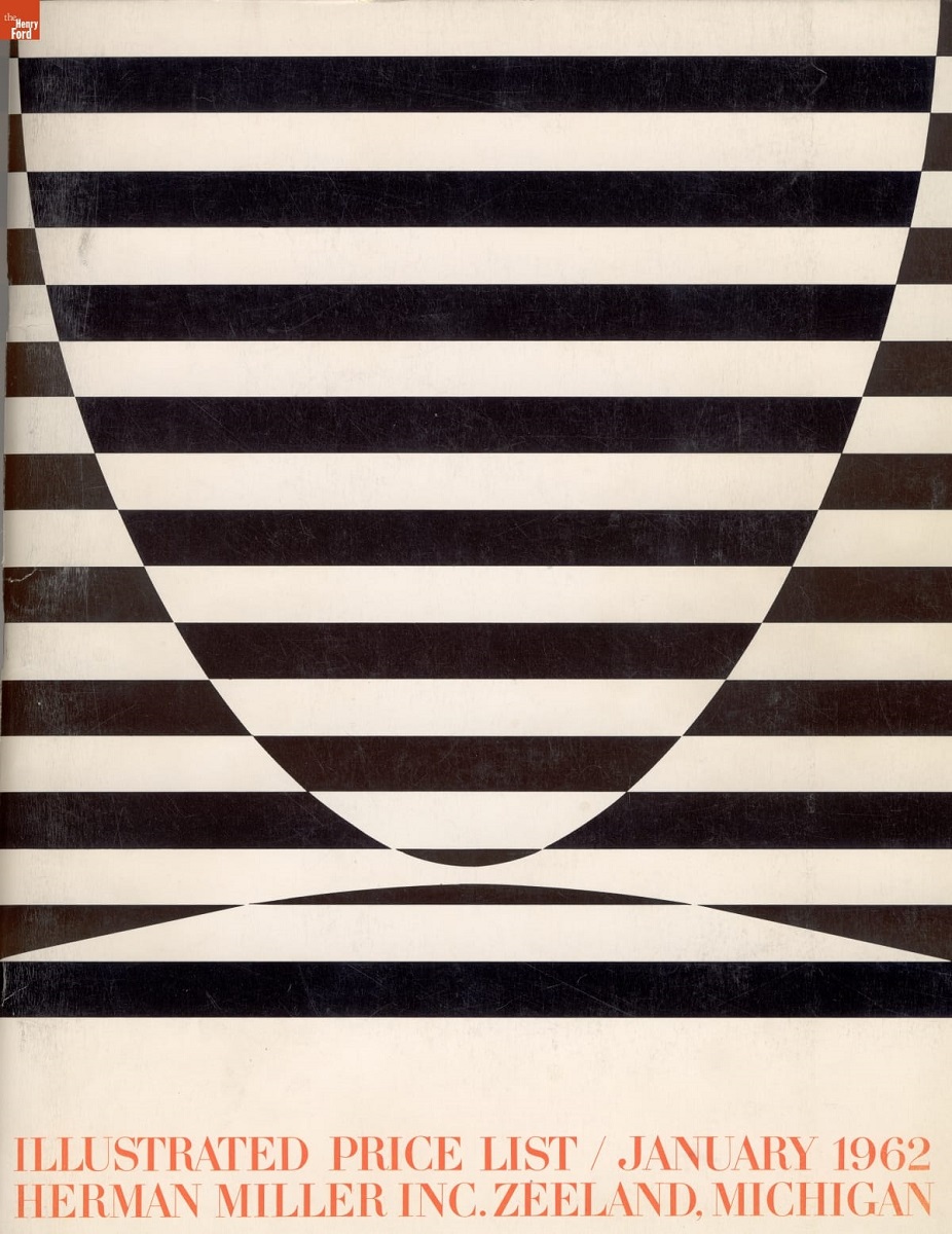
Tomoko Miho featured the Herman Miller logo in this price list, camouflaging it in bold contrasting stripes. This is one document in a suite, all featuring the same design, but in different colorways. / THF64160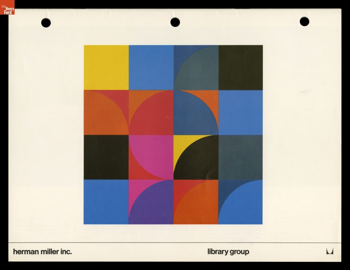
The “Library Group” trade literature was designed by Tomoko Miho, circa 1970. / THF147737
Katherine White is Associate Curator, Digital Content, at The Henry Ford.
Keywords | |
|---|---|
Series | |
Themes |
