
Posts Tagged by katherine white
Throughout history, women have served their country during war and in peacetime, on the home front and at the front lines. Since the founding of this country, both military and civilian women contributed to their nation’s cause—whether through active service, or by using their talents and time to support our fighting forces from afar—in ways that were and are often overlooked. Through these objects from the collections of The Henry Ford, we can explore some of these important stories, shedding light on women and their service.
Frances Clayton
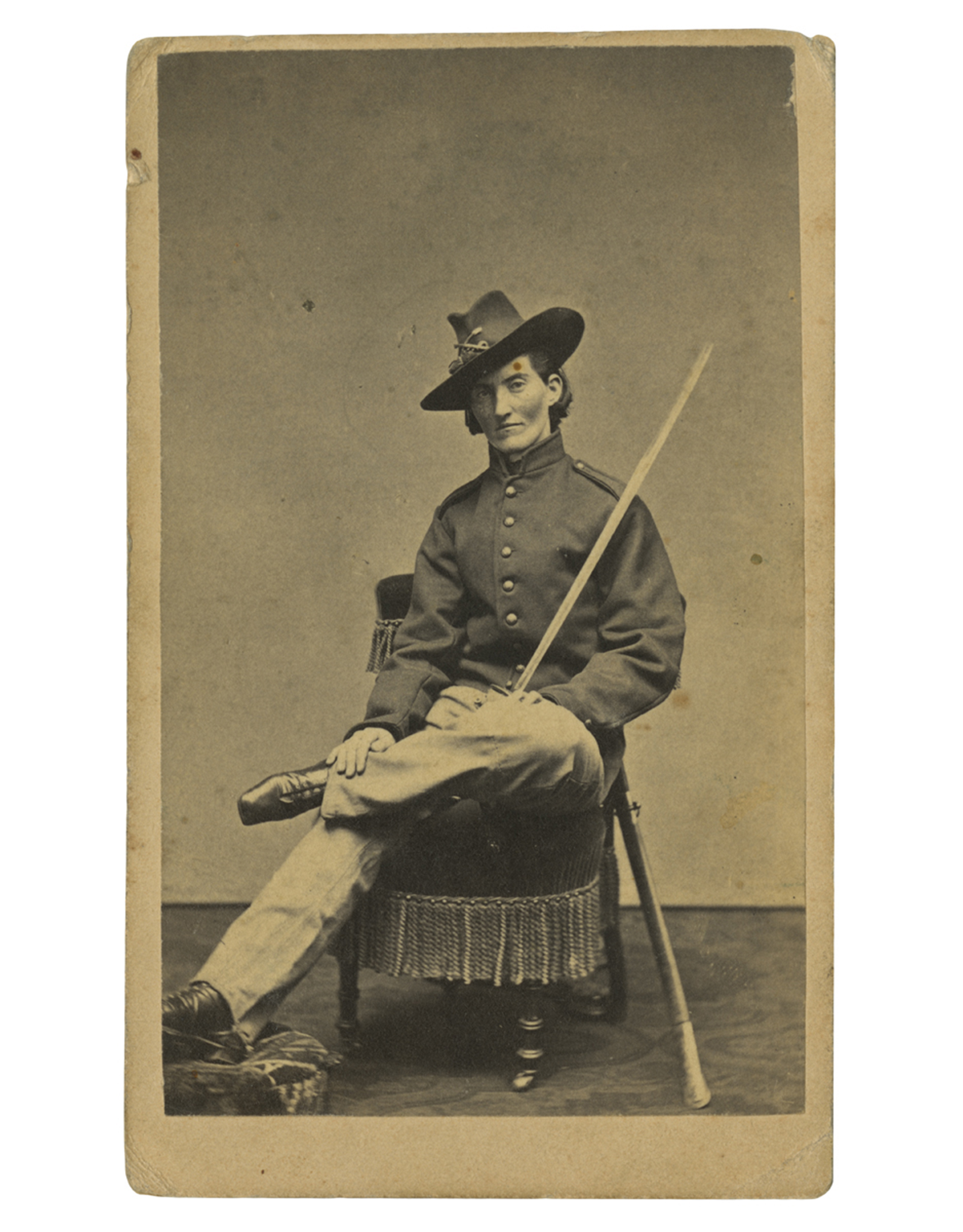 Frances Clayton (c.1830-after 1865), who disguised herself as “Jack Williams” to join her husband in the war, posed for this carte-de-visite at Samuel Masury’s studio in Boston, Massachusetts, circa 1865. While some have questioned Clayton’s exact involvement in the war, her images in uniform are probably the most recognized. / THF71763
While women could not officially serve in combat roles in the United States until 2016, women participated in combat as early as the American Revolution—dressed as men.
During the Civil War, hundreds of women concealed their identities to enlist and fight in battles across the country. Their motivations varied: some wanted to stay close to husbands, brothers, or other loved ones, while others sought to defy societal norms, pursue adventure, or earn a soldier’s pay and enlistment bounty. Patriotism was another driving force—with northern women supporting the Union or abolitionist causes, and southern women joining to support the Confederacy.
At the time, joining the military was easier. With an urgent need for soldiers, physical exams were brief, and no identification was required. A woman could cut her hair, wear men’s baggy clothing, and adopt a male alias. Some were eventually discovered and sent home, others were wounded or killed during service, and others returned home, mustering out at the end of their service.
—Aimee Burpee, Associate Curator
WAAC Women's Army Auxiliary Corps
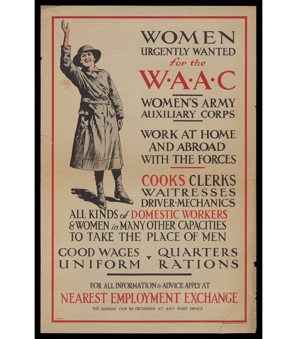 “Women Urgently Wanted for the WAAC Women's Army Auxiliary Corps,” circa 1917 / THF726518
Over 50,000 British women volunteered with the Women's Army Auxiliary Corps in 1917 and 1918, the final two years of the First World War. WAAC volunteers took on support roles such as administrative work, catering, or vehicle maintenance at home in the United Kingdom and on the front in France and Belgium. In doing so, WAAC freed up British men on the front from non-combative tasks so the military could focus on the battlefield. This was the first time that women were allowed in the British armed forces in an official capacity outside of nursing.
The corps was renamed Queen Mary's Army Auxiliary Corps in 1918 after Mary of Teck, the queen consort of King George V, became the corps patron. The original WAAC/QMAAC disbanded in 1921, but it inspired women's auxiliary military corps in Great Britain and the Commonwealth and in the United States during the Second World War.
—Kayla Chenault, Associate Curator
“Molly Pitchers”
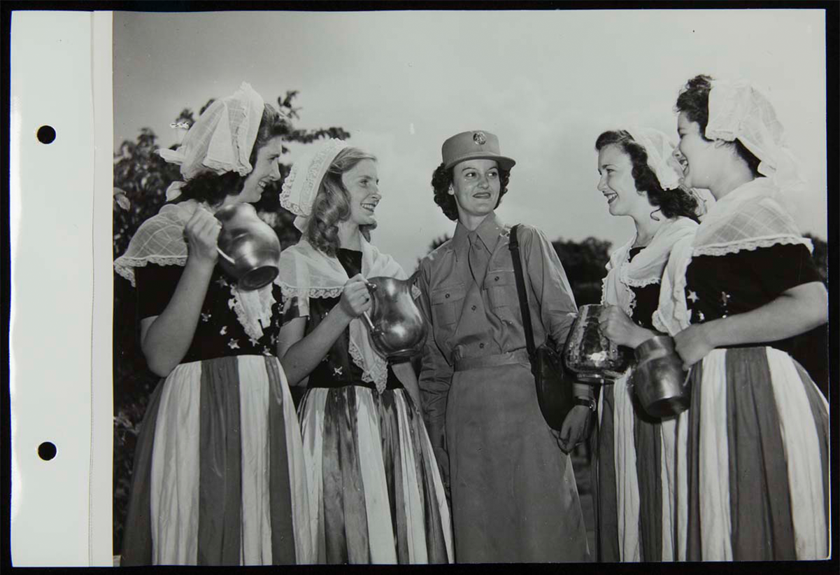 “Molly Pitchers” and Women’s Army Corps recruiter, August 4, 1943. / THF272635
"Molly Pitcher" was the symbolic name given to several historic women who served during the Revolutionary War. These women, usually a soldiers' wife, were noted for carrying water and other provisions to frontline troops. But they became more famous for fighting alongside other soldiers after their husbands or loved ones had fallen in battle.
During the Second World War, August 4, 1943, was designated Molly Pitcher Tag Day. On that day, thousands of women throughout the United States dressed in early American or patriotic costumes and became contemporary "Molly Pitcher" heroines by selling war stamps and bonds. At Greenfield Village, Women's Army Corps recruiters from Detroit, Michigan, and four "Molly Pitchers" came together to raise money for the bond drive, shining a light on women's contributions—whether on the home front or in military service—to America's war efforts since our country's founding.
—Andy Stupperich, Associate Curator
Eames Molded Plywood Leg Splint
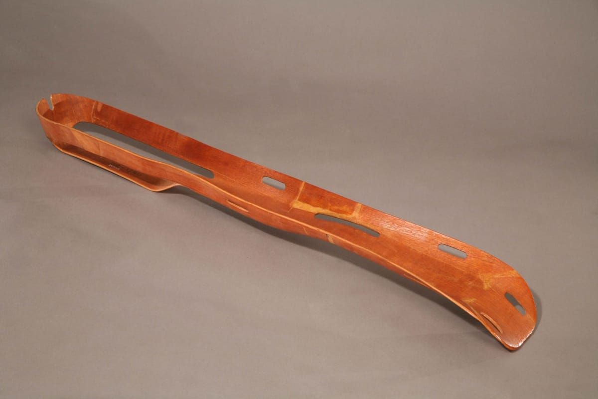 "Eames Molded Plywood Leg Splint, circa 1943. / THF65726
Husband-and-wife designers Charles and Ray Eames spent the early years of their partnership experimenting with molding plywood for use in furniture and sculptural objects. In the early 1940s, they used the spare bedroom in their Los Angeles, California, apartment to develop a machine to mold plywood using pressure. A friend, Dr. Wendell Scott of the Army Medical Corps, visited the Eames’ home and saw the potential of molded plywood for the war effort. America’s entry into World War II had created material shortages, including metal. Despite the shortage, metal splints were being used for broken limbs on the battlefield even though they were inflexible and heavy, and worsened wounds in transport.
Upon hearing this, the Eames designed a flexible, lightweight and durable leg splint using the same molded plywood technology they were developing for plywood furniture. They presented their prototype splint to the U.S. Navy and worked with them to further modify and perfect the product. By 1942, the Navy had placed an order for 5,000 splints. The Eames Leg Splint became a successful medical innovation and a design artifact, as well as a critical step in the Eames understanding of molded plywood.
—Adapted from What if Collaboration is Design? Katherine White, Curator of Design
Lillian Schwartz, Nurse Cadet
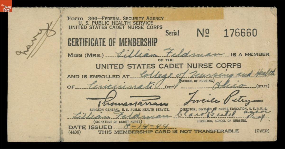 Certificate of Membership in the United States Cadet Nurse Corps for Lillian Feldman (Schwartz), August 14, 1944 / THF705895
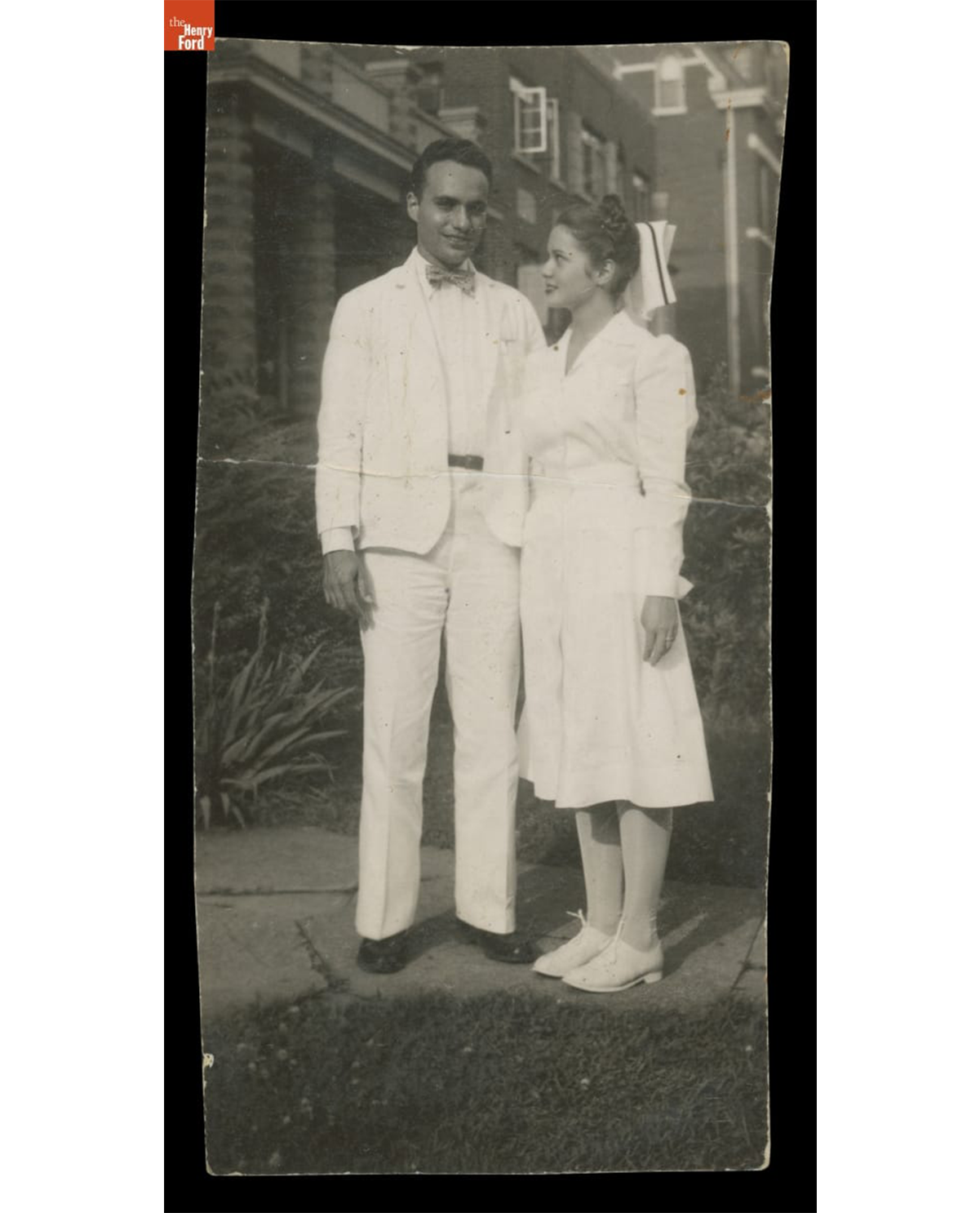 Lillian Schwartz and Jack Schwartz, circa 1946. / THF704693
Lillian Feldman Schwartz (1927-2024) was an American artist who began working at the forefront of computer art and experimental film in the late 1960s at Bell Laboratories. Before her art career was established, however, her life was entwined and impacted by service in the medical field during the last years of WWII, and in its immediate aftermath.
In 1944, when Lillian was 17, she applied to the United States Cadet Nurse Corps—a tuition-free program designed to address the WWII nursing shortage. Lillian did well in her coursework, but she quickly realized that she struggled with nursing people. Despite this, she found ways to bring joy into the Cincinnati hospital where she worked by painting murals in the children’s ward and making plaster sculptures in the cast room. Lillian quickly realized that she was an artist, not a nurse. While working in the hospital pharmacy, she met an intern named Jack Schwartz, whom she would marry in 1946. In 1948, Jack was stationed in Fukuoka, Japan, and Lillian traveled to join him after the birth of her first son. Unfortunately, she developed polio symptoms several weeks after her arrival, and in the post-war aftermath, she was also exposed to the lingering effects of radiation from the atomic bombings in Hiroshima and Nagasaki. These experiences led to serious health issues throughout her life and were often referenced in her art projects and writing.
—Kristen Gallerneaux, Curator of Communication & Information Technology
This collaborative blog was written by the staff of The Henry Ford
by Kristen Gallerneaux, by Aimee Burpee, by Rachel Yerke-Osgood, by Andy Stupperich, By Kayla Chenault, by Katherine White
IBM Selectric Typewriter designed by Eliot Noyes in 1961. / THF802461
In August 2024, a monumental design collection arrived at the doors of The Henry Ford after an international journey nearing 600 miles. The collection was donated by the Stewart Program for Modern Design in Montreal, Canada, and represents decades of collecting by founder and philanthropist Liliane Stewart alongside her incredible staff, especially curator David Hanks and registrar Angéline Dazé. While Liliane Stewart and her husband, David, had a longstanding formal relationship with the Montreal Museum of Fine Arts (a pavilion named for the Stewarts houses a significant design collection donated by them in 1999), this portion of the considerable collection was offered to The Henry Ford upon the closing of the Stewart Program for Modern Design in 2024.
This poster, entitled “A Lot of People are Waiting for Martin Luther King... We Are It. It is Up to Us. It is Up to You. Marian Wright Edelman” was created by graphic designer Gail Anderson in 2018. / THF721539
The Stewart Program Collection at The Henry Ford includes over 500 objects, a library of more than 100 books and 500 periodicals, and an archive nearing 40 linear square feet. As design touches nearly every area of the museum, so too does this collection. The range in object type is vast — from ceiling lamps to bicycle helmets, teapots to stools, studio glass to adding machines and more, and spans over 140 years of design history, from the 1880s through 2020. The designers and companies represented in this donation are also remarkably wide-ranging and include some of the most celebrated names in design, as well as successful works by unknown designers. They were created by designers of various nationalities and manufactured in a range of countries —but every object had significant impact on American society and American design, through its retail availability on the American market or through its prominence and influence on American designers, reflecting the trajectory of globalization in design.
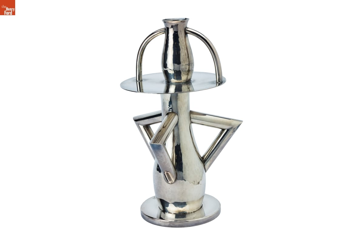
“Alaska” Vase by Italian designer Ettore Sottsass, 1982 / THF802469
The Henry Ford and the Stewart Program for Modern Design have compatible philosophies in collecting design. Both institutions hold a deep respect for design’s role in the everyday lives of people, in the problem-solving nature of good design, and the practice of prioritizing design in its cultural context. The Stewart Program Collection fits serendipitously within the museum’s existing holdings, while also stretching, expanding, and deepening the collection as well as pushing into new areas.
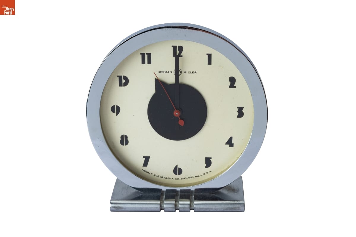
This Model 4706 Electric Clock, 1933-1934 by Gilbert Rohde was exhibited at the 1933-1934 Century of Progress International Exposition with the 3317 series furniture collection, also designed by Rohde. The Henry Ford holds numerous pieces from the 3317 series, including this dresser which is on display in the Fully Furnished exhibit. / THF802510
Collections Connection
In numerous instances, the objects donated by the Stewart Program happily supplement the strengths of our collections. For instance, The Henry Ford has an especially strong collection of furniture by pioneering designer Gilbert Rohde for the Herman Miller Furniture Company, including much of the bedroom set Rohde designed for the “Design for Living House” at the 1933-1934 Century of Progress International Exposition. However, we lacked the table clock exhibited in the bedroom. But as luck would have it, that particular clock was included in the Stewart Collection donation. Reuniting these objects that were designed to coexist will allow us to tell a fuller story about this moment in design history.
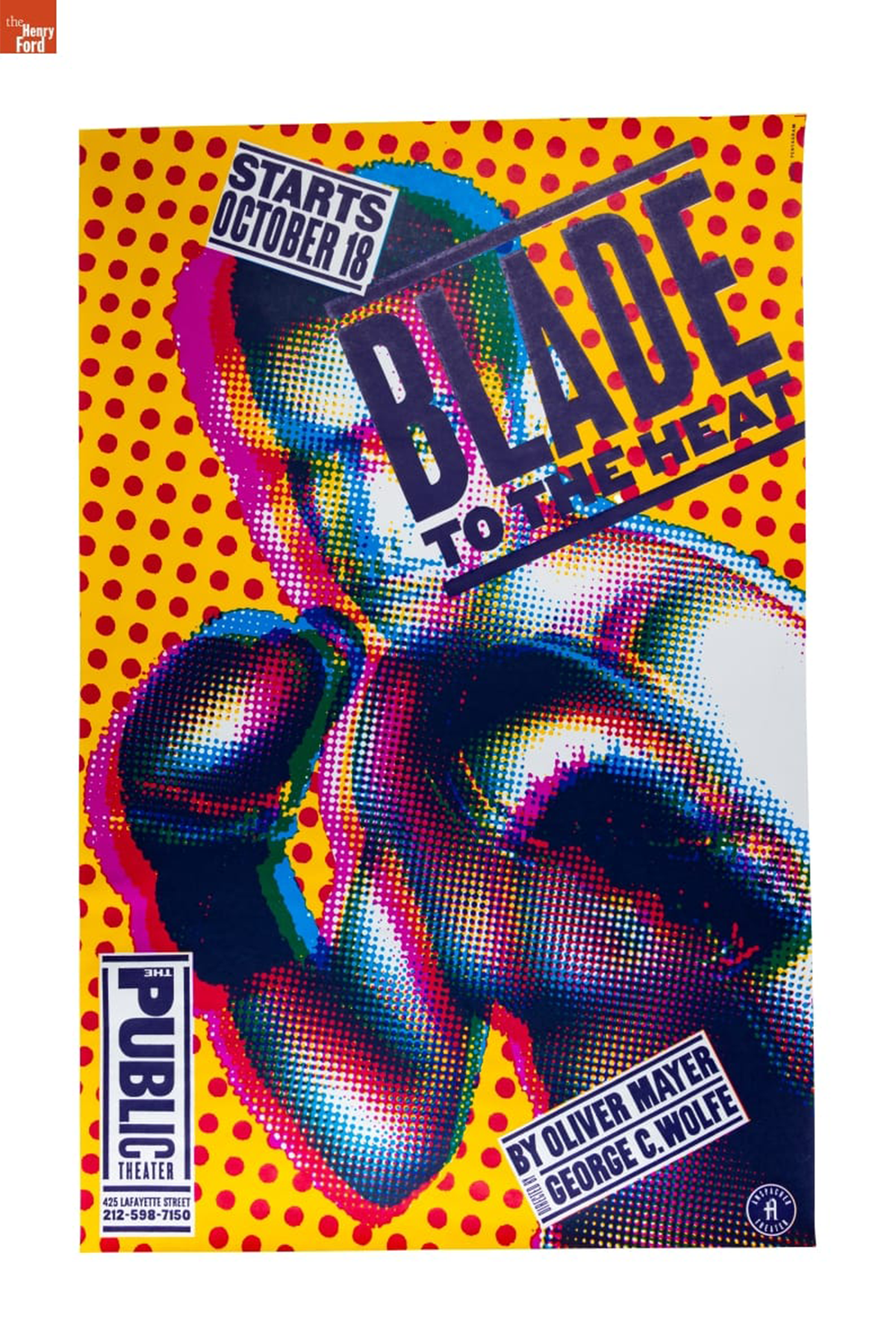
Numerous posters designed by Paula Scher were donated by the Stewart Program for Modern Design, including this “Blade to the Heat” poster designed for the New York Public Theatre in 1994. / THF802482
Designed by Women
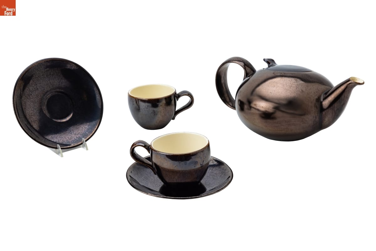
In 2018, the staff of the Stewart Program for Modern Design embarked upon their Designed by Women project, which encompassed an ambitious new acquisitions program of objects designed by women, an expansive website, and digital exhibitions. Highlighting women designers across the globe from 1910 to 2024, the project has become a resource for the design profession as it showcases both well-known and lesser-known designers. Similarly, The Henry Ford has been working in recent years to expand representation of women in the design collections, with recent acquisitions like Lucia DeRespinis’ Beehive Lamp, Evelyn Ackerman’s Campesina Tapestry, and Gloria Caranica’s Rocking Horse. Many of the objects acquired by the Stewart Program for Modern Design for this project were donated to The Henry Ford, expanding our collection of objects designed by women, including a large collection of posters by pioneering graphic designed Paula Scher, a teapot by Edith Heath of Sausalito, California-based Heath Ceramics, a pendant necklace by Indigenous jewelry artist Angie Reano Owen, and many more.
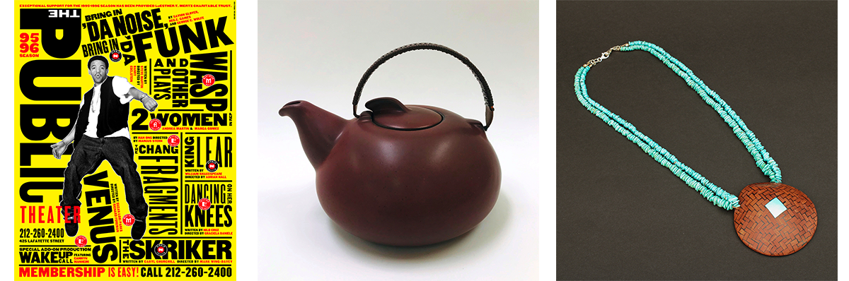
Paula Scher’s “Bring in ‘Da Noise, Bring in ‘Da Funk” Poster, 1995 (left), Edith Heath Teapot, c. 1944 (center), Shell Necklace by Angie Reano Owen, 2014 (right). / Images courtesy of the Stewart Program for Modern Design
Check out the Selections from the Stewart Collection expert set for more information about some of the objects donated by the Stewart Program for Modern Design.
Eva Zeisel’s “Town & Country” Teapot, Teacups, and Saucers, c. 1945 / THF802477
Katherine White is Curator of Design at The Henry Ford. This blog post was adapted and expanded from the January-June 2025 issue of The Henry Ford Magazine.

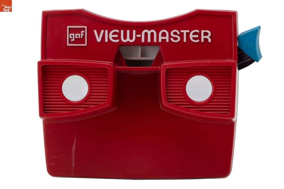
View-Master Standard Stereo Viewer, Model G, 1958-1962 / THF371561
Generations of Americans have memories of peering through a View-Master lens and being transported through the images shown in the cardboard reel — to Yosemite National Park, the streets of Bangkok, or even the set of a Batman movie. The wonders of the world became accessible anywhere, in an era before the internet made that experience commonplace. For many, including this author, the View-Master seemed like pure magic.
The View-Master model that made the device omnipresent in American society was the Model G. The View-Master Model G was introduced in 1962 and designed by Chicago-based industrial designer Charles Harrison for Sawyer’s Inc., the company that released the first handheld stereoscope 3D viewer at the 1939 New York World’s Fair. Although the View-Master was far from a new device when Harrison was tasked with its redesign, Harrison’s Model G viewer was the first to use injection-molded thermoplastics. Prior versions used Bakelite, a type of synthetic plastic which was costlier, heavier, and brittle. As Harrison later recalled, “My contribution was to design it for a different process, injection molding, that could produce units 10 times faster and would reduce cost considerably. The projected volume was high enough to support the tooling costs, while keeping the amortization costs low for each piece part. This made it possible to get the finished product to the consumer at the target selling price.” Harrison also redesigned the form of the View-Master, modernizing its appearance. The View-Master was a relatively minor project for Harrison (it took him less than two weeks!) but it is the object for which he is most well known today.
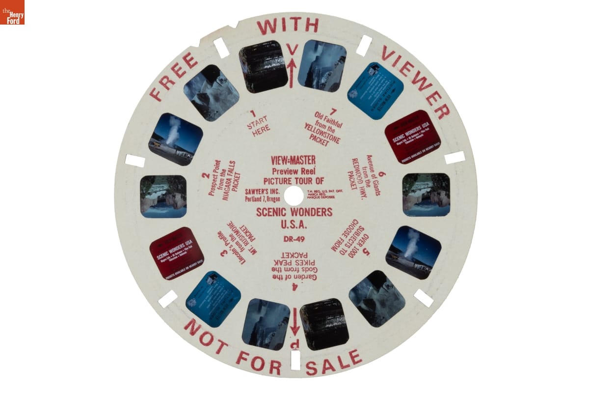
"Picture Tour of Scenic Wonders U.S.A." View-Master Reel, 1960-1966 / THF371614
Charles “Chuck” Alfred Harrison Jr. was born in Shreveport, Louisiana, in 1931. His family moved around frequently when Harrison was a child, from Louisiana to Texas to Arizona. He became interested in industrial design while studying at the City College of San Francisco and, after graduation, applied to all the accredited industrial design programs in the United States. He was accepted to the School of the Art Institute of Chicago (SAIC) on a four-year tuition and travel scholarship.
Although he was the only Black student in his classes at SAIC, Harrison felt that “in the arts, racism seemed to be less intense than other places.” He graduated from SAIC in 1954, but then was drafted into the U.S. Army, where he learned to be a mapmaker and was stationed in Germany for nearly two years. Harrison was discharged from the Army in May of 1956, and he returned to the SAIC. After a semester though, he transferred to the Illinois Institute of Technology and completed a master’s degree in art education because it was the only program with night classes and he needed to work during the day.
Harrison began to look for design work, but repeatedly faced racist companies and hiring managers. In the fall of 1956, he applied for an industrial design job at Sears. The company’s manager of design, Carl Bjorncrantz, told Harrison that he would like to hire him but that “Sears has an unwritten policy against hiring Black people.” Instead, Bjorncrantz hired him as a freelance designer, which was allowed. Harrison freelanced for numerous Chicago-based design companies in the following years, completing work for RCA, Grinnell Brothers Piano, Davis Sweeper Company, Williams Electric Company, Victory Manufacturing Company, Montgomery Ward, Allied Radio, and many others. Harrison began to work with injection molded plastics in 1957 — with butter dishes, his first mass-produced product, and later, with measuring cups, sweepers, and plastic pails. It was around the same time that Harrison, then freelancing under Robert Podall Associates, received the assignment to redesign the View-Master.

In 1966, General Aniline & Film (GAF) acquired Sawyer’s and began to produce View-Master. For the 1976 American Bicentennial, they produced a special Bicentennial Gift Pak with a special red, white, and blue version of Harrison’s Model G View-Master / THF371564
In 1961, Carl Bjorncrantz from Sears called Harrison, saying, “Well, Chuck, we can hire you now.” Harrison declined at first. But after a conversation, he took the job and became the first Black executive at Sears headquarters. Harrison rose through the ranks to eventually lead the design group at Sears. He designed hundreds of manufactured products in his career — lawn mowers and power tools, pots and stoves, and the very first plastic trash can. He retired in 1993, when the company closed its in-house design department.
After his retirement, Harrison taught at his alma mater, the School of the Art Institute of Chicago, as well as a few other Chicago-area colleges.
He was president of the Chicago chapter of the International Designers Society of America and involved with the Organization of Black Designers. In recognition of his impactful and groundbreaking career, Harrison received a lifetime achievement award from the Smithsonian’s Cooper Hewitt National Design Museum in 2008 and an honorary doctorate from SAIC in 2009. Harrison passed away in 2018.
Red Model G View-Master, 1976 / THF371568
Katherine White is Curator of Design at The Henry Ford. She has fond memories of playing with a Charles Harrison-designed bright red Model G View-Master as a child. All quotes were excerpted from the book Charles Harrison published in 2005, A Life’s Design: The Life and Work of Industrial Designer Charles Harrison.
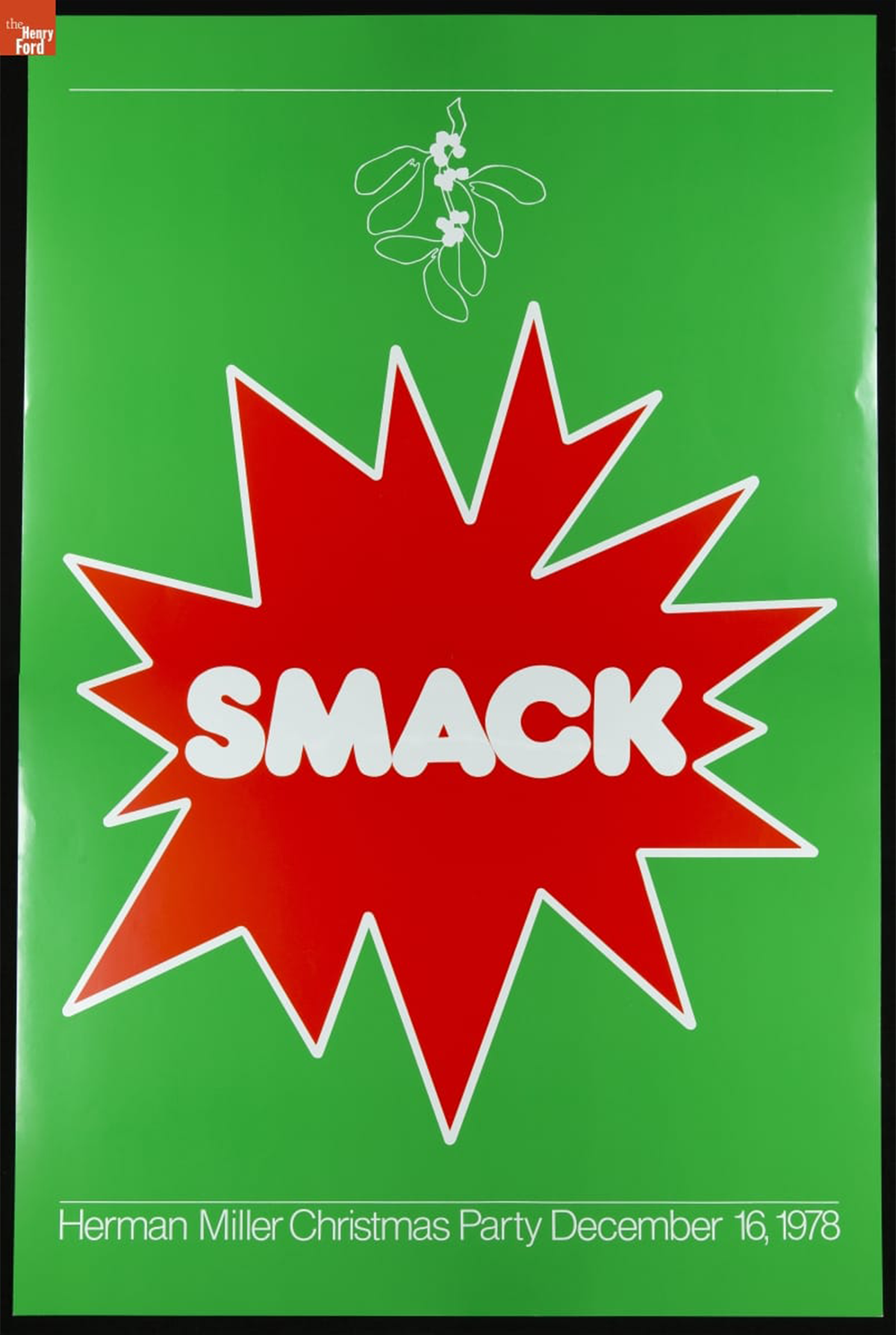
Herman Miller Christmas Party Poster, "Smack," December 16, 1978 / THF626909
In 1976, Linda Powell was hired as a graphic designer at the Herman Miller Furniture Company in Zeeland, Michigan. A recent graduate of Western Michigan University in nearby Kalamazoo, Michigan, she received a bachelor's degree in graphic design and a master’s degree in education. For Herman Miller, Powell designed a dizzying variety and amount of material, including internal magazines, holiday cards, annual reports, invitations, product packaging, environmental graphics, posters, and more.
Powell’s supervisor, Steve Frykholm, was Herman Miller’s first internal graphic designer and his poster series for the company’s annual summer picnic became an immediate and resounding success. This success sparked a tradition of the company’s internal graphic designers producing posters and other materials for internal employee events. In the spirit of Frykholm’s Picnic Posters, Powell was asked to design a poster for the 1976 employee Christmas party. She continued to create posters for each Christmas party until 1979.
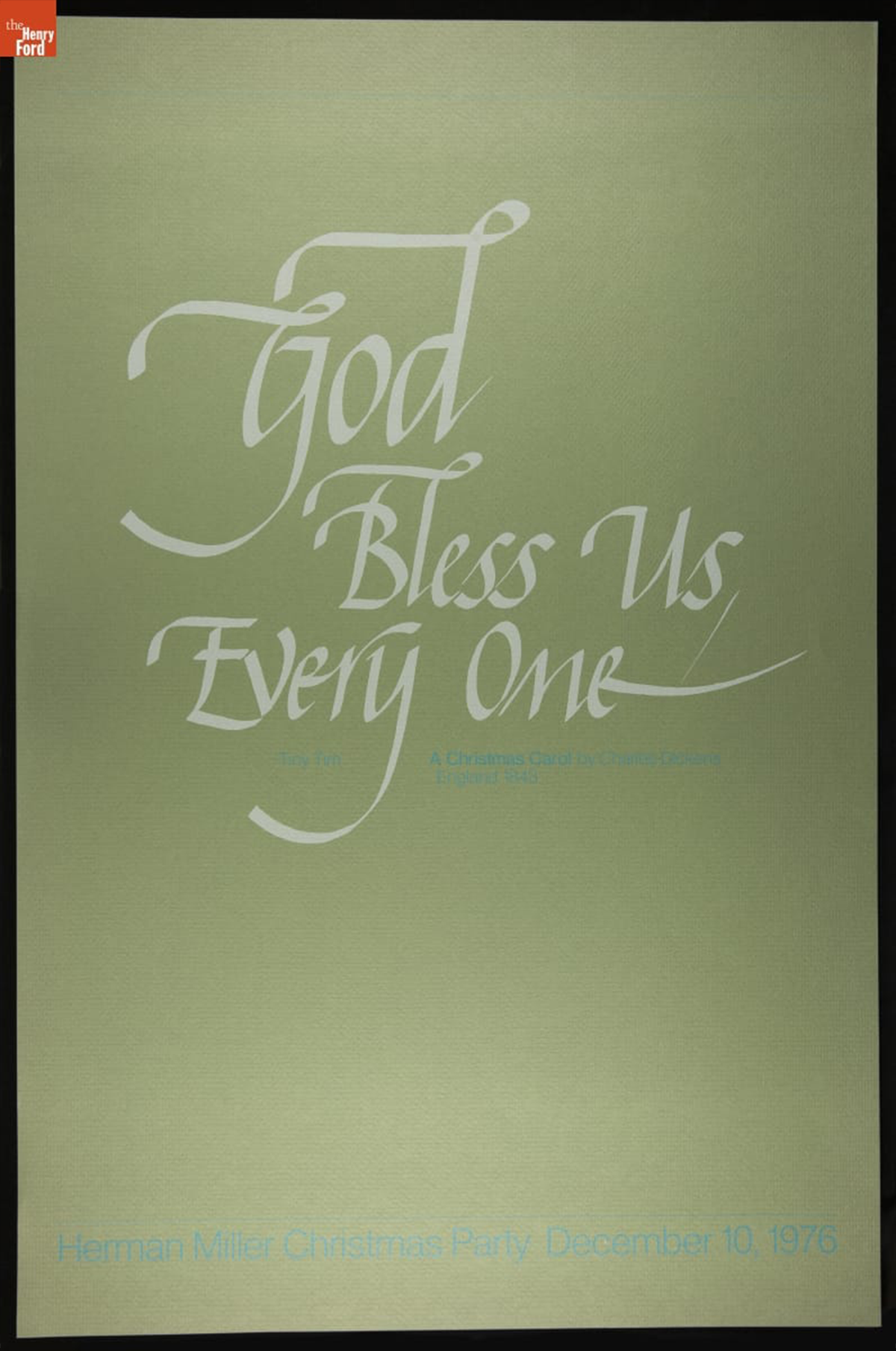
Herman Miller Christmas Party Poster, "God Bless Us, Everyone," December 10, 1976 / THF626900
The 1976 Christmas party theme was “English Christmas.” Powell’s poster invokes the words of Tiny Tim Cratchit, a major character from Charles Dickens’ 1843 novella, A Christmas Carol. At the end of the story, the ailing Tiny Tim announces, “God bless us, every one!” after his father raises a toast at the Christmas dinner table. It is also repeated as the final line of the story and symbolizes protagonist Ebenezer Scrooge’s change of heart. Powell’s poster was produced in different colorways, including this green stock, as well as a brown and blue, but the focus is always Tiny Tim’s message.
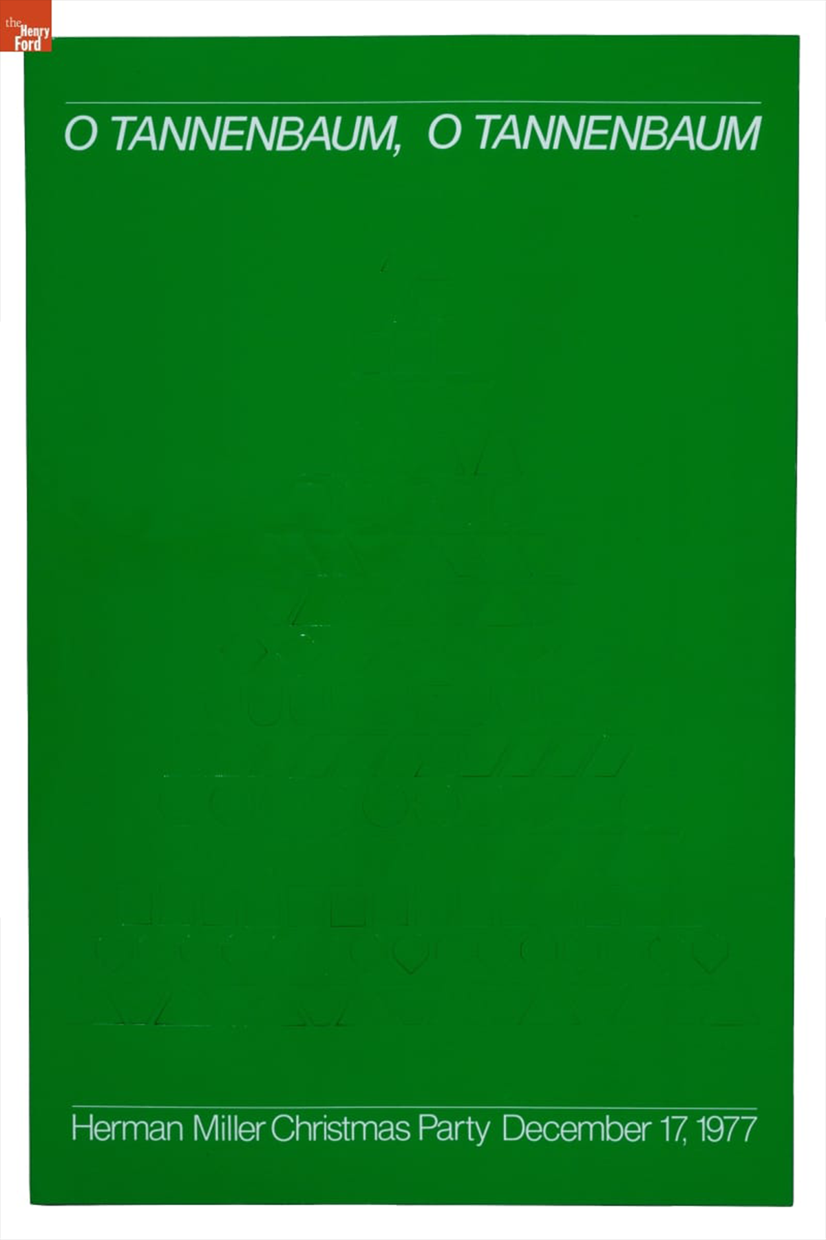
Herman Miller Christmas Party Poster, "O Tannenbaum," December 17, 1977 / THF189135
The 1977 theme was “German Christmas.” Powell’s poster design features die-cut Christmas ornaments. The die-cut ornaments are difficult to see in this image as the ornaments have not been popped out and creased, but the same poster held at the West Michigan Graphic Design Archive showcases the three-dimensionality of this poster quite well. “O Tannenbaum,” references the German Christmas folk song, known in English as “O Christmas Tree.”
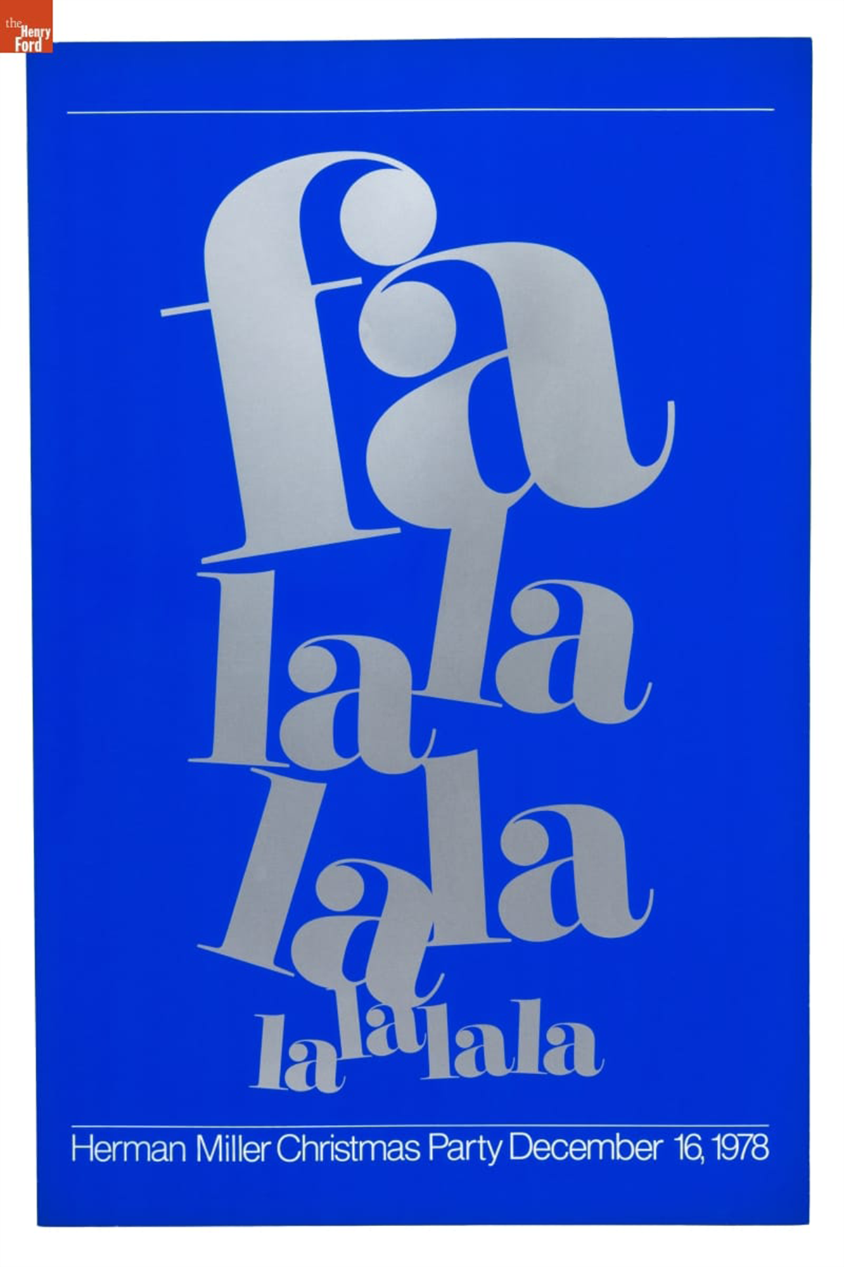
Herman Miller Christmas Party Poster, "Fa La La La La," December 16, 1978 / THF189136
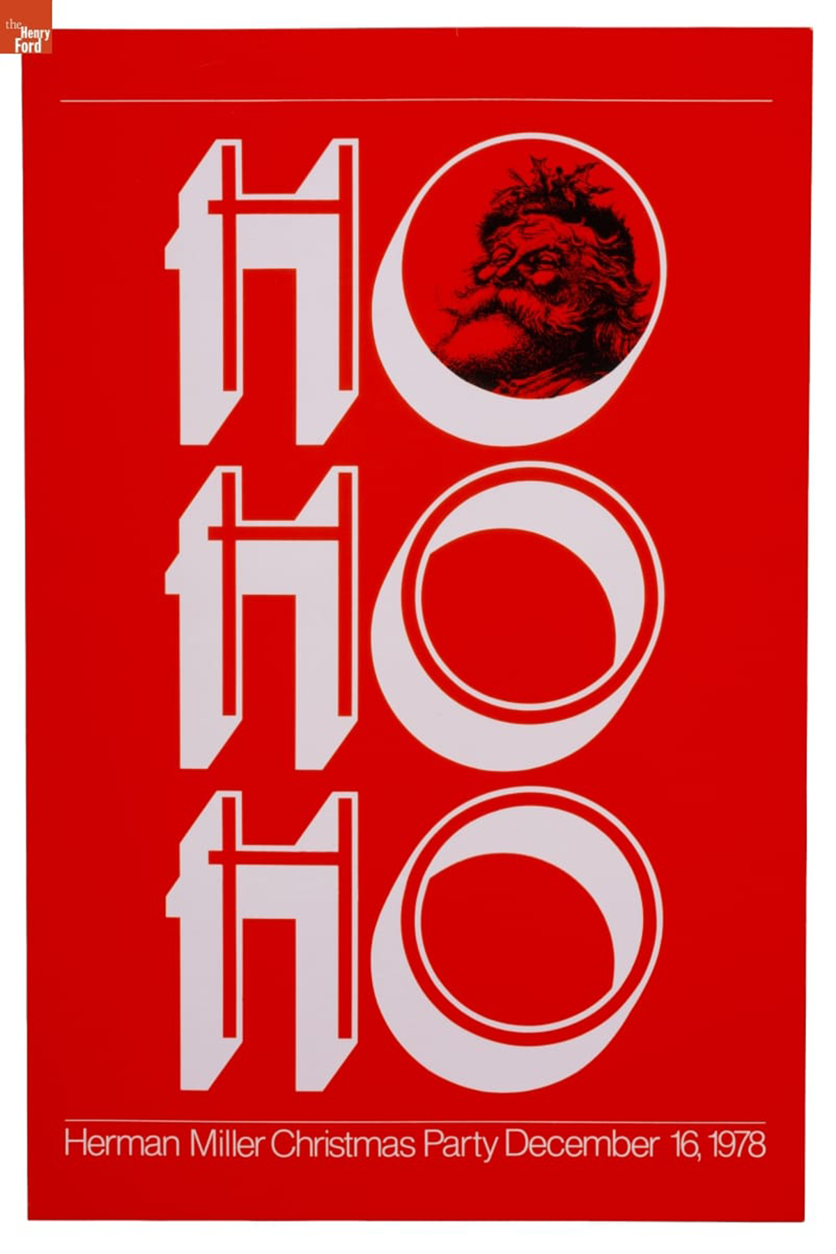
Herman Miller Christmas Party Poster, "Ho Ho Ho," December 16, 1978 / THF189137
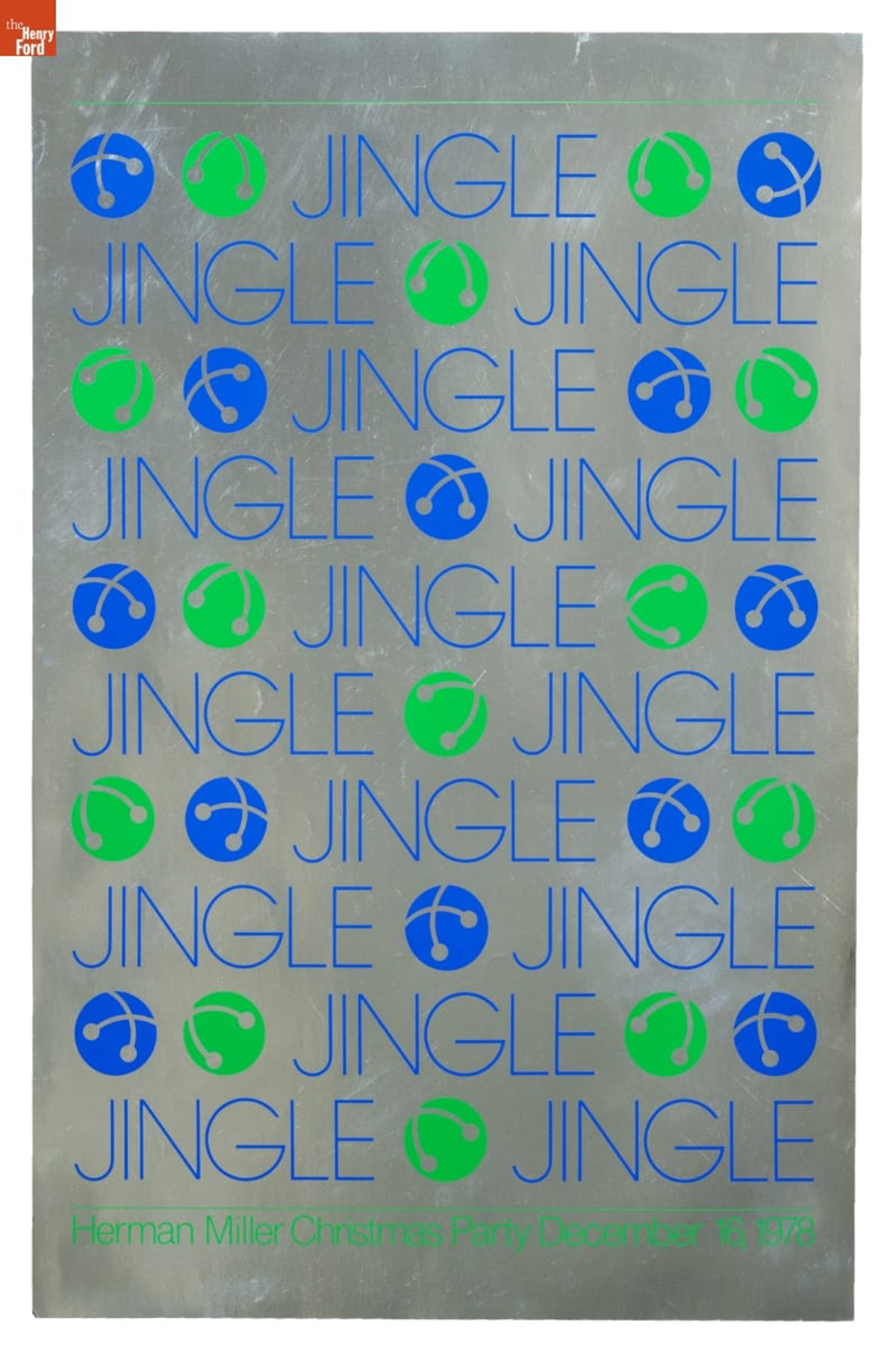
Herman Miller Christmas Party Poster, "Jingle," December 16, 1978 / THF189138
In 1978, Powell designed four unique posters for the “sounds of Christmas” themed party, instead of attempting to address the multitudes of holiday audio in one design. These high saturation, high contrast posters each foreground one sound. “Smack” (shown as the cover image to this blog) references the sound of a kiss under the mistletoe. A jolly Santa Claus peeks through the first “O” in the “Ho Ho Ho” to ensure one imagines his laughter. The final two posters reference the sounds of classic Christmas songs: “Fa La La La La” invokes “Deck the Halls” and “Jingle,” of course, refers to “Jingle Bells.”
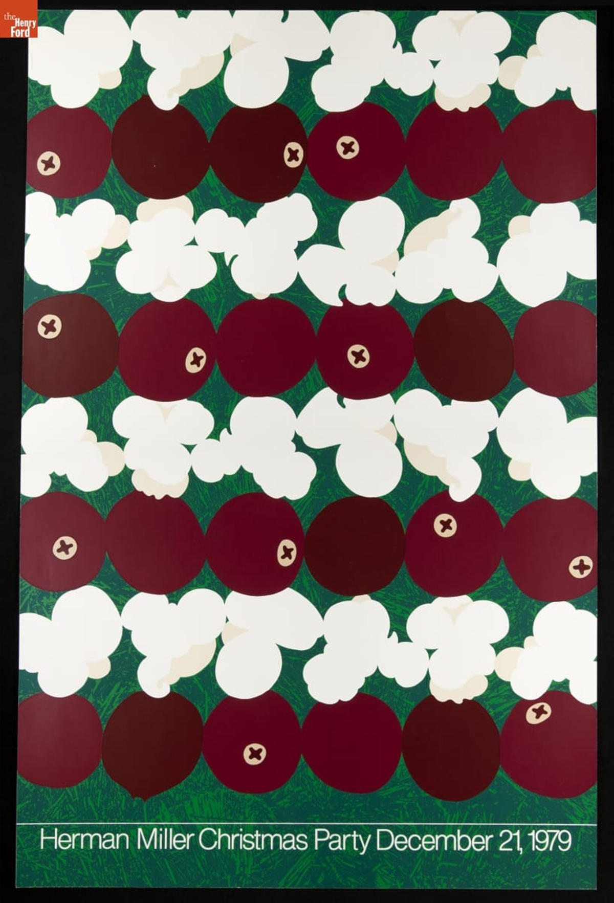
Herman Miller Christmas Party Poster, "Popcorn and Cranberries," December 21, 1979 / THF626905
The final Christmas Party Poster designed by Linda Powell was undertaken in 1979. Taking clear inspiration from Steve Frykholm’s food-focused Picnic Posters, she features alternating rows of popcorn and cranberries hung on a Christmas tree. This zoomed-in, micro perspective encourages attention paid to details of the holiday.
After fifteen years at Herman Miller, Powell resigned in 1991 and began a career in academia as a professor at Ferris State University in Big Rapids, Michigan. Alongside Herman Miller colleague Barbara Loveland, she developed a robust design program at the university. Since retiring from Ferris State University, Powell co-founded the West Michigan Graphic Design Archive, held at the archive of her alma mater, Western Michigan University, and continues to advocate for preservation of graphic design originating in western Michigan.
Further reading:
- Check out the Fall 2023 issue of The Henry Ford Magazine for a spotlight on Steve Frykholm’s Picnic Posters for Herman Miller.
- Read about Kathy Stanton, colleague of Linda Powell, in the “Women Design: Kathy Stanton’s Picnic Posters for Herman Miller” on The Henry Ford’s blog.
Katherine White is curator of design at The Henry Ford.

Prototype Beehive Hanging Lamp, 1960. / THF370555
When Lucia DeRespinis designed the Beehive Lamp in 1960, she was the only female industrial designer at the George Nelson Associates design firm in New York City. The firm is often remembered for its connection to the Herman Miller Furniture Company where its founder, George Nelson, served as design director for decades, but George Nelson Associates worked with and for a variety of companies during its long tenure. One such collaboration was with renowned lighting company Nessen Studios to design a series of versatile indoor/outdoor lighting. DeRespinis was put on the project and the Beehive Lamp she designed for the series is one of her more celebrated product designs today. This particular Beehive Lamp, acquired by The Henry Ford in 2023, is likely the second prototype, DeRespinis posited. It cannot be the first prototype—although it is nearly identical to it—as that one sits in DeRespinis’ own home, above her dining room table.
Lucia Neumann was born in 1927 in Cleveland, Ohio. She initially attended St. Lawrence University but transferred to the Pratt Institute, graduating with a bachelor’s degree in industrial design in 1952, as one of just a few women in her class. She first worked for the design office of Monte Levin before hearing about an open position at George Nelson Associates. She was hired as George Nelson’s first female industrial designer in 1956 and shortly after, in 1957, married Pratt classmate and fellow industrial designer, Louis DeRespinis. While employed by George Nelson, Lucia DeRespinis designed the iconic Eye and Spindle clocks for Howard Miller, interiors of an apartment at the 1959 American National Exhibition in Moscow, dinnerware for Hall China Co., and more—although she has only recently received credit for this work. As was common in the mid-twentieth century, the lead designer (in this case, George Nelson) received credit for all work completed by the eponymous design firm.

Underside of the Prototype Beehive Hanging Lamp, 1960. / THF370558
DeRespinis left George Nelson Associates in 1963, when she was “too pregnant to lean over the drafting table.” She became a freelance designer, and her contracted work varied from designing interiors for television news programs to logos and packaging design. In 1970, Lucia’s husband Louis tragically passed away, leaving her a single mother. With the help of her building’s babysitting co-op, DeRespinis continued to freelance design. In 1975, while working with advertising firm Sandgren & Murtha, she selected the vibrant orange and fuchsia colorway of the Dunkin’ Donuts logo, inspired by the favorite colors of her daughter—because she thought “donuts are fun!” and that the logo should reflect that playfulness. Although the Dunkin’ Donuts logo has been altered in the decades since, what remains is DeRespinis’ iconic orange and fuchsia.
DeRespinis returned to Pratt Institute in 1980. She spent decades teaching generations of designers as a professor in the Department of Industrial Design at Pratt Institute and retired in 2020. She lives in the same I.M. Pei-designed Manhattan apartment complex that she and Louis moved into in 1965.
Katherine White is curator of design at The Henry Ford. Katherine is grateful to Lucia DeRespinis for generously opening her home and sharing stories of her life’s work.

Designs for Aging: New Takes on Old Forms, a temporary pop-up exhibit in Henry Ford Museum of American Innovation from August through October 2022 / THF191476
A chair, a cane, a vegetable peeler.
These are not new forms. Versions of these objects have existed for hundreds of years and have even worked well enough for many people.
But did these objects work well for all people?
This is the question that Universal Design asks. As the industrial design discipline has evolved, designers’ awareness of needs beyond those of “the average person”—such as children, those with disabilities, and older adults—has grown. The practice of Universal Design advocates for the inclusion of a range of bodies and abilities in the design of objects.
Each of the objects below represent the story of a designer working to transform an ordinary object into one that performs better for a group whose needs are often overlooked: older adults.
The results are products that work better for all of us.
Disability Rights & the “Graying of America”
The American disability rights movement gained traction and national attention by the mid-1970s. Activists advocated for equitable care for all people and framed accessibility as a civil rights issue—modeling their language after the 1964 Civil Rights Act.
At the same time, concerns were raised about the future impacts of the baby boom and decreasing fertility rates: soon, the media reported, elderly people would outnumber children.
The disability rights movement and the “graying of America” converged and designers began to explore what part design could play in creating equitable and accessible environments for older adults.
Notal Program, 1979, page 6 / THF702602
Herman Miller’s Projects for Aging
In the 1970s, Michigan-based furniture company Herman Miller embarked upon exploratory design projects for the elderly.
The Notal project was their first foray into design specifically for older adults, researching how their day-to-day lives were affected by ill-suited environments.
The MetaForm project was established in the mid-1980s. The project’s leaders hoped to reimagine whole environments to best suit the challenges that accompany aging—enabling people to “age in place,” at home instead of an institution. A variety of high-profile consultants and designers were hired to explore solutions for five specific areas—sleeping, long-term sitting, food preparation, material handling, and personal hygiene.
Woman in Motion Study with Prototype Sarah Chair, 1987-1991 / THF702658
The Sarah Chair
Herman Miller designers Don Chadwick and Bill Stumpf were tasked with creating a chair that would accommodate long-term sitting for the MetaForm project.
Stumpf had deep knowledge of ergonomics; Chadwick was especially adept at solving problems of form. Their “Sarah Chair” incorporated ideas to serve aging bodies, including an advanced tilt mechanism to aid users in getting into and out of the chair without losing balance.
Despite years of research, user testing, and prototyping, Herman Miller canceled MetaForm in 1991, primarily due to the challenges of marketing high-end furniture to older adults.
Stumpf and Chadwick applied the lessons learned from the Sarah Chair toward another group of people who sat for long periods: office workers. The Aeron Chair was introduced in 1994 to immediate and lasting acclaim.
Prototype Sarah Lounge & Rocker Combination Chair, 1987-1991 / THF191319
OXO Good Grips
In the 1980s, Sam and Betsey Farber had retired from a long career in the cookware industry and were enjoying travel. While on vacation, Betsey was trying to peel an apple but was having difficulty due to the arthritis in her hands. The traditional vegetable peeler she was using was difficult to grip, especially when applying force. Sam and Betsey realized there was an opportunity to improve this object and called a friend, Davin Stowell of design consultancy Smart Design, and asked him to prototype an easier-to-user peeler.
The OXO Good Grips Swivel Peeler was introduced in 1990. Despite its cost (nearly triple the traditional peeler), it sold well. This relatively simple improvement to a classic tool increased usability for a wide range of people. The OXO Good Grips line of tools now numbers in the hundreds.
OXO Good Grips Swivel Peeler, 2022 / THF191162
Patricia Moore: Designer and Gerontologist
As a young industrial designer working for the firm of design legend Raymond Loewy, Patricia Moore often challenged her superiors to design more accessibly, for a wider variety of body types and abilities. Looking to better understand the challenges of an elderly person, Moore employed a professional makeup artist and transformed herself into an 80-year-old woman using a latex mask and custom prosthetics. She even put baby oil in her eyes to blur her vision, stuffed wax in her ears to muffle sound, and bound her body to restrict movement. She then went out into the world—observing, interacting, and connecting with people as an elderly woman—with the ultimate goal of using these experiences to help design better products for aging adults.
Moore disguised herself for over three years, conducting research and becoming a sought-after expert in design for aging populations. She has spent decades consulting on projects, including Herman Miller’s MetaForm and OXO Good Grips.
Disguised!, 1985 / THF703274
Michael Graves’s Canes
Architect and industrial designer Michael Graves developed an interest in Universal Design and the healthcare industry after an infection left him paralyzed from the waist down in 2003. In the years after his own ability shift, Graves redesigned the utilitarian objects that become indispensable with age and disability—objects that didn't hold the attention of most mainstream industrial designers. He focused on the cane as an object particularly ripe for revision, prototyping numerous ergonomic handles and experimenting with the grip.
Cane Handle Models on Display Board, 2014-2015 / THF191163
The canes that Graves designed, as well as those created by his design firm after his death in 2015, are adaptable to bodies as well as lifestyles. They are lightweight, available in numerous colors, adjustable to accommodate differing heights, and foldable for storage. 
Quick Fold Cane, 2021 / THF191154
Michael Graves Design & Stryker
Michael Graves Design teamed up with Stryker, a medical technologies company, to reimagine the hospital patient’s experience. Spurred by one of his many extended hospital stays, Michael Graves remarked, “It was far too ugly for me to die in there!”

Stryker Prime TC Transport Chair, 2013 / THF188699
Graves redesigned the wheelchair—a chair that had seen little change since the 1930s—as well patient room furniture. User comfort was the ultimate focus. The objects Graves designed feature adjustable components, easy maneuverability, and intuitive operation, as well as quality finishes and his signature injection of color.
Katherine White is Associate Curator at The Henry Ford. A temporary exhibit, Designs for Aging: New Takes on Old Forms, curated by Katherine, was on view in Henry Ford Museum of American Innovation from August–October 2022. The content of the exhibition is replicated in this post.
Additional Readings:
- Table, Used as a Writing Desk by Mark Twain, 1830-1860
- Creatives of Clay and Wood
- Sidney Houghton: The Fair Lane Rail Car and the Engineering Laboratory Offices
- Women Design: Peggy Ann Mack
21st century, 20th century, home life, Herman Miller, healthcare, furnishings, design, by Katherine White

Photo by Kristen Gallerneaux/Katherine White
In 2022, The Henry Ford displayed a temporary exhibit, OUT!: LGBTQ+ Visibility and Identity, at Henry Ford Museum of American Innovation. The exhibit, co-curated by Kristen Gallerneaux and Katherine White and featuring items from The Henry Ford's collections, contained recent acquisitions that relate to the history and lived experiences of LGBTQ+ people.
The first theme explored in this exhibit was how LGBTQ+ communities have used a variety of communication networks—from print media to Internet platforms—to advocate and educate, to resist discrimination, and to unapologetically celebrate identity.
The second major theme gathered collections that relate to queer-positive and diverse forms of gender expression. These artifacts included stories of gay pride and trans visibility through acceptance, body positivity, and pronoun advocacy.
These artifacts do not sit still. The stories and lives represented in OUT!: LGBTQ+ Visibility and Identity are evidence of turning points and triumphs—and ongoing battles—of the LGBTQ+ community individually, communally, and societally.
Getting the Word Out
In the 1960s, LGBTQ+ people faced a largely unaccepting American society and legal landscape that restricted how they could express themselves. Queer bars and clubs were among the only private, “safe” spaces, for LGBTQ+ patrons but they were also easy targets for police, who harassed and arrested patrons. On June 28, 1969, New York City police raided the Stonewall Inn, a gay club in Greenwich Village. A riot ensued.
Queer bars and clubs also became sites of community and connection—even amidst persecution and harassment—and became fertile soil for the burgeoning queer liberation movement. LGBTQ+ newspapers were distributed in these spaces, broadcasting news unlikely to be shared in mainstream media. Print media like these unified queer/LGBTQ+ people in the fight for acceptance and equality through sharing manifestos, organizing protests, and recruiting members.
Today, we recognize the legacy of the Stonewall Riots as the genesis for the Pride marches that celebrate the LGBTQ+ community every June, in cities big and small across America. .jpg?sfvrsn=e6cd3601_2 "Citizens News, Volume IV, Number 12, 1964-1965 / front page")
THF627212.jpg?sfvrsn=b2cd3601_2 "Flier,")
THF627336
These fliers were created by New York City’s chapter of The Mattachine Society, one of the oldest gay rights groups in America, in the months following the Stonewall Riot. They illustrate the urgency felt by the queer community in the wake of persistent and brutal police violence.
Raising Awareness
In the early and mid-1980s, activist collectives formed to raise awareness of HIV and AIDS. This advocacy was critical, since government and public health organizations initially refused to act or acknowledge the developing crisis. Misinformation about HIV and AIDS transmission was widespread, and so LGBTQ leaders and allies spoke up—demanding an end to negligence, access to testing, treatment options, and vetted public education about HIV prevention..jpg?sfvrsn=aacd3601_2 "SILENCE = DEATH Collective Poster, 1987")
THF179775.jpg?sfvrsn=9acd3601_2 "Poster,")
THF627370
The Silence=Death Collective’s “AIDSgate” poster condemns then-president Ronald Reagan’s lack of response to the AIDS epidemic. In 1981, the first AIDS cases in the United States; President Reagan did not recognize AIDS in a public speech until September 1985..jpg?sfvrsn=eecd3601_2 "Illustration,")
THF627366.jpg?sfvrsn=86cd3601_2 "Illustration,")
THF627364
Howard Cruse, author of the acclaimed graphic novel Stuck Rubber Baby, uses the slogan of the Gay Liberation Front in the top drawing above: “We’re here, we’re queer, get used to it!” The “Gay is Good” illustration mimics historical photographs of protestors at the 1969 Stonewall Uprising that were also referenced in the “Gay Liberation” poster by Su Negrin, Peter Hujar, and Suzanne Bevier.
THF190487
In 1988, Richard Eichberg and Jean O’Leary founded Coming Out Day to provide resources for LGBTQ+ people wishing to publicly declare their identity. The pair believed that “coming out” would promote solidarity and acceptance while reducing homophobia. The Human Rights Campaign (an LGBTQ+ advocacy and political lobbying group) sponsors this event in the United States. This poster commemorates the 10th anniversary of the observance, which remains active in 2022. The logo of a person dancing their way out of a closet depicted on the cake on this poster references artist Keith Haring’s original NCOD logo.
Online Identity & Safe Spaces
Online platforms can act as digital “safe spaces” for LGBTQ+ community-building. Beginning with Usenet bulletin board systems in the 1980s and transitioning to LiveJournal, Twitter, and Tumblr in the 2000s, these sites can act as support networks for LGBTQ+ people—including those who live in isolated areas or in situations where openly exploring identity poses challenges AFK (away from keyboard). 
Photo by Kristen Gallerneaux/Katherine White
Zack Arad launched a microblog on July 21, 2010. Arad, who self-identifies as gay, has been active on social media since he was a teenager. His popular Tumblr blog and YouTube vlogs explore themes like gay pride, pop culture, humor, dating, and political issues.
Photo by Kristen Gallerneaux/Katherine White
This “mini-quilt” was created by Zak Foster, a textile artist who identifies as gay and has a strong online following for their work, selling one-of-a-kind upcycled quilts on Etsy. With Grace Rother, Foster also created this collection of “zines,” and distributed them online “as a love offering … to all the queer folks in the quilting community.”
Identity & Solidarity
Buttons, patches, badges, and pins are consciousness-raising, inexpensive, quick to create, and able to be distributed widely. Wearing a button can be a method of activism. When simply being “out” as LGBTQ+ means possible danger and discrimination, choosing to wear a visible symbol of queerness is a courageous act. .jpg?sfvrsn=becd3601_2 "Motorcycle Cap with Buttons Commemorating LGBTQ+ Events and Places, 1969-1971")
THF189705
The cap above was worn by a member of a California-based gay motorcycle club. Among the oldest gay organizations in the United States, these clubs emphasized hypermasculinity, which appealed to many gay men who had long been stereotyped as effeminate.
Photo by Kristen Gallerneaux/Katherine White
Many of the buttons featured here use symbols or terms that were once weaponized against the LGBTQ+ community but were later reclaimed. The inverted pink triangle, for example, has its roots in the Holocaust, when Nazis forced queer people to wear a pink triangle as a form of identification and persecution. By repurposing these symbols, a shared and recognizable language of identity and solidarity is created among LGBTQ+ people and allies.
Trans Acceptance
Transgender and nonbinary people have always existed, across time and in every corner of the world—just as have gay, bisexual, lesbian, and other queer communities. But acceptance by the broader world has been difficult to achieve. Even the early leaders of the LGBTQ+ equality movement pushed the transgender community to the fringes. For many transgender and nonbinary individuals, the realization that their gender identity does not align with their assigned-at-birth gender comes long before even their own acceptance and celebration of it.
THF190453
THF611162
Miley Kirby came out publicly and applied trans flag patches to her medic bag during Detroit’s Black Lives Matter protests, which held supplies used to provide medical care to fellow protestors. Kirby is visible carrying this same bag in the center of the press photo above, published in the Detroit News during the Black Lives Matter protests of Summer 2020.
“The people I met at the [George Floyd] protest were one of the first groups of people that encouraged me to be me. They refused to let me cop out on pronouns, names, or hand-waving of my transness for others comfort. We yelled our message in the streets, why not scream your identity to the world? My time in those protests found me my voice as Miley Kirby, or at least the beginning of one.” – Miley Kirby 
THF190458
Allie Zecivic listened to an insistent inner voice and purchased this dress, her first article of women’s clothing. It helped her to accept her gender identity as a transwoman.
“Hot Topic skinny jeans and too tight graphic tees were alright, but this was a dress. A long, flowy, spinny dress. I spent a lot of time sitting alone in my room wearing it, my heart racing and the paranoia spinning horrible outcomes in my head, but it felt right. The validation that dress brought was freeing. It was this feeling in the face of trepidation of being caught, that solidified my need for more. And such my wardrobe grew.” – Allie Zecivic 
THF190456
THF190457
Laura Bowman began the medical transition to female with these hormone replacement therapy medications. She crossed out her “deadname”—the male name she was given at birth—and kept these bottles as symbols of her journey.
“Hormones don't make a transperson trans, but for many of us they are the beginning of the end. The end of the old life, and the beginning of a new experience, a new chance to be who we want to be, to make the outside fit how we feel inside. When I first picked up these pill bottles, I felt a giant weight off my chest as it felt like I was going to be able to make some progress on that person in the mirror and come to like her just a little better. The major part of that comes when you change the way you perceive yourself, but damn do the hormones help!” –Laura Bowman
Body Positive
Carrie Metz-Caporusso is an artist and tattooer who identifies as queer and non-binary. They began tattooing in 2011 and are committed to challenging traditions in tattooing culture that sometimes stigmatize LGBTQ+ and larger-bodied people. After experiencing fat shaming in the tattooing world, Carrie brainstormed a way to celebrate—rather than conceal—plus-sized body types with custom “roll flower” tattoos. These tattoos align with the body positivity movement by embracing the natural folds and creases on client’s backs or sides, which serve as a “stem” for flowers and leaves emerging from above and below.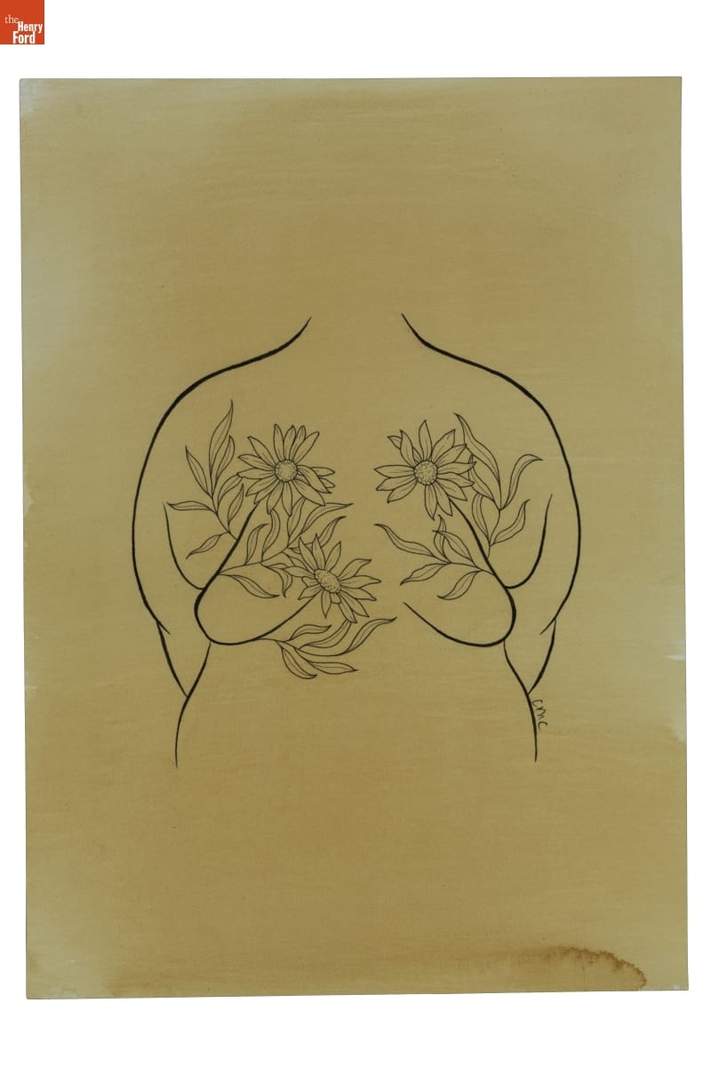
THF190488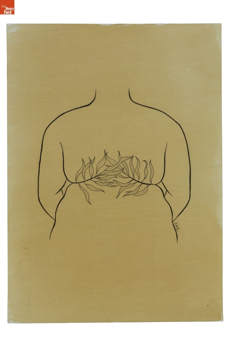
THF190489
These signature “roll flower” tattoo flash designs were drawn and donated by Metz-Caporusso to The Henry Ford. In 2022, The Henry Ford commissioned Metz-Caporusso to create illustrations for apparel, which will soon be available in museum stores. 
Photo courtesy of Carrie Metz-Caporusso
Mother of the Movement
Marsha “Pay It No Mind” Johnson was a New York City–based drag performer and activist who identified as a gay transvestite (the term transgender was not used at that time).
She was tireless in her advocacy for gay rights. From the mid-1960s on, she was an active presence—often a mischievous instigator—at almost every major uprising, parade, and political action connected to the LGBTQ+ equality movement. She clashed with police during the Stonewall Uprising, helped create the Gay Liberation Front, and participated in AIDS awareness group ACT-UP. With Sylvia Rivera, Johnson was a “house mother” for the Street Transvestite Action Revolutionaries—a political collective and homeless shelter for trans youth of color. Johnson died under suspicious circumstances in 1992—believed by many to be a victim of anti-gay violence.
THF190491
This print, created by Julia Feliz in 2018, honors the intersectional legacies of Black LGBTQ+ leaders, as well as Daniel Quasar’s redesign of the Pride Flag to include stripes for BIPOC (Black, Indigenous, and people of color) and trans people.
Listening to the Community
The stories and lives represented in this exhibit just barely scratch the surface of what it means to be LGBTQ+ in the United States. Visibility often increases vulnerability—and backlash. Bigotry, discrimination, and social justice issues related to equal rights and access continue to impact LGBTQ+ people around the world.
Kristen Gallerneaux, Curator of Communications & Information Technology at The Henry Ford, and Katherine White, Associate Curator at The Henry Ford, collaboratively produced this exhibit and blog.
Henry Ford Museum, by Katherine White, by Kristen Gallerneaux
The posters designed for Herman Miller’s annual employee picnic are some of the best-known examples of American graphic design from the latter half of the 20th century. Much has been written about how the 1970 poster was Steve Frykholm’s first assignment as Herman Miller’s first internal graphic designer—as well as how his series of posters gained fans almost immediately. Museums took notice and collected these posters, even while the series was still ongoing—including The Henry Ford. However, Frykholm did not design all of Herman Miller’s picnic posters, but the first 20 of them, from 1970–1989. Kathy Stanton, a graphic designer on Frykholm’s team, recalled telling Frykholm, “if you ever decide to give this [the picnic posters] up, I’ll be interested.” In 1989, after designing 20 posters, Steve Frykholm decided it was time to pass the reins, and took Kathy Stanton up on her offer.
Herman Miller Picnic Poster, "Fish," 1992 / THF626917
Kathy Stanton began taking art classes in high school at the Cincinnati Art Museum and the University of Cincinnati, in her hometown. She went on to attend the University of Cincinnati and received her Bachelor of Science degree in Graphic Design. In 1979, shortly after graduation (and in a tough job market), she was hired by Herman Miller to work in their internal graphic design department. Stanton worked on many projects in her time at Herman Miller, but she was particularly interested in designing for difficult technical and informational projects, like sales manuals and price books. She explained, “if you said it was impossible to digest, I was all on it.” The picnic posters, then, were a bit more free-form than the work that she had gravitated towards in her first decade at Herman Miller.
Herman Miller Picnic Poster, "Duck Pond," 1998 / THF189134
Frykholm’s picnic posters famously focused on the food that might be found at the company’s annual employee summer picnic. Stanton decided to take another approach. Each of the 11 posters Stanton designed, one each year from 1990–2000, showcases an activity or feature of the summer picnic—from the clown that entertained children and adults alike, to the mallard ducks floating in a pond, or a game of croquet or ring toss in action. The earliest of these posters—"Ring Toss,” 1990; “Carousel,” 1991; and “Fish,” 1992—coincide with the growing availability (and capability) of computer programs to aid in design. “Ring Toss” is the only poster of her series that did not utilize a computer; “Carousel” was a hybrid design; and “Fish” was designed using a computer program but drawn freehand. She recalled, “I can tell where I grew and how the programs improved as I designed the posters.” Each of Stanton’s posters also include a small “Easter egg,” or additional element to delight the viewer. The first poster, “Ring Toss,” features a small ladybug resting in the grass in the lower right quadrant. Can you find the surprise element in each of the other posters?
“Ring Toss, 1990” by Kathy Stanton, with detail of ladybug / THF626913
Stanton would hand off the picnic poster project to designer Brian Edlefson for the 2001 poster. He designed the series through 2005, when Andrew Dull took over and designed the final two posters in 2006 and 2007. Kathy Stanton would remain at Herman Miller until 2008, after 29 years at the company. Today, she is a freelance designer and artist working primarily in photography, painting, and jewelry-making. As she’s expanded her work, she still relies on balance, color, line, and composition—design concepts she learned in design school and honed at Herman Miller.
Herman Miller Picnic Poster, "Croquet," 1999 / THF626929
Katherine White is Associate Curator at The Henry Ford.
Michigan, 20th century, 1990s, women's history, summer, posters, Herman Miller, design, by Katherine White, art


Peggy Ann Mack illustrated both of these publications for Herman Miller Furniture Company. She is credited on the “An History…” pamphlet—the middle of the page reads, “Delineation by: Peggy Ann Mack.” / THF626879, THF229445
Peggy Ann Mack was born Margaret Ann Cecelia Kruelski on May 11, 1911, to Anthony and Frances (Krupinska) Kruelski. She grew up as the eldest of six children in the Bedford-Stuyvesant Heights neighborhood of Brooklyn, New York. Her parents were Polish immigrants and her father Anthony’s occupation was “decorator,” according to census records. He was also an artist who specialized in gilding—or gold leaf application—on bottles and small objects, even on store windows. Peggy, as she preferred to be called, was one in a line of artistically minded members of her family.
Peggy Ann Mack went to Pratt Institute and graduated on June 4, 1931, with a diploma in Teacher Training in Fine and Applied Arts. She later attended Columbia University and the art school at Yale University, first serving as a model there. She was a recipient of a travel fellowship through the Kosciuszko Foundation to study at Krakow University in Poland and, while there, traveled and studied Europe’s Modernist art and architecture. A 1940 article reports that “she became so intrigued with the European methods of industrial designing she flatly refused to come home in time to take up her duties. So, there she stayed until her money ran out and, perforce, she had to return.” The “duties” the article refers to were her teaching duties—she was employed as an art and design teacher in New York City’s high schools at the time. A 1945 Interiors magazine article reports that she considered those four years of teaching to be “miserable.” She was increasingly interested in becoming a practicing industrial designer. Peggy Ann Mack often turned to formal education to help guide her and enrolled at the tuition-free Works Progress Administration (WPA) design school headed by Gilbert Rohde and called the Design Laboratory.
Peggy Ann Mack was one of many students who enrolled at the Design Laboratory. By 1936 she was recommended for an apprenticeship at the Gilbert Rohde Office at 22 East 60th Street in New York City and began working there. Rohde had been hired by the Herman Miller Furniture Company of Zeeland, Michigan, in the early 1930s and was hard at work to modernize the company’s furniture. The Rohde Office also did work for companies like Heywood-Wakefield, Troy Sunshade, and Modernage Furniture Company, as well as completed quite a bit of work for both the 1933–34 Chicago World’s Fair and the 1939–1940 New York World’s Fair. It is likely that Peggy Ann Mack did a bit of everything in the office, but, as was common, staff designer contributions largely went unnoted. She was, however, named in a few instances for her illustrations as well as for murals completed in some of Rohde’s interiors. She also likely had a hand in interior, showroom, and exhibit design for many Rohde Office projects.

Peggy Ann Mack’s illustration of Gilbert Rohde’s Executive Office Group (EOG) desks in the Herman Miller EOG catalog, 1942. / THF229448, detail, and THF229449, detail
At some point in Mack’s time employed by the Gilbert Rohde Office, a romance blossomed. Gilbert Rohde and Peggy Ann Mack married on July 28, 1941, in Santa Fe, New Mexico. The couple did not have children of their own but Gilbert’s sons (from his second marriage to Gladys Vorsanger), Kurt and Lee, got to know Peggy for a short period. Lee Rohde recalls that Gilbert, Lee, and Kurt Rohde drove all the way to New Mexico from New York, ostensibly for a family vacation, and the boys were surprised when Peggy arrived in Santa Fe. Lee Rohde recalled, “We didn’t know—my brother and I—that our trip to New Mexico was more than just a vacation, that it was a wedding trip!”
In 1944, at the age of just 50, Gilbert Rohde suffered a heart attack while he and Peggy ate lunch together at Le Beaujolais, one of their most-frequented restaurants, as it was located directly across the street from the Rohde Office. A few magazines reported Gilbert’s death and pointed to Peggy as the new director in the same breath—one article reported that she “decided to continue his work in industrial design, product development, store modernization and interiors…” Peggy took over the design office, completing already-begun projects and starting new ones. However, certain clients—like Herman Miller—declined to continue the relationship with the Rohde Office after Gilbert’s death because they did not want to work with a woman. The loss of this business must have dealt a double blow to Peggy Ann Mack—both financially and to her spirit.

“Oodles of duster-uppers” clean the “dust-cashing gee gaws” in Peggy Ann Mack’s 18th-century modern vanity illustration, juxtaposed with the simple lines of the 20th-century modern vanity designed by her husband. / THF626888, detail
Peggy Ann Mack’s work after Gilbert Rohde’s death is easier to account for than her work while under the auspices of his office, but only just slightly. A few documented commissions include the design of model showrooms for department stores and storefronts. She designed interiors for New London, Connecticut–based Templeton Radio in 1947, as well as a line of radio cases for the company. In 1950, she wrote and illustrated a book, Making Built-In Furniture, using the surname Rohde. Peggy’s signature illustrations fill the book, both to convey information as well as for added flourish.

Peggy Ann Mack wrote and illustrated this handy book in 1950, using the surname of her late first husband, Gilbert Rohde. / THF700688
Peggy Ann Mack was an early member of the Society of Industrial Designers (SID). SID was established in February of 1944 and Gilbert Rohde was one of the founding designers, but his name was removed after his death in June of that year, effectively removing record of his involvement as the organization became established. The Industrial Design Society of America (IDSA) reports that SID “membership requirements were stringent, requiring the design of at least three mass-produced products in different industries. SID was formed in part to reinforce the legality of industrial design as a profession, and to restrict membership to experienced professionals.” Peggy Ann Mack was the only female member of SID in its early years, alongside the much better remembered names of designers such as Walter Dorwin Teague, Raymond Loewy, Laszlo Moholy-Nagy, and George Nelson. Her membership certificate, dated November 9, 1945, was signed by SID President Walter Dorwin Teague and Secretary Egmont Arens.
Peggy Ann Mack’s story ends somewhat abruptly. In the early 1950s, Peggy Ann Mack moved to Northern California, where some of her family lived. She died in 1956 in Alameda, California, just days before her 45th birthday. She has been largely forgotten by the design world—a world that was unkind to her as an outspoken woman in its male-dominated club. She was an impressive and talented woman who continued to find creative avenues to push her design aspirations forward, all the while trying to combat the mounting frustration of doors closing around her due to her gender. Evidence of her life and work continue to evaporate as time marches on, as is unfortunately common for many overlooked women designers from the period. Peggy Ann Mack’s story—and the stories of many other unsung women—is worth uncovering, preserving, and remembering.

Peggy Ann Mack designed a line of radio cases (as well as the storefront interior) for the Templetone Radio Company of New London, Connecticut, including this E-514 Model. She described it as follows: “ACDC Table Model with walnut cabinet and glass slide rule dial in red, brown, and silver. Cream and “silver” rayon and cotton grille cloth. Aluminum legs, White plastic inlay. Wartime availability determined materials used.”/ THF189960
A note on her name: Margaret Kruelski began going by the nickname “Peggy” at least by the time she enrolled at Pratt Institute in 1929. She chose “Peggy Ann Mack” in the mid-1930s. While we don’t know where “Mack” comes from, she reputedly chose to cease using her given surname because people had difficulty saying the Polish “Kruelski.” Even after marrying Gilbert Rohde in 1941 and legally taking the surname “Rohde,” she continued to use the surname “Mack.” However, after Rohde’s death in 1944, she increasingly used the surname “Rohde,” likely to give credence and name recognition to her work. She continued to alternate between “Peggy Ann Rohde” and “Peggy Ann Mack” until her death, even after a second marriage to Basil Durant in 1946. Peggy Ann Mack is used here because it is the name she chose for herself.
Katherine White is Associate Curator at The Henry Ford. Her research on Peggy Ann Mack is ongoing.
Additional Readings:
- Sidney Houghton: The Later Commissions
- Portable Writing Desk, Owned by Edgar Allan Poe, 1830-1849
- Armchair Made from Longhorn Steer Horns, 1904-1910
- Striker to the Line: An English Plate Depicting an American Sport
drawings, art, Herman Miller, furnishings, by Katherine White, design, women's history
Language helps fulfill the human need to be understood, but what happens when you can’t find the precise word to express yourself? When one word just doesn’t do justice to the situation or emotion you are trying to convey? In these circumstances, we often turn to figurative language, like metaphors, hyperbole, or symbolism. These non-literal tools give our speech and writing color, drama, and often a specificity that is hard to achieve with more direct language.
One such linguistic tool is so frequently used that it tends to “fly under the radar.” An idiom is a non-literal expression whose meaning cannot be deduced from the true meaning of its individual words. It comes to have its own meaning. But the concept is more easily understood by examples of its usage—like “raining cats and dogs,” “grab the bull by the horns,” “get cold feet,” or “cost an arm and a leg.” These phrases only make sense because of our association with them. Today, taken literally, they have no understandable meaning. However, when they were first used, the situation described would have been familiar enough with others to resonate and repeat.
Idioms are democratic. Although perhaps invented by one person, that one person cannot force an idiom into the lexicon. The expression has to connect with enough people to gain momentum and spread. Eventually, the idiom’s origin story is often forgotten, divorced from the expression—and yet, sometimes, the idiom and the expression it conveys remain.
Above all, the persistence of idioms demonstrates that the words we use matter. They attest to our need for connection—their precision allows for shared experience or shared understanding. Idioms both evidence and activate human imagination.
A survey of The Henry Ford’s collection reveals idioms in every corner. Certain objects inspired or played a role in the origin stories of idioms. Other objects integrate idioms, and still others serve to illustrate them.
Mad as a Hatter
Someone who is behaving unpredictably; insane
Top Hat, 1830-1860 / THF301599
Hatmakers from the 18th through early 20th centuries used the toxic substance formally named mercurous nitrate to turn an animal hide into the felt used to make hats, especially top hats. Mercury is a cumulative poison—the longer and more often one is exposed, the more it builds, and symptoms worsen. Prolonged exposure can cause mood swings, loss of coordination, memory loss, paranoia, and erratic behavior. Many hatmakers experienced the symptoms of acute mercury poisoning—but were thought to have gone insane or “mad as a hatter.” By late December 1941, the use of mercury in the felt industry was banned by the United States Public Health Service, but the concept of a “mad hatter” was properly solidified in the English vernacular.
Lewis Carroll’s novel Alice’s Adventures in Wonderland, published in 1865, popularized the caricature in the portrayal of the Hatter. By the time Carroll wrote the novel, the idiom was in common use.
Fly by the Seat of Your Pants
To improvise by instinct
Agnes Firth in a Caudron Airplane, 1911-1912 / THF255259
Prior to the widespread use of reliable aviation instruments, pilots were at the mercy of the weather. Assessment of cloud cover and potential storms were vital in the early days of flying, when encapsulation of an aircraft by thick cloud or dense fog could have fatal consequences. The thin air and inability to see could become disorienting. When overtaken by rough conditions, a skilled pilot would “fly by the seat of their pants.” They flew by instinct and feel—and their backside, or the seat of their pants, made the most physical contact with the airplane.
The Time Is Ripe
It is the most favorable time
Protest Poster, "The Time is Always Ripe to Do Right –Martin Luther King, Jr.," 2020 / THF610242
Perhaps unsurprisingly, this idiom has agricultural roots. While substituting “right” for “ripe” maintains the meaning of the expression, there is a loss of specificity that the idiom allows. For example, when an apple is perfectly ripe, it is sweet with a satisfying crunch. When it passes peak ripeness, it begins to rot. The sweetness becomes cloying, and the crunch turns to mush. Moreover, one rotten apple begets another and another. As poet Geoffrey Chaucer wrote, “A rotten apple’s better thrown away before it spoils the barrel.” “The time is ripe” implies that not only is the time right, but that it is the perfect time—and that waiting has consequences.
This famous quote by Martin Luther King, Jr., was printed on a protest poster following the brutal murder of George Floyd by police in May 2020. King used the idiom to promote urgency in a 1968 speech at the National Cathedral in Washington, D.C., “Remaining Awake Through a Great Revolution”:
“It may well be that we will have to repent in this generation. Not merely for the vitriolic words and the violent actions of the bad people, but for the appalling silence and indifference of the good people who sit around and say, ‘Wait on time.’ Somewhere we must come to see that human progress never rolls in on the wheels of inevitability. It comes through the tireless efforts and the persistent work of dedicated individuals who are willing to be co-workers with God. And without this hard work, time itself becomes an ally of the primitive forces of social stagnation. So we must help time and realize that the time is always ripe to do right [emphasis added].”
Burning the Midnight Oil
To work late into the night
Pewter Oil Lamp, 1842-1847 / THF153606
Before the invention of gas-powered lamps (or later, electricity), candles or oil lamps were used to illuminate the darkness. Poet Francis Quarles refers to “mid-night oil” in Emblem II of his 1635 book Emblemes:
“We spend our mid-day sweat, our mid-night oil,
We tire the night in thought; the day in toil.”
College students today might “burn the midnight oil” while “pulling an all-nighter.” Although oil lamps were superseded by kerosene lamps in the 19th century, and then by electricity in the 20th, the expression remains in use, but may be well on its way to obsolescence.
Break the Ice/Ice-Breaker
To prepare the way; to do something to relieve tension
U.S.S. Eagles 1 and 2 in Ice at Entrance to White Sea, Bound for Arkhangelsk, 1919 / THF270358
A still-relevant, centuries-old idiom is “break the ice” or “ice-breaker.” Referring originally to the physical breakage of the frozen surface of a body of water to allow a boat’s passage, it quickly became a resonating figurative expression, seemingly ready-made for its idiomatic use. The phrase has become a favorite of authors and playwrights, used from the 16th century up to the present. Nowadays, “ice breakers”—in the form of a personal question or group activity—are often used at the start of a class or meeting to relieve nerves and get participants involved.
Handle with Kid Gloves
To deal with a situation gently or carefully
Ladies Leather Gloves, 1920-1930 / THF102566
Some of the finest leather gloves are made of kidskin or kid leather—made from the hide of a young goat, called a “kid.” Kid leather is especially soft and thin, so the wearer of kid gloves must handle objects carefully so as not to scratch or rip the leather. To “handle with kid gloves” means to handle a situation carefully, as one would if wearing fine, fragile gloves.
Make the Grade
To succeed
Allegheny Steam Locomotive, 1941 / THF134572
Standing next to the Allegheny steam locomotive in Henry Ford Museum of American Innovation, you can almost feel its physical power—even when static, unmoving. The Chesapeake & Ohio Railway’s Allegheny steam locomotives were incredibly powerful, featuring an output of 7,500 horsepower. They were designed to pull heavy, loaded coal trains up and over the Allegheny Mountains. These trains had a steep climb to the summit, but the 771,000-pound giants had enough traction to “make the grade.”
Although many people queried today might point to academics as the origin of the idiom “make the grade,” the phrase comes from a train’s ability to successfully climb a hill—or gradient.
Surf the Net/Net Surfer
To move quickly from webpage to webpage
Internet: A First Discovery Book, 2000 / THF627799
A librarian is to be credited with the perfect ‘90s slang idiom: “surf the net.” Jean Armour Polly was one of the first librarians to prioritize free Internet access in a public library setting. An assistant librarian in 1981, Polly advocated for the Liverpool Public Library of Liverpool, NY, to make computer and Internet access available to the library’s patrons. She faced backlash from traditional librarians who saw the Internet as a threat to books and other printed matter, but worked to convince others that the Internet could be a resource for learning.
Polly’s 1992 guide for a library journal, titled “Surfing the Internet: An introduction,” used surfing as a metaphor for using the internet. She recalled that she felt it appropriate because, “It’s hard. You need some skill. You never know if there are going to be sharks.” The phrase “surfing the net” quickly caught on and spawned variations, like “net surfer.”
She later wrote a book—Net-mom’s Internet Kids & Family Yellow Pages—which became a best-selling resource for families looking to provide fun and safe educational internet access for children. In 2019, Polly was inducted into the Internet Hall of Fame.
Eye Candy
Superficially attractive
"Patterns of Thought: Eye Candy" by Ginny Ruffner and Steve Kursh, 1994 / THF164911
Glass artist Ginny Ruffner was in serious car accident in 1991. She awoke after weeks in a coma, but was partially paralyzed and suffered significant memory loss—including about her own identity. She recalled, “I was terrified. My mind was like a big empty house that you knew you used to live in." In order to stimulate her memory, friends—fellow studio glass artists—sent Ruffner a bouquet of “eye candy”—blown glass orbs of brilliant color and pattern, individually crafted by her friends and loved ones. This eye candy surely would have stimulated Ruffner’s spirit as well as her memory.
Ruffner eventually made miraculous improvements and just a year later, was back at work creating glass sculpture, persevering through vision issues, lingering paralysis in her dominant hand, and the challenges of being confined to a wheelchair.
The idiom “eye candy” is often used today to describe a superficially attractive person or object. This use of “eye candy” is a slightly more literal use of the non-literal phrase—the orbs look like pieces of candy in a dish, but for your eyes! Also, the meaning of “superficial” here may refer to its definition of “occurring at the surface.” These blown glass orbs are only attractive at the surface because, of course, nothing lies beneath the surface—just air.
Katherine White is Associate Curator at The Henry Ford.
