

The RadWagon 5 electric bicycle with an appropriate backdrop, Edison Illuminating Company’s Station A. / Image by Staff of The Henry Ford
Recent visitors to Henry Ford Museum of American Innovation know that bikes are prominent right now. The Bicycles: Powering Possibilities exhibit in the Collections Gallery features seventeen two-wheelers covering two centuries of bicycle history and technology, and it remains on view through February 15, 2026. Our bicycle collection continues to grow, and The Henry Ford acquired a new addition this fall: a RadWagon 5 electric cargo bicycle. It’s the first regular-production e-bike in the museum’s collection. (Our 2015 Ford Mode:Flex is also an e-bike, but it’s strictly a prototype.)
E-bikes, with electric motors to assist with propulsion, represent the most significant shift in the bicycle industry in years. Depending on the design, an e-bike’s motor might either add to the rider’s own muscle power by providing a boost when needed, or it might eliminate the need to pedal altogether. Modern e-bikes are capable of speeds up to 28 miles per hour, and their batteries are good for anywhere from 30 to 60 miles between charges.
While motorized bikes seem like a recent idea, patents for electric bicycles date back at least to the 1890s. But high cost and high weight, combined with low battery range, discouraged serious interest in e-bikes for a century. There was a more fundamental issue too: a widespread and long-held belief among riders and manufacturers that motors violated the very spirit of the human-powered bicycle. In the 1990s, advancing technologies and shifting attitudes began to make e-bikes practical. Ironically, former Ford and Chrysler executive (and consummate “car guy”) Lee Iacocca was a major promoter. In 1997, he founded EV Global Motors and sold about 25,000 e-bikes to consumers.
E-bikes gained a following in Asia and Europe, where bicycling itself is more common, but growth in the United States lagged due to a car-centric culture, a lack of bike lanes and charging infrastructure, and a general perception of cycling as a recreational or fitness activity rather than a regular mode of transportation. Then came COVID-19. Americans got more interested in outdoor activities, and they looked for socially distanced alternatives to carpools and public transit. Stimulated by these unique circumstances, U.S. e-bike sales topped one million units for the first time in 2022 — a significant milestone.

Cargo bikes are designed to haul. The RadWagon 5’s extended rear frame provides room for groceries, packages or — with seats and handlebars — young children. / THF806493
The Henry Ford’s newly acquired e-bike is a product of — and a gift of — Rad Power Bikes of Seattle, Washington. The company was formed by Mike Radenbaugh, whose interest in electric bicycles dates to his teenage experiments with motors and bikes in his parents’ garage. He launched the company in 2007 and introduced the RadWagon e-bike in 2015. With a longer frame, space at the rear for child seats or packages, and a carrying capacity of 350 pounds, the RadWagon cargo bike offered a practical, two-wheeled alternative to the family car. And like an automobile, the RadWagon went through several subsequent generations of technology and design updates. The model at The Henry Ford, a RadWagon 5, debuted in 2024 and boasted improvements like a front suspension fork, hydraulic disc brakes, and an increased cargo capacity of 375 pounds. The bike’s 750-watt motor has a top speed of 28 miles per hour and a range of about 60 miles between charges.

The RadWagon 5’s brake and shift controls resemble those on a traditional bike. Its display screen, near the center of the handlebars, includes a battery-level indicator, a speedometer, and a timer and trip meter, among other functions. / THF806494
E-bikes are still an emerging technology, and the regulations that govern them are evolving. Specific rules vary by state and city, but e-bikes are generally designated as one of three classes that determine where and how they may be ridden. Class 1 e-bikes are limited to 20 miles per hour, and their electric motors work only when the rider is pedaling. Usually, these bikes are allowed on bicycle paths that might otherwise be designated for non-motorized vehicles. Class 2 e-bikes are also limited to 20 miles per hour, but they have throttle controls that activate the motor even if the rider isn’t pedaling. Class 3 e-bikes operate at speeds up to 28 miles per hour, and they may or may not have throttle controls. Class 3 e-bikes are generally allowed in on-road bicycle lanes, but they are not permitted on separate bike paths or multiuse trails. One of the RadWagon 5’s key advantages is that it can be switched between Class 1, 2, or 3 settings depending on the rider’s location or needs.
The RadWagon 5 is an important addition to The Henry Ford’s bicycle collection. It helps us to document the growth of electric bikes and the increasing popularity of cargo bicycles among American riders. (Indeed, some of those rising cargo bike sales are due to electric motors — the power boost making it easier to ride with heavy loads.) E-bike sales are expected to climb at an annual rate of about 15 percent throughout the rest of the decade. It’ll be interesting to see how these machines change our laws, landscapes, and lives in the years ahead.
Matt Anderson is Curator of Transportation at The Henry Ford.
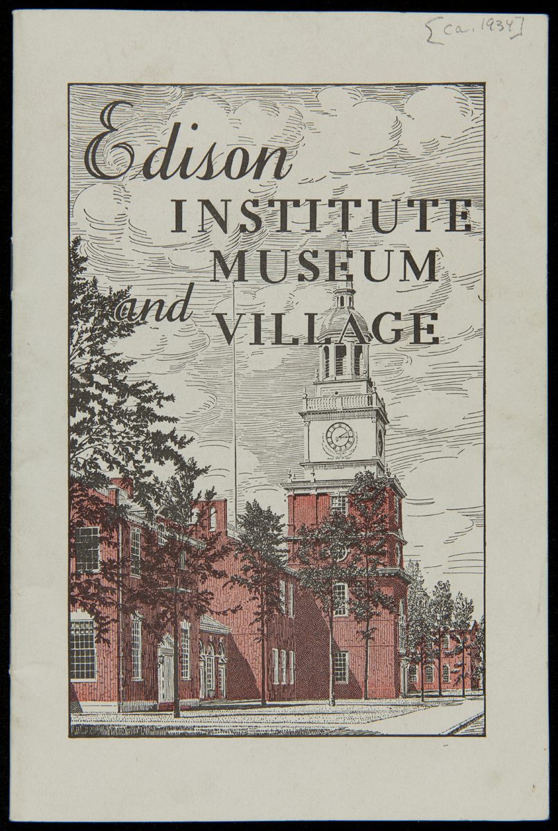
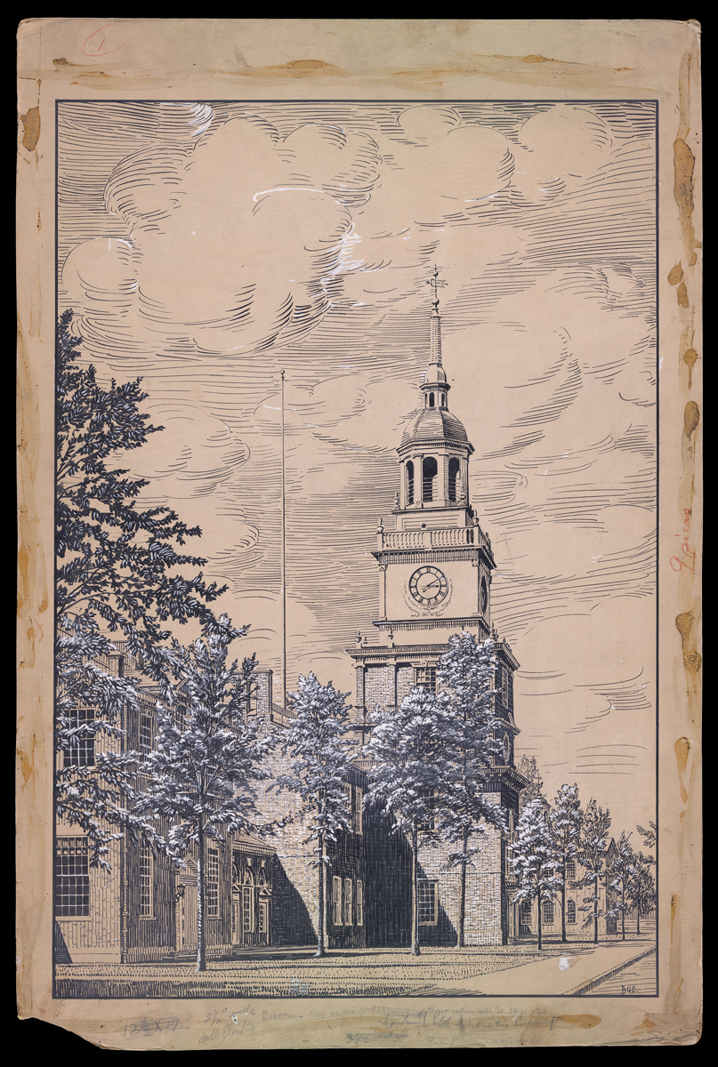
Edison Institute Museum and Village Guidebook, circa 1934. / THF223430
When the Edison Institute Museum and Greenfield Village (now The Henry Ford) opened to the general public on June 12, 1933, a series of detailed illustrations were used to highlight the many exhibits and attractions. Many of these illustrations would appear in guidebooks, brochures, and other promotional materials into the 1940s.
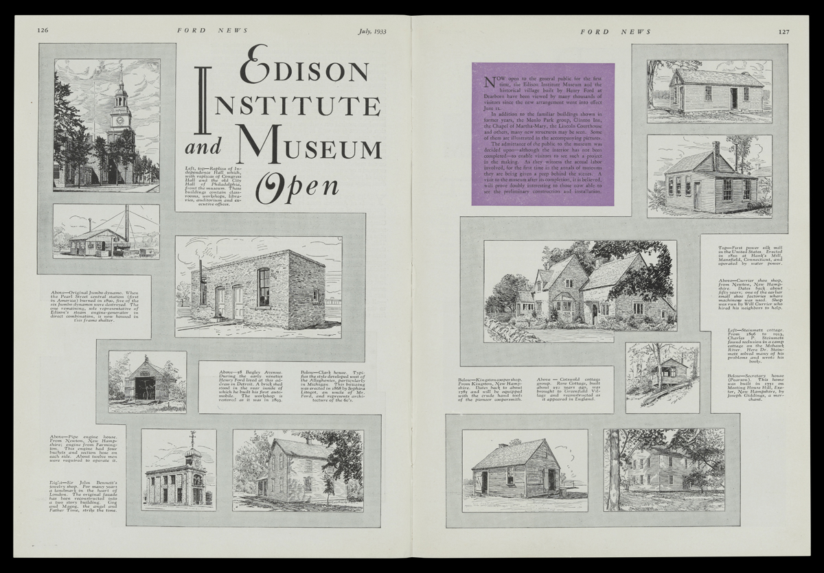
Ford News, July 1933, pp. 126-127. / THF731751
Henry Ford’s go-to artist for these projects was Irving R. Bacon, a prolific painter, illustrator, and cartoonist, whose work had previously appeared in newspapers and magazines including the Detroit Evening News, the Detroit Free Press, Harper’s Weekly, and McClure’s. Since 1913, Bacon had been employed by the Ford Motor Company, his work appearing in the Ford Times and The Dearborn Independent.
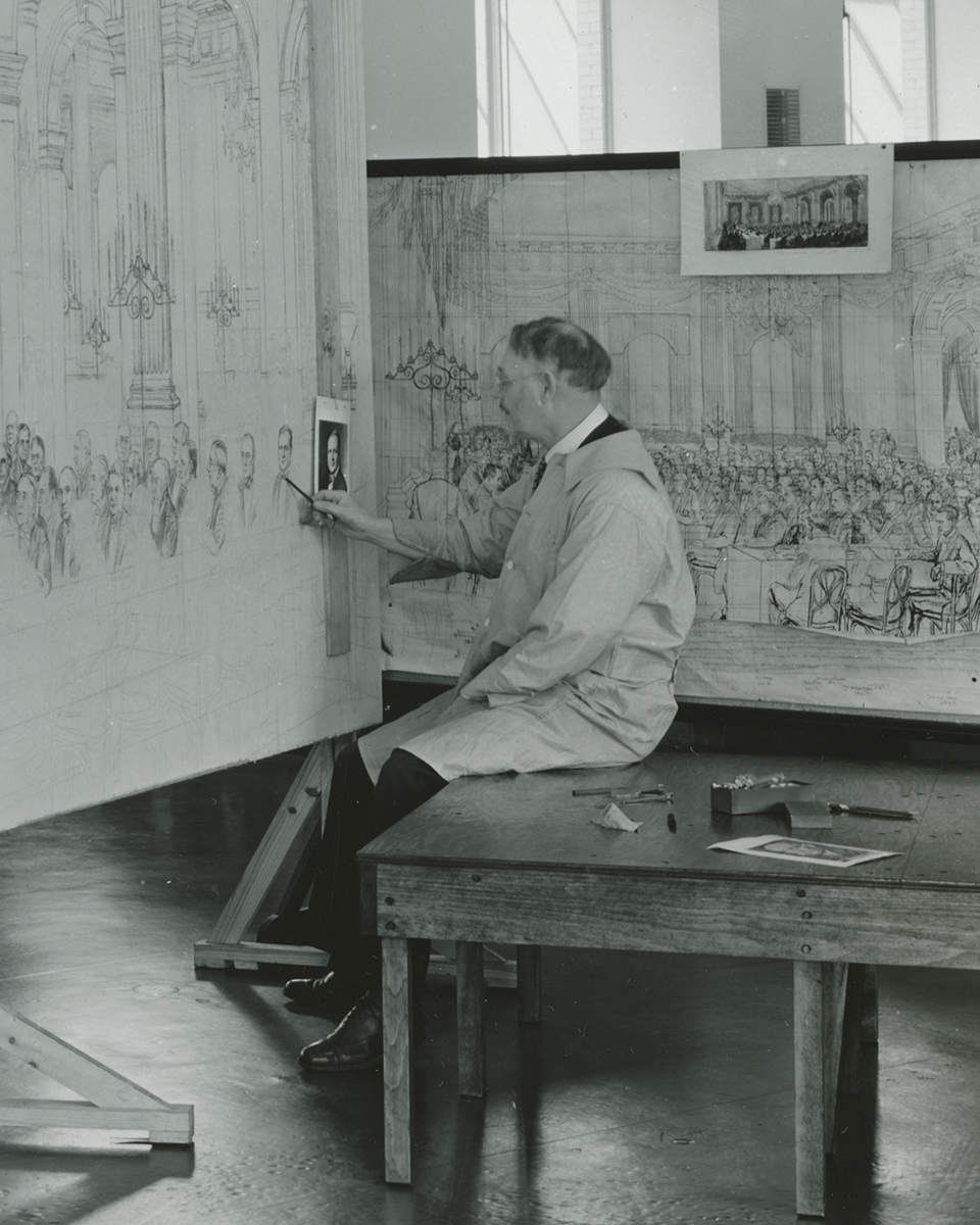
Irving Bacon Works on the Painting of Light's Golden Jubilee, January 17, 1938. / THF149655
Modern-day visitors to the museum may be familiar with Bacon’s panoramic oil painting depicting Light’s Golden Jubilee and its 262 notable attendees, including Henry Ford, Thomas Edison, Harvey Firestone, George Eastman, Orville Wright, Marie Curie, and President Herbert Hoover.
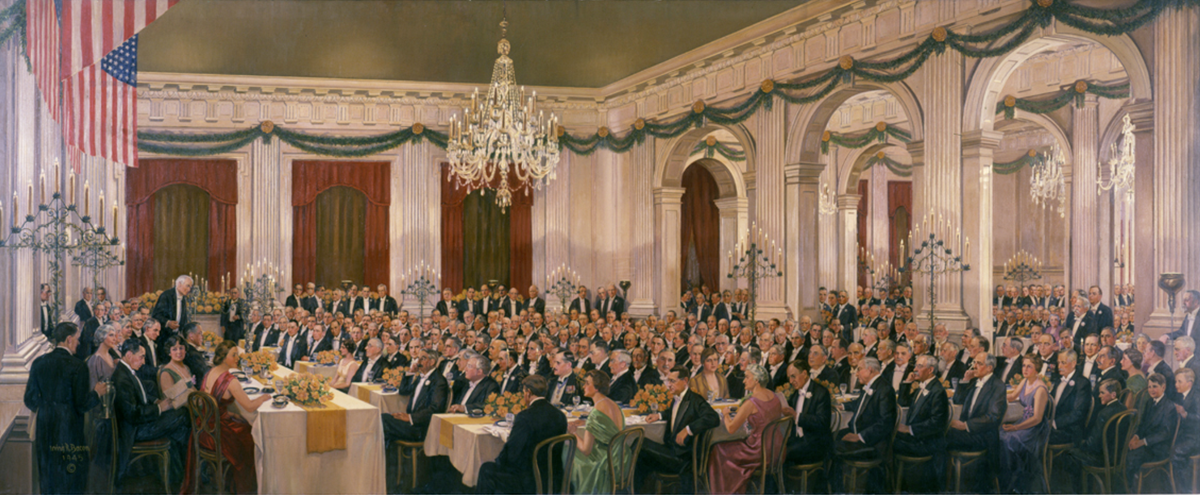
Light's Golden Jubilee and Dedication of Edison Institute by Irving Bacon, painted 1945. / THF119552
Bacon’s original pen-and-ink artwork can be found in the Irving R. Bacon Papers and in our collection of Edison Institute Advertising Drawings.
The drawings were done on illustration board, at sizes between 11 x 14 in. and 18 x 30 in., depending on the level of detail required. The drawings were lightly sketched in pencil first, then finished in ink. Corrections and adjustments were made using white paint (correction fluid would not be available until the 1950s).
Henry Ford Museum, circa 1933. / THF717872
The drawings were based on photographs taken by Ford Motor Company photographers or by Bacon himself. The drawings were usually very faithful to the original photographs, but some artistic license may have been taken with trees and foliage.
Bacon’s photograph of the Soybean Experimental Laboratory was used as reference for an illustration that appears in the circa 1934 guidebook. During the 1930s, this “modern” laboratory was used for experiments in agricultural chemistry, processing soybeans into materials that might be used in manufacturing.
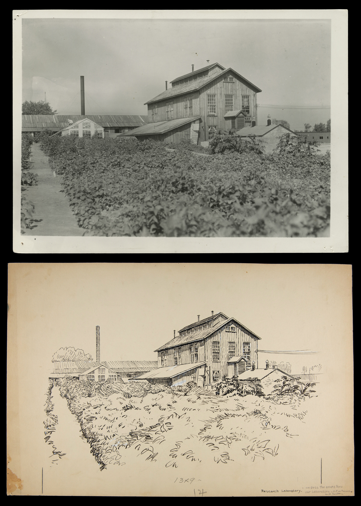
Soybean Laboratory in Greenfield Village. / THF728456 (top) and THF716604 (bottom)
Bacon’s photograph of the Charles Steinmetz Cabin was used as reference for an illustration that appears in the circa 1934 guidebook. At the time, the secluded cabin overlooked a channel of the Rouge River, which was later diverted to create the Suwanee Lagoon.
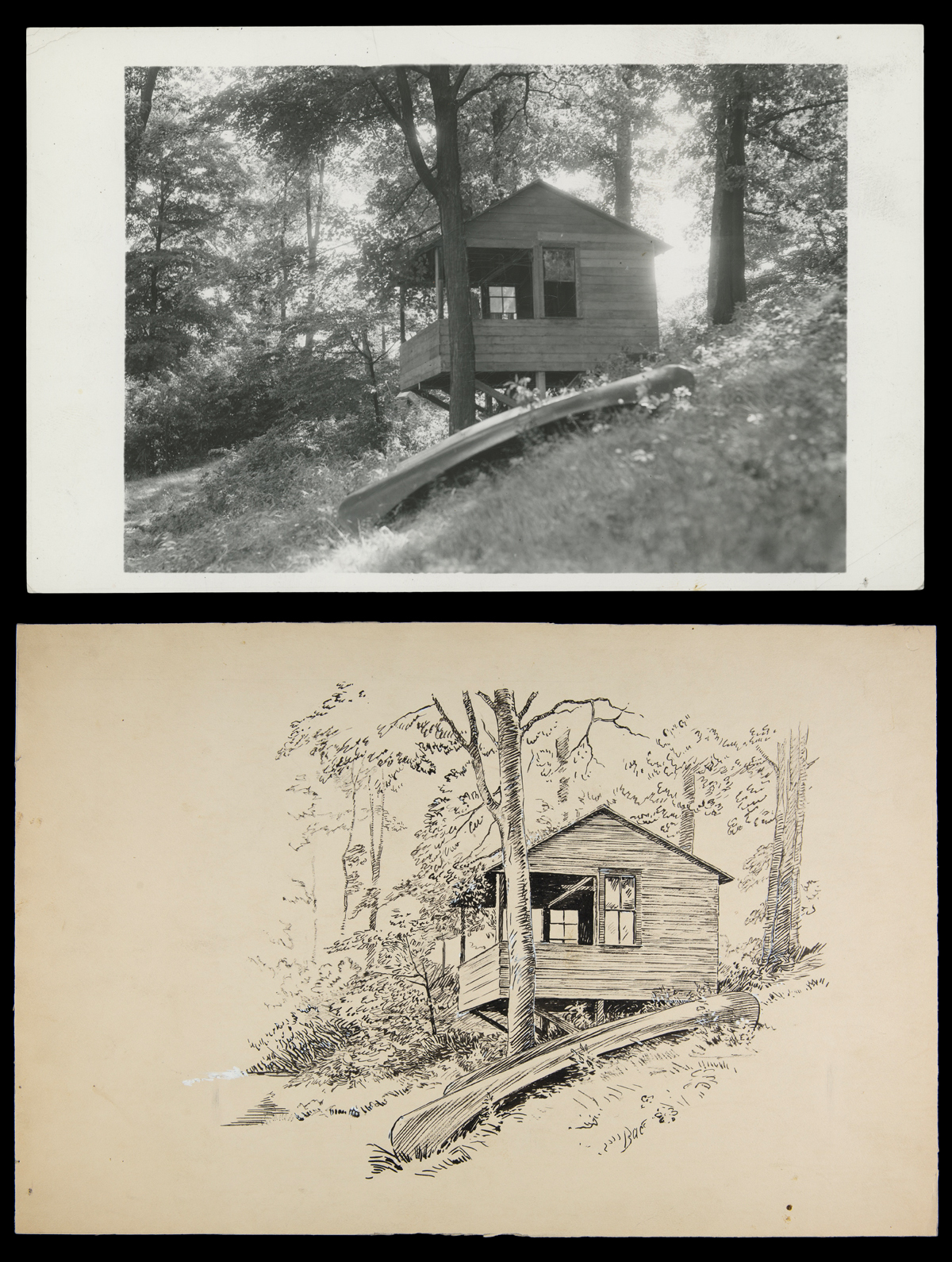
Charles Steinmetz Cabin in Greenfield Village. / THF728476 (top) and THF716480 (bottom)
A Ford Motor Company photograph of automobiles on exhibit in the Edison Institute Museum in 1936 was used as reference for an illustration that appears in the 1937 guidebook.
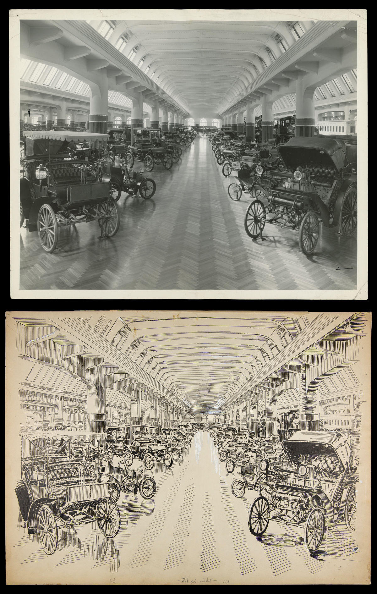
Automobiles in Henry Ford Museum. / THF728563 (top) and THF716674 (bottom)
A Ford Motor Company photograph of the Chariot made by William Ross for Angelica Campbell, taken in 1934, was used as reference for an illustration that appears in the 1941 guidebook. Temporary walls were positioned behind the chariot during the photo shoot.
-thf728906-thf716704.jpg?sfvrsn=52550e01_1)
Campbell Chariot in Henry Ford Museum. / THF728906 (top) and THF716704 (bottom)
Models in period-appropriate costumes posed for Ford Motor Company photographs in the “Street of Shops” exhibits inside the Edison Institute Museum. The photographs were used as reference for illustrations that appear in the 1941 guidebook.
-thf728869-thf716684.jpg?sfvrsn=51550e01_1) Toy Shop in Henry Ford Museum. / THF728869 (top) and THF716684 (bottom)
Toy Shop in Henry Ford Museum. / THF728869 (top) and THF716684 (bottom)
We digitize a lot of interesting photographs, documents, and printed matter every day, but drawings like these are a favorite of mine, because it is always evident just how much time, effort, and care went into making each one. Ninety years later, it seems like time well spent!
Jim Orr is Imaging Services Specialist at The Henry Ford.
Volunteer gardeners have shared their green thumbs with The Henry Ford for decades. It began when Mary Thompson Gerathy, a teacher, herbalist, and traveler, asked if she could use a garden plot in Greenfield Village to grow plants for the herb classes she taught. It developed into the Village Herb Associates, an organization that illustrates how passionate gardeners laid the foundation for a mutually beneficial community-museum partnership.
A history of the Village Herb Associates recounts an oft repeated story. Mary taught herb classes for the Edison Institute (now The Henry Ford). She ran out of materials and appealed to the manager of the adult education program to see if she could grow her own on-site. Approval given, Mary Gerathy organized like-minded individuals, many of whom had taken her classes, to study herbs, share their findings with the team, and apply their knowledge to grow herbs in a production garden in Greenfield Village.
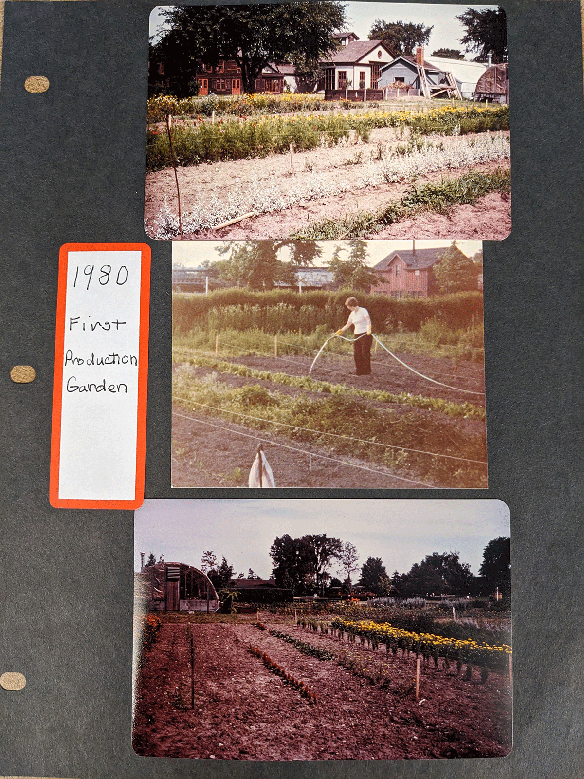
First production garden, located by greenhouses near the entrance to Greenfield Village, now the site of Firestone Farm fields. From a scrapbook in the records of the Village Herb Associates, E.I. 396, Benson Ford Research Center, The Henry Ford, Dearborn, Michigan. / Photo by the Staff of The Henry Ford.
The Village Herb Associates (VHA) organized as the Herb Associates of Greenfield Village in 1981. Adopting the motto, “Each One Teach One,” members created monographs about specific herbs and shared these during their regular meetings. This satisfied a need because, while scientific study of herbal remedies had a long and complicated history, few popular-press publications of herbs existed at the time.
In addition to information sharing, Mary sought herbs from a source she trusted. Namely, if VHA members raised their own, they had control over production. They could monitor their plants to ensure the herbs were free of disease, pests, herbicides, and other contaminants.
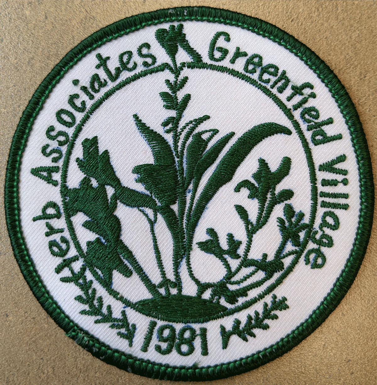
Patch, Village Herb Associates, 1981-1988. Designed by Ginny Schalm. Records of the Village Herb Associates, E.I. 396, Benson Ford Research Center, The Henry Ford, Dearborn, Michigan. / Photo by the Staff of The Henry Ford.
While VHA members maintained their gardens, they also grew their organization. They created a logo in 1981, published the first issue of Herb Associates Newsletter in March 1982, and began inviting speakers to meetings and serving food that featured herbal ingredients. They also set a minimum number of volunteer hours of work in the garden to remain an active member. This began as ten hours per year, set in September 1983. In January 1984 VHA established a gardening roster and schedule. They also drafted rules of membership and adopted a dress code to help them be more recognizable while gardening in the village.
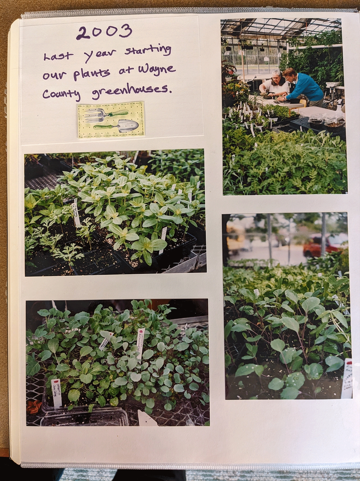
Producing plants to meet consumer demand for courses and herbal wreath sales in museum gift shops required planning. The VHA used the greenhouses at Wayne County, Regional Educational Service Agency to start plants. This began as early as 1981 and continued through 2003.
Page from a scrapbook in the records of the Village Herb Associates, E.I. 396, Benson Ford Research Center, The Henry Ford, Dearborn, Michigan. / Photo by the Staff of The Henry Ford.
Change: A Constant for Gardeners
Between 1981 and the present, VHA members established and maintained their production gardens, moved established gardens, and created new garden spaces.
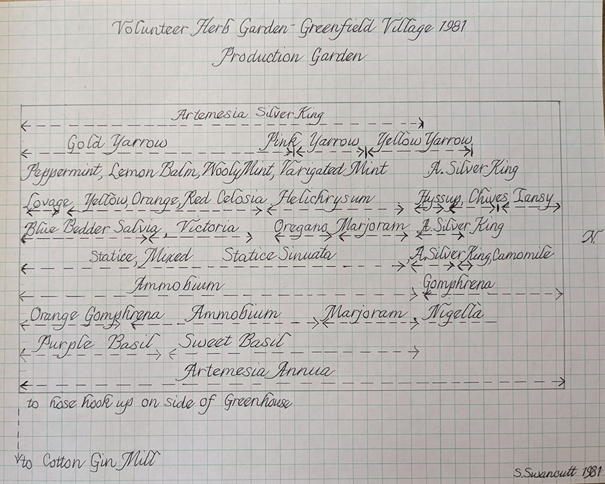
Map of the VHA production garden, drawn by Shirley Swancutt, 1981. Shirley succeeded Mary Gerathy as VHA coordinator in March 1984. From the records of the Village Herb Associates, E.I. 396, Benson Ford Research Center, The Henry Ford, Dearborn, Michigan. / Photo by the Staff of The Henry Ford.
The first VAH garden meant to add context to a historic structure, Dr. Howard’s Office, provided an opportunity for members to hone their knowledge and skills with growing herbs used in mid-nineteenth century pharmacological contexts. The VHA members responsible for this garden had to relocate it from one side of the Village Green to the other as part of the rehabilitation of Greenfield Village in 2000. The addition of the Jackson Home to the village reduced space available for Dr. Howard's Garden and meant that VHA members had to rethink their location and herb arrangements..
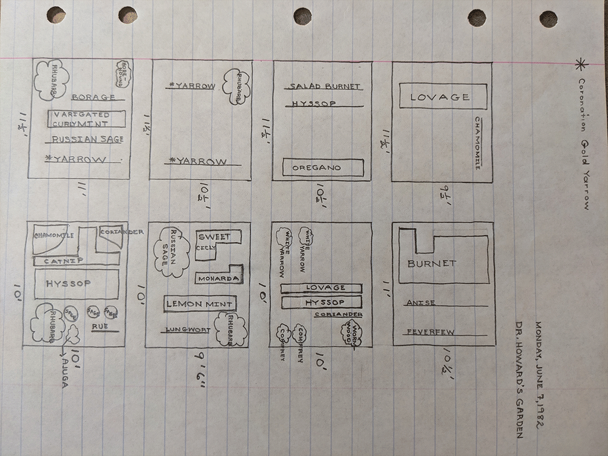
Map of Dr. Howard’s Garden, June 7, 1982. From the records of the Village Herb Associates, E.I. 396, Benson Ford Research Center, The Henry Ford, Dearborn, Michigan. / Photo by the Staff of The Henry Ford.
Other major changes over the decades included relocation of the first production garden from the fields repurposed for Firestone Farm fields into “the back forty” of THF property in 1984. It remained there until the dedication of the new Burbank Garden and its operation as a production space in 1996. VHA members also assumed responsibility for plantings around the birthplace of Luther Burbank and the Burbank Information Office.

Meditative space with seating, dedicated to VHA founder Mary Thompson Gerathy, in the Burbank Garden. / Photo by the Staff of The Henry Ford.
Members refurbished the Garden of the Leavened Heart in 1988. Then in 1993 members worked with Greenfield Village grounds staff to relocate the garden in front of Martha-Mary Chapel; this was to clear space for A Taste of History restaurant. The reinstallation included a plaque crediting Clara Ford, an avid gardener, as designer of the original Garden of the Leavened Heart, and reminded viewers of the importance of pollinators and the need for compassion.
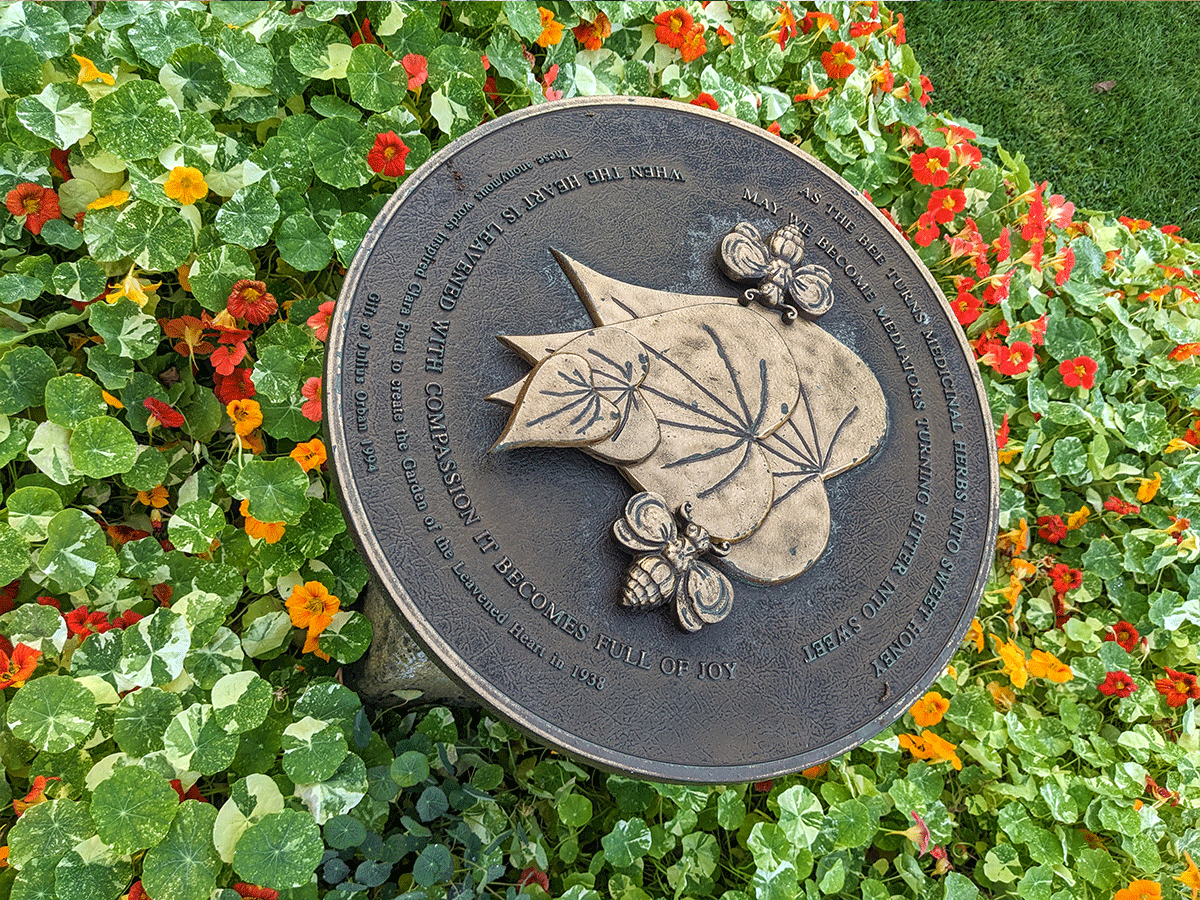
The plaque reads: “As the bee turns medicinal herbs into sweet honey / may we become mediators turning bitter into sweet / when the heart is leavened with compassion it becomes full of joy / These anonymous words inspired Clara Ford to create the Garden of the Leavened Heart in 1938 / 6th of Julius Orban 1994.” / Photo by the Staff of The Henry Ford.
Growing Strong
VHA began with a clear vision, and members maintain the momentum through teamwork. They do this as they continue to balance maintenance of beautiful gardens in the public spaces of Greenfield Village and fundraising to support their work. Members turn plants grown in the production garden into herb wreaths, tussie-mussie bouquets, potpourri, and other handmade crafts for sale. Detroit Central Market offers a prime location for VHA to engage with the public during market days as well as a chance to sell their wares.
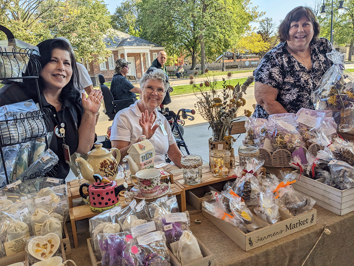
Village Herb Associates members and some of the products created by members for sale during the 2025 September market weekend at Detroit Central Market in The Henry Ford’s Greenfield Village. / Photo by the Staff of The Henry Ford.
Self-aware members understood the importance of retaining records to document garden plantings and to keep track of their own work. The group’s archive resides in the Benson Ford Research Center at The Henry Ford. To date it includes a brief VHA history, examples of herb reports, information about each garden, and several colorful and complete scrapbooks that document group work from 1981 to 2013. Newsletter files include issues from the first in 1982 to 2020. Active members maintain regular contact with THF archivists and deposit archived material on schedule. This resource makes it easy to recount the organization’s history and utility.
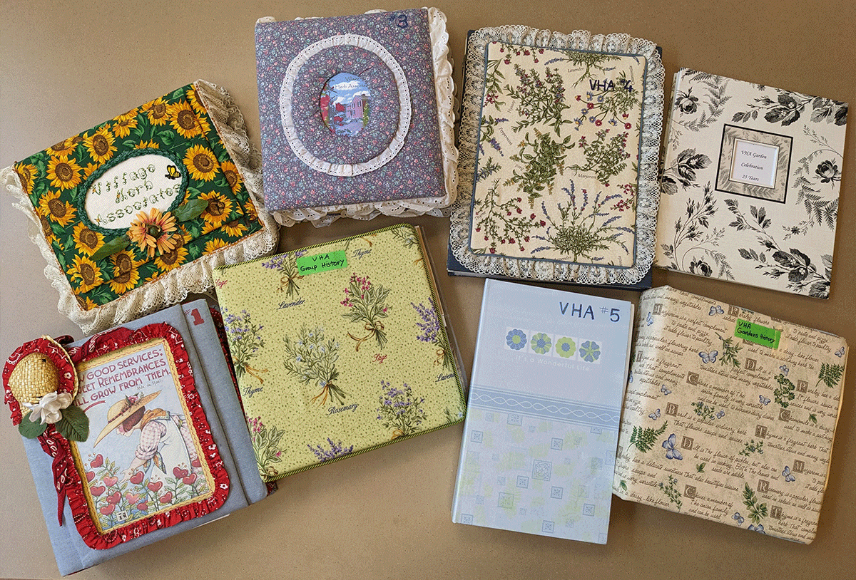
Scrapbooks in the records of the Village Herb Associates, E.I. 396, Benson Ford Research Center, The Henry Ford, Dearborn, Michigan. / Photo by the Staff of The Henry Ford.
The Village Herb Associates remind us of how one person can mobilize a team that affirms personal interests in gardening and that enhances guest experiences in Greenfield Village. Each One Teach One, indeed.
Debra A. Reid, Curator of Agriculture and the Environment, The Henry Ford.
On July 14, 1948, Lois Kelley wrote "Dear Mother and Dad - Today is beginning clear, fresh, and cool, and I couldn't be happier because. . ."
Happy because of life on the farm with her husband, Bob, and their young son, Bobby. Happy because of the way the place was responding to their nourishing touch. Happy because of the rabbits and peas and hay, and because "the baby is due in only five weeks."
In 1948, the Kelleys had settled on eleven acres in Rockville, Connecticut. The house, barn, hayfields, and berry patches all needed attention. The work and the record-breaking cold and snow of their first winter hadn’t chilled their enthusiasm for the future. They warmed to the learning and achievements ahead.
 Kelley family farmhouse in Rockville, Connecticut, 1948. / THF723661
In the spring and summer of 1948, in her regular letters to her parents, Lois described learning how to plow a field, milk cows, harvest vegetables, and process meats. As the August birth of their daughter, Diana neared, Lois turned to indoor concerns like pie and shortcake, buying a freezer, making curtains, and increasingly, heating the house.
The Kelleys applied to add expenses for a new furnace to their mortgage. In July 1948, they received word that the request to add the furnace was denied. Undaunted, Lois reflected "all we have to do is ask ourselves whether we'd rather be in the apartment where there's heat and hot water, where dirt doesn't get tracked in, and weeds don't grow—and we feel absolutely blissful about this no matter what it lacks."
By October the Kelleys had a plan for winter. "We have another oil heater now - double burner living room type of a rather old vintage. . . so. . . we have our lovely stove in the kitchen, two double burner heaters (for living room and bathroom), and one single burner heater (for our bedroom). I don't see how we can help but be warm, even if this winter were to be as ferocious as the last. Just the same - I'm going to get Bobby some long-legged underwear - and some for myself too. (Red if possible.) Bob has a couple of sets from the Army.''
 Detail from a letter from Lois Kelley to her parents, September 22, 1948, pg. 1. / THF723677
In February 1949, as the winter bore on, Bob intoned his favorite weather saying: "When the days begin to lengthen, the cold begins to strengthen." The Kelleys layered the home in curtains, storm windows, and insulation, and began to discuss central heat and hot water in earnest.
 Bob Kelley removing his boots near the heating stove in the Kelley house kitchen, Rockville, Connecticut, 1948. / THF723649
Over the winter of 1948-49 the family's finances improved. Thus, the bank approved their furnace loan in late August 1949, but the Kelleys still needed approval from the Veterans Administration (VA) Loan Guaranty Service. Anticipating delays there, the Kelleys would rely on the fireplace, but first they had to repair the chimney. They decided to build a Heatilator—a steel-lined fireplace that circulated heated air.
There were surprises. Lois Kelley recounted these with humor in letters to her parents.
August 26: "Bob started tearing down the plaster around the old chimney, the wainscoting, and the wall where the fireplace is to go. . . After Bob had torn up a few boards and then fell through. . . the sub-flooring, we decided that we need a new floor as well as a new ceiling and walls. . ."
August 29: “We ripped up the remaining floorboards this morning before Bob went to work, and just to make it unanimous, I fell through up to my hip. . . he's busy here now, putting in new joists. . . . One of the old ones practically disintegrated under Bob’s touch yesterday, it was so rotten!
And the chimney!. . . When Bob started to take it down, it split in half and fell, one half falling through the upstairs hall ceiling, and the other half landing on top of the guest bed, clean sheets and all!” The VA assessor chose that moment to arrive for his inspection.
 Charlie Magdefrau replacing floor joists in the Kelley house living room, Rockville, Connecticut, 1949. / THF723664
The fireplace was finished before winter. On October 16, the day after their first test fire, "Bob started a real blaze, took off his shoes and took up the paper."
But delays continued with the furnace, as Lois revealed in her regular letters to her parents. Two days after that cozy fireplace fire, they signed papers for the furnace loan, though it would be five more cold weeks before they heard from the contractor. On November 23 he apologized that the steel strike had delayed a few parts. Midway through December Lois bemoaned that they were "just about due to run out of our cordwood." On the previous Saturday morning, "when we got up there was a skim of ice in the toilet. . . We're really ready for baths!" she complained.
Finally, on December 20, 1949, she exclaimed, "Yes we have heat!" For the first time in over a year, the family could take hot baths or invite overnight guests. Their yearly Christmas card featured the Heatilator with its advertised "Fireplace Charm plus Room Wide Comfort."
 Kelley family Christmas card featuring Bobby hanging his sister's stocking above the Heatilator, December 1949. / THF723655
Having secured some creature comforts at the farmhouse in Rockville, Connecticut, the Kelleys turned their ambitions toward a larger farm. In 1953 they purchased a house constructed in the 1750s, located on Bear Swamp Road in nearby Andover, Connecticut. When they applied for financing, their bank said that it wasn't their "policy to take houses so old or unmodernized." The realtor, who owned an old house himself, helped them find a banker who also liked old houses, and the papers were signed.
 South side of the Kelley family home with ell and vegetable garden in the foreground (positioned where the sun shown most intently), Bear Swamp Road, Andover, Connecticut, 1953. / THF723673
Lois described their new winter preparations in a note to her parents on August 24, 1953. "Since we weren't able to get a heating system from the money derived from the other house, we have bought instead a gas chain saw. We call it our heating system. . ." With no regrets for leaving the Rockville furnace behind, she added, "We may not be as warm this winter as we might be. . . but we are certainly going to have a lot more fun than a furnace and radiators ever gave anyone!"
Wood cutting often took a neighborly tone. "Sunday we went over to the Hetzels' for an eat-and-run breakfast. . . the men all came back to cut wood. . . in return for their day helping us cut wood, we would take Sunday and cut wood for them."
 The Hetzel family visiting the Kelley family, Bear Swamp Road, Andover, Connecticut, 1953. / THF723667
Life on Bear Swamp Road found the Kelleys shuttling between the eighteenth and twentieth centuries. The fireplaces on the central chimney that originally heated the house had been “updated” with layers of brick and plaster. In a move that was typical of the Kelleys, not just resisting but reversing trends of modernization, they began to look behind the walls.
Lois explained in an August 1953 letter: "We worked up our nerve and started chipping away plaster on the long room wall to see how large the fireplace had originally been. It was going to be only a small piece of plaster but by now the whole wall is nearly uncovered…"
By the end of 1953 plaster removal revealed four fireplaces all vented by the central chimney. The Kelleys restored the original cooking hearth and ashlar stone firebox. They heated the house with two cast-iron box stoves, Fire King and Dudley, that burned nearly constantly. Each stove—with their names cast into their sides—seemed to have a personality. Dudley was the "Big Guy!" Eight-year-old Bobby kept the wood boxes filled but Bob emptied them as fast, stoking the stoves.
 Bob Kelley maintaining the heating stove, Dudley, in the Kelley farmhouse, Andover, Connecticut, 1955. / THF723675
The combination of wood stoves and hearth kept the large farmhouse snug. As Lois explained in a letter dated December 21, 1953: "We were tickled with our stoves during the cold snap. At times, although 10-15° outside, it was almost uncomfortably warm in here."
To the Kelleys, the Rockville house with its 1950s conveniences could not compare with the 1750 farm at Bear Swamp Road. Wood heat and the stone hearth were the center of the home and the feature of their 1954 Christmas card, as well as the center of the Kelleys' growing interest in historic preservation which shaped the rest of their lives.
 Christmas Card showing the restored fireplace, Andover, Connecticut, 1954. / THF723671
This article was written by Diana “Daisy” Kelley, Curatorial Research Volunteer, The Henry Ford, with Debra A. Reid, Curator of Agriculture and the Environment, The Henry Ford. The stories and pictures are from the Lois Kelley collection at The Henry Ford.
You can read more about the Kelley family in "Kids on the Farm" and about their stewardship of a sugar bush on their second farm as they supplemented their food supply and farm income in "Maple Trees and Family: A Long-Term Relationship."
The modern-day commercial Christmas card traces its origins back to England in the early 1840s when Henry Cole distributed holiday greetings on a card designed by John Callcott Horsley. The first American Christmas card appeared several years later. The innovative idea grew slowly in America until Louis Prang (1824-1909), a Boston-based German immigrant printer, educator, and colorist renowned for his chromolithographed artist prints, began creating small Christmas cards for the American market in the mid-1870s. His colorful holiday greetings were not much more than an extension of his business and trade card production. Prang's first cards featured an image of flowers with a brief holiday message—not the typical Christmas imagery found on cards today. Still, it was a successful enterprise. By 1880, Prang was selling nearly five million holiday cards a year—some now assuming more distinctive holiday themes. Also in 1880, he initiated a series of artist-designed Christmas card contests that attracted the public's attention and helped secure an annual holiday card-giving tradition. For these efforts, many consider Prang the father of the American Christmas card.
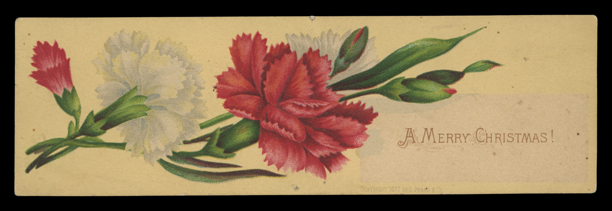 An early Prang Christmas card, 1877. / THF728302
Prang's Christmas Card Competitions
Louis Prang aspired to educate Americans about art through his chromolithographs, and his production of Christmas cards provided a unique opportunity to continue that passion. In the spring of 1880, Prang arranged an art contest for holiday card designs. He gathered several notable designers, architects, and artists to judge the competition. The cards would be exhibited at the American Art Gallery in New York, and prize money, totaling $2,000 for the top four designs, would be awarded. There were more than 800 entries. Prang would receive the winning entries from which he produced Christmas cards. Winning artists received recognition with their names placed on the backs of the cards, along with their prize position and the amount of money won. Prang also reserved the right to purchase any other card design that met his approval for production.
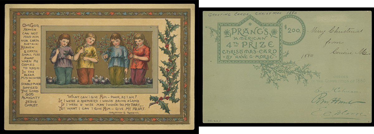 Anne G. Morse's design won fourth prize in the 1880 card competition. / THF716793 and THF716794
The public loved it. In February 1881, Prang held a second competition and exhibition. He again assembled a group of well-qualified judges, this time to assess nearly 1,500 entries.
 Charles Caryl Coleman won third prize in the February 1881 competition. / THF716795
After this second showing, Prang conducted another round of card design competitions later in November 1881 (for 1882 production cards). Entries poured in. And the public flocked to the two exhibitions at New York's American Art Gallery. These showings piqued the public's interest even more because exhibition-goers now could vote for four popular prize award winners, alongside the jury awards. Art critics, however, questioned the quality of what they considered a flood of amateur works.
 The fourth artist's prize for the November 1881 contest went to Alfred Fredericks. / THF716799
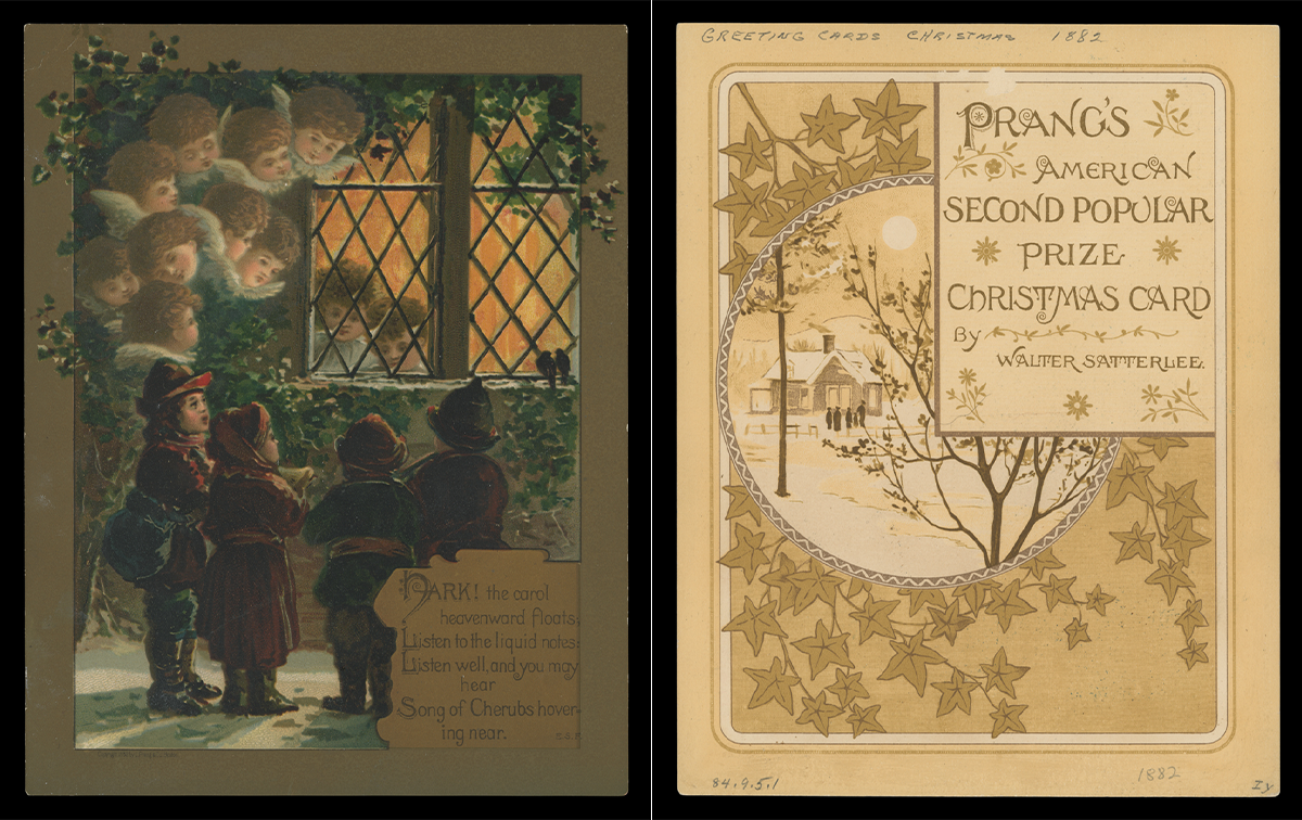 The November 1881 contest included popular prize awards. The exhibit going public gave the second popular prize to genre painter Walter Satterlee. / THF716797 and THF716798
Prang decided to halt the contests after this competition. He had sparked the public's desire for art all too well, but the overwhelming number of amateur works held little value for Prang, artistically or monetarily. Also, design and literature competitions held by other companies (copying Prang's initial success) began to fail as professional artists and authors refused to submit their works to exhibitions awash with amateur entries. Prang would hold one last competition at the end of 1884, but limited the entrants to twenty-two selected artists. Judges would select four artist design winners—and only later would the public award one popular prize.
After the Competitions
Prang continued to produce Christmas cards after the run of competitions. But times were beginning to change. Other companies copied Prang's success, marketing their own fringed, tasseled, and colorful Christmas cards. Foreign printers also provided inexpensive alternatives, with some American producers contracting with German publishers to create colorful cards. With the flood of cards, Americans could now buy and send reasonably priced Christmas greetings to friends and family. Prang, however, still wanted his cards to meet his exacting standards, adding to the production time and cost. Consumer tastes also shifted. By the early 1890s, the large, frilly, high-priced cards—seen more as gifts than as greetings—began to fall out of favor in America. Prang, too, refocused and began to concentrate on other printing ventures, especially educational materials—a passion he had since his early years as a printer. The aging chromolithographer, credited as being the father of the American Christmas card, had, for all intents and purposes, left the holiday card market.
Andy Stupperich is an Associate Curator at The Henry Ford.
“A lot of my work is based on identity and how I relate to my culture, my experiences of being Native, and growing up inside and outside and bouncing back and forth in the community. I explore beadwork in my pieces; I explore florals and storytelling.” —Maggie Thompson (Fond du Lac Ojibwe).
This year, The Henry Ford took steps toward building community with Indigenous nations by expanding the institution’s Artists in Residence program, offered annually in Greenfield Village. To kick off Celebrate Indigenous History programming, we welcomed Maggie Thompson (Fond du Lac Ojibwe) as the inaugural Indigenous Artist in Residence.
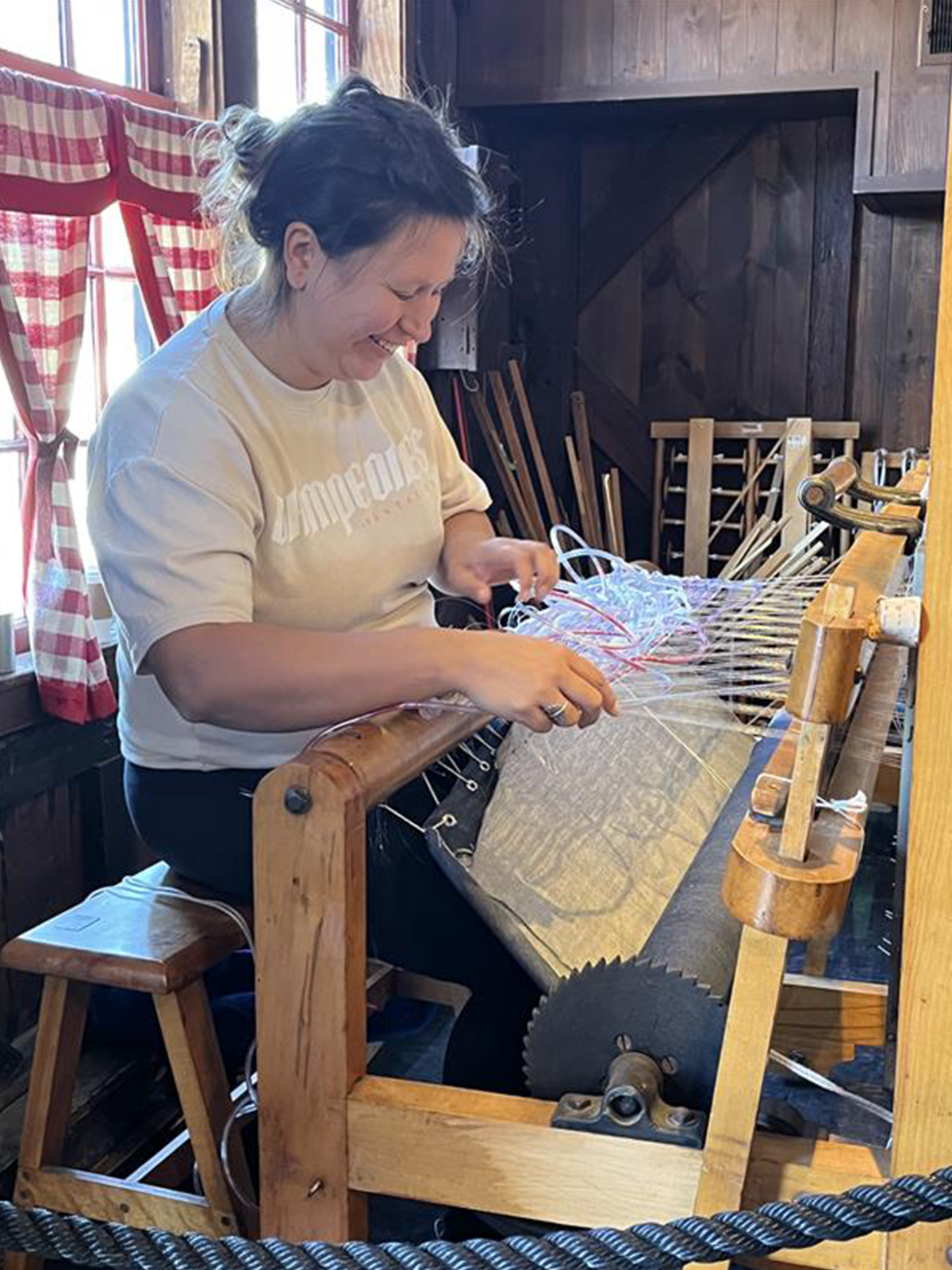
Maggie Thompson begins to weave in Greenfield Village Weaving Shop, October 2025. / Image by Staff of The Henry Ford.
Thompson was born and raised in Minneapolis, Minnesota, and her Ojibwe heritage comes from her father's side. Inspired from a young age, Maggie was creating art by the time she was in the fourth grade. Her mother is a painter, and she has been inspired by other Indigenous artists, including Jim Denomie (Ojibwe) and Dyani White Hawk (Lakota).
She received her bachelor of fine arts in textiles at the Rhode Island School of Design (RISD) in 2013. The following year, she mounted her first solo exhibition, Where I Fit at All My Relations Arts in Minneapolis. In 2024, her work was included in the exhibition The Shape of Power: Stories of Race and American Sculpture at the Smithsonian American Art Museum. And most recently, she was featured at the Detroit Institute of Arts’ celebrated 2025 exhibition, Contemporary Anishinaabe Art: A Continuation.
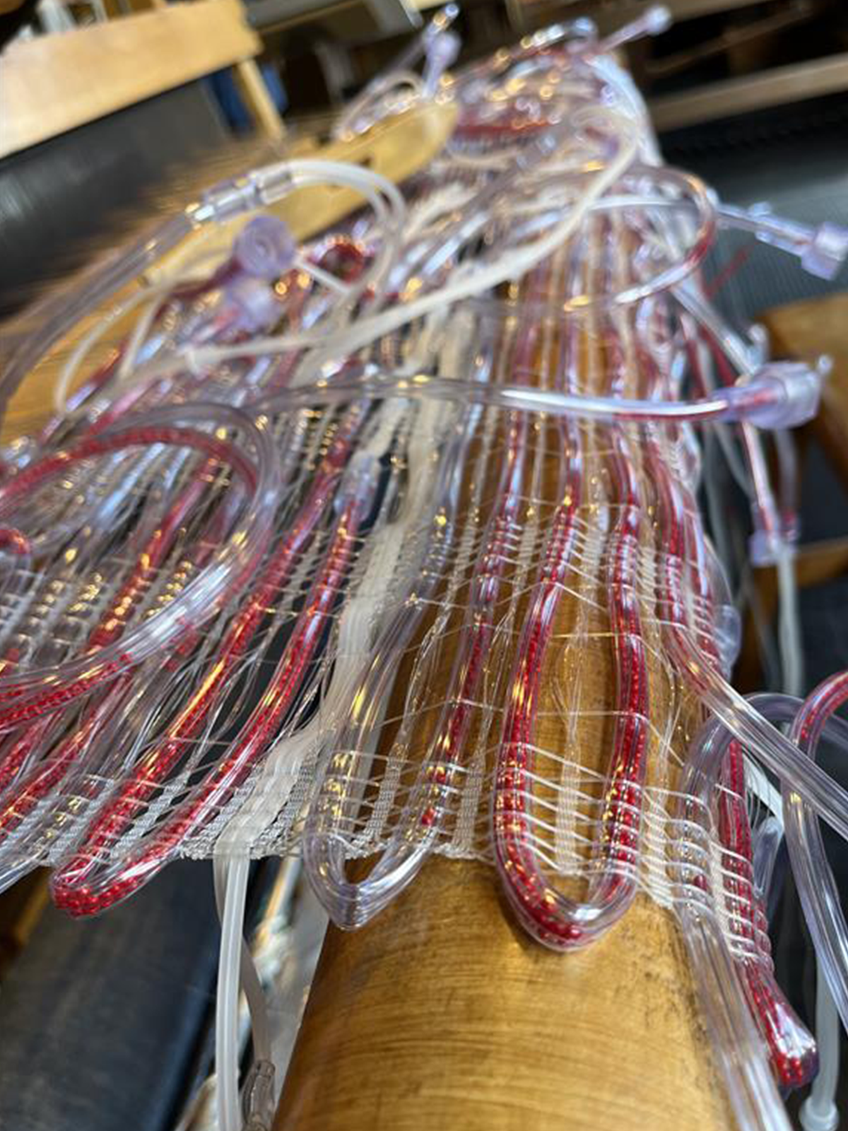
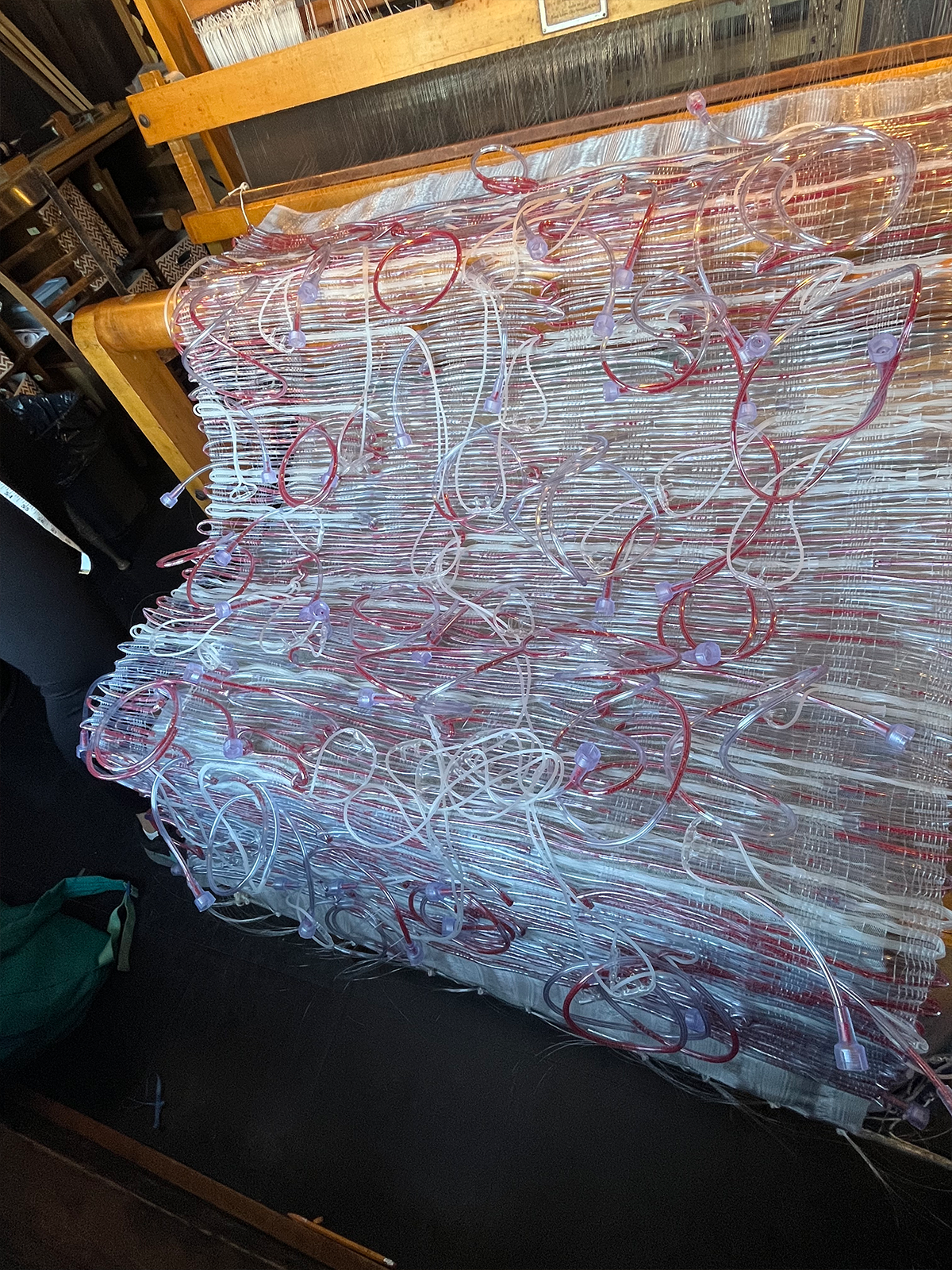
Detail of weaving by Maggie Thompson during the inaugural Indigenous Artist in Residence, October 2025. / Image by Staff of The Henry Ford.
Thompson has been awarded several grants and awards, including the All My Relations and Bockley Gallery Jim Denomie Memorial Scholarship and the Jerome Foundation Jerome Hill Artist Fellowship. Her work is represented in the collections of the Minneapolis Institute of Art, the Minnesota Museum of American Art, and the Field Museum, among others. In addition to her arts practice, Maggie runs a knitwear business called Makwa Studio—an Indigenous-run space that promotes Indigenous creativity, education, and collaboration.
During her residency in Greenfield Village, Thompson activated the Weaving Shop located in Liberty Craftworks. This building—a converted 1840s cotton mill from Bryan County, Georgia—is a popular experience for guests to see daily demonstrations of historic textile production on our many working looms. While Thompson does use traditional weaving materials such as natural fibers in her work, during her residency she relied on nontraditional materials such as nylon monofilament (better known as fishing line) and hollow, plastic, oxygen tubes that she filled with red seed beads.
Maggie Thompson’s weaving in progress, Greenfield Village Weaving Shop, October 2025. / Image by Staff of The Henry Ford.
Thompson’s recent weaving projects use nontraditional materials to talk about complex topics that affect many families across the country and within Indian Country: substance use, addiction, and recovery. Many issues contribute to the high rates of substance use among Indigenous populations especially. Poverty, historical trauma, discrimination, and racism—and lack of health insurance—all play a role. A 2018 survey by the American Addiction Centers reports that 10% of Indigenous Americans have a substance use disorder and 7.1% have an alcohol use disorder. These numbers make it so that Indigenous people living in the United States have rates of addiction higher than any other group. With the work that she created at the Weaving Shop, Maggie hopes to raise awareness of these issues.
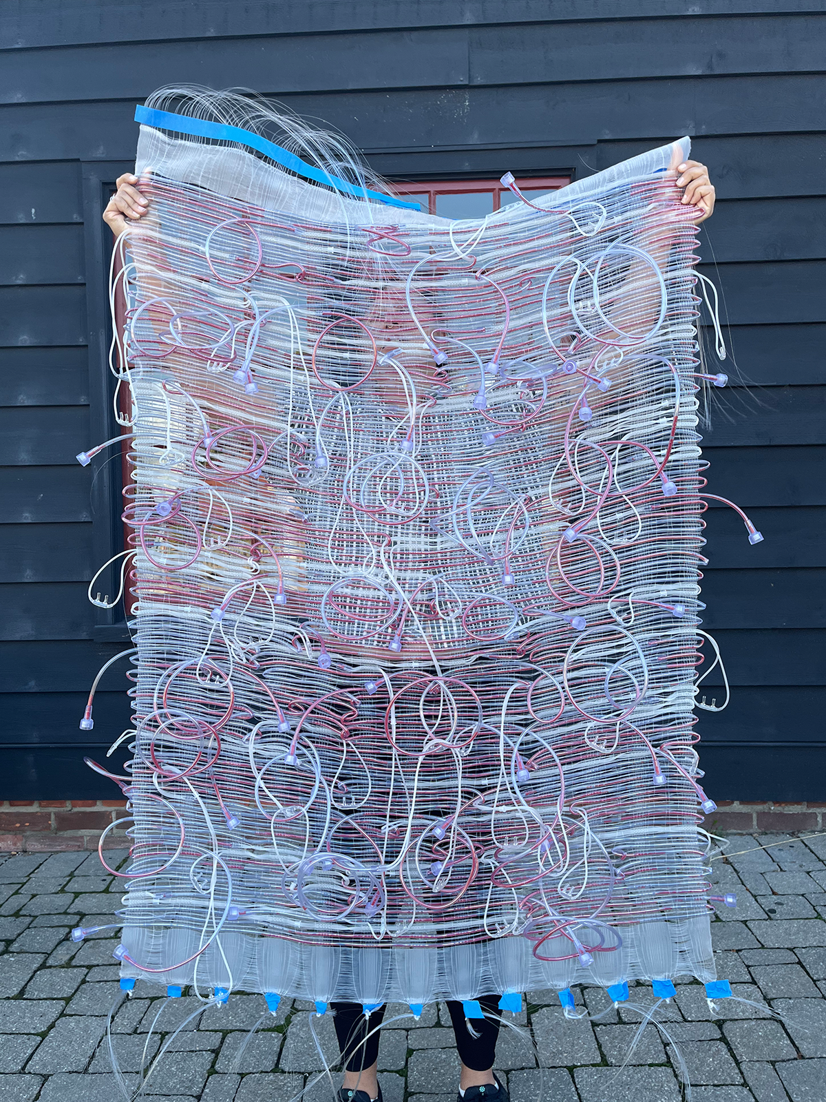
Maggie Thompson holds up the work created during her residency at The Henry Ford. / Image by Staff of The Henry Ford.
Heather Bruegl (Oneida/Stockbridge-Munsee) is the Curator of Political and Civic Engagement at The Henry Ford.
Lois and Robert Kelley craved outdoor space and projects to absorb their enthusiasm for life. After World War II they married and invested wholeheartedly in farming, believing it could provide peace of mind and sustenance for the family, with income supplemented by outside work. They bought an 11-acre property in Rockville, Connecticut, and modeled their work on the popular “Have-More” Plan promoted by Ed and Carolyn Robinson of Noroton, Connecticut.
The “Have-More” Plan motto, “A Little Land—A Lot of Living,” captured the farm family’s enthusiasm. At some point, Lois Kelley wrote Ed and Carolyn Robinson, explaining that “Your plan was the inspiration that led us to buy an 11-acre Homestead, complete with cow and chickens. . . . The fact that there is so little work is continually amazing to us, but perhaps it's because we really enjoy doing it. We're an enthusiastic advertisement for your plan.” The Robinsons must have cherished that letter because it appeared in a special issue of Mother Earth News (1, no. 2, 1970) devoted to the 1940s back-to-the-land plan.
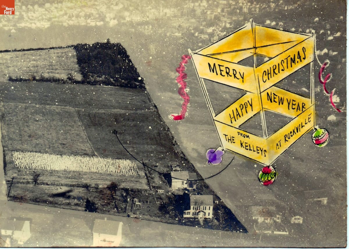 Aerial view of the Kelley farm adapted to a Christmas card / THF720527
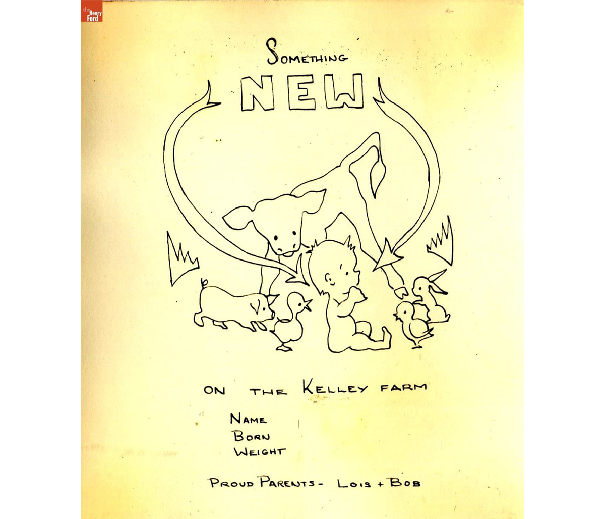
The Kelley farm included a house and barn, gardens, apple trees, hayfields, and berry patches, and after mid-1948, two children and dozens of farm animals. The birth announcement that Lois Kelley drew for Diane, her second child, shows the new baby with a calf, a piglet, a duckling, a bunny, and a chick. Lois rued the fact that, try as she might, she couldn't fit a goat kid into the picture.
 D's birth announcement drawn by Lois Kelley 1948 / THF720614
Diane and her brother Bobby grew up helping in the kitchen, barn, and garden. In a letter to her parents while she was pregnant with Diane, Lois wrote that her three-year-old son Bobby began doing chores. He fed the ducks and gathered eggs with her. The banty hens hid their nests in random places, to search out each morning as if it were Easter. A constant round of eggs incubated into ducklings, goslings, squab, and chicks in the cellar.
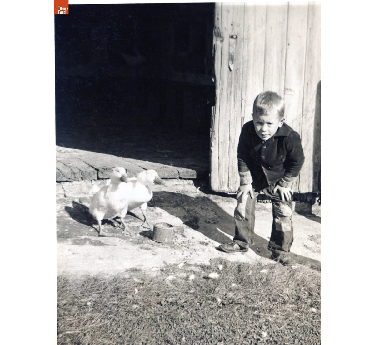 Bobby Kelley with ducks at the Kelley farm barn door, 1948 / THF720525
Each type of bird the Kelleys raised was hatched, fed, housed, and killed at the proper time, then prepared for the freezer or the table. Chickens, especially, fed the Kelley family all summer—broiled, fried, baked, or stewed. Lois wrote to her parents about a summer night when Bob surprised her by arriving home at midnight, bringing his sister and two of her children with him: “Lucky we'd planned on killing a chicken for Sunday dinner! The chicken killing was quite a process. The children watched . . . Bob tied its feet and hung it up instead of letting it flap all over, and later Judy, who's five, said to me, “You know, if Uncle Bob was going to cut my head off, he wouldn't have to tie my feet—I'd hold them still.”
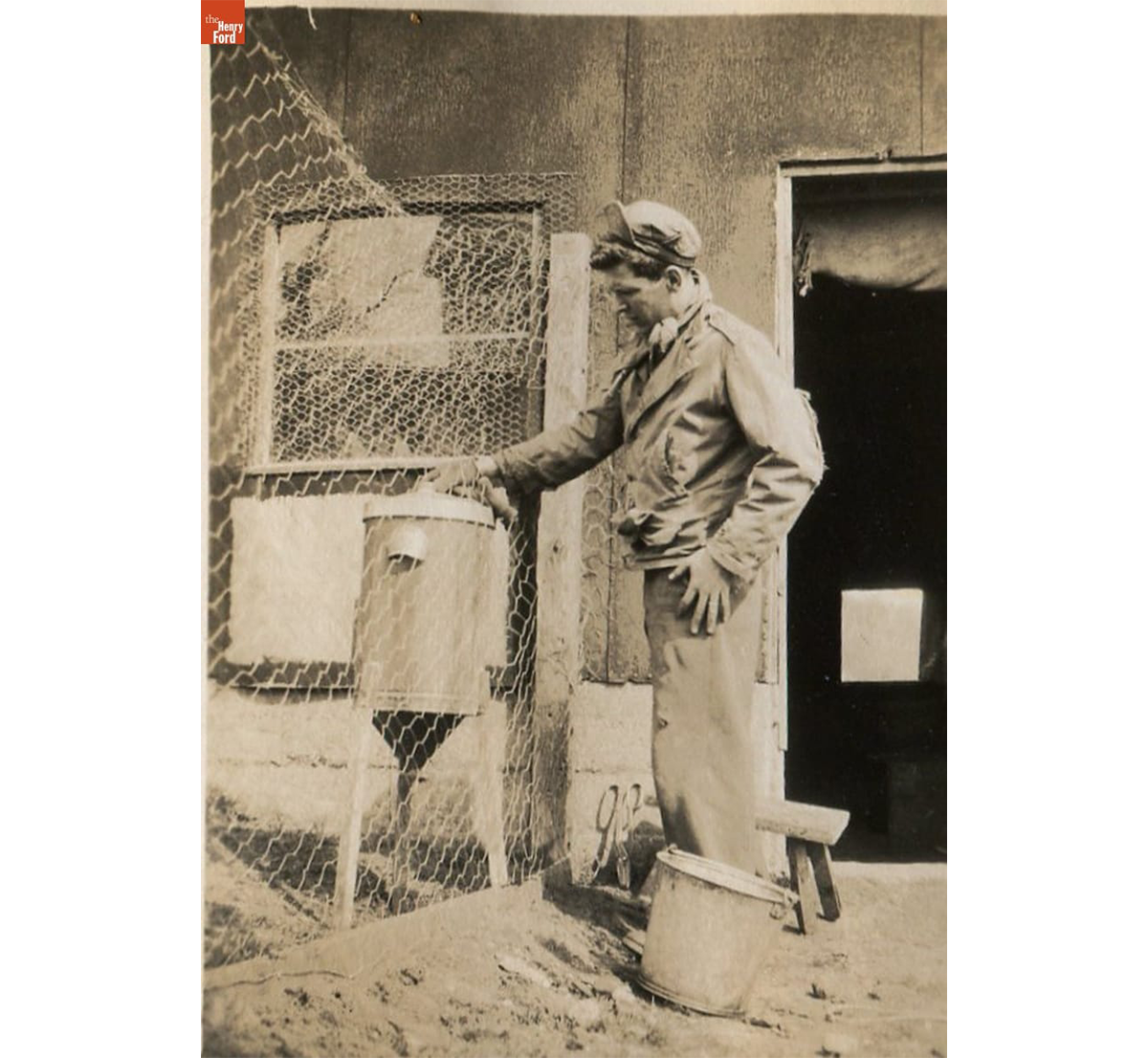 New chicken coop at the Kelley farm with feeder (likely a repurposed cream separator), 1948 / THF720526
The "Have-More" plan made clear that farm families raised livestock to meet their food needs. The Kelley family all pitched in to raise their food supply on their little farm. This included fresh dairy products that Lois poured over berries to make rich desserts that she gloated over, and fresh milk served with eggs and bacon at breakfast. Cow's milk helped fatten the calves and piglets that the family raised throughout the summer. The Kelleys also enriched the garden soil with the organic fertilizer that the livestock generated. This ensured the summer's bounty of vegetables and fruit. Then, in the fall the family had the grown steers and pigs butchered, and they wrapped the meat and stored it in the freezer.
The process began with the arrival of piglets.
The Kelleys secured their first piglets in May 1948. Then, Lois wrote to her parents: “from Pig Heaven, May 3, 1948 . . . our biggest thrill is the pigs. They're well settled, little and white and cute—and one has a black spot and a blackish ear so we can tell them apart.” Bob built a pen with chicken wire and barbed wire, and a three-sided shelter of scrap wood. Lois was gratified that the piglets, though they previously had only nursed from their mother, knew exactly how to “eat like pigs.” She explained to her parents that “They began rooting like old-timers, and the battle they had over a pan of milk was something to see.” She hadn't expected that the pigs would inspire three-year-old Bobby to mimic them. “There he was,” Lois wrote, “on his hands and knees trying to root in the ground with his nose—his mouth full of dirt.”
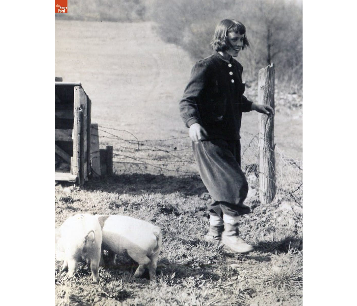 Lois Kelley with the first piglets, 1948 / THF720528
Three weeks later, on May 24, Lois wrote that “The pigs seem to be at least twice the size they were ... Their hide is so tough by now that they don't respond to a good healthy slap, and if they had the least desire, they could be outside their pen in two minutes. . . . It was tough enough to catch them before, and now . . . it would be a job to keep hold.”
In June, barely a month after the piglets arrived, Lois's naivete over their cuteness was over. She explained in a letter to her parents that: “Yesterday the 'black 'pig got out once too often—he'll never do it again. Both nasty animals are now settled in the cellar of the barn where we said it was utter inhumanity to keep an animal. They brought it on themselves, however . . . They're getting awfully heavy to move .. It'll be a relief to the neighbors too, who have helped me catch this one on the several past occasions when it's rooted out.” On October 9, she wrote that feeding them had “become quite dangerous—not that they're ferocious, but they're so eager to be fed that they swing their weight around with a terrible disregard for any one else's rights. I've given up going in—just the noises they make behind that door are enough to terrify me.”
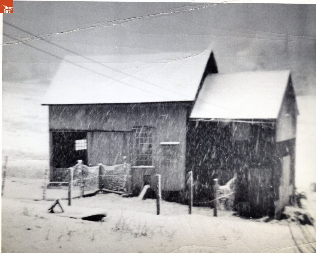 Kelley barn in a Snowstorm, 1948 / THF720523
November 3rd six months from the day the “cute” piglets arrived, they met their fate as provisions for the freezer. Lois wrote that the butcher dispatched them with his .22, bled them, “then drove off with them in his truck to scald, scrape, disembowel and chill them at his place.”
Lois and Bob cut and wrapped the meat from one of the pigs, weighing 154 pounds, and a neighbor took the other in trade for spring plowing. Together, they provided the following (plus sausage, head cheese and lard):
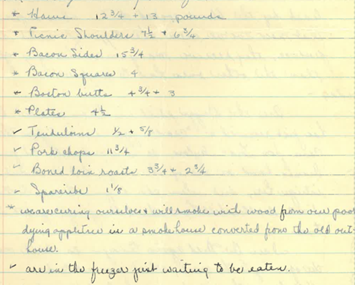 Detail from “Dear Mother and Dad” letter, November 3, 1948 p3. Image provided by Daisy Kelley.
The Kelley family prized the food in the freezer year-round, but the larder took on special meaning for the holidays. In August Lois began dreaming of Thanksgiving dinner. Would she serve turkey, capon, duck, rabbit, or broiled or fried chicken? Corn on the cob, raspberry or strawberry shortcake, tons of vegetables, blueberries, squash, ice cream? Lois's letters tell that when the first Thanksgiving on the farm finally arrived, duck was served. They were the same ducks Bobby had fed daily as part of his chores. “We are proud,” Lois wrote, “that though Bobby took care of them from the time Bob brought them home, he was just as interested in the killing, plucking, and eating of them as the rest of us.”
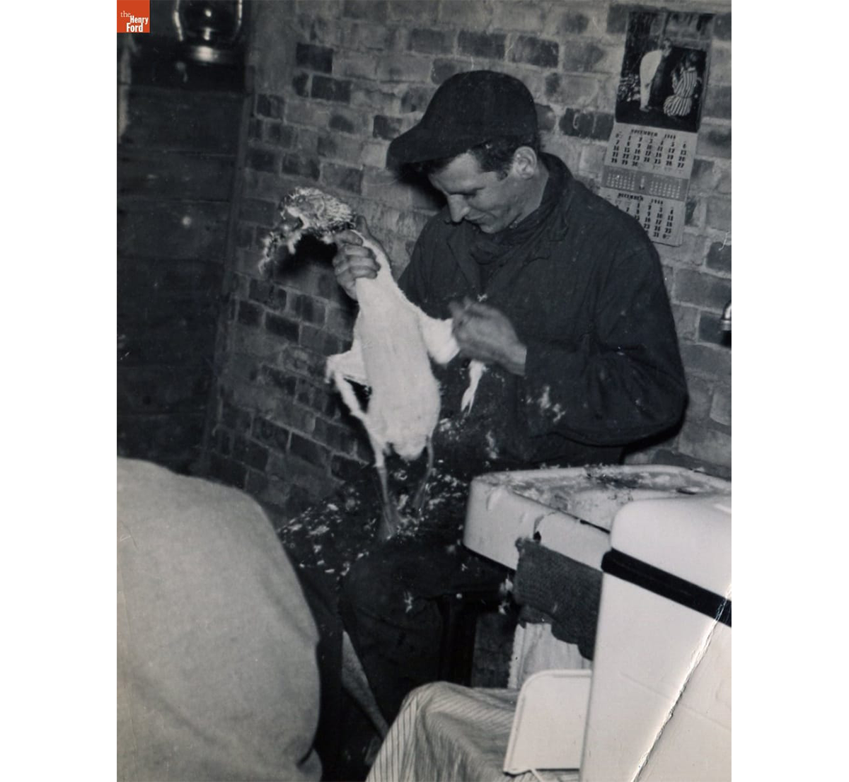 Bob Kelley plucking a duck on the night before Thanksgiving, November 24, 1948 / THF720524
On Christmas Day 1948, Lois and Bob took the first of the hams out of the freezer for dinner, a finale for that year’s pigs and for 1948, the family’s first year raising food on the farm.
This article was written by Diana “Daisy” Kelley, Curatorial Research Volunteer, The Henry Ford, with Debra A. Reid, Curator of Agriculture and the Environment, The Henry Ford. The stories and pictures are from the Lois Kelley collection at The Henry Ford.
You can read more about the Kelley family and their stewardship of a sugar bush on their second farm (another supplement to their food supply and their farm income) in the blog, "Maple Trees and Family: A Long-Term Relationship."
In early 19th-century America, life was changing fast. More Americans were venturing farther from home as the country expanded westward and new innovations in steam and rail transport made travel more accessible. This also meant that more Americans were dying far from home. Society, though, still viewed it as important that a person be laid to rest among their family; to not have this final closure would have been deeply upsetting.
New York stove maker Almond Dunbar Fisk found himself in this very situation when his brother, William, died in Mississippi in 1844. Fisk’s family was unable to have William’s body returned to New York to be buried in the family plot, and the sorrow of the situation propelled Almond to look for solutions for families in similar situations. After applying his own knowledge of creating furnaces and boilers and consulting with experts in organic decomposition, in 1848 Fisk was granted a patent for an airtight cast iron coffin. With his father-in-law, Harvey Raymond, Fisk opened “Fisk and Raymond” in Manhattan and began selling his iron coffins.
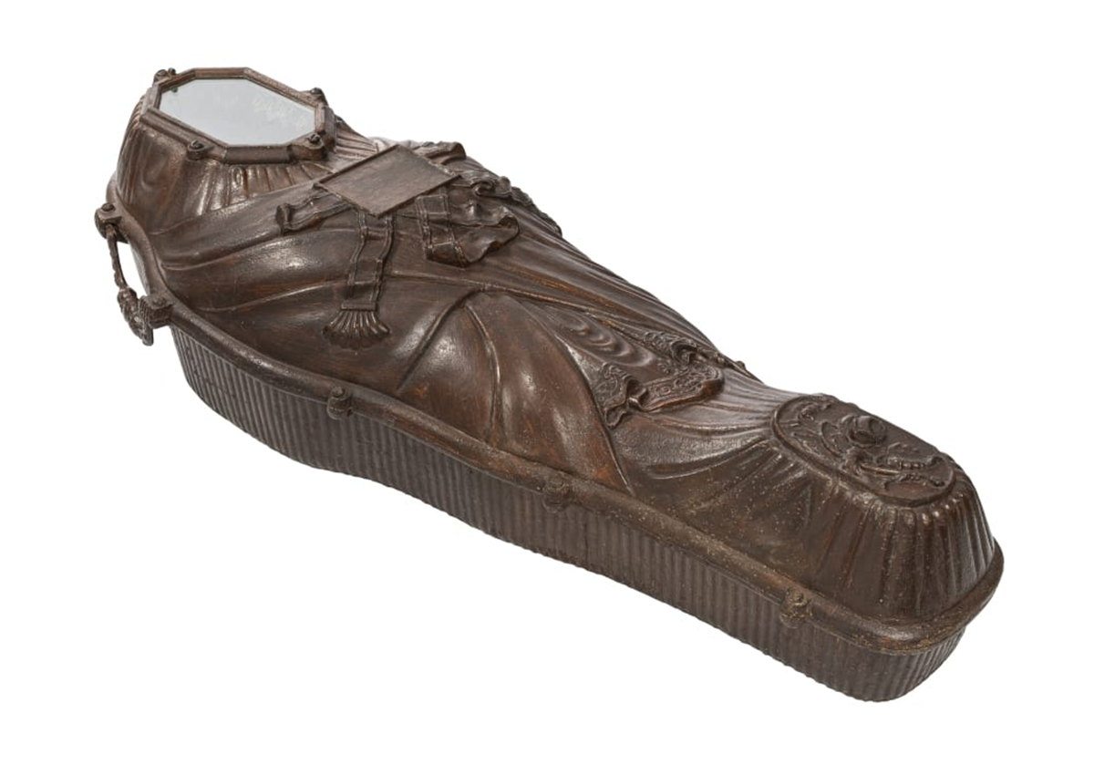
Mummiform Iron Coffin, 1854-1858. This small coffin is unused and was possibly kept as a sales sample. / THF370110
Once thought to be only the privilege of the wealthy, more recent evidence and research suggest that iron coffins were relatively popular in the years before embalming became a common practice around the time of the Civil War. This makes sense when you consider how many practical issues the iron coffin addressed, beyond just body transport. Cholera was plaguing the nation, and the airtight seal of Fisk’s coffin design helped assuage fears of spreading the disease (as cholera is one of the incredibly few diseases that can be contagious even after death). Fisk and Raymond also advertised their coffins as a deterrent to grave robbery, although the fear of such acts was perhaps more prevalent than the act itself.
Iron coffins would be used or endorsed by several notable figures, including Henry Clay, Daniel Webster, James Monroe, Dolley Madison, John C. Calhoun, and Zachary Taylor. But they also received a bit of notoriety for another reason: anecdotes relating how they would occasionally “explode.” One such story in the September 4,1886, issue of Scientific American is fairly typical of the reporting of such stories: while waiting for family to return from out of town to arrange for a proper plot, a body was buried in a metal coffin in a temporary grave. When the final resting place was ready, the body and coffin were exhumed, and a family member asked to see their loved one’s face in the little glass window. The metal lid over the face was removed to reveal a glass viewing window, and the face was there—perfectly preserved. While the coffin was left briefly unattended before burial, “an explosion of gas ensued, shattering the glass . . . into numerous fragments . . . The report of the explosion was equal to that of a dynamite cartridge.” While it is in fact true that the buildup of gas inside the coffin could cause the glass to fracture and then break, particularly if there was a change in temperature, the strength of the “explosion” was often overstated for the sake of a more sensational story to tell.
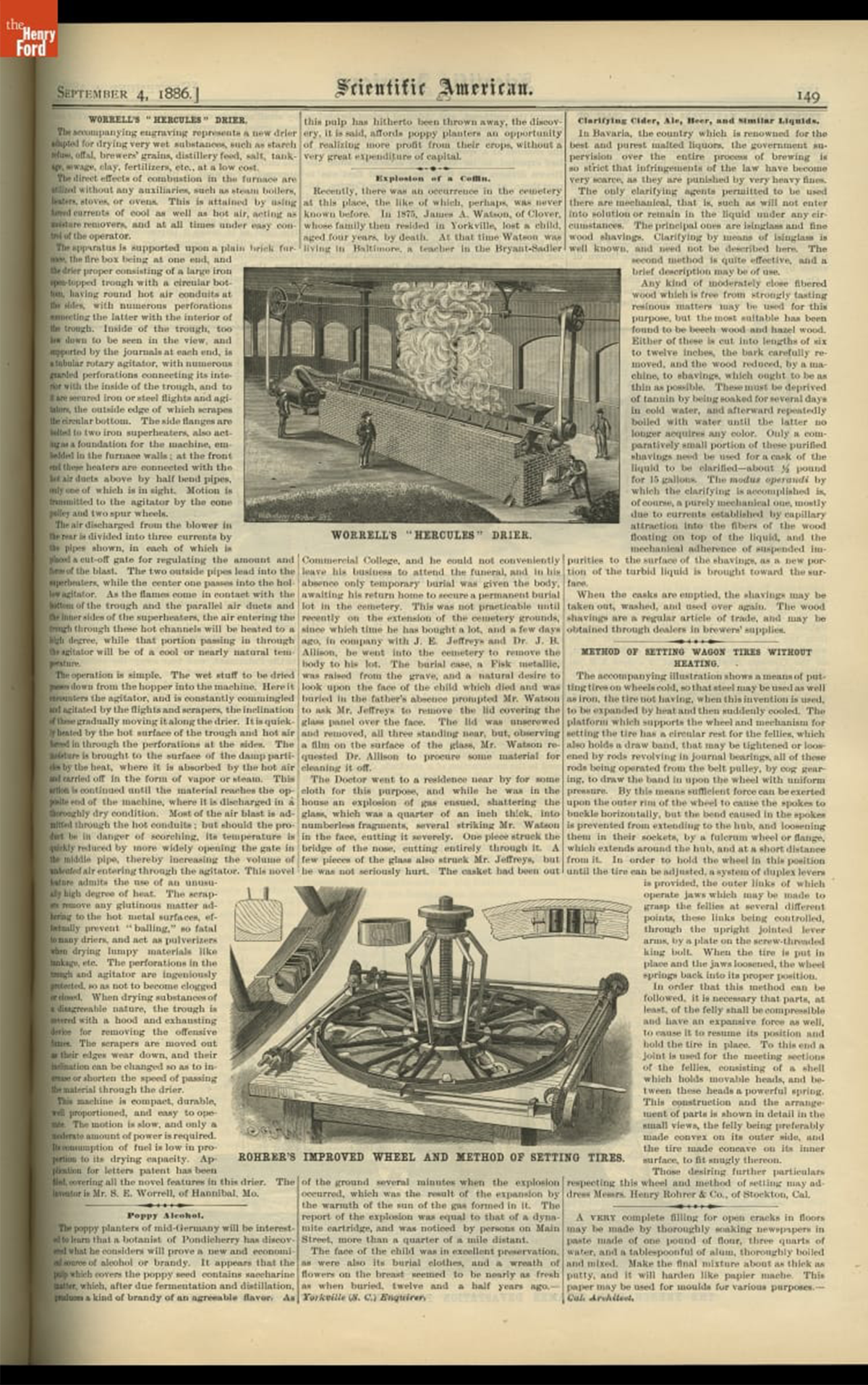
Scientific American, Vol. 55, July-December 1886. The story of a Fisk coffin rupturing is found in the center column, under "Explosion of a Coffin.” / THF705631
While “Fisk coffins” or “Fisk burial cases” would become the shorthand for these iron coffins, Fisk and Raymond was not the only manufacturer. Through a combination of licensing the manufacturing rights, the patent changing hands, and changing company names, iron coffins were produced by companies including: W.C. Davis and Co.; Crane, Barnes and Co.; Crane, Breed and Company; W. M. Raymond and Company; and Metallic Burial Case Company. While production of these metallic coffins would cease around 1889, remaining stock continued to be sold until the start of the 1900s.
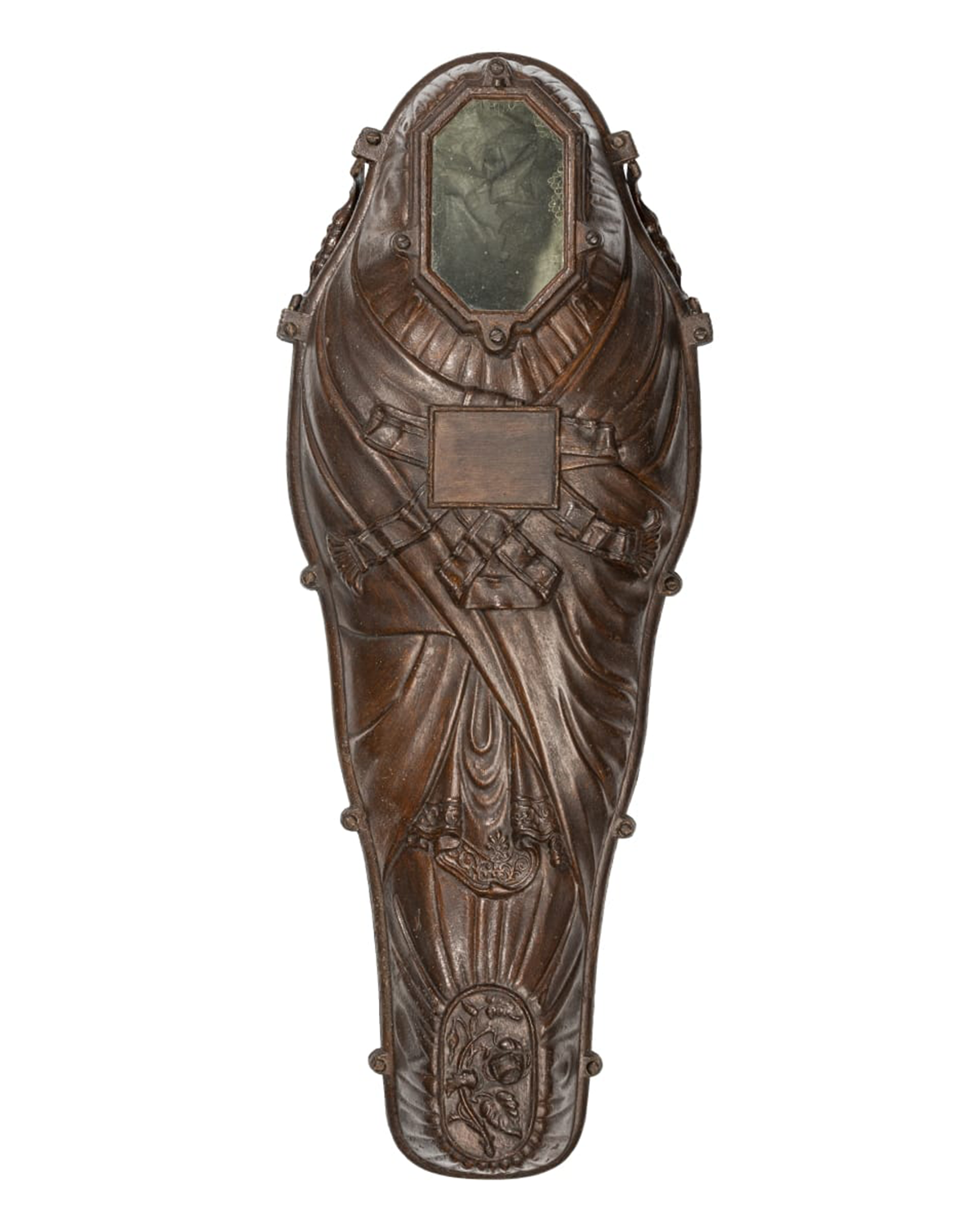
This “Fisk coffin,” produced by Crane, Breed and Company., maintains the mummiform shape of the original Fisk patent, but its decorative design is distinct to the manufacturer. The coffin mimics the folds of a burial shroud, and the rose at the foot is a common burial symbol, often used on headstones to convey various meanings. / THF370111
The Henry Ford is lucky enough to have one of these coffins in our collection—joining institutions such as the Memphis Museum of Science and History, Museum of Appalachia, the LSU Rural Life Museum, the Simpson Funeral Museum, and the Smithsonian. It provides a beautiful example of Fisk’s invention, and demonstrates the importance of keeping our loved ones close—even after death. Together with objects like our burial quilt, mourning jewelry, and items related to Dia de Muertos, our death-related collections paint a picture of the myriad ways grief, mourning, and remembrance manifest themselves. Macabre as these items may be to some, we need only dig a little deeper to see that they contain stories of great love and care.
Rachel Yerke-Osgood is an Associate Curator at The Henry Ford.
With gratitude to Scott Warnasch for sharing his detailed research.
In this interview, Jeanine Head Miller (Curator of Domestic Life), and Charles Sable (Curator of Decorative Arts) sat down with Kristen Gallerneaux (Curator and Editor-in-Chief of Digital Curation) to share their efforts to restore the interiors and furnishings of The Jackson Home. This article is part of an ongoing series focusing on the history, preservation, and restoration of the landmark Jackson Home experience, slated to open in Greenfield Village in Summer 2026.
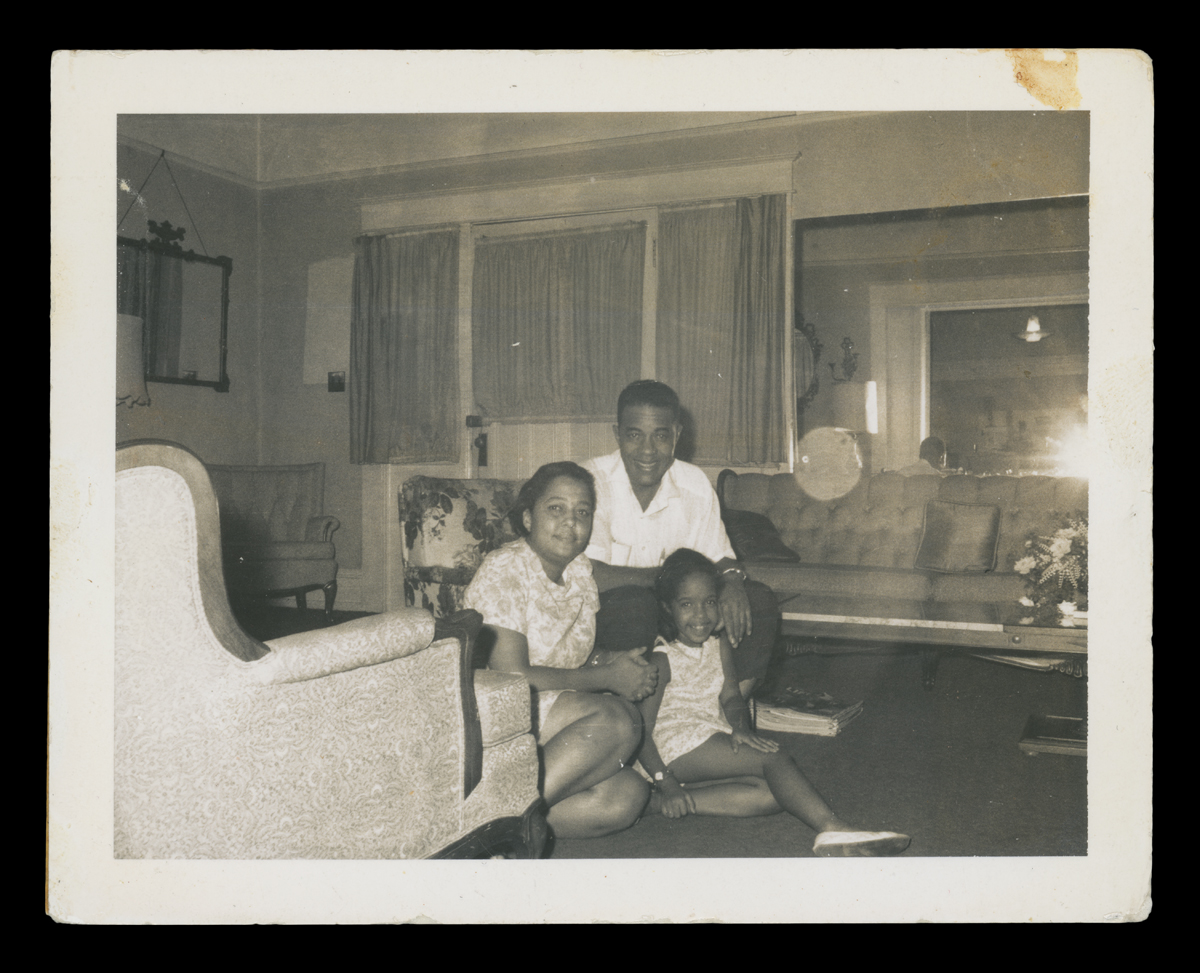
Dr. Sullivan, Richie Jean, and Jawana Jackson in their living room, 1960s. / THF708482
Kristen Gallerneaux: The Jackson Home project has been a very complex undertaking. You have both spent a large part of your respective careers at The Henry Ford, and you each bring complementary forms of expertise to the project through your knowledge of the histories of domestic life and decorative arts. How do your collection responsibility areas complement this project? And in turn, how does your expertise work in collaboration with the rest of the Jackson Home team?
Jeanine Head Miller: Historical environments — like the Jackson Home — help a story come to life by creating the illusion of time and place. Our goal is to return the Jackson Home to its 1965 appearance as closely as possible, the date of significance for the home’s story. As Curator of Domestic Life, my focus is the history of the American home and how domestic settings reflect changes in American society through time — and what those changes meant for people living in a particular time and place. For the Jackson Home, this requires developing an understanding of the lives of the Jackson family of Selma, Alabama, and the world they lived in — and how that story should be reflected in the way the home is furnished. So, our team thinks about how the Jacksons, and others who came to the house, interacted with the space and the objects in it. We use furnishings and accessories to suggest the presence of these individuals and their activities.
Charles Sable: My background is in the history of the decorative arts, specifically, furniture, glass, ceramics, metals, and in a larger context, the history of interiors. In this case I take my knowledge of mid-20th century decorative arts and apply it to the Jackson House story. In this project I examine the period photographs in great detail and work with what we have from the family. Then I collaborate with the team to accurately portray how the home was lived in. The goal is to show our guests what life was like for the Jackson family in 1965.
KG: Are there any unique layers of history and interpretation in this project that differ from previous Greenfield Village projects?
JHM: The Jackson Home is very different! Greenfield Village is filled with buildings dating from the 1600s to the early 1900s — buildings from bygone eras. The story of the Jackson Home dates to the mid-1960s, making it by far the most modern experience encountered in a Greenfield Village building. (The Jackson Home will be the only historic house in Greenfield Village with an indoor bathroom and a driveway!) It also dates from an era within the the living memory of many people today.
With the Jackson Home, we are very fortunate. We have an unusual number of available research resources on the history of the home and its occupants. Vintage photographs taken in the home, Richie Jean Jackson’s 2011 book, House by the Side of the Road, and her oral interviews, as well as the recollections of her daughter Jawana and others, help guide us in restoring the home to its 1965 appearance. We have more information about the 1965 appearance for some rooms (the living room) and less for others (the bathroom and music room). So, we must use our understanding of the Jacksons and the era to determine additional objects or accessories with which to furnish the home.
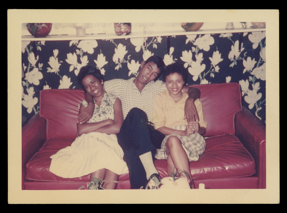
1960 photo of three people sitting on a couch in the Music Room. Behind, you can see a hint of the curtains. / THF731071
This home offers a significant, entirely new story to Greenfield Village. It reflects the lives of middle-class Black professionals in the mid-20th century segregated South and their key role in supporting the voting rights movement, as well as the efforts of the Black community that led to the marches — and ultimately to the Voting Rights Act of 1965.
CS: This project is radically different from other Greenfield Village homes. We have much (nearly two thirds) but not all of the family’s furnishings. This creates opportunities and challenges. This house was built in 1919 occupied consecutively by three families until 2010 or so. We have literally generations of furnishings given to us by the Jackson family. We spent a great deal of time examining the contents to identify objects dating to our period of interpretation, the early 1960s. In the process, we’ve learned much about the Jacksons and their predecessors’ tastes.
We know that Richie Jean and her husband, Dr. Sullivan Jackson, moved into the house shortly after their 1958 wedding. They shared the house with Mrs. Benny Portlock, a widow, who had lived in the house since 1940. Over a period of four to five years, Richie Jean Jackson redecorated the house to her own taste, called “transitional.” This was a popular style in the 1960s, incorporating historical with more modern elements. Once we learned Richie Jean Jackson’s aesthetic, combined with a knowledge of “transitional” style, we were able to gather what we need to tell our story.
KG: Can you talk about some of the interesting problems — and importantly, the solutions — that have emerged so far in your work on the Jackson Home? Are there particular rooms or interior spaces that you’ve spent more time on than others?
CS: The most important room in the house is the living room, which is where the Jacksons, Dr. Martin Luther King Jr., and many associates gathered on March 15, 1965, to watch President Johnson deliver his televised speech to Congress on the Voting Rights Act of 1965. This gathering was photographed for an article in Life Magazine. It gives us unprecedented documentation of the room – so we know exactly what was there — which is a blessing and a challenge. We have most of the items, but finding missing objects is difficult since our knowledge of them is so specific.
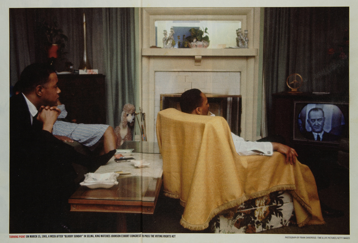
Dr. Sullivan Jackson (left) and Dr. Martin Luther King Jr. (center) watch President Johnson’s televised speech on March 15, 1965 in this Life magazine photograph. / THF724118
A good example is the living room oval mirror. Fortunately, the mirror came to us with the contents of the house—unfortunately, the pair of matching sconces did not. The back of the mirror revealed a maker’s label, “Syroco,” for the Syracuse Ornamental Company, Syracuse, New York. With this information, we searched for the matching sconces for sale online. We additionally used the Google Lens app as a shortcut to find replacement sconces. This has proved a great strategy for finding a number of other items for the house.
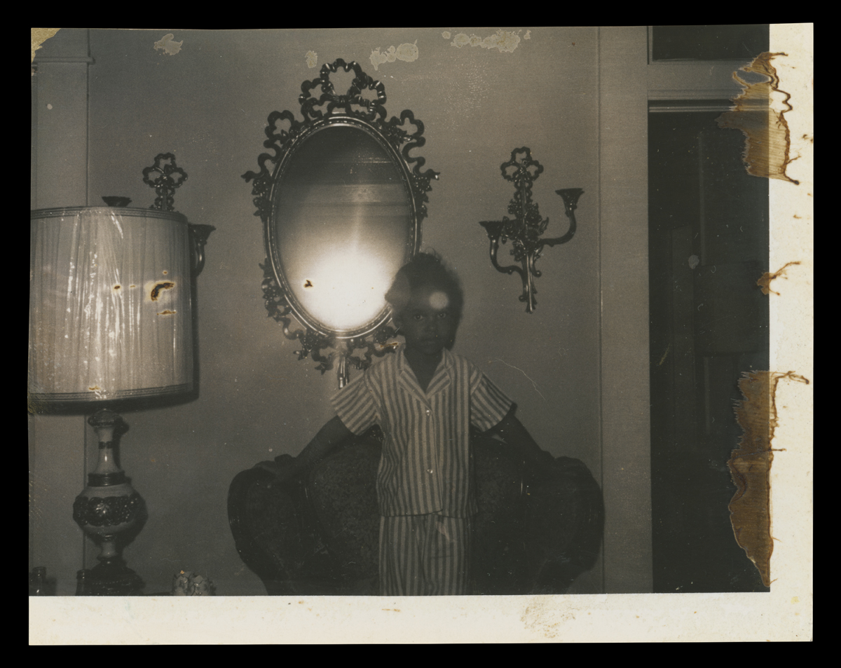
Jawana Jackson, the Jacksons’ daughter, in front of the mirror and sconces about 1965. / THF708621
JHM: The detective work for the kitchen has proved to be somewhat of a challenge. There were lots of changes from 1919 to 1965, as each of the three families who lived there placed their personal stamp on the room. We peeled back the layers of paint, wallpaper, and floor coverings both literally and figuratively. Then put the physical clues together with what we know about the home’s residents over time to discern what the kitchen looked like in 1965.

Wall treatments went from paint to wallpaper and back again. “Ghosting” on the wall revealed placement of objects like the range hood and a cupboard. / Photo by The Henry Ford
KG: How are you working with the Jackson Home team to ensure those important “lived moments” that occurred in the house are preserved and shine through for guests?
JHM: We are ensuring that the appearance of the interiors not only align with the historical images of the home, but that furnishings and supporting objects allow our visitors to not only see and hear the story — but help them to feel it as well. Each room has a theme to convey, so the objects in the room — and their placement — must provide visual support for each story. Even the bathroom will play an important role. It will reflect the theme “Care & Keeping,” indicating the hospitality, support, and safe space that Richie Jean and Sullivan Jackson provided during this crucial time. Many people involved with the movement stayed at the house. So, this room will contain extra towels, toilet paper, and toiletries, along with a pillow and blanke t— one person even slept in the bathtub.
CS: The bedroom of the Jackson’s 4-year-old daughter Jawana conveys the theme “Safety & Youth.” The room will juxtapose the innocence of childhood with racial discrimination — and her parents’ desire to assure their child a better future. The walls were, and will be, decorated with images of nursery rhyme characters and children praying.
Jawana Jackson (with a babysitter) in her bedroom, about 1968. / Edited from THF708616
KG: What has been the most challenging interior “object” (broadly speaking) that you’ve had to seek out, replace — or re-create so far?
JHM: Finding the appropriate refrigerator is proving quite a challenge! A photo taken in the kitchen of the Jackson home about 1961, shows that the family owned a white Frigidaire Lacework Styling freezer-on-top refrigerator model — a 1959-only design. (The handle on the Jackson refrigerator was a model only made one year by Frigidaire.) This refrigerator — along with a matching white stove — appears to have been still in place in the Jackson house kitchen in 1965, our period of significance. If anyone knows where one of these illusive refrigerators might be, please let us know!
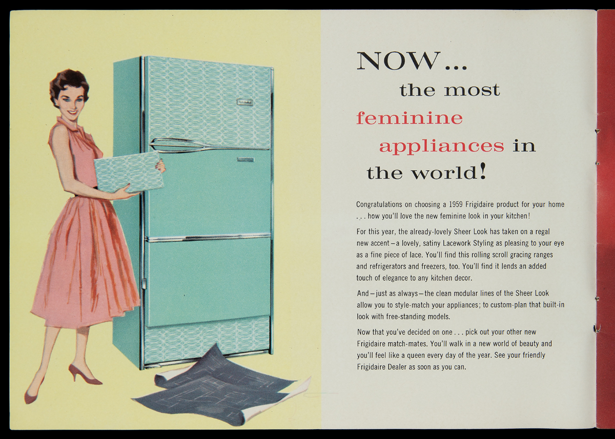
A turquoise version of the 1959 Lacework Styling Frigidaire model, shown in a trade catalog. / THF717091
CS: One of the most difficult objects to replace was a common piece in the 1960s — a brass, floor to ceiling tension pole that held a wire support to display vinyl record albums. This was in the music room. These tension poles were a fad of the period and were out of fashion by the 1970s. With the current public fascination with mid-century modern decoration, these tension poles are difficult to find. When they come up for sale, they quickly disappear, and they can be expensive. After several near misses, our diligent staff located a great example.
The album holder appears in this photo of the Jackson Home music room, taken about 1990. / Image 8591, courtesy of the Jackson family
KG: Any major surprises or favorite moments so far — or things that I haven’t thought to ask that you would like to talk about?
JHM: We had been told that the bathroom sink that came with home was a later replacement. Maker name and model number in hand, we found the sink in a period Kohler catalog. It IS the original Jackson sink!
CS: One of my favorite outcomes is the conservation of the chair that Martin Luther King was seated in during President Johnson’s speech. This venerated upholstered armchair came to us needing some tender loving care. Through careful conservation, the original upholstery was stabilized and preserved for posterity.
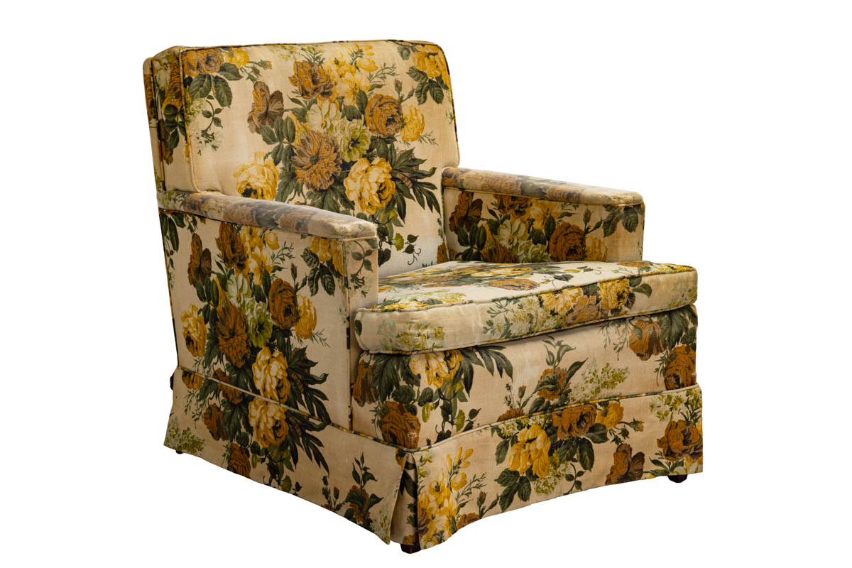
Chair in which Martin Luther King Jr. was seated during President Johnson’s televised speech. / THF804175
Jeanine Head Miller is Curator of Domestic Life and Charles Sable is Curator of Decorative Arts at The Henry Ford .
At The Henry Ford, we often think of the countless stories of innovation that our institution can tell through archival materials—from the automotive parts drawings to the Bill Stumpf and Robert Propst design collections. Beyond these examples, there are many stories of American life in the last few centuries. Materials collected over the years document different aspects of life, both public and private, and tell stories of how society has survived, as life changed rapidly. We turn to museums and archives to tell “the big stories” of the past. But what about the small ones, the ones that go unnoticed? These hidden gems are often what tell us the most about what life was like, because they highlight what was most precious to the average person.
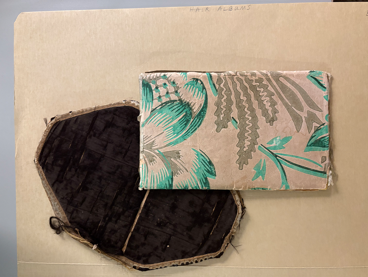 Two hair albums in the Collections of The Henry Ford, Acc. 56.40.1 (top) and 38.509.1 (bottom) / Photo by Staff of The Henry Ford
Finding these hidden gems in an archive is not as uncommon as you would think, especially when you have a collection the size of The Henry Ford’s. When I first started as a processing archivist, I decided to look through some of our unprocessed boxes to get a better idea of what items were in our holdings. This is how I found a folder labeled “hair albums,” containing two albums (as seen above) from 1850 and 1858, belonging to Sarah Smith and Chloe Thayer, respectively. At the time, I didn’t know what treasures I was holding, but through meticulous research and curiosity, I have unearthed powerful stories connected to everyday life in the mid nineteenth century.
What is a hair album? Sometimes called autograph albums or friendship albums, hair albums contain locks of hair along with verses from friends and family. They come from the Victorian era, largely in the time span of 1850 into the early 1900s. This era is notably remembered for its mourning practices. Many will be familiar with hair wreaths and hairwork jewelry that was created as a way of memorializing the dead. Hair albums, however, were created with the purpose of showcasing friendships and the ties that bind people together, not just to memorialize a life. For example, hair albums were sometimes made as farewell presents for women who were getting married and moving away. At a time when photographs were not common in use or availability, giving a lock of one’s hair was a very real representation of giving a piece of oneself to be remembered by. As author Neely Tucker wrote in an essay on this topic, “People might go months or years between seeing one another; a lock of hair was a meaningful talisman.”
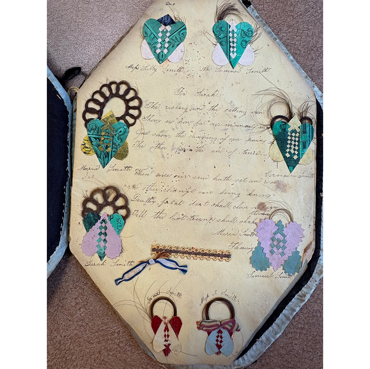 Opening page of Smith Album, Accession 38.509.1 / Photo by Staff of The Henry Ford
After I discovered what a hair album is, and why they were made, I started looking for examples held in other institutional collections to compare notes. I wanted to find out how they described these albums, which then informed me how to describe the Smith and Thayer albums at The Henry Ford. The Newberry Library has a lovely hair album from 1845 available in their digital collections, which is similar in look to the Thayer Album. Harvard and Pennsylvania State universities also have hair albums in their collections. I reached out to Penn State to see if their processing archivist who worked on their albums would be willing to answer questions I had about their process, but unfortunately that person had long since retired. My next idea was to contact an expert on hair albums and ask them what they look for in a successful archival finding aid, which is used by researchers to find materials they want to review.
This led me to Dr. Helen Sheumaker, a professor at the University of Miami in Miami, Ohio, and author of Love Entwined: The Curious History of Hairwork in America. Dr. Sheumaker's book was one of the first sources I found that discussed hairwork outside of the context of the history of mourning, and after I read through it, I felt that she would be a good resource for me on this project. She graciously agreed to a virtual meeting, where we could review the hair albums in the collections of The Henry Ford, and to help me come up with descriptive terms for them.
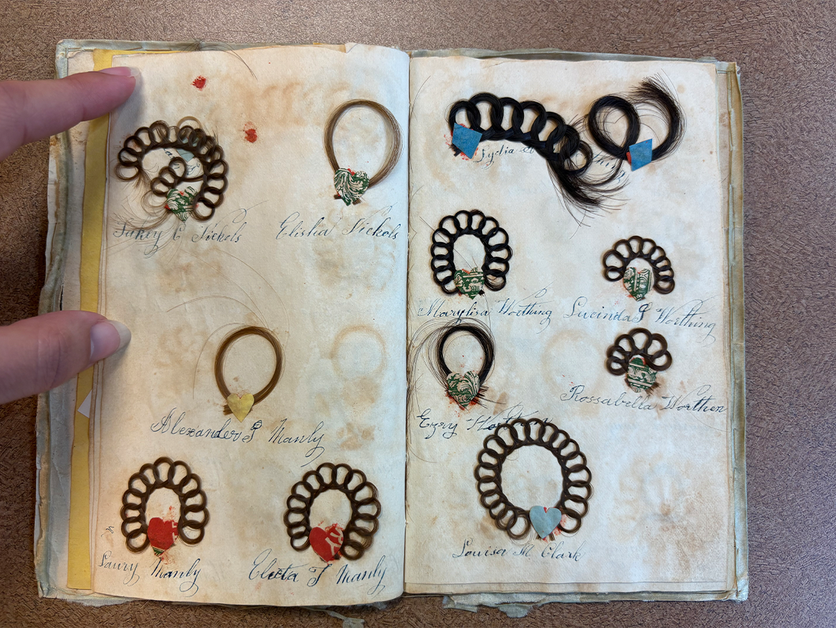 Pages from Thayer Album, Accession 56.40.1 / Photo by Staff of The Henry Ford
While each album is unique, they have similarities. For example, locks of hair are arranged in familial groups, with persons of the same last name presented together. Both books are handmade and likely made with repurposed materials like wallpaper or dress fabric. The Smith Album in particular shows signs of hand stitching along the edge of the cover. The handwriting throughout the books is consistent, giving the impression that the creator collected the materials and assembled the book later. But what is different?
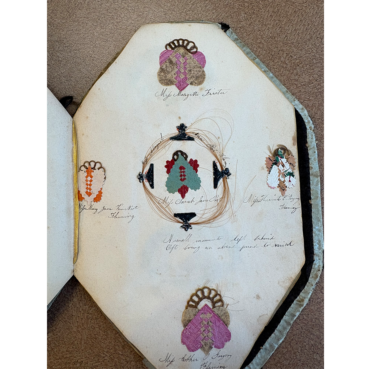 Pages depicting different colored woven hearts in Smith Album, Accession 38.509.1 / Photo by Staff of The Henry Ford
The Smith Album is more ornate of the two, which can be seen from the intricacy and detail present on each page and the elongated octagon shape of the album. When comparing the hair looping and braiding between the two albums, the Smith Album shows precision to detail, while the Thayer Album contains more loose hairs. The woven hearts holding the hair in place in the Smith Album vary by page and appear to be collected from the donor. This is not the case with the Thayer Album, with blue and pink paper being used throughout.
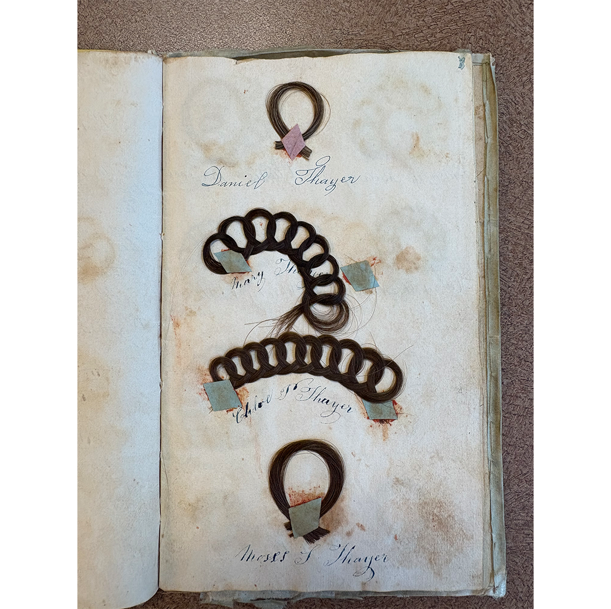 Pages from Thayer Album showing simple hair loops, Accession 56.40.1 / Photo by Staff of The Henry Ford
These differences may be due to the ages of the two women creating the albums, as it is likely that the Smith Album was created as a going away present for Sarah Smith's wedding while Chloe Thayer was a young schoolgirl. Understanding these foundational differences provides the context necessary to accurately describe these materials. Talking with Dr. Sheumaker, I was able to grow my knowledge of hair albums, and also determine a strong vocabulary needed to make them rise to the surface for future researchers. While not every archival processing story involves this level of research, most do involve a level of curiosity and a passion for discovery. Understanding the details is crucial, especially in the moments when you find yourself describing the little stories—like friendship—to make materials like these viewable within our collections.
Regina Parsell is a Processing Archivist at The Henry Ford.
