
Posts Tagged by andy stupperich
The modern-day commercial Christmas card traces its origins back to England in the early 1840s when Henry Cole distributed holiday greetings on a card designed by John Callcott Horsley. The first American Christmas card appeared several years later. The innovative idea grew slowly in America until Louis Prang (1824-1909), a Boston-based German immigrant printer, educator, and colorist renowned for his chromolithographed artist prints, began creating small Christmas cards for the American market in the mid-1870s. His colorful holiday greetings were not much more than an extension of his business and trade card production. Prang's first cards featured an image of flowers with a brief holiday message—not the typical Christmas imagery found on cards today. Still, it was a successful enterprise. By 1880, Prang was selling nearly five million holiday cards a year—some now assuming more distinctive holiday themes. Also in 1880, he initiated a series of artist-designed Christmas card contests that attracted the public's attention and helped secure an annual holiday card-giving tradition. For these efforts, many consider Prang the father of the American Christmas card.
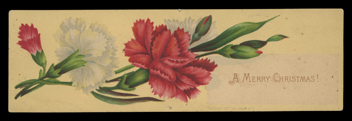 An early Prang Christmas card, 1877. / THF728302
Prang's Christmas Card Competitions
Louis Prang aspired to educate Americans about art through his chromolithographs, and his production of Christmas cards provided a unique opportunity to continue that passion. In the spring of 1880, Prang arranged an art contest for holiday card designs. He gathered several notable designers, architects, and artists to judge the competition. The cards would be exhibited at the American Art Gallery in New York, and prize money, totaling $2,000 for the top four designs, would be awarded. There were more than 800 entries. Prang would receive the winning entries from which he produced Christmas cards. Winning artists received recognition with their names placed on the backs of the cards, along with their prize position and the amount of money won. Prang also reserved the right to purchase any other card design that met his approval for production.
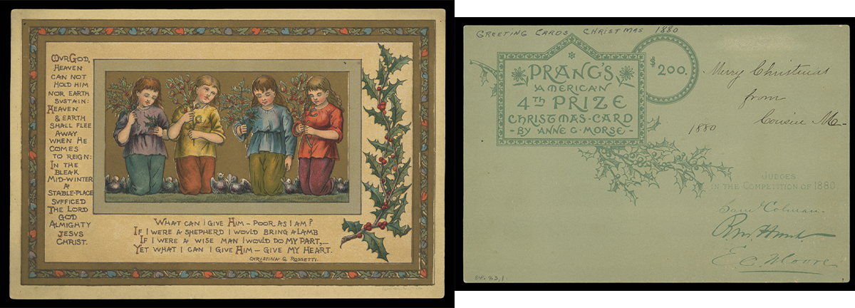 Anne G. Morse's design won fourth prize in the 1880 card competition. / THF716793 and THF716794
The public loved it. In February 1881, Prang held a second competition and exhibition. He again assembled a group of well-qualified judges, this time to assess nearly 1,500 entries.
 Charles Caryl Coleman won third prize in the February 1881 competition. / THF716795
After this second showing, Prang conducted another round of card design competitions later in November 1881 (for 1882 production cards). Entries poured in. And the public flocked to the two exhibitions at New York's American Art Gallery. These showings piqued the public's interest even more because exhibition-goers now could vote for four popular prize award winners, alongside the jury awards. Art critics, however, questioned the quality of what they considered a flood of amateur works.
 The fourth artist's prize for the November 1881 contest went to Alfred Fredericks. / THF716799
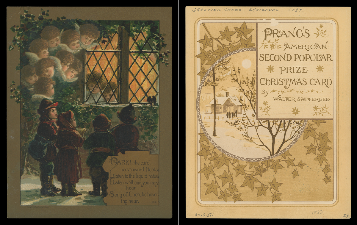 The November 1881 contest included popular prize awards. The exhibit going public gave the second popular prize to genre painter Walter Satterlee. / THF716797 and THF716798
Prang decided to halt the contests after this competition. He had sparked the public's desire for art all too well, but the overwhelming number of amateur works held little value for Prang, artistically or monetarily. Also, design and literature competitions held by other companies (copying Prang's initial success) began to fail as professional artists and authors refused to submit their works to exhibitions awash with amateur entries. Prang would hold one last competition at the end of 1884, but limited the entrants to twenty-two selected artists. Judges would select four artist design winners—and only later would the public award one popular prize.
After the Competitions
Prang continued to produce Christmas cards after the run of competitions. But times were beginning to change. Other companies copied Prang's success, marketing their own fringed, tasseled, and colorful Christmas cards. Foreign printers also provided inexpensive alternatives, with some American producers contracting with German publishers to create colorful cards. With the flood of cards, Americans could now buy and send reasonably priced Christmas greetings to friends and family. Prang, however, still wanted his cards to meet his exacting standards, adding to the production time and cost. Consumer tastes also shifted. By the early 1890s, the large, frilly, high-priced cards—seen more as gifts than as greetings—began to fall out of favor in America. Prang, too, refocused and began to concentrate on other printing ventures, especially educational materials—a passion he had since his early years as a printer. The aging chromolithographer, credited as being the father of the American Christmas card, had, for all intents and purposes, left the holiday card market.
Andy Stupperich is an Associate Curator at The Henry Ford.
Alice in Wonderland pop-up book by Vojtěch Kubašta, c. 1960.
Vojtěch Kubašta is a name unfamiliar to most Americans. It's not surprising, as Kubašta lived and worked in Prague, behind the Iron Curtain in what is now the Czech Republic, for most of his life. But his name is revered among lovers of pop-up and movable books. He was an innovative storyteller, blending his deceptively simple artistry with imaginative movable and pop-up designs. His quiet ingenuity influenced and impacted others who created three-dimensional books, ushering in a resurgence of pop-ups.
Vojtěch Kubašta (1914-1992) was born in Vienna, Austria, but his family soon moved to Prague in what is now the Czech Republic. At an early age, Kubašta knew he wanted to be an artist. As a boy and young man, he filled pages and pages with drawings, sketches, and illustrations. In the early 1930s, he enrolled in the Czech Polytechnic University in Prague, studying to be an architect—a discipline that allowed him to do something with his hands and later helped him design movable and pop-up books. His university friends remembered Kubašta as an artist who studied architecture.
Kubašta honed his artistry and design skills over the next few decades. In the late 1930s and early 1940s, Kubašta designed stage sets for puppet theater -- a growing artistic movement in Czechoslovakia during the interwar years. (This experience, too, influenced his later mastery of movable and pop-up designs.) He taught graphic design. Kubašta also worked for a local plastics company, designing household items and creating marketing and advertising promotions. And as war engulfed Europe and the Czech people were overrun by Germany, Kubašta avoided run-ins with the Nazi occupiers, illustrating literary classics, fairy tales, children's books, and local interest subjects that appealed to national pride.
Kubašta continued his artistic journey after the end of World War II and the communist takeover of then-Czechoslovakia. Prague's printing industry had survived relatively intact, but communist control and censorship severely limited publishing output. Many Czech publishing houses closed. Yet, Kubašta persevered, creating advertisements and promotional materials and illustrating books, maps, posters, and other ephemera for several state-run agencies. He also devised ads with movable elements while working for the Czechoslovakian Chamber of Commerce.
In 1953, Kubašta began working for Artia, the state-run publishing and trading house. He offered his first pop-up book to Artia a few years later. Although he considered this first attempt crude, he would soon master the technique. Kubašta would add movable elements and create visuals to his pop-up books that extended beyond the pages, soaring over the book's flatness. Many of these pop-up books employed a stage-like setting -- pages with text parallel to the spine and that opened to a 90-degree angle to reveal three-dimensional scenery. These books' designs drew on his training as an architect and his work in puppet theater.
However, it wasn't only the three-dimensional elements that made Kubašta's books special. His richly colored illustrations are deceptively simple, filled with wit, humor, and little surprises. Kubašta masterfully blended two- and three-dimensional artistry, creating a visual unity to capture the imaginations of children and adults alike.
In the late 1950s and early 1960s, Artia contracted with several publishing houses in Western Europe, like Bancroft & Company of Westminster, London, to distribute Kubašta's works. Some of these children's storybooks made it to the United States. Alice in Wonderland, produced around 1960, displays the talent of Kubašta: soaring pop-ups, an innovative front cover (a die-cut opening covered with cellophane representing the rabbit hole), and bright, detailed illustrations with delightful surprises.
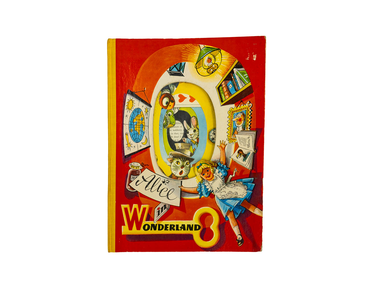 The oval die-cut opening on the cover is lined with cellophane, resembling the rabbit hole down which Alice fell. When closed, the images in the first pop-up are skillfully layered, allowing the reader to view some of the characters without opening the book. Kubašta was known for adding unusual materials, such as cellophane and foil, to his books. / THF803657
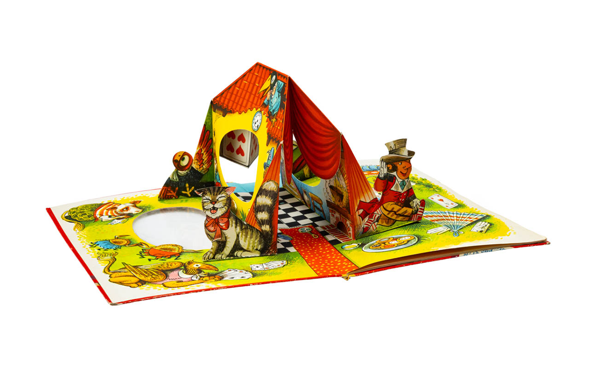 Open the book and discover this colorful pop-up filled with delightful illustrations depicting characters and images from Alice in Wonderland looming over the page. / THF803671
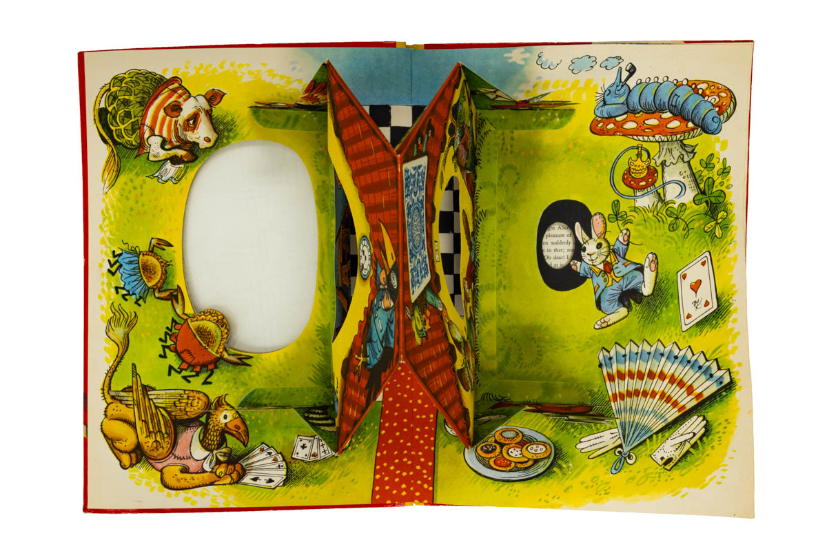 The front pop-up seen from above shows how Kubašta designed the cellophane-covered die-cut to reveal images. Note the large oval on the front cover (left), the oval cutouts in the pop-up house, and the smaller oval on the right (next to the rabbit) showing some of the book's text. / THF803658
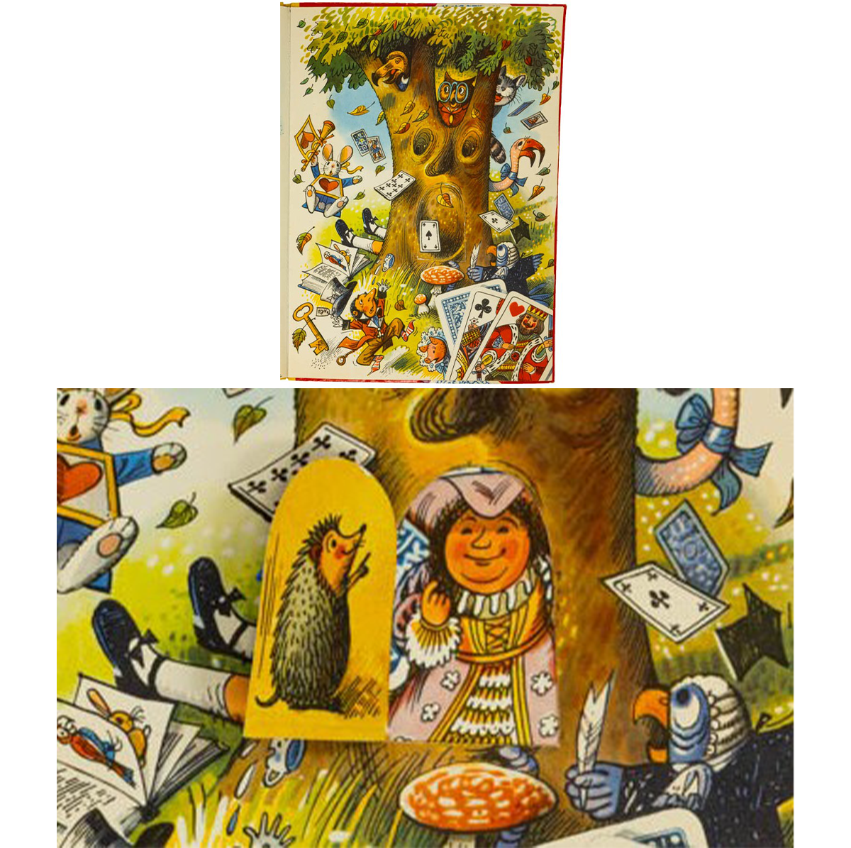 In an illustration at the end of the book, a hidden door in the tree opens to reveal an extra little surprise. / Details of THF803667 and THF803669
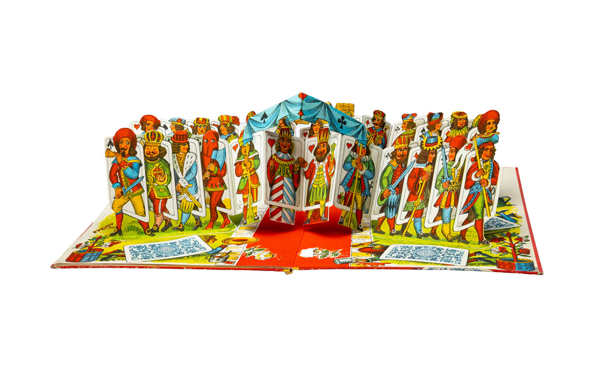 A host of card characters leap from the page at the end of the book. / THF803679
Kubašta's innovative books and other works that made it to the West caught the attention of entrepreneurs and future movable book artists in America. Waldo Hunt, a self-described "creative businessman," remembers seeing Kubašta's pop-up books in New York in the early 1960s. They inspired him. Hunt's work in advertising and publishing in the early 1960s soon incorporated movable and three-dimensional elements. He created the Wrigley Zoo animal pop-ups for the children's magazine Jack and Jill and, in 1965, published Bennett Cerf's Pop-Up Riddles, a promotional item for Maxwell House coffee. That was just the beginning. Hunt's passion spurred a pop-up book revival in America, jump-starting a new era in three-dimensional publications. He collaborated with Hallmark and Random House, then created Intervisual Communications, a firm that would dominate pop-up publications for decades.
Kubašta's work also influenced artists and paper engineers. When Robert Sabuda was ten, he received a copy of Kubašta's Cinderella. The gift forever changed his view of pop-up books; Sabuda would go on to become an award-winning artist and paper engineer. Other artists, such as Ib Penick and David A. Carter, have also cited Kubašta's influence in their careers
Vojtěch Kubašta's impact was far-reaching. A prolific creator, he produced more than 300 pop-up books during his lifetime and influenced a renaissance in pop-up books. But more than this, his colorful illustrations and imaginative movable and three-dimensional artistry depicted wonder and humor in uncomplicated, simple terms. The universal appeal of his works provides a lasting legacy of innovation that breaks through the confines of borders.
Source and for more information, see:
A. Findlay and Ellen G.K. Rubin. Pop-ups, Illustrated Books, and Graphic Designs of Czech Artist and Paper Engineer, Vojtěch Kubašta (1914-1992). Fort Lauderdale, FL: Bienes Center for the Literary Arts, 2005.
Andy Stupperich is an Associate Curator at The Henry Ford.
Objects and their histories can sometimes be inadvertently separated or lost — especially in long-lived institutions and museums. Recently, staff at The Henry Ford rediscovered a simple, unassuming object with its history literally attached to it — a history that pointed to early voice transmission. A history once lost that had to be pieced together again, some one hundred years later. Research connected with this object is an ongoing rediscovery to present a story of invention, innovation, and resourcefulness.
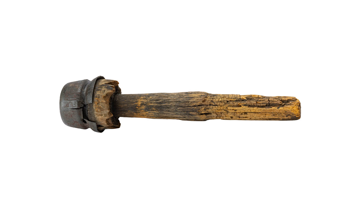 A telephone insulator with possible links to early voice transmission experiments. / THF805303
The Object
The object is a piece of wood, a little over ten inches long, with a metal cap around a shaped end. Staff found this club-like object as part of our 2024–2026 IMLS grant project (a two-year federally funded grant to clean, rehouse, and create digital records for artifacts related to power and energy, mobility and transportation, and communications and information technology). It was found in a storage box with other unassociated communications bits and pieces — unnumbered. The object looked like an early telegraph insulator, which had been around for decades before the invention of telephone. However, an attached tag specified a "Telephone Insulator." Also, this insulator is not much to look at, and it easily could have been disregarded as an unremarkable communication insulator and bracket — reminiscent of other objects in The Henry Ford's collection.
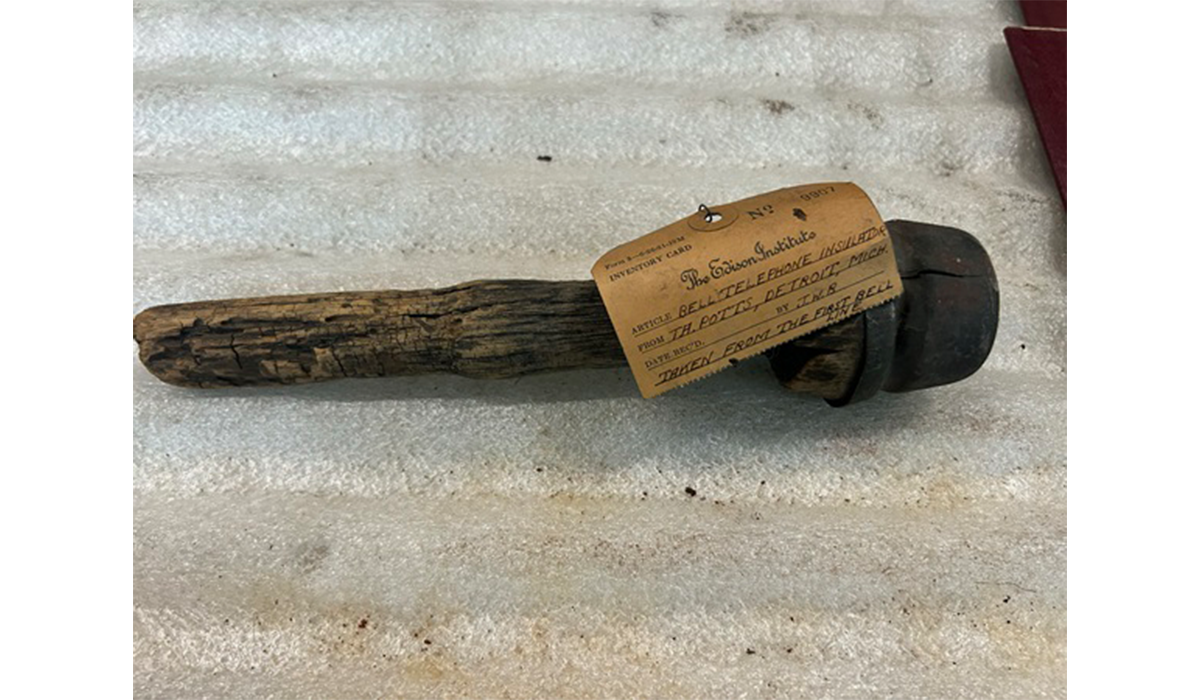 The telephone insulator soon after it was found with the letter and map/drawing removed. Photo by Colleen Sikorski.
But something set this object apart from the rest. It had information, usually found in museum files, wrapped around the bracket body: an old Edison Institute tag and two pieces of paper with a map. After reading the tag and unrolling the pages to find the original donation letter and a hand-drawn map, our staff recognized that this object held more significance than once believed. This piece of wood possibly had a connection to Alexander Graham Bell, early voice transmission, and the invention of the telephone.
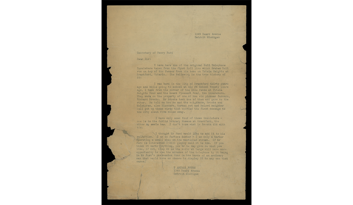 Typed letter from Thomas Potts to the secretary of Henry Ford. / THF727164
The Story Attached
The Edison Institute tag contained a somewhat cryptic message: this object was a "Bell telephone insulator … taken from the first Bell line," but there was no explanation of what the "first Bell line" was. The attached letters and map provided more information and posed additional questions. The donor, T. Arthur Potts, wrote to the secretary of Henry Ford, offering Ford one of the "original Bell Telephone Insulators taken from the first Bell line which Graham Bell run [sic] on top of the fences from his home on Tutela Heights at Brantford, Ontario." If true, the object was not simply an ordinary insulator but one connected to Alexander Graham Bell and the early history of the telephone.
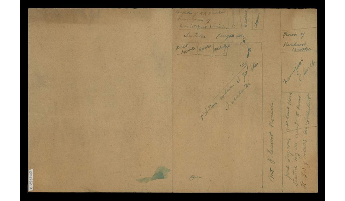 "Thomas Potts' hand drawn map. / THF727167
Mr. Potts then related how he acquired the insulator (where it was found and what happened to the other recovered insulators) and offered this one to Henry Ford. Potts added a hand-drawn map (noting the location of Bell's home and Bell's neighbors and indicating the insulator's initial location) and provided a drawing of the insulator on a separate page.
At face value, this is an intriguing story. But as many historians understand, some stories do not live up to their histories. There may be truth in this unsubstantiated story, or it may be just that — a story. As curators, we began to piece back together the history — one hundred years lost.
A History Uncovered
The undated letter provided a starting point. In it, T. Arthur Potts mentioned he was born in Brantford, Ontario, "thirty years ago," and that he received the insulator "twenty years ago." But when was that? The tag on the insulator came from the Edison Institute (established in 1929), but Henry Ford had been collecting before that. The letter could date from 1920 up into the mid-to-late 1930s. Genealogy research provided some answers.
According to census and other records, Thomas Arthur Potts was born in 1896 in Brantford, Ontario. Other documents reveal that Potts emigrated to the United States at the end of 1923; he then shows up in the 1924–1925 Polk's Detroit city directory living at the address indicated in the letter. This information places the letter sometime in the mid-1920s. Potts, then, would have received the insulator about 1906.
But is there a connection to Alexander Graham Bell and the early history of the telephone? My understanding of the invention of the telephone was limited. I knew Bell received the first patent for the telephone, but I thought he made the first "call" somewhere in the United States. Potts lived in Canada and mentioned that the insulator was "from the first Bell line." Through some quick online searches, I found references to the "first long-distance" phone call made from Brantford to Paris (Ontario) on August 10, 1876 (months after Bell's call to his assistant Thomas Watson on May 6, 1876, in Boston, Massachusetts). Could this insulator have something to do with the supposed "first long-distance" phone call? Reading more about Alexander Graham Bell and the history of the telephone, then contacting other experts, provided more answers.
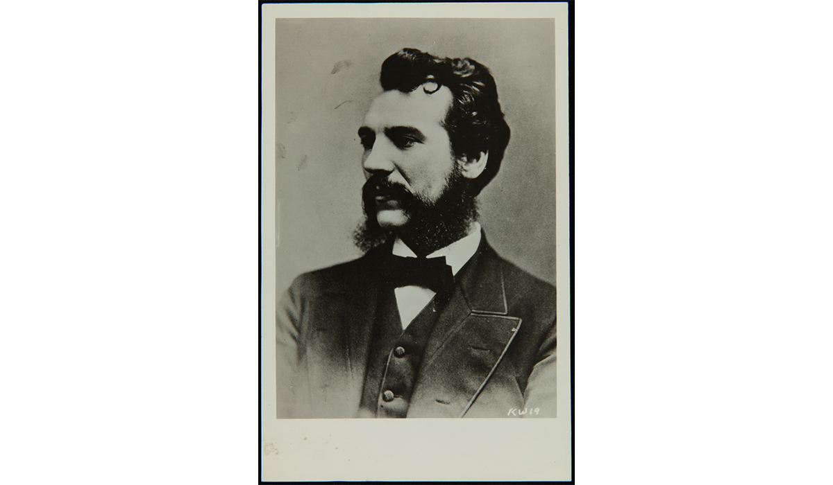 Alexander Graham Bell. / THF253967
Alexander Graham Bell's family lived on Tutela Heights Road near Brantford, Ontario. The home is now the Bell Homestead National Historic Site. When the question of whether this insulator could be associated with that historic "first long-distance" phone call, the Bell Homestead curator doubted the connection. This one-way, "long-distance" call, with the transmitter in Brantford and the receiver in Paris, Ontario, used the existing telegraph lines that already had insulators — and certainly not like the one that The Henry Ford had. And through other research I discovered that the first long-distance two-way call where people could receive and transmit voice messages happened a few months later in October 1876, between Boston and Cambridge, Massachusetts, far from where Mr. Potts had resided. Was this a dead end? Was it time to move on? Was this just an object with a story — a lost history? It appeared so.
A few last-minute searches proved fortuitous. The famed "long-distance call" from Brantford to Paris, Ontario, happened in August 1876 and was made over existing telegraph lines. I did not yet fully realize that Alexander Graham Bell conducted other voice transmission experiments at the same time until I saw a copy of Bell's address at the unveiling of the Bell Memorial in Brantford in 1917. In the speech, Bell mentioned "[t]here were also other experiments that some of the older residents of Brantford may remember, in which the receiving instrument was placed on the porch of my father's house at Tutela Heights…" He continued: "… we got stove-pipe wire in Brantford… and tacked it along the fences from the corner of the Mount Pleasant Road to Tutela Heights - and it worked." Was it possible that this telephone insulator donated by Potts was part of these additional experiments?
Another source provided further confirmation. In the 1926 publication, Pioneering the Telephone in Canada, William Patten related the same story and added key pieces of information that meshed with the Potts letter. Patten wrote that Bell made notes of these experiments, and when "[s]peaking at the annual banquet of the Brantford Board of Trade in 1906 … Dr. Bell said that his memory had come back very clearly to him, in driving out to his father's old homestead at Tutelo [Tutela] Heights, and on his way there he was pleased and proud to meet the two men who had helped him put up the first telephone line in Canada, Mr. McIntyre and Mr. Brooks." (p. 16) These were two of the three names mentioned in the letter by Thomas Potts. And the 1906 date is telling. That was around the time when Thomas Potts states he received this insulator as a ten-year-old boy. Was Potts there when the three old neighbors met, and did he listen to their reminiscences? For a young boy, this would have been a memorable event, to see and hear from Brantford's renowned inventor and one-time resident. Unfortunately, Potts' letter is silent on whether this occurred, only that he received this insulator around that time.
Yet, even with more questions, we have a link to the August 1876 experiments by Alexander Graham Bell to refine his invention that linked friends and families together — not with the taps and clicks of a telegraph key, but the sounds of their own voices — an initial step to communicate across town, city, country, and the world.
Story or History
A telephone insulator wrapped with an old, undated letter could easily have been overlooked and its history disregarded. However, deciphering the clues found in bits of human memory has begun to restore its once-lost history. Piecing together the information — placing people and names in context, asking the right questions, and learning from knowledgeable sources and colleagues — may not reveal its complete history, as some things remain hidden. But even what we have already uncovered can help us tell fuller stories. How complexities of human memory mesh with stories of invention, innovation, and resourcefulness run through wire strung along a fence line attached to an unassuming piece of wood to bring human voice transmission to the world, transforming communication.
Sources consulted in this (re)discovery of the history of the telephone insulator, include:
Brantford Public Library and the Brant County Board of Education. Brantford Honours Alexander Graham Bell, 1874-1974. (Brantford, Ontario): Brantford Public Library and the Brant County Board of Education, 1974.
Bruce, Robert V., Alexander Graham Bell and the Conquest of Solitude. Ithaca and London: Cornell University Press, 1990 [1973].
Patten, William. Pioneering the Telephone in Canada. Montreal: Privately Printed, 1906.
Andy Stupperich is an Associate Curator at The Henry Ford.
Throughout history, women have served their country during war and in peacetime, on the home front and at the front lines. Since the founding of this country, both military and civilian women contributed to their nation’s cause—whether through active service, or by using their talents and time to support our fighting forces from afar—in ways that were and are often overlooked. Through these objects from the collections of The Henry Ford, we can explore some of these important stories, shedding light on women and their service.
Frances Clayton
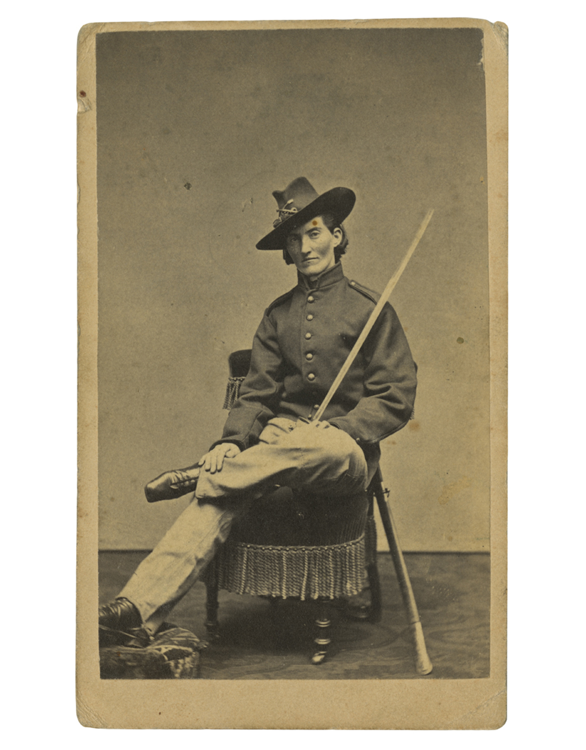 Frances Clayton (c.1830-after 1865), who disguised herself as “Jack Williams” to join her husband in the war, posed for this carte-de-visite at Samuel Masury’s studio in Boston, Massachusetts, circa 1865. While some have questioned Clayton’s exact involvement in the war, her images in uniform are probably the most recognized. / THF71763
While women could not officially serve in combat roles in the United States until 2016, women participated in combat as early as the American Revolution—dressed as men.
During the Civil War, hundreds of women concealed their identities to enlist and fight in battles across the country. Their motivations varied: some wanted to stay close to husbands, brothers, or other loved ones, while others sought to defy societal norms, pursue adventure, or earn a soldier’s pay and enlistment bounty. Patriotism was another driving force—with northern women supporting the Union or abolitionist causes, and southern women joining to support the Confederacy.
At the time, joining the military was easier. With an urgent need for soldiers, physical exams were brief, and no identification was required. A woman could cut her hair, wear men’s baggy clothing, and adopt a male alias. Some were eventually discovered and sent home, others were wounded or killed during service, and others returned home, mustering out at the end of their service.
—Aimee Burpee, Associate Curator
WAAC Women's Army Auxiliary Corps
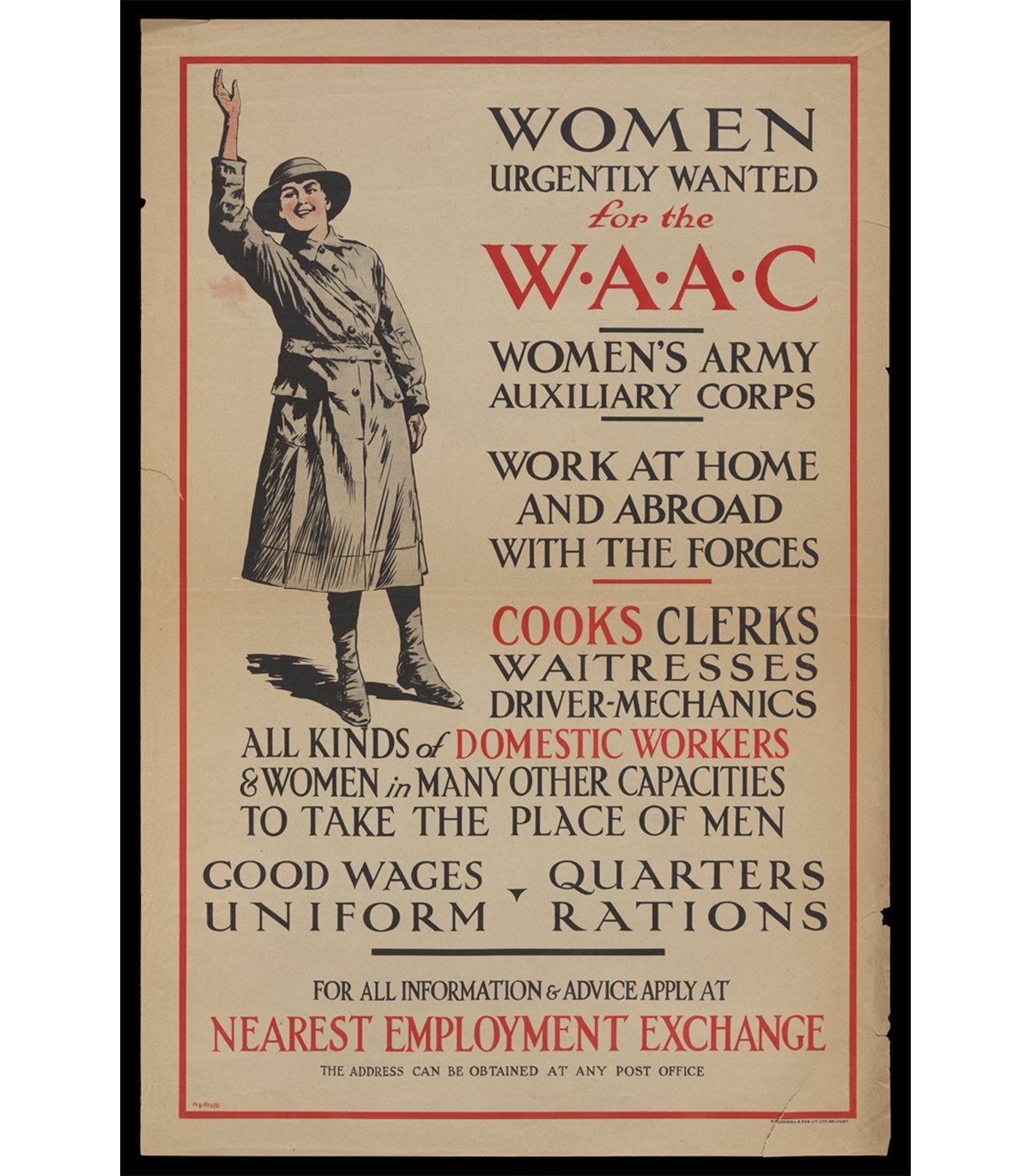 “Women Urgently Wanted for the WAAC Women's Army Auxiliary Corps,” circa 1917 / THF726518
Over 50,000 British women volunteered with the Women's Army Auxiliary Corps in 1917 and 1918, the final two years of the First World War. WAAC volunteers took on support roles such as administrative work, catering, or vehicle maintenance at home in the United Kingdom and on the front in France and Belgium. In doing so, WAAC freed up British men on the front from non-combative tasks so the military could focus on the battlefield. This was the first time that women were allowed in the British armed forces in an official capacity outside of nursing.
The corps was renamed Queen Mary's Army Auxiliary Corps in 1918 after Mary of Teck, the queen consort of King George V, became the corps patron. The original WAAC/QMAAC disbanded in 1921, but it inspired women's auxiliary military corps in Great Britain and the Commonwealth and in the United States during the Second World War.
—Kayla Chenault, Associate Curator
“Molly Pitchers”
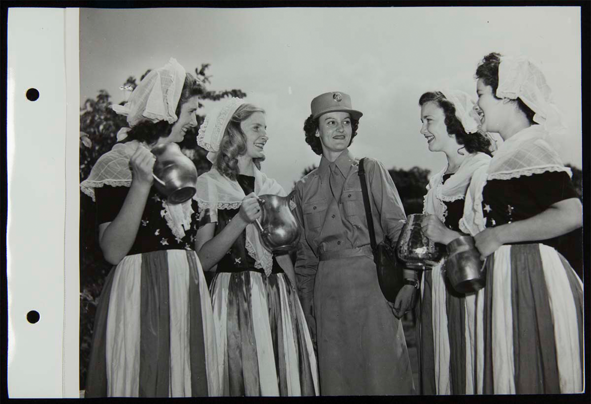 “Molly Pitchers” and Women’s Army Corps recruiter, August 4, 1943. / THF272635
"Molly Pitcher" was the symbolic name given to several historic women who served during the Revolutionary War. These women, usually a soldiers' wife, were noted for carrying water and other provisions to frontline troops. But they became more famous for fighting alongside other soldiers after their husbands or loved ones had fallen in battle.
During the Second World War, August 4, 1943, was designated Molly Pitcher Tag Day. On that day, thousands of women throughout the United States dressed in early American or patriotic costumes and became contemporary "Molly Pitcher" heroines by selling war stamps and bonds. At Greenfield Village, Women's Army Corps recruiters from Detroit, Michigan, and four "Molly Pitchers" came together to raise money for the bond drive, shining a light on women's contributions—whether on the home front or in military service—to America's war efforts since our country's founding.
—Andy Stupperich, Associate Curator
Eames Molded Plywood Leg Splint
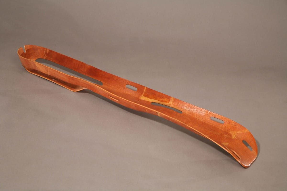 "Eames Molded Plywood Leg Splint, circa 1943. / THF65726
Husband-and-wife designers Charles and Ray Eames spent the early years of their partnership experimenting with molding plywood for use in furniture and sculptural objects. In the early 1940s, they used the spare bedroom in their Los Angeles, California, apartment to develop a machine to mold plywood using pressure. A friend, Dr. Wendell Scott of the Army Medical Corps, visited the Eames’ home and saw the potential of molded plywood for the war effort. America’s entry into World War II had created material shortages, including metal. Despite the shortage, metal splints were being used for broken limbs on the battlefield even though they were inflexible and heavy, and worsened wounds in transport.
Upon hearing this, the Eames designed a flexible, lightweight and durable leg splint using the same molded plywood technology they were developing for plywood furniture. They presented their prototype splint to the U.S. Navy and worked with them to further modify and perfect the product. By 1942, the Navy had placed an order for 5,000 splints. The Eames Leg Splint became a successful medical innovation and a design artifact, as well as a critical step in the Eames understanding of molded plywood.
—Adapted from What if Collaboration is Design? Katherine White, Curator of Design
Lillian Schwartz, Nurse Cadet
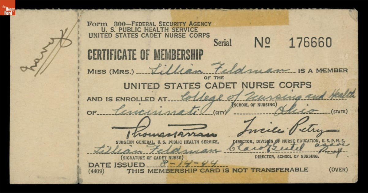 Certificate of Membership in the United States Cadet Nurse Corps for Lillian Feldman (Schwartz), August 14, 1944 / THF705895
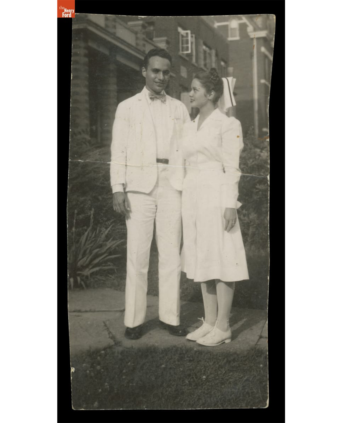 Lillian Schwartz and Jack Schwartz, circa 1946. / THF704693
Lillian Feldman Schwartz (1927-2024) was an American artist who began working at the forefront of computer art and experimental film in the late 1960s at Bell Laboratories. Before her art career was established, however, her life was entwined and impacted by service in the medical field during the last years of WWII, and in its immediate aftermath.
In 1944, when Lillian was 17, she applied to the United States Cadet Nurse Corps—a tuition-free program designed to address the WWII nursing shortage. Lillian did well in her coursework, but she quickly realized that she struggled with nursing people. Despite this, she found ways to bring joy into the Cincinnati hospital where she worked by painting murals in the children’s ward and making plaster sculptures in the cast room. Lillian quickly realized that she was an artist, not a nurse. While working in the hospital pharmacy, she met an intern named Jack Schwartz, whom she would marry in 1946. In 1948, Jack was stationed in Fukuoka, Japan, and Lillian traveled to join him after the birth of her first son. Unfortunately, she developed polio symptoms several weeks after her arrival, and in the post-war aftermath, she was also exposed to the lingering effects of radiation from the atomic bombings in Hiroshima and Nagasaki. These experiences led to serious health issues throughout her life and were often referenced in her art projects and writing.
—Kristen Gallerneaux, Curator of Communication & Information Technology
This collaborative blog was written by the staff of The Henry Ford
by Kristen Gallerneaux, by Aimee Burpee, by Rachel Yerke-Osgood, by Andy Stupperich, By Kayla Chenault, by Katherine White
Spring! A time to celebrate! The season brings longer days, warmer weather, and new life. Budding flowers, baby chicks and lambs, painted eggs, and, of course, the Easter Bunny — all symbolize the return of spring and the end of dreary winter.
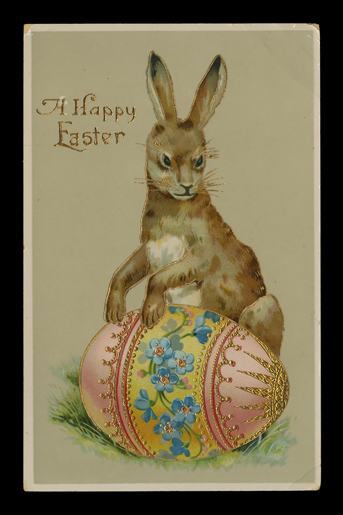
Easter Greeting Postcard, circa 1910 / THF113344
The Easter Bunny's ancient origins are unclear, but various cultures have long associated the amazingly reproductive rabbit (or hare) with spring and the celebration of new life. Spring is the time when hares and rabbits — hares are larger and have longer ears and hind feet — produce large litters of leverets (baby hares) or kittens (baby rabbits). This association was a small step toward a connection with spring and Easter, the Christian holiday celebrating the resurrection of Christ.
The Easter Bunny (originally known as the Easter Hare or Easter Rabbit) is believed to have originated in German folklore, which described the mythic creature bringing colorfully decorated eggs to children. Whether the Easter Bunny laid the eggs or hid them may be a matter of interpretation, especially when inquisitive children ask for explanations. Written accounts from Germany in the 1680s mention the Easter egg-laying hare, identified hundreds of years later as the Easter "Bunny." German immigrants brought the tradition to colonial America, perhaps as early as the late 1600s. A drawing by Fraktur artist Johann Conrad Gilbert (1734-1812) depicting a hare hopping along with a basket of decorated eggs provides more substantial proof of the Easter Bunny in early America. Yet, few outside the areas populated by German-speaking immigrants recognized the mythic creature. By the late 1800s, however, the Easter Bunny — like Santa Claus and the Christmas tree — was well on its way to becoming an established holiday symbol throughout America. Growing commercialization of Easter materials — greeting cards, books, toys, candies and sweets, and other material — spread the holiday celebration across cultures, establishing the mythic egg-bringer as a holiday tradition. In the early 1900s, Americans would shed the monikers, Easter Hare or Easter Rabbit, in favor of the more kid-friendly Easter Bunny.
Check out these other Spring and Easter posts found on The Henry Ford's webpages:
Resources used for this article:
- Shoemaker, Alfred L. Eastertide in Pennsylvania, a folk cultural study. Kutztown, PA: Pennsylvania Folklife Society. 1960, pp. 46-50.
- Winick, Stephen. "On the Bunny Trail: In Search of the Easter Bunny." Library of Congress Blogs: Folklife Today. American Folklife Center & Veterans History Project. March 22, 2016.
Andy Stupperich is an Associate Curator at The Henry Ford.
In the 1930s and especially after the Second World War, American greeting card companies began hiring well-known artists and illustrators to design Christmas cards. Artist-designed cards enticed customers to purchase a company's cards, sometimes sold at a slightly higher price. For the artists, creating holiday cards expanded their artistic expression and provided an avenue for greater name recognition. Designing Christmas cards also supplemented incomes for artists and illustrators when other work became unpredictable. A ready pool of artists found success as production designers, animators, and illustrators in the West Coast film and movie industry — notably at Walt Disney Studios. Along with this studio talent, Walt Disney hired other well-established artists to work on his animation projects. Not only did these artists create classic animated films, but they also designed memorable holiday greeting cards.
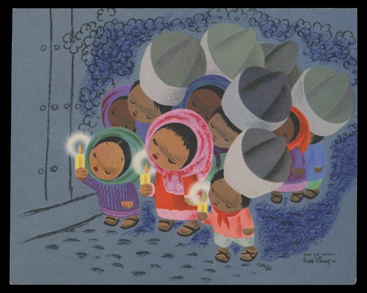
Christmas card, 1945. Procession of Children with Candles — "Los Posadas." Artwork by Mary Blair from the Walt Disney Film The Three Caballeros. / THF715961
Mary Browne Robinson [later Mary Blair] (1911-1978) was born in McAlester, Oklahoma. Her family moved to California in the early 1920s, and she attended San Jose State College, where she majored in fine art. A gifted and talented young artist, Blair received a scholarship to the prestigious Chouinard Art Institute in Los Angeles in 1931, where she aspired to be an illustrator. During the 1930s, she became one of the few women members of the California Water Color Society and exhibited her works throughout the country. She married fellow artist Lee Blair in 1934. As the Great Depression lingered, both turned to Southern California's animation industry to augment their incomes, working for Ub Iwerks, Hugh Harman, Rudolf Ising, and, most notably, Walt Disney.
Mary Blair went to work for Walt Disney in 1940, following her husband Lee, who had joined the studio a few years earlier. At Disney, Blair created watercolor concept art for new films but was not happy working in animation — she had the artistic ambition of working in commercial illustration. Blair left the company in 1941, only to be rehired to accompany her husband on a research trip Walt Disney planned to Latin America for a Good Neighbor policy tour sponsored by the United States. She flourished on the tour, and Walt took notice of her work. Over the next twelve years, Blair would research and create concept artwork for numerous Disney projects, including The Three Caballeros (1944), Make Mine Music (1946), Cinderella (1950), Alice in Wonderland (1951), and Peter Pan (1953). Blair left the company again in the mid-1950s and returned to the work she loved — illustration and advertising design. Her diverse accomplishments encompassed clothing and textile design, children's book illustrations, commercial advertisement and greeting card design, high-end department store window displays, and Broadway and Hollywood film industry projects. Disney never forgot Blair, eventually hiring her to create special project murals and designing "It's a Small World" — a ride experience for the 1964 World's Fair, which later was moved to Disneyland.
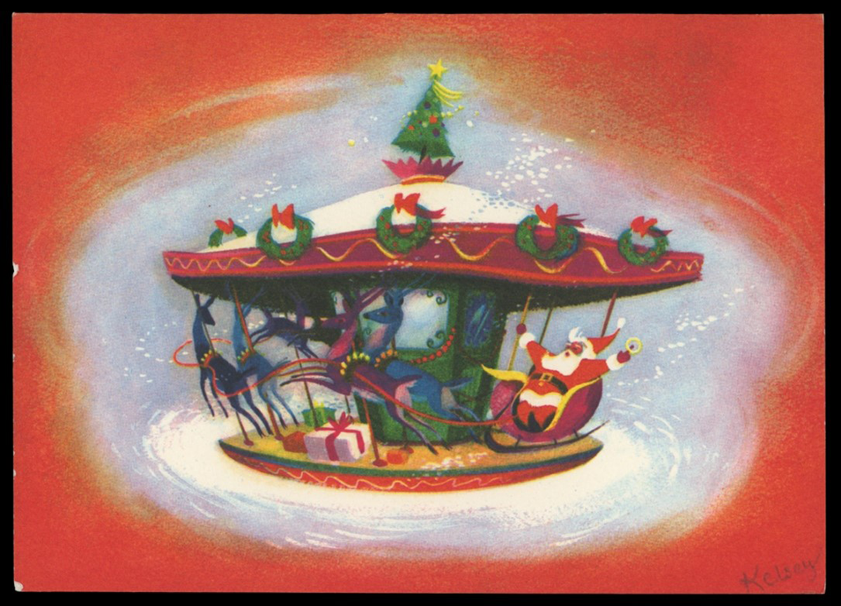
Christmas card, 1952. "Christmas Carrousel." Artwork by Richmond "Dick" Kelsey. / THF702987
Dick Kelsey
Richmond "Dick" Kelsey (1905-1987) was born in San Diego, California, and studied art at the Otis Art Institute and the Art Center School in Los Angeles. Kelsey, a noted watercolorist in the 1930s, had works exhibited at the Smithsonian Institute and the 1935 California-Pacific International Exposition in San Diego. He was a member of the American Watercolor Society and California Watercolor Society.
In 1938, Kelsey began working for Walt Disney Studios on several of their animated films: Pinocchio, Fantasia, and Bambi. As one of the art directors for Disney, Kelsey worked closely with the directors, helping to establish the mood, staging, and color of the animated production. He left to serve in World War II but returned after the war and worked on other Disney projects, as a writer for Alice in Wonderland and as a background artist for Bedknobs and Broomsticks. Among his other works, Kelsey assisted in the design of Disneyland, illustrated children's books based on Disney characters and stories, and designed holiday greeting cards. Kelsey, a mentor to other Disney artists, encouraged others to pursue Christmas card design. One artist was Tyrus Wong, whose atmospheric backgrounds for Bambi captured the spirit of the forest that inspired the film's visual style — a style later translated into Christmas cards.
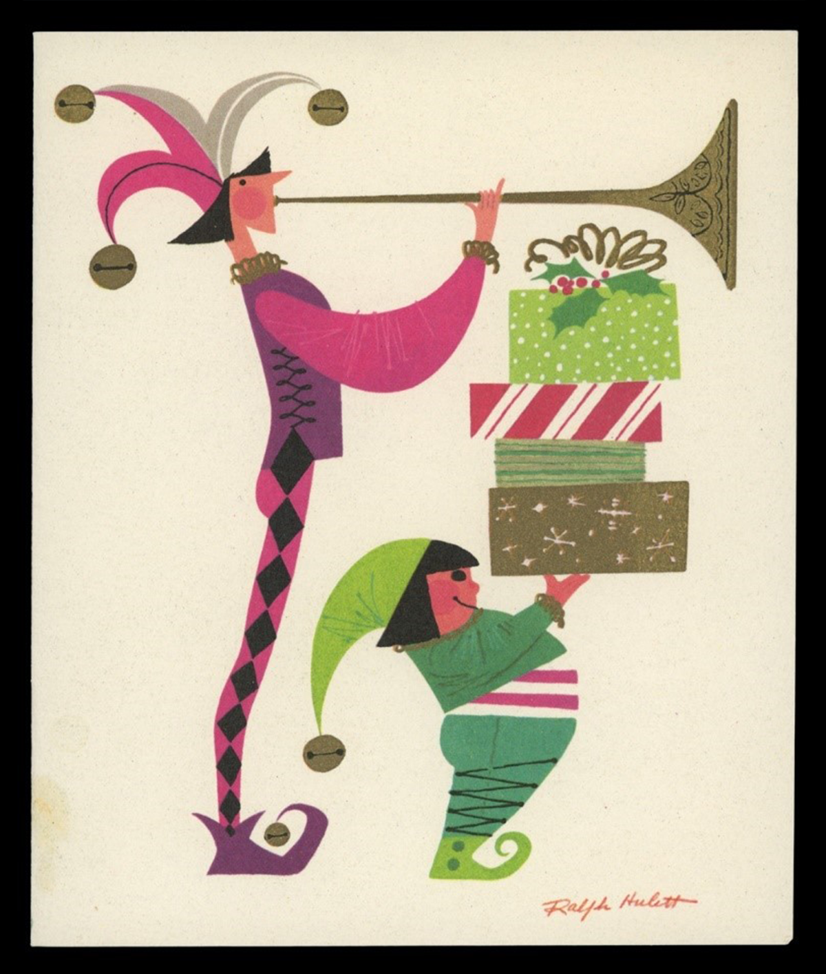
Christmas card, 1955. "Christmas Herald." Artwork by Ralph Hulett. / THF703002
Ralph Hulett
Ralph Hulett (1915-1974) attended high school in Glendale, California, after his family had moved from Illinois, where he was born. The artistically talented student received a four-year scholarship to Chouinard Art Institute in Los Angeles. Like many who attended Chouinard, Hulett became a member of the California Watercolor Society, exhibiting and selling his works through local galleries. Many of his works depict scenes of California and Mexico. Hulett also was a member of the American Watercolor Society and exhibited in its annual New York City shows.
Walt Disney Studios hired Ralph Hulett to work on Snow White and the Seven Dwarfs while he was still attending Chouinard, which became a full-time role after his graduation. Throughout his lifelong career at Disney, Hulett created backgrounds for several of the Studio's famous animated shorts and features, including Pinocchio, Dumbo, Bambi, Peter Pan, Lady and the Tramp, Sleeping Beauty, and The Jungle Book. In the 1940s, Hulett began creating Christmas cards for greeting card companies — notably Designers Showcase and California Artists — turning out hundreds of holiday designs over the next thirty years.
Eyvind Earle
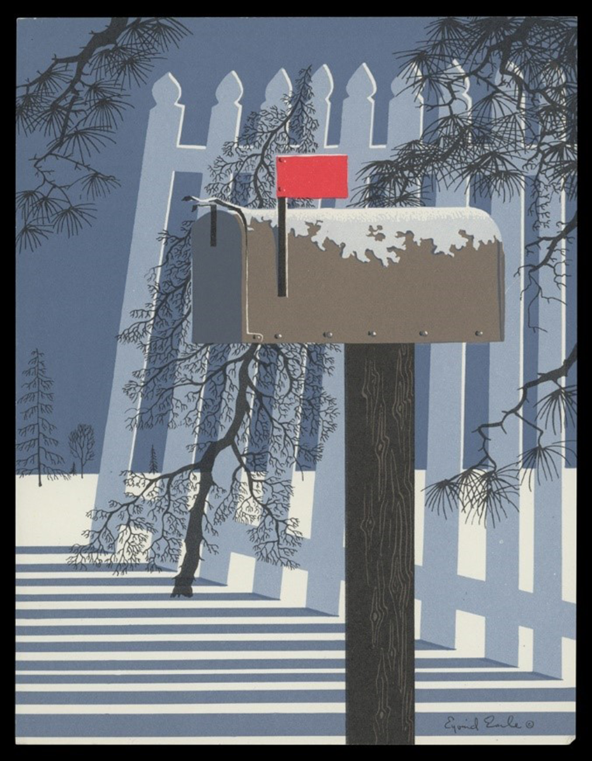
Christmas card, 1955. "Mailbox in the Snow." Artwork by Eyvind Earle. / THF703008
Eyvind Earle (1916-2000) began working for Walt Disney Studios in the early 1950s as an assistant background painter, designing static backdrops for animated films. His first project was Peter Pan, and he later created some concept art for other films, including Lady and the Tramp. But Earle's lasting impact came when Walt Disney tapped him for the overall production design for Sleeping Beauty, including its styling, background, and color. The film's backgrounds were lush, detailed, and enchanting — a departure from previous Disney projects — and are now a highly acclaimed animation achievement.
Christmas card, 1942. An early card design by Eyvind Earle for Earle and Ball, Inc. / THF702955
Earle, however, was a recognized artist and Christmas card designer well before he went to work for Walt Disney — and remained so after he left the company in the 1960s. When Earle was ten, his father challenged him to read fifty pages of a book or create a painting a day; Earle did both. His artistic skill developed, and by fourteen, Earle had his first one-artist show. During the Depression, at twenty-one, he biked and painted his way across the United States. In 1939, New York's Metropolitan Museum of Art purchased one of his works for its permanent collection. It was also in the late 1930s, during the lingering Depression, that Earle began creating artwork for holiday cards. Earle and his mother printed the cards by hand for the first year. Over the next few years, he teamed up with friends and formed companies to sell his holiday design products — first Monroe and Earle, then Earle and Ball. His design relationship with the later company lasted until he was drafted into the Navy in 1943. By then, producing Christmas cards had become a passion — Earle would create more than 800 designs over the rest of his life.
Andy Stupperich is an associate curator at The Henry Ford.
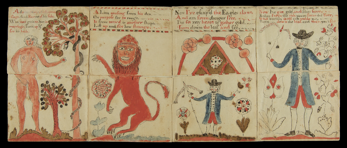
Metamorphosis Turn-Up Book, 1790-1820 / THF715860
Boxed and tucked away for many years in the Benson Ford Research Center archives at The Henry Ford, this turn-up book has found a new life — a metamorphosis — much like its title. This "book" — a sheet of cut and folded paper — engaged the reader in tactile learning and instilled moral lessons in interactive ways, conveying lessons and meaning through visual images and texts that change with the lift of a flap.
Movable and Turn-up Books
For hundreds of years, artists, illustrators, publishers, designers, and paper engineers have added motion and 3-dimensional depth to the flat pages of books and other paper-based media. Early examples of movable books date to the thirteenth century and involved the use of volvelles — a movable paper disk or wheel — and flaps. Designed as teaching tools for adult learners, scholars of science, religion, and philosophy manipulated these movable elements to predict astronomical events, plot yearly spiritual holidays, teach anatomy and other medical disciplines, and aid navigation, among other uses.
Eighteenth-century transformations in childhood education from strict rote learning to a more active model made movable books an appealing option for teaching children. By the mid- to late 18th century, publishers began selling printed flap or turn-up books for a wider readership that included adults and children. These sheets of cut and folded paper lured readers to interact with its pages filled with stimulating images and poetic texts that changed when readers lifted or folded down flaps. In the United States, printed versions of Metamorphosis or A Transformation of Pictures with Poetical Explanations for the Amusement of Young Persons presented a series of moral tales on movable pages and, as the title states, were directed toward a younger audience.
Metamorphosis
Metamorphosis or A Transformation of Pictures with Poetical Explanations for the Amusement of Young Persons traces its origins to earlier turn-ups such as the mid-1600s English publication The Beginning, Progress and End of Man. These early turn-ups instilled religious and moral lessons (and perhaps exposed political preferences as well) through images and verse — aspects that later authors copied, modified, and recontextualized in printed and handmade versions.
The Henry Ford's handmade version of Metamorphosis or A Transformation of Pictures consists of four panels and dates from the late 18th or early 19th century. Each panel contains two intersecting flaps; one turns up, the other down. Panels transform not once but twice, imparting moral lessons through religious, mythological, and heraldic iconography and poetic texts. First, Adam in the Garden of Eden changes to Eve — who then transforms into a mermaid. Next, a lion transforms into a mythical griffin and finally into an eagle, grasping a young child to carry him off. The third panel depicts the grown child as a young man eager to make money no matter the cost. The last panel shows what awaits the man who follows such a path: disease and death.
The first panel shows Adam in the Garden of Eden. The verse begins:
Adam comes first upon the
stage And Eve out of his side
Who was giv'n to him in
marriage, Turn up &
See his bride.
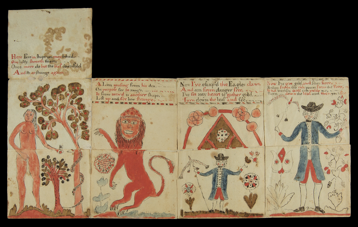
As the reader lifts the flap to reveal Eve, the verse continues:
Here Eve in shape you may behold,
One body sheweth twain
Once more do but the leaf downfold
And its [sic] as strange again,
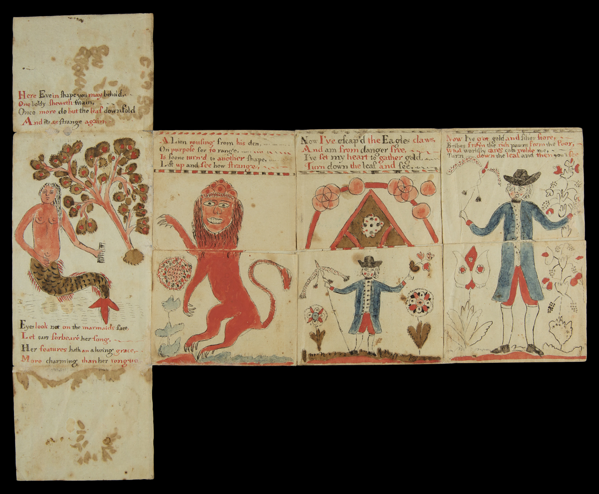
Next, the reader turns down the flap to reveal a "marmaid," as the verse concludes:
Eyes look not on the marmaids [sic] face,
Let ears forbeare [sic] her song.
Her features hath an aluring [sic] grace,
More charming than her tongue.
It is unfortunate that the artist and owner histories of this Metamorphosis turn-up book have been lost. Similar handmade versions from the early 1700s to the late 1800s in other library collections exist, with only some including an artist's name. These examples have been an invaluable source for researching our copy. Curators at The Henry Ford — examining the book's form, texts, and imagery, including stylistic clues in the man's dress and the ornamentation on the later panels — believe this turn-up book may have been made in Pennsylvania, sometime between 1790 and the first decades of the 1800s.
Speculation continues about the artistic origins of this book. Was this made by a young woman as part of her education, promoting art and writing skills that would aid her later in life, or was this something a new mother crafted for her children to reinforce moral lessons? What we do know is that this once-hidden gem is part of a larger collection of turn-up books scattered in museums and libraries across the nation that may shed light on the beliefs, educational practices, and life of Americans in the early years of the republic.
Resources
For more information and to see other turn-up books like the one in the collection of The Henry Ford, see the following:
"Learning as Play: An Animated, Interactive Archive of 17th- to 19th- Century Narrative Media for and by Children." The Pennsylvania State University, 2019. https://sites.psu.edu/play/
Sperling, Juliet. "Unfolding Metamorphosis, or the Early American Tactile Image." American Art, 35, (3) 58-87. 2021.
Reid-Walsh, Jacqueline. "Format and Meaning-Making in Religious Turn-Up Books: The Remediation of The Beginning, Progress and End of Man into Metamorphosis, or a Transformation of Pictures: With Poetical Explanations for the Amusement of Children." [Chapter 10] in Forms, Formats and the Circulation of Knowledge: British Printscape's Innovations, 1688-1832. Ed. by Louisiane Ferlier and Bénédicte Miyamoto. (Library of the Written Word, 83; The Handpress World, 64.) Leiden and Boston: Brill. 2020.
Andy Stupperich is an associate curator at The Henry Ford.

Unidentified Member of Alert Hose Company. / THF212048
Sometime during the late 1870s, members of the Alert Hose Company in Big Rapids, Michigan, posed for the local photographer. Arms crossed and standing tall, each of the firefighters wears a uniform—typical of those worn when competing in a local or regional firemen's tournament. The men had won several tournament prizes by the time they posed for these photographs—perhaps the prize money helped pay for the cartes-de-visite that became a remembrance of the company's victory. But these images offer more than just a glimpse at the Alert Hose Company's participation in a sporting event. They document the culmination of the company's years of hard work protecting Big Rapids against the ravages of fire, the pride in their company and their community, and their connection with the greater fraternity of 19th-century firefighters.
Fires in Big Rapids
Big Rapids, located in Mecosta County, Michigan, was incorporated in 1869. Like many 19th-century cities, it was susceptible to fire. The wood used to construct early homes and businesses offered ready fuel to the flames of an unwatched candle or lamp or a stray ember from a stove or fireplace. According to the 1883 Mecosta County history [p. 645], "Big Rapids has been a sufferer from fire at various times… The first fire of any consequence in the place was… in the year 1860." It was not any better in 1869 when another disastrous fire occurred [p. 645]: "No water supply or engines for extinguishing fires were here at that time, and common pails or buckets were the only appliance afforded. Lines of men were formed to supply water with buckets from wells in the vicinity, and even from the river, but without avail. The Mason House... was only saved by tearing down a small building [nearby] belonging to Harwood & Olds, and then hanging carpets and bed-clothes from the roof and windows, and keeping them saturated with water."
Finally, in 1871, men in Big Rapids organized volunteer fire companies, and the citizens and the city government discussed creating a local water supply for fire protection and private use.
Unidentified, Charles Gore, Jack Shaw, and W. E. Drew. / THF212050, THF212054, THF212056, THF212058
Volunteer Fire Companies in Big Rapids
Volunteer firefighters needed to work as a unit when it came time to fight a fire. Nineteenth-century fire companies usually consisted of men from similar class divisions, backgrounds, or ethnic groups and kinships. This sense of fraternity cemented the unit's cohesion. The camaraderie and kinship of fighting fires and their unique status as protectors in the community bound the firefighters together.
The Alert Hose Company was one of several volunteer firefighting companies to organize in Big Rapids in the early 1870s. The volunteers' job was to get to a burning structure as quickly as possible—pulling a hose cart or carriage—and attach hoses to an available water source so they could begin controlling the conflagration. By 1876, the growing city of Big Rapids had at least two other hose companies (Defiance and Protection) and the Pioneer Hook and Ladder company. (Hook and ladder companies employed hooks to tear down parts of buildings to limit a fire's spread and ladders to fight fires and rescue individuals in multi-story buildings.)
Little is known about the men who made up the Alert Hose Company, though names written on the back of some of the photographs provide a start. A quick review of census records from 1870 and 1880 and a city directory from 1884 give a few clues about a small subset. They were young working men mostly in their mid-20s and a couple in their 30s, though one was in his late teens. Several were related in some fashion. Their occupations included laborers, clerks, and a drayman (teamster)—none of the known men owned a business, though a few may have owned farms. Being part of the local fire company provided connections to businesses in the community to help guide their careers. A more thorough search of records (outside the scope of this blog) would provide more information on why this group of men came together to form the Alert Hose Company.
Henry Shaw, Charles Ellis, "Zip" Hammond, and Thomas Shaw. / THF212060, THF212062, THF212064, THF212066
Firemen's Tournaments
By the 1870s, fire companies tested their firefighting skills against other companies at various regional, state, and national firemen's tournaments. Local companies usually competed against one another on holidays or community fair days. State and national associations sponsored large competitions and set tournament rules and dates. Companies invited to participate usually competed in hose cart races, hook and ladder competitions, and pumping contests (to see how far a company could spray water from a hose), among other activities.
Training for and participating in firemen's tournaments tested and sharpened a company's firefighting skills, promoted a sense of pride in competition, and strengthened the sense of teamwork and fraternity. Participation in these tournaments by fire companies also engaged the local community. Government officials, business leaders, and ordinary citizens supported fire companies by cheering them on and providing monetary support through donations and prize money. Finally, friendly competitions between local companies broadened the sense of fraternity by creating a larger brotherhood of firefighters.
Arthur Webster, "Louie" Goulette, Angus McLelland, and Fred Marble. / THF212068, THF212070, THF212072, THF212074
The Alert Hose Company in Tournaments
The men of the Alert Hose Company in Big Rapids, Michigan, began participating in hose cart races at various tournaments in the mid-1870s. In a hose cart race, a fire company ran a set distance pulling a cart reeled with hoses. Men in the company unwound the hoses, attached them to a water source, and then sprayed water. The fastest time won the prize. A review of articles from the Detroit Free Press highlights the successes of the fire company and the support of its community.
In 1875, the Alert Hose Company (along with the Pioneer Hook and Ladder company) made an appearance at the State Firemen's Tournament held in Jackson, Michigan. Reports mentioned no prizes, but, according to the papers, when they returned home, the men were met "with an enthusiastic reception and dinner[.]" On July 4, 1876, the Big Rapids' firefighting companies competed against one another for prize money. The "Alerts" won the champion belt and a cash prize of $50 offered by the mayor. The other firefighting companies took home lesser amounts funded by the citizens. The following year at the Mecosta County Fair, the "Alerts" took home a $100 purse in the hose cart race.
A bigger prize awaited in 1878. In September, the "Alerts" headed off to Chicago to compete in a national competition. Their teamwork paid off; they finished second within a long list of competitors. The prize this time was noteworthy—$300 in cash and a nickel-plated hose cart made by Silsby Company of Seneca Falls, New York. Citizens of Big Rapids turned out to greet their heroes when they returned home. Evergreens, flags, and banners decorated the local hall, the women of the town prepared a dinner, and, of course, there were speeches. A final mention from this period came in an 1882 article that reported the men of the Alert Hose Company had won a special prize of $10 at the State Firemen's Tournament for the "best appearing company."
Conclusion
Throughout the 1870s, local fire companies organized in the newly formed city of Big Rapids, Michigan. These volunteer firemen worked to protect their homes and community against the ever-present danger of fire. Each company needed to work as a cohesive unit when fighting flames and smoke. Similar backgrounds, ethnicities, and economic status—and the desire to protect their community—brought these men together. And local and regional firefighters' tournaments provided a way to hone the skills needed to become an effective team. The small images shown here, taken by a local photographer, point to the unity and pride that the men of the Alert Hose Company had in their avocation and the fraternity they represented.
See all 14 members of the Alert Hose Company (including one member not in uniform) in The Henry Ford's Digital Collections here.
Andy Stupperich is Associate Curator, Digital Content, at The Henry Ford.
19th century, 1870s, 1860s, photographs, Michigan, by Andy Stupperich

THF188409
Karl Koehler printed, folded, scored, and snipped paper to create three-dimensional Christmas cards and decorations. His post–World War Two pop-up designs added an unexpected dimension to Christmas holiday greetings at a time when most American card companies produced flat, center-folded Christmas cards. Koehler's paper engineering followed in a line of other creative pop-up designs—only he applied it to Christmas cards. Eventually, others would come to see the joy in three-dimensional Christmas cards.
Karl Koehler is pictured in this advertisement piece from the early 1950s. / THF621157
Karl Koehler
Karl Koehler (1913–2000) was born in Hennepin County, Minnesota. When Koehler was fourteen, his father died, and the family moved to Philadelphia, Pennsylvania, to live with his uncle. Koehler trained at the Pennsylvania Museum School of Industrial Art in Philadelphia, and by 1940 was employed at the Pictograph Corporation in New York City. Working under Rudolf Modley, Koehler designed pictorial symbols used in business, corporate, and government publications to communicate statistical data.
During the Second World War, Koehler directed artwork for military training manuals, and in 1942, co-created two award-winning posters for the National War Poster Competition. He returned to Pennsylvania after the war and settled in Coopersburg. There he began designing Christmas cards and holiday decorations.
In 1950, Koehler dreamed up a Christmas tree that people could construct from the flat pages of the December 25th issue of Life magazine—a holiday surprise for the whole family. / THF624861
Koehler's whimsical three-dimensional, hand-assembled decorations and cards delighted children and adults alike. He made traditional folded holiday greeting cards for businesses and corporations, but none rivaled the depth-filled creations Koehler handcrafted in his studio. He trademarked the name "Mantelpiece"—where better to display pop-up Christmas greetings?—and sold his holiday creations in high-end department stores and museums. His list of clients included Nelson Rockefeller, Greer Garson, and Benson Ford. Koehler's artwork was fresh, colorful, and bright, incorporating a bit of fantasy and fun into the traditional symbols of the seasons. And his cards literally added an unexpected dimension to holiday greetings. One European design journal stated, "Karl Koehler has … swept clean the dusty structure of greeting card design."
THF188412 and THF188411
Christmas and Pop-up Design Influences
Christmas cards, as we know them today, first appeared in England in the early 1840s. Historians note that the first card showed a happy scene of holiday feasting flanked by images depicting acts of charity. The custom of sending Christmas cards, though not initially widespread, grew slowly and by 1850, Americans had joined the holiday tradition. By the late 1800s, more and more Americans began giving inexpensive and colorful cards—made possible by low-cost postage and new printing technologies—to friends, family, and acquaintances.
Many valentines in the 19th and early-20th centuries contained layers of embossed paper or other materials. Others had a pop-up element that made the valentine three-dimensional. / THF99091, THF166622, and THF313817
While Karl Koehler focused on crafting high-end Christmas cards, he appears to have drawn much of his card design and construction from late-19th- and early-20th-century valentines. Most 19th-century Christmas cards tended to be relatively flat and remained so well into the 20th century. Valentines, however, had greater dimensionality. English and American manufacturers produced elaborate valentines constructed of highly embossed paper, layered with colorful inserts and, more importantly, pop-up elements that made the valentines three-dimensional. One clue that valentines played a role in Koehler's Christmas card production is a listing from the estate auction advertisement after his death in 2000: "100 old pop-up/pull-out mechanical Valentines."
THF188403
Other influences, such as pop-up and movable books, may have played a part in Koehler's designs. Movable and pop-up books usually included flaps, revolving discs (volvelles), pull tabs, and other mechanical devices that made elements on the pages move. By the late 1800s, publishers and designers produced these books—some with elaborate works hidden between the pages—mainly for children. New York-based McLoughlin Brothers began producing movable books in the late-19th century in the United States—one of the first American companies to do so. One of McLoughlin's earliest efforts contained colorful illustrations that folded or popped out into three-dimensional displays. While there is no documented connection with these types of books, several of Koehler's Christmas cards created a three-dimensional stage-like quality reminiscent of movable or pop-up books.
THF188405
After Christmas Cards
In the late 1950s, Koehler applied for a patent for a collapsible and expandable pyramid structure design used for "greeting cards, calendars, containers, advertising novelties, displays, geometric educational devices, etc." But a few years later, in November 1961, the last printed mention of his Christmas card production appeared. That same year, Koehler traveled to Ireland to help create an industrial design course at that country's National School of Art. He made other trips to Europe and later traveled to Brazil and wrote of his excursions. Existing documentation suggests that Koehler did not create any new three-dimensional holiday cards during the last decades of the 20th century.
THF188402
Today, card companies such as Graphics3, LovePop, Hallmark, and others create an array of elaborate holiday pop-up cards meant to delight both giver and recipient. Few have probably ever heard of Karl Koehler, but they would appreciate his designs and revel in his amusing creations.
View more Christmas cards designed by Karl Koehler in our Digital Collections.
Andy Stupperich is Associate Curator, Digital Content, at The Henry Ford.
1950s, 19th century, Pennsylvania, 20th century, popular culture, holidays, entrepreneurship, design, correspondence, Christmas, by Andy Stupperich

THF610382
For as long as I can remember, I have been a fan of Charles Schulz's comic strip Peanuts. And It's the Great Pumpkin, Charlie Brown is one of my favorite animated holiday specials. Each year, I set aside time to relive the experiences of the Peanuts characters—and it doesn't grow old. Maybe because it first aired the year I started grade school, or because I also loved Halloween when I was growing up, my memories have kept It's the Great Pumpkin fresh and alive. It could also be the imaginative story, animation, and music encapsulated in a simple format that draws me back year after year, now that I am sadly well beyond the age of trick-or-treating. Or maybe it is a combination of all of these, the artistic creativity playing off deep-seated childhood memories, that makes me look forward to watching this animated classic every autumn.
It’s the Great Pumpkin, Charlie Brown, written by Charles Schulz, is a simple story of imagination, belief, and the joys of childhood. The main story centers on Linus, whose faith in and devotion to the Great Pumpkin reminds us of the fragile childhood innocence we all experienced—and hopefully still resides in us in some form. Within this larger story, Schulz weaves scenes reminiscent of his multi-framed comic strips. Each of these reminds us why we love his characters. The dismay of Linus at watching Lucy carve the pumpkin he brought home into a jack-o-lantern. The attempt by Charlie Brown to kick a football held by Lucy, who we all know will pull it away at the last minute. The help Snoopy gives to Charlie Brown with putting leaves in a pile. The eagerness of Linus to jump into that same pile of leaves—later philosophizing that he should not have done it holding a wet sucker. The joy of trick-or-treaters discovering what they got after dashing from house to house on Halloween night. Or the imagination of Snoopy concocting an epic battle with the Red Baron and his escape through no man's land. Childhood, even with its setbacks, never seemed better.
THF610396
It’s the Great Pumpkin, Charlie Brown is masterfully animated by Bill Melendez. Melendez made Schulz's static comic strip characters move. And it is Melendez who made Snoopy fly. His color palette reminds me of the clear October days when I played in the backyard. And the backgrounds of blotchy blue and purple skies are reminiscent of those blustery Halloween nights when my cousins and I tromped through the neighborhood trick-or-treating.
Finally, where would the Peanuts gang be without the score by Vince Guaraldi? His somber, flute-accompanied themes instill a sense of eerie-ness as trick-or-treaters glide through the streets, Snoopy maneuvers through no man's land, and Linus waits in anticipation in the shadowed pumpkin patch.
| Schulz, Melendez, and Guaraldi (along with producer Lee Mendelson) were the same talented team that helped make A Charlie Brown Christmas so successful the year before, 1965. Learn more about that Peanuts animated holiday classic in this 2015 blog post, Good Grief! "A Charlie Brown Christmas” Turns 50. |
These colorful impressions, these musical moods, these familiar storylines—these snippets of autumnal life—still resonate with me 55 years after the program first aired.
Andy Stupperich is Associate Curator, Digital Content, at The Henry Ford. You will find him on Halloween night watching this animated classic on DVD before he heads out to wait for the Great Pumpkin in the sincerest pumpkin patch he can find.
20th century, 1960s, TV, popular culture, holidays, Halloween, childhood, by Andy Stupperich
