
Posts Tagged by katherine white
What Have We Been Collecting at The Henry Ford?: A Peek at Recent Acquisitions
The Henry Ford’s curatorial team works on many, many tasks over the course of a year, but perhaps nothing is as important as the task of building The Henry Ford’s collections. Whether it’s a gift or a purchase, each new acquisition adds something unique. What follows is just a small sampling of recent collecting work undertaken by our curators in 2021 (and a couple in 2020), which they shared during a #THFCuratorChat session on Twitter.
In preparation for an upcoming episode of The Henry Ford's Innovation Nation, Curator of Domestic Life Jeanine Head Miller made several new acquisitions related to board games. A colorful “Welcome to Gameland” catalog advertises the range of board games offered by Milton Bradley Company in 1964, and joins the 1892 Milton Bradley catalog—dedicated to educational “School Aids and Kindergarten Material”—already in our collection.
Milton Bradley Company Catalog, “Welcome to Gameland,” 1964. / THF626388
Milton Bradley Company Trade Catalog, “Bradley’s School Aids and Kindergarten Material,” 1892. / THF626712
We also acquired several more board games for the collection, including “The Game of Life”—a 1960 creation to celebrate Milton Bradley’s centennial anniversary that paid homage to their 1860 “The Checkered Game of Life” and featured an innovative, three-dimensional board with an integrated spinner. “The Game of Life,” as well as other board games in our collection, can be found in our Digital Collections.
Board games recently acquired for use in The Henry Ford’s Innovation Nation. / THF188740, THF188741, THF188743, THF188750
This year, Katherine White, Associate Curator, Digital Content, was thrilled to unearth more of the story of designer Peggy Ann Mack. Peggy Ann Mack is often noted for completing the "delineation" (or illustration) for two early 1940s Herman Miller pamphlets featuring her husband Gilbert Rohde's furniture line. After Rohde's death in 1944, Mack took over his office. One commission she received was to design interiors and radio cases for Templetone Radio. The Henry Ford recently acquired this 1945 radio that she designed.
Radio designed by Peggy Ann Mack, 1945. / Photo courtesy Rachel Yerke
Peggy Ann Mack wrote and illustrated the book Making Built-In Furniture, published in 1950, which The Henry Ford also acquired this year. The book is filled with her illustrations and evidences her deep knowledge of the furniture and design industries.
Making Built-In Furniture, 1950. / Photo courtesy Katherine White
Mack (like many early female designers) has never received her due credit. While headway has been made this year, further research and acquisitions will continue to illuminate her story and insert her name back into design history.
Katherine White also worked this year to further expand our collection of Herman Miller posters created for Herman Miller’s annual employee picnic. The first picnic poster was created by Steve Frykholm in 1970—his first assignment as the company’s internal graphic designer. Frykholm would go on to design 20 of these posters, 18 of which were acquired by The Henry Ford in 1988; this year, we finally acquired the two needed to complete the series.
Herman Miller Summer Picnic Poster, “Lollipop,” 1988. / THF626898
Herman Miller Summer Picnic Poster, “Peach Sundae,” 1989. / THF189131
After Steve Frykholm, Kathy Stanton—a graduate of the University of Cincinnati’s graphic design program—took over the creation of the picnic posters, creating ten from 1990–2000. While The Henry Ford had one of these posters, this year we again completed a set by acquiring the other nine.
Recently acquired posters created by Kathy Stanton for Herman Miller picnics, 1990–2000 / THF626913, THF626915, THF626917, THF626921, THF189132, THF189133, THF189134, THF626929, THF626931
Along with the picnic posters, The Henry Ford also acquired a series of posters for Herman Miller’s Christmas party; these posters were created from 1976–1979 by Linda Powell, who worked under Steve Frykholm at Herman Miller for 15 years. All of these posters—for the picnics and the Christmas parties—were gifted to us by Herman Miller, and you can check them out in our Digital Collections.
Posters designed by Linda Powell for Herman Miller Christmas parties, 1976–1979 / THF626900, THF189135, THF189137, THF189136, THF189138, THF626909, THF626905
Thanks to the work of Curator of Communications and Information Technology Kristen Gallerneaux, in early 2021, a very exciting acquisition arrived at The Henry Ford: the Lillian F. Schwartz and Laurens R. Schwartz Collection. Lillian Schwartz is a groundbreaking and award-winning multimedia artist known for her experiments in film and video.
Lillian Schwartz was a long-term “resident advisor” at Bell Laboratories in New Jersey. There, she gained access to powerful computers and opportunities for collaboration with scientists and researchers (like Leon Harmon). Schwartz’s first film, Pixillation (1970), was commissioned by Bell Labs. It weaves together the aesthetics of coded textures with organic, hand-painted animation. The soundtrack was composed by Gershon Kingsley on a Moog synthesizer.
“Pixillation, 1970 / THF611033
Complementary to Lillian Schwartz’s legacy in experimental motion graphics is a large collection of two-dimensional and three-dimensional materials. Many of her drawings and prints reference the creative possibilities and expressive limitations of computer screen pixels.
“Abstract #8” by Lillian F. Schwartz, 1969 / THF188551
With this acquisition, we also received a selection of equipment used by Lillian Schwartz to create her artwork. The equipment spans from analog film editing devices into digital era devices—including one of the last home computers she used to create video and still images.
Editing equipment used by Lillian Schwartz. / Image courtesy Kristen Gallerneaux
Altogether, the Schwartz collection includes over 5,000 objects documenting her expansive and inquisitive mindset: films, videos, prints, paintings, sculptures, posters, and personal papers. You can find more of Lillian Schwartz’s work by checking out recently digitized pieces here, and dig deeper into her story here.
Katherine White and Kristen Gallerneaux worked together this year to acquire several key examples of LGBTQ+ graphic design and material culture. The collection, which is currently being digitized, includes:
Illustrations by Howard Cruse, an underground comix artist…
Illustration created by Howard Cruse. / Photo courtesy Kristen Gallerneaux
A flier from the High Tech Gays, a nonpartisan social club founded in Silicon Valley in 1983 to support LGBTQ+ people seeking fair treatment in the workplace, as LGBTQ+ people were often denied security clearance to work in military and tech industry positions...
High Tech Gays flier. / Photo courtesy Kristen Gallerneaux
An AIDSGATE poster, created by the Silence = Death Collective for a 1987 protest at the White House, designed to bring attention to President Ronald Reagan’s refusal to publicly acknowledge the AIDS crisis...
“AIDSGATE” Poster, 1987. / Photo courtesy Kristen Gallerneaux
A number of mid-1960s newspapers—typically distributed in gay bars—that rallied the LGBTQ+ community, shared information, and united people under the cause...
“Citizens News.” / Photo courtesy Kristen Gallerneaux
A group of fliers created by the Mattachine Society in the wake of the 1969 Stonewall Uprising, which paints a portrait of the fraught months that followed...
Flier created by the Mattachine Society. / Photo courtesy Kristen Gallerneaux
And a leather Muir cap of the type commonly worn by members of post–World War II biker clubs, which provided freedom and mobility for gay men when persecution and the threat of police raids were ever-present at established gay locales. Its many pins and buttons feature gay biker gang culture of the 1960s and early 1970s.
Leather cap with pins. / Photo courtesy Kristen Gallerneaux
Another acquisition that further diversifies our collection is the “Nude is Not a Color” quilt, recently acquired by Curator of Domestic Life Jeanine Head Miller. This striking quilt was created in 2017 by a worldwide community of women who gathered virtually to take a stand against racial bias.
“Nude is Not a Color” Quilt, Made by Hillary Goodwin, Rachael Door, and Contributors from around the World, 2017. / THF185986
Fashion and cosmetics companies have long used the term “nude” for products made in a pale beige—reflecting lighter skin tones and marginalizing people of color. After one fashion company repeatedly dismissed a customer’s concerns, a community of quilters used their talents and voices to produce a quilt to oppose this racial bias. Through Instagram, quilters were asked to create a shirt block in whatever color fabric they felt best represented their skin tone, or that of their loved ones.
Shirt blocks on the “Nude is Not a Color” quilt. / THF185986, detail
Quilters responded from around the United States and around the world, including Canada, Brazil, the United Kingdom, Spain, the Netherlands, and Australia. These quilt makers made a difference, as via social media the quilt made more people aware of the company’s bias. They in turn lent their voices, demanding change—and the brand eventually altered the name of the garment collection.
Jeanine Head Miller has also expanded our quilt collection with the addition of over 100 crib quilts and doll quilts, carefully gathered by Paul Pilgrim and Gerald Roy over a period of forty years. These quilts greatly strengthen several categories of our quilt collection, represent a range of quilting traditions, and reflect fabric designs and usage—all while taking up less storage space than full-sized quilts.
A few of the crib quilts acquired from Paul Pilgrim and Gerald Roy. / THF187113, THF187127, THF187075, THF187187, THF187251, THF187197
During 2021, Curator of Agriculture and the Environment Debra Reid has been developing a collection documenting the Civilian Conservation Corps, a New Deal program that employed around three million young men. This year, we acquired the Northlander newsletter (a publication of Fort Brady Civilian Conservation Corps District in Michigan), a sweetheart pillow from a camp working on range land regeneration in Oregon, and a pennant from a camp working in soil conservation in Minnesota’s Superior National Forest.
Recent Civilian Conservation Corps acquisitions. / THF624987, THF188543, THF188542
We also acquired a partial Civilian Conservation Corps table service made by the Crooksville China Company in Ohio. This acquisition is another example of curatorial collaboration, this time between Debra Reid and Curator of Decorative Arts Charles Sable. These pieces, along with the other Civilian Conservation Corps material collected, will help tell less well-documented aspects of the Civilian Conservation Corps story.
Civilian Conservation Corps Dinner Plate, 1933–1942. / THF189100
If you’ve been to Greenfield Village lately, you’ve probably noticed a new addition going in—the reconstructed Vegetable Building from Detroit’s Central Market. While we acquired the building from the City of Detroit in 2003, in 2021, Debra Reid has been working to acquire material to document its life prior to its arrival at The Henry Ford. As part of that work, we recently added photos to our collection that show it in service as a horse stable at Belle Isle, after its relocation there in 1894.
“Seventy Glimpses of Detroit” souvenir book, circa 1900, page 20. While this book has been in our collections for nearly a century, it helps illustrate changes in the Vegetable Building structure over time. / THF139104
Riding Stable at the Eastern End of Belle Isle, Detroit, Michigan, October 27, 1963. / THF626103
Horse Stable on Belle Isle, Detroit, Michigan, July 27, 1978. / THF626107
This year, Debra Reid also secured a photo of Dorothy Nickerson, who worked with the Munsell Color Company from 1921 to 1926, and later as a Color Specialist at the United States Department of Agriculture. Research into this new acquisition—besides leading to new ideas for future collecting—brought new attention (and digitization) to a 1990 acquisition: A.H. Munsell’s second edition of A Color Notation.
Dorothy Nickerson of Boston Named United States Department of Agriculture Color Specialist, March 30, 1927. / THF626448
All of this is just a small part of the collecting that happens at The Henry Ford. Whether they expand on stories we already tell, or open the door to new possibilities, acquisitions like these play a major role in the institution’s work. We look forward to seeing what additions to our collection the future might have in store!
Compiled by Curatorial Assistant Rachel Yerke from tweets originally written by Associate Curators, Digital Content, Saige Jedele and Katherine White, and Curators Kristen Gallerneaux, Jeanine Head Miller, and Debra A. Reid for a curator chat on Twitter.
quilts, technology, computers, Herman Miller, posters, women's history, design, toys and games, #THFCuratorChat, by Debra A. Reid, by Jeanine Head Miller, by Kristen Gallerneaux, by Katherine White, by Saige Jedele, by Rachel Yerke, #Behind The Scenes @ The Henry Ford

The Detroit News Magazine, "Noguchi: He Sculpts the Landscape," April 15, 1979. / THF147950
Isamu Noguchi sculpted the landscape, just as stated in the title of this 1979 Detroit News article. Born in 1904 in Los Angeles, California, to an American mother and Japanese father, Noguchi spent his childhood in Japan and his adolescence in rural Indiana. He attended the Interlaken School in LaPorte, Indiana, under the mentorship of the school’s founder, Dr. Edward Rumely. The school emphasized both craft and industry—a tension Noguchi would work within all his life, sometimes moving towards handicrafts, and other times toward mass production and new technologies.
In his own words, Noguchi was “foremost a sculptor.” The material, size, and function might change, but the result was always sculpture. In Noguchi’s early years working as an artist, he designed product packaging and sculpted busts on commission to help to pay his living expenses. Later, he designed furniture and lighting, like the Noguchi Table for Herman Miller and the electrified sculptures known as his Akari lamps. He ventured more fully into mass production and industrialization with the striking design of the molded Bakelite Radio Nurse—the first baby monitor.
Noguchi was always interested in environmental and space-planning projects—it’s just that the environments and spaces evolved from rooms to stage sets to entire landscapes. He had aspired to complete a large-scale environmental project for a civic space for many years. In 1933, Noguchi submitted his first of such proposals: a design for “Play Mountain,” a pyramidal play landscape intended for the heart of Manhattan’s Central Park. That project—and many other proposed landscape projects—did not come to fruition.
But late in his career, Noguchi embarked on one of his largest environmental projects—a 10+ acre site in downtown Detroit. In Noguchi’s hands, the landscape became a large-scale sculpture in the form of a public plaza.
Detroit Free Press Article, "Park, Fountain to Rise at River," March 16, 1976. / THF147953
Detroit’s Philip A. Hart Plaza
Detroit had long been interested in a civic park in the center of the city and by the late 1890s, the Detroit River waterfront had been identified as a prime location for such a park. Numerous designs were submitted—and even agreed upon—in the 80+ years between these early discussions and the completion of Hart Plaza (notably iterations designed by Eliel and Eero Saarinen of Cranbrook fame). Buildings were razed and space was made along the riverfront. Civic-minded buildings, meant to surround the park, were constructed, but the park itself languished. As politics and priorities shifted, so did the fate of the park. In the early 1970s, the park’s completion again became a priority, mostly due to a bequest of two million dollars by Anna Thomson Dodge for the completion of a fountain dedicated to the Dodge family. A committee was created to select an artist to complete the fountain, and the committee chose Isamu Noguchi’s proposal in 1971. Noguchi ended up with the commission to design not only the fountain, but the entire plaza.
Today, Noguchi’s design for the park still plays with the interaction between positive and negative space. Although the use of concrete is liberal, the plaza exudes a feeling of softness and flexibility alongside its strength. Noguchi designed Hart Plaza as a sculpture, a place where people could interact bodily with art. Below, we’ll explore a few of the key elements of the plaza.
The Detroit News Magazine, "Noguchi, He Sculpts the Landscape," April 15, 1979. / THF626513, detail
Horace E. Dodge & Son Memorial Fountain
At Hart Plaza’s center, both figurately and literally, resides Noguchi’s now-acclaimed fountain. A modern futuristic abstraction of a fountain, it looks nothing like the traditional fountains found in most public parks and plazas the world over. In his presentation to the selection committee, Noguchi explained: “The great fountain, projected to be the most significant of modern times, will rise from the plateau of primal space. It will be an engine for water, plainly associating its spectacle to its source of energy, an engine so deeply a part of Detroit. It will recall and commemorate the dream that has produced the automobile, the airplane, and now the rocket, a machine become a poem.”
The “cloud creating, computer-operated” Dodge Fountain comprises a stainless-steel torus, or donut shape, hoisted 30 feet into the air that features 80 continually changing jet and light shows. A 120-foot-wide basin with a 7-foot-high granite pool creates the base of the fountain. Noguchi’s long-time collaborator, architect Shoji Sadao, was instrumental in ensuring the fountain’s successful completion and operation.
The Pylon
The Pylon, a 120-foot-tall tower, stands to greet the public at the city-side entrance to the park. Constructed of aluminum plating on stainless steel, the tower gently twists upwards, spiraling into the sky, as 120 lights illuminate the tower from its base. Noguchi explained that it symbolized “the spiral of life; the double helix upon which all life is based.” This was a fitting welcome for a park which Noguchi said would be “a people’s park, not a monument.”
Imprints and Extrusions
Detroit’s leaders commissioned the park with numerous purposes in mind, but one of them took precedence in discussions—events and festivals, especially cultural and music festivals. Festivals need seating, and a stage. Noguchi provided multiple spaces for such purposes. A large amphitheater, a recessed oval pushed into the ground as if imprinted into the land, could transform into an ice-skating rink in the winter. A pyramidal form that extrudes from the northeast section of the plaza provided more seating. Ingeniously, the pyramid also hides some of the mechanical equipment in a functional, graceful solution. In a change-order request by Detroit Mayor Coleman A. Young, Noguchi expanded the area underneath the plaza to incorporate space for offices, kiosks, a restaurant, and more. Noguchi’s concrete landscape on the river seems to push and pull at the earth, creating a finely balanced public space for Detroiters to enjoy. 
Detroit Free Press Article, "Park, Fountain to Rise at River," March 16, 1976. / THF147954
When Hart Plaza was dedicated on April 20, 1979, it completed a nearly century-old desire by Detroit’s leaders to have a civic plaza on the Detroit River. It also marked complete one of Noguchi’s most expansive projects and a decades-long desire to transform such a landscape. Detroit’s Hart Plaza serves as one of Noguchi’s crown jewels, showcasing his ability to sculpt on all levels—from small busts to the land at large.
Katherine White is Associate Curator, Digital Content, at The Henry Ford.
1970s, 20th century, Michigan, Detroit, design, by Katherine White, art
On July 3, 1981, the New York Times published an article that would send shockwaves through the LGBTQ+ community across the country. Headlined “Rare Cancer Seen in 41 Homosexuals,” the article, which appeared not on the first page, but on page A20, reported the death of eight individuals, and that the cause of the outbreak was unknown. For LGBTQ+ individuals living in the affected areas, the article was more a confirmation of their fears than new information. And for many heterosexual people, it sparked trepidation and deepened discrimination against the LGBTQ+ community. Other smaller publications had published articles in the months preceding July 1981, and Morbidity and Mortality Weekly Report, from the U.S. Center for Disease Control (now known as the Centers for Disease Control and Prevention), documented early cases of the epidemic in June. In the gay community, friends and loved ones were getting sick and many were dying. The alarm bell had been rung.

The Silence = Death Collective designed this poster prior to the formation of the ACT UP organization, but transferred ownership to ACT UP in 1987. / THF179775
Silence = Death
The Silence = Death poster has come to symbolize the early fight against the AIDS epidemic. It was borne of deep grief and an unrelenting desire for action. One evening in late 1985, after the loss of his partner from AIDS in November 1984, Avram Finkelstein met with Jorge Socarras and Oliver Johnston in a New York City diner to catch up. Although the AIDS epidemic was a constant, tumultuous undercurrent in the gay community in the mid-1980s, the topic was often coded or avoided. That night, Finkelstein recalls, AIDS was all the men discussed, which he found “exhilarating after so many years of secrecy.” They decided to form a collective, each agreeing to bring one additional person to their next meeting. Chris Lione, Charles Kreloff, and Brian Howard joined. These six men met regularly to discuss the epidemic’s impact on their lives—and to process, rage, mourn, and, eventually, strategize. Finkelstein illustrates these meetings in his book After Silence: A History of AIDS through Its Images: “There were animated conversations, always, and there was often hilarity. We were almost never mean, but we frequently fought. There was shouting, there was fist pounding, and occasionally tears…. Fear may have been the canvas for our conversations. But anger was definitely the paint.”
These conversations turned to action. Each of the men had an artistic background—the group was comprised of art directors, graphic designers, and a musician. They decided to create a political poster, hoping to inspire action from the community’s fear. According to Finkelstein, “the poster needed to simultaneously address two distinctly different audiences, with a bifurcated goal: to stimulate political organizing in the lesbian and gay community, and to simultaneously imply to anyone outside the community that we were already fully mobilized.” The group spent six months designing the poster—debating everything from the background color to the text before deploying the poster all over Manhattan by March of 1987.
The poster’s central graphic element is a pink triangle. It references and reclaims the pink triangle patches on concentration camp uniforms that homosexual men were forced to wear by the Nazi regime during World War II (lesbian women were given a black triangle). The pink triangles subjected the men to added brutality. The poster’s triangle is inverted, however, from the one used during the Holocaust. This was initially a mistake. Chris Lione had recently been to the Dachau concentration camp and recalled that the pink triangle he saw on exhibit pointed upward. However, the collective embraced the accident once it was discovered, reasoning that the inverted triangle was “superimposing an activist stance by borrowing the ‘power’ intonations of the upwards triangle in New Age spirituality.” The expansive black background created a meditative negative space that further emphasized the bright pink triangle and the white text below.
The tagline for the poster—“SILENCE = DEATH”—was quickly developed. It also soon became the name of the men’s group: the Silence = Death Collective. The equation references the deafening silence of the public and government-at-large—the New York Times didn’t give the AIDS crisis front-page coverage until 1983; President Ronald Reagan’s administration made light of the epidemic in its early years (the administration’s press secretary jokingly referred to the epidemic as the “gay plague” in 1982); and President Reagan didn’t address the AIDS epidemic publicly until September of 1985. The tagline also targeted the LGBTQ+ community, whose uncomfortable silence came at ultimate risk. Without discussion, education, and action about the AIDS crisis, many more people would die. By the end of 1987, over 47,000 people had already died of AIDS. Silence—quite literally—equaled death.

Artist and activist Keith Haring designed this poster, titled “IGNORANCE = FEAR, SILENCE = DEATH Fight AIDS ACT UP,” in 1989 for the ACT UP organization. It utilizes the “Silence = Death” tagline and the inverted pink triangle symbol initially created by the Silence=Death Collective. / THF179776
The Formation of ACT UP (AIDS Coalition to Unleash Power)
At almost the same time that the Silence = Death Collective’s poster began appearing around Manhattan, playwright and activist Larry Kramer gave a legendary lecture at New York’s Lesbian and Gay Community Services Center on March 10, 1987. Kramer famously began this speech by telling the crowd that half of them would be dead within the year (due to the AIDS epidemic). He repeatedly asked the crowd “What are you going to do about it!?!” Kramer’s rage and urgency pushed the crowd towards actionable steps to combat the AIDS crisis. Within days, a group met that would become the AIDS Coalition to Unleash Power—or ACT UP. Around 300 people attended that first meeting, including some of the members of the Silence = Death Collective.
ACT UP quickly mobilized and became the political action group that many in the LGBTQ+ community—including the Silence = Death Collective—had envisioned. ACT UP was (and still is) “committed to direct action to end the AIDS crisis.” On March 24, 1987, just two weeks after Larry Kramer’s lecture, the group held its first “action” when it protested pharmaceutical price-gouging of AIDS medication on Wall Street. Kramer had published an op-ed in the New York Times the day before, titled “The FDA’s Callous Response to AIDS,” which helped contextualize ACT UP’s protest in the media. ACT UP and its many chapters, subcommittees, and affinity groups kept pressure on the government for its inaction in the AIDS epidemic by frequently staging creative acts of civil disobedience and nonviolent protest.
“We had designed Silence = Death. ACT UP was about to create it,” Finkelstein wrote. The Silence = Death Collective gave the rights for the poster to ACT UP and it became a fundraiser for the organization. When this transition occurred, a few changes were made to the poster, including the correction of some minor errors (the “Food and Drug Administration” had been mistakenly referred to as the “Federal Drug Administration,” for example) and the addition of the “© 1987 AIDS Coalition to Unleash Power” in the bottom righthand corner.
Over the last four decades, AIDS has taken the lives of men, women, and children, without regard to sexual orientation or race. However, the LGBTQ+ community has suffered the bulk of misinformation and discrimination related to the disease and done the difficult work to push direct action to end the AIDS crisis. The work of activists like the Silence = Death Collective, the members of ACT UP, and many others made treatment available to more people and curbed the spread of the disease. ACT UP broadened its mission to the eradication of AIDS at the global level and remains an active organization.
Katherine White is Associate Curator, Digital Content, at The Henry Ford.
New York, 20th century, 1980s, posters, healthcare, design, by Katherine White, art
In 1947, George Nelson opened his eponymous design office on Lexington Avenue in New York City. George Nelson & Co., as the first iteration of the office was named, was located on the second floor of a narrow building; the ground floor was a health food restaurant. In the introduction to Nelson’s collection of 26 essays called Problems of Design, Museum of Modern Art curator Arthur Drexler recalled that the restaurant had a loyal customer base, even though it “smelled funny.” Drexler observed an “unnerving contrast between the solemnity on the ground floor and that haphazard urbanity on the floor above.” George Nelson’s tendency to do many things simultaneously would have created a sometimes chaotic but always exhilarating environment that perhaps occasionally featured a pungent reminder of its downstairs neighbor.
Over the next four decades, the office would change names, move around New York City, employ many of the best and brightest designers, and complete a dizzying number of projects for a variety of clients. Constant through these changes was George Nelson’s emphasis on the importance of the design process. Even late nights at the office, sometimes saturated with drink, could be productive. Concepts imagined the night before might find their way to the drawing board in the bright light of the morning to be refined, altered, and honed further.
Sometimes, Nelson was more involved with the ideation and later refinement of an idea than with its realization—the office’s staff designers tended to that. A one-time employee of the office, architect and designer Michael Graves, reminisced that Nelson “would come in and touch down his magic dust on somebody and then leave.” While Nelson’s “magic dust”—and the powerful brand that his name symbolized—was vital to the office’s success, Nelson’s own hand in the development of a product or design was sometimes exaggerated. It has taken many years for certain designs to be accurately attributed—and surely there are many more that have not been and may never be. This problem is not unique to Nelson’s office, however, and was often the price designers paid to gain experience and contacts in the field. Hilda Longinotti, the office’s long-time receptionist, reflected on this: “As the years went by, George with all of his intelligence, did not do one thing he should have done and that is make the most talented designers partners in the firm. He gave them titles, but he didn’t give them a piece of the business. As the years went by, they left to form their own offices…”
The hundred-plus people employed by George Nelson over the course of his career—some for a short time and others much longer—include Lance Wyman, Ernest Farmer, Tomoko Miho, Irving Harper, Michael Graves, Don Ervin, Lucia DeRespinis, George Tscherny, and many others. The Henry Ford’s collections feature graphics and products designed by Nelson himself as well as some confirmed to be designed by the office’s staff. Below, we will focus on three of these designers: Irving Harper, George Tscherny, and Tomoko Miho.
Irving Harper
For many of the years that George Nelson was Herman Miller’s design director, Irving Harper was the director of design at George Nelson’s office. George Nelson hired Harper in 1947, and Harper did a little bit of everything in his tenure there—industrial design, furniture, and, eventually, graphics. Although he didn’t have much experience in graphic design, Harper quickly excelled. Herman Miller’s sweeping red “M” logo was one of Harper’s first forays into graphic design, and, 75 years later, the logo is still beloved and used by the company. Harper also designed many of the Nelson Office’s notable products, including many of the clocks for Howard Miller and the iconic Marshmallow sofa.
Born in New York City in 1916, Harper trained as an architect at New York’s Cooper Union and Brooklyn College. He soon began designing interiors. At the age of 19, Harper was hired by Gilbert Rohde, Nelson’s predecessor at Herman Miller, to work on projects for the 1939 World’s Fair, including renderings and production drawings. Harper worked for George Nelson from 1947 until 1963, when he left to start his own firm, Harper+George, which primarily designed interiors for commercial clients. Harper began to create incredibly intricate paper sculptures in the early 1960s as a stress relief measure, turning him into a proper sculptor as well as designer. The paper sculptures bridged his active design years into his retirement in 1983, when his sculpting output greatly increased. Harper died in 2015 at his long-time home in Rye, New York.
This 1947 advertisement features Herman Miller’s sweeping new “M” logo, which was designed by Irving Harper in one of his first forays into graphic design. / THF623975
Irving Harper designed this 1961 Herman Miller advertisement for the “Eames Chair Collection.” / THF266918
George Tscherny
George Tscherny began working at George Nelson & Co. in 1953. Nelson hired Tscherny specifically to design print advertisements for the office’s largest client, Herman Miller, under the direction of Irving Harper. Nelson reportedly had a hands-off approach. Tscherny recalled, “He had no pressing need to involve himself in my area. That meant I could do almost anything within reason.” Tscherny was able to expand and hone his graphic style, which stresses the inherent nature of objects and is always human-centered—even when a human isn’t visible.
Tscherny, born into a Jewish family in 1924 in Budapest, Hungary, grew up in Berlin, Germany. The rise of the Nazi Party and, specifically, the evening of Kristallnacht (“The Night of the Broken Glass”) on November 10, 1938, led Tscherny to believe “there was no future for us in Germany.” The following month, George and his younger brother Alexander escaped to the Netherlands, where they spent the following years moving between refugee camps and Jewish orphanages. Their parents, Mandel and Bella (Heimann) Tscherny, obtained visas and emigrated to the United States in 1939. It wasn’t until June of 1941 that George and Alexander finally joined their parents in New Jersey, after numerous close calls with the Nazi Party. In 1943, George Tscherny enlisted as a soldier in the U.S. Army to fight in World War II and went back to Europe, using his language skills as an interpreter. After the war, Tscherny used the G.I. Bill to fund his study of graphic design, attending the Pratt Institute in Brooklyn, New York; he would leave just weeks before graduation to work for designer Donald Deskey. In 1953, he was hired by George Nelson.
Although Tscherny only worked for Nelson until 1955, numerous advertisements he designed for Herman Miller during his short tenure became iconic of the era. Tscherny left the office to start his independent design studio, which designed graphics for major corporations. He also taught at the School of the Visual Arts in New York City for over half a century. Tscherny says he attempted to teach his students, as Nelson taught him, “not to have preconceptions, but rather to be receptive to new ideas.” Tscherny, currently 96 years old, lives in New York City with Sonia, his wife of over 70 years.
The famous "Traveling Men" advertisement for Herman Miller was designed by George Tscherny in 1954. / THF624755
George Tscherny’s 1955 “Herman Miller Comes to Dallas” advertisement implies a human presence through the inclusion of a cowboy hat. / THF148287
Tomoko Miho
Tomoko Miho was one of a few women that George Nelson hired to design for his office. Miho is not very well-known today, both due to a societal tendency to ignore contributions of women working in the mid-century period and to her private and reserved nature. Although her name may be unfamiliar, this is not due to a lack of talent—Miho’s skill in graphic design and art direction were extraordinary. Once you identify her clean, minimalist, architectural style, it becomes distinct from the others working in the Nelson office.
Born Tomoko Kawakami in 1931 in Los Angeles, she and her family were held at the Gila River Japanese internment camp in Arizona during World War II. Afterwards, the family moved to Minneapolis, where Tomoko began coursework in art and design. She received a full scholarship to the Art Center School in Los Angeles, where she graduated with a degree in Industrial Design in 1958. She worked as a packaging designer for Harley Earl Associates before moving to New York City and, on the recommendation of George Tscherny, she contacted Irving Harper and was then hired by George Nelson in 1960. As the prominent graphic designer (and later colleague of Miho) John Massey stated, Miho was “a master of the dramatic understatement.” Her work is graceful, clean, and highly structured, while also seeming unrestricted. Her designs are masterfully well-balanced and lend themselves well to their primary purpose—conveying information.
Miho worked for the Nelson office until 1965, when family commitments took her to California, back to New York City, and then to Chicago, where she worked for the Center for Advanced Research and Design (CARD). She designed possibly her best known work while working for CARD—the 1967 "Great Architecture in Chicago" poster. It reflects her sense that Chicago’s architecture is “both solid and ethereal,” as Miho explained. Miho continued to collaborate with designers she met at George Nelson & Co. for years. She also had an incredibly long-lasting relationship with Herman Miller: she began designing for the company during her tenure at George Nelson & Co., continued while she was employed by CARD, and even after starting her own firm, Tomoko Miho Co., Herman Miller remained a client. Miho passed away in 2012 in New York City.
Tomoko Miho featured the Herman Miller logo in this price list, camouflaging it in bold contrasting stripes. This is one document in a suite, all featuring the same design, but in different colorways. / THF64160
The “Library Group” trade literature was designed by Tomoko Miho, circa 1970. / THF147737
Katherine White is Associate Curator, Digital Content, at The Henry Ford.
Europe, New York, 20th century, women's history, immigrants, Herman Miller, furnishings, design, by Katherine White, advertising

Product Tag for an Original George Nelson Design Executed by Herman Miller, 1955 / THF298217
George Nelson is one of the giants of American Modern design. Often with such individuals, it is usually sufficient to point to their output—the architecture, products, graphics they designed—as a way to simplify and quantify their impact. While George Nelson’s output was undeniably significant, an accounting of his legacy in this way will always fall short. Nelson’s contributions to Modernism and the field of design are akin to his office’s famous Marshmallow Sofa—a study in how parts relate to the whole.
Born in 1908 to an affluent family in Connecticut, George Nelson was encouraged to cultivate his intellect from a young age. He attended Yale University—more so for its proximity to home and prestige in the eyes of his parents than due to his own desire—and quite literally happened upon the study of architecture by chance. He recalled ducking into the architecture building on Yale’s campus to avoid a sudden rainfall. Student renderings of cemetery gateways hung in the halls. Nelson “fell in love instantly with the whole business of creating designs for cemetery gateways” and decided, “without further question,” to become an architect. He graduated with his B.A. in 1928 and a B.F.A. in 1931.
Marshmallow Love Seat, 1956-1965 / THF134573
Writing on Design
Nelson graduated with his new degree as the Great Depression tightened its grip on the United States. He was offered a teaching job at Yale, but was soon let go. He later considered this lucky, saying “…if you’re lucky, you are not allowed to stay safe. You’re thrown into jeopardy.” After a period of uncertainty in which he threw himself into applications for architectural fellowships in Europe, he was successful in winning the prestigious Rome Prize. This came with an all expenses paid, two-year architectural fellowship in Rome, which he took from 1932–1934. Those years in Rome allowed Nelson to travel throughout Europe, study great architecture, and become acquainted with many of the leading figures in the budding Modernism movement.
Architectural criticism and theory writing became a continuous outlet for Nelson throughout his career, beginning in the early 1930s when he first published drawings and articles in Pencil Points and Architecture magazines. Upon his return to the United States, he took a position with The Architectural Forum in New York City and worked his way up to co-managing editor. Nelson’s career path didn’t continue in a linear fashion, but sprouted offshoots. Soon, he simultaneously continued his journalistic pursuits (and expanded to other publications), designed architectural commissions, and created exhibitions. The work was never about the output, but about the process and the solving of problems in whichever way a circumstance demanded.
LIFE magazine for January 22, 1945 / THF623999
The Storage Wall
While writing a book on the house of the future titled Tomorrow’s House with Architectural Forum colleague Henry Wright, Nelson confronted the problem of household storage inadequacies, among other domestic matters. He explained his method in writing the book, “you will not find a chapter on bedrooms … but a great deal about sleeping.” His storage solution was a masterful rethinking of furniture and architecture in one. He recalled his “aha” moment: “My goodness, if you took those walls and pumped more air into them and they got thicker and thicker until maybe they were 12 inches thick, you would have hundreds and hundreds of running feet of storage.” Nelson’s innovative “storage wall” opened new doors for the furniture industry for years to come. His idea was featured in Architectural Forum in 1944 and then in a generous 1945 spread in Life magazine. It also attracted the attention of D.J. De Pree, the founder of the Herman Miller Furniture Company in Zeeland, Michigan.
LIFE Magazine for January 22, 1945 / THF623998
A Market for Good Design
After the untimely death of Gilbert Rohde, D.J. De Pree began to look for a new director of design. Rohde had successfully set the Herman Miller Furniture Company on the path of Modernism and De Pree was looking to continue that trajectory. Initially, De Pree considered German architect Erich Mendelsohn or industrial designer Russel Wright for the post, but eventually chose George Nelson, sensing a kindred spirit in a perhaps unlikely partnership. De Pree was devoutly religious and a teetotaler; Nelson, always accompanied by the lingering smell of cigarette smoke, questioned everything—especially religion—and loved martinis. Despite these differences, De Pree thought, rightfully, that Nelson was “thinking well ahead of the parade,” and hired him for the job. Like De Pree and Rohde, Nelson was completely invested in continuing Herman Miller’s focus on honesty and quality in Modern design. In the forward to a groundbreaking 1948 catalogue, Nelson outlined the company philosophy:
The attitude that governs Herman Miller’s behavior, as far as I can make out, is compounded of the following set of principles:
What you make is important….
Design is an integral part of the business….
The product must be honest….
You decide what you will make….
There is a market for good design.
Advertisement for Herman Miller Furniture Company, "George Nelson Designs," October 1947 / THF623977
Herman Miller and George Nelson’s decades-long collaboration was fruitful almost immediately. Nelson rethought some of Gilbert Rohde’s furniture and issued lines of his own furniture design. He had proven himself a prescient thought leader in the design world through his writing, but became adept at finding talented people and bringing them together for the greater good of design. D.J. De Pree admitted surprise when Nelson requested to bring on other designers—even before his own contract was formalized. Instead of hoarding the glory (and potential income) for himself, Nelson saw the far-reaching benefits of collaboration with other visionary designers. It was Nelson who brought together the core design team that still shapes Herman Miller’s design today—most notably, Charles and Ray Eames, Isamu Noguchi, and Alexander Girard.
A tendency towards collaboration was not isolated to Nelson’s work at Herman Miller. In his personal life, he counted architect Minoru Yamasaki and architect and futurist Buckminster Fuller among his close friends. And those that he employed in his eponymous design office (which had many clients, although Herman Miller was certainly the largest account for many years) were the best of the best too. These staff designers—Irving Harper, Tomoko Miho, Lance Wyman, and Don Ervin, to name just a few—maintained the constant hum of the office. They diligently continued to ideate, design, and make for the office’s clients. Sometimes they executed their own concepts, and other times the staff designers brought their metaphorical and literal pens to paper for some of Nelson’s lofty visions.
Nelson has faced fair criticism of taking more credit than was due for some of the designs that came from his office. He positioned himself as a powerful brand—and many of those who worked under him gained valuable experience, but perhaps never the full realization of their efforts in the public sphere.
Trade Card for Herman Miller, “Come and See the New Designs at the Herman Miller Showroom,” circa 1955 / THF215327
George Nelson actively designed for Herman Miller until the early 1970s and continued designing products, exhibits, interiors, graphics, and more with his own firm until 1984. He lectured and wrote on design theory and practice until his death in 1986, influencing and inspiring generations of designers. George Nelson’s contributions to design are much greater than his output—the products, writings, structures, and graphics he produced. He may have been more concerned with principles and processes than about the tangible result—but his loftier focus is what made his tangible designs so effective. Nelson’s ideas and ideals shaped the Modernist design movement and his influence can still be felt, reverberating through the halls of design offices and school halls alike.
Katherine White is Associate Curator, Digital Content, at The Henry Ford.
20th century, Michigan, New York, home life, Herman Miller, furnishings, design, by Katherine White
Imagine attending a choral concert in a century-old church. Instead of monochromatic robes, the choristers emerge in bright, radiant color with bold geometric design. The colors of the robes are a musical key, made visual—yellow for the soprano, orange for the contralto, red for the tenor, and purple for the bass. As the choristers sing and sway, the robes come alive, a modern counterpoint to the traditional church interior.
Imagination aside, this is a scene familiar to those who have watched the Hope College Chapel Choir perform. Originally a creation of Charles and Ray Eames from the 1950s, faithful replicas of the robes continue to be used.
The Hope College Chapel Choir at Dimnent Chapel, circa 2001. Photo Courtesy of the Joint Archives of Holland.
Although husband-and-wife design team Charles and Ray Eames collaborated in nearly everything, it was Ray who showed an early and enduring interest in textiles and fashion design. The daughter of a theatre aficionado and manager, she attended the Bennett School for Girls, a two-year college in Millbrook, New York, earning a degree in Fashion Design in 1933. She completed fashion sketches throughout her life—even creating original paper dolls with custom clothing, complete with the tabs used to affix the clothing onto the doll! She designed a few textiles (one of which—“Crosspatch”—won an honorable mention in a 1946 Museum of Modern Art competition) and dedicated significant energy into the design and creation of her own clothing. The clothes she designed for herself and for Charles are quintessential Eames—functional yet beautiful, with playful delights to be found in the details.
D.J. De Pree, the founder and president of the Herman Miller Furniture Company (which produced Charles and Ray Eames’ furniture), was known for his religious fervor. Further, the company is headquartered in Zeeland, Michigan, a Dutch-American enclave with deep Protestant Christian roots. So, when an employee suggested the creation of a company-sponsored chorus in 1952 (something that might otherwise have been an unusual corporate activity), the De Prees granted it legitimacy, naming it the Herman Miller Mixed Chorus and inviting the chorus to perform at company and company-sponsored events. They soon required choral robes to outfit the company chorus and asked Charles and Ray Eames to design them.
Herman Miller Mixed Chorus Soprano and Contralto Vocalist Choir Robes, 1953-1960 / THF75585, THF75580
With Ray’s background, it is likely that she was primarily responsible for the design, although as always in collaboration with her husband. The robes are bold and colorful and make a statement, but they are also functional. Their symbolism is evidence of the Eames’ signature research-heavy process and attention to detail. The colors of the robes identify the vocal type (soprano, alto, tenor, bass) and each color’s hue (from light to dark) corresponds with the vocal range (from high to low). The horizontal black lines at the center of each robe reference the musical staff. Charles and Ray may have scoured the extensive Eames Office reference library to ensure symbolic depth and accuracy. Or, perhaps, this came from an ingrained knowledge of music. They enjoyed a variety of musical types, like jazz, folk, and classical, and music was a major component of the films they produced throughout their life, often collaborating with talented composers like Elmer Bernstein. The theatrical backdrop of Ray’s childhood, her interest in textiles and fashion, and the Eames’ interest in music coalesce in these robes.
Herman Miller Mixed Chorus Tenor and Bass Vocalist Choir Robes, 1953-1960 / THF75574, THF75569
The robes were designed at the Eames Office in Los Angeles, but it is unknown whether the robes were created there and shipped, finished, to Zeeland, or if the patterns and fabric were shipped and the robes were then sewn locally.
By 1960, the Herman Miller Mixed Chorus was disbanded, and Hugh De Pree, son of D.J. De Pree, donated the robes to the Hope College Chapel Choir in the neighboring city of Holland, Michigan, where the family had deep connections. The Hope College Chapel Choir was larger than the Herman Miller Mixed Chorus, so more robes had to be made. Doris Schrotenboer and Millie Grinwis, a mother and daughter team from Zeeland, made the extra. Millie Grinwis recalls that the fabric and patterns were shipped from the Eames Office to her mother’s home, where they were painstakingly put together.
After over 44 years in use, the original robes were retired in 2004. Unwilling, however, to part with the signature design, Hope College commissioned replicas, albeit in a slightly lighter fabric. The original robes were donated to several institutions. At The Henry Ford, these robes add an extra dimension to our design collections, as well as another way to better understand the many talents of Charles and Ray Eames.
The Hope College Chapel Choir recording at Milwaukee’s WTMJ-TV, circa 1965. / Photo Courtesy of the Joint Archives of Holland.
Katherine White is Associate Curator, Digital Content, at The Henry Ford. She is also an alumnus of Hope College, where she was first delighted by these robes! Thank you to Geoffrey Reynolds at the Joint Archives of Holland for graciously sharing pictures of the Hope College Chapel Choir through the years.
20th century, 1950s, women's history, music, Michigan, Herman Miller, fashion, Eames, design, by Katherine White
Kalamazoo, Michigan, is known for its industry. For a relatively small midwestern city, it became a leader in the production of an impressive number of products, some more readily remembered today than others—including celery, paper, stoves, taxicabs, guitars, craft beer, and pharmaceuticals. At the turn of the 20th century, the Kalamazoo Corset Company gave the city more reasons to be noticed—for its high output of corsets, the advertising used to sell them, and for an historic labor strike, led primarily by women.
The Kalamazoo Corset Company began as the Featherbone Corset Company. The company’s name changed in 1894, a few years after the company was relocated 70+ miles from Three Oaks, Michigan, to the city of Kalamazoo. As the original name suggests, the company prided itself on its innovative use of turkey wing feathers—“featherbone”—which replaced the occasionally malodorous whalebone corsets (while these corsets were referred to as containing “whalebone,” it was actually whale baleen that was used, which is not bone).
While the company featured numerous lines of corsets, by 1908, they were focusing on advertising for their “American Beauty” line. These corsets were named to reflect a version of an idealized American woman—an “American Beauty.” Charles Dana Gibson had created his version of the feminine ideal of physical attractiveness, the “Gibson Girl,” during the 1890s—this “American Beauty” followed in her footsteps. The company’s use of “American Beauty” also likely referenced a deep crimson hybrid rose bred in Europe in 1875, which by the turn of the 20th century was popularized in America as the rather expensive American Beauty Rose. By associating their corset line with both the concept of the quintessential American girl and the coveted American Beauty Rose, they were sending a message to the consumer—"buy our corset and you too will take on these qualities!”
Kalamazoo Corset Company "American Beauty Style 626" Corsets, 1891-1922 / THF185765
Promotional songs that advertised a product were becoming increasingly popular at the time. Since the end of the Civil War, Americans had been purchasing parlor pianos for their homes in great numbers—as many as 25,000 per year. The parlor piano became the center of most Americans’ musical experience. Music publishers, like those in the famous Tin Pan Alley of New York City, took note and sold sheet music aimed at these amateur musicians. The rise of music publishing led to a new mode of advertising for retailers and manufacturers. How better to promote your product than by creating a tune that consumers could play in their homes? It seems the Kalamazoo Corset Company agreed, hiring Harry H. Zickel and the Zickel Bros. to write three such songs to advertise the “American Beauty” line: the “American Beauty March and Two-Step” (1908), “My American Beauty Rose: Ballad” (1910), and “My American Beauty Girl” (1912).
My American Beauty Rose: Ballad, 1910 / THF621565
Around the time these songs were being written, issues at the company began to come to light. The company was a major employer in the area, employing 1026 people, 835 of whom were women, in 1911. This made the company the largest employer of women in Kalamazoo. First in 1911, and then again in 1912, around 800 mostly female workers went on strike. They formed the Kalamazoo Corset Workers’ Union, Local 82 of the International Ladies Garment Workers Union (ILGWU), and protested unequal wages, unsanitary working conditions, and sexual harassment.
The strike gained national attention and the ILGWU headquarters in New York City sent well-known women’s rights advocates Josephine Casey and Pauline Newman to Kalamazoo to assist in the negotiations. The strike looked to New York as an example—the infamous Triangle Shirtwaist Factory fire and subsequent “Uprising of the 20,000” strike of 1909–1910 had sparked more uprisings, some far from New York City, as in Kalamazoo’s example.
The Story of the I.L.G.W.U., 1935 / THF121022
The protesters received support from local unions, but the owner of the company, James Hatfield, was a prominent Kalamazoo businessman and was well-liked among his upper-class peers. Local women’s organizations did not come to the aid of the protestors. Even the local group of suffragettes did not openly support the strike, possibly due to class issues (the suffragettes were upper class, while the women protesting were working class) or because their focus was on getting a women’s suffrage amendment to the state’s constitution passed. The women of the Kalamazoo Corset Company faced an uphill battle to obtain even a semblance of equality in the workplace.
The strike ended on June 15, 1912, ultimately unsuccessful. While an agreement was reached which addressed many of Local 82’s demands, no measures were put in place to ensure adherence, and the company quickly lapsed in its promises. Within just a few years, James Hatfield left the company to begin another, and the company was renamed Grace Corset Company. Between the financial woes wrought by the strike and changing fashions, difficult days for the company were ahead.
The Kalamazoo Corset Company’s business was women—manufacturing garments for women, shaping idealized notions of women—but it was still unable to adequately value the many women it employed by creating an equitable and safe workplace. In the end, the inability of the company to recognize the value of the gender by which they made their business helped to ensure its downfall.
Katherine White is Associate Curator, Digital Content, at The Henry Ford.
20th century, 19th century, women's history, music, Michigan, manufacturing, labor relations, fashion, by Katherine White
The story of Frederick Douglass’s life is, at turns, tragic and awe-inspiring. He is a testament to the strength and ingenuity of the human spirit. The Henry Ford is fortunate to have some materials related to Douglass, as well as to the many areas of American history and culture he touched. What follows is an exploration of Frederick Douglass’s story through the lens of The Henry Ford’s collection, using our artifacts as touchpoints in Douglass’s life. 
This portrait of Douglass was taken circa 1860, around the time Abraham Lincoln was elected the 16th president of the United States. / THF210623
Early Life & Escape
Born into slavery in Talbot County, Maryland, Frederick Douglass was named Frederick Augustus Washington Bailey by his enslaved mother, Harriet Bailey. Tragically, Douglass only saw his mother a few times before her early death, when Douglass was just seven years old. Though he had few memories of his mother, he recalled her fondly and was proud to learn that she also knew how to read. He wrote that he was “quite willing, and even happy, to attribute any love of letters I possess” to his mother. Few enslaved people could read at that time—Douglass’s pride in his mother was certainly justified.
In 1826, Douglass was sent to Baltimore, Maryland, to live with the family of Hugh and Sophia Auld—extended family of his master, Aaron Anthony. This move to Baltimore would be transformative for Douglass. It not only exposed Douglass to the wider world, but was also where Douglass learned to read.
Douglass was initially taught to read by Sophia Auld, who considered him a bright pupil. However, the lessons were put to a stop by Hugh Auld. It was not only illegal to teach an enslaved person to read, but Hugh also believed literacy would “ruin” Douglass as a slave. In a sense, Douglass agreed, as he came to understand the vast power of literacy. Douglass would later remark that “education and slavery are incompatible with each other.”
Douglass was determined to read. He “converted to teachers” some of the friendlier white children in the neighborhood. They showed him a school reader entitled The Columbian Orator, by Caleb Bingham, that he came to rely upon. In 1830, he purchased his own copy for 50 cents. The book—a collection of exceptional oration, poems, dialogue, and tips on the “art of eloquence”—became a great inspiration to Douglass. He carried it with him for many years to come.")

“The Columbian Orator” features a discussion between an enslaved person and their master which impressed Douglass. The enslaved person’s dialogue—referred to as “smart” by Douglass—resulted in the man’s unexpected emancipation. / THF621972, THF621973
As recollected in his first memoir, Narrative of the Life of Frederick Douglass, an American Slave, published in 1845, Douglass’s teenage years were some of his most challenging. He became viewed as a “troublemaker.” He was hired out to different farmers in the area, including one who had the reputation as an “effective slave breaker” and was especially cruel. Knowing that a larger world awaited and facing a terrible quality of life, Douglass attempted an escape in 1836. The escape failed and he was put in jail. Douglass was surprised to be released. He was sent not to the deep South as he had feared, but instead, back to Baltimore and the family of Hugh Auld, to learn the trade of caulking at the shipyards. While working there, Douglass was subjected to the animosities of his white coworkers, who beat him mercilessly—and were never arrested for it because a white witness would not testify and the word of a Black man was not admissible. He continuously dreamt of escape.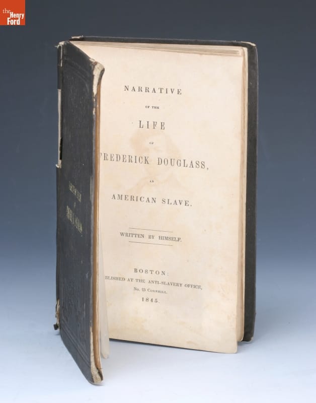
In this first memoir, Douglass provides great detail into his early life. However, because he was still a fugitive at the time of publication, he omitted details related to his escape. / THF8133
Recalling the ships on Chesapeake Bay, Douglass wrote:
“Those beautiful vessels, robed in purest white, so delightful to the eye of the freemen, were to me so many shrouded ghosts, to terrify and torment me with thoughts of my wretched condition. You are loosed from your moorings and are free; I am fast in my chains and am a slave! You move merrily before the gentle gale, and I sadly before the bloody whip!”
The ships’ freedom taunted him.
On September 3rd, 1838, Douglass courageously escaped slavery. Dressed as a sailor and using borrowed documents, he boarded a train, then a ferry, and yet another train to reach New York City—and freedom. His betrothed, Anna Murray Douglass, a free Black woman, followed, and soon after they were married. Frederick and Anna Murray Douglass moved to New Bedford, Massachusetts, with hopes that Frederick could find work as a caulker in the whaling port. Instead, he took on a variety of jobs—but, finally, the money he earned was fully his. It is believed that Anna Murray Douglass played a crucial role in supporting Frederick's escape. Their shared commitment to freedom made them a formidable team in the fight against slavery.
The American Anti-Slavery Society & the Abolitionists
While living in New Bedford, Douglass encountered William Lloyd Garrison’s abolitionist newspaper, The Liberator, for the first time. Douglass later wrote that the paper “took its place with me next to the Bible.” The Liberator introduced to Douglass the official abolitionist movement. This was a pivotal moment in his journey to becoming a prominent abolitionist leader.
In August of 1841, Douglass attended an abolitionist convention. In an impromptu speech, he regaled the audience with stories of his enslaved past. William Lloyd Garrison and other leading abolitionists noticed—Douglass’s career as an abolitionist orator had begun. Douglass became a frequent speaker at meetings of the American Anti-Slavery Society. His personal story of life enslaved humanized the abolitionist movement for many Northerners—and eventually, the world. His powerful speeches resonated deeply, inspiring many to join the cause.
In 1845, he published his first memoir, Narrative of the Life of Frederick Douglass, an American Slave. By 1847, it had already sold more than 11,000 copies! This would be followed by two more memoirs: My Bondage and Freedom in 1855 and Life and Times of Frederick Douglass in 1881. These narratives became essential texts in the abolitionist movement and the aftermath of the Civil War, providing firsthand accounts of the horrors of slavery.
This copy of William Lloyd Garrison’s The Liberator was published on August 16, 1839—around the time when Douglass first encountered the paper. / THF621979
Women’s Suffrage
Douglass was also supportive of the women’s suffrage movement. He spoke at the famous Seneca Falls Convention of 1848 in support of women’s rights. In fact, the motto of his newspaper, The North Star, was “Right is of no sex—Truth is of no color—God is the Father of us all, and we are brethren.”
While Douglass forcefully supported women’s suffrage, some of his actions put him at odds with others in the movement. He supported the adoption of the 14th amendment, ratified in 1868, which guaranteed equality to all citizens—which included Black and white males, including the formerly enslaved. It did not include women. He also supported adoption of the 15th amendment, ratified in 1870, which secured Black males voting rights. Again, the amendment excluded women. Although a dedicated women’s rights activist, Douglass supported the adoption of the 14th and 15th amendments as he believed the matter to be “life or death” for Black people. This put him in disagreement with Elizabeth Cady Stanton and Susan B. Anthony, two of the leaders of the women’s suffrage movement, as well as his friends. Despite this disagreement about timing, Douglass would continue to lecture in support of women’s equality and suffrage until his death.
John Brown’s Raid
Douglass was well-acquainted with famous abolitionist leader John Brown, first meeting him in 1847 or 1848. Brown became known for leading a raid on the armory at Harpers Ferry, Virginia, in 1859, intending to create an “army of emancipation” to liberate enslaved people. Douglass and Brown spoke shortly before John Brown’s raid. Brown had hoped that Douglass would join him, but Douglass declined. He believed that Brown was “going into a perfect steel trap, and that once in he would not get out alive.”
Douglass was right. Brown was captured during the raid and was subsequently tried, convicted, and executed. Brown became seen as an anti-slavery martyr, as the below print shows. Henry David Thoreau remarked about him, “No man in America has ever stood up so persistently and effectively for the dignity of human nature…”
A letter from Douglass was found among John Brown’s belongings, leading to warrants for Douglass’s arrest as a conspirator. He was lecturing in Philadelphia at the time of the discovery. John Hurn, Philadelphia’s telegraph operator, was sympathetic to the abolitionist cause. He received a dispatch for the sheriff calling for Douglass’s arrest and both sent a warning to Douglass and delayed relaying the dispatch to the sheriff. Douglass fled and made it to Canada, narrowly escaping arrest. He then went abroad on a lecture tour, resisting apprehension in the States.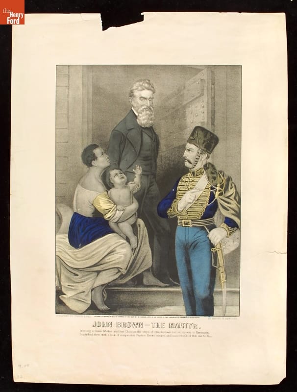
The text on this Currier & Ives print reads “John Brown—The Martyr: Meeting a Slave Mother and her Child on the steps of Charlestown Jail on his way to Execution. Regarding them with a look of compassion Captain Brown stooped and kissed the Child then met his fate." This did not actually occur, but became popular lore, as well as the subject of artwork and literature. / THF8053
The Civil War & Abraham Lincoln
In 1860, Abraham Lincoln was elected President of the United States. At the time, Douglass was not optimistic about the cause of abolition under Lincoln’s presidency. As tensions between the North and South grew and Civil War loomed, Douglass welcomed the impending war. As biographer David Blight states, “Douglas wanted the clarity of polarized conflict.”
Douglass got involved in the war effort through the recruitment of Black soldiers. Two of his sons, Charles and Lewis, joined the 54th Massachusetts Regiment, the second Black regiment in the Union Army. Douglass first met President Abraham Lincoln in August 1863, when he visited the White House to discuss grievances against Black troops. Even without an appointment and a room full of people waiting, Douglass was admitted to see Lincoln after just a few minutes.
Two of Frederick Douglass’s sons, Lewis and Charles, fought with the 54th Massachusetts Colored Regiment. Lewis Douglass was appointed Sergeant Major, the highest rank that a Black person could then hold. / THF73704
Douglass would go on to advise Lincoln over the following years. After Lincoln’s second inaugural address, he asked Douglass his thoughts about it, adding, “There is no man in these United States whose opinion I value more than yours.”
On February 1, 1865, Lincoln approved the Joint Resolution of the United States Congress proposing the 13th Amendment to the Constitution—the “nail in the coffin” for the institution of slavery in the United States. But before the 13th Amendment could be ratified, Lincoln was assassinated by John Wilkes Booth on April 15, 1865. While Douglass and Lincoln certainly disagreed on many topics, Douglass remembered him fondly. In his eulogy, Douglass called Lincoln “the Black man’s president: the first to show any respect to their rights as men.”
After the Civil War and even after Reconstruction, Douglass held high-ranking government appointments—often becoming the first Black person to do so. Douglass was appointed the Minister Resident and Consul General to Haiti in 1889.
While Douglass certainly supported the 13th Amendment’s abolition of slavery, he did not think it went far enough. He remarked, “Slavery is not abolished until the black man has the ballot. While the legislatures of the south retain the right to pass laws making any discrimination between black and white, slavery still lives there.” / THF118475
Douglass continued to lecture in support of his two primary causes—racial equality and women’s suffrage—until the very end. On February 20, 1895, he attended a meeting of the National Council of Women, went home, and suffered a fatal heart attack. He was 77 years old.
Frederick Douglass remains one of the most inspirational figures in American history. We can still feel the weight of the words he wrote and spoke, more than 125 years after his passing. Douglass said, “Memory was given to man for some wise purpose. The past is … the mirror in which we may discern the dim outlines of the future and by which we may make it more symmetrical.” This work continues.
Frederick Douglass remains a powerful symbol of the fight for racial justice and equality. Here, his image graces the cover of Ebony Magazine’s issue celebrating the 100th anniversary of the Emancipation Proclamation. / THF98736_REDACTED
Katherine White is Associate Curator, Digital Content, at The Henry Ford. She appreciated the recently published book by David Blight, Frederick Douglass: Prophet of Freedom, as she conducted research for this post.
Maryland, women's history, voting, Massachusetts, education, Civil War, Civil Rights, by Katherine White, books, African American history, Abraham Lincoln, 19th century, #THFCuratorChat

"Narrative of the Life of Frederick Douglass," 1845 / THF8133
“I was born in Tuckahoe…in Talbot County, Maryland,” begins Frederick Douglass, in this, his first of three memoirs. In 1818, he was born into slavery as Frederick Augustus Washington Bailey, to Harriet Bailey, his enslaved mother, and an unknown white father—likely his master, Aaron Anthony. At the age of twenty, he escaped slavery and changed his name to Frederick Douglass. This first memoir, published in 1845, is foremost an account of Douglass’s early life—from the time of his birth until his daring escape.
But it is also a political text that humanized the enslaved and the cause of abolition. Douglass was a master storyteller—as well as a legendary orator—and this memoir is a compilation of the most moving moments of his young life, including the tragically few memories he has of his mother, the gruesome beatings he both endured and witnessed, the joys and challenges of learning to read, and, of course, his courageous escape from slavery. By 1847, it had already sold more than 11,000 copies and supported the young family he was building with his wife, Anna Murray Douglass. 
Portrait of Frederick Douglass, circa 1860 / THF210623
Douglass is best known for his long and celebrated career as an abolitionist orator, which began with an impromptu speech at an 1841 antislavery meeting. This would be the first of a lifetime of speeches. Douglass would go on to lecture about racial equality all over the world until his death in 1895. He also advised numerous sitting American presidents, including Abraham Lincoln, and was the first Black man to hold numerous high-ranking governmental posts.
Douglass was both a witness and a catalyst: he exposed the horrors of slavery and inequality, and then made it his life’s work to create a more just America.
This post was adapted from a stop on our forthcoming “Stories of Black Empowerment” tour of Henry Ford Museum of American Innovation in the THF Connect app, written by Katherine White, Associate Curator, Digital Content at The Henry Ford. To learn more about or download the THF Connect app, click here.
Maryland, THF Connect app, Henry Ford Museum, by Katherine White, books, African American history, 19th century, 1840s

Stone Cold Systems Ice-Less Vaccine Refrigerator, 2018 / THF185488
People might think that curators look at objects in the same way. In fact, every curator at The Henry Ford has a different background and range of expertise, and we interpret things through a varied set of lenses.
Take, for example, an artifact in The Henry Ford’s collection that is related to a top-of-mind subject right now—vaccines. We were asked to offer two interpretations of the Stone Cold Systems Ice-less Vaccine Refrigerator, a 2018 IDSA (Industrial Design Society of America) winner (you can find out more about The Henry Ford’s relationship with IDSA here). Here are our thoughts.
Katherine White, Associate Curator, Digital Content:
At its best, design solves problems. Good designers are problem solvers, creatively working through a problem’s constraints towards a competent solution. When I first became familiar with this artifact, the Stone Cold Systems Ice-Less Vaccine Refrigerator, I was taken with its functionality and potential for social impact, all wrapped in a sleek case. This vaccine refrigerator, built within a siren-red carrying cage, aims to improve vaccine distribution to hard-to-reach locations.
The invention of vaccines has had an incredibly positive impact on global health. The World Health Organization estimates that 2–3 million deaths globally are avoided due to immunizations each year. But, perhaps surprisingly, vaccines can be fragile. They often need to be kept at a stable temperature (usually cold) without exposure to light or significant environmental fluctuation. The efficacy of the vaccine could be compromised should these factors not be met. The journey from the scientist’s laboratory to the arm of someone in New York City is a long one—and an even longer journey should that someone live in a rural area or developing country.
Stone Cold Systems Ice-Less Vaccine Refrigerator Quick Start Guide / THF621440
This vaccine refrigerator aims to increase access to immunizations, regardless of where one calls home. It utilizes a more reliable iceless thermoelectric cooling technology and is rechargeable by multiple methods, including solar energy, so can be used anywhere. Although developed prior to the global COVID-19 pandemic, its future in fighting the pandemic is clear.
The late design critic Ralph Caplan is noted as saying that “design is a process of making things right.” Creation of a product which facilitates access to effective immunizations for all people—even far from a modern hospital building—is certainly one way to make things right.
Donna R. Braden, Curator of Public Life:
This vaccine refrigerator immediately brought to mind the recent research I’ve been doing on Dr. Alonson Bingley Howard, a 19th-century country doctor whose office is now located in Greenfield Village. At the time Dr. Howard was practicing medicine (1855–83), people didn’t understand the nature of germs and contagion, or that diseases were transmitted this way. As a result, infectious diseases—like cholera, tetanus, yellow fever (or malaria), measles, dysentery, scrofula, and typhoid—were the leading causes of death at the time. These often reached epidemic proportions and people constantly feared that they, or members of their families, might contract them. But, without knowledge of what caused and spread disease, or modern pharmaceuticals (including vaccines), safe drinking water, and improved sanitation facilities, 19th-century country doctors constantly fought an uphill battle.
How relevant this is, I thought, to our lives today—to the COVID-19 pandemic; to people fearing they or members of their family might contract the virus; to our current knowledge of germs and our understanding that washing our hands, cleaning surfaces, and wearing masks reduces their spread; and to our hopes for combatting this disease through the application of successful vaccines.
Stone Cold Systems Ice-Less Vaccine Refrigerator, alternate view / THF185489
What about those deadly infectious diseases of the 19th century that Dr. Howard was attempting to treat, like cholera, yellow fever, and typhoid? One might assume they have disappeared—but they haven’t. Many of them still exist, especially in developing countries that have limited-to-no access to modern medical treatments, sanitation facilities, and vaccines. This refrigerator was, in fact, designed to hold vaccines where there is no electricity—in these very countries.
Katherine White is Associate Curator, Digital Content, at The Henry Ford. Donna Braden is Senior Curator and Curator of Public Life at The Henry Ford.
21st century, 2010s, International Design Excellence Awards, healthcare, design, COVID 19 impact, by Katherine White, by Donna R. Braden
