
Posts Tagged by kristen gallerneaux
Throughout history, women have served their country during war and in peacetime, on the home front and at the front lines. Since the founding of this country, both military and civilian women contributed to their nation’s cause—whether through active service, or by using their talents and time to support our fighting forces from afar—in ways that were and are often overlooked. Through these objects from the collections of The Henry Ford, we can explore some of these important stories, shedding light on women and their service.
Frances Clayton
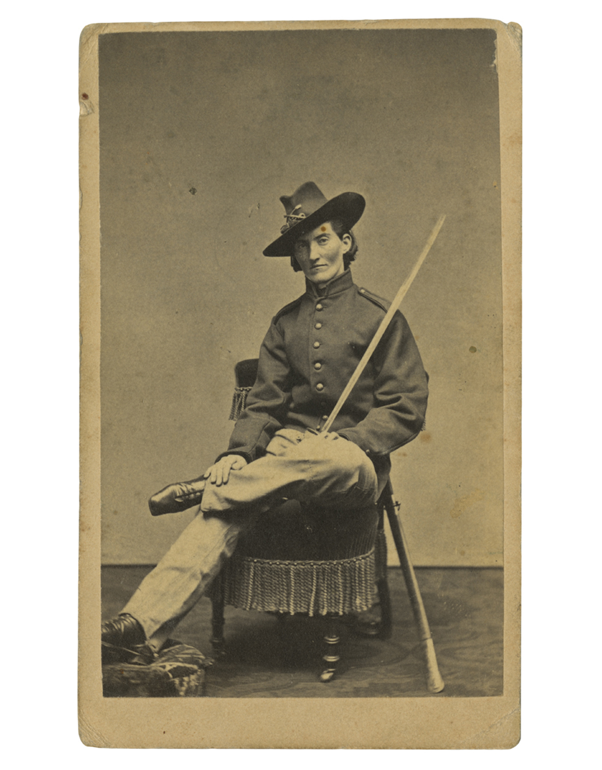 Frances Clayton (c.1830-after 1865), who disguised herself as “Jack Williams” to join her husband in the war, posed for this carte-de-visite at Samuel Masury’s studio in Boston, Massachusetts, circa 1865. While some have questioned Clayton’s exact involvement in the war, her images in uniform are probably the most recognized. / THF71763
While women could not officially serve in combat roles in the United States until 2016, women participated in combat as early as the American Revolution—dressed as men.
During the Civil War, hundreds of women concealed their identities to enlist and fight in battles across the country. Their motivations varied: some wanted to stay close to husbands, brothers, or other loved ones, while others sought to defy societal norms, pursue adventure, or earn a soldier’s pay and enlistment bounty. Patriotism was another driving force—with northern women supporting the Union or abolitionist causes, and southern women joining to support the Confederacy.
At the time, joining the military was easier. With an urgent need for soldiers, physical exams were brief, and no identification was required. A woman could cut her hair, wear men’s baggy clothing, and adopt a male alias. Some were eventually discovered and sent home, others were wounded or killed during service, and others returned home, mustering out at the end of their service.
—Aimee Burpee, Associate Curator
WAAC Women's Army Auxiliary Corps
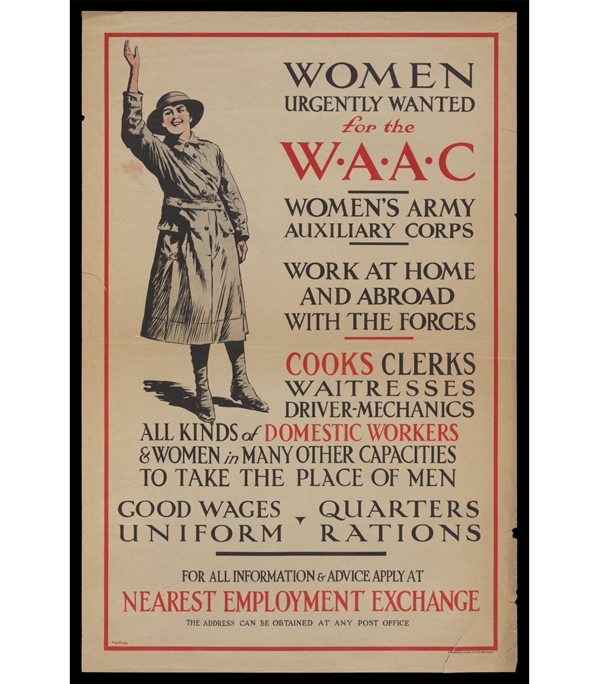 “Women Urgently Wanted for the WAAC Women's Army Auxiliary Corps,” circa 1917 / THF726518
Over 50,000 British women volunteered with the Women's Army Auxiliary Corps in 1917 and 1918, the final two years of the First World War. WAAC volunteers took on support roles such as administrative work, catering, or vehicle maintenance at home in the United Kingdom and on the front in France and Belgium. In doing so, WAAC freed up British men on the front from non-combative tasks so the military could focus on the battlefield. This was the first time that women were allowed in the British armed forces in an official capacity outside of nursing.
The corps was renamed Queen Mary's Army Auxiliary Corps in 1918 after Mary of Teck, the queen consort of King George V, became the corps patron. The original WAAC/QMAAC disbanded in 1921, but it inspired women's auxiliary military corps in Great Britain and the Commonwealth and in the United States during the Second World War.
—Kayla Chenault, Associate Curator
“Molly Pitchers”
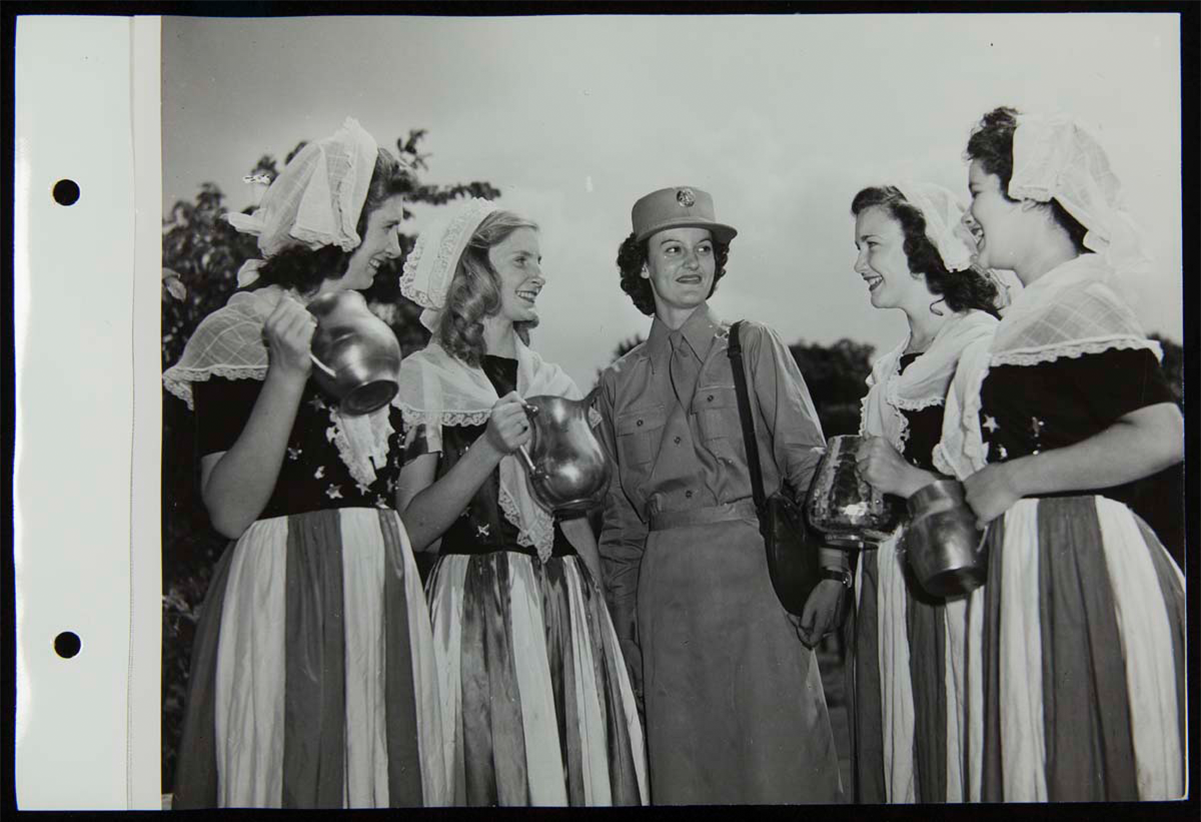 “Molly Pitchers” and Women’s Army Corps recruiter, August 4, 1943. / THF272635
"Molly Pitcher" was the symbolic name given to several historic women who served during the Revolutionary War. These women, usually a soldiers' wife, were noted for carrying water and other provisions to frontline troops. But they became more famous for fighting alongside other soldiers after their husbands or loved ones had fallen in battle.
During the Second World War, August 4, 1943, was designated Molly Pitcher Tag Day. On that day, thousands of women throughout the United States dressed in early American or patriotic costumes and became contemporary "Molly Pitcher" heroines by selling war stamps and bonds. At Greenfield Village, Women's Army Corps recruiters from Detroit, Michigan, and four "Molly Pitchers" came together to raise money for the bond drive, shining a light on women's contributions—whether on the home front or in military service—to America's war efforts since our country's founding.
—Andy Stupperich, Associate Curator
Eames Molded Plywood Leg Splint
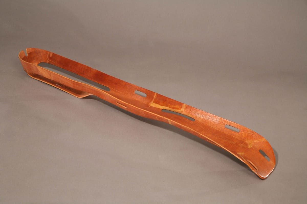 "Eames Molded Plywood Leg Splint, circa 1943. / THF65726
Husband-and-wife designers Charles and Ray Eames spent the early years of their partnership experimenting with molding plywood for use in furniture and sculptural objects. In the early 1940s, they used the spare bedroom in their Los Angeles, California, apartment to develop a machine to mold plywood using pressure. A friend, Dr. Wendell Scott of the Army Medical Corps, visited the Eames’ home and saw the potential of molded plywood for the war effort. America’s entry into World War II had created material shortages, including metal. Despite the shortage, metal splints were being used for broken limbs on the battlefield even though they were inflexible and heavy, and worsened wounds in transport.
Upon hearing this, the Eames designed a flexible, lightweight and durable leg splint using the same molded plywood technology they were developing for plywood furniture. They presented their prototype splint to the U.S. Navy and worked with them to further modify and perfect the product. By 1942, the Navy had placed an order for 5,000 splints. The Eames Leg Splint became a successful medical innovation and a design artifact, as well as a critical step in the Eames understanding of molded plywood.
—Adapted from What if Collaboration is Design? Katherine White, Curator of Design
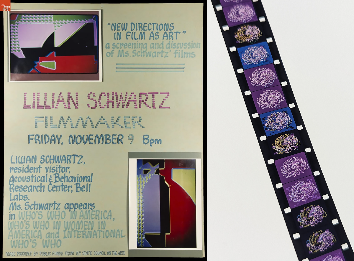
Lillian Schwartz, Nurse Cadet
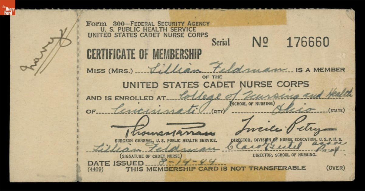 Certificate of Membership in the United States Cadet Nurse Corps for Lillian Feldman (Schwartz), August 14, 1944 / THF705895
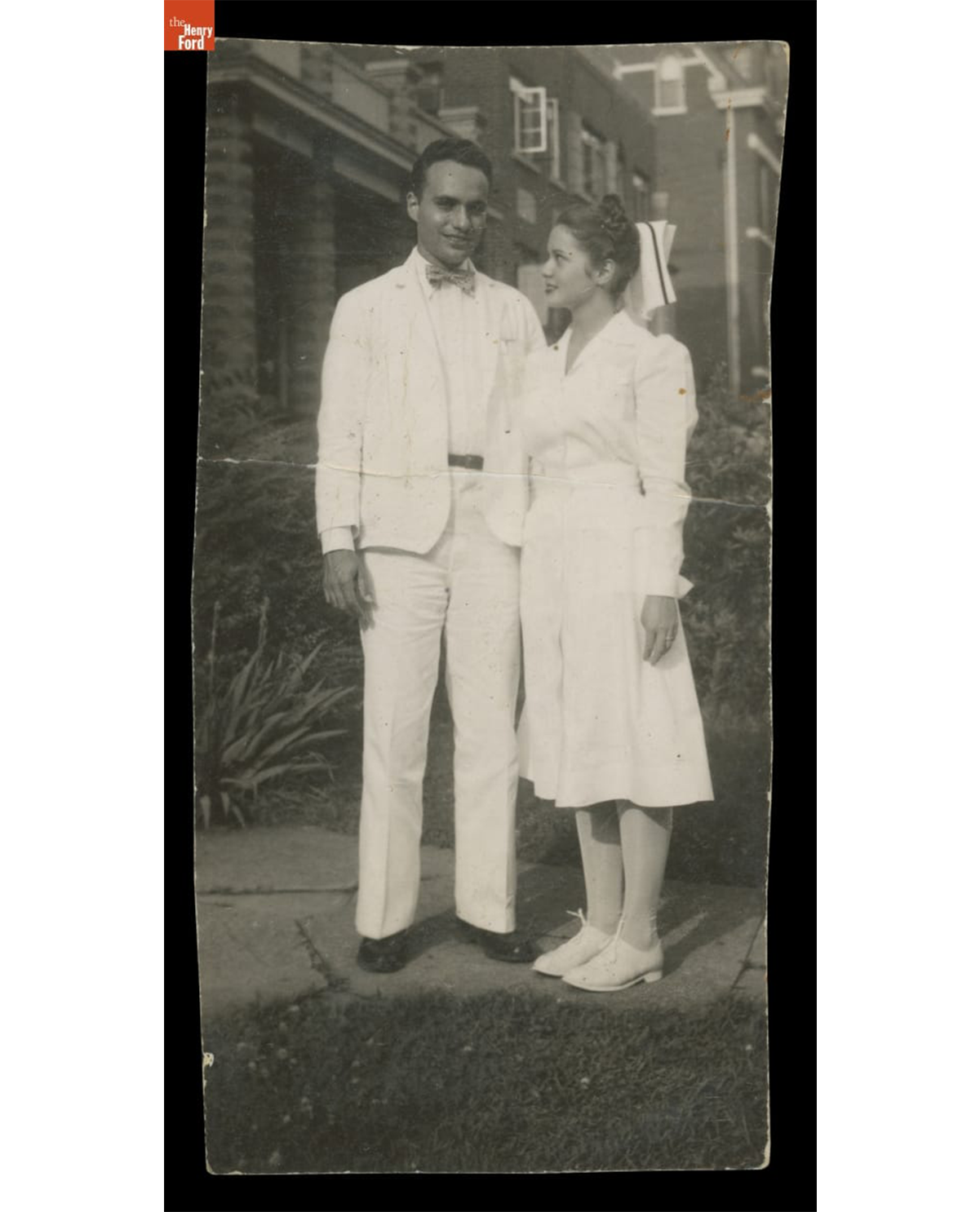 Lillian Schwartz and Jack Schwartz, circa 1946. / THF704693
Lillian Feldman Schwartz (1927-2024) was an American artist who began working at the forefront of computer art and experimental film in the late 1960s at Bell Laboratories. Before her art career was established, however, her life was entwined and impacted by service in the medical field during the last years of WWII, and in its immediate aftermath.
In 1944, when Lillian was 17, she applied to the United States Cadet Nurse Corps—a tuition-free program designed to address the WWII nursing shortage. Lillian did well in her coursework, but she quickly realized that she struggled with nursing people. Despite this, she found ways to bring joy into the Cincinnati hospital where she worked by painting murals in the children’s ward and making plaster sculptures in the cast room. Lillian quickly realized that she was an artist, not a nurse. While working in the hospital pharmacy, she met an intern named Jack Schwartz, whom she would marry in 1946. In 1948, Jack was stationed in Fukuoka, Japan, and Lillian traveled to join him after the birth of her first son. Unfortunately, she developed polio symptoms several weeks after her arrival, and in the post-war aftermath, she was also exposed to the lingering effects of radiation from the atomic bombings in Hiroshima and Nagasaki. These experiences led to serious health issues throughout her life and were often referenced in her art projects and writing.
—Kristen Gallerneaux, Curator of Communication & Information Technology
This collaborative blog was written by the staff of The Henry Ford
by Kristen Gallerneaux, by Aimee Burpee, by Rachel Yerke-Osgood, by Andy Stupperich, By Kayla Chenault, by Katherine White
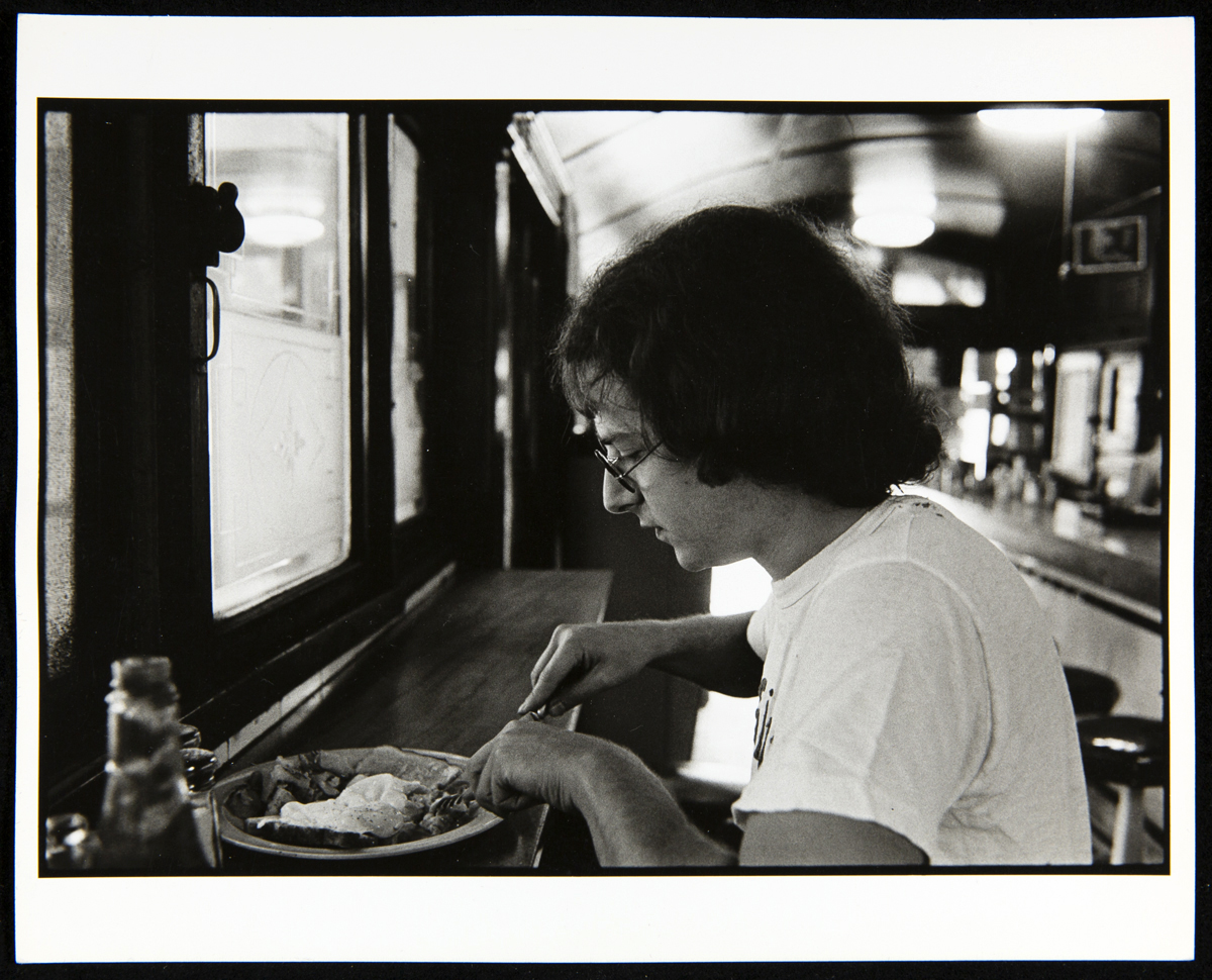
Richard J.S. Gutman in the Kichenette Diner, Cambridge, MA, circa 1974. Photograph by John Baeder. / THF297027
The diner, it seems, is irresistible. The sleek diner in a streetscape, the booth as setting for friends and family getting together, the beckoning counter stool for the lone traveler’s brief stop—all of it has become cherished over generations—the diner as a world within the greater landscape of people’s lives. For over half a century Richard J.S. “Dick” Gutman has been immersed in this world. He has spent his career living and breathing his way through the origins, design, operation, and stories connected to diners. Starting academically with his architecture thesis at Cornell University, his interests and efforts expanded and have continued to the present day through an active roster of publications, research, lectures, and restoration consultations.
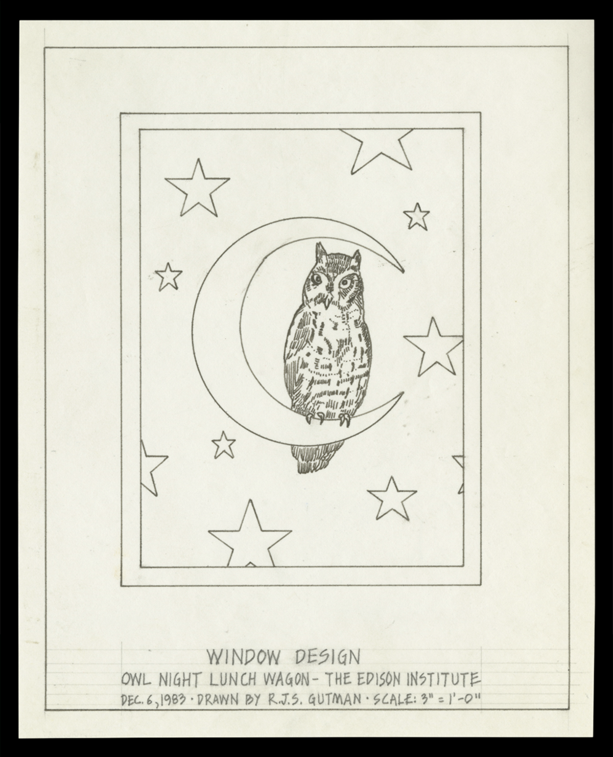
Window design drawn by Gutman during the restoration of the Owl Night Lunch Wagon, 1983. / THF715111
Much has already been “dished” about Gutman’s foundational years as an architectural historian specializing in American diners. Most recently, we were treated to a guest feature in The Henry Ford Magazine, penned by Mr. Gutman himself. Likewise, since the 1980s, he has worked as a consultant at The Henry Ford on guest-favorite projects such as the Owl Night Lunch restoration, the relocation of Lamy’s Diner, and collaborating to ensure the historical accuracy of Lamy’s menu.
In 2019, Mr. Gutman generously donated his diner collection to The Henry Ford. This collection includes everything from architectural fragments and interior fixtures to menus, trade magazines, historic photographs, and Gutman’s own photographic documentation. A rich and unmatched resource, co-curators Kristen Gallerneaux and Marc Greuther were honored to look deeply into this collection to create the temporary exhibit, Dick Gutman, DINERMAN (on view 25 May 2024 - 16 March 2025). A selection of the less-explored areas of this collection that are included in this exhibit are gathered here.
Dick Gutman, On the Road
In 1975, when Gutman was 25 years old, he met Charles Gemme from the Worcester Lunch Car Company. Gemme—who was 95 at the time—wrote down a list of diners that Gutman should visit. Gutman hit the road with his camera. Typically he traveled alone but was sometimes accompanied by his wife Kellie or fellow diner-obsessive and painter John Baeder.
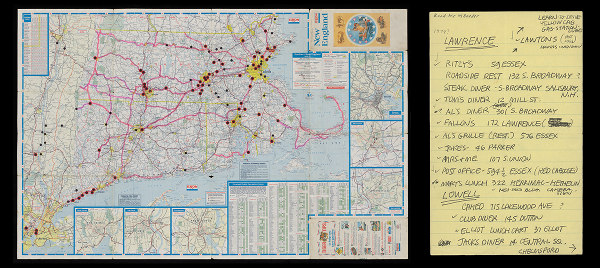
New England road map used by Dick Gutman with locations of diners indicated, circa 1975 (left) / THF715142; A diner list used during a 1974 road trip by Gutman & painter John Baeder (right) / THF714577
In an interview, Gutman described his challenges on these early trips: “Some [diner owners] didn't want to talk to me. They were too busy, they didn't understand it. They didn't like that my hair was too long. They thought I was from the health department.” But eventually, he began to break through: “I unearthed the history of diners by visiting and photographing them and talking to the people who owned them and the people who built them.”
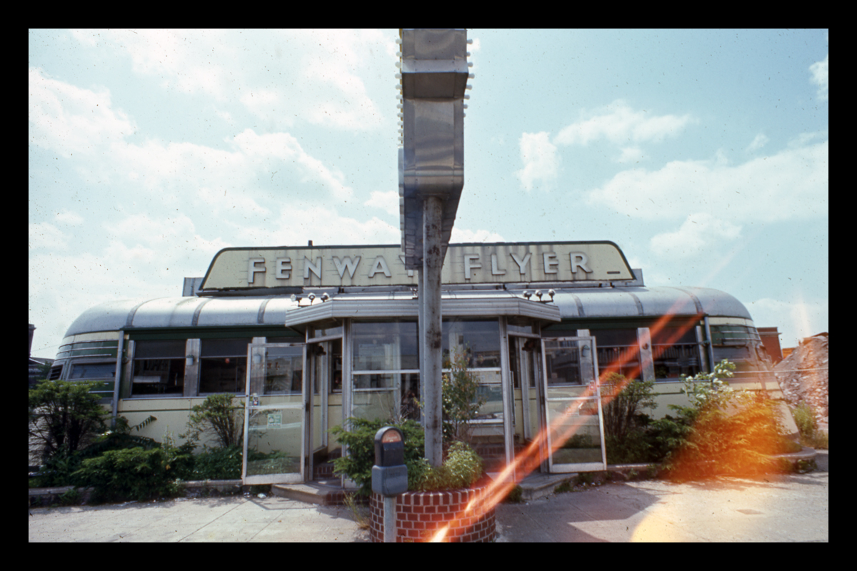
The Fenway Flyer diner, as photographed by Dick Gutman in August 1971. This is the first photograph of a diner that Gutman took. / THF714873
Gutman’s collection contains an important “first,” in the form of a photograph. “The first diner I ever took a picture of was the Fenway Flyer. You have the slide, and it has a light leak. It's the first picture on my roll and I hadn't rolled the film in enough. I only took one picture like that, so it's timestamped in that manner. It was demolished around 1975.”
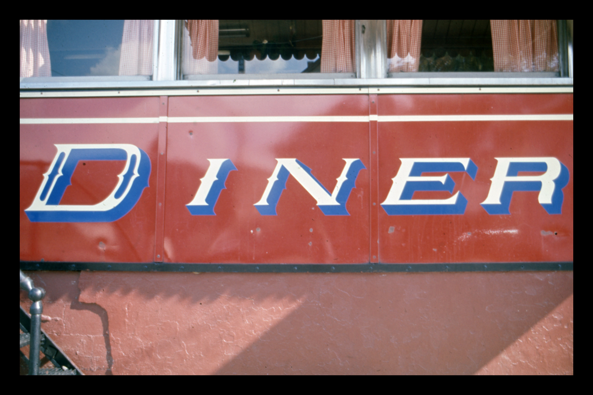
Gutman’s photographs of diners—largely concentrated in the 1970s through the early-2000s—are an invaluable time capsule planted at the intersection of unique architectural history, homegrown entrepreneurship, and community memory. They document the surface-level details of the type of visual flare that diners are known for: decorative tile, flashy steel and Formica-clad surfaces, and colorful, attention-seeking enamel signage.
Lettering on a porcelain enamel diner façade, Peerless Diner, later Four Sons Diner, Lowell, Massachusetts. Photograph by Dick Gutman. / THF714788
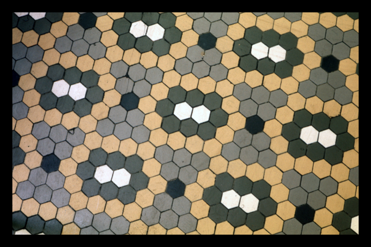
Floor tile in Jimmy's Diner, Bloomfield, NJ. Photograph by Dick Gutman. / THF714819
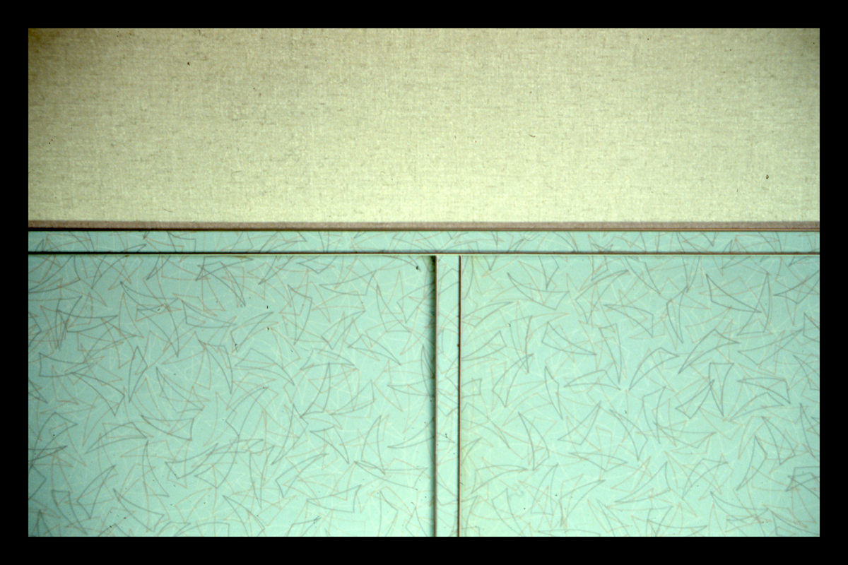
Formica at Deepwater Diner, Deepwater, NJ, 1987. Photograph by Dick Gutman. / THF714808
Notably, Gutman turned his camera to the details of interior spaces as well. He photographed employees moving through the nuanced workflows of confined diner spaces—spaces where everything was always on view. We see evolving uniforms, optimized grills, cluttered cashier’s booths, handmade menus, and shorthand orders scribbled on tickets. While Gutman’s collection contains a Wunderkammer’s-worth of disposable goods—paper coffee cups, toothpicks, serve ware, and paper hats—it is within these images where we are given a glimpse of these items situated within the “diner in action.”
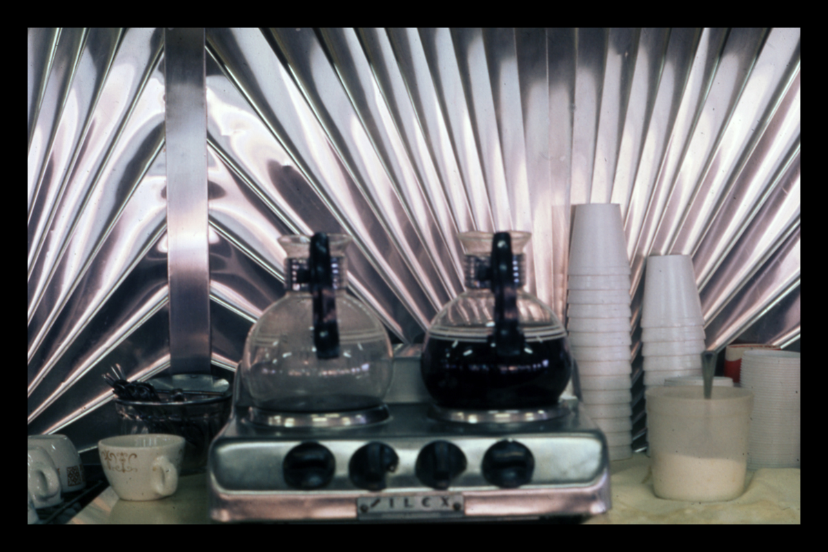
Coffee pots in front backbar clad in sunburst stainless steel panels, Phillips Diner, Woodbury, CT. Photograph by Dick Gutman. / THF714795
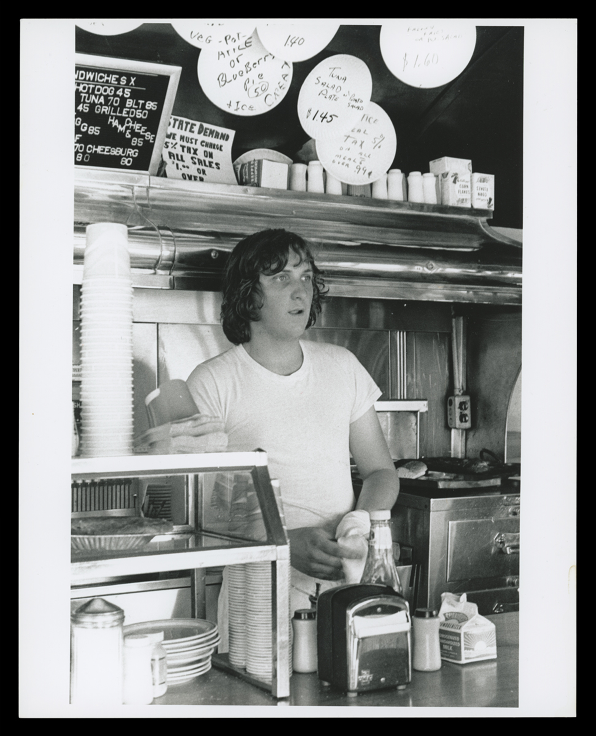
Cook Kenny Barrett inside Buddy's Truck Stop, Somerville, MA, circa 1974. Note the handwritten specials on paper plates. / THF715018
Less acknowledged in these images—but of great significance—is Gutman’s use of the camera to hint at those most elusive of sensory memories connected to the diner: a sun-drenched ashtray on a table that you can almost smell, vinyl-covered stools that stick to the back of your legs in the summer, the intense concentration of waitstaff leaning in to hear your order, the sizzle of the flat top grill cutting through the din of conversations, a sleeping baby on a booth table—oblivious to it all (or perhaps dreaming of diners). Enigmatic and unpretentious at once, these fleeting moments of the everyday that fill Gutman’s photography portfolio throughout the 1970s-1990s are deserving of our attention.
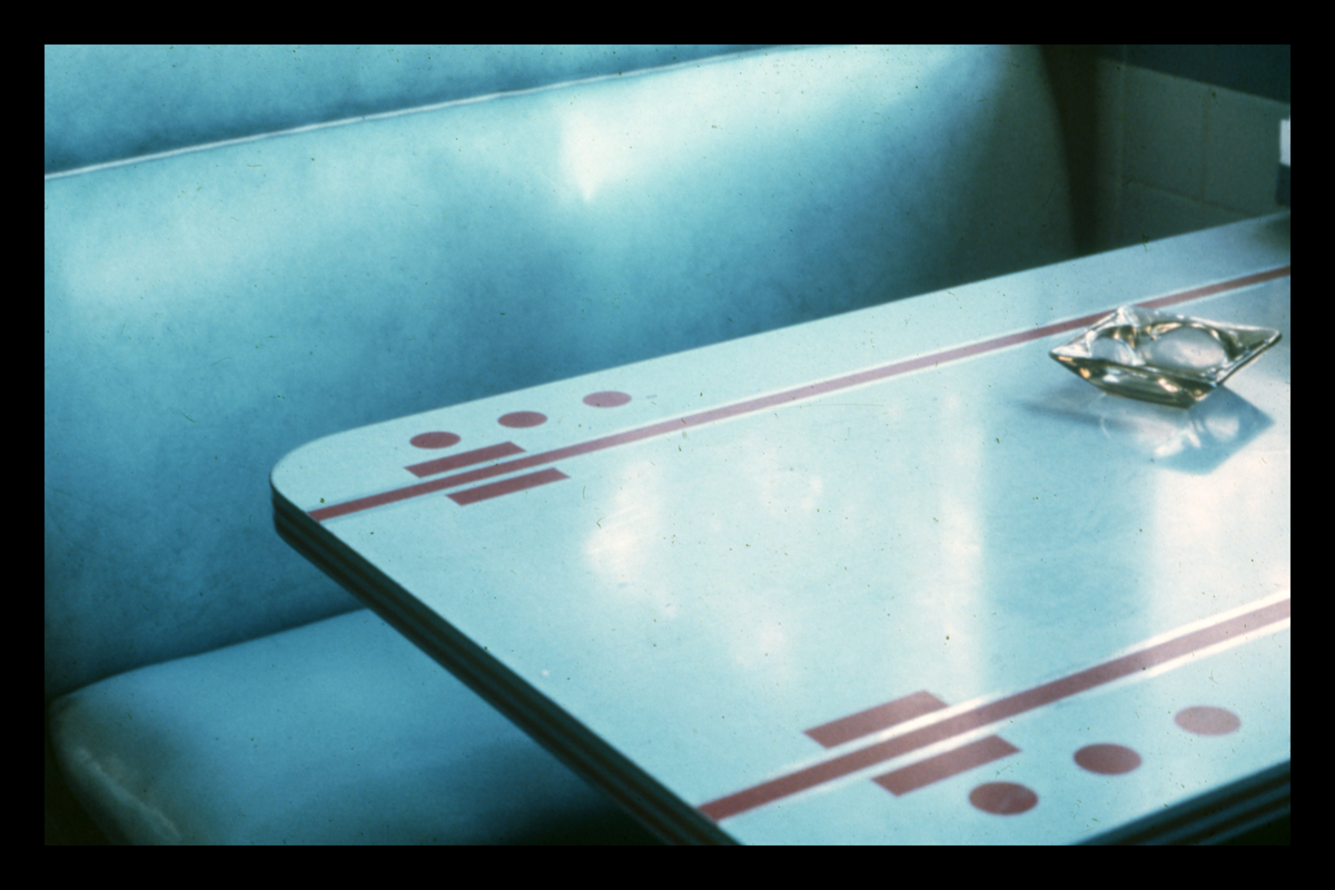
Booth in Village Square Diner, Grand Gorge, New York, 1973. Photograph by Dick Gutman. / THF714814
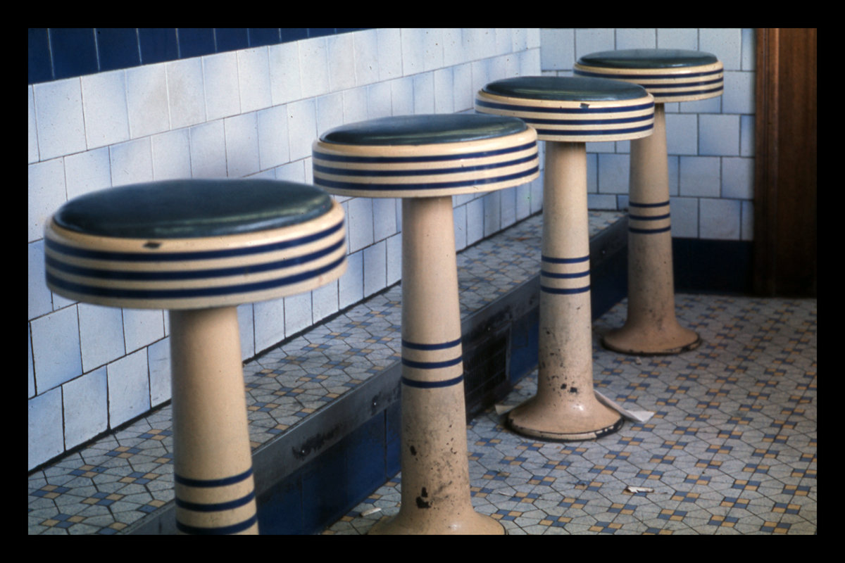
Original 1938 porcelain enamel stools in Silver Top Diner, Providence, RI, 1973. Photograph by Dick Gutman. / THF714811
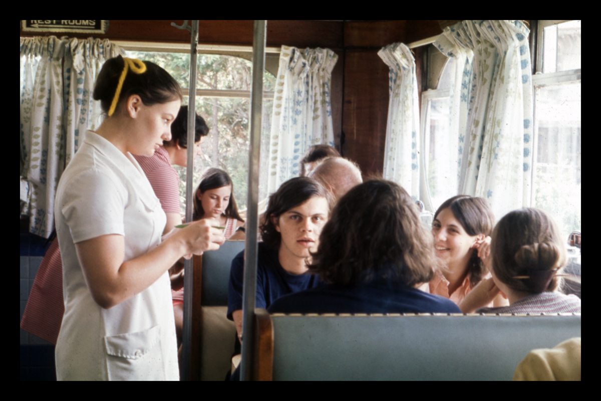
Server taking orders at Collin's Diner, North Canaan, CT, 1972. Photograph by Dick Gutman. / THF714846
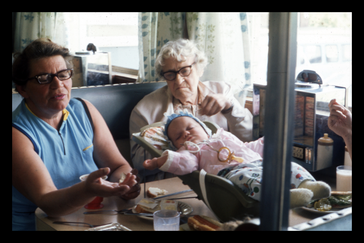
Customers seated in a booth at Collin's Diner, North Canaan, CT, March 1973. Photograph by Dick Gutman. / THF714844
Diner Archeology
As Gutman quickly learned, diners were on the decline. He realized that his first visit to a diner might turn out to be the last. All too often, he would return to a business after a short time to find the windows boarded over with for sale signs. Even worse, there were the times when he would find himself staring at a rubble-filled lot—the building demolished.

The former "Uncle Wally's," a 1950 Paramount Roadking model diner in a field, circa 1975. / THF714969
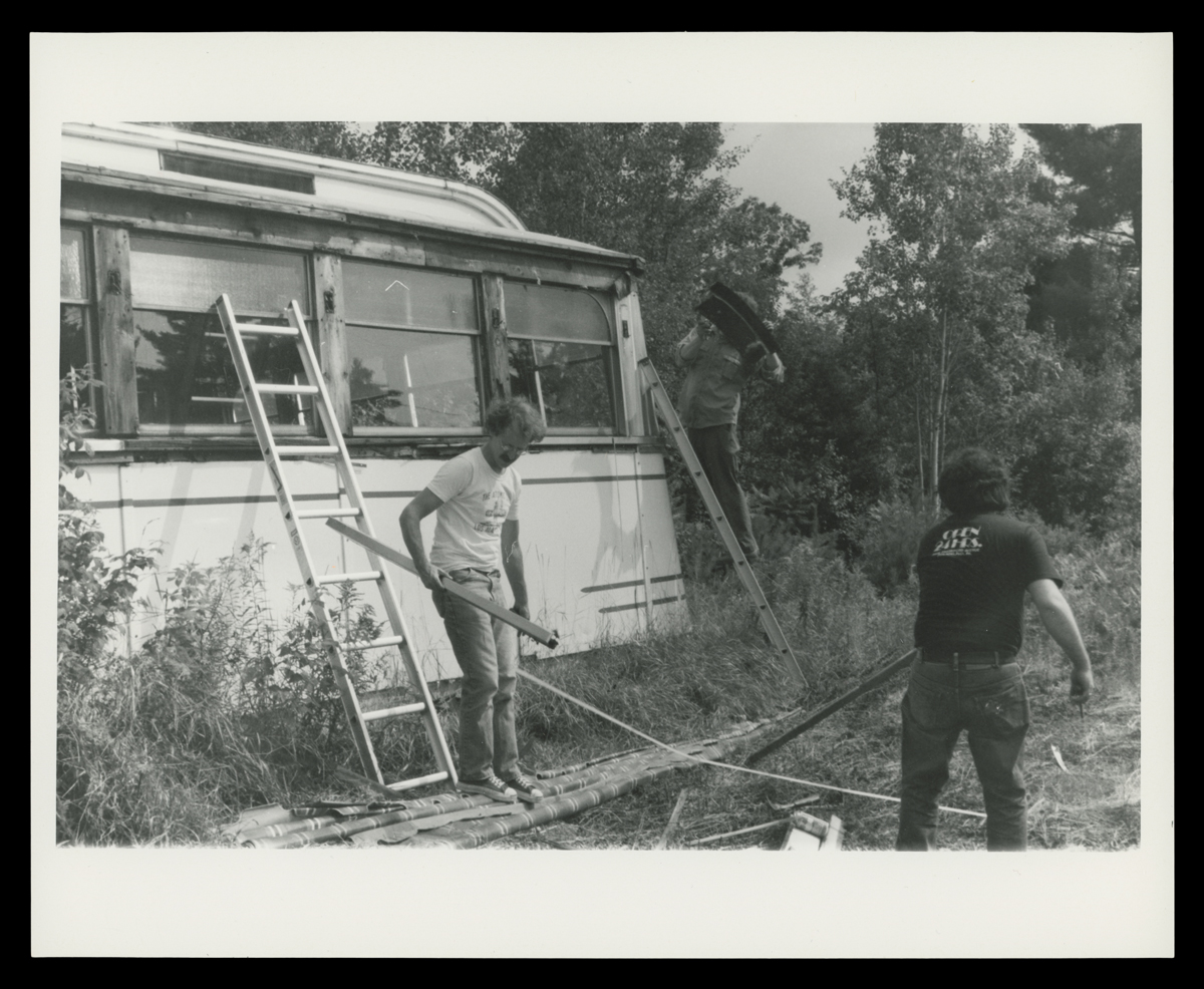
Richard Gutman (left) and Larry Cultrera Dismantling Corriveau's Diner for salvage, Gilmanton, NH, August 1985. / THF715129
These experiences led to Gutman’s impulse to begin salvaging literal fragments of diners: chunks of tile floor lovingly laid by hand generations prior, a craggy section of Formica bearing the iconic pink “Skylark” pattern, and sparkling jewel-toned Flexglass tiles. They formed an essential reference library for Gutman’s restorations, providing physical proof of surprising trends in materials, interior designs, color, and patterns that filled diners.
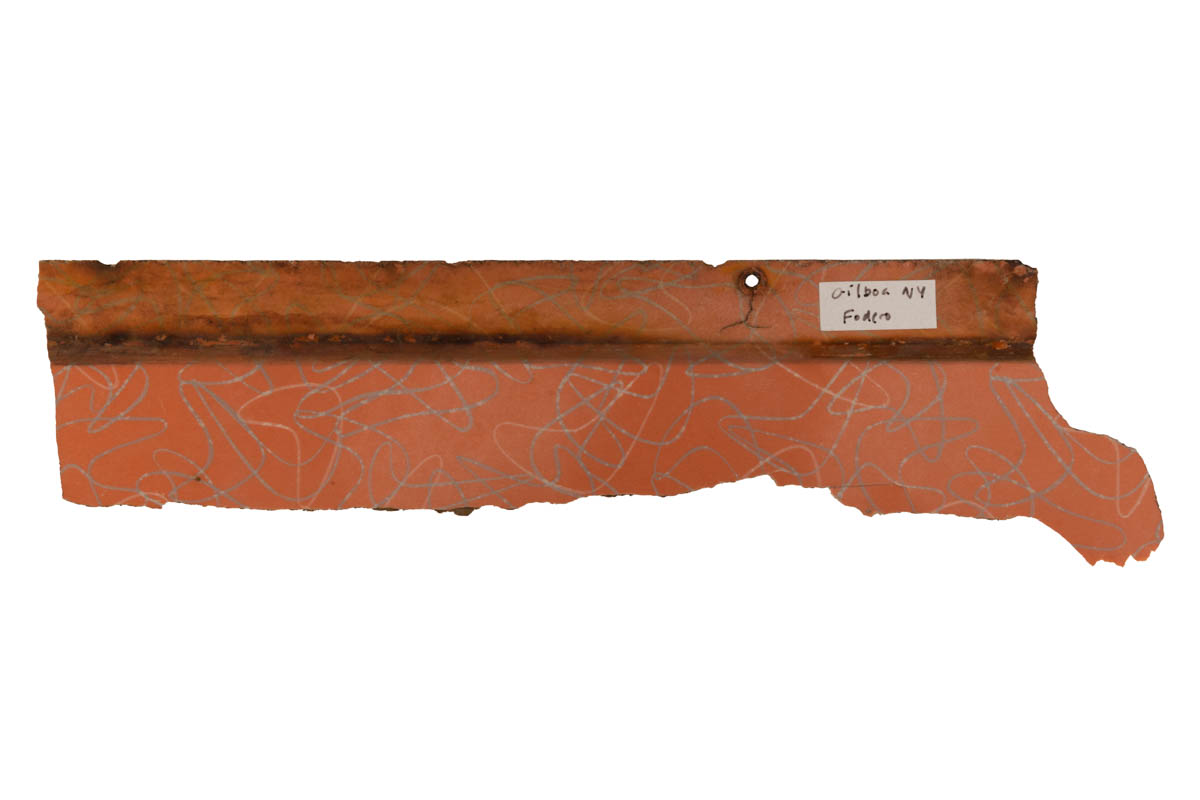
"Skylark” pattern Formica fragment, from the Americana Diner, 1952-1953. / THF371317
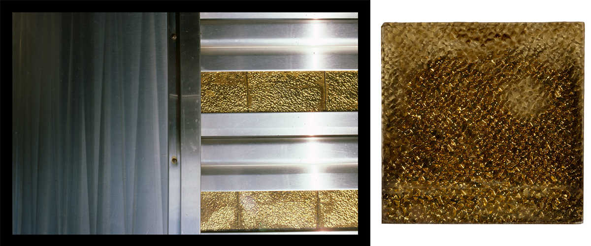
Flexglass and stainless steel cladding on Key City Diner, Phillipsburg, NJ (left) / THF714804; Flexglass tile from the Lincoln Diner, Kensington, CT, circa 1960 (right) / THF371079
Sometimes, Gutman received news of a diner closing and was able to work directly with its owners to recover decorative panels, menu boards, and historic counter stools. During these salvage operations, he was careful to document where even the tiniest shards originated, which—over decades of collecting—might be reunited with additional ephemera from the same diner. While some may find this type of collecting strange, Gutman extracted these fragments of the past from the field as a way of preserving the future.
Gutman noted in a recent interview: “One of the great tile finds was in Rhode Island. I was photographing Snoopy's Diner and I had to go across the road to get the picture. […] I'm carefully backing up to make sure that I don't fall down the hill. And I look, and there's the remains of another diner. Instead of hauling it away, they just bulldozed the thing! A lot of it had rotted, but there were still the indestructible ceramic tile walls and floor—which I picked up some massive pieces of and put in our car. They're now part of [The Henry Ford’s] collection. Not exactly like Pompeii or Herculaneum—but they have a story to tell.”
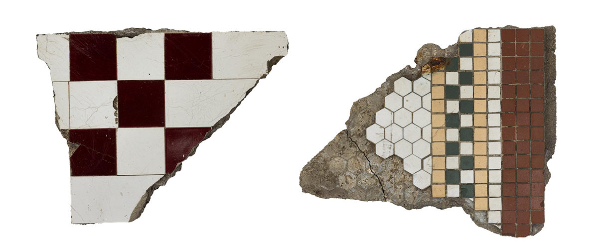
Wall tile fragment mentioned above, from the site of a Worcester Lunch Car in North Kingstown, RI, 1920-1939 (left) / THF197842; Floor tile fragment from Hodgin's Diner, York Beach, ME, circa 1915 (right) / THF197841
Beyond their importance within the built environment, diners have impacted our culture, communities, and of course foodways at a national scale. During a time when the American diner seemed to be rapidly disappearing, Dick Gutman raced to document this landscape. This undertaking was crucial to preserving and raising awareness of these easily-lost commercial forms of architecture. We at The Henry Ford are grateful to act as the repository for the incredibly prolific tapestry of research, images, and objects that Dick Gutman gathered.
Kristen Gallerneaux is Curator of Communication & Information Technology. This blog excerpts and expands upon exhibit labels written by Kristen Gallerneaux and Marc Greuther, co-curators of Dick Gutman, DINERMAN.
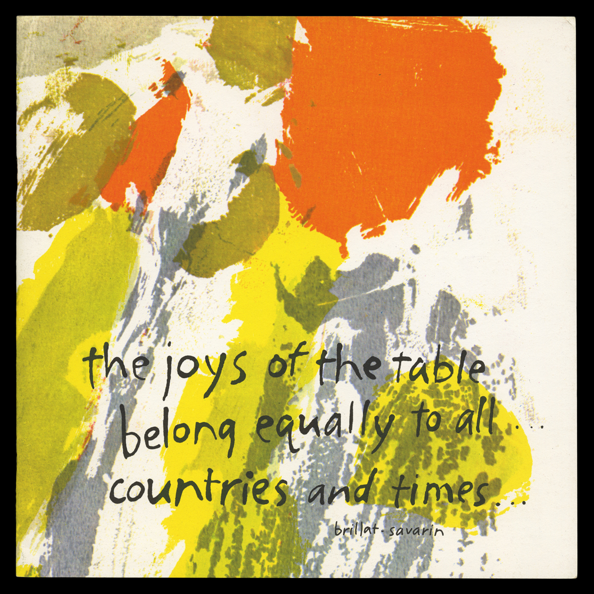
In 1963, the artist, activist, and educator Corita Kent worked in partnership with the American seasoning brand Spice Islands Company to create this publication, “International Dining with Spice Islands.” Originally sold as a mail-in incentive, it contains culinary histories, recipes, and suggested menus that are aimed at demystifying global cuisine for American home chefs. The folded paper presentation sleeve contains ten booklets focused on the cuisine of “nine of the world’s most savory kitchens”: France, India, Japan, Germany, Italy, Spain, Greece, Israel, and Sweden. Unfolding the unassuming gold and cream-colored outer sleeve, a kaleidoscope of movement and color emerges. Each of the ten booklets inside is wrapped in a colorful reproduction of a Corita Kent serigraph—overlaid with a handwritten proverb relating to the cuisine featured inside.

Presentation sleeve for the “International Dining with Spice Islands” recipe portfolio / THF720260

Spanish recipe booklet with art by Corita Kent from “International Dining with Spice Islands” with the proverb “Reading and eating should both be done slowly.” / THF720271
At age 18, Corita joined the Order of the Immaculate Heart of Mary in Los Angeles. From 1947-1968 she taught art at Immaculate Heart College, where she eventually became chair of the art department. This liberal arts school had a reputation for its progressive curriculum, which coincided with the shifts and reforms of Vatican II Catholicism in the 1960s. Corita was a vibrant individual whose belief in the importance of community, intentional presence in the world, and social protest through art are reflected in her teaching philosophy and own creative output. She was extremely active as an artist while teaching at IHC, exhibiting widely and receiving international attention for her bold pop art styled serigraphs (or screen prints).
Corita often referenced the visual language of food logos in her prints—famously, pairing Wonder Bread and Sunkist logo designs with fragments of scripture, song lyrics, poems, and quotes from public figures. Regarding her work for the “International Dining” publication, the Corita Art Center states, “These succinct and charming proverbs echo Corita’s use of food advertising language to playfully connote spiritual messages within her artwork.” The publication was popular enough that they were reprinted in 1967, which is the version recently acquired by The Henry Ford.
Introductory booklet with art by Corita Kent from “International Dining with Spice Islands” with a quote by Jean Anthelme Brillat-Savarin / THF720261
The cover of the introductory booklet references a quote from Jean Anthelme Brillat-Savarin, an 18th-century French lawyer and author: “The joys of the table belong equally to all ages, conditions, countries and times; they mix with all other pleasures, and remain the last to console us for their loss.” As the author of “The Physiology of Taste: Or Meditations on Transcendental Gastronomy,” Brillat-Savarin is considered one of the first essayists of the gastronomy genre. He also famously wrote “tell me what you eat, and I will tell you what you are”—the origin point for the common adage, “you are what you eat.”
The first booklet also contains a brief history of fine dining and provides instructions and etiquette for how to form an “international dining club” with adventurous diners. These clubs “…need not be a stuffy aggregation of posturing food snobs” but should be “…a congenial group of acquaintances who need hold nothing more in common that a singular interest in food.”
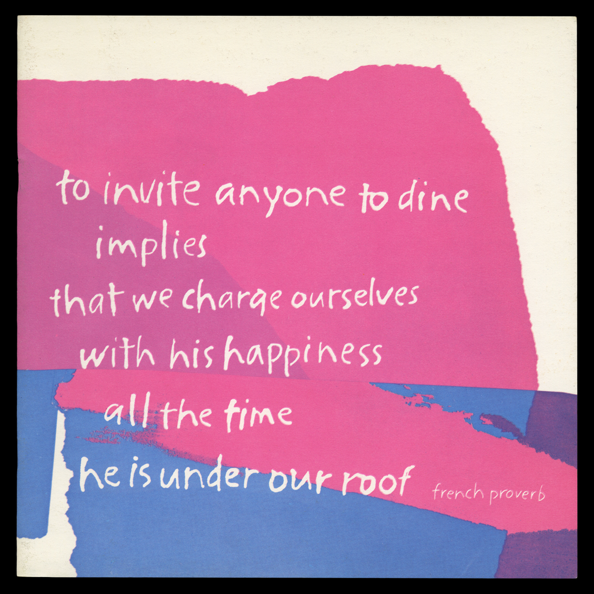
French recipe booklet with art by Corita Kent from “International Dining with Spice Islands” with the proverb “To invite anyone to dine implies that we charge ourselves with his happiness all the time he is under our roof.” / THF720264
Today, Spice Islands branded herbs are commonly sold in American grocery stores. The company was founded in 1941 and currently operates production facilities in Ankeny, Iowa—home to the largest American spice brands in the US. Geographically speaking, the “Spice Islands” themselves refer to the Malaku or the Moluccas—a group of Eastern Indonesian islands that became a powerhouse of spice trade with the arrival of European and Portuguese ships in the 16th century. The main spices exported from the Spice Islands were “warming spices”: nutmeg, cloves, mace, and peppercorns.
Beyond Corita’s contributions to the “International Dining” project, James R. Stitt is credited as the main art director and designer. Following his service in the US Navy and Marines, Stitt worked as a technical illustrator for Boeing before moving into the corporate advertising field in San Francisco. In the early 1960s, while working at the firm Dancer Fitzgerald Sample, he was assigned the Spice Islands account. Stitt recalled meeting Corita Kent at the ArtCenter School in Los Angeles while he was a student, and as a fan of her work, contacted her to commission illustrations for covers of the “International Dining” recipe booklets. Despite working as an illustrator in the years when digital design was on the rise, Stitt was staunchly anti-computer throughout his career. His iconic labels for the Anchor Brewing Company were entirely drawn by hand; they included 44 years of Christmas Ale labels starting in 1975 until his retirement in 2019.
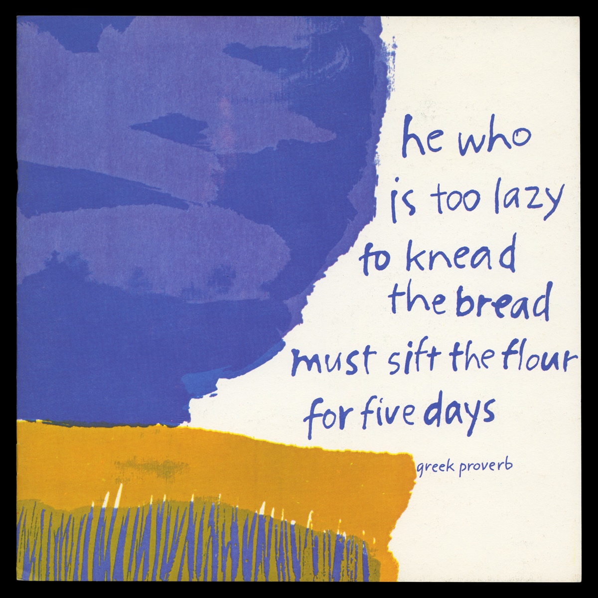
Greek recipe booklet with art by Corita Kent from “International Dining with Spice Islands” with the proverb “He who is too lazy to knead the bread must sift the flour for five days.” / THF720266
Country by country, the booklets contained within the “International Dining with Spice Islands” portfolio explain indigenous regional cuisines, shifting foodways, hospitality expectations, seasonal menus, the impacts of religious belief on food preparation and consumption, and cuisine balanced with local agricultural abundance (or scarcity). Also included are sources for seasonings not readily available in typical US retail grocery stores in the 1960s. (Michigan locations include J.L. Hudson Company in Detroit.) Chefs are urged to take seasoning seriously and to broaden their palates: “If you are not familiar with a particular herb, spice, or seasoning called for in a recipe, do not omit it. […] Broadening one’s seasoning scope is an exciting adventure in itself.”

Spanish recipe booklet with art by Corita Kent from “International Dining with Spice Islands” with the proverb “Food must feast the eyes as well as the stomach.” / THF720270

Italian recipe booklet with art by Corita Kent from “International Dining with Spice Islands” with the proverb “Thou shouldst eat to live not live to eat.” / THF720269
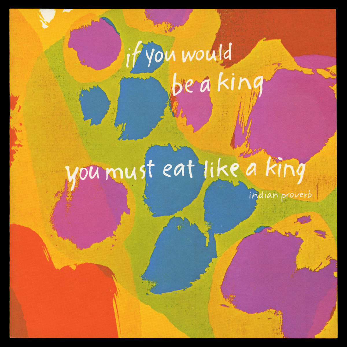
Indian recipe booklet with art by Corita Kent from “International Dining with Spice Islands” with the proverb “If you would be a king you must eat like a king.” / THF720267
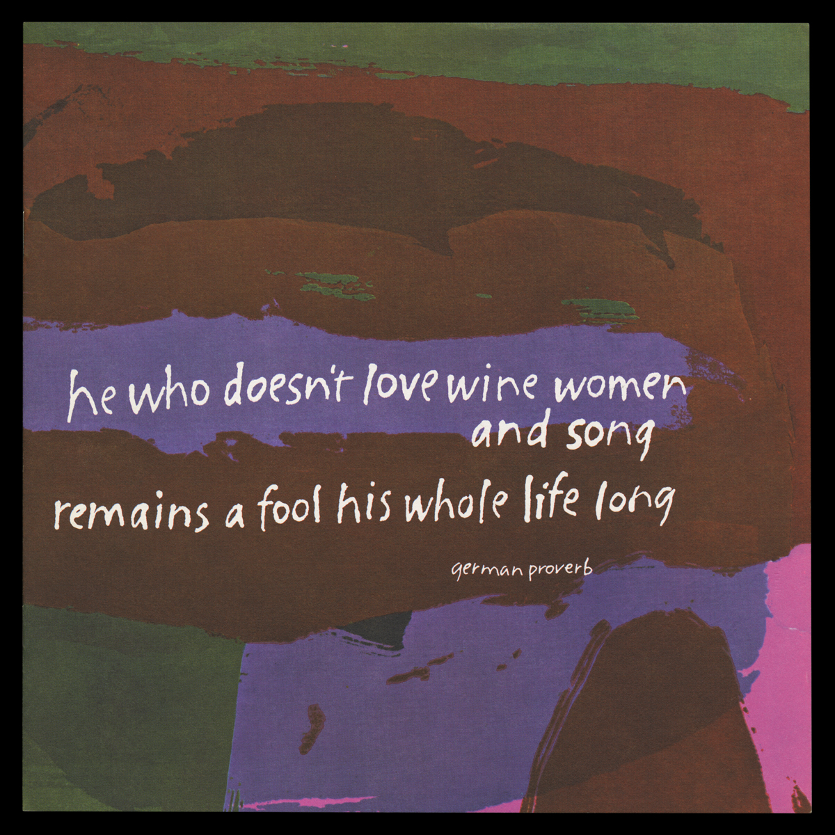
German recipe booklet with art by Corita Kent from “International Dining with Spice Islands” with the proverb “He who doesn’t love wine women and song remains a fool his whole life long.” / THF720265
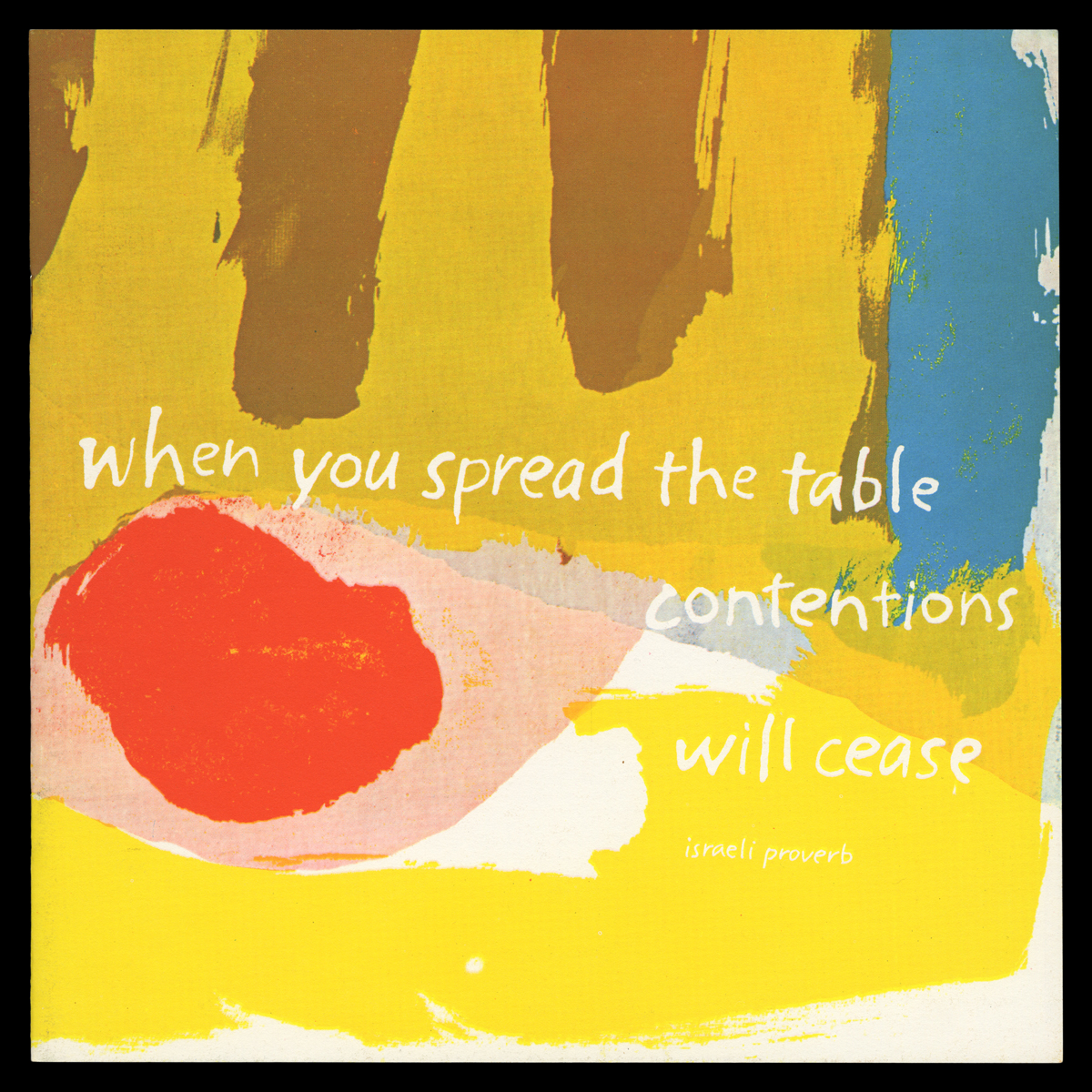
Israeli recipe booklet with art by Corita Kent from “International Dining with Spice Islands” with the proverb “When you spread the table contentions will cease.” / THF720268
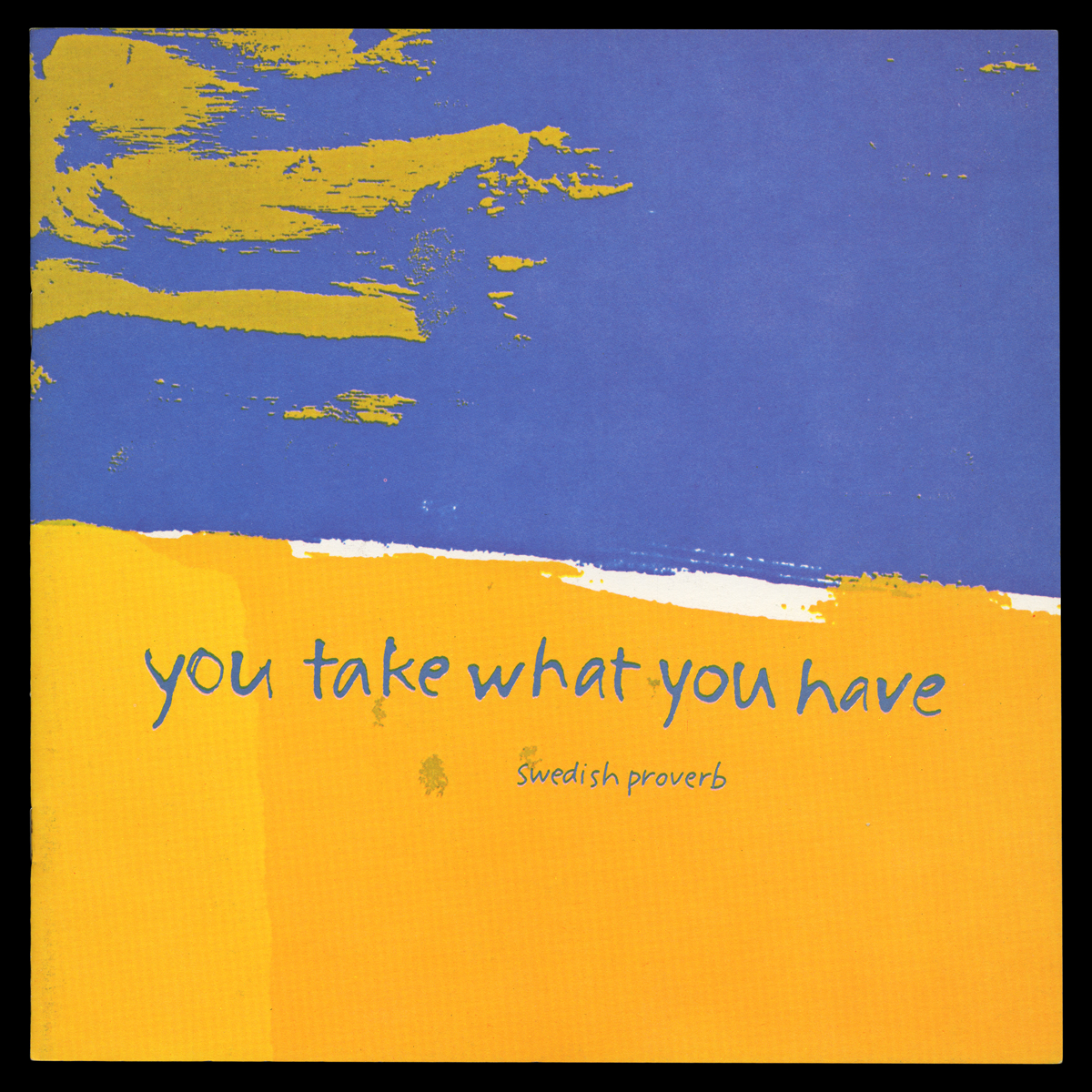
Swedish recipe booklet with art by Corita Kent from “International Dining with Spice Islands” with the proverb “You take what you have.” / THF720272
Kristen Gallerneaux is curator of communications & information technology, editor-in-chief of digital curation. .
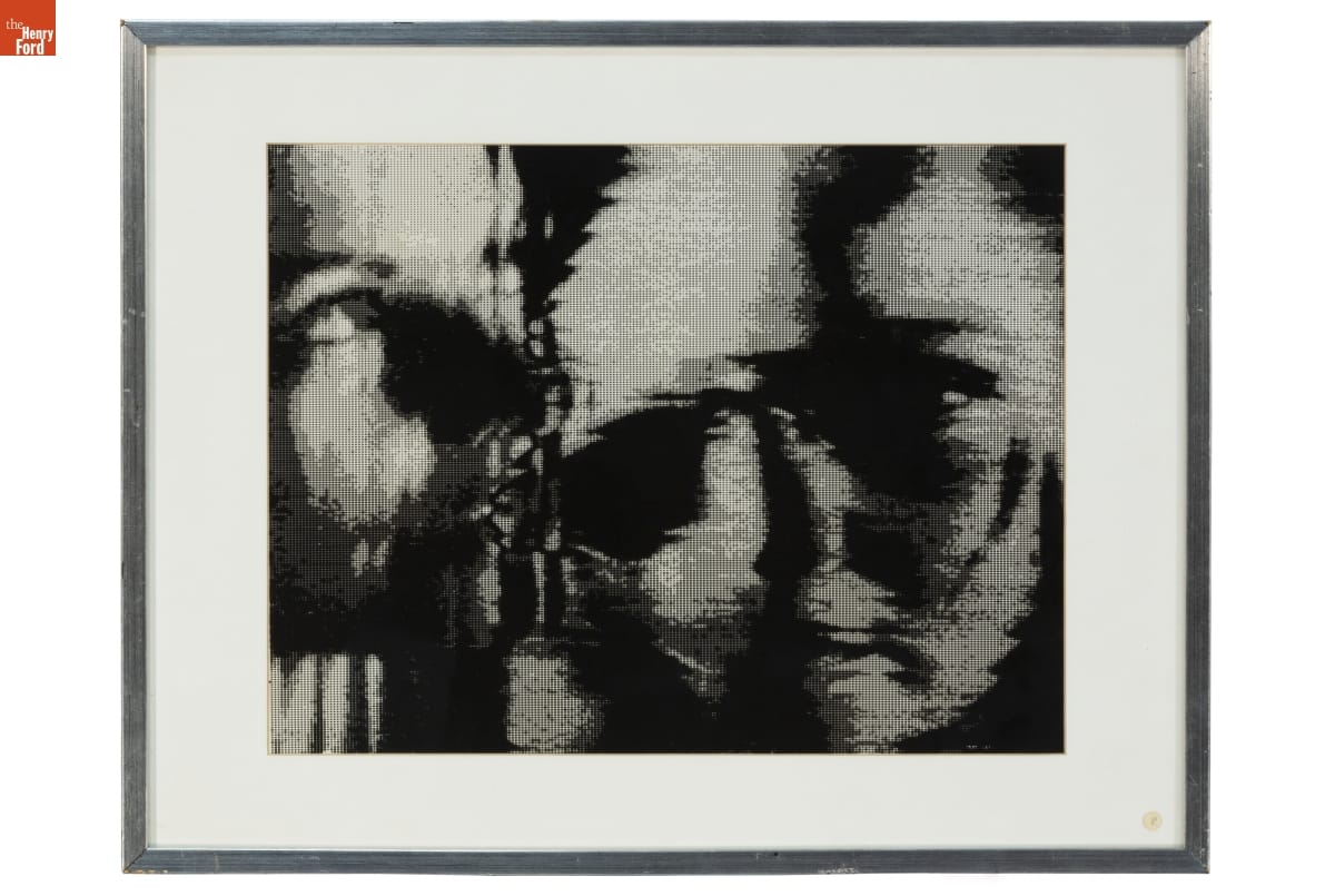
Self Portrait by Lillian F. Schwartz, circa 1979 / THF188557
On October 12, 2024, The Henry Ford was saddened to receive news of Lillian Schwartz's passing. Lillian was a visionary multimedia artist — an early adopter, innovator, and life-long learner in creative computing and digital art. At Bell Laboratories, she held the role of "resident visitor" from 1968-2002, where she created her celebrated films and videos. At the Labs, she described herself as a "morphodynamicist" and "pixellist." Max Mathews — director of Bell Labs' Acoustical and Behavioral Research Center — supported and advocated for Lillian, calling her "the brightest genius" he had ever met. Arno Penzias, a Nobel laureate for his co-discovery of the Big Bang Theory, credited her work as "establishing computers as a valid and fruitful artistic medium." There is no question that Lillian helped to define and expand the boundaries of digital creativity beginning in the late 1960s — a time when the very validity of computer-mediated art was in question.
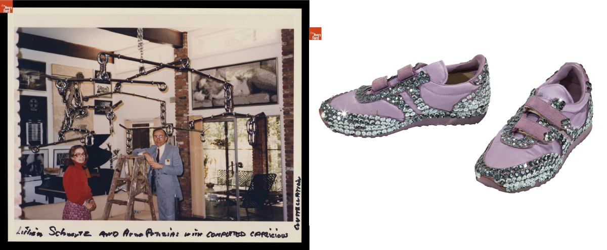
Left: Lillian Schwartz and Arno Penzias with the Capricious Constellation Sculpture, circa 1984 / THF705948
Right: Custom bedazzled Jordache sneakers made and worn by Lillian, circa 1984 / THF191767
In 2021, thanks to a generous donation by the Schwartz family, the Lillian F. Schwartz and Laurens R. Schwartz Collection found a permanent home at The Henry Ford. This collection contains thousands of objects documenting her life and art practice, spanning her childhood to late career. Lillian's expansive career is represented through her iconic films and videos, 2D artwork and sculptures, personal papers, computer hardware, and film editing equipment.
Since this acquisition, staff at The Henry Ford have been diligently conserving, restoring, organizing, digitizing, and interpreting this collection to improve accessibility and ensure ongoing recognition for Lillian's contributions. In 2023, I was honored to be deeply immersed in this collection while curating Lillian Schwartz: Whirlwind of Creativity. This retrospective exhibition provided a holistic portal to her life and artistic practice. Many of the exhibit's early "analog" and 2D works showed a clear lineage to the aesthetic values seen in her film and digital art that would follow.
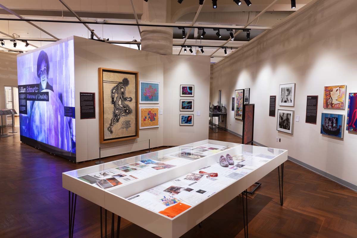
Exhibition view of Lillian Schwartz: Whirlwind of Creativity, which was open at The Henry Ford from March 2023-March 2024. Image by Staff of The Henry Ford.
Since acquiring this collection, The Henry Ford has collaborated with major museums, institutions, and educators by providing loans of her work for exhibitions, film festivals, and public programs — ensuring the continuation of her presence and legacy at a global scale. Notably, The Henry Ford has provided loans to international venues including: Venice Biennale, LACMA, ZKM Centre for Art & Media, Mudam Luxembourg, Tate Modern, Buffalo AKG, the Computer History Museum, and many more.
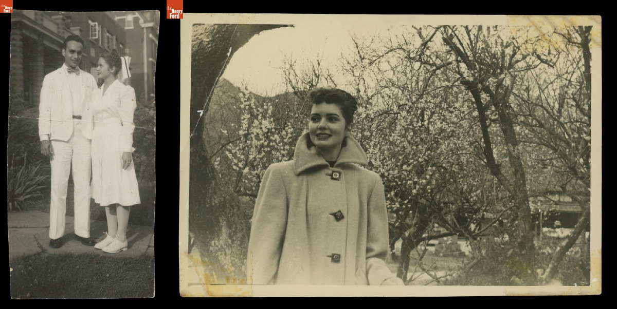
Left: Lillian and Jack J. Schwartz, circa 1946 / THF704695
Right: Lillian Schwartz with a Flowering Plum Tree in Japan, 1948-1950 / THF705897
Lillian was born in Cincinnati in 1927 to Russian and English immigrant parents. Her large family faced economic challenges and, as Jewish people, became the targets of antisemitism. In 1944, Lillian applied to join the U.S. Cadet Nurse Corps — a program designed to address the WWII nursing shortage. Lillian struggled with nursing people but enjoyed mixing medicines, painting murals in the children's ward, and making sculptures from plaster supplies intended for broken bones. Here, Lillian realized she was an artist, not a nurse. During this time, she met her future husband, Jack Schwartz, a doctor in training. They were married in 1946. In 1949, Lillian and her newborn son Jeffrey traveled across the Pacific Ocean by U.S. Army transport ship to be reunited with Jack, who was stationed at a hospital in Fukuoka, Japan. Just weeks after this journey, Lillian contracted polio and was quarantined; she worked diligently for months to overcome the worst of her paralysis, but upon her return, she continued to face health issues, which she referenced in her work.
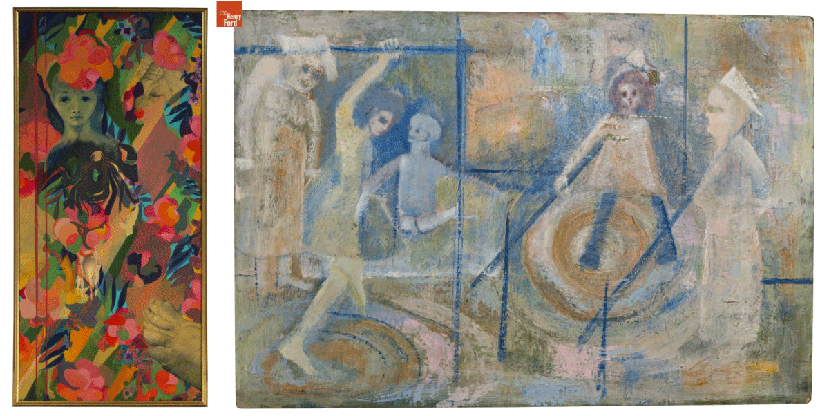
Many of Lillian's earliest paintings have childhood, motherhood, and family themes. Other times, they reflect traumatic events that Lillian faced. Left: Lady with Foot,' 1962 / THF190937
Right: After Polio,' circa 1950 / THF193129
In October 1968, Lillian received news that her kinetic sculpture — Proxima Centauri — had been selected by curator Pontus Hultén for an exhibition at the Museum of Modern Art in New York City, "The Machine as Seen at the End of the Mechanical Age." It was a breakthrough moment in her career.
Lillian met the scientist Leon Harmon at the MoMA opening, and he invited her to visit his workplace, Bell Laboratories. This fateful meeting led to Lillian's introduction to the people, equipment, and software integral in creating her first computer films. In her unpublished memoir, Lillian recalls: "When I first saw Leon Harmon at the opening reception of the 'Machine' exhibition, he was on his hands and knees peeking under the pad that covered the mechanism that triggered my sculpture to move up and down. When he looked up, he saw me standing in front of his computer-generated nude [Studies in Perception I (Computer Nude)]."
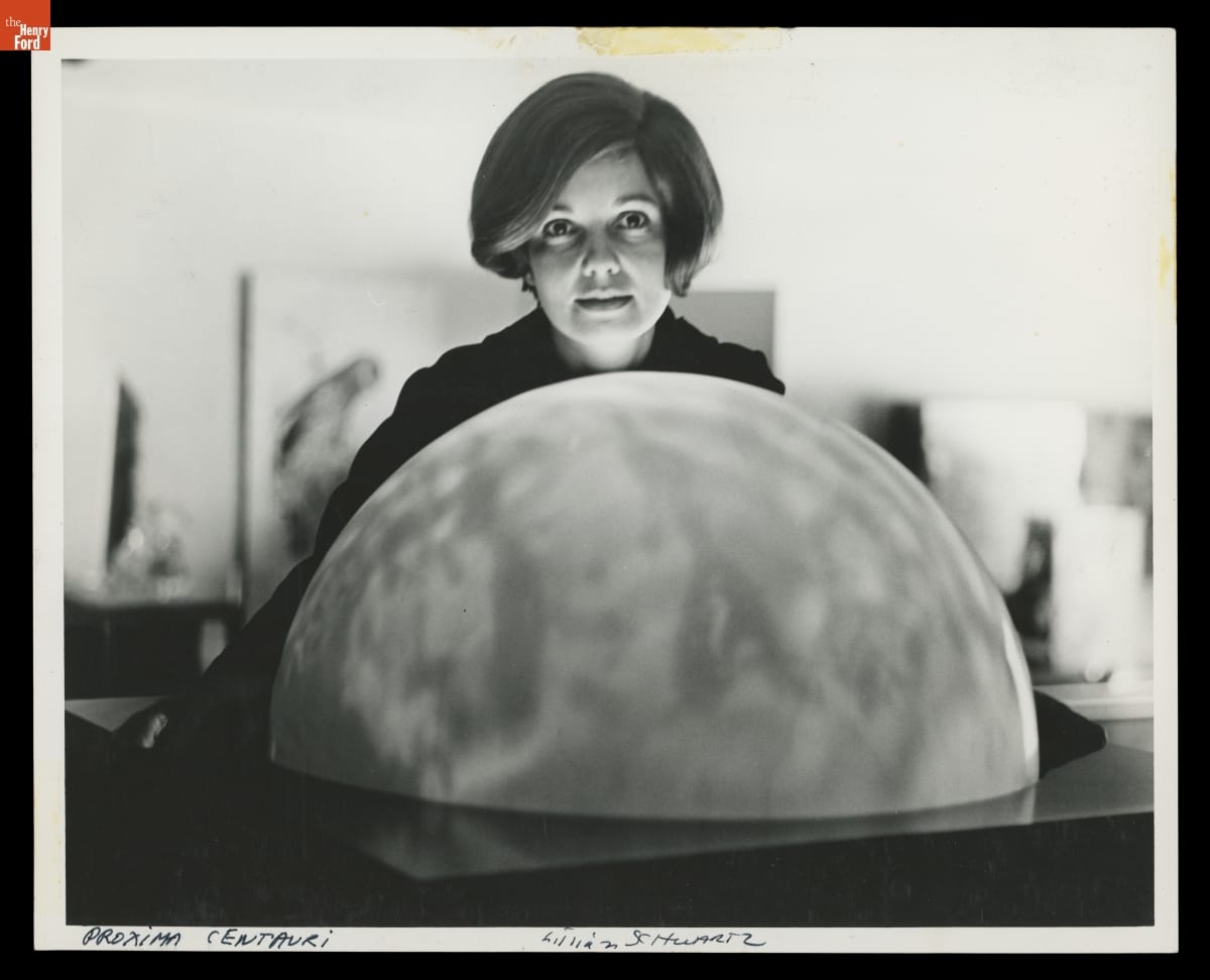
Lillian Schwartz with ‘Proxima Centauri’ Globe, 1968-69. The globe that Lillian used was originally designed to be a municipal streetlamp cover. / THF705911
Studies in Perception I (Computer Nude) by Leon D. Harmon and Kenneth C. Knowlton is considered to be the first ‘digital nude.’ It was shown in the same MoMA exhibit as Proxima Centauri / THF188553
Lillian's youngest son and frequent collaborator Laurens remembers how he and Lillian "explored trash in the Bowery, bringing back wire, motors, and a globe that had been a streetlamp cover. But Lillian also created new tools and media. In 1960, she convinced the owner of a plastics factory to let her use it at night, moving rods to shape abstract [sculptures]. She built kinetics using metal frames lit inside to highlight the colors and movement of liquids through tubing and receptacles she bought from a medical supplier."

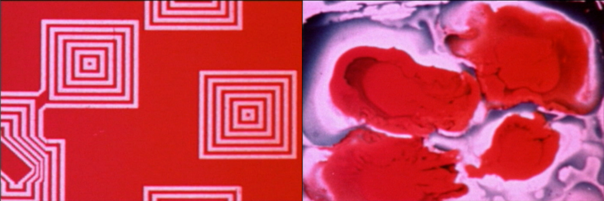
To prepare for the exhibit, our conservation team restored several kinetic sculptures that had not been exhibited in decades, including Proxima Centauri and World’s Fair, shown here. / THF370299
The kinetic sculpture referenced in this memory is World's Fair — a mock-up that Lillian created to propose a 70-foot-tall water sculpture for Expo 70 in Osaka, Japan. The sculpture was never built at full scale. The spiraling glass tubes in this version were given to her by a chemist planning to throw them in the trash. Lillian imagined how they could be filled with color and light to create the illusion of multiple colors. In her unpublished memoir, she described the process of finding the pigments to meet her vision: "Since I could not find the right green I wanted, I emptied [my husband Jack's] Creme de Menthe from the liquor cabinet. Of course, Jack was not happy. Even worse, I took all the red cough syrup samples from Jack's [medical] office. Not as expensive, but not the right thing to do."
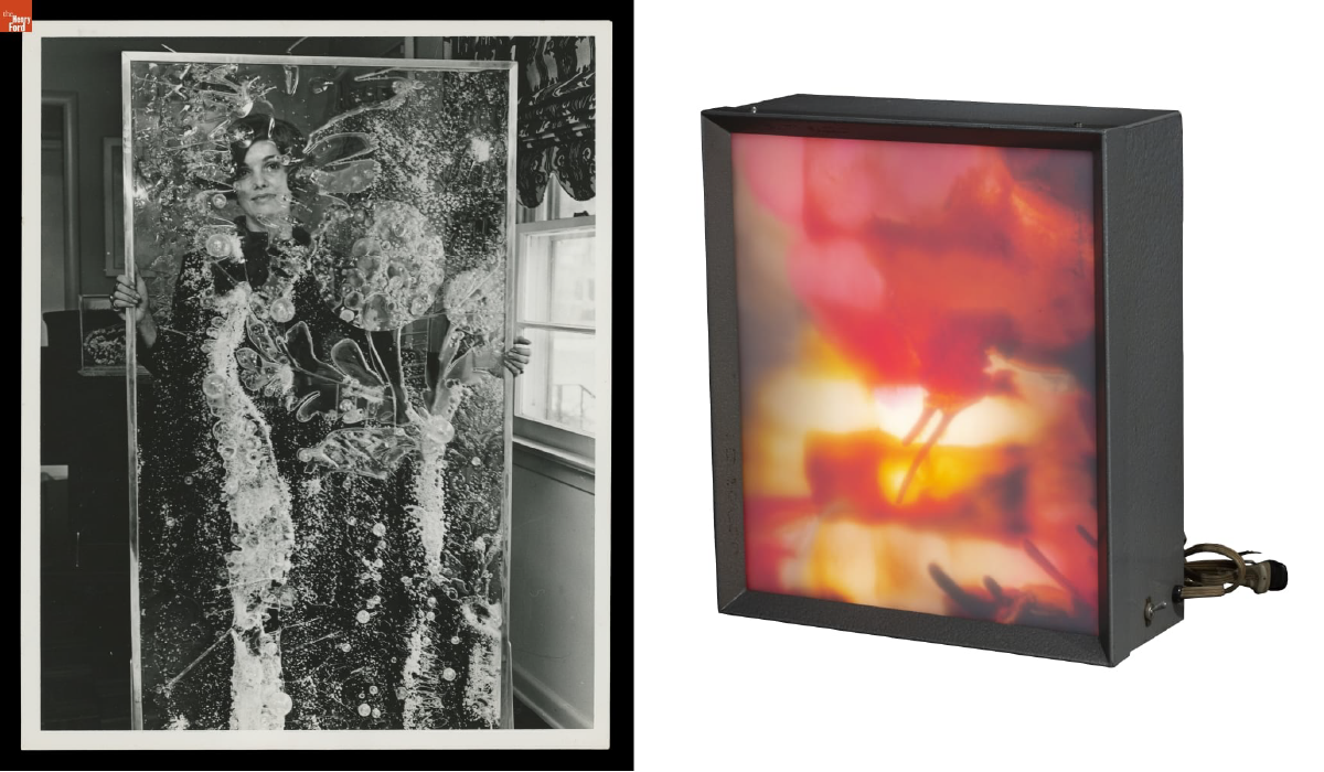
Left: Lillian Schwartz looking through one of her acrylic panels, 1968 / THF706047
Right: Illuminated Light Box by Lillian F. Schwartz, 1966 / THF188459
Lillian also created large cast acrylic resin sculptures. Once the resin hardened, she used a blowtorch to melt and change the plastic, sometimes gluing on extra material or using pigment to add color. She brought many of her sculptures and paintings to life by introducing sound, light, and electronic sensors. She called these works "electric paintings." Even her non-digital and kinetic works — screenprints hung on a wall or sculptures sitting static on a pedestal — clearly show Lillian's desire to create motion, eventually leading to the trailblazing computer films she would make at Bell Laboratories.
Lillian Schwartz photographed at work at Bell Laboratories by Gerard Holzmann, circa 1975 / THF149836
By gaining an invitation to Bell Labs, Lillian was in a rare and privileged position at one of the world's most revered research facilities. On her first day, she was introduced to the large mainframe computers and bespoke software that would lead to her first 2D digital artworks and computer-mediated films. On lunch breaks in the cafeteria, she formed fruitful collaborations with scientists. As she wandered the halls on breaks, she peered through open doors and was invited in for demonstrations of cutting-edge technology. With permission, she scavenged toss-off material from the trash to use in her own work. At night, she attended math, logic, and computer programming courses at the New School.
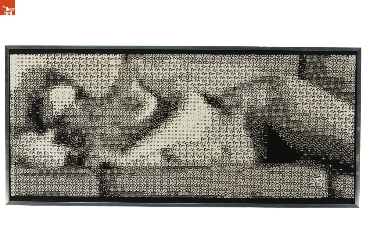
Digital born (left) and hand painted (right) stills from Pixillation, 1970 / THF701620 & THF701618
In 1969, Lillian received a $250 grant from AT&T Bell Laboratories to begin creating her first film, Pixillation. Given the limitations of 1960s computers, the process was time-consuming and frustrating. After several weeks of work, she had mere seconds of footage, so found creative ways to meet her deadline. She smeared and dropped paint onto glass to create abstract patterns, drawing her finger through the pigment to mimic the pixelated squares generated by the computer. She used a microscope to photograph growing crystals. She reshot the computer footage on an optical bench, adding color and motion. A soundtrack by Gershon Kingsley was added, which was crucial in and of itself for being composed on a new electronic instrument — the Moog synthesizer. By 1970, Pixillation was finally complete. Today, this film continues to be hailed as a masterwork of experimental film with its hypnotic and chaotic blend of computer-born and hand-painted imagery. Many awards and many films followed, a selection of which are visible in our Digital Collections.
Left: Advertisement for a screening of Lillian’s work / THF628917
Right: A view of one of Lillian’s films, currently undergoing restoration. Photo by Kristen Gallerneaux.
Lillian saw computers as exciting tools full of possibility, but her peers also described her as having a healthy sense of "technological ingratitude." In her most playful and impatient moments, she sought out the limitations of technology — embracing its glitches, feedback, and happy mistakes. She described this impulse: "…the machine had to keep pace with me — just as I learned that I had to grow with the machine as its scientifically oriented powers evolved."
In her 2013 oral history with the Computer History Museum, she shared a potent memory that foreshadowed her later life as a filmmaker: "My story was as long as the pavement in front of my house. [...] When I had drawn as far as I could, I ran back to my house, sat on a step and looked at the pictures in my head to see the rest of the story." Lillian will be missed immensely, and we at The Henry Ford are honored to be stewards of her legacy.
Kristen Gallerneaux is the Curator of Communications & Information Technology at The Henry Ford.
Further Resources:

Photo by Kristen Gallerneaux/Katherine White
In 2022, The Henry Ford displayed a temporary exhibit, OUT!: LGBTQ+ Visibility and Identity, at Henry Ford Museum of American Innovation. The exhibit, co-curated by Kristen Gallerneaux and Katherine White and featuring items from The Henry Ford's collections, contained recent acquisitions that relate to the history and lived experiences of LGBTQ+ people.
The first theme explored in this exhibit was how LGBTQ+ communities have used a variety of communication networks—from print media to Internet platforms—to advocate and educate, to resist discrimination, and to unapologetically celebrate identity.
The second major theme gathered collections that relate to queer-positive and diverse forms of gender expression. These artifacts included stories of gay pride and trans visibility through acceptance, body positivity, and pronoun advocacy.
These artifacts do not sit still. The stories and lives represented in OUT!: LGBTQ+ Visibility and Identity are evidence of turning points and triumphs—and ongoing battles—of the LGBTQ+ community individually, communally, and societally.
Getting the Word Out
In the 1960s, LGBTQ+ people faced a largely unaccepting American society and legal landscape that restricted how they could express themselves. Queer bars and clubs were among the only private, “safe” spaces, for LGBTQ+ patrons but they were also easy targets for police, who harassed and arrested patrons. On June 28, 1969, New York City police raided the Stonewall Inn, a gay club in Greenwich Village. A riot ensued.
Queer bars and clubs also became sites of community and connection—even amidst persecution and harassment—and became fertile soil for the burgeoning queer liberation movement. LGBTQ+ newspapers were distributed in these spaces, broadcasting news unlikely to be shared in mainstream media. Print media like these unified queer/LGBTQ+ people in the fight for acceptance and equality through sharing manifestos, organizing protests, and recruiting members.
Today, we recognize the legacy of the Stonewall Riots as the genesis for the Pride marches that celebrate the LGBTQ+ community every June, in cities big and small across America. .jpg?sfvrsn=e6cd3601_2 "Citizens News, Volume IV, Number 12, 1964-1965 / front page")
THF627212.jpg?sfvrsn=b2cd3601_2 "Flier,")
THF627336
These fliers were created by New York City’s chapter of The Mattachine Society, one of the oldest gay rights groups in America, in the months following the Stonewall Riot. They illustrate the urgency felt by the queer community in the wake of persistent and brutal police violence.
Raising Awareness
In the early and mid-1980s, activist collectives formed to raise awareness of HIV and AIDS. This advocacy was critical, since government and public health organizations initially refused to act or acknowledge the developing crisis. Misinformation about HIV and AIDS transmission was widespread, and so LGBTQ leaders and allies spoke up—demanding an end to negligence, access to testing, treatment options, and vetted public education about HIV prevention..jpg?sfvrsn=aacd3601_2 "SILENCE = DEATH Collective Poster, 1987")
THF179775.jpg?sfvrsn=9acd3601_2 "Poster,")
THF627370
The Silence=Death Collective’s “AIDSgate” poster condemns then-president Ronald Reagan’s lack of response to the AIDS epidemic. In 1981, the first AIDS cases in the United States; President Reagan did not recognize AIDS in a public speech until September 1985..jpg?sfvrsn=eecd3601_2 "Illustration,")
THF627366.jpg?sfvrsn=86cd3601_2 "Illustration,")
THF627364
Howard Cruse, author of the acclaimed graphic novel Stuck Rubber Baby, uses the slogan of the Gay Liberation Front in the top drawing above: “We’re here, we’re queer, get used to it!” The “Gay is Good” illustration mimics historical photographs of protestors at the 1969 Stonewall Uprising that were also referenced in the “Gay Liberation” poster by Su Negrin, Peter Hujar, and Suzanne Bevier.
THF190487
In 1988, Richard Eichberg and Jean O’Leary founded Coming Out Day to provide resources for LGBTQ+ people wishing to publicly declare their identity. The pair believed that “coming out” would promote solidarity and acceptance while reducing homophobia. The Human Rights Campaign (an LGBTQ+ advocacy and political lobbying group) sponsors this event in the United States. This poster commemorates the 10th anniversary of the observance, which remains active in 2022. The logo of a person dancing their way out of a closet depicted on the cake on this poster references artist Keith Haring’s original NCOD logo.
Online Identity & Safe Spaces
Online platforms can act as digital “safe spaces” for LGBTQ+ community-building. Beginning with Usenet bulletin board systems in the 1980s and transitioning to LiveJournal, Twitter, and Tumblr in the 2000s, these sites can act as support networks for LGBTQ+ people—including those who live in isolated areas or in situations where openly exploring identity poses challenges AFK (away from keyboard). 
Photo by Kristen Gallerneaux/Katherine White
Zack Arad launched a microblog on July 21, 2010. Arad, who self-identifies as gay, has been active on social media since he was a teenager. His popular Tumblr blog and YouTube vlogs explore themes like gay pride, pop culture, humor, dating, and political issues.
Photo by Kristen Gallerneaux/Katherine White
This “mini-quilt” was created by Zak Foster, a textile artist who identifies as gay and has a strong online following for their work, selling one-of-a-kind upcycled quilts on Etsy. With Grace Rother, Foster also created this collection of “zines,” and distributed them online “as a love offering … to all the queer folks in the quilting community.”
Identity & Solidarity
Buttons, patches, badges, and pins are consciousness-raising, inexpensive, quick to create, and able to be distributed widely. Wearing a button can be a method of activism. When simply being “out” as LGBTQ+ means possible danger and discrimination, choosing to wear a visible symbol of queerness is a courageous act. .jpg?sfvrsn=becd3601_2 "Motorcycle Cap with Buttons Commemorating LGBTQ+ Events and Places, 1969-1971")
THF189705
The cap above was worn by a member of a California-based gay motorcycle club. Among the oldest gay organizations in the United States, these clubs emphasized hypermasculinity, which appealed to many gay men who had long been stereotyped as effeminate.
Photo by Kristen Gallerneaux/Katherine White
Many of the buttons featured here use symbols or terms that were once weaponized against the LGBTQ+ community but were later reclaimed. The inverted pink triangle, for example, has its roots in the Holocaust, when Nazis forced queer people to wear a pink triangle as a form of identification and persecution. By repurposing these symbols, a shared and recognizable language of identity and solidarity is created among LGBTQ+ people and allies.
Trans Acceptance
Transgender and nonbinary people have always existed, across time and in every corner of the world—just as have gay, bisexual, lesbian, and other queer communities. But acceptance by the broader world has been difficult to achieve. Even the early leaders of the LGBTQ+ equality movement pushed the transgender community to the fringes. For many transgender and nonbinary individuals, the realization that their gender identity does not align with their assigned-at-birth gender comes long before even their own acceptance and celebration of it.
THF190453
THF611162
Miley Kirby came out publicly and applied trans flag patches to her medic bag during Detroit’s Black Lives Matter protests, which held supplies used to provide medical care to fellow protestors. Kirby is visible carrying this same bag in the center of the press photo above, published in the Detroit News during the Black Lives Matter protests of Summer 2020.
“The people I met at the [George Floyd] protest were one of the first groups of people that encouraged me to be me. They refused to let me cop out on pronouns, names, or hand-waving of my transness for others comfort. We yelled our message in the streets, why not scream your identity to the world? My time in those protests found me my voice as Miley Kirby, or at least the beginning of one.” – Miley Kirby 
THF190458
Allie Zecivic listened to an insistent inner voice and purchased this dress, her first article of women’s clothing. It helped her to accept her gender identity as a transwoman.
“Hot Topic skinny jeans and too tight graphic tees were alright, but this was a dress. A long, flowy, spinny dress. I spent a lot of time sitting alone in my room wearing it, my heart racing and the paranoia spinning horrible outcomes in my head, but it felt right. The validation that dress brought was freeing. It was this feeling in the face of trepidation of being caught, that solidified my need for more. And such my wardrobe grew.” – Allie Zecivic 
THF190456
THF190457
Laura Bowman began the medical transition to female with these hormone replacement therapy medications. She crossed out her “deadname”—the male name she was given at birth—and kept these bottles as symbols of her journey.
“Hormones don't make a transperson trans, but for many of us they are the beginning of the end. The end of the old life, and the beginning of a new experience, a new chance to be who we want to be, to make the outside fit how we feel inside. When I first picked up these pill bottles, I felt a giant weight off my chest as it felt like I was going to be able to make some progress on that person in the mirror and come to like her just a little better. The major part of that comes when you change the way you perceive yourself, but damn do the hormones help!” –Laura Bowman
Body Positive
Carrie Metz-Caporusso is an artist and tattooer who identifies as queer and non-binary. They began tattooing in 2011 and are committed to challenging traditions in tattooing culture that sometimes stigmatize LGBTQ+ and larger-bodied people. After experiencing fat shaming in the tattooing world, Carrie brainstormed a way to celebrate—rather than conceal—plus-sized body types with custom “roll flower” tattoos. These tattoos align with the body positivity movement by embracing the natural folds and creases on client’s backs or sides, which serve as a “stem” for flowers and leaves emerging from above and below.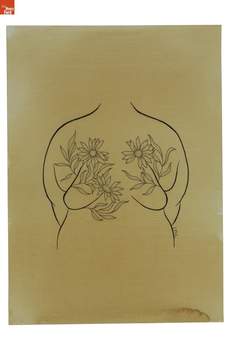
THF190488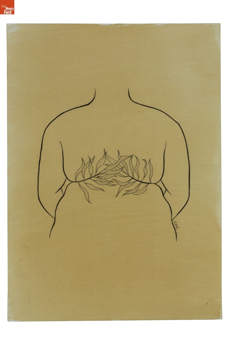
THF190489
These signature “roll flower” tattoo flash designs were drawn and donated by Metz-Caporusso to The Henry Ford. In 2022, The Henry Ford commissioned Metz-Caporusso to create illustrations for apparel, which will soon be available in museum stores. 
Photo courtesy of Carrie Metz-Caporusso
Mother of the Movement
Marsha “Pay It No Mind” Johnson was a New York City–based drag performer and activist who identified as a gay transvestite (the term transgender was not used at that time).
She was tireless in her advocacy for gay rights. From the mid-1960s on, she was an active presence—often a mischievous instigator—at almost every major uprising, parade, and political action connected to the LGBTQ+ equality movement. She clashed with police during the Stonewall Uprising, helped create the Gay Liberation Front, and participated in AIDS awareness group ACT-UP. With Sylvia Rivera, Johnson was a “house mother” for the Street Transvestite Action Revolutionaries—a political collective and homeless shelter for trans youth of color. Johnson died under suspicious circumstances in 1992—believed by many to be a victim of anti-gay violence.
THF190491
This print, created by Julia Feliz in 2018, honors the intersectional legacies of Black LGBTQ+ leaders, as well as Daniel Quasar’s redesign of the Pride Flag to include stripes for BIPOC (Black, Indigenous, and people of color) and trans people.
Listening to the Community
The stories and lives represented in this exhibit just barely scratch the surface of what it means to be LGBTQ+ in the United States. Visibility often increases vulnerability—and backlash. Bigotry, discrimination, and social justice issues related to equal rights and access continue to impact LGBTQ+ people around the world.
Kristen Gallerneaux, Curator of Communications & Information Technology at The Henry Ford, and Katherine White, Associate Curator at The Henry Ford, collaboratively produced this exhibit and blog.
Henry Ford Museum, by Katherine White, by Kristen Gallerneaux

Cover of "Habitability Study, Earth Orbital Space Stations," 1968 / THF109188
In 1967, late in his storied career, industrial designer Raymond Loewy and a small team were contracted as NASA “space habitability” experts, producing a series of reports that focused on long-duration missions and the problem of how to exist as a “whole human” in outer space.
These reports acknowledged the restrictive parameters of spacecraft interiors yet stressed the ability of human-centered design to boost crew morale. They considered sleeping arrangements, modular storage, communal dining, mental decompression spaces, and entertainment in zero gravity—including a “one man theatre” helmet and a weighted “space dart” game.
"Habitability Study, Earth Orbital Space Stations,” Figure 6B, page 15B / THF701089, detail from THF701085
Loewy’s plans underscored the most “human” of all space travel design problems: the intake of food and disposal of body waste. The images above and below may look quaint to us now, but it is important to note that at the time that Loewy was considering how an astronaut might eat tomato soup in space, plastic squeeze-tube packaging was still considered experimental. As for the inevitable issue of waste collection, Loewy provided several ergonomic space toilet designs, underlining bathroom privacy for crew members.
"Habitability Study, Earth Orbital Space Stations,” Figure 55, page 112 / THF701090, detail from THF701086
While not all of Loewy’s ideas were adopted, several suggestions were implemented in the Skylab space station, including the biggest astronaut perk of all—a window to gaze at the stars while floating in space.
Visit our Digital Collections to browse selected pages and images from one of Raymond Loewy’s habitability studies.
Kristen Gallerneaux is Curator of Communications and Information Technology at The Henry Ford. This post was adapted from an article in the January–May 2022 issue of The Henry Ford Magazine.
20th century, 1960s, The Henry Ford Magazine, space, design, by Kristen Gallerneaux
What Have We Been Collecting at The Henry Ford?: A Peek at Recent Acquisitions
The Henry Ford’s curatorial team works on many, many tasks over the course of a year, but perhaps nothing is as important as the task of building The Henry Ford’s collections. Whether it’s a gift or a purchase, each new acquisition adds something unique. What follows is just a small sampling of recent collecting work undertaken by our curators in 2021 (and a couple in 2020), which they shared during a #THFCuratorChat session on Twitter.
In preparation for an upcoming episode of The Henry Ford's Innovation Nation, Curator of Domestic Life Jeanine Head Miller made several new acquisitions related to board games. A colorful “Welcome to Gameland” catalog advertises the range of board games offered by Milton Bradley Company in 1964, and joins the 1892 Milton Bradley catalog—dedicated to educational “School Aids and Kindergarten Material”—already in our collection.
Milton Bradley Company Catalog, “Welcome to Gameland,” 1964. / THF626388
Milton Bradley Company Trade Catalog, “Bradley’s School Aids and Kindergarten Material,” 1892. / THF626712
We also acquired several more board games for the collection, including “The Game of Life”—a 1960 creation to celebrate Milton Bradley’s centennial anniversary that paid homage to their 1860 “The Checkered Game of Life” and featured an innovative, three-dimensional board with an integrated spinner. “The Game of Life,” as well as other board games in our collection, can be found in our Digital Collections.
Board games recently acquired for use in The Henry Ford’s Innovation Nation. / THF188740, THF188741, THF188743, THF188750
This year, Katherine White, Associate Curator, Digital Content, was thrilled to unearth more of the story of designer Peggy Ann Mack. Peggy Ann Mack is often noted for completing the "delineation" (or illustration) for two early 1940s Herman Miller pamphlets featuring her husband Gilbert Rohde's furniture line. After Rohde's death in 1944, Mack took over his office. One commission she received was to design interiors and radio cases for Templetone Radio. The Henry Ford recently acquired this 1945 radio that she designed.
Radio designed by Peggy Ann Mack, 1945. / Photo courtesy Rachel Yerke
Peggy Ann Mack wrote and illustrated the book Making Built-In Furniture, published in 1950, which The Henry Ford also acquired this year. The book is filled with her illustrations and evidences her deep knowledge of the furniture and design industries.
Making Built-In Furniture, 1950. / Photo courtesy Katherine White
Mack (like many early female designers) has never received her due credit. While headway has been made this year, further research and acquisitions will continue to illuminate her story and insert her name back into design history.
Katherine White also worked this year to further expand our collection of Herman Miller posters created for Herman Miller’s annual employee picnic. The first picnic poster was created by Steve Frykholm in 1970—his first assignment as the company’s internal graphic designer. Frykholm would go on to design 20 of these posters, 18 of which were acquired by The Henry Ford in 1988; this year, we finally acquired the two needed to complete the series.
Herman Miller Summer Picnic Poster, “Lollipop,” 1988. / THF626898
Herman Miller Summer Picnic Poster, “Peach Sundae,” 1989. / THF189131
After Steve Frykholm, Kathy Stanton—a graduate of the University of Cincinnati’s graphic design program—took over the creation of the picnic posters, creating ten from 1990–2000. While The Henry Ford had one of these posters, this year we again completed a set by acquiring the other nine.
Recently acquired posters created by Kathy Stanton for Herman Miller picnics, 1990–2000 / THF626913, THF626915, THF626917, THF626921, THF189132, THF189133, THF189134, THF626929, THF626931
Along with the picnic posters, The Henry Ford also acquired a series of posters for Herman Miller’s Christmas party; these posters were created from 1976–1979 by Linda Powell, who worked under Steve Frykholm at Herman Miller for 15 years. All of these posters—for the picnics and the Christmas parties—were gifted to us by Herman Miller, and you can check them out in our Digital Collections.
Posters designed by Linda Powell for Herman Miller Christmas parties, 1976–1979 / THF626900, THF189135, THF189137, THF189136, THF189138, THF626909, THF626905
Thanks to the work of Curator of Communications and Information Technology Kristen Gallerneaux, in early 2021, a very exciting acquisition arrived at The Henry Ford: the Lillian F. Schwartz and Laurens R. Schwartz Collection. Lillian Schwartz is a groundbreaking and award-winning multimedia artist known for her experiments in film and video.
Lillian Schwartz was a long-term “resident advisor” at Bell Laboratories in New Jersey. There, she gained access to powerful computers and opportunities for collaboration with scientists and researchers (like Leon Harmon). Schwartz’s first film, Pixillation (1970), was commissioned by Bell Labs. It weaves together the aesthetics of coded textures with organic, hand-painted animation. The soundtrack was composed by Gershon Kingsley on a Moog synthesizer.
“Pixillation, 1970 / THF611033
Complementary to Lillian Schwartz’s legacy in experimental motion graphics is a large collection of two-dimensional and three-dimensional materials. Many of her drawings and prints reference the creative possibilities and expressive limitations of computer screen pixels.
“Abstract #8” by Lillian F. Schwartz, 1969 / THF188551
With this acquisition, we also received a selection of equipment used by Lillian Schwartz to create her artwork. The equipment spans from analog film editing devices into digital era devices—including one of the last home computers she used to create video and still images.
Editing equipment used by Lillian Schwartz. / Image courtesy Kristen Gallerneaux
Altogether, the Schwartz collection includes over 5,000 objects documenting her expansive and inquisitive mindset: films, videos, prints, paintings, sculptures, posters, and personal papers. You can find more of Lillian Schwartz’s work by checking out recently digitized pieces here, and dig deeper into her story here.
Katherine White and Kristen Gallerneaux worked together this year to acquire several key examples of LGBTQ+ graphic design and material culture. The collection, which is currently being digitized, includes:
Illustrations by Howard Cruse, an underground comix artist…
Illustration created by Howard Cruse. / Photo courtesy Kristen Gallerneaux
A flier from the High Tech Gays, a nonpartisan social club founded in Silicon Valley in 1983 to support LGBTQ+ people seeking fair treatment in the workplace, as LGBTQ+ people were often denied security clearance to work in military and tech industry positions...
High Tech Gays flier. / Photo courtesy Kristen Gallerneaux
An AIDSGATE poster, created by the Silence = Death Collective for a 1987 protest at the White House, designed to bring attention to President Ronald Reagan’s refusal to publicly acknowledge the AIDS crisis...
“AIDSGATE” Poster, 1987. / Photo courtesy Kristen Gallerneaux
A number of mid-1960s newspapers—typically distributed in gay bars—that rallied the LGBTQ+ community, shared information, and united people under the cause...
“Citizens News.” / Photo courtesy Kristen Gallerneaux
A group of fliers created by the Mattachine Society in the wake of the 1969 Stonewall Uprising, which paints a portrait of the fraught months that followed...
Flier created by the Mattachine Society. / Photo courtesy Kristen Gallerneaux
And a leather Muir cap of the type commonly worn by members of post–World War II biker clubs, which provided freedom and mobility for gay men when persecution and the threat of police raids were ever-present at established gay locales. Its many pins and buttons feature gay biker gang culture of the 1960s and early 1970s.
Leather cap with pins. / Photo courtesy Kristen Gallerneaux
Another acquisition that further diversifies our collection is the “Nude is Not a Color” quilt, recently acquired by Curator of Domestic Life Jeanine Head Miller. This striking quilt was created in 2017 by a worldwide community of women who gathered virtually to take a stand against racial bias.
“Nude is Not a Color” Quilt, Made by Hillary Goodwin, Rachael Door, and Contributors from around the World, 2017. / THF185986
Fashion and cosmetics companies have long used the term “nude” for products made in a pale beige—reflecting lighter skin tones and marginalizing people of color. After one fashion company repeatedly dismissed a customer’s concerns, a community of quilters used their talents and voices to produce a quilt to oppose this racial bias. Through Instagram, quilters were asked to create a shirt block in whatever color fabric they felt best represented their skin tone, or that of their loved ones.
Shirt blocks on the “Nude is Not a Color” quilt. / THF185986, detail
Quilters responded from around the United States and around the world, including Canada, Brazil, the United Kingdom, Spain, the Netherlands, and Australia. These quilt makers made a difference, as via social media the quilt made more people aware of the company’s bias. They in turn lent their voices, demanding change—and the brand eventually altered the name of the garment collection.
Jeanine Head Miller has also expanded our quilt collection with the addition of over 100 crib quilts and doll quilts, carefully gathered by Paul Pilgrim and Gerald Roy over a period of forty years. These quilts greatly strengthen several categories of our quilt collection, represent a range of quilting traditions, and reflect fabric designs and usage—all while taking up less storage space than full-sized quilts.
A few of the crib quilts acquired from Paul Pilgrim and Gerald Roy. / THF187113, THF187127, THF187075, THF187187, THF187251, THF187197
During 2021, Curator of Agriculture and the Environment Debra Reid has been developing a collection documenting the Civilian Conservation Corps, a New Deal program that employed around three million young men. This year, we acquired the Northlander newsletter (a publication of Fort Brady Civilian Conservation Corps District in Michigan), a sweetheart pillow from a camp working on range land regeneration in Oregon, and a pennant from a camp working in soil conservation in Minnesota’s Superior National Forest.
Recent Civilian Conservation Corps acquisitions. / THF624987, THF188543, THF188542
We also acquired a partial Civilian Conservation Corps table service made by the Crooksville China Company in Ohio. This acquisition is another example of curatorial collaboration, this time between Debra Reid and Curator of Decorative Arts Charles Sable. These pieces, along with the other Civilian Conservation Corps material collected, will help tell less well-documented aspects of the Civilian Conservation Corps story.
Civilian Conservation Corps Dinner Plate, 1933–1942. / THF189100
If you’ve been to Greenfield Village lately, you’ve probably noticed a new addition going in—the reconstructed Vegetable Building from Detroit’s Central Market. While we acquired the building from the City of Detroit in 2003, in 2021, Debra Reid has been working to acquire material to document its life prior to its arrival at The Henry Ford. As part of that work, we recently added photos to our collection that show it in service as a horse stable at Belle Isle, after its relocation there in 1894.
“Seventy Glimpses of Detroit” souvenir book, circa 1900, page 20. While this book has been in our collections for nearly a century, it helps illustrate changes in the Vegetable Building structure over time. / THF139104
Riding Stable at the Eastern End of Belle Isle, Detroit, Michigan, October 27, 1963. / THF626103
Horse Stable on Belle Isle, Detroit, Michigan, July 27, 1978. / THF626107
This year, Debra Reid also secured a photo of Dorothy Nickerson, who worked with the Munsell Color Company from 1921 to 1926, and later as a Color Specialist at the United States Department of Agriculture. Research into this new acquisition—besides leading to new ideas for future collecting—brought new attention (and digitization) to a 1990 acquisition: A.H. Munsell’s second edition of A Color Notation.
Dorothy Nickerson of Boston Named United States Department of Agriculture Color Specialist, March 30, 1927. / THF626448
All of this is just a small part of the collecting that happens at The Henry Ford. Whether they expand on stories we already tell, or open the door to new possibilities, acquisitions like these play a major role in the institution’s work. We look forward to seeing what additions to our collection the future might have in store!
Compiled by Curatorial Assistant Rachel Yerke from tweets originally written by Associate Curators, Digital Content, Saige Jedele and Katherine White, and Curators Kristen Gallerneaux, Jeanine Head Miller, and Debra A. Reid for a curator chat on Twitter.
quilts, technology, computers, Herman Miller, posters, women's history, design, toys and games, #THFCuratorChat, by Debra A. Reid, by Jeanine Head Miller, by Kristen Gallerneaux, by Katherine White, by Saige Jedele, by Rachel Yerke, #Behind The Scenes @ The Henry Ford

Drawing, "Child Volcano Play Sculpture," 1958-1960 / THF140518
Designer Robert Propst was best known for leading Herman Miller’s development of the Action Office cubicle system. In the mid-1950s, though, he created a number of toy designs, including the Fun Sticks game, a Fun Duck scooter, and the Fun Swing—a piece of playground equipment safety experts might cringe to see in action today.
In 1958, Propst drew up designs for playground sculptures cast in fine cement—no sharp corners in sight—covered in red, yellow, and blue plasticized paint. Park plans show the curiously labeled “Child Volcano” nestled between slides and biomorphic hide-and-seek structures. Inside the volcano’s hollow core, ladder rungs allowed children to climb out the top and tumble down its sides like flowing magma.
Drawing, "Park Playground," October 30, 1958. The Child Volcano is the yellow structure in the lower right. / THF623880
Playgrounds seem to contrast with the controlled systems Propst is celebrated for. However, this approach—proposing a spectrum across structured activity and free exploration—not only encouraged creative thinking paramount to learning and growth but informed his vision for flexibility and problem-solving in the office.
Kristen Gallerneaux is Curator of Communications & Information Technology at The Henry Ford. This post was adapted from an article first published in the June–December 2021 issue of The Henry Ford Magazine.
playgrounds, The Henry Ford Magazine, Robert Propst, drawings, design, childhood, by Kristen Gallerneaux, archives

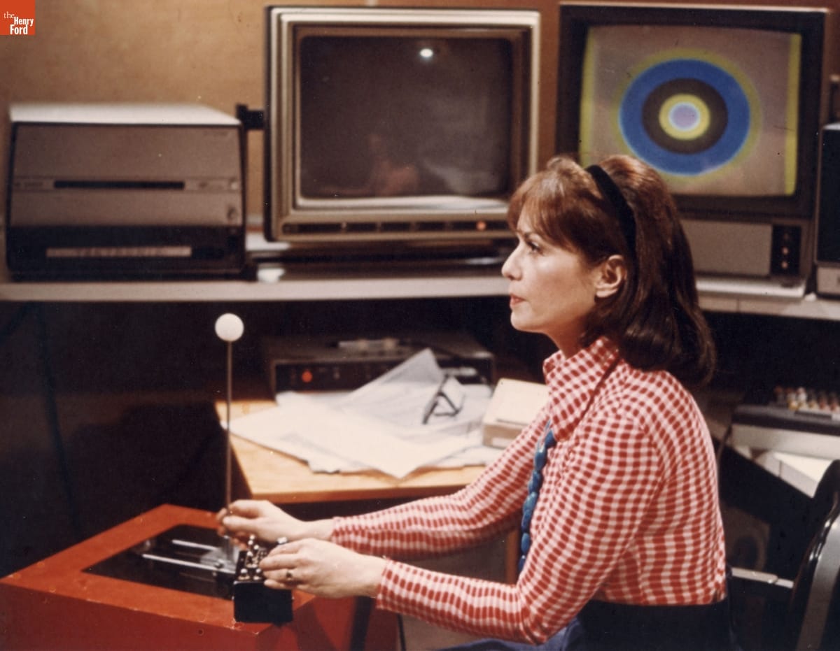
Lillian Schwartz working with a joystick interface at Bell Laboratories. Photo by Gerard Holzmann. / THF149836
In early 2021, The Henry Ford secured a very exciting donation: the Lillian F. Schwartz & Laurens R. Schwartz Collection. This material—which came to us through the generosity of the Schwartz family—spans from early childhood to late career and includes thousands of objects that document Lillian Schwartz’s expansive and inquisitive mindset: films and videos, two-dimensional artwork and sculptures, personal papers, computer hardware, and film editing equipment.
The late 1960s in California were a heady time in computing history. Massively influential technologies that are now part of our everyday lives were being invented or improved upon: home computers, the graphical user interface, the computer mouse, and ARPAnet. Meanwhile, on the opposite side of the country in New Jersey, the artist Lillian Schwartz was about to walk through the doors of revered technology incubator Bell Telephone Laboratories. Schwartz had recently met Bell Labs perceptual researcher Leon Harmon at the opening for the Museum of Modern Art’s group exhibition “The Machine at the End of the Mechanical Age.” Harmon and Schwartz each had work in the exhibit, and the pair struck up a conversation that led to an invitation for Lillian to visit the Labs.

A poster for the Museum of Modern Art exhibit that led to Schwartz and Leon Harmon’s friendship (top) and a portrait of Harmon painted by Schwartz (bottom). / THF188555, THF188581
This fateful meeting led to Schwartz’s decades-long tenure as a “resident visitor” at Bell Labs, where she was exposed to powerful equipment like the IBM 7090 mainframe computer and Stromberg Carlson SC-4020 microfilm plotter. Allowing artists access to this high-end research and development facility upended conventions, creating an environment that was fruitful for cross-disciplinary collaboration between the sciences, humanities, and arts. From 1968 until the early 2000s, Schwartz paid regular visits to the Labs, where she developed groundbreaking computer films and videos, and an impressive array of multimedia artworks.
Continue Reading
women's history, making, technology, computers, The Henry Ford Magazine, by Kristen Gallerneaux, art

Poster, "Together, We Are Power," 2020 / THF626365
In honor of Indigenous Peoples’ Day, The Henry Ford would like to share our recent acquisition of two posters. Designed by artist Mer Young for the Amplifier Foundation in partnership with Nia Tero and IllumiNative, these graphics were created in support of a land stewardship campaign and timed to drive participation of the Native American vote during the 2020 presidential election.
Mer Young (Hidalgo Otomi and Mescalero-Chiricahau Apache) is an artist focusing on narratives that “inspire, celebrate and elevate repressed indigenous, first nations and native cultures and women of color” as well as issues related to immigration rights, equality, and the Black Lives Matter movement. These posters use digital collage techniques and were designed to be activated with augmented reality.
Poster, "Vote in Solidarity," 2020 / THF626361
In 1992, Indigenous Peoples’ Day was officially adopted in Berkeley, California, as an alternative to Columbus Day. Cities across the country have since adopted the holiday, including several in Michigan. This counter-celebration addresses the controversy over the “discovery” of the Americas by Christopher Columbus—and the suffering of First Peoples under the violence of European colonization and settlement that followed. Indigenous Peoples’ Day is a way to express solidarity and acknowledge this history while celebrating Native American history, culture, and communities.
For culturally sensitive activities and resources for Indigenous Peoples’ Day, check out “Unlearning Columbus Day Myths” from the Smithsonian National Museum of the American Indian.
Kristen Gallerneaux (Métis-Wendat) is Curator of Communications & Information Technology at The Henry Ford.
21st century, 2020s, Indigenous peoples, voting, technology, posters, by Kristen Gallerneaux, art
