
Posts Tagged printing

Photo by Curatorial Staff of The Henry Ford
When you think of the word “protest,” what does it mean to you?
- Marching at a rally with a sign?
- Participating in a “walk out” at school?
- Boycotting companies?
- Wearing a shirt or hat with a message?
- Correcting people on their biases?
- Donating money to organizations?
- Civil disobedience?
A new temporary exhibit now on view in Henry Ford Museum of American Innovation, Quiet & Loud Protest, explores this question by demonstrating the ways that protest can be both loud and quiet. Throughout history, people have found different ways to advocate for change, whether marching in the streets or finding quieter ways to be an ally. Both are valuable in drawing attention to injustices. The exhibit draws together a small selection of recent acquisitions that showcase how artist-activists have used graphics to demand change and organize communities. The content of the exhibition is replicated in this post (with slightly expanded descriptions) for those unable to see it in person.
Amos Paul Kennedy, Jr.


Amos Paul Kennedy Jr. has generously donated several prints to the collections of The Henry Ford. These examples feature quotes attributed to George Washington Carver and Rosa Parks—two advocates for change who are prominent in our collections. / THF626953 (top), THF626939 (bottom)
These letterpress prints are by Amos Paul Kennedy, Jr., who relocated to Michigan from the South in 1963 with his parents. In junior high, he experienced racism from teachers who presumed he was uneducated and poor because he was Black.
At the age of 40, Kennedy visited Colonial Williamsburg while on vacation with his family and was so enamored with the letterpress and bookbinding demonstrations being given by historical reenactors that he went home and began to take classes at a community print shop. His love for the medium grew to the point where he made the decision to leave his career as a corporate computer programmer at AT&T so that he could focus on printmaking full time.

Letterpress prints by Amos Paul Kennedy, Jr./ THF626947 (top), THF626949 (bottom)
He went on to earn an MFA in Fine Arts and taught in university art programs. When Kennedy left academia, he adopted the historical role of an iterant printer, travelling through the American South to different print shops, learning about print media and developing his style over the course of many years. Kennedy sometimes describes himself as a “humble Negro printer” and wears bib overalls with a pink dress shirt. By doing this, Kennedy confronts people with their biases, causing them to question race, language use, and class. In 2013, Kennedy moved to Detroit, where he operates Kennedy Prints today.

Letterpress prints by Amos Paul Kennedy, Jr. / THF626943 (top), THF626941 (bottom)
Kennedy is known for his prolific output of vibrant letterpress prints that address cultural biases and social justice issues. Many of his prints feature quotes by Black civil rights activists and abolitionists, scientists and innovators, and literary figures, as well as traditional African proverbs. In an interview with the Library of Congress in January 2020, Kennedy said:
“People sometimes classify me as a political artist, and I find that amusing because when I was young, I was told that everything you do is political […] I print the things that reflect the way that I want the world to be. I think that people who say they are not political in their work fail to recognize that ‘not being political’ is a political act.”
Kennedy refuses to call himself an artist and sells his work at affordable prices to make it more accessible. Thanks to the power of the multiple, Kennedy can use printmaking to spread messages of hope widely—to reflect exactly the type of world that he wants to live in.
Corita Kent

Photo by Kristen Gallerneaux
Many people imagine the life of a Catholic nun as quiet and contemplative. Sister Mary Corita Kent challenged this notion. In 1936, after graduating high school, she joined the Order of the Immaculate Heart of Mary—a progressive Catholic convent and college in Los Angeles—where she taught art until 1968.
In the mid-1960s, Corita became famous for her colorful screenprints inspired by social justice issues, religious scripture, advertising, popular music, and literature. Her most celebrated prints are text-heavy and vibrant, layering blocks of bright color and DayGlo ink with high-key photographic imagery and words that twist around the page.
Detail of Quiet & Loud Protest exhibit with Corita Kent’s “my people” print. / Photo by Kristen Gallerneaux
Her print “my people” pairs a newspaper clipping about the 1965 Watts Uprising with a quote from Maurice Ouellet, an outspoken priest involved in the Civil Rights Movement in Selma, Alabama. Part of the quote Corita included reads: “Youth is a time of rebellion. Rather than squelch the rebellion, we might better enlist the rebels to join that greatest rebel of his time—Christ himself.” And in an oral history, Corita herself said: “I feel that the time for physically tearing things down is over. It’s over because as we stand and listen, we can hear it crumbling from within.”
Corita Kent’s print “You Shoot at Yourself, America” was created in response to the 1968 assassination of Robert F. Kennedy. It features a poem by Yevgeny Aleksandrovich. / THF189649”")
Corita Kent’s print “Road Signs (Part 1 & 2)” features text excerpted from Walt Whitman’s Leaves of Grass. / THF189650
Corita encouraged collaboration and “presence” among her students and encouraged them to balance awareness of political issues with finding joyful moments—even during dark times. Many important designers and creative thinkers visited her classroom, including Buckminster Fuller and Charles and Ray Eames. Artist Ben Shahn once called her “a joyous revolutionary” and in the media she was styled as a radical “pop art nun.”
Art was a Corita’s way of protesting through LOUD colors and bold designs.
During the height of Corita’s fame, the Catholic Church was reassessing many of its traditions, striving for unity and modernization under Vatican II. And yet not everyone agreed. In 1967, the Los Angeles archdiocese and Archbishop James McIntyre claimed the Immaculate Heart Community’s (IHC’s) approach to education was “communist” and referred to Corita’s work as being “blasphemous.” When the IHC sisters were ordered to end the liberating “renewal innovations” they had come to enjoy—or be asked to leave their teaching posts—many asked to be released from their vows and left in protest.
Corita’s decision to leave the order came a little sooner. In 1968, exhausted from an intense schedule and censorship from the church, Corita took a sabbatical. At the end of her time away, she left the Order and moved to Boston. There, she continued to receive commissions and to create art such as painting the Boston Gas Company’s tanks and designing the iconic “Love” postage stamp.
Corita Kent continues to be celebrated through exhibitions and publications. This book, Make Meatballs Sing: The Life and Art of Corita Kent, introduces young audiences to her story. / Photo by Kristen Gallerneaux
Angela Davis
Angela Davis is an activist, educator, and scholar who was a member of the Communist Party USA and the Black Panther Party. In 1970, Davis was placed on the FBI’s “Most Wanted” list. Guns registered to her name were used in a fatal attempt to free the Soledad Brothers during a courtroom trial. Davis was not present at the event. She fled police, fearing unfair treatment. After her capture, she spent 18 months in prison until being cleared of charges.
For some people, Davis is a controversial figure who believed in non-peaceful protest. To others, she is an inspiration as an outspoken supporter of women’s and civil rights, prison reform, and socialism. In recent years, she came out as lesbian and advocates for LGBTQ+ rights as well as those of Palestinian people.
The following artifacts relate to the impact of Angela Davis’s activism, past and present..jpg?sfvrsn=cc0a3601_2 "FBI Captures Angela, circa 1970")
Vermont S. Galloway—a WWII veteran—made this “FBI Captures Angela” screenprint at Westside Press to advocate for Davis’s freedom. Galloway was fatally shot by the Los Angeles Police Department in 1972. / THF277084
A parade flier documents the international “Free Angela” movement. The reverse side shows the planned route through Oakland, California. / THF627614
“13 Questions…” was the first interview with Davis while she was incarcerated. Her discussion with Joe Walker covers topics such as the surveillance of Black people, legal corruption, solidarity, and dismal prison conditions. / THF627594
An illustration by Akinsanya Cambon advertises the Black Panther Party’s newspaper and the “Free Breakfast for Children Program,” using Davis’s name. / THF627598.jpg?sfvrsn=c40a3601_2 "Poster,")
Davis appears in a poster by Tongva artist Mer Young for the Amplifier Foundation. This poster shows the continued impact of Davis’s legacy and was created to encourage Black and Indigenous voting in the 2020 election. / THF626361
Listening to Our Community
In 2021, The Henry Ford began to seek community feedback for ways to update and improve our permanent exhibit With Liberty and Justice for All. This work is continuing in 2022.
Stories of movements, social innovators, and political history are difficult to fully capture in museum labels. There is always too much to tell in 100 words or less. To address this, throughout the display of this exhibit, we will be inviting several community partners to contribute their own labels, in their own voices, to foreground the issues they believe matter the most.
By the Curatorial Staff of The Henry Ford. Quiet & Loud Protest is on view in Henry Ford Museum of American Innovation until March 31, 2022.
Civil Rights, art, making, women's history, African American history, Henry Ford Museum, printing
The Henry Ford acquires a poster portfolio as a way to document one of the largest protest movements in U.S. history
About half of the Signal-Return solidarity posters acquired by The Henry Ford.
“Justice Can’t Wait,” “Make Good Trouble,” “No Justice No Peace.” These are just a few of the messages that appear in a collection of letterpress posters recently acquired from Signal-Return printshop by The Henry Ford. In the history of well-designed posters, brevity of words and a strong visual impact work together to communicate messages at a glance. Boldly capitalized, imprinted in flat black ink on brown or white chipboard by the embossing strike of a printing press—these posters are meant to generate a feeling of urgency.
In early June 2020, Detroit’s nonprofit letterpress organization Signal-Return responded to the civil unrest sparked by the deaths of George Floyd, Breonna Taylor, Ahmaud Arbery, and others by producing free protest posters. The project was undertaken in solidarity with the principles behind the Black Lives Matter movement, with the intent that the posters would be carried by supporters in protests.
The remainder of the Signal-Return solidarity posters acquired by The Henry Ford.
Using social media to spread the word about their project, Signal-Return offered to create small batches of custom posters for the metro Detroit community, free of charge. As stated in their announcement, “The printing press has been, since its invention, a powerful tool of protest and an agent of change. Let us provide posters to aid in this effort.” Each recipient was asked to submit a concise five-word message through an online form. A few days later, the posters were ready for pickup “social distance style” across the roped-off front entry of the printshop. Many of these posters were visible throughout Detroit in the summer of 2020 at protests and taped to store windows, streetlight poles and freeway overpasses.
Signal-Return Letterpress Shop, Detroit, Michigan, June 2020 / THF610910
By September 2020, Signal-Return’s director, Lynne Avadenka, counted a total of 168 individual requests. Some requests repeated popular protest language of the day, while others were entirely unique and personal. Thanks to Signal-Return’s donation, The Henry Ford has acquired a portfolio of 44 examples as a way to document one of the largest protest movements in the history of the United States. The method by which they were acquired—called “rapid response collecting” by museum professionals—allows museums to collect stories of current events and major moments in history as they unfold.
Kristen Gallerneaux is Curator of Communications and Information Technology at The Henry Ford. This story was originally published in the January–May 2021 issue of The Henry Ford Magazine, available on Issuu.
21st century, 2020s, The Henry Ford Magazine, printing, posters, Michigan, Detroit, communication, by Kristen Gallerneaux, African American history
In the early 1930s, tensions were running high between two competing news sources: newspaper publishers were feeling the strength of their monopoly slipping away as the public’s appreciation for radio news broadcasts grew. This time of conflict in communications history is known as “The Press-Radio War.”
Publishers felt especially threatened by the nimbleness of radio networks. Broadcasters could share breaking news immediately over the airwaves, rather than having to wait for the next day’s run of newspapers to be printed and distributed. At first, newspaper companies tried to boycott radio’s ability to grow into something more than just an entertainment medium by asking wire services to block the flow of newsworthy information to radio stations. But eventually, the two media formats settled into a truce by the late 1930s, partly owing to the demand for reliable information-sharing as the threat of World War II grew. 
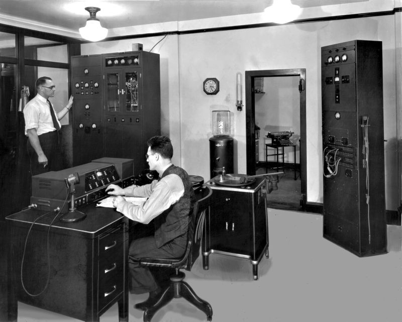
The Detroit News “autogiro” aircraft flies over the WWJ transmitter towers on the roof of the Detroit News building. The autogiro used a swiveling camera to take aerial photos of newsworthy events and quickly transported reporters to the sites of developing stories. / THF238502
Some newspapers saw the financial benefit in blending formats and went so far as to cut out the competition by starting their own radio news stations. The Detroit News was one of the first newspapers in the United States to incorporate a commercial radio station into its operations. In August 1920, WWJ (then owned by the Detroit News) launched its program of nightly broadcasts under the call sign 8MK. As of 2020, WWJ has been on-air for 100 years!
In this image, the Detroit News autogiro flies over downtown Detroit. The Penobscot Building—site for the News’s experimental W8XWJ station—appears in the foreground. The original vertical “whip” antenna is just visible on the ball that tops the metal tower. / THF239963
In 1936, the Detroit News launched experimental audio broadcasting station W8XWJ from the 47th floor of the Penobscot Building in downtown Detroit. W8XWJ was formed under the FCC’s ultra-high short-wave “Apex” station program, an experiment designed to provide listeners with higher quality AM signals. The station’s original 100-watt AM vertical “whip” antenna was attached to the beacon sphere that tops the metal tower perched on the roof of the Penobscot Building. The height of the Penobscot—the tallest skyscraper in the city at that point—helped to disperse the radio waves over the entire city. Many people are familiar with the glowing red beacon at the top of the Penobscot, but its connection to the growth of radio in the city is not as well known.
From 1938-1940, W8XWJ ran a fascinating but ultimately short-lived experiment with an emerging technology called “radio facsimile.” Customers would hook a special “radio printer” up to their own radio, which would print the news overnight while they slept. In the morning, the news would be ready to enjoy with morning coffee – no need to deliver a physical newspaper! 
One of the original Finch Facsimile Transmitters from W8XWJ, complete with original station badge visible and a sample of a radio fax. / THF160295
At W8XWJ, a Finch Facsimile Transmitter was used to convert images and text into audio tones. These signals would arrive in customer’s home via radio waves, where their “radio printer” would translate the tones into human language. Everything would print out onto continuous rolls of thermal paper.
A Crosley “Reado” Radio Printer. / THF160315
This is a Crosley Reado Radio Printer – the type of device that people would connect to their home radio and would receive their faxed newspapers on. When The Henry Ford conserved this artifact through an Institute for Museum and Library Services grant, our conservators were excited to find an example of a facsimile still on the drum inside the machine. In this image, you can see an original radio facsimile portrait of Boris Karloff, who was famous for his 1931 portrayal of Frankenstein’s monster.
The Henry Ford’s collections also include the original transmitter and amplifier that powered the W8XWJ station.
W8XWJ’s Western Electric 500 Watt Ultra Shortwave Transmitter and Amplifier. These two devices are visible in their original installation here. / THF173159, THF173165
The idea behind W8XWJ’s radio facsimile experiment was revolutionary, but the process was slow and fussy. It could take over 20 minutes to print a single page of news, and signal reception became unreliable beyond a mile or two away from the transmitter. In 1940, W8XWJ ended its radio facsimile project.
While the original “whip” antenna for W8XWJ was replaced by a FM antenna in the early 1940s, if you look toward the top of the Penobscot building today, there is a tangle of communication equipment visible from street level. And in the interesting way that the new and the old can merge and converge within the histories of technology, some of this contemporary equipment fulfills radio facsimile’s promise to provide easily accessible information—the top of the Penobscot now serves as an important hub for Detroit’s wireless Internet network.
Kristen Gallerneaux is Curator of Communications & Information Technology at The Henry Ford.
1930s, 1920s, 20th century, radio, printing, newspapers, Michigan, Detroit, communication, by Kristen Gallerneaux, #THFCuratorChat
As Project Curator for the William Davidson Foundation Initiative for Entrepreneurship, I research objects within The Henry Ford’s collections that tell entrepreneurial stories. Most recently, I delved into the Label Collection’s food labels – a collection of beautiful labels from canned food and West Coast fruit crates. While examining this collection, I was drawn to the eye-catching and artistic designs and took note of the lithographers’ signatures. A recurring name was the Schmidt Lithograph Company. Further research in our collections database revealed other items designed by this lithography firm, including seed packets and a recipe booklet. These objects help tell the story of Max Schmidt and the evolution of his successful company. Crate Label, “Victor Vineyard Tokay Grapes,” circa 1920, designed by Schmidt Lithograph Company THF293997
Max Schmidt was born in Germany in 1850. At the age of fourteen – not wanting to enter his family’s traditional medical practice – Schmidt set sail around the world for six years as a cabin boy, arriving in San Francisco in 1871. Speaking little to no English, Schmidt took odd jobs until he found himself working for engraving and lithography companies. These new jobs in California gave him the opportunity to hone his artistic skills.
In 1874, Schmidt ventured into a partnership with Frederick Beuhler, creating pictorial cuts for local newspapers. A “cut” refers to an image or illustration that can be reproduced through mass printing. Traditionally, this would have been done using woodcuts, but Schmidt and Beuhler utilized the new etching technique known as zincography. This process, which involved using a stylus to cut lines into a zinc metal plate, was more efficient and allowed their company to quickly become the printing plate supplier for all the San Francisco newspapers. Crate Label, “River Lad Brand Asparagus,” 1940-1950, designed by Schmidt Lithograph Company THF294037
In 1876, Schmidt went into business on his own, creating M. Schmidt & Company, which produced stock certificates and colored labels utilizing the process of stone lithography. This involved drawing images on soft stone, like limestone, and transferring the image from the stone to paper using a printing press. Several years later in 1883, the company was incorporated as Schmidt Label & Lithographic Company.
Crate Label, “Edna Alma Rancho Brand Grapes,” 1883-1899 THF294345
 Close-up view of the lithographer signature on the Edna Alma Rancho label THF294349
Lithographic firms often included a signature on their designs so that people would know who created them. Today, these signatures can help us date the labels in our collection. In this case, because we know the name “Schmidt Label & Lithographic Company” was used from 1883--1899, we know the label was created within that date range.
With the completion of the transcontinental railroad in 1869, more produce than ever before was being shipped across the country to eastern markets. Competition among growers and packing companies increased the necessity for labels, which aided in product and brand identification. In the 1870s and 1880s, the lithography industry in California swelled to meet the demand for labels. Los Angeles and San Francisco – where Schmidt’s company emerged as an industry leader – became major hubs for lithography.
 Can Label, “Lynx Brand Puget Sound Salmon,” 1880-1900 THF109742
Just as his business was flourishing, Max Schmidt experienced a series of setbacks that could have very easily been the end of his lithography business. An unfortunate string of fires destroyed his factory in 1884 and again in 1886. Despite his misfortune, Max Schmidt – and his company’s reputation – persevered to continue producing high-quality commercial lithographs, including labels for fruit crates, canned fruits and vegetables, and canned salmon from the Pacific Northwest.
The turn of the century saw a trend towards consolidation of the lithography industry. Out of the dozens of lithograph companies that had opened to meet the demand for labels and other commercial lithographs, several larger companies emerged as the leaders. By this time, Schmidt’s company was one of the most well-known in the industry. Following the consolidation trend, Schmidt acquired San Francisco-based Dickman-Jones and the label department from H. S. Crocker to form the Mutual Label & Lithographic Company in 1899. Throughout the early 1900s, the Los Angeles-based firms of Western Lithograph Company and Los Angeles Lithographic Company were also associated with Mutual, which quickly became a powerhouse in the industry.
 Title page for the 1904 St. Louis World’s Fair Edition recipe booklet for “How to Eat Canned Salmon,” designed by Mutual Label & Lithographic Company THF294360
The 1906 earthquake and subsequent fire that hit San Francisco was devastating to the San Francisco lithography industry. Many companies lost all label designs, production equipment, and business records. Schmidt’s company was completely destroyed, but his previous financial success allowed him to quickly rebuild where other lithographers were not so lucky. When the new building opened in 1907, the Mutual name was replaced with Schmidt Lithograph Company, which remained the name of the business for the next six decades. Stock Crate Label for an Unknown Brand of Asparagus, 1906-1966 THF293101
A common product for lithography companies was the stock label, like this one produced by the Schmidt Lithograph Company. These labels were void of brand identification so that it could be customized for any company. This was often a cost-efficient option for growers and packing houses.
Throughout the 1900s, the Schmidt Lithograph Company experienced tremendous success. Schmidt was a showman with a kind disposition, leading to great working relationships with the firm’s clients and employees. His success enabled the company to expand, establishing offices and factories in Florida, Texas, Honolulu, Utah, and along the West Coast. When Max Schmidt died in 1936, his company was still one of the most successful lithography businesses in the country. In 1966, Schmidt Lithograph Company was purchased by the Stecher-Traung to create the powerful firm, Stecher-Traung-Schmidt, which remained in business until 1994.

Crate Label, “Santa Brand Fruits,” 1928 THF293105
Close-up view of the lithographer signature on the Santa Brand Fruits label THF294347
Lithographer signatures can tell us where a design came from. Schmidt was a major player in the lithography industry with factories across the country. The signature on this label tells us that it was created in Schmidt’s Los Angeles factory.

Dodson Seed Store “Nasturtium” Seed Packet, 1966-1983 THF294259
Lithographers produced designs for a number of items including seed packets. The signature on the bottom of this seed packet notes that its design was created by the firm of Stecher-Traung-Schmidt.
Samantha Johnson is Project Curator for the William Davidson Foundation Initiative for Entrepreneurship at The Henry Ford.

Crate Label, “Far West Brand Pears,” circa 1930 THF293059
As Project Curator for the William Davidson Foundation Initiative for Entrepreneurship, I research objects within The Henry Ford’s collections that tell entrepreneurial stories. Most recently, I delved into the Label Collection, which includes labels from alcoholic beverages, cigar boxes, medicines, various food related items, and miscellaneous products. This blog post highlights the West Coast fruit crate labels and canned food labels.
Label Lithography
Can Label, “Defender Brand Tomatoes,” 1913-1918 THF293393
In the late 1800s, the preferred method of printing used to make image-centric labels like these was lithography. This process involved the transfer of an inked image from stone or metal plates to paper via a printing press. Skilled artists drew their images on flattened, smooth pieces of stone – traditionally limestone – to then be inked and transferred. Later, flexible, photosensitive metal plates were used on rotary and offset presses, making the lithographic process more efficient. The artists who worked in this medium were called lithographers. Some of the growers, as well as some of the packing and distribution companies, had their own lithography departments to produce labels. The majority, however, hired lithography companies to create their label designs.
The introduction of color into the lithography process, known as chromolithography, transformed the advertising industry. Multi-colored lithographs involved several transfers of the same image from multiple stones, or plates, each with their own color ink in the desired layout. The more colors included in the image, the more transfers (and stones/plates) required to produce the desired result.
Crate Label, “Atlas Brand Blackberries,” 1916-1930 THF113854
This label for Atlas Brand Blackberries is an example of single-color lithography and was produced through a single ink pass. The shading and variation seen in this image was created by the methods of stippling, linework, and applying different densities of the same color of ink to the page. The stippling method refers to the pattern of dots, which can be seen if you look closely at the fruit depicted on this label.
Can Label, “Holly Brand Peaches,” circa 1916 THF293047
To enhance the attractiveness of a label some lithographers incorporated metallic pigments and dimensional, embossed areas into their designs. Metallic pigments created the shiny golden appearance that can be seen along the edges of this label for Holly Brand Yellow Cling Peaches.
Fruit Crate Labels
Before the 1860s, East and West Coast markets were essentially isolated. Because of differing climates, certain produce was only available to consumers living in the eastern United States during specific seasons while most produce in the West could be grown throughout the entire year. When the transcontinental railroad opened in 1869, eastern markets were opened to the West Coast produce industry for the first time. The railroad, along with the growing canning industry, allowed consumers to enjoy fruits and vegetables year-round – encouraging the establishment of more growers and packing companies in the West to meet the high demand. By the turn of the century and into the early twentieth-century, California fruit growers provided an abundance of fresh fruit to the national markets, transforming the American diet.
With greater competition among growers and packing houses, the crate label became an important marketing tool. At the time, grocers were the link between customers and the products. Grocers obtained their goods from wholesale markets, choosing their products by price and intuition. The label had to stand out and appeal to the grocer who would then buy several crates of the product and sell it in his store. If the grocer heard that customers liked a certain brand over previous ones he’d supplied, he could make sure to purchase that particular brand again, using the crate label for identification.
These fruit crate labels are often stunningly beautiful – more like mini-posters with broad color palettes, incredibly detailed images, and clever brand names. A common feature of label design was an image of where the fruits and vegetables were produced. Customers became enamored with the shining groves of oranges in the West and came to identify certain places with the best produce. Other labels feature popular motifs of the time and allow us to explore the trends in graphic design.
Crate Label, “Orchard Brand Pears,” circa 1920 THF293065
California wasn’t the only state on the West Coast to produce delicious fruit. Washington was known for its many varieties of apples as well as other fruits, including pears.
Crate Label, “Bocce Brand Zinfandel Grapes,” circa 1940 THF293043
C. Mondavi & Sons’ “Bocce” label played up the family’s Italian roots, aligning its product with the quality grapes grown in Italian vineyards. This successful business was established by Cesare Mondavi, a Minnesota grocer and saloon owner who often traveled to California to select and ship grapes back home to make his own wine. After becoming enamored with the California climate, which reminded him of Italy, he moved his family to Lodi in 1923 to open a business growing and shipping grapes. His success allowed him to purchase a winery in 1946, which is still thriving today as C. K. Mondavi and Family.
Crate Label, “Santa Rosa Brand Ventura County Lemons,” copyright 1927 THF293109
This label features the sprawling lemon groves in Oxnard, California. It also features the “Sunkist” logo, which became a popular brand known for its high-quality oranges and lemons.
Canned Food Labels
The process of canning food has been around since the early 19th century, with products used as wartime provisions for French and British armies. Tin cans allowed food producers to safely transport their goods without fear of them breaking – as was common with glass jars and bottles – making cans a more economical container for foodstuffs. While canned foods were introduced to America by the 1820s, the demand for these products came four decades later during the American Civil War.
Unlike glass jars or bottles, which allowed consumers to view the product inside, cans required identification. At first, labels were simply a tool to inform the customers of the product they were buying, who produced it, and where it was produced. As railroad networks expanded in the late 1800s and competition increased, more elaborate labels were created to appeal to customers in new markets across the country. The label became even more important after World War I when customers began selecting products for themselves in self-service grocery stores.

Can Label, “Butterfly Brand Golden Pumpkin,” 1880-1895 THF113859
Can Label, “Butterfly Brand Golden Wax Stringless Beans,” circa 1885 THF113860
Using the same design for several different products became a strategy for helping customers find the brand with which they were familiar. Olney and Floyd’s Butterfly Brand products were easy to identify with their colorful, eye-catching labels and signature butterfly.
Can Label, “Bare Foot Boy Brand Tomatoes,” circa 1910 THF293079
Characters were a common feature in product advertising. The goal was to create an emotional or personal connection between the product and the customer – a practice that is still seen in marketing strategies today.
Can Label, “Lynx Brand Puget Sound Salmon,” 1880-1900 THF109742
As canned goods made their way across the country, certain states became known for specific products. Washington, for instance, was known for its salmon industry and canned salmon was shipped from the Pacific Northwest all across the United States. This beautiful label was created by the Schmidt Lithograph Company – one of the most well-known companies in the lithography industry.
If you enjoyed this small sample of labels, visit our Digital Collections to see other fruit crate labels and canned food labels in our collection.
Samantha Johnson is Project Curator for the William Davidson Foundation Initiative for Entrepreneurship at The Henry Ford.
shopping, by Samantha Johnson, advertising, communication, technology, printing, food, entrepreneurship

Tray of Wood Type, circa 1840. THF159398
The Henry Ford and House Industries, two institutions committed to celebrating the spirit of innovation, joined forces to create House Industries: A Type of Learning, an exhibit in Henry Ford Museum of American Innovation from May 27 through September 4, 2017.
Artifacts provided by House Industries and others are complemented by pieces from our own collections, like this tray of wood type from around 1840. These items can be seen in the exhibit or in this expert set. Regardless of where you see them for yourself, these artifacts showcasing design might just spark your own creative moment.

Linotype Composing Machine, circa 1915. THF126838
For the past 25 years House Industries has been known for their unique font collections. Their fonts have been used to create logos for some of the best-known brands, from entertainers to news outlets. At The Henry Ford, our collections house some important printing presses. The printing press democratized knowledge. As mechanical improvements were made, printing became faster and cheaper. By extension, the content of newspapers and books diversified, and the printed word was distributed on a mass scale.
This collection documents the mechanical lineage of printing presses, from a circa 1809 Ramage--one of the oldest surviving hand presses in the country--to the efficient Mergenthaler Linotype composing machine.

What's new on The Henry Ford's Innovation Nation this weekend? Host Mo Rocca shows us the hardware store robot; the incredible patent models from Thomas Edison that show us the beginning of our electronic world; how the USG Corp. is leading the way with grooming the next generation of engineers and mathematicians; the Israeli inventors of a printer that fits in your pocket. Learn more here and see a sneak peek below.
Lish Dorset is Social Media Manager at The Henry Ford.
printing, technology, by Lish Dorset, Thomas Edison, The Henry Ford's Innovation Nation

A colleague's insightful blog post from March 19, 2012, focuses on the famous "Rosie the Riveter" poster and many photographs of women factory workers at Ford Motor Company during the 1940s.
The first poster (above), "Free a Man to Fight," shows a woman worker not in a factory but in a railroad's maintenance roundhouse. She is lubricating a locomotive wheel, previously a man's occupation. It is part of the early 1940s home front effort encouraging women to join the work force to replace men serving in the armed forces. New York Central Railroad hired the artist Leslie D. Ragan to make the poster artwork. He is the same artist the railroad company used for their well-known posters in the 1920s and 1930s featuring locomotives and travel destinations.

The next poster, "For Every Fighter a Woman Worker," shows a young woman in a typical factory work outfit from the First World War. She symbolically holds a biplane and a bomb, standing in front of a large blue triangle. In 1914 the Young Women's Christian Association (Y.W.C.A.) was one of a group of organizations in the U.S. that formed the United War Work Campaign, Inc. This campaign recruited women to serve in industry, government and agriculture positions. The Y.W.C.A. supported the war work in diverse ways, including opening and maintaining many "Blue Triangle" houses, which provided safe and morally upright places for young working women to gather for rest and recreation.

Another poster of the United War Work Campaign and the Young Women's Christian Association, this features a young woman in uniform working a telephone switchboard. The background includes marching soldiers through a window. The Y.W.C.A. helped to recruit and sustain women working for the government in military jobs in the U.S. and abroad during World War I.

During World War II many women served in offices. This U.S. government poster made in 1943 features a young woman cleaning her typewriter in front of an outline of a combat soldier. The text below, pointedly asked women office workers to "Remember his needs. Your care of office equipment will save vital materials and help him win."

While many posters focus on harnessing youthful energy for the war effort, the reality during World War II was a collaborative endeavor by all Americans. This poster shows one of the ways mature women could help by working the conveyor line in a food processing plant.

Many young men left farms to serve in the military during World War I. An acute labor shortage soon ensued and to help farmers continue producing vital food, the Y.W.C.A. Land Service Committee recruited young women to work on the farms. This poster depicts "farmerettes" wearing uniforms walking next to a team of horses while one carries a rake and another a basket of vegetables. Often working with young women from the cities, the Y.W.C.A. and other groups like the Farm and Garden Association provided these young women with training in agricultural skills.

During the Second World War, an agricultural labor shortage again developed. The government formed the U.S. Crop Corps to recruit and train young women from the cities to replace the men called to military service. This poster shows a young woman driving a tractor through a farm field, pausing to turn and give the "V for Victory" sign. The government printed thousands of posters and provided a space at the bottom for use by local groups. This poster has a handwritten note in red pencil following the printed "Enlist Today" by the "Junior Board of Commerce - Philadelphia."

Even with the successful recruiting of young women to work on the farm, another challenge during wartime is inevitably food shortages. During the First World War "Meatless Mondays" and "Wheatless Wednesdays" became campaigns of the United States Food Administration seeking voluntary changes in the eating habits of Americans. The mainstay of many a woman's work continued to be as food shopper and cook for her family. This poster from 1918 shows a woman cooking muffins and pancakes made from corn products like corn meal, grits and hominy. It was a challenge substituting corn for wheat and the government used this poster to encourage women to do this by promoting corn as "appetizing, nourishing, economical."
Our collection of world war posters from the 1910s and 1940s features women contributing to the war effort in so many different ways. I think it is illuminating to see the variety of jobs that the poster artists chose to help rally women for the national effort during these wars.
By Cynthia Read Miller, Curator of Photographs and Prints at The Henry Ford, with much thanks to the catalogers of our hundreds of world war posters, especially Jan Hiatt, Marian Pickl and Carol Wright.
20th century, 1940s, 1910s, World War II, World War I, women's history, printing, posters, food, by Cynthia Read Miller, agriculture
