Posts Tagged art
Lillian Schwartz Collection: Beginning the Journey
In 2021, The Henry Ford acquired the papers of noted computer-generated film and new media artist Lillian F. Schwartz as part of the larger Lillian F. Schwartz & Laurens R. Schwartz Collection.
The papers, perhaps the most complex set of materials ever brought into the holdings of the archives and library at The Henry Ford, contain multiple formats, including documents, graphics, audio, still and moving images, and books in both physical and digital forms.
In addition to the archival and library materials, the larger collection includes many three-dimensional items, such as sculpture, clothing, and large framed artworks, with our collections management and registrar staff being responsible for the care of those items.
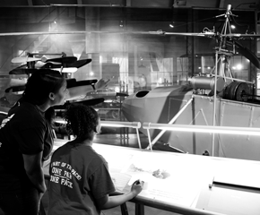
The collection’s journey to the archives and library began by receiving the shipment into a large project area in Henry Ford Museum of American Innovation, and then unwrapping and unloading pallets.
Photo by Brian Wilson
Photo by Brian Wilson
Boxes were sorted so that we could check them against existing inventory lists and create additional inventories if needed. Any unlabeled boxes were given temporary paper labels so that they could be tracked.
As the inventories were reviewed, determinations were made about where materials would be stored in the Benson Ford Research Center (BFRC). Storage locations were specified based on the format of the material with, for example, film being placed in cold storage, and books being transferred to library storage.
Once we understood how much we had and where we wanted to put it, we began making shelf space in the BFRC. Many existing collections had to be relocated to create room, with location data for each of those collections requiring updates in our collections management system. In several cases, moving a collection required moving one, two, or three other collections to make efficient use of available shelving. In the end, we made 95 shelves and 16 flat file drawers available for the Schwartz papers. With each shelf being 40 inches wide, this added up to over a football field in length of shelving!
Photo by Brian Wilson
Photo by Brian Wilson
The newly cleared shelves and drawers were slowly filled with boxes and folders over several weeks as the materials were moved from the museum to the BFRC.
Photo by Brian Wilson
Photo by Brian Wilson
In addition to storing the physical materials, we’ve also been reviewing the electronic data included in the papers. Located on multiple “carriers,” including computers, external hard drives, and backup disks, the data includes thousands of text, image, and video files. We’re noting the type, storage size, manufacturer, and part and serial number for each carrier and have created disk images of the most recently used hard drive to improve access to and preserve that data.
Our next steps in this journey will be to expand and refine the original inventories by reviewing the entire collection in the BFRC box-by-box, folder-by-folder, and hard-drive-by-hard-drive with the goal of creating a single master inventory. This inventory will become the starting point for access to the papers for our staff and researchers.
Be sure to visit our Digital Collections to see items from the entire collection that have already been digitized, and contact the archives and library at research.center@thehenryford.org if you’d like more information on this collection—or any of the hundreds of others in our holdings.
Brian Wilson is Senior Manager of Library and Archives at The Henry Ford.
2020s, 21st century, women's history, technology, Michigan, drawings, Dearborn, computers, collections care, by Brian Wilson, art, archives, #Behind The Scenes @ The Henry Ford
Western Interactions with East Asia in the Decorative Arts: The 19th Century
Western Europe and its former colonies in the Americas were long fascinated with the Eastern cultures Europeans depicted as “mysterious”—specifically their exotic and luxurious trade goods. This is the second of two blog posts that examine this European and American fascination with Asia and the way that was expressed in the decorative arts. In the first post, I discussed the China trade in the 17th and 18th centuries, specifically Chinese export porcelain and the related tea trade. This post focuses on the 19th century, with the decline of the China trade, the opening of Japan to the West, Western eclecticism in the decorative arts, and the beginning of Western understanding of Asian design.
The China Trade in the First Half of the 19th Century
By the early 19th century, Europe and America had learned the secret of “hard paste” or true porcelain, so Westerners could produce their own high-quality wares. In the early American republic, porcelain factories popped up as early as the 1820s. This is not to suggest that that trade in Chinese porcelains declined; rather, it entered a new phase.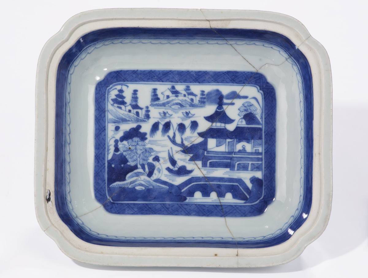
Canton Ware Serving Bowl, 1800–1850 / THF160724
The serving bowl above would have been a prized possession of an American family in the first half of the 19th century. Part of a dinnerware set, this Canton ware, or “Blue Willow,” pattern appealed to middle-class Americans as an example of the exoticism of a faraway place, and implied the owners’ good taste and sophistication. Compared with the expensive and highly prized 18th-century wares, Canton china was inexpensive. This porcelain was shipped from Guangzhou, then called the Port of Canton by the English, to serve as a ship’s ballast under the more valuable tea chests.
Canton Ware Serving Bowl, 1800–1850 / THF160723
These wares usually depict a landscape with Chinese buildings and a bridge in the center and have a decorated rim. This pattern was widely copied by English makers in the late 19th and 20th centuries and became so inexpensive that it was sold at five-and-ten cent stores in the 20th century. This example is interesting as it broke at some point during its working life and was mended with visible staples, indicating that it was indeed a valued possession.
Watercolor Painting, Two Rooms of a Chinese Painter's Studio, circa 1865 / THF119916
The remarkable image above shows the interior of a Chinese porcelain studio, with craftspeople decorating ceramics for the Western market. Visible on the wall on the left are prints or drawings supplied by Western agents, which were then copied by the artists in the foreground. The table on the right is filled with finished pieces of decorated ceramics. This piece itself was a souvenir intended for the Western market.
While the China trade continued throughout the 19th century, imports to America declined with the Civil War in the 1860s and never rebounded. After the Civil War, the United States and Europe became fascinated with another Asian nation, Japan.
Japan and the West
Japan, like China, traded with the Spanish, Portuguese, and Dutch beginning in the 15th century. However, by the middle of the 17th century, Japanese authorities closed their doors to Europeans, primarily due to the undue influence of Catholic and Protestant missionaries. In 1853, the American Commodore Matthew Perry, under the direction of President Millard Fillmore, arrived in Yokohama harbor with a fleet of steam ships, which impressed the Japanese with their high degree of technology. The Japanese grudgingly agreed to open their markets to the Americans and the West. During the next few decades, traditional Japanese arts flowed to the West, where they profoundly influenced European and American fine and decorative arts.
Japanese River Scene Wood Block Print, 1900–1929 / THF292625
Japanese Travelers in a Snow Storm, Wood Block Print, 1900–1929 / THF292633
The wood block prints above are good examples of Japanese exports that excited Western artists and designers. The compositions were like nothing ever seen in Europe or America. The use of flat, unmodulated colors laid down next to each other, combined with diagonals, provided a sense of depth. This influenced the Impressionist and Post-Impressionist artists in France and designers everywhere.
Folding Side Chair, 1880–1885 / THF92166
The influence of images from Japanese prints on Western decorative arts can be seen in the carved cranes on the side chair above, painted in black to imitate ebony, an expensive wood that late Victorians associated with Japan. This is known as Anglo-Japanese style, which began in England in the 1870s and spread to America by the 1880s. Like many of the Asian imports, this Western style had little to do with Japan itself; rather, it suggested the “exoticism” of the Far East.
Pitcher, 1870–1875, Made by Tiffany and Company, New York, New York / THF190746
Like the side chair, Tiffany and Company’s elegant silver pitcher uses stylized images of birds and foliage done in the Anglo-Japanese style.
Floral Wallpaper Sample, 1860–1880 / THF190058
Floral Wallpaper Sample, 1860–1880 / THF190057
Wallpaper Sample, 1880–1890 / THF190054
The highly stylized wallpapers shown above were derived from the floral patterns of Japanese prints. European and American designers called these abstracted patterns “conventionalized” ornament. These wallpapers appealed to those interested in what was called the “aesthetic” taste. This taste tended to be high style, although by the 1880s, middle-class Americans applied elements of it in their interiors. For example, the sample above was found in the middle-class Firestone Farmhouse, now in Greenfield Village. The date of our interpretation is 1885.
Eclectic Design in the Late 19th Century
What we’ve looked at so far has imagery directly linked to either Chinese or Japanese originals, but there is another category of decorative objects that contain more interpretive elements derived from Chinese, Japanese, or other Asian designs. Some of these pieces contain imaginary elements that the designer created out of thin air.
“Crown Milano” Vase, 1888–1893, Made by the Mount Washington Glass Company, New Bedford, Massachusetts / THF163595
“Burmese” Caster, 1885–1895, Made by the Mount Washington Glass Company, New Bedford, Massachusetts / THF167758
The ornate and elegant glass pieces above are clearly influenced by Japanese designs but have been transformed by late-19th-century American glassmakers into something unique. They are highly decorative and distinctly of their time.
Silver Tea Caddy, 1875, Made by the Gorham Manufacturing Company, Providence, Rhode Island / THF190070
Tea and Coffee Service, 1883–1884, Made by Gorham Manufacturing Company, Providence, Rhode Island / THF154882
In the late 19th century, wealthy Americans demanded ornate silver sets, and above are notable examples of just how wild they could get. The tea caddy references Asian design elements—as perceived by Americans, who had little true understanding of Asian cultures. Likewise, the full tea set picks up on the Anglo-Japanese style, but takes it much farther, into something truly Victorian—and, like the glass examples, totally unique.
Attempts at Understanding Asia

Vase, 1896–1908, Made by Hugh Robertson at the Dedham Pottery, Dedham, Massachusetts / THF176707
By the beginning of the 20th century, there were several designers looking for true sources of inspiration in Asian design. One of the most interesting of these was the English-born potter Hugh Robertson (1845–1908). During his time at the Dedham Pottery in Massachusetts, Robertson was obsessed with recreating the well-known Chinese oxblood glaze, seen on the vase above. He spent decades experimenting and perfecting the glaze, first at his family's Chelsea Keramic Art Works and later at Dedham. He was also interested in recreating the forms of Chinese porcelain made for domestic production rather than for export.
I hope you have enjoyed this quick journey through The Henry Ford's collection of Asian-influenced decorative arts. All of these artifacts, as well as many more, are available for browsing online in our Digital Collections.
Charles Sable is Curator of Decorative Arts at The Henry Ford.
Additional Readings:
- Davidson-Gerson Modern Glass Gallery
- Digitizing Our Newest Exhibit
- Photographing Glass
- Artist in Residence: Shelley Muzylowski Allen
Europe, 19th century, Asia, paintings, glass, furnishings, design, decorative arts, ceramics, by Charles Sable, art
The Hidden Painting of Robert Frost Home

Unknown artist, “Lady in a Lace Bonnet,” located in Robert Frost Home in Greenfield Village, before conservation. / Photo by Marlene Gray

The same painting, after conservation. / Photo by Marlene Gray
It is that time again, as Greenfield Village opens this week for another exciting season! While you were away, staff at The Henry Ford have been busily cleaning and repairing objects throughout the village buildings. During the winter months, conservation staff move artifacts in need of repair back to our labs for a bit of TLC. Some of these objects are on full display while others hardly ever get the spotlight. One of the latter objects is a painting rarely seen by visitors.
View of Robert Frost Home with the parlor on the right. / THF1883
Within the Porches and Parlors district of Greenfield Village is the home of American poet Robert Frost. Originally located in Ann Arbor, Michigan, the house was moved to the village by Henry Ford in the 1930s. As you enter the house, a parlor is on the immediate right. If you look inside on the left, you will see a frame on the wall. There hangs a portrait of a woman, “Lady in a Lace Bonnet.” During routine maintenance, our dedicated clean team noticed the painting had some paint losses, which you typically find with old paintings. The paint losses at the top and bottom of the painting were the most obvious. These types of losses can occur when the painting is roughly handled during framing.
Image courtesy of clean team member Teresa McCloud, who noted the damage.
Conservation staff then brought the artwork to the lab to give this hidden painting some much needed attention. Once the painting was removed from the frame, the next step was a good cleaning. Paintings trap abrasive dust and debris, both on the canvas behind and the painted surface. After vacuuming to remove the larger debris, a very mild cleaning agent was used to remove the surface grime collected over the years. What a drastic change that made!
Grime cleaning, with right side cleaned. / Photo by Marlene Gray
Still, the portrait had a yellow tint, visible in the sitter’s face, which is a tell-tale sign of an aged varnish. Various solvents were tested to see what worked best at removing the old varnish, and we selected one that did not cause harm to the paint surface. After the varnish was removed, the portrait looked much brighter and fresher.
Varnish removal, with left side cleaned. / Photo by Marlene Gray
Once our lady was cleaned, it was time to tackle the paint losses. Color-matching the surrounding paint is tricky and takes patience to get right, but when we do, it is so rewarding to see the complete image. Last but certainly not least, a new coat of varnish with stabilizers that resist the harmful effects of ultraviolet radiation was added to protect the painting from light from the window on the other side of the parlor.
After securing the painting back inside the frame (being sure not to scratch the surface), we whisked it back to Frost home, tucked into its “hidden” spot. Now you know what hangs on the wall, and you may even be able to get a little peek from outside the parlor window on your next visit. The lady will be happy to show off her fresh appearance!
“Lady in a Lace Bonnet” returned home. / Photo by Marlene Gray
Marlene Gray is Senior Conservator at The Henry Ford.
collections care, conservation, Greenfield Village buildings, Greenfield Village, #Behind The Scenes @ The Henry Ford, by Marlene Gray, art, paintings
The posters designed for Herman Miller’s annual employee picnic are some of the best-known examples of American graphic design from the latter half of the 20th century. Much has been written about how the 1970 poster was Steve Frykholm’s first assignment as Herman Miller’s first internal graphic designer—as well as how his series of posters gained fans almost immediately. Museums took notice and collected these posters, even while the series was still ongoing—including The Henry Ford. However, Frykholm did not design all of Herman Miller’s picnic posters, but the first 20 of them, from 1970–1989. Kathy Stanton, a graphic designer on Frykholm’s team, recalled telling Frykholm, “if you ever decide to give this [the picnic posters] up, I’ll be interested.” In 1989, after designing 20 posters, Steve Frykholm decided it was time to pass the reins, and took Kathy Stanton up on her offer.
Herman Miller Picnic Poster, "Fish," 1992 / THF626917
Kathy Stanton began taking art classes in high school at the Cincinnati Art Museum and the University of Cincinnati, in her hometown. She went on to attend the University of Cincinnati and received her Bachelor of Science degree in Graphic Design. In 1979, shortly after graduation (and in a tough job market), she was hired by Herman Miller to work in their internal graphic design department. Stanton worked on many projects in her time at Herman Miller, but she was particularly interested in designing for difficult technical and informational projects, like sales manuals and price books. She explained, “if you said it was impossible to digest, I was all on it.” The picnic posters, then, were a bit more free-form than the work that she had gravitated towards in her first decade at Herman Miller.
Herman Miller Picnic Poster, "Duck Pond," 1998 / THF189134
Frykholm’s picnic posters famously focused on the food that might be found at the company’s annual employee summer picnic. Stanton decided to take another approach. Each of the 11 posters Stanton designed, one each year from 1990–2000, showcases an activity or feature of the summer picnic—from the clown that entertained children and adults alike, to the mallard ducks floating in a pond, or a game of croquet or ring toss in action. The earliest of these posters—"Ring Toss,” 1990; “Carousel,” 1991; and “Fish,” 1992—coincide with the growing availability (and capability) of computer programs to aid in design. “Ring Toss” is the only poster of her series that did not utilize a computer; “Carousel” was a hybrid design; and “Fish” was designed using a computer program but drawn freehand. She recalled, “I can tell where I grew and how the programs improved as I designed the posters.” Each of Stanton’s posters also include a small “Easter egg,” or additional element to delight the viewer. The first poster, “Ring Toss,” features a small ladybug resting in the grass in the lower right quadrant. Can you find the surprise element in each of the other posters?
“Ring Toss, 1990” by Kathy Stanton, with detail of ladybug / THF626913
Stanton would hand off the picnic poster project to designer Brian Edlefson for the 2001 poster. He designed the series through 2005, when Andrew Dull took over and designed the final two posters in 2006 and 2007. Kathy Stanton would remain at Herman Miller until 2008, after 29 years at the company. Today, she is a freelance designer and artist working primarily in photography, painting, and jewelry-making. As she’s expanded her work, she still relies on balance, color, line, and composition—design concepts she learned in design school and honed at Herman Miller.
Herman Miller Picnic Poster, "Croquet," 1999 / THF626929
Katherine White is Associate Curator at The Henry Ford.
Michigan, 20th century, 1990s, women's history, summer, posters, Herman Miller, design, by Katherine White, art
Women Design: Peggy Ann Mack


Peggy Ann Mack illustrated both of these publications for Herman Miller Furniture Company. She is credited on the “An History…” pamphlet—the middle of the page reads, “Delineation by: Peggy Ann Mack.” / THF626879, THF229445
Peggy Ann Mack was born Margaret Ann Cecelia Kruelski on May 11, 1911, to Anthony and Frances (Krupinska) Kruelski. She grew up as the eldest of six children in the Bedford-Stuyvesant Heights neighborhood of Brooklyn, New York. Her parents were Polish immigrants and her father Anthony’s occupation was “decorator,” according to census records. He was also an artist who specialized in gilding—or gold leaf application—on bottles and small objects, even on store windows. Peggy, as she preferred to be called, was one in a line of artistically minded members of her family.
Peggy Ann Mack went to Pratt Institute and graduated on June 4, 1931, with a diploma in Teacher Training in Fine and Applied Arts. She later attended Columbia University and the art school at Yale University, first serving as a model there. She was a recipient of a travel fellowship through the Kosciuszko Foundation to study at Krakow University in Poland and, while there, traveled and studied Europe’s Modernist art and architecture. A 1940 article reports that “she became so intrigued with the European methods of industrial designing she flatly refused to come home in time to take up her duties. So, there she stayed until her money ran out and, perforce, she had to return.” The “duties” the article refers to were her teaching duties—she was employed as an art and design teacher in New York City’s high schools at the time. A 1945 Interiors magazine article reports that she considered those four years of teaching to be “miserable.” She was increasingly interested in becoming a practicing industrial designer. Peggy Ann Mack often turned to formal education to help guide her and enrolled at the tuition-free Works Progress Administration (WPA) design school headed by Gilbert Rohde and called the Design Laboratory.
Peggy Ann Mack was one of many students who enrolled at the Design Laboratory. By 1936 she was recommended for an apprenticeship at the Gilbert Rohde Office at 22 East 60th Street in New York City and began working there. Rohde had been hired by the Herman Miller Furniture Company of Zeeland, Michigan, in the early 1930s and was hard at work to modernize the company’s furniture. The Rohde Office also did work for companies like Heywood-Wakefield, Troy Sunshade, and Modernage Furniture Company, as well as completed quite a bit of work for both the 1933–34 Chicago World’s Fair and the 1939–1940 New York World’s Fair. It is likely that Peggy Ann Mack did a bit of everything in the office, but, as was common, staff designer contributions largely went unnoted. She was, however, named in a few instances for her illustrations as well as for murals completed in some of Rohde’s interiors. She also likely had a hand in interior, showroom, and exhibit design for many Rohde Office projects.

Peggy Ann Mack’s illustration of Gilbert Rohde’s Executive Office Group (EOG) desks in the Herman Miller EOG catalog, 1942. / THF229448, detail, and THF229449, detail
At some point in Mack’s time employed by the Gilbert Rohde Office, a romance blossomed. Gilbert Rohde and Peggy Ann Mack married on July 28, 1941, in Santa Fe, New Mexico. The couple did not have children of their own but Gilbert’s sons (from his second marriage to Gladys Vorsanger), Kurt and Lee, got to know Peggy for a short period. Lee Rohde recalls that Gilbert, Lee, and Kurt Rohde drove all the way to New Mexico from New York, ostensibly for a family vacation, and the boys were surprised when Peggy arrived in Santa Fe. Lee Rohde recalled, “We didn’t know—my brother and I—that our trip to New Mexico was more than just a vacation, that it was a wedding trip!”
In 1944, at the age of just 50, Gilbert Rohde suffered a heart attack while he and Peggy ate lunch together at Le Beaujolais, one of their most-frequented restaurants, as it was located directly across the street from the Rohde Office. A few magazines reported Gilbert’s death and pointed to Peggy as the new director in the same breath—one article reported that she “decided to continue his work in industrial design, product development, store modernization and interiors…” Peggy took over the design office, completing already-begun projects and starting new ones. However, certain clients—like Herman Miller—declined to continue the relationship with the Rohde Office after Gilbert’s death because they did not want to work with a woman. The loss of this business must have dealt a double blow to Peggy Ann Mack—both financially and to her spirit.

“Oodles of duster-uppers” clean the “dust-cashing gee gaws” in Peggy Ann Mack’s 18th-century modern vanity illustration, juxtaposed with the simple lines of the 20th-century modern vanity designed by her husband. / THF626888, detail
Peggy Ann Mack’s work after Gilbert Rohde’s death is easier to account for than her work while under the auspices of his office, but only just slightly. A few documented commissions include the design of model showrooms for department stores and storefronts. She designed interiors for New London, Connecticut–based Templeton Radio in 1947, as well as a line of radio cases for the company. In 1950, she wrote and illustrated a book, Making Built-In Furniture, using the surname Rohde. Peggy’s signature illustrations fill the book, both to convey information as well as for added flourish.

Peggy Ann Mack wrote and illustrated this handy book in 1950, using the surname of her late first husband, Gilbert Rohde. / THF700688
Peggy Ann Mack was an early member of the Society of Industrial Designers (SID). SID was established in February of 1944 and Gilbert Rohde was one of the founding designers, but his name was removed after his death in June of that year, effectively removing record of his involvement as the organization became established. The Industrial Design Society of America (IDSA) reports that SID “membership requirements were stringent, requiring the design of at least three mass-produced products in different industries. SID was formed in part to reinforce the legality of industrial design as a profession, and to restrict membership to experienced professionals.” Peggy Ann Mack was the only female member of SID in its early years, alongside the much better remembered names of designers such as Walter Dorwin Teague, Raymond Loewy, Laszlo Moholy-Nagy, and George Nelson. Her membership certificate, dated November 9, 1945, was signed by SID President Walter Dorwin Teague and Secretary Egmont Arens.
Peggy Ann Mack’s story ends somewhat abruptly. In the early 1950s, Peggy Ann Mack moved to Northern California, where some of her family lived. She died in 1956 in Alameda, California, just days before her 45th birthday. She has been largely forgotten by the design world—a world that was unkind to her as an outspoken woman in its male-dominated club. She was an impressive and talented woman who continued to find creative avenues to push her design aspirations forward, all the while trying to combat the mounting frustration of doors closing around her due to her gender. Evidence of her life and work continue to evaporate as time marches on, as is unfortunately common for many overlooked women designers from the period. Peggy Ann Mack’s story—and the stories of many other unsung women—is worth uncovering, preserving, and remembering.

Peggy Ann Mack designed a line of radio cases (as well as the storefront interior) for the Templetone Radio Company of New London, Connecticut, including this E-514 Model. She described it as follows: “ACDC Table Model with walnut cabinet and glass slide rule dial in red, brown, and silver. Cream and “silver” rayon and cotton grille cloth. Aluminum legs, White plastic inlay. Wartime availability determined materials used.”/ THF189960
A note on her name: Margaret Kruelski began going by the nickname “Peggy” at least by the time she enrolled at Pratt Institute in 1929. She chose “Peggy Ann Mack” in the mid-1930s. While we don’t know where “Mack” comes from, she reputedly chose to cease using her given surname because people had difficulty saying the Polish “Kruelski.” Even after marrying Gilbert Rohde in 1941 and legally taking the surname “Rohde,” she continued to use the surname “Mack.” However, after Rohde’s death in 1944, she increasingly used the surname “Rohde,” likely to give credence and name recognition to her work. She continued to alternate between “Peggy Ann Rohde” and “Peggy Ann Mack” until her death, even after a second marriage to Basil Durant in 1946. Peggy Ann Mack is used here because it is the name she chose for herself.
Katherine White is Associate Curator at The Henry Ford. Her research on Peggy Ann Mack is ongoing.
Additional Readings:
- Sidney Houghton: The Later Commissions
- Portable Writing Desk, Owned by Edgar Allan Poe, 1830-1849
- Armchair Made from Longhorn Steer Horns, 1904-1910
- Striker to the Line: An English Plate Depicting an American Sport
drawings, art, Herman Miller, furnishings, by Katherine White, design, women's history
When thinking about the celebrated figures in decorative arts history, one first thinks of individuals like Thomas Chippendale, Duncan Phyfe, and Gustav Stickley in furniture, Paul Revere and Tiffany and Company in silver, and Josiah Wedgwood in ceramics. All these prominent figures have something in common—they all are men. There are few celebrated female leaders in the decorative arts. This may be due to the scholarly focus on great men, to the detriment of women, until recent years.
Cover of Tried by Fire by Susan Frackelton, 1886. / THF627718
One of the most important and underrecognized women in decorative arts history was Susan Frackelton (1848–1932). She was a founder of the field of women’s china painting in the 1870s and 1880s. She was also a catalyst in transforming that pastime into a profession with the evolution of china painting into art pottery in the 1890s. Unlike her more famous peers, Susan Frackelton earned her living and supported her family on the proceeds of her publishing, teaching, and collaborations with like-minded artists.
Susan Frackelton faced many challenges in her personal and professional life. In many ways, she was a trailblazer for the modern, independent woman. Only in recent years have her contributions been recognized. Like other major figures in the decorative arts, including Thomas Chippendale, she is best remembered for a publication, her 1886 Tried by Fire. In the introduction, she states, “If the rough road that I have traveled to success can be made smoother for those who follow, or may hereafter pass me in the race, my little book will have achieved the end which is desired.”
Why Was China Painting a Means for Women’s Liberation?
Many factors fueled the growth of amateur china painting in late-19th-century America. As America became wealthier after the Civil War, women of the middle and upper middle classes gained more leisure time for personal pursuits. China painting became a socially acceptable pastime for women because it allowed them to create decorative objects for the home. Further, the influence of the English Aesthetic movement and later the Arts and Crafts movement advocated that the creation of art should be reflected in the home. By the 1870s and 1880s, wealthy women were freer to leave the confines of the home through organizations that they set up to create and exhibit their work.
What Is China Painting?

Pitcher, 1890–1910, decorated by an amateur china painter. / THF176880
This pitcher is a good example of the work of an amateur china painter. The artist would take a “blank”—a piece of fired, undecorated, white porcelain, in this case a pitcher made by the English firm Haviland—and paint over the glaze. These blanks could be purchased in multiples at specialty stores. One of the most prominent of these was the Detroit-based L.B. King China Store. It was founded in 1849 and closed during the Great Depression, about 1932. According to a 1913 advertisement, the retailer sold hotel china, fine china dinnerware, cut glass, table glassware, lamps, shades, art pottery, china blanks, and artists materials. Elbert Hubbard, founder and proprietor of the Roycrofters, a reformist community of craft workers and artists that formed part of the Arts and Crafts movement, wrote enthusiastically about the products of the L.B King China Store: “The store is not only a store—it is an exposition, a school if you please, where the finest displays of hand and brain in the way of ceramics are shown.” A woman seeking to learn about china painting could literally walk into the L.B. King Store and walk out with paints, blanks, and a manual like Frackelton’s Tried by Fire and start painting her own china.
The pitcher above is part of a large group of serving pieces in our collection. Also in our collections is a full set of china decorated by a young woman and her friends who learned china painting at what is now Michigan State University. They decorated the dinnerware service in preparation for the young woman’s wedding in 1911. According to family history, the young woman purchased the blanks at the L.B. King Store.
How Did China Painting Evolve in the Late 19th Century?
During the 1870s, Cincinnati was the center of American china painting. The movement was led by two wealthy women, Maria Longworth Nichols (1849–1932), who later founded the Rookwood Pottery, and her rival, Mary Louise McLaughlin (1847–1939). Both studied with European male ceramic artists who had made their way to Cincinnati. Both evolved from amateur status into extraordinary artists, who moved from painting over the glaze to learning how to throw and fire their own vessels, create designs, and formulate glazes for their vessels. This all occurred during the late 1870s, following a display of ceramic art at the Women’s Pavilion of the 1876 Centennial Exhibition in Philadelphia. Both sought to outdo each other in the formulations of glazes. It is generally believed McLaughlin was the first to learn the technique of underglaze decoration, although Nichols later claimed that she was the first to do so. Nichols’ most important achievement was in creating the Rookwood Pottery in Cincinnati in 1880. It was essentially the first commercial art pottery company in America, and it led the way in the development of new techniques that were widely imitated by other firms. Rookwood and its competitors began to hire women to decorate ceramics, opening a new livelihood for women less well off than Nichols and McLaughlin.
Vase, 1902, decorated by Grace Young, Rookwood Pottery Company, Cincinnati, Ohio. / THF176709
Vase, 1917, decorated by Lenore Asbury at the Rookwood Pottery Company in Cincinnati, Ohio. / THF176918
Tile, 1910–1920, made by the Rookwood Pottery Company in Cincinnati, Ohio. / THF176941
Essentially, through the pastime of china painting, a new industry, art pottery, came into being by 1900. Under the influence of popular magazines like the Ladies’ Home Journal and House Beautiful, Americans eagerly acquired art pottery. In fact, tastemakers like the young architect Frank Lloyd Wright filled his houses with art pottery. He considered it very much part of his total aesthetic. Through the first three decades of the 20th century, art pottery was considered a must in any well-furnished American home. It only fell out of fashion in the 1930s, when the Great Depression drastically altered lifestyles.
How Does Susan Frackelton’s Story Fit into All of This?
Susan Stuart Goodrich Frackelton was a contemporary of both Maria Longworth Nichols and Mary Louise McLaughlin, born in 1848 like Maria Longworth Nichols, and just a year older than Mary Louise McLaughlin. Unlike either of these women, she came from a modest background. Her father was a brick maker in Milwaukee, and she was raised in a middle-class environment. Susan began her artistic career studying painting with the pioneer Wisconsin artist Henry Vianden. In 1869, she married Richard Frackelton and eventually raised three sons and a daughter.
Richard’s business was importing English ceramics and glass and was relatively successful. Within a few years, however, the business began a sharp decline and Susan stepped in to help. She later said that she learned about American taste in ceramics and business while working with her husband. Concurrently, she began to experiment with china painting, applying her experience in painting with Henry Vianden. She was essentially self-taught, unlike her contemporaries in Cincinnati. Through publications, she was aware of what was going on in the field. She was also aware of the innovations of Mary Louise McLaughlin in glazes, and by the late 1870s was experimenting in underglaze painting herself.
Frackelton’s contributions to china painting began in 1877, when she opened Frackelton’s Decorating Works in Milwaukee. She trained young women in the art of china painting. By 1882 she opened a related business called Mrs. Frackelton’s Keramic Studio for Under and Overglaze, where she sold her own work, wares made by her students, commercial china, and glassware, as well as painting supplies. Like Detroit’s L.B. King store, she created a one-stop shop for young women interested in exploring china painting and, later, art pottery.
Title page, Tried by Fire, 1886. / THF627720
Frackelton made a national name for herself in 1886 with the publication of Tried by Fire. It differed from other manuals for china painters in that it was written by a teacher for beginning students. Frackelton’s conversational style and advice on not expecting too much too soon appealed to readers and the book became a best seller, reprinted in two revised editions in 1892 and 1895. As a teacher, Frackelton had no equal in the world of art pottery. She advocated that both wealthy and poor women could enjoy the art of china painting: “Beauty is the birthright of the poor as well as the rich, and he lives best who most enjoys it.”
Color plate from Tried by Fire, 1886. / THF627772
Color plate from Tried by Fire, 1886. / THF627773
Color plate from Tried by Fire, 1886. / THF627775
Color plate from Tried by Fire, 1886. / THF627774
Pitcher, 1890–1910, decorated by an amateur china painter. Note that the botanical decoration on this pitcher is similar to the Tried by Fire color plates. / THF176879
Another major innovation was the development of a patented gas-fired kiln, first offered in the advertising section of Tried by Fire. By 1888 she was granted a second patent for a new and improved version.
Advertising section of Tried by Fire showing Frackelton’s portable gas kiln. / THF627793
By 1890 Frackelton was a well-known figure and was noted for displaying her work in international exhibits. In 1893 she won eight awards for her work in a competition held at Chicago’s World’s Columbian Exposition. Additionally, she became renowned for her work in a variety of ceramic media, especially for her blue and white salt-glazed stoneware. She also worked to create new and easier-to-use paints for decoration. She went so far as to organize the National League of Mineral Painters in 1892, an organization “aimed to foster a national school of ceramic art and provide a link between china painters throughout the country.”
By the late 1890s, Frackelton’s reputation was secure, as were her finances. In 1897 she divorced Richard Frackelton and moved to Chicago and spent much of her time lecturing and promoting ceramic art. She collaborated with several ceramic artists, including the now famous George Ohr, a unique artist who called himself “the mad potter of Biloxi.” Together, they created several highly unusual pieces, now in the collections of the Wisconsin Historical Society.
In her later years, Frackelton moved away from working in ceramics, preferring to return to painting and working as an illuminator of manuscripts. However, Frackelton’s promotion of the ceramic arts made her one of the most admired female artists in America in the first decade of the 20th century. Susan Frackelton was a remarkable figure in American ceramics, justifiably earning her status as one of the prominent figures in the decorative arts and certainly in broadening the role of women in American society.
Charles Sable is Curator of Decorative Arts at The Henry Ford. Many thanks to Sophia Kloc for editorial preparation assistance with this post.
Illinois, Wisconsin, 20th century, 19th century, women's history, teachers and teaching, making, furnishings, entrepreneurship, education, decorative arts, ceramics, by Charles Sable, books, art
Cast in Plaster: Isaac Hathaway and Sculpture as Black Biography
Black sculptor Isaac Scott Hathaway (1872–1967) took issue with inadequate recognition of Black achievement. He dedicated his career to creating and marketing affordable plaster busts and other commemorative sculpture, literally putting Black activists, educators, ministers, and dozens of other individuals on a pedestal. These stood in stark contrast to lawn jockeys and other statuary that emphasized caricatures and stereotypes.
Plaster Plaque of George Washington Carver (1864?–1943) Cast by Isaac Scott Hathaway, 1945. / THF152082
Hathaway remembered visiting a Midwestern museum when he was nine years old (around 1881), with his father, Robert Elijah Hathaway (1842–1923). The young Hathaway wondered why museums did not include statues of Black people. His father explained that white people modeled their own, and that if Black Americans wanted to see sculptures of Black Americans, “we will have to grow our own sculptors.”
This museum visit changed Hathaway’s life, as he recalled in a 1939 Federal Writers’ Project interview and in a 1958 article in the Negro History Bulletin. He studied art during the era of the New Negro, a movement of the 1890s to 1910s that emphasized African and Black American contributions to the arts, literature, and culture. He taught school, created sculpture, and distributed his plaster casts through the Afro Art Company, which he launched after he moved to Washington, D.C., in 1907.
Hathaway moved when opportunities to further ceramics education arose. He relocated to Pine Bluff, Arkansas, by 1915 to launch ceramics education at the Branch Normal College (now the University of Arkansas at Pine Bluff). He moved his company, renamed the Isaac Hathaway Art Company, to Pine Bluff at the same time. In 1937, he joined the faculty at Tuskegee Institute (now Tuskegee University) in Alabama, to introduce a ceramics curriculum there. In 1947, he moved to Montgomery, Alabama, to direct ceramics instruction at Alabama State College (now Alabama State University).
Plaster Cast of George Washington Carver's Hand, 1943. / THF34092
The Henry Ford has two of Hathaway’s plaster casts. Hathaway gave them to Henry Ford in December 1945, explaining that he wanted Ford to have the small plaque (shown at the beginning of this post) and “a cast … made from the hand of the late Dr. George Washington Carver” (shown above). The plaque was one of three types of casts of Carver that Hathaway made. The others included a small bust (around one foot tall) and a heroic bust, visible in this photograph of the artist at work (courtesy of the Tuskegee University Archives).
Carver’s hands attracted a lot of attention, long and strong and well-worn after years of physical labor. Based on Hathaway’s description, it appears that he made the cast of Carver’s hand after Carver died on January 5, 1943. Hathaway instructed students in techniques he used. Photographs show him instructing students in creating molds of their hands at Alabama Polytechnic University (now Auburn University) around 1947.
Hathaway’s reputation earned him a commission in 1946 to design the Booker T. Washington Memorial Half Dollar. This was the first coin designed by a Black American for the U.S. Mint, and the first coin minted that featured a Black American. You can read more about this in “Coining Liberty: The Challenge of Commemorating Black History.”
Hathaway’s plaster casts remind us of the importance of acknowledging Black accomplishments. Others followed his examples.
Benjamin Akines (c1904–?), a bricklayer and brick mason living in Jackson, Mississippi, knew of Henry Ford’s interest in and respect for Carver’s work. Akines gave Ford a bust of the Black scientist in 1941, four years before Hathaway sent his two casts to Ford.
Bust of George Washington Carver, circa 1941. / THF170783
Akines sent the plaster bust and a letter directly to Henry Ford: “Enclosed you will find a token (in the form of a bust) of one of whom I am told you esteem very highly … I trust this will mean a moment of happiness to you.” Akines claimed that he “was divinely inspired to model,” though he worked as a bricklayer. The back of the bust represents the work of a bricklayer, sculpted with a cut stone foundation with a laid brick pier. This brickwork was his signature, as Akines included bricks in other creative works. On November 10, 1931, he received a patent for an ornamental clock case in the form of a brick façade and sides (Patent Des. 85,507).
Bust of George Washington Carver, circa 1941, Cast by Benjamin Akines. / THF170784
Eager to share his efforts, Akines communicated his news to the Chicago Defender, the Black newspaper in the then second-largest U.S. city, Chicago, Illinois. It reported that “Akines, a bricklayer who indulges in sculpturing as a hobby,” gave Ford a plaster cast of Carver, and that Ford’s secretary and Carver himself acknowledged his generosity (“Bricklayer-Sculpturor [sic] is Lauded for Bust of Carver,” July 12, 1941).
It is difficult to know whether others who cast busts of Carver influenced Akines’ approach. For example, German-born Steffen Thomas (1906–1990) sculpted a clay model of Carver during a 1936 visit to Tuskegee. This was the model from which he cast the sculpture recognizing Carver’s 40 years of service to Tuskegee. The gift received media coverage at the time Carver received it in 1937 and appeared prominently during the dedication of the Carver Museum in 1941, given its location on a plinth outside the museum.
George Washington Carver and Austin W. Curtis, Jr., at Tuskegee Institute with Sculpture by Steffen Thomas, circa 1938. / THF213732
These last two examples indicate more recent commemorations of Black historical figures. One represents a respectful but commercial venture, and the other an exceptional recognition.
Commemorative Bust of Rosa Parks (1913–2005), designed by Sarah’s Attic, Inc., 1995. / THF98391
A popular Michigan-based figurine manufacturer, Sarah’s Attic., Inc., released a limited-edition bust of rights activist Rosa Parks in 1995. Cast of synthetic resin and hand-painted, it was one of four “Faces of Courage” in the Black Heritage Collection. The others featured abolitionist Harriet Tubman, a Buffalo Soldier, and a Tuskegee Airman. The Rosa Parks bust was one of 9,898 made and distributed through a commercial contract, with Sarah’s Attic holding the copyright and Rosa Parks holding the license.
Commemorative Bust of Detroit Lions Tight End Charlie Sanders (1946–2015), 2007. / THF165543
This cast metal bust of the Detroit Lions’ legendary tight end Charlie Sanders exists because of his election to the Pro Football Hall of Fame. The Hall commissioned Tuck Langland, an artist and retired university educator, to cast Sanders. Langland first created a bust out of clay based on photographs and a visit with Sanders. That clay statue became the model for the cast bronze bust displayed in the Hall of Fame Gallery in Canton, Ohio, and the copy presented to Sanders (and later donated to The Henry Ford).
So many variables exist in the business of commemoration.
When Isaac Scott Hathaway created respectful sculptures of Black Americans, he challenged white exceptionalism. Who decided who received recognition? Hathaway. What criteria informed his decisions? He selected subjects he respected, but as an educator, he selected people with lessons to teach, and as a businessman, he selected subjects that would sell. Disagreements over selections can derail seemingly straightforward acknowledgment.
What form should the recognition take? Hathaway mass-produced inexpensive plaster casts. Others create one-of-a-kind sculpture or mass-produce limited-edition items. Other recognition in the form of a historical marker or a street sign can draw attention to places of significance and the people who lived there.
Recognition of Black accomplishments remains important—in fact, critical—to understanding the human experience.
Sources
Gates, Henry Louis, Jr. “The New Negro and the Black Image: From Booker T. Washington to Alain Locke.” Freedom’s Story, TeacherServe©. National Humanities Center.
“The Hathaway Family: A Journey from Slavery to Civil Rights,” a paper compiled by scholars Yvonne Giles, Reinette Jones, Henri Linton, Brian McDade, Quantia "Key" M. Fletcher, and Mark Wilson, based in materials at these institutions: Alabama State University, Montgomery, Alabama; Auburn University, Auburn, Alabama; the Isaac Scott Hathaway Museum, Lexington, Kentucky; the Mosaic Templars Cultural Center, Little Rock, Arkansas; Tuskegee University Archives, Tuskegee, Alabama; the University Museum and Cultural Center, University of Arkansas Pine Bluff, Pine Bluff, Arkansas. (n.d.).
“Isaac Scott Hathaway,” a product of the Appalachian Teaching Project, Auburn University, and the Tuskegee Human and Civil Rights Multicultural Center (2012).
"Isaac Scott Hathaway: Artist and Teacher," Negro History Bulletin, vol. 21, no. 4 (January 1958), pp. 74, 78-81.
Perry, Rhussus L. Federal Writers’ Project Interview of Isaac Hathaway. February 2, 1939. Folder 60, Coll. 03709, Federal Writers' Project papers, Southern Historical Collection, The Wilson Library, University of North Carolina at Chapel Hill.
Register, Heather. “Isaac Scott Hathaway (1872-1967).” Encyclopedia of Arkansas.
Zinkula, Jacob. “South Bend Artist Busts His Way into Football Hall of Fame.” South Bend Tribune. 13 July 2015.
Debra A. Reid is Curator of Agriculture and the Environment at The Henry Ford, and sends appreciation to Saige Jedele and Sophia Kloc for comments that strengthened this post.
teachers and teaching, education, making, George Washington Carver, Rosa Parks, by Debra A. Reid, art, African American history
Quiet & Loud Protest
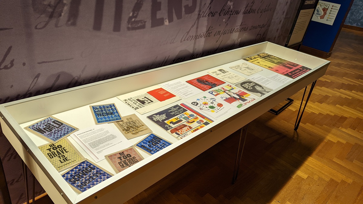
Photo by Curatorial Staff of The Henry Ford
When you think of the word “protest,” what does it mean to you?
- Marching at a rally with a sign?
- Participating in a “walk out” at school?
- Boycotting companies?
- Wearing a shirt or hat with a message?
- Correcting people on their biases?
- Donating money to organizations?
- Civil disobedience?
A new temporary exhibit now on view in Henry Ford Museum of American Innovation, Quiet & Loud Protest, explores this question by demonstrating the ways that protest can be both loud and quiet. Throughout history, people have found different ways to advocate for change, whether marching in the streets or finding quieter ways to be an ally. Both are valuable in drawing attention to injustices. The exhibit draws together a small selection of recent acquisitions that showcase how artist-activists have used graphics to demand change and organize communities. The content of the exhibition is replicated in this post (with slightly expanded descriptions) for those unable to see it in person.
Amos Paul Kennedy, Jr.
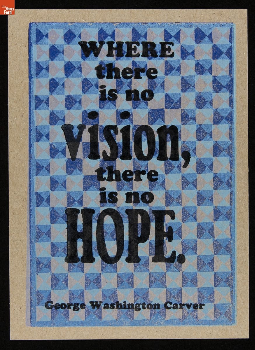
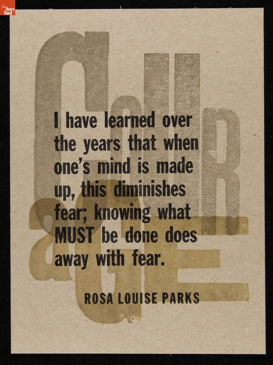
Amos Paul Kennedy Jr. has generously donated several prints to the collections of The Henry Ford. These examples feature quotes attributed to George Washington Carver and Rosa Parks—two advocates for change who are prominent in our collections. / THF626953 (top), THF626939 (bottom)
These letterpress prints are by Amos Paul Kennedy, Jr., who relocated to Michigan from the South in 1963 with his parents. In junior high, he experienced racism from teachers who presumed he was uneducated and poor because he was Black.
At the age of 40, Kennedy visited Colonial Williamsburg while on vacation with his family and was so enamored with the letterpress and bookbinding demonstrations being given by historical reenactors that he went home and began to take classes at a community print shop. His love for the medium grew to the point where he made the decision to leave his career as a corporate computer programmer at AT&T so that he could focus on printmaking full time.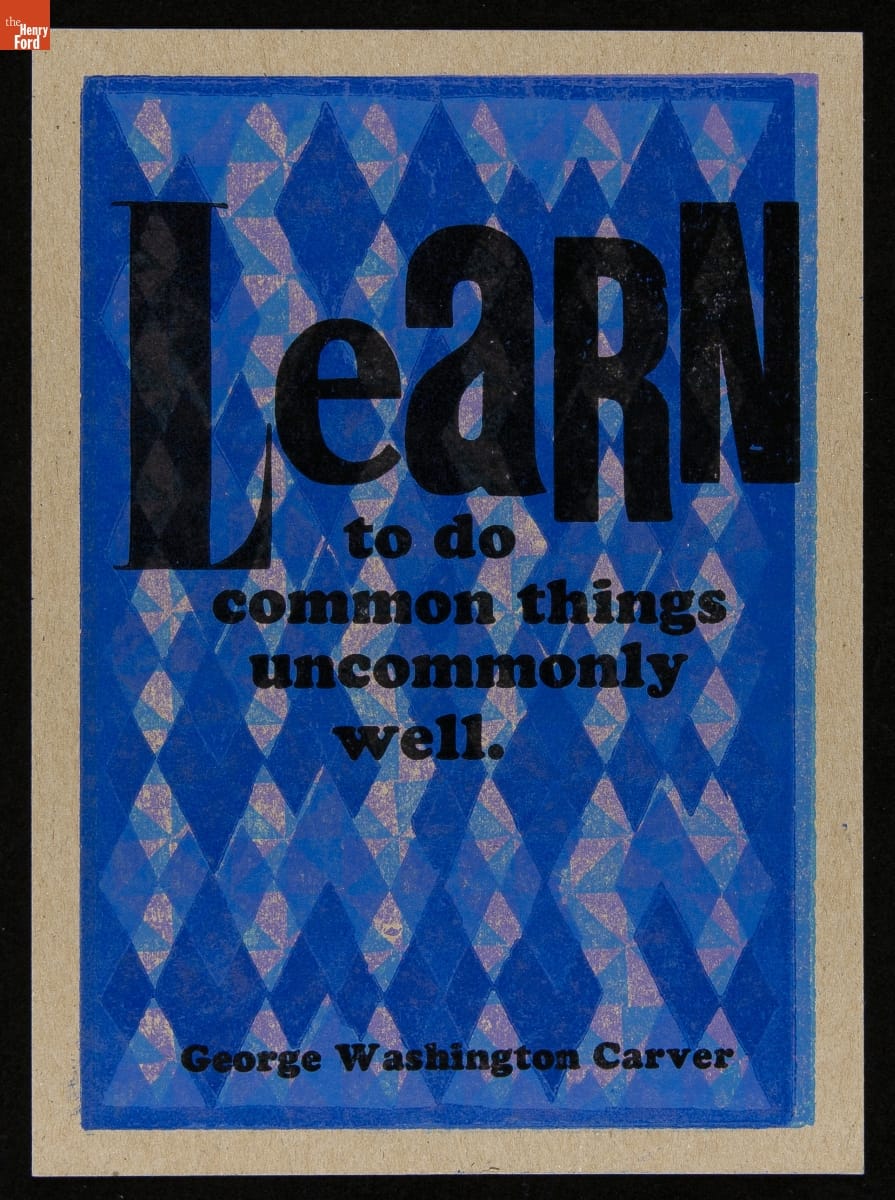
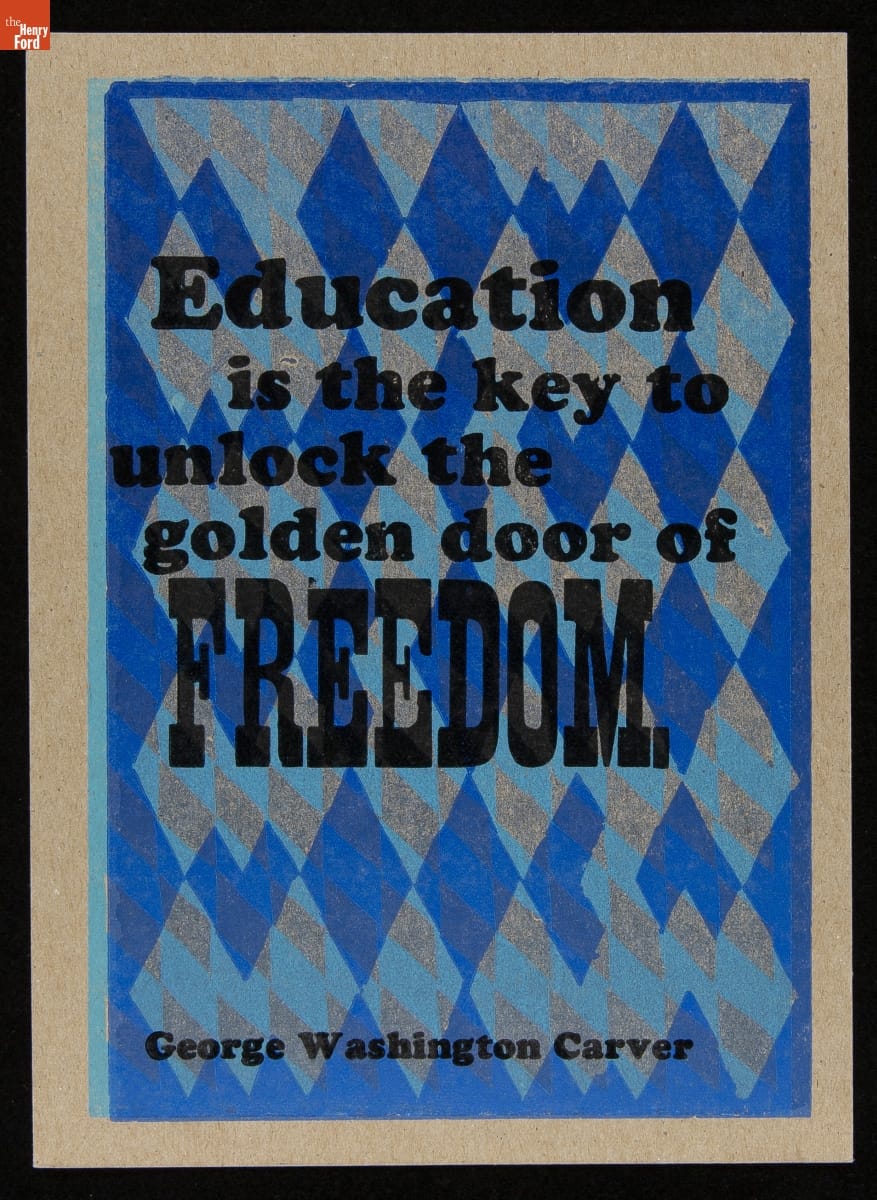
Letterpress prints by Amos Paul Kennedy, Jr./ THF626947 (top), THF626949 (bottom)
He went on to earn an MFA in Fine Arts and taught in university art programs. When Kennedy left academia, he adopted the historical role of an iterant printer, travelling through the American South to different print shops, learning about print media and developing his style over the course of many years. Kennedy sometimes describes himself as a “humble Negro printer” and wears bib overalls with a pink dress shirt. By doing this, Kennedy confronts people with their biases, causing them to question race, language use, and class. In 2013, Kennedy moved to Detroit, where he operates Kennedy Prints today.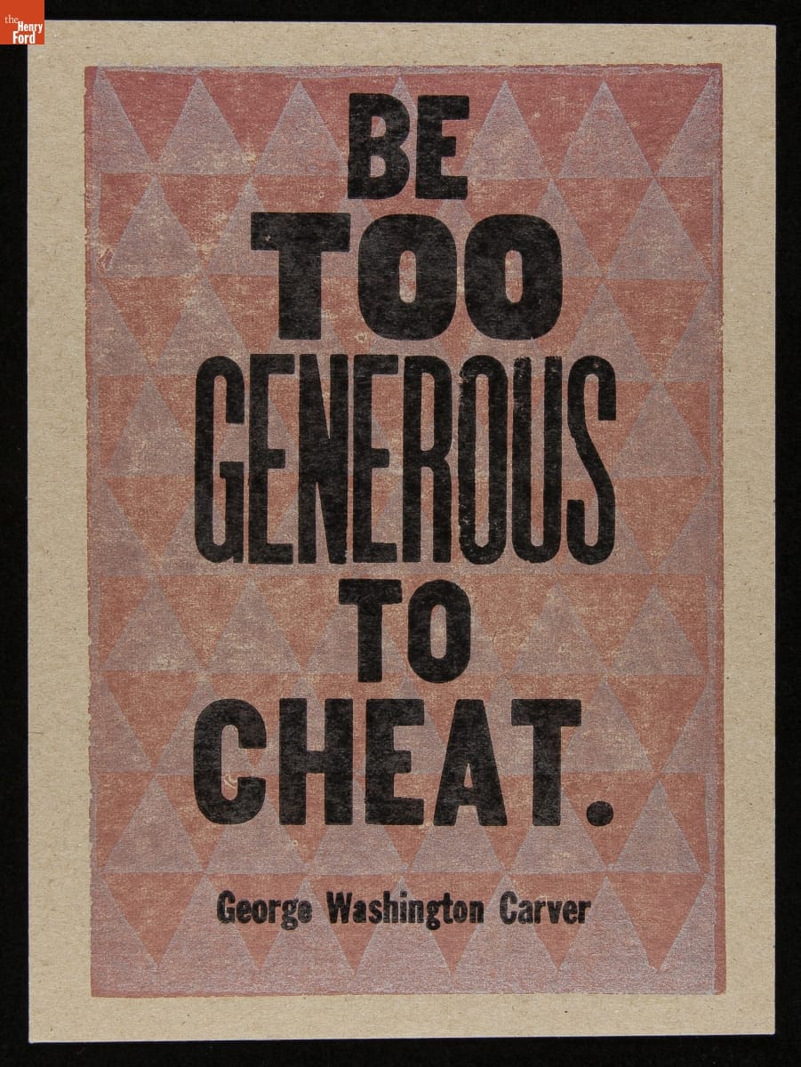

Letterpress prints by Amos Paul Kennedy, Jr. / THF626943 (top), THF626941 (bottom)
Kennedy is known for his prolific output of vibrant letterpress prints that address cultural biases and social justice issues. Many of his prints feature quotes by Black civil rights activists and abolitionists, scientists and innovators, and literary figures, as well as traditional African proverbs. In an interview with the Library of Congress in January 2020, Kennedy said:
“People sometimes classify me as a political artist, and I find that amusing because when I was young, I was told that everything you do is political […] I print the things that reflect the way that I want the world to be. I think that people who say they are not political in their work fail to recognize that ‘not being political’ is a political act.”
Kennedy refuses to call himself an artist and sells his work at affordable prices to make it more accessible. Thanks to the power of the multiple, Kennedy can use printmaking to spread messages of hope widely—to reflect exactly the type of world that he wants to live in.
Corita Kent
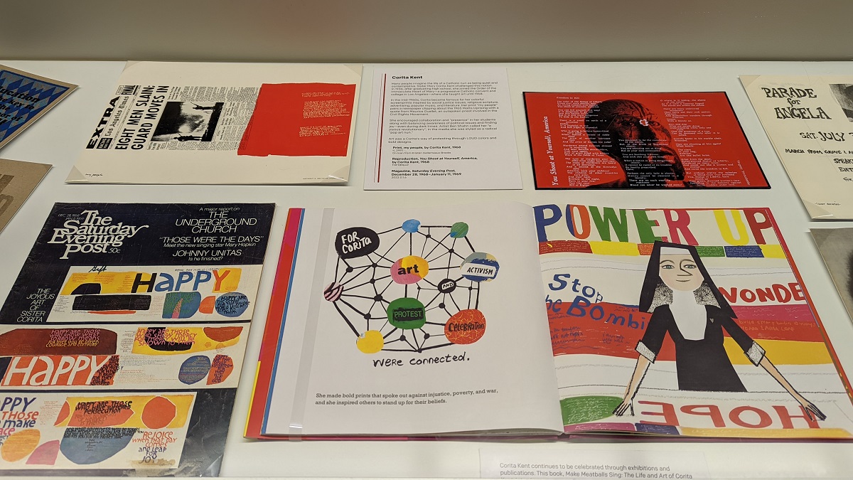
Photo by Kristen Gallerneaux
Many people imagine the life of a Catholic nun as quiet and contemplative. Sister Mary Corita Kent challenged this notion. In 1936, after graduating high school, she joined the Order of the Immaculate Heart of Mary—a progressive Catholic convent and college in Los Angeles—where she taught art until 1968.
In the mid-1960s, Corita became famous for her colorful screenprints inspired by social justice issues, religious scripture, advertising, popular music, and literature. Her most celebrated prints are text-heavy and vibrant, layering blocks of bright color and DayGlo ink with high-key photographic imagery and words that twist around the page.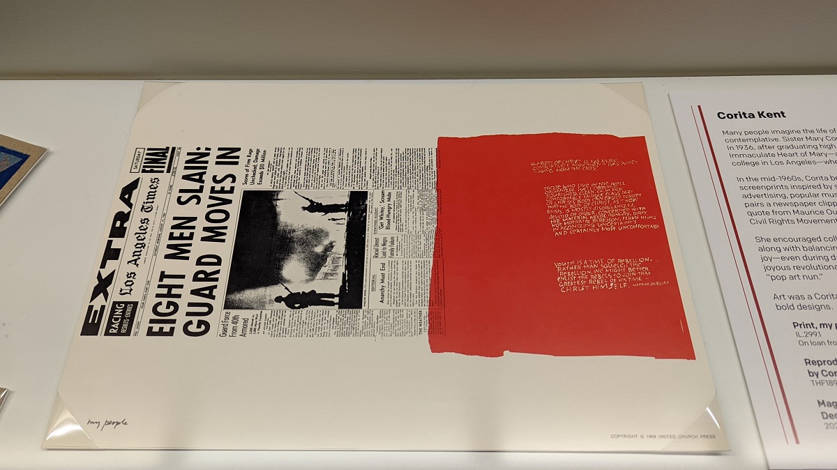
Detail of Quiet & Loud Protest exhibit with Corita Kent’s “my people” print. / Photo by Kristen Gallerneaux
Her print “my people” pairs a newspaper clipping about the 1965 Watts Uprising with a quote from Maurice Ouellet, an outspoken priest involved in the Civil Rights Movement in Selma, Alabama. Part of the quote Corita included reads: “Youth is a time of rebellion. Rather than squelch the rebellion, we might better enlist the rebels to join that greatest rebel of his time—Christ himself.” And in an oral history, Corita herself said: “I feel that the time for physically tearing things down is over. It’s over because as we stand and listen, we can hear it crumbling from within.”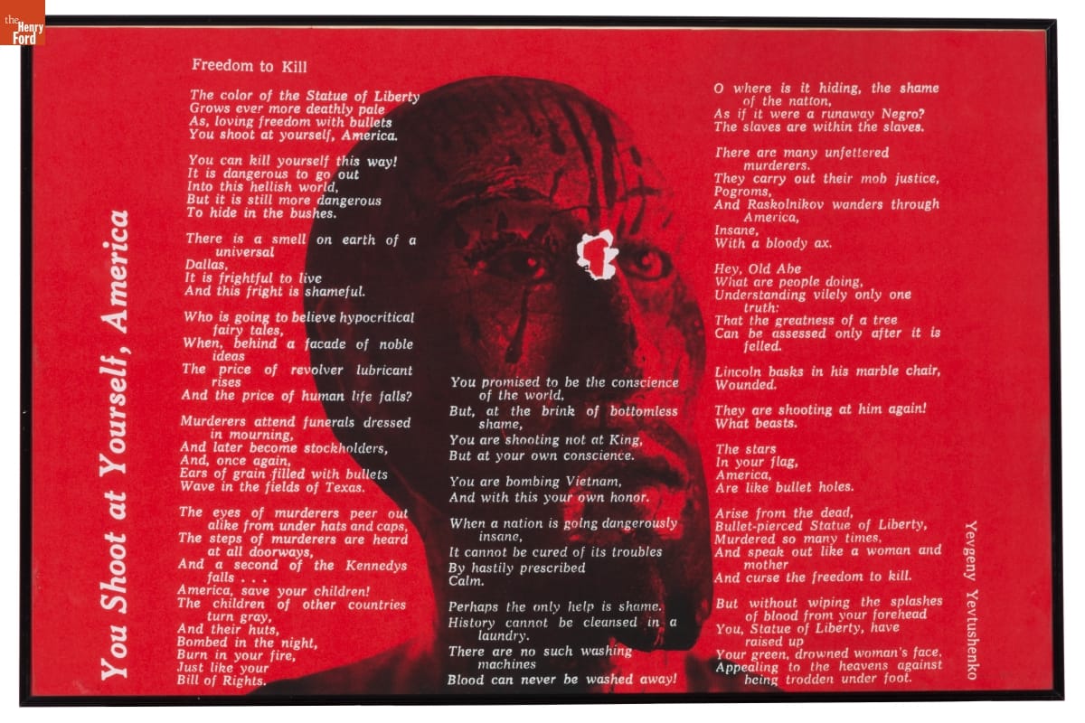
Corita Kent’s print “You Shoot at Yourself, America” was created in response to the 1968 assassination of Robert F. Kennedy. It features a poem by Yevgeny Aleksandrovich. / THF189649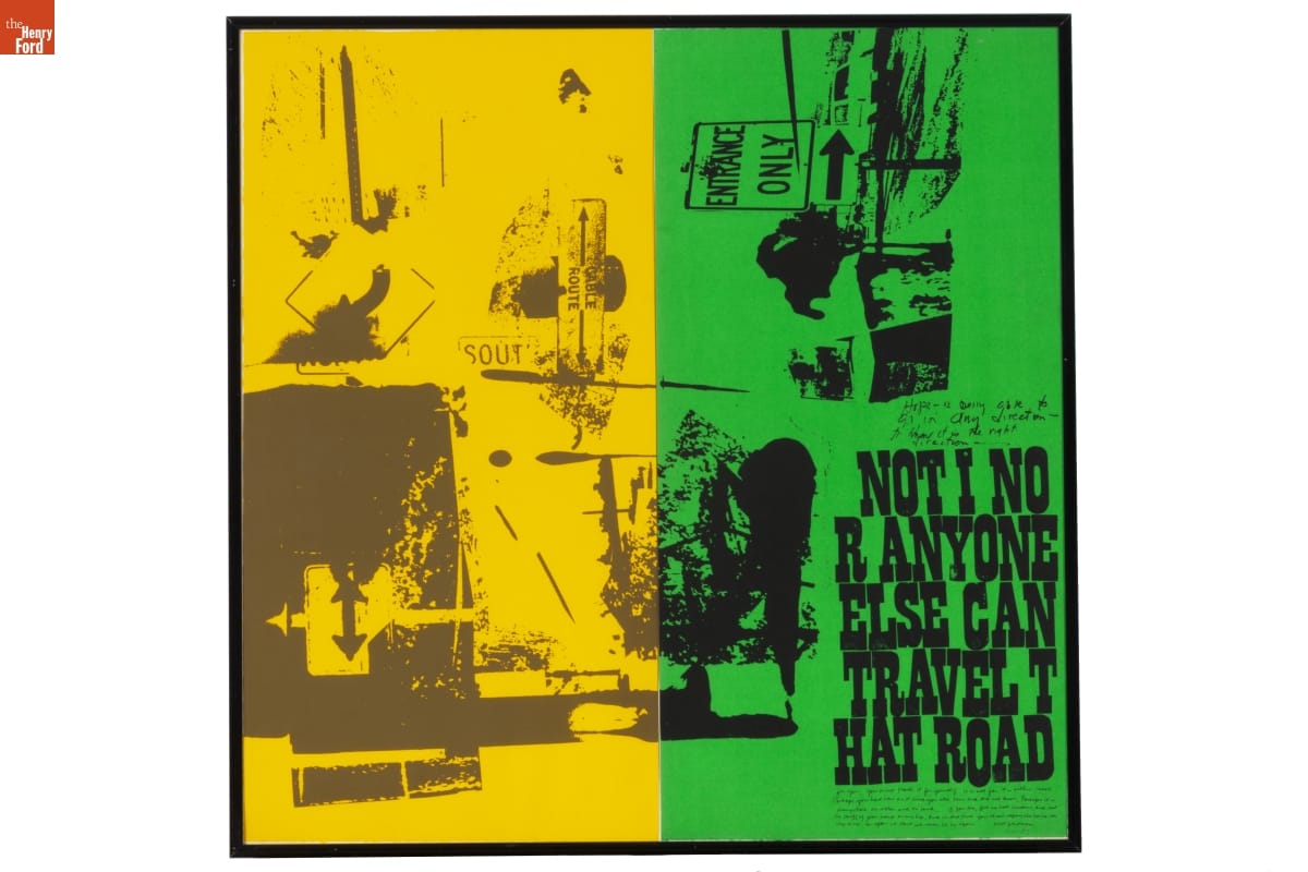
Corita Kent’s print “Road Signs (Part 1 & 2)” features text excerpted from Walt Whitman’s Leaves of Grass. / THF189650
Corita encouraged collaboration and “presence” among her students and encouraged them to balance awareness of political issues with finding joyful moments—even during dark times. Many important designers and creative thinkers visited her classroom, including Buckminster Fuller and Charles and Ray Eames. Artist Ben Shahn once called her “a joyous revolutionary” and in the media she was styled as a radical “pop art nun.”
Art was a Corita’s way of protesting through LOUD colors and bold designs.
During the height of Corita’s fame, the Catholic Church was reassessing many of its traditions, striving for unity and modernization under Vatican II. And yet not everyone agreed. In 1967, the Los Angeles archdiocese and Archbishop James McIntyre claimed the Immaculate Heart Community’s (IHC’s) approach to education was “communist” and referred to Corita’s work as being “blasphemous.” When the IHC sisters were ordered to end the liberating “renewal innovations” they had come to enjoy—or be asked to leave their teaching posts—many asked to be released from their vows and left in protest.
Corita’s decision to leave the order came a little sooner. In 1968, exhausted from an intense schedule and censorship from the church, Corita took a sabbatical. At the end of her time away, she left the Order and moved to Boston. There, she continued to receive commissions and to create art such as painting the Boston Gas Company’s tanks and designing the iconic “Love” postage stamp.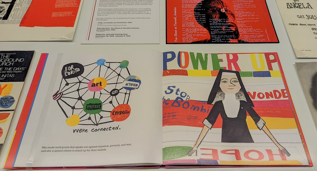
Corita Kent continues to be celebrated through exhibitions and publications. This book, Make Meatballs Sing: The Life and Art of Corita Kent, introduces young audiences to her story. / Photo by Kristen Gallerneaux
Angela Davis
Angela Davis is an activist, educator, and scholar who was a member of the Communist Party USA and the Black Panther Party. In 1970, Davis was placed on the FBI’s “Most Wanted” list. Guns registered to her name were used in a fatal attempt to free the Soledad Brothers during a courtroom trial. Davis was not present at the event. She fled police, fearing unfair treatment. After her capture, she spent 18 months in prison until being cleared of charges.
For some people, Davis is a controversial figure who believed in non-peaceful protest. To others, she is an inspiration as an outspoken supporter of women’s and civil rights, prison reform, and socialism. In recent years, she came out as lesbian and advocates for LGBTQ+ rights as well as those of Palestinian people.
The following artifacts relate to the impact of Angela Davis’s activism, past and present..jpg?sfvrsn=cc0a3601_2)
Vermont S. Galloway—a WWII veteran—made this “FBI Captures Angela” screenprint at Westside Press to advocate for Davis’s freedom. Galloway was fatally shot by the Los Angeles Police Department in 1972. / THF277084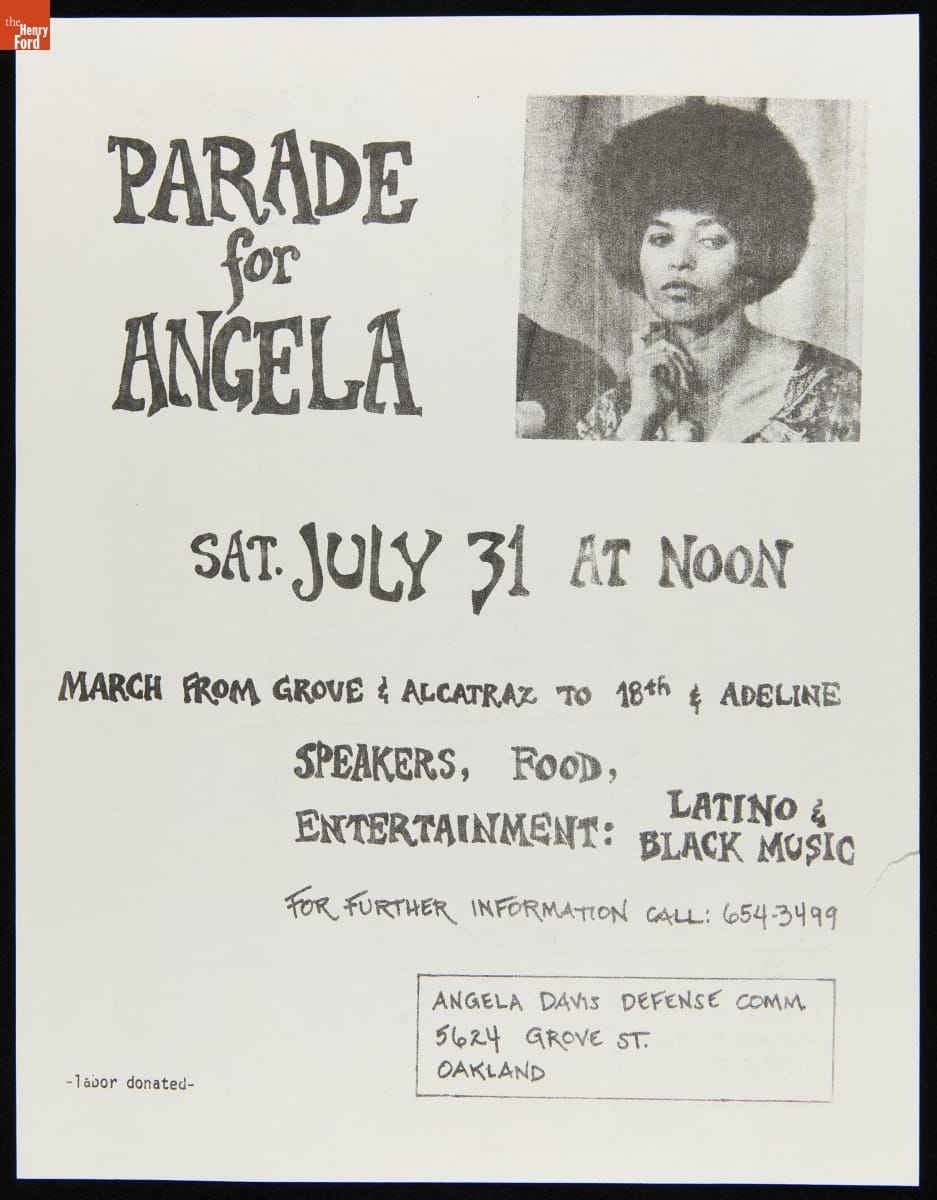
A parade flier documents the international “Free Angela” movement. The reverse side shows the planned route through Oakland, California. / THF627614
“13 Questions…” was the first interview with Davis while she was incarcerated. Her discussion with Joe Walker covers topics such as the surveillance of Black people, legal corruption, solidarity, and dismal prison conditions. / THF627594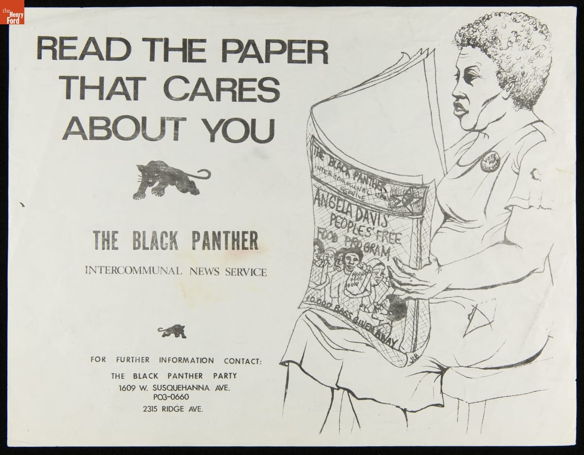
An illustration by Akinsanya Cambon advertises the Black Panther Party’s newspaper and the “Free Breakfast for Children Program,” using Davis’s name. / THF627598.jpg?sfvrsn=c40a3601_2)
Davis appears in a poster by Tongva artist Mer Young for the Amplifier Foundation. This poster shows the continued impact of Davis’s legacy and was created to encourage Black and Indigenous voting in the 2020 election. / THF626361
Listening to Our Community
In 2021, The Henry Ford began to seek community feedback for ways to update and improve our permanent exhibit With Liberty and Justice for All. This work is continuing in 2022.
Stories of movements, social innovators, and political history are difficult to fully capture in museum labels. There is always too much to tell in 100 words or less. To address this, throughout the display of this exhibit, we will be inviting several community partners to contribute their own labels, in their own voices, to foreground the issues they believe matter the most.
By the Curatorial Staff of The Henry Ford. Quiet & Loud Protest is on view in Henry Ford Museum of American Innovation until March 31, 2022.
Civil Rights, art, making, women's history, African American history, Henry Ford Museum, printing
New Acquisition: The Lillian F. Schwartz Collection

Lillian Schwartz working with a joystick interface at Bell Laboratories. Photo by Gerard Holzmann. / THF149836
In early 2021, The Henry Ford secured a very exciting donation: the Lillian F. Schwartz & Laurens R. Schwartz Collection. This material—which came to us through the generosity of the Schwartz family—spans from early childhood to late career and includes thousands of objects that document Lillian Schwartz’s expansive and inquisitive mindset: films and videos, two-dimensional artwork and sculptures, personal papers, computer hardware, and film editing equipment.
The late 1960s in California were a heady time in computing history. Massively influential technologies that are now part of our everyday lives were being invented or improved upon: home computers, the graphical user interface, the computer mouse, and ARPAnet. Meanwhile, on the opposite side of the country in New Jersey, the artist Lillian Schwartz was about to walk through the doors of revered technology incubator Bell Telephone Laboratories. Schwartz had recently met Bell Labs perceptual researcher Leon Harmon at the opening for the Museum of Modern Art’s group exhibition “The Machine at the End of the Mechanical Age.” Harmon and Schwartz each had work in the exhibit, and the pair struck up a conversation that led to an invitation for Lillian to visit the Labs.

A poster for the Museum of Modern Art exhibit that led to Schwartz and Leon Harmon’s friendship (top) and a portrait of Harmon painted by Schwartz (bottom). / THF188555, THF188581
This fateful meeting led to Schwartz’s decades-long tenure as a “resident visitor” at Bell Labs, where she was exposed to powerful equipment like the IBM 7090 mainframe computer and Stromberg Carlson SC-4020 microfilm plotter. Allowing artists access to this high-end research and development facility upended conventions, creating an environment that was fruitful for cross-disciplinary collaboration between the sciences, humanities, and arts. From 1968 until the early 2000s, Schwartz paid regular visits to the Labs, where she developed groundbreaking computer films and videos, and an impressive array of multimedia artworks.
Continue Reading
women's history, making, technology, computers, The Henry Ford Magazine, by Kristen Gallerneaux, art
What Are We Reading and Watching?: Books, Apps, and Collections on Play

Children play in a boat in this turn-of-the-twentieth-century New York image from the Jenny Young Chandler collection. / THF38259
In every issue of The Henry Ford Magazine, staff from The Henry Ford recommend books, websites, apps, and archival collections that we are enjoying. In the June-December 2021 issue, the recommendations centered around the idea of “play.” Read on to find out what we recommended, and why.
The Design of Childhood: How the Material World Shapes Independent Kids by Alexandra Lange

Have you ever noticed how design influences our lives? The Design of Childhood by Alexandra Lange provides an in-depth look into how design and the things and items around us throughout our lives have a direct influence on our development and the way we see and think about the world.
From early childhood, the items we play and learn with—like wooden blocks and LEGO bricks—and the way our homes and cities are designed influence and shape the development and interactions of all of us. As a designer myself, I am fascinated by how things such as simple toys or architecture, from the development of planned communities to the differences between local versus government-built play spaces, can shape our learning and behavior. Now as a parent, I try to give my daughters the best opportunities to learn and grow, allowing them as much free play as I can—even when I am thinking in my head that’s not the way to do it.
Lange shines light on the things that we often take for granted and experiences that we don’t always realize are working to shape us every day. This book gave me insight into how my kids are seeing the world and how simple things are helping to mold them, from collaborative learning spaces in schools to the evolution of playgrounds in the United States. As Massachusetts Emergency and Hygiene Association’s Kate Gannett Wells is quoted in Lange’s book as saying, “Playing in the dirt is the royalty of childhood.”
The Design of Childhood is one of those texts that has rapidly become a coffee-table book for me, enticing me to pick it up, randomly open it to a page, and dive in.
—Matt Elliott, Head of Creative and Digital Experience
The Noble Hustle: Poker, Beef Jerky and Death by Colson Whitehead

Colson Whitehead’s fiction covers topics ranging from the zombie apocalypse and slavery to elevator maintenance. In this nonfiction book, the Pulitzer Prize and National Book Award winner recounts his unlikely adventures competing in the 2011 World Series of Poker in Las Vegas. Spoiler alert: He doesn’t win anything, but the reader is rewarded by Whitehead’s droll look into the world of high-stakes poker.
—Ellice Engdahl, Manager, Digital Collections & Content
ARTLENS Gallery, The Cleveland Museum of Art, and the ArtLens App (available on Google Play and the App Store)

Playing in museums isn’t always allowed, but at The Cleveland Museum of Art’s ARTLENS Gallery, play isn’t just encouraged—it’s how you engage with art. Guests can play immersive multisensory games with original artworks and even create their own masterpieces.
| DID YOU KNOW? |
| The Cleveland Museum of Art’s ArtLens for Slack, the channel-based messaging platform, was a finalist for a 2020 Fast Company Innovation by Design Award. The first rapid-response art exhibition app, ArtLens for Slack is designed for remote workspaces, letting coworkers create team-building exercises from their home offices using the museum’s collections for inspiration. |
Although not everyone lives within easy reach of Cleveland, you can still experience the ArtLens App, which allows you to explore on-view works in the permanent collection both at the museum and elsewhere.
—Olivia Marsh, Program Manager, Educator Professional Development
The Way Things Work (1988) by David Macaulay

My copy of this wonderfully whimsical adventure into the inner workings of our most fundamental inventions is 33 years old now. While the newest edition reveals smartphones and drones, some things never change. The Way Things Work will make the mechanics of a zipper fun again and perhaps help you explain, with fascination, how a differential works during your next kid-sponsored LEGO session.
—Wing Fong, Head of Experience Design & Senior Project Manager
From Our Library and Archives
The Benson Ford Research Center has a number of books, resources, and archival content with playful undertones—from books on carousels, doll quilts, and car games to a collection of coloring books. For help with access, contact the Research Center.
Books
The Carousel Keepers: An Oral History of American Carousels by Carrie Papa
Here Today and Gone Tomorrow: The Story of World’s Fairs and Expositions by Suzanne Hilton
Once Upon a Playground: A Celebration of Classic American Playgrounds, 1920-1975 by Brenda Biondo
Coney Island: The People’s Playground by Michael Immerso
From Playgrounds to PlayStation: The Interaction of Technology and Play by Carroll Pursell
The Maker Movement Manifesto: Rules for Innovation in the New World of Crafters, Hackers and Tinkerers by Mark Hatch
Archival Collections
"I Love Lucy" Cut-Out Dolls, 1953, from The Henry Ford’s Paper Doll Collection. / THF94403
Paper Doll Collection, 1850-2008, consisting of both commercially produced and handmade dolls featuring fictional characters, celebrities, politicians and more.
Coloring Book Collection, 1894-1990, consisting of books containing line drawings, primarily for children to paint or color. Many are souvenirs of tourist sites or museums.
Exhibitions and World’s Fair Collection, 1848-1986, consisting of a variety of ephemeral materials related to expositions and exhibitions, which were often forums for introducing new ideas.
This post was adapted from an article first published in the June–December 2021 issue of The Henry Ford Magazine.
archives, childhood, design, art, technology, The Henry Ford Magazine, books

