
Posts Tagged 1950s
Out There Having Fun in the Warm California Sun: Aeronutronic Systems
Looking out the window at snowy Michigan probably had any Ford Motor Company engineer, researcher, or scientist thinking that developing and researching space systems, air cushioned vehicles, and computer components in sunny Newport Beach, California, was the way to go.
Aeronutronic Systems, Inc. was formed as a subsidiary of Ford in 1956 under the leadership of G.J. Lynch. The group was originally organized to develop and manufacture products for military purposes in the fields of Complete Weapons Systems, Aeronautics, Electronics, Computers, and Nucleonics and Physics. By 1959, the group was a made a division of Ford and had expanded into research and development beyond military purposes.
Lobby, computer products building. / THF627413
The division was headquartered in Newport Beach, California. Brochures for the division flaunted its cutting-edge research facilities, testing laboratories, research library, and proximity to deep-sea fishing, sailing, skiing, and the fact that the temperature rarely dropped below 44 or rose above 75.
Aeronutronic campus map. / THF627410
The groups within the division worked on a variety of projects. The Space Systems group completed projects including the Blue Scout vehicle, which tested equipment in space; a lunar capsule, designed to land on the moon with scientific testing equipment to gather data on the lunar environment; and a design for a space station.
Group of women who worked on the Blue Scout project. / THF627401
Artist's rendering of lunar capsule built by Ford Motor Company Aeronutronic Division, 1960. / THF141214
Space station concept drawing. / THF627416
In Weapons Systems, they worked on several missile projects, including the Shillelagh Guided Missile for the Army Missile Command, and ARTOC (Army Tactical Operations Central), which was a mobile command post for the Army Signal Corp.
ARTOC command board. / THF627406, detail
The Electronics and Computers division worked on BIAX computer components, as well as MIND (Magnetic Integration Neuron Duplication), an electronic neuron that duplicated the function of live nerve cells, among other things.
Computer elements. / THF627414
Research projects included surface tension tests; developing thin films solid state components; manufacturing the FLIDEN Flight Data Entry Unit, which was used as part of the FAA air traffic control system; and developing an air cushioned vehicle.
FLIDEN unit, demonstrated by Ellen Arthur. / THF627397
Air-cushioned vehicle concept. / THF627420
The employees at the Aeronutronic division had fun too, with an employee newsletter to keep them up to date on company happenings as well as their many recreation leagues, which included bowling, basketball, and baseball among other sports, as well as chess and bridge clubs.
Fred Ju, team captain, bowling in the Men’s Bowling League. / THF627399
Members of the Bridge Club / THF627395
Aeronutronic continued to change with the times. In 1962, it became a division of the Ford subsidiary Philco, and in 1976 became Ford Aerospace and Communication Corporation, before being sold by Ford in 1990.
Kathy Makas is Reference Archivist at The Henry Ford. This post is based on a December 2021 presentation of History Outside the Box on The Henry Ford’s Instagram channel. Follow us there for new presentations on the first Friday of each month.
1960s, California, 20th century, 1950s, technology, space, History Outside the Box, Ford workers, Ford Motor Company, computers, by Kathy Makas, archives
 "The Road Ahead, the Exciting Story of the Nation's 50 Billion Dollar Road Program," 1956 / THF103981
Last June marked the 65th anniversary of the Federal-Aid Highway Act of 1956, which initiated a program to plan and fund an interstate system. In recognition of this milestone, Reference Archivist Lauren Brady selected some items from our collections that show how the highway system changed the American way of life. She shared these artifacts as part of our monthly History Outside the Box series on Instagram, which showcases items from our archives.
If you missed her presentation or would like to see it again, you can check it out below.
Continue Reading
20th century, 1950s, roads and road trips, History Outside the Box, by Lauren Brady, by Ellice Engdahl, archives

THF188409
Karl Koehler printed, folded, scored, and snipped paper to create three-dimensional Christmas cards and decorations. His post–World War Two pop-up designs added an unexpected dimension to Christmas holiday greetings at a time when most American card companies produced flat, center-folded Christmas cards. Koehler's paper engineering followed in a line of other creative pop-up designs—only he applied it to Christmas cards. Eventually, others would come to see the joy in three-dimensional Christmas cards.
Karl Koehler is pictured in this advertisement piece from the early 1950s. / THF621157
Karl Koehler
Karl Koehler (1913–2000) was born in Hennepin County, Minnesota. When Koehler was fourteen, his father died, and the family moved to Philadelphia, Pennsylvania, to live with his uncle. Koehler trained at the Pennsylvania Museum School of Industrial Art in Philadelphia, and by 1940 was employed at the Pictograph Corporation in New York City. Working under Rudolf Modley, Koehler designed pictorial symbols used in business, corporate, and government publications to communicate statistical data.
During the Second World War, Koehler directed artwork for military training manuals, and in 1942, co-created two award-winning posters for the National War Poster Competition. He returned to Pennsylvania after the war and settled in Coopersburg. There he began designing Christmas cards and holiday decorations.
In 1950, Koehler dreamed up a Christmas tree that people could construct from the flat pages of the December 25th issue of Life magazine—a holiday surprise for the whole family. / THF624861
Koehler's whimsical three-dimensional, hand-assembled decorations and cards delighted children and adults alike. He made traditional folded holiday greeting cards for businesses and corporations, but none rivaled the depth-filled creations Koehler handcrafted in his studio. He trademarked the name "Mantelpiece"—where better to display pop-up Christmas greetings?—and sold his holiday creations in high-end department stores and museums. His list of clients included Nelson Rockefeller, Greer Garson, and Benson Ford. Koehler's artwork was fresh, colorful, and bright, incorporating a bit of fantasy and fun into the traditional symbols of the seasons. And his cards literally added an unexpected dimension to holiday greetings. One European design journal stated, "Karl Koehler has … swept clean the dusty structure of greeting card design."
THF188412 and THF188411
Christmas and Pop-up Design Influences
Christmas cards, as we know them today, first appeared in England in the early 1840s. Historians note that the first card showed a happy scene of holiday feasting flanked by images depicting acts of charity. The custom of sending Christmas cards, though not initially widespread, grew slowly and by 1850, Americans had joined the holiday tradition. By the late 1800s, more and more Americans began giving inexpensive and colorful cards—made possible by low-cost postage and new printing technologies—to friends, family, and acquaintances.
Many valentines in the 19th and early-20th centuries contained layers of embossed paper or other materials. Others had a pop-up element that made the valentine three-dimensional. / THF99091, THF166622, and THF313817
While Karl Koehler focused on crafting high-end Christmas cards, he appears to have drawn much of his card design and construction from late-19th- and early-20th-century valentines. Most 19th-century Christmas cards tended to be relatively flat and remained so well into the 20th century. Valentines, however, had greater dimensionality. English and American manufacturers produced elaborate valentines constructed of highly embossed paper, layered with colorful inserts and, more importantly, pop-up elements that made the valentines three-dimensional. One clue that valentines played a role in Koehler's Christmas card production is a listing from the estate auction advertisement after his death in 2000: "100 old pop-up/pull-out mechanical Valentines."
THF188403
Other influences, such as pop-up and movable books, may have played a part in Koehler's designs. Movable and pop-up books usually included flaps, revolving discs (volvelles), pull tabs, and other mechanical devices that made elements on the pages move. By the late 1800s, publishers and designers produced these books—some with elaborate works hidden between the pages—mainly for children. New York-based McLoughlin Brothers began producing movable books in the late-19th century in the United States—one of the first American companies to do so. One of McLoughlin's earliest efforts contained colorful illustrations that folded or popped out into three-dimensional displays. While there is no documented connection with these types of books, several of Koehler's Christmas cards created a three-dimensional stage-like quality reminiscent of movable or pop-up books.
THF188405
After Christmas Cards
In the late 1950s, Koehler applied for a patent for a collapsible and expandable pyramid structure design used for "greeting cards, calendars, containers, advertising novelties, displays, geometric educational devices, etc." But a few years later, in November 1961, the last printed mention of his Christmas card production appeared. That same year, Koehler traveled to Ireland to help create an industrial design course at that country's National School of Art. He made other trips to Europe and later traveled to Brazil and wrote of his excursions. Existing documentation suggests that Koehler did not create any new three-dimensional holiday cards during the last decades of the 20th century.
THF188402
Today, card companies such as Graphics3, LovePop, Hallmark, and others create an array of elaborate holiday pop-up cards meant to delight both giver and recipient. Few have probably ever heard of Karl Koehler, but they would appreciate his designs and revel in his amusing creations.
View more Christmas cards designed by Karl Koehler in our Digital Collections.
Andy Stupperich is Associate Curator, Digital Content, at The Henry Ford.
1950s, 19th century, Pennsylvania, 20th century, popular culture, holidays, entrepreneurship, design, correspondence, Christmas, by Andy Stupperich
1959 Cadillac Eldorado Biarritz Convertible: Is This the Car for You?

THF90001
In the prosperous 1950s, many people bought luxury cars like this vast Cadillac, and many more wished they could. The car did more than fulfill needs—it sparked desires. But even at the height of uninhibited automotive design, some people questioned the logic of such vehicles. This car mirrors American attitudes of an era when gas was cheap, times were good, and the future seemed unlimited.
The 1958 book shown below peeked under the chrome and found some grime. The price and operating costs of American cars were soaring along with their size—while quality and fuel economy were declining.
"The Insolent Chariots," 1958. / THF108045
George Romney, president of American Motors, said famously in 1955, “Cars 19 feet long, weighing two tons, are used to run a 118-pound housewife three blocks to the drugstore for a two-ounce package of bobby pins and lipstick.” Even America’s inexpensive cars grew bigger. Plymouth, Ford, and Chevrolet all offered flashy entry-level vehicles. By 1960, highways, driveways, and parking lots were full of fins.
Postcard, Hart's U.S. 30 Diner, Lancaster, Pennsylvania, circa 1960. / THF297320
Archie finds the girl of his dreams in July 1959. / THF100874
This post was adapted from an exhibit label in Henry Ford Museum of American Innovation.
Additional Readings:
- 1931 Bugatti Type 41 Royale Convertible: Unmatched Style and Luxury
Driving America - 1896 Ford Quadricycle Runabout, First Car Built by Henry Ford
- 1981 Checker Marathon Taxicab
20th century, 1950s, Henry Ford Museum, Driving America, convertibles, cars

THF90538
Drop the top and cruise like a movie star! It sounds like fun. But movie stars live in sunny California— most of us don’t. Convertibles may draw people into showrooms, but sedans take them home. In 1956, only about 2.6% of Chevy customers drove home in ragtops. Despite that fact, the carefree appeal of 1950s convertibles has made them a symbol of that era. Let the wind blow through your hair!
Many entry-level brands—such as Chevrolet—made sleek, powerful convertibles to boost their image. It didn’t matter that convertibles weren’t big sellers.
1956 Chevrolet Bel Air Advertisement, "Man, that Chevy's Really Got It!" / THF100023
After enclosed cars became inexpensive enough for everyone to buy in the 1920s, open cars gained an aura of luxury and adventure. Ads associated the ’56 Chevy with youth, appealing not only to the young but also to those wanting to appear young.
1956 Chevrolet Bel Air Advertisement, "Youth, Beauty, Chevrolet, Action!" / THF100024
Convertibles became show-off cars, perfect for cruising around town, impressing dates, and hanging out. In 1949, these teenagers posed at a drive-in with their Ford convertible. / THF101124
This post was adapted from an exhibit label in Henry Ford Museum of American Innovation.
Additional Readings:
- 1956 Continental Mark II Sedan: “The Excitement of Being Conservative”
- Fozzie Bear’s 1951 Studebaker Commander
- Douglas Auto Theatre Sign, circa 1955
- 1931 Bugatti Type 41 Royale Convertible
20th century, 1950s, popular culture, Henry Ford Museum, Driving America, convertibles, Chevrolet, cars

This 1885 Harper's Weekly cover celebrated the freedom of enslaved African Americans 22 years after emancipation with the text, "Proclaim liberty throughout all the land unto all the inhabitants." / THF11676
Liberty stands as one of the ideals that inspired the United States from its beginning, as the following quotes from founding documents indicate:
“We hold these truths to be self-evident, that all men are created equal, that they are endowed by their Creator with certain unalienable Rights, that among these are Life, Liberty, and the pursuit of Happiness.” –Declaration of Independence, 1776
“We the People of the United States, in Order to form a more perfect Union, establish Justice, ensure domestic Tranquility, provide for the common defense, and promote the general Welfare, and ensure the Blessings of Liberty to ourselves and our Posterity.” –Constitution of the United States, 1788
National aspirations for liberty resonated, but “liberty” for some trapped others in servitude. United States expansion came at the highest cost to indigenous and enslaved individuals. For them, liberty rang hollow.
The Union victory in the Civil War affirmed the nation’s authority to abolish slavery, expand citizenship and civil rights protection, and grant universal manhood suffrage. The Fourteenth Amendment affirmed that “No state shall . . . deprive any person of life, liberty, or property, without due process of law; nor deny to any person within its jurisdiction the equal protection of the law.” Yet, newly freed Black Americans faced discrimination that deprived them of these unalienable rights.
Throughout this tumultuous history, the word “liberty” has been on all U.S. coins. The Coinage Act of 1792 established the U.S. Mint and decreed that all coins include an “impression emblematic of liberty” and the word “liberty.” Thus, the lawful tender in the United States, from the start of our national currency, emphasized liberty—even as the nation built its economy on and around the enslavement of people of African origin and descent.
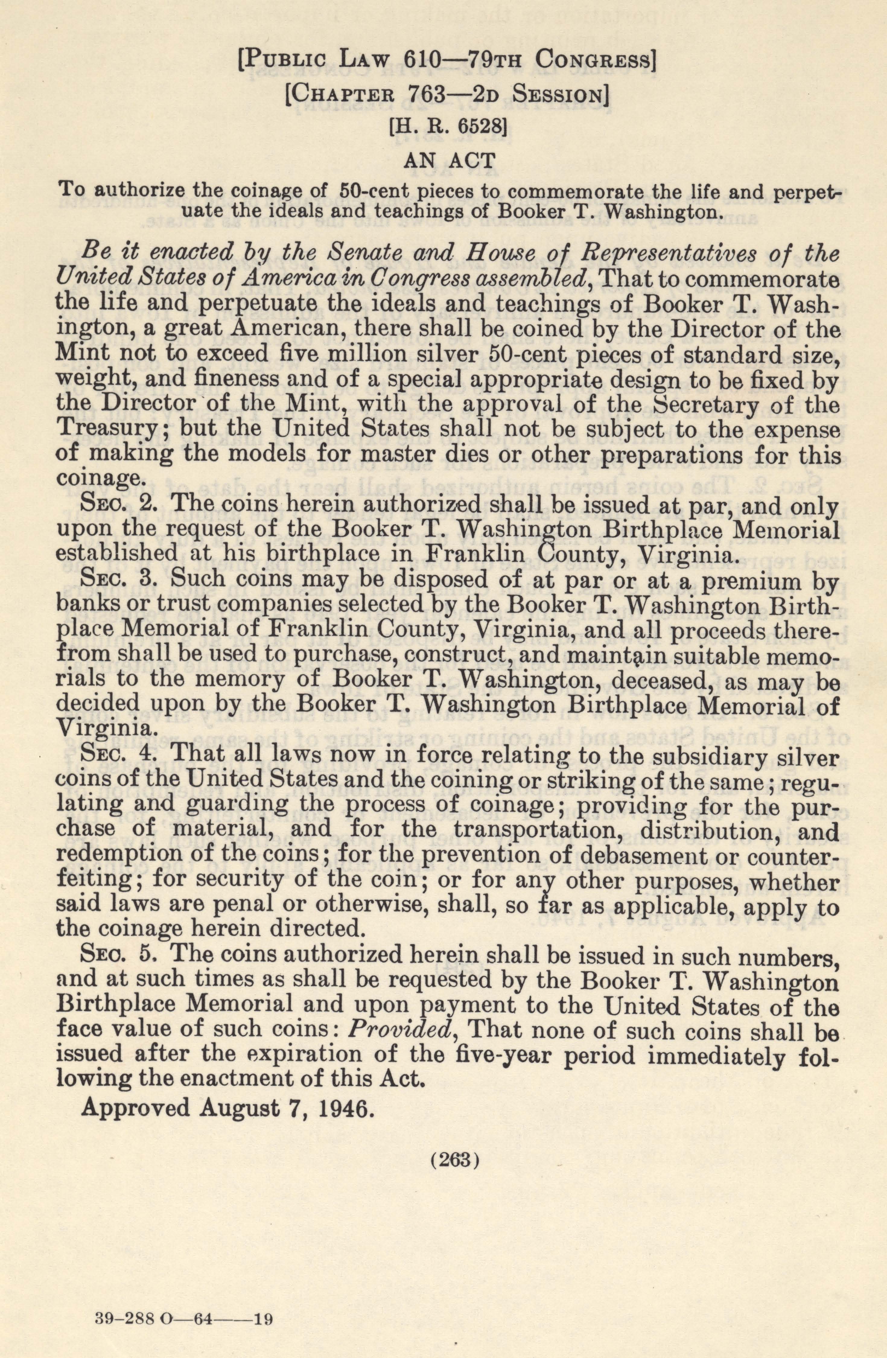
The United States marked its 170th anniversary in the year that the U.S. Mint first linked “liberty” to Black history. Congress authorized production of a 50-cent coin to “commemorate the life and perpetuate the ideals and teachings of Booker T. Washington,” about 30 years after Washington’s death, on August 7, 1946 (Public Law 610-79th Congress, Chapter 763-2D Session, H.R 6528 August 7, 1946). Washington, noted educator and advocate for economic independence and Black autonomy, built his reputation as he built a segregated public school in Tuskegee, Alabama, into an engine of Black economic development. The Tuskegee alumni networks enthusiastically sustained his ideals, including liberty achieved regardless of racism and separate-but-equal segregation.
Commemorative Half Dollar Coin Featuring Booker T. Washington, 1946. / THF170779
In addition to the word “liberty,” the coin’s reverse side summarized Washington’s evolution, from his birth as an enslaved person to his induction into the Hall of Fame for Great Americans in 1945.
Verso, Booker T. Washington Commemorative Half Dollar Coin, 1946, Produced in Philadelphia, Pennsylvania. The back of the coin featured the log structure memorialized as the Booker T. Washington Birthplace Memorial in Franklin County, Virginia, and the Hall of Fame for Great Americans, into which Washington was posthumously inducted in 1945, located in the Bronx, New York City. / THF170780
The Black sculptor who designed the coin, Isaac Scott Hathaway, summarized Washington’s life story on a trajectory from enslavement to recognition. Hathaway had pursued this work for most of his life, convinced that Black Americans warranted representation in classical forms—specifically on busts and bas-relief plaques—that rivaled those of gods and goddesses. He mass-produced plaster busts and plaques of more than 200 Black women and men for customers to purchase and display in homes, schools, and churches. He divided his time between memorializing Black individuals and teaching in Tuskegee Institute’s Department of Ceramics, which he founded. His connection to Tuskegee helped secure his appointment as the first Black artist to design a coin for the U.S. Mint in 1945.
George Washington Carver Plaque, 1945. Hathaway knew Carver, and he cast this small bas-relief plaster plaque out of respect for “this venerable man whose acquaintance and friendship I enjoyed for 40 years.” He donated this plaque, as well as a plaster cast of Carver’s hand, to The Henry Ford in December 1945. / THF152082
The commemorative half-dollar coin featuring Booker T. Washington remained in production between 1946 and 1951. Sales of the commemorative sets, however, fell short of expectations. The U.S. Congress amended the August 7, 1946, act, reauthorizing a redesigned coin that added Tuskegee Institute agricultural scientist George Washington Carver to the front, and a patriotic message on the back (Public Law 151-82d Congress, Chapter 408, 1st Session. H.R. 3176 September 21, 1951). The Mint again retained Hathaway to design this second coin. One and one-half million Washington coins were melted and recast into the new issue.
Commemorative Half Dollar Coin Featuring George Washington Carver and Booker T. Washington, 1953. / THF152213
Reverse Side, Commemorative Half Dollar Coin Featuring George Washington Carver and Booker T. Washington, 1953, Produced at Denver, Colorado. / THF152214
Proceeds from sales of both of these commemorative coins were ear-marked for completion of the only national monuments documenting Black history at the time—the Booker T. Washington Birthplace Memorial in Virginia and the George Washington Carver National Monument in Missouri. But sluggish sales did not generate the anticipated income for these two projects. When the amended act expired on August 7, 1954, the remaining million coins minted but not sold were melted and used for other coins. The practice of issuing commemorative coins for private initiatives—funding historic sites and memorials, in the case of these two coins—also ended with the expiration of the Washington commemorative coin act.
Continue Reading
Alabama, Washington DC, 1950s, 1940s, 20th century, 19th century, George Washington Carver, by Debra A. Reid, African American history

The Henry Ford’s 1951 Studebaker Champion, a cousin to Fozzie Bear’s 1951 Commander. / THF90649
Cars and movies go together like peanut butter and jelly, or cake and ice cream. It’s only natural. The two industries appeared almost simultaneously around the turn of the 20th century. Southern California became a major center of American automobile culture and, of course, the center of the U.S. film industry. Over time, certain movies even came to define certain marques. Aston Martin had Goldfinger, DeLorean had Back to the Future, and Studebaker had… The Muppet Movie.
For those who haven’t seen The Muppet Movie, which brought Jim Henson’s creations to the big screen, for the first time, in 1979, stop reading and go watch it right now. Seriously. I’ll wait.
But if a summary has to suffice, then I’ll tell you that The Muppet Movie is in the tradition of the Bing Crosby-Bob Hope “Road” movies, where a simple trip turns into a series of misadventures. But instead of Bing and Bob, you get Kermit the Frog and Fozzie Bear. (Well, you get Bob too, but I digress.) The movie follows Kermit as he makes his way from the Florida swamps to the bright lights of Hollywood, chasing his dream to “make millions of people happy” in show business. Along the way he meets Fozzie, the Great Gonzo, Miss Piggy, and all the usual Muppet favorites.
Paul Williams, seen on a 1980 visit to The Henry Ford, co-wrote The Muppet Movie’s songs. He’d previously penned hits for Three Dog Night, the Carpenters, and Barbra Streisand. / THF128260
Kermit begins his journey on a bicycle, but, after meeting Fozzie Bear, the two continue the trip in Fozzie’s uncle’s 1951 Studebaker Commander. The Stude doesn’t make it all the way to Hollywood—they trade it in for a 1946 Ford station wagon partway through—but it features in two of the movie’s memorable musical numbers: “Movin’ Right Along” and “Can You Picture That?,” both co-written by Paul Williams and Kenny Ascher.
The Muppet Movie is more than great songs and story. The film set new standards in puppetry by convincingly putting its characters into “real world” settings. Prior to Henson’s work, puppets were largely stationary figures, stuck behind props that hid puppeteers from view. Even early Muppet projects, notably The Muppet Show, suffered from this limitation. But in The Muppet Movie, Kermit rides a bicycle, Gonzo floats through the sky below a bunch of balloons, and Fozzie, of course, drives his Commander.")
The Studebaker’s “bullet nose” served a practical purpose for the filmmakers. / THF90652
In a way, these elaborate special effects were responsible for the Studebaker appearing in the film. The 1951 Commander’s most distinctive feature is the chrome “bullet nose” between its headlights. The special-effects Commander used in The Muppet Movie had its bullet removed and replaced with a small video camera. The car’s trunk was fitted with a TV screen connected to the camera, a steering wheel, throttle and brake controls, and a seat. With these modifications, a small person was able to operate the car, hidden from view and able to see the road ahead via the camera. With Fozzie placed in the driver’s seat; his puppeteer, Frank Oz, hidden under the dashboard; and the car’s operator concealed in the trunk, it appeared as though the comic bear himself was driving the Studebaker in several scenes. The trick worked so well that, more than 40 years later in the age of computer-generated special effects, Fozzie’s driving is still remarkably convincing. The crew used a second, unmodified Commander for shots where driving effects weren’t needed.
Practical concerns weren’t the only reasons a Commander was used in the movie. In comments published in Turning Wheels, the newsletter of the Studebaker Drivers Club, The Muppet Movie screenwriter Jerry Juhl described the ’51 Commander as perhaps the “goofiest” looking car ever put into production. Goofiness, Juhl added, was a highly-respected quality in the Henson organization, so it seemed only fitting that Fozzie should drive that particular car.
Studebaker’s bullet nose was part of a long, productive relationship between the automaker and industrial designer Raymond Loewy. / THF144005
That bullet nose is a story unto itself. Credit for the feature goes to designer Bob Bourke, working for Studebaker contractor Raymond Loewy Associates at the time. As Bourke later recalled, Loewy told him to model the car’s appearance after an airplane. Bourke responded with the bullet, more properly described as a propeller or a spinner, since it’s a direct reference to that crucial aviation device. And a divisive device it was. People either loved the Studebaker bullet nose or they hated it (and so it goes today).
It’s worth noting that the feature wasn’t without precedent. Ford had used a similar device on its groundbreaking 1949 models. (In fact, Bob Bourke later said that he had contributed informally to the design of the 1949 Ford. You can read Bourke’s reminiscences here.) Studebaker used the bullet nose for just two model years, 1950 and 1951, but it remains one of the company’s most memorable designs.
Studebaker emphasized the aviation influence on the bullet nose design in this 1950 advertisement. / THF100021
The Henry Ford’s collections include a Maui Blue 1951 Studebaker Champion coupe. The lower-priced Champion featured a six-cylinder engine, while the Commander came with a standard V-8. Other than their different badges, the look of the two models is nearly identical. But if you’d like to see the actual car that Fozzie and Kermit used in The Muppet Movie, then head over to South Bend, Indiana. The effects car survives in the collections of (where else) the Studebaker National Museum. It still wears the psychedelic paint scheme applied by Dr. Teeth and the Electric Mayhem in a clever plot device—faded with age, but unmistakable.
Matt Anderson is Curator of Transportation at The Henry Ford.
Additional Readings:
- Women in the War Effort Workforce During WWII
- Mimi Vandermolen and the 1986 Ford Taurus
- 1956 Continental Mark II Sedan: “The Excitement of Being Conservative”
- 2002 Toyota Prius Sedan: An Old Idea Is New Again
1970s, 20th century, 1950s, popular culture, music, Muppets, movies, Jim Henson, Henry Ford Museum, Driving America, design, cars, by Matt Anderson
Imagine attending a choral concert in a century-old church. Instead of monochromatic robes, the choristers emerge in bright, radiant color with bold geometric design. The colors of the robes are a musical key, made visual—yellow for the soprano, orange for the contralto, red for the tenor, and purple for the bass. As the choristers sing and sway, the robes come alive, a modern counterpoint to the traditional church interior.
Imagination aside, this is a scene familiar to those who have watched the Hope College Chapel Choir perform. Originally a creation of Charles and Ray Eames from the 1950s, faithful replicas of the robes continue to be used.
The Hope College Chapel Choir at Dimnent Chapel, circa 2001. Photo Courtesy of the Joint Archives of Holland.
Although husband-and-wife design team Charles and Ray Eames collaborated in nearly everything, it was Ray who showed an early and enduring interest in textiles and fashion design. The daughter of a theatre aficionado and manager, she attended the Bennett School for Girls, a two-year college in Millbrook, New York, earning a degree in Fashion Design in 1933. She completed fashion sketches throughout her life—even creating original paper dolls with custom clothing, complete with the tabs used to affix the clothing onto the doll! She designed a few textiles (one of which—“Crosspatch”—won an honorable mention in a 1946 Museum of Modern Art competition) and dedicated significant energy into the design and creation of her own clothing. The clothes she designed for herself and for Charles are quintessential Eames—functional yet beautiful, with playful delights to be found in the details.
D.J. De Pree, the founder and president of the Herman Miller Furniture Company (which produced Charles and Ray Eames’ furniture), was known for his religious fervor. Further, the company is headquartered in Zeeland, Michigan, a Dutch-American enclave with deep Protestant Christian roots. So, when an employee suggested the creation of a company-sponsored chorus in 1952 (something that might otherwise have been an unusual corporate activity), the De Prees granted it legitimacy, naming it the Herman Miller Mixed Chorus and inviting the chorus to perform at company and company-sponsored events. They soon required choral robes to outfit the company chorus and asked Charles and Ray Eames to design them.
Herman Miller Mixed Chorus Soprano and Contralto Vocalist Choir Robes, 1953-1960 / THF75585, THF75580
With Ray’s background, it is likely that she was primarily responsible for the design, although as always in collaboration with her husband. The robes are bold and colorful and make a statement, but they are also functional. Their symbolism is evidence of the Eames’ signature research-heavy process and attention to detail. The colors of the robes identify the vocal type (soprano, alto, tenor, bass) and each color’s hue (from light to dark) corresponds with the vocal range (from high to low). The horizontal black lines at the center of each robe reference the musical staff. Charles and Ray may have scoured the extensive Eames Office reference library to ensure symbolic depth and accuracy. Or, perhaps, this came from an ingrained knowledge of music. They enjoyed a variety of musical types, like jazz, folk, and classical, and music was a major component of the films they produced throughout their life, often collaborating with talented composers like Elmer Bernstein. The theatrical backdrop of Ray’s childhood, her interest in textiles and fashion, and the Eames’ interest in music coalesce in these robes.
Herman Miller Mixed Chorus Tenor and Bass Vocalist Choir Robes, 1953-1960 / THF75574, THF75569
The robes were designed at the Eames Office in Los Angeles, but it is unknown whether the robes were created there and shipped, finished, to Zeeland, or if the patterns and fabric were shipped and the robes were then sewn locally.
By 1960, the Herman Miller Mixed Chorus was disbanded, and Hugh De Pree, son of D.J. De Pree, donated the robes to the Hope College Chapel Choir in the neighboring city of Holland, Michigan, where the family had deep connections. The Hope College Chapel Choir was larger than the Herman Miller Mixed Chorus, so more robes had to be made. Doris Schrotenboer and Millie Grinwis, a mother and daughter team from Zeeland, made the extra. Millie Grinwis recalls that the fabric and patterns were shipped from the Eames Office to her mother’s home, where they were painstakingly put together.
After over 44 years in use, the original robes were retired in 2004. Unwilling, however, to part with the signature design, Hope College commissioned replicas, albeit in a slightly lighter fabric. The original robes were donated to several institutions. At The Henry Ford, these robes add an extra dimension to our design collections, as well as another way to better understand the many talents of Charles and Ray Eames.
The Hope College Chapel Choir recording at Milwaukee’s WTMJ-TV, circa 1965. / Photo Courtesy of the Joint Archives of Holland.
Katherine White is Associate Curator, Digital Content, at The Henry Ford. She is also an alumnus of Hope College, where she was first delighted by these robes! Thank you to Geoffrey Reynolds at the Joint Archives of Holland for graciously sharing pictures of the Hope College Chapel Choir through the years.
20th century, 1950s, women's history, music, Michigan, Herman Miller, fashion, Eames, design, by Katherine White
Deborah Sussman began her design career as an intern at the Eames Office in 1953. There, over the course of a decade, she was promoted to an art director and worked on graphic design, exhibitions, films, toy design, packaging, and photography. In 1963, she acted as designer for the “Beware of Imitations” image below, with Charles and Ray Eames as creative directors. Appearing as an advertisement in Arts & Architecture magazine, it celebrated Eames-designed furniture produced by Herman Miller. The image is a fascinating herald, hinting at how Sussman’s approach toward the power of large-scale graphics to communicate within environments would define her future vision.
Herman Miller “Beware of Imitations” Advertisement. / THF147716
The foundation image was printed to poster size and affixed to the outside wall of the Eames Office, where it was photographed in situ. The weathered brick wall, scrabbly Californian plant life, and spray-painted stencil additions surrounding the paste-up add texture to the image, revealing it to be evidence of a process. An image at the Library of Congress takes us one step further into this moment, revealing Sussman pasting up the original work. 
Detail. / THF147716
If you look closely toward the bottom left of this image, you will also see a bouquet of flowers on a placard with the text, “Zeeland, Michigan.” Zeeland is, of course, home to the Herman Miller company, but the floral design has its own interesting lifespan. It appears on Herman Miller’s stock certificates and on the underside of a kiosk designed by the Eames Office for the IBM Pavilion at the 1964 New York World’s Fair. Sussman is credited with contributing to both projects. 
Kiosk from the IBM Pavilion at the 1964 New York World’s Fair. / THF156766
Detail of the underside of the IBM Kiosk. / THF171121
Sussman left the Eames Office temporarily to continue her design studies through a Fulbright scholarship in Germany, but was eventually “lured back” to California to work on the Mathematica exhibit. When The Henry Ford acquired the 1964 version of the Mathematica exhibit (now on permanent view in Henry Ford Museum of American Innovation), extensive research was undertaken in the Charles & Ray Eames Papers at the Library of Congress to create the most historically accurate version of the exhibit possible. Photographs at the Library of Congress documented numerous contributions made by women to the exhibit’s design, including Sussman, Ray Eames, and many others. Sussman, for her part, once recounted setting the type for the mathematician biographies that appear on the History Timeline and also appears in a photograph working on the graphics for the base of the Multiplication Cube interactive.
Detail of the Multiplication Cube from the Eames Office-designed Mathematica exhibit. / THF164150
Detail of the History Timeline in Mathematica. / THF170845
In 1968, Sussman formed an independent design practice as Sussman/Prejza & Co. with her husband, Paul. Together they designed things like the “urban branding” for the cities of Long Beach and Santa Monica, California, and wayfinding signage for Walt Disney World and EuroDisney. Her favorite kind of work involved vibrant, larger-than-life graphic and typographic treatments installed in architectural spaces and outdoor urban areas. For this work, she is credited as a pioneer of “environmental design” and “Supergraphics.”
Design Preview / Brand Identity Guidelines for the 1984 Los Angeles Olympics. / THF287946
This approach is especially obvious in her design identity work for the 1984 Los Angeles Olympics. The look and feel of the LA Olympics—created by Sussman/Prejza & C0. in collaboration with the Jerde Partnership—transformed the city of Los Angeles. The holistic plan was for “an energetic montage of color and form [to] appear on everything from tents to tickets.” There were 43 art installations, 28 game venues, 3 Olympic villages, and wayfinding signage. There was a monumental 145-foot tower of colorful scaffolding erected in Exposition Park. Color-coded gateways and walkways lined with concrete “Sonotubes” wrapped in bright abstract graphics. Uniforms for officials and volunteers.
Design Quarterly #127. / THF287955
Detail from Design Quarterly #127. / THF287972
An entire issue of Design Quarterly was dedicated to the project, in which the designers explained their hopes for a successful event as “a modern environment that recalls the imageable qualities of a medieval jousting festival” and one that anticipated that “the city will be transformed overnight, as if an invasion of butterflies has descended upon it.”
Souvenir Street Banner designed by Deborah Sussman for the LA 1984 Olympics. / THF171692
Color played an essential role in unifying the visual language of color, graphics, and typographic treatments. Notably, Sussman broke away from the palette of traditional red, white, and blue, and captured the “Southern California spirit” through shades of vibrant magenta, vermillion, aqua, purple, and sunset orange. A favorite quote in the Design Quarterly issue states: “The glorious colors—the banners, the kiosks and booths, even the trash cans and hot dog napkins—were happily original, all Toyland confetti, in light and airy shades all their own. We get enough of red-white-and-blue everywhere else, don’t we?”
Partial credit to Sussman’s approach can be connected to her early training at the Eames Office, where her mentors emphasized the value of playfulness. There, she had the opportunity to document festivals in other countries. She learned to appreciate folk art and the indigenous cultures of the Pacific Rim. And the “kit of parts” approach to design was part of everyday life at the Eames Office too, which undoubtedly influenced Sussman’s own adaptable “visual alphabet” for the 1984 LA Olympics. Today, her contributions for this and other projects stand as beloved and masterful examples of environmental graphic design. Like many designers who passed through the Eames Office, Deborah Sussman took what she learned, remixed it, and made it an evolved and color-saturated language all her own.
Kristen Gallerneaux is Curator of Communications & Information Technology at The Henry Ford.
California, 1980s, 1960s, 1950s, women's history, sports, Herman Miller, Henry Ford Museum, design, by Kristen Gallerneaux, #THFCuratorChat

This April 1956 issue of Liberation magazine featured the Montgomery bus boycott on its cover. / THF139343
In the 2021 book, Time to Teach: A History of the Southern Civil Rights Movement, Civil Rights movement leader Julian Bond (1940–2015) stated that the Montgomery bus boycott provides a case study of how a social movement starts, develops, and grows. Such movements, Bond continued, begin with a concrete, precipitating event (in this case, Rosa Parks’s arrest), but they are usually the result of known or shared incidents on the part of the participants. A successful movement, he added, contains agitation, fosters fellowship, sustains morale, and develops tactics. The Montgomery bus boycott embodied all of these things—aided by both the words and actions of well-known leaders, such as Reverends Martin Luther King, Jr., and Ralph Abernathy, and the active involvement of countless others.
This 1957 comic book, produced by the international Fellowship of Reconciliation, highlighted the leadership of Martin Luther King, as well as featuring Rosa Parks and the Montgomery bus boycott. / THF110738
How did the Montgomery bus boycott begin? By 1955, Black activists and community leaders in Montgomery, Alabama, were exploring the idea of a city-wide bus boycott—an organized refusal to ride the buses after decades of humiliating incidents and indignities that the Black community suffered. But they knew they would need the united support of the city's African American bus riders, a notion that was unprecedented, untested, and likely to fail, given past experience. After some fits and starts in trying to find an appropriate test case, they finally found that test case when Rosa Parks was arrested on December 1, 1955, for refusing to give up her seat to a white man on a city bus. Rosa Parks’s arrest led directly to a city-wide bus boycott, during which members of the Black community willingly walked, shared rides, and worked out carpools for 381 days—despite continual resistance from white segregationists in the community.
Bus in which Rosa Parks refused to give up her seat, currently in Henry Ford Museum of American Innovation. / THF134576
Accompanying The Henry Ford’s acquisition of the Rosa Parks bus in 2001 was a binder of newspaper clippings recounting the events of Rosa Parks’s arrest and the ensuing bus boycott in Montgomery, Alabama. These had been clipped, dated, taped onto pieces of blank white paper, and compiled in chronological order into a binder by Montgomery bus station manager Charles “Homer” Cummings.
I had initially naively thought that these articles would contain a neat, objective recounting of the bus boycott. A closer perusal, however, revealed that this was, of course, not the case. Newspaper journalists write with a story-based angle in mind, one that will capture the attention of their readers—and these accounts are no exception. Moreover, even though the newspapers included here—primarily the Montgomery Advertiser—had a large following among both Black and white citizens, the journalists who wrote these articles were white, as were the newspaper company owners, the Montgomery city bus company owners and operators, and the local Montgomery government that maintained ties with both of these.
Keeping these perspectives in mind, this selection of clippings—with occasional added content to provide context—provides a portal to the events that unfolded during the first three months of the twelve-month boycott. These clippings not only offer a powerful lens into how quickly and deeply the boycott divided members of the Montgomery community, but they also uncover a clear sense of the Black community’s collective strength and resilience when faced with continual obstacles.
Note that the images below were adapted from the original articles to emphasize the headlines; if you want to read the entire articles or see the original scrapbook pages, you can find links to those pages in the image captions. “5000 at Meeting Outline Boycott; Bullet Clips Bus,” by Joe Azbell, Montgomery Advertiser, December 5, 1955 / adapted from THF147008
As the boycott began, an estimated 90–100% of local African Americans chose to participate. They walked, shared rides, and worked out carpools
This “mass demonstration of black pride” took by surprise the city’s white leaders, who were certain the boycott would end soon. Mayor W.A. Gayle was said to have remarked, “comes the first rainy day and the Negroes will be back on the buses.
But the Black community held fast and strengthened their resolve, inspired by ongoing mass meetings led by community and church leaders. Reverend Martin Luther King, Jr., arose as a key leader, increasingly articulating a vision for nonviolent protest.
“Negroes to Continue Boycott,” Montgomery Advertiser, December 5, 1955 / adapted from THF147011
According to this article, on the evening of the first day of the boycott, “an estimated 5000 hymn-singing Negroes” packed the Holt Street Baptist Church and voted to continue “a racial boycott against the Montgomery City buses.” The “emotional group” unanimously passed a resolution “with roaring applause” to extend the boycott beyond the first day, refraining from riding city buses “until the bus situation is settled to the satisfaction of its patrons.”
Detailed in the article is the speech given at the meeting by “the Rev. M.L. King, pastor of the Dexter Avenue Baptist Church,” who told the crowd that the “tools of justice” must be used to attain the “day of freedom, justice and equality.” He urged “unity of Negroes,” for “we must stick together and work together if we are to win and we will win in standing up for our rights as Americans.”
City officials assumed there would be violence but found little. The headline of this article reported that a bullet hit the rear of a city bus but further reading revealed that the bus driver could not determine from where it had been fired.
“Bus Boycott Conference Fails to Find Solution,” Montgomery Advertiser, December 9, 1955 / adapted from THF147024
On December 8, a delegation of Black leaders issued a formal list of requests to the city bus company and political officials, one of several attempts to reach a compromise. Led by Rev. King, the Black delegation assured bus company officials that “they were not demanding an end to segregated seating (as this was the law).” Instead, they issued three requests: more courteous treatment on the buses; the hiring of Black drivers on routes serving Black neighborhoods; and a first-come-first-serve seating by race, back to front and front to back, with no one having to give up their seat or stand over an empty seat.
City and bus company officials expressed surprise at these grievances and refused to comply with them. The bus company responded only by disciplining a few of its employees while avoiding the larger questions of systemic racial inequity and injustice on city buses. They also declared that they had no intention of hiring “Negro drivers” (stating “the time is not right in Montgomery”) and dismissed the third demand as illegal under existing segregation laws.
According to the article, Rev. King’s response was simple: “We are merely trying to peacefully obtain better accommodations for Negroes.”
“Notice to Bus Patrons,” Montgomery Advertiser, December 10, 1955 / adapted from THF147026
The Montgomery city bus company, lacking its usual business, soon raised fares, cut services to Black neighborhoods, begged local citizens to use the buses for Christmas shopping, and asked the city for help. The year ended with the mayor and other city officials determined to get tough, to find new ways of dealing with the Black community’s united display of nonviolent resistance to segregation with their own united response.
“Negro Rule in Boycott Is to Walk,” Alabama Journal, December 12, 1955 / adapted from THF147029
As the boycott continued into the second week, Black taxicab operators told their drivers to charge only 10 cents a person for Black passengers—the same price as bus fare. Almost immediately, Police Commissioner Clyde Sellers threatened to arrest any Black taxi driver who charged less than the minimum 45-cent fare.
Responding to this, Black leaders implemented a carpool system to support citizens taking part in the boycott. They called on car owners to volunteer their vehicles and urged those with licenses to volunteer as drivers. Ministers also volunteered to drive cars. These “car pools” had to be organized and executed precisely, with an intricate web of pickup and drop-off points that were developed by postal workers who knew the layout of neighborhoods.
Eventually 275 to 300 Black-owned vehicles transported thousands of boycotters, while thousands more walked. As the article described, “None thumbed rides. As each car passed, the Negro driver would inquire of the men and women on the street corner where they were going. If they were going in the same direction, they loaded in.” In addition, “scores of Negroes were walking, their lunches in brown paper sacks under their arms. None spoke to white people. They exchanged little talk among themselves. It was an event almost solemn.”
While the newspaper article claimed that the police were out in force to “protect” the boycotters, in fact, police harassment was formidable. Local police pulled over cars, intimidated drivers, and gave tickets for real or imagined infractions.
“White Citizens of Central Alabama / Rally to the Support of Your Central Alabama Citizens Council,” Montgomery Advertiser, December 15, 1955 / adapted from THF147035
This announcement is a membership appeal to white segregationists in the Montgomery community. In Fall 1955, a local group of the White Citizen’s Council (WCC) had been established in Montgomery to provide organized economic, political, and at times physical resistance to impending desegregation. Before the boycott, the council had less than 100 members. But after the boycott started, membership swelled to 14,000 members in three months.
The WCC played an increasing role in public life, believing that white citizens’ way of life was under siege. Whites were pressured to join—in fact, it was dangerous to be white and not join, as such people could be accused of sympathizing with the Black community.
“Mayor Stops Boycott Talk,” Montgomery Advertiser, January 24, 1956 / adapted from THF147077
In January, tensions were rising. The Montgomery bus company was on the verge of bankruptcy. WCC members supported economic reprisals. Mayor Gayle, who had been previously known as “pleasant and easy to approach,” now felt increased pressure from hardline segregationists, and urged putting an end to the boycott. Leaders of the Black community continued to take the stance that, “More than 99 per cent of the Negro citizens of Montgomery have stated their positions and it remains the same. The bus protest is still on and it will last until our proposals are given sympathetic treatment.”
But Mayor Gayle had had enough. This article describes his new “get tough” policy—stating that he would hold the line against integration and that there would be “no more discussions with the Negro boycott leaders until they are ready to end the boycott.” According to the article, Gayle remarked that, “We have pussyfooted around on this boycott long enough and it has come time to be frank and honest.” Furthermore, he made the accusation that, “The Negro leaders have proved they are not interested in ending the boycott but rather in prolonging it so that they may stir up racial strife.”
The city commissioners and members of the WCC were convinced that most Blacks wanted to ride the buses, but that they were tricked and manipulated by the boycott leaders, whom city officials began to refer to as “a group of Negro radicals.” Furthermore, they assumed that there was a single instigator behind the boycott, someone behind it who was inciting otherwise cooperative Black community members to boycott. They pinpointed Rev. King as that instigator, certain that getting rid of him would put an end to the boycott once and for all. They attacked King through words (calling him, among other names, a “troublesome outsider”) and, soon, through action.
“End to Free ‘Taxi Service,’” Montgomery Advertiser, January 25, 1956 / adapted from THF147081
One of Mayor Gayle’s first moves in his new “get tough” policy was to crack down on Black carpool drivers, especially urging white Montgomerians to halt the practice of using their automobiles as “taxi services for Negro maids and cooks who work for them.” As Gayle remarked, “When a white person gives a Negro a single penny for transportation or helps a Negro with his transportation, even if it’s a block ride, he is helping the Negro radicals who lead the boycott.” He also insisted, “We are not going to be a part of any program that will get Negroes to ride the buses again at the price of the destruction of our heritage and way of life.”
At this point, police were told to step up their issuing of tickets to Black drivers, whether they were deserved or not. They also harassed boycotters waiting at pickup stations, accusing some of “vagrancy.”
“None Injured after Bombing of King Home,” Montgomery Advertiser, January 31, 1956 / adapted from THF147091
Once city and WCC leaders (now one and the same) decided that Rev. King was the “ringleader” of the boycott, they focused their efforts on going after him. They arrested him for speeding and threw him in jail—attracting bigger and noisier mass meetings and more determination by the Black community to continue the boycott. King received threatening letters and phone calls from both angry white segregationists and members of the Ku Klux Klan.
This anger led to outright violence on January 30, when a bomb was thrown through a window of King’s home. As a crowd of about 300 anxious members of the Black community gathered outside his house, Rev. King asked the group to be “peaceful.” “I did not start this boycott,” he told the crowd. “I was asked by you to serve as your spokesman. I want it to be known the length and breadth of this land that if I am stopped this movement will not stop. If I am stopped our work will not stop. For what we are doing is right. What we are doing is just. And God is with us.”
"Grand Jurors Told to Probe Legality of Bus Boycott," Alabama Journal, February 13, 1956 / adapted from THF147126
The month of February saw both sides digging in, strengthening their resolve. The racial divide grew wider. White pushback increased, with more arrests. Black determination gained strength.
Continuing the Mayor’s “get tough” policy, a local circuit judge impaneled a Montgomery County grand jury to determine whether the bus boycott was legal. “If it is illegal,” Mayor Gayle said, “the boycott must be stopped.” He declared the jurors to be the “supreme inquisitorial body” and called the grand jury system “democracy in action.”
“Plan to End Bus Boycott is Rejected,” Mobile Register, February 21, 1956 / adapted from THF147150
This article reports that, on the eve of the grand jury report, Black leaders rejected a supposed “compromise plan for ending the boycott.” They argued that they did not see any change. The proposed seating was similar to the plan they had already rejected. Promises for driver courtesy were not called out and individual bus drivers still had the authority to assign seats. Finally, boycotters were not promised that there would be no retaliation against them for their participation in the boycott. At a mass meeting, the Black community voted to continue the boycott with a count of 3,998 to 2.
In “a prepared statement following the meeting,” Rev. Ralph Abernathy stated that, “We have walked for 11 weeks in the cold and rain. Now the weather is warming up. Therefore, we will walk on until some better proposals are forthcoming from our city fathers.”
“The protest is still on,” he confirmed, “and approximately 50,000 colored persons have stated that they will continue to walk.”
“75 Nabbed by Deputies on Boycott Indictments,” Montgomery Advertiser, February 23, 1956 / adapted from THF147165
The city called more than 200 Blacks to testify before the grand jury, including King, 23 other ministers, and all carpool drivers. The indictment was based upon an obscure 1921 state law prohibiting boycotts “without just cause or legal excuse” (and referencing an earlier 1903 law that outlawed boycotts in response to Black streetcar protests). Those indicted were accused of taking an “active part in the 12-week-old racial boycott” against the Montgomery City lines buses.
Rev. Abernathy called it a “a great injustice.” Many indicted boycott leaders showed defiance by voluntarily turning themselves in and drawing attention away from singular blame on Martin Luther King. Hundreds of Black spectators shouted encouragement, cheered, and applauded as leaders showed up one by one to be “taken through the arrest process at the county jail.” The act of being arrested had become a badge of honor.
"Boycotters Plan ‘Passive’ Battle," Montgomery Advertiser, February 24, 1956 / adapted from THF147180
The boycott indictments strengthened the resolve of the Black community. At a mass meeting that an estimated 5,000 attended, Black leaders called for a Prayer and Pilgrimage Day and asked all Black citizens to walk that day.
The Central Alabama White Citizens Council was incensed about the continuation of the boycott. State Senator Sam Englehardt of Macon County, Chairman of the Central Alabama Citizens’ Council, said, “If these people [who were indicted] succeed in getting the Negroes of Montgomery to break this law, and get away with it, then who’s to say what unlawful act they will advocate next?”
Rosa Parks reflected the feelings of the Black community that day by remarking, “The white segregationists tried to put pressure to stop us. Instead of stopping us, they would encourage us to go on.”
These events, as documented through a selection of newspaper clippings compiled in a bus manager’s scrapbook, mark just the first three months of the Montgomery bus boycott. The boycott went on to last more than one year—381 days to be exact—with members of the Black community enduring continual arrests, bombings, jailing, threats, and general harassment until the U.S. Supreme Court finally declared segregation on Alabama buses to be unconstitutional. Before it was over, it would become what Julian Bond referred to in his book as nothing short of “a struggle to achieve democracy in the mid-20th century.”
For more on Rosa Parks and what led to the Montgomery bus boycott, see also Segregated Travel and the Uncommon Courage of Rosa Parks and Anniversary of Rosa Parks’ Arrest: December 1, 1955.
Donna Braden is Curator of Public Life at The Henry Ford. Many thanks also to Hannah Glodich, Graphic Designer at The Henry Ford, for adapting the original scrapbook pages into the images shown in this post.
Alabama, 20th century, 1950s, Rosa Parks bus, Rosa Parks, newspapers, Civil Rights, by Donna R. Braden, African American history
