Posts Tagged advertising
Henry Ford: Case Study of an Innovator
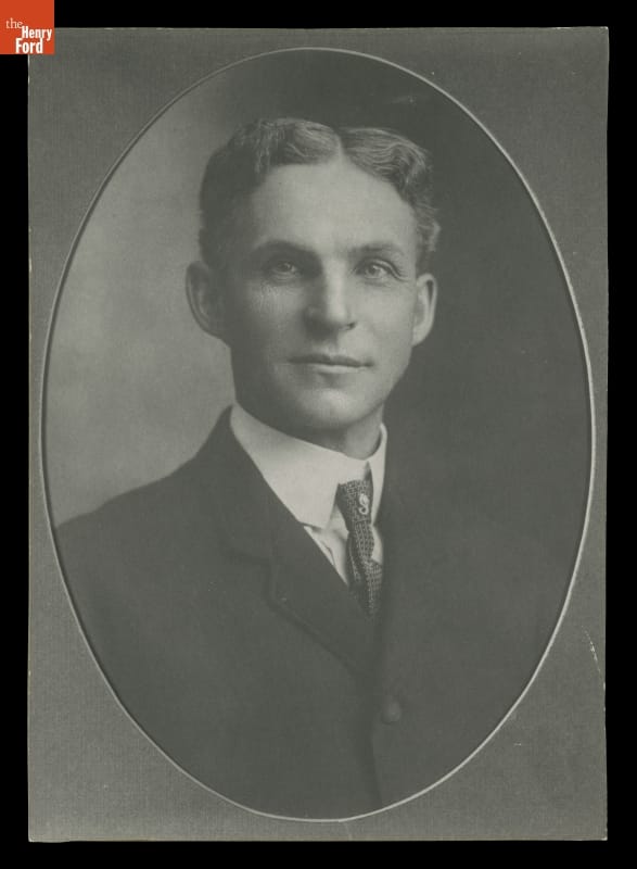
Henry Ford’s first official Ford Motor Company portrait, 1904. / THF97952
Henry Ford did not invent the automobile. But more than any other single individual, he was responsible for transforming the automobile from an invention of unknown utility into an innovation that profoundly shaped the 20th century and continues to affect the 21st. His work at Ford Motor Company revolutionized the automotive industry, setting new standards for production and accessibility.
Innovators change things. They take new ideas—sometimes their own, sometimes other people’s—and develop and promote those ideas until they become an accepted part of daily life. Innovation requires self-confidence, a taste for taking risks, leadership ability, and a vision of what the future should be. Henry Ford had all these characteristics, but it took him many years to develop all of them fully.
Portrait of the Innovator as a Young Man
Ford’s beginnings were perfectly ordinary. He was born on his father’s farm in what is now Dearborn, Michigan, on July 30, 1863. At this time, most Americans were born on farms, and most looked forward to being farmers themselves. Early on, Ford demonstrated some of the characteristics that would make him successful. In his family, he became infamous for taking apart his siblings’ toys as well as his own. He organized other boys to build rudimentary waterwheels and steam engines. He learned about full-size steam engines by becoming acquainted with the engines’ operators and pestering them with questions. He taught himself to fix watches and used the watches themselves as textbooks to learn the basics of machine design. Thus, at an early age, Ford demonstrated curiosity, self-confidence, mechanical ability, the capacity for leadership, and a preference for learning by trial and error. These characteristics would become the foundation of his whole career.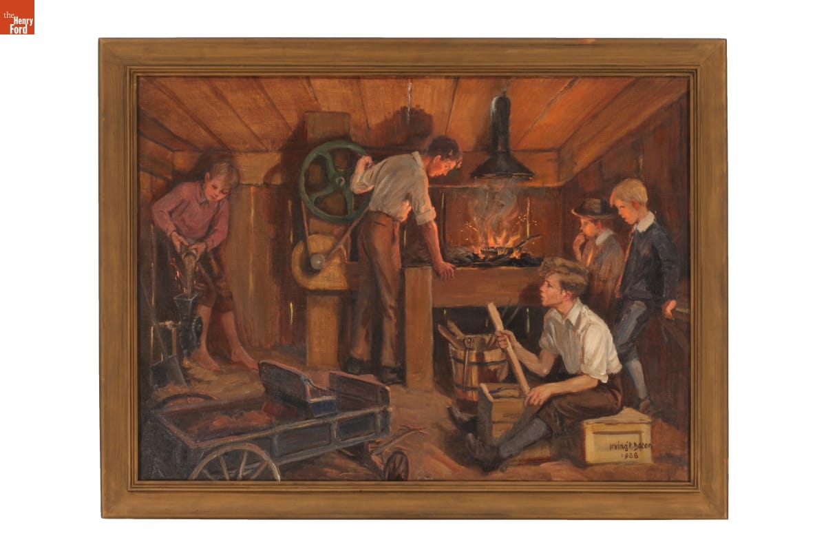
Artist Irving Bacon depicted Henry Ford in his first workshop, along with friends, in this 1938 painting. / THF152920
Ford could simply have followed in his father’s footsteps and become a farmer. But young Henry was fascinated by machines and was willing to take risks to pursue that fascination. In 1879, he left the farm to become an apprentice at a machine shop in Detroit. Over the next few years, he held jobs at several places, sometimes moving when he thought he could learn more somewhere else. He returned home in 1882 but did little farming. Instead, he operated and serviced portable steam engines used by farmers, occasionally worked in factories in Detroit, and cut and sold timber from 40 acres of his father’s land.
By now, Ford was demonstrating another characteristic—a preference for working on his own rather than for somebody else. In 1888, Ford married Clara Bryant, and in 1891 they moved to Detroit. Ford had taken a job as night engineer for the Edison Electric Illuminating Company—another risk on his part, because he did not know a great deal about electricity at this point. He took the job in part as an opportunity to learn.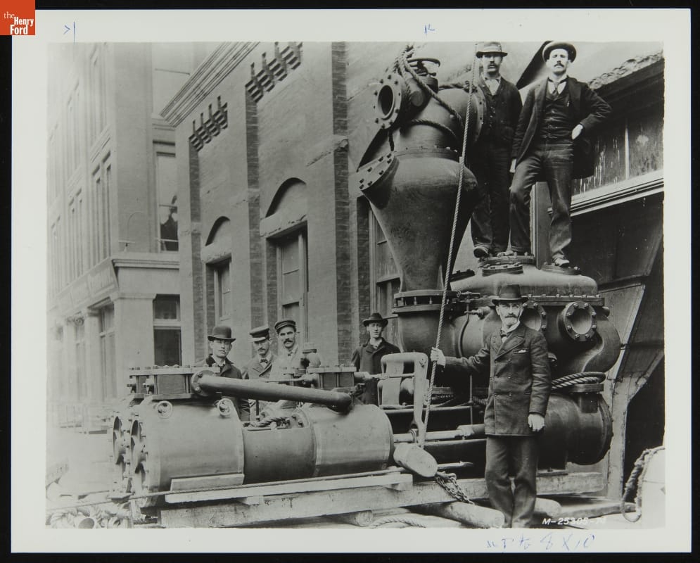
Henry Ford (third from left, in white coat) with other employees at Edison Illuminating Company Plant, November 1895. / THF244633
Early Automotive Experiments: Failure and Then Success
Henry was a skilled student, and by 1896 had risen to chief engineer of the Illuminating Company. But he had other interests. He became one of the scores of other people working in barns and small shops trying to make horseless carriages. Ford read about these other efforts in magazines, copying some of the ideas and adding some of his own, and convinced a small group of friends and colleagues to help him. This resulted in his first primitive automobile, the Quadricycle, completed in 1896. A second, more sophisticated car followed in 1898. These early experiments laid the groundwork for his future endeavors in the automotive industry.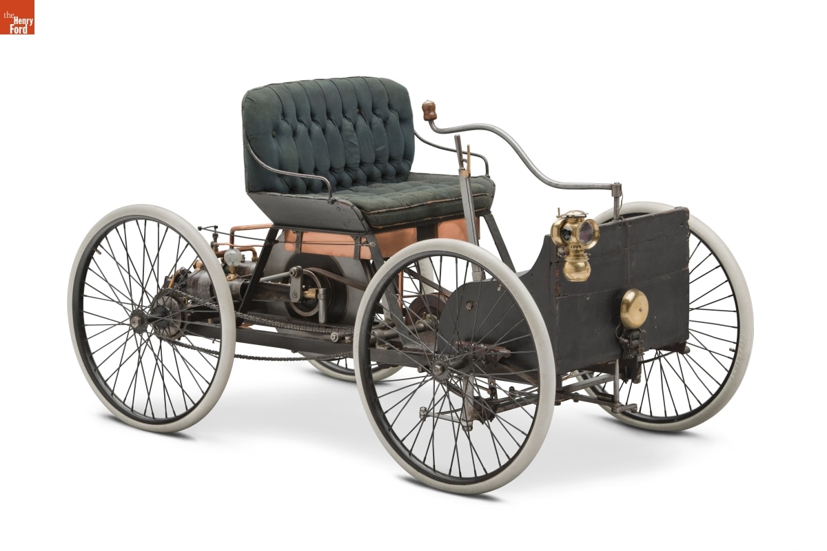
Henry Ford’s 1896 Quadricycle Runabout, the first car he built. / THF90760
Ford now demonstrated one of his most important characteristics—the ability to articulate a vision and convince other people to sign on and help him achieve that vision. He convinced a group of businessmen to back him in the biggest risk of his life—starting a company to make horseless carriages. But Ford knew nothing about running a business, and learning by doing often involves failure. The new company failed, as did a second. His first venture, the Detroit Automobile Company, failed due to the poor quality of its vehicles. Ford tried again, this time with the Henry Ford Company. But disputes over the new company’s direction soon caused Ford and his investors to part ways.
To revive his fortunes, Ford took bigger risks, building and even driving a pair of racing cars. The success of these cars attracted additional financial backers, and on June 16, 1903, just before his 40th birthday, Henry incorporated his third automobile venture, the Ford Motor Company.
The early history of Ford Motor Company illustrates another of Henry Ford’s most valuable traits—his ability to identify and attract outstanding talent. He hired a core of young, highly competent people who would stay with him for years and make Ford Motor Company into one of the world’s great industrial enterprises. He hired a core of young, highly competent people who would stay with him for years, reshaping America’s automotive industry while building Ford Motor Company into one of the world’s great industrial enterprises.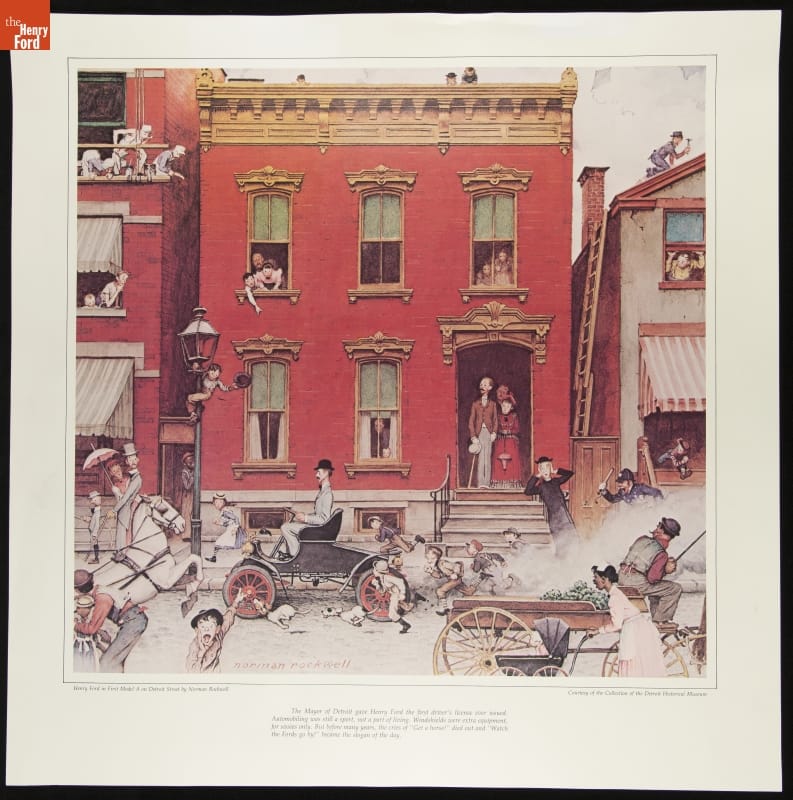
Print of Norman Rockwell's painting, "Henry Ford in First Model A on Detroit Street." / THF288551
The new company’s first car was called the Model A, and a variety of improved models followed. In 1906, Ford’s 4-cylinder, $600 Model N became the best-selling car in the country. But by this time, Ford had a vision of an even better, cheaper “motorcar for the great multitude.” Working with a small group of employees, he came up with the Model T, introduced on October 1, 1908. The Model T was a game-changer, designed to be simple, reliable, and ultimately affordable for the average American.
The Automobile: A Solution in Search of a Problem
As hard as it is for us to believe, in 1908 there was still much debate about exactly what automobiles were good for. We may see them as a necessary part of daily life, but the situation in 1908 was very different. Americans had arranged their world to accommodate the limits of the transportation devices available to them. People in cities got where they wanted to go by using electric street cars, horse-drawn cabs, bicycles, and shoe leather because all the places they wanted to go were located within reach of those transportation modes.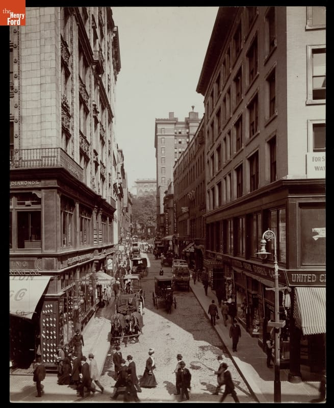
This Boston street scene, circa 1908, shows pedestrians and horse-drawn carriages on the road—but no cars. / THF203438
Most of the commercial traffic in cities still moved in horse-drawn vehicles. Rural Americans simply accepted the limited travel radius of horse- or mule-drawn vehicles. For long distances, Americans used our extensive, well-developed railroad network. People did not need automobiles to conduct their daily activities. Rather, the people who bought cars used them as a new means of recreation. They drove them on joyrides into the countryside. The recreational aspect of these early cars was so important that people of the time divided motor vehicles into two large categories: commercial vehicles, like trucks and taxicabs, and pleasure vehicles, like private automobiles. The term “passenger cars” was still years away. The automobile was an amazing invention, but it was essentially an expensive toy, a plaything for the rich. It was not yet a true innovation.
Henry Ford had a wider vision for the automobile. He summed it up in a statement that appeared in 1913 in the company magazine, Ford Times:
“I will build a motor car for the great multitude. It will be large enough for the family but small enough for the individual to run and care for. It will be constructed of the best materials, by the best men to be hired, after the simplest designs that modern engineering can devise. But it will be so low in price that no man making a good salary will be unable to own one—and enjoy with his family the blessings of hours of pleasure in God’s great open spaces.”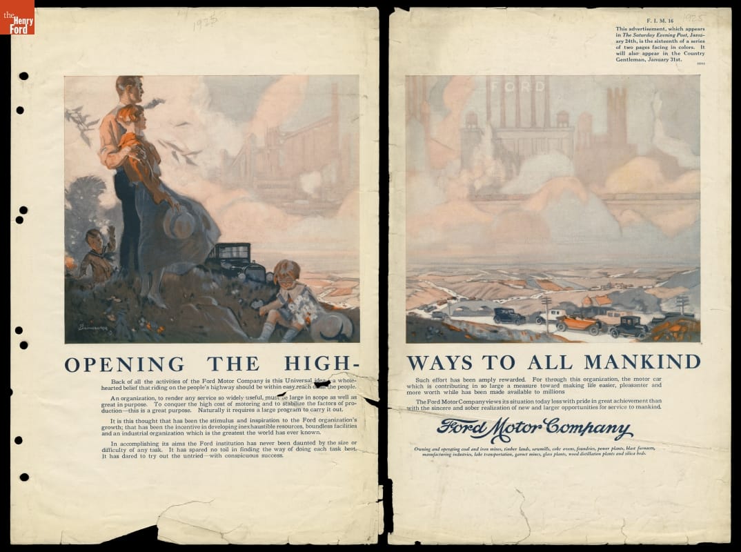
This 1924 Ford ad, part of a series, echoes the vision expressed 11 years earlier by Henry Ford: “Back of all of the activities of the Ford Motor Company is this Universal idea—a wholehearted belief that riding on the people’s highway should be in easy reach of all the people.” / THF95501
It was this vision that moved Henry Ford from inventor and businessman to innovator. To achieve his vision, Ford drew on all the qualities he had been developing since childhood: curiosity, self-confidence, mechanical ability, leadership, a preference for learning by trial and error, a willingness to take risks, and an ability to identify and attract talented people.
One Innovation Leads to Another
Ford himself guided a design team that created a car that pushed technical boundaries. The Model T’s one-piece engine block and removable cylinder head were unusual in 1908 but would eventually become standard on all cars. The Ford’s flexible suspension system was specifically designed to handle the dreadful roads that were then typical in the United States. The designers utilized vanadium alloy steel that was stronger for its weight than standard carbon steel. The Model T was lighter than its competitors, allowing its 20-horsepower engine to give it performance equal to that of more expensive cars. The Model T forever changed the automotive industry and American culture. Its impact can still be felt today.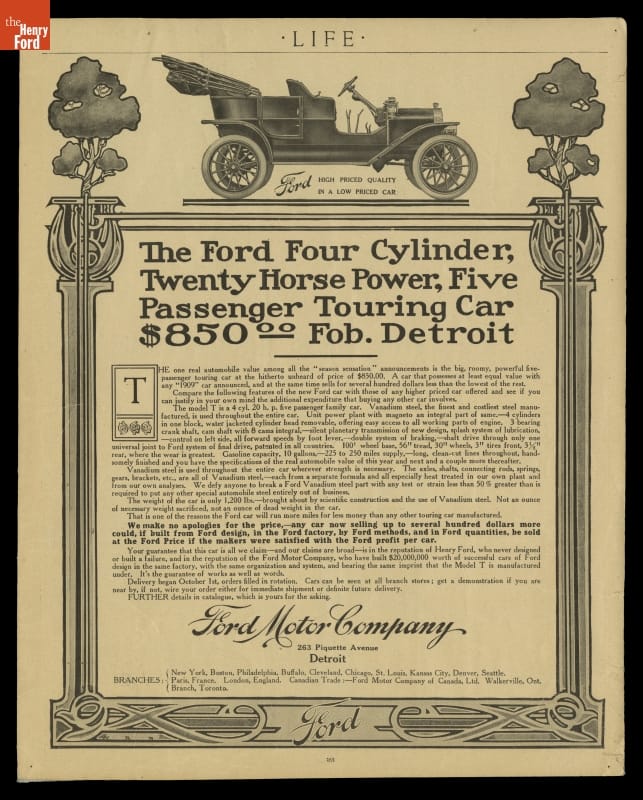
1908 advertisement for the 1909 Ford Model T. In advertisements, Ford Motor Company emphasized key technological features and the low prices of their Model Ts. Ford's usage of vanadium steel enabled the company to make a lighter, sturdier, and more reliable vehicle than other early competitors. / THF122987
The new Ford car proved to be so popular that Henry could easily sell all he could make, but he wanted to be able to make all he could sell. So Ford and his engineers began a relentless drive both to raise the rate at which Model Ts could be produced and to lower the cost of production.
In 1910, the company moved into a huge new factory in Highland Park, a city just north of Detroit. Borrowing ideas from watchmakers, clockmakers, gunmakers, sewing machine makers, and meat processors, Ford Motor Company had, by 1913, developed a moving assembly line for automobiles. But Ford did not limit himself to technical improvements.
When his workforce objected to the relentless, repetitive work that the line entailed, Ford responded with perhaps his boldest idea ever—he doubled wages to $5 per day. With that one move, he stabilized his workforce and gave it the ability to buy the very cars it made. He hired a brilliant accountant named Norval Hawkins as his sales manager. Hawkins created a sales organization and advertising campaign that fueled potential customers’ appetites for Fords. Model T sales rose steadily while the selling price dropped. By 1921, half the cars in America were Model Ts, and a new one could be had for as little as $415.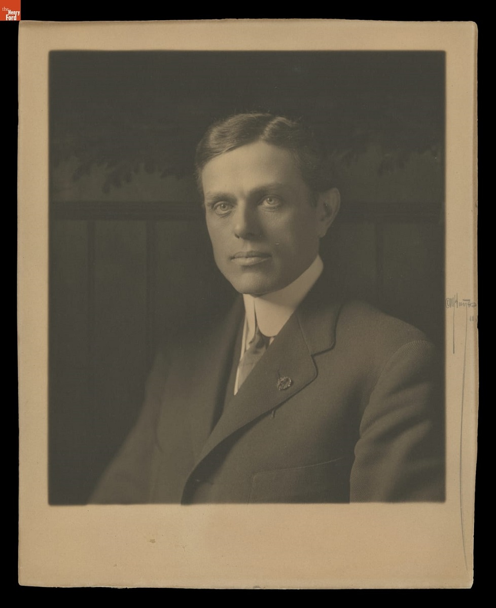
Norval Hawkins headed the sales department at Ford Motor Company for 12 years, introducing innovative advertising techniques and increasing Ford’s annual sales from 14,877 vehicles in 1907 to 946,155 in 1919. / THF145969
Through these efforts, Ford turned the automobile from an invention bought by the rich into a true innovation available to a wide audience. By the 1920s, largely as a result of the Model T’s success, the term “pleasure car” was fading away, replaced by “passenger car.” Ford’s moving assembly line and $5 day ushered in a new era of mass production and affordability. American society itself was transformed as motorists were free to travel where they wanted, when they wanted.
The assembly line techniques pioneered at Highland Park spread throughout the auto industry and into other manufacturing industries as well. The high-wage, low-skill jobs pioneered at Highland Park also spread throughout the manufacturing sector. Advertising themes pioneered by Ford Motor Company are still being used today. Ford’s curiosity, leadership, mechanical ability, willingness to take risks, ability to attract talented people, and vision produced innovations in transportation, manufacturing, labor relations, and advertising. His legacy is preserved at places like Greenfield Village, showcasing his impact on American life and the evolution of the automotive industry.
What We Have Here Is a Failure to Innovate
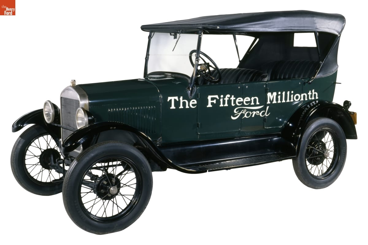
Henry Ford was slow to admit that customers no longer wanted the Model T. However, in 1927, he finally acknowledged that shift, and Henry Ford and his son, Edsel Ford, drove this last Model T—number 15,000,000—off the assembly line at Highland Park. / THF135450
Henry Ford’s great success did not necessarily bring with it great wisdom. In fact, his very success may have blinded him as he looked to the future. The Model T was so successful that he saw no need to significantly change or improve it. He did authorize many detail changes that resulted in lower cost or improved reliability, but there was never any fundamental change to the design he had laid down in 1907.
He was slow to adopt innovations that came from other carmakers, like electric starters, hydraulic brakes, windshield wipers, and more luxurious interiors. He seemed not to realize that the consumer appetites he had encouraged and fulfilled would continue to grow. He seemed not to want to acknowledge that once he started his company down the road of innovation, it would have to keep innovating or else fall behind companies that did innovate. He ignored the growing popularity of slightly more expensive but more stylish and comfortable cars, like the Chevrolet, and would not listen to Ford executives who believed it was time for a new model.
But Model T sales were beginning to slip by 1923, and by the late 1920s, even Henry Ford could no longer ignore the declining sales figures. In 1927, he reluctantly shut down the Model T assembly lines and began the design of an all-new car. It appeared in December 1927 and was such a departure from the old Ford that the company went back to the beginning of the alphabet for a name—it was called the Model A.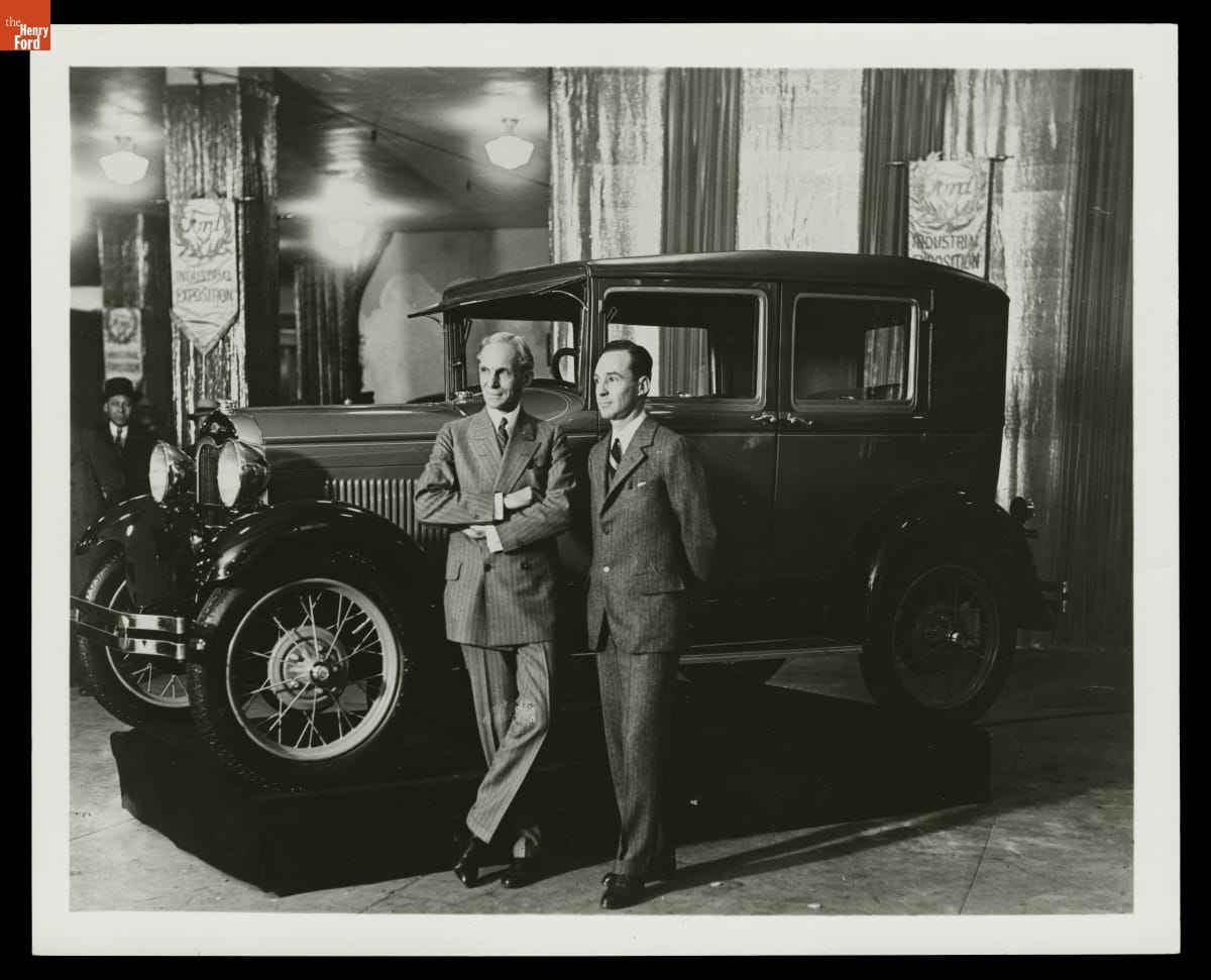
Edsel and Henry Ford introduce the new Model A at the Ford Industrial Exposition in New York in January 1928. Edsel had worked to convince his father to replace the outmoded Model T with something new. / THF91597
One area where Ford did keep innovating was in actual car production. In 1917, he began construction of a vast new plant on the banks of the Rouge River southwest of Detroit. This plant would give Ford Motor Company complete control over nearly all aspects of the production process. Raw materials from Ford mines would arrive on Ford boats, and would be converted into iron and steel, which were transformed into engines, transmissions, frames, and bodies. Glass and tires would be made onsite as well, and all of this would be assembled into completed cars. Assembly of the new Model A was transferred to the Rouge. Eventually the plant would employ 100,000 people and generate many innovations in auto manufacturing. The River Rouge complex became a symbol of Ford's ambition and scale, a testament to his vision for vertically integrated production.
But improvements in manufacturing were not enough to make up for the fact that Henry Ford was no longer a leader in automotive design. The Model A was competitive for only four years before needing to be replaced by a newer model. In 1932, at age 69, Ford introduced his last great automotive innovation, the lightweight, inexpensive V-8 engine. It represented a real technological and marketing breakthrough, but in other areas Fords continued to lag behind their competitors. The Ford factory continued to evolve, but the company faced new challenges in keeping up with changing consumer preferences and technological advancements in the automotive industry.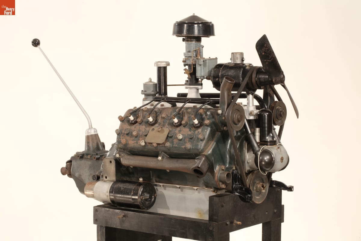
The V-8 engine was Henry Ford’s last great automotive innovation. This is the first V-8 engine produced, which is on exhibit in Henry Ford Museum of American Innovation. / THF101039
By 1936, the company that once sold half of the cars made in America had fallen to third place behind both General Motors and the upstart Chrysler Corporation. By the time Henry Ford died in 1947, his great company was in serious trouble, and a new generation of innovators, led by his grandson Henry Ford II, would work long and hard to restore it to its former glory. Henry’s story is a textbook example of the power of innovation—and the power of its absence. His contributions to the automotive industry and American society are undeniable, but his later resistance to change serves as a cautionary tale.
Bob Casey is former Curator of Transportation at The Henry Ford. This post is adapted from an educational document from The Henry Ford titled “Henry Ford and Innovation: From the Curators.”
Detroit, Michigan, Dearborn, 20th century, 19th century, quadricycle, Model Ts, manufacturing, Henry Ford, Ford Rouge Factory Complex, Ford Motor Company, entrepreneurship, engines, engineering, cars, by Bob Casey, advertising

Operating the Marionettes in Writer’s Cramp: A Review in Little Marionette Show at the A.B. Dick Company Exhibit at the New York World’s Fair, 1939 / THF623950
The A.B. Dick Company, a major copy machine and office supply manufacturer, wanted to draw a crowd to its 1939 New York World’s Fair exhibition. The company decided that a musical marionette show, Writer’s Cramp: A Review in Little, was just the ticket. A.B. Dick selected Tatterman Marionettes, a high-quality touring company managed by Edward H. Mabley (1906–1986) and William Duncan (1902–1978). Mabley wrote the musical comedy and Duncan produced the show, staged at the entrance to the A.B. Dick display in the Business Systems and Insurance Building.
A.B. Dick Company Mimeograph Exhibit and Writer’s Cramp Marionette Show at the New York World’s Fair, 1939 / THF623944
Writer’s Cramp featured changes in communication technology from “the days of the cave man” to the efficient modern office mimeograph machine. Marionettes represented Miss Jones, the secretary, and Mr. Whalen, the executive, trying to rush distribution of important correspondence. Father Time helped inform Mr. Whalen of his good fortune at present (1939) by escorting him through millennia of changes, starting with Stone Age stenographers, and including tombstone cutting, monks with their quill pens, and typists with their typewriters. The play culminated with the unveiling of A.B. Dick Company’s Model 100 Mimeograph, “the World’s Fairest writing machine!”
Writer’s Cramp: A Review in Little Marionette Show at the A.B. Dick Company Exhibit at the New York World’s Fair, 1939 / THF623948
Mabley and Duncan organized Tatterman Marionettes in Detroit, Michigan, in 1922, and had relocated to Cleveland, Ohio, by 1930. They established a reputation through high-quality performances to a range of audiences.
Panel 4 of promotional material, “A Modern Adult Program and a New Children’s Program for the Tatterman Marionettes,” 1931-1932 / THF623902
Edsel B. Ford contracted with the company to perform for children in his home during March 1931. At that time, the always entrepreneurial Mabley recommended his and Duncan’s product, Master Marionettes, as “unusual gift favors” for the children attending that show.
Master Marionettes: Professional Puppets for Amateur Puppeteers, 1930-1940 / THF623904
Tatterman Marionettes’ reputation grew through work with the Century of Progress exposition in Chicago in 1934, where the company presented 1,300 plays. More World’s Fair performances followed. A.B. Dick Company and General Electric both contracted with Tatterman to produce marionette performances during the 1939 World’s Fair. General Electric’s Mrs. Cinderella promoted electrification as part of the modernization of Cinderella’s drafty old castle. (Libby, McNeill & Libby also featured marionette performances, and other corporations staged puppet shows.)
The A.B. Dick Company spared no expense to ensure a first-class production. Tatterman provided the marionettes and experienced operators, while industrial designer Walter Dorwin Teague (1883–1960) prepared blueprints for a detailed stage set. Teague’s exhibit work for A.B. Dick and several corporations during the 1939 World’s Fair helped solidify his reputation as “Dean of Industrial Design.” The company invested in a conductor’s score by Tom Bennett (1906–1970), who would go on to join NBC Radio as staff arranger and musical director after the World’s Fair.
With the script finalized (February 27, 1939), experienced operators put the marionettes to work. After the World’s Fair opened on April 30, 1939, they delivered programs on a set schedule published in official daily programs. On Sunday, October 22, 1939, for example, Tatterman Marionettes performed 15 shows—at 10:20, 11:00, and 11:40 in the morning; at 12:20, 1:00, 1:40, 2:20, 3:00, 3:40 in the afternoon; and at 5:40, 6:20, 7:00, 7:20, 8:00, and 8:20 in the evening.
“Brighten Up Your Days,” Song for the Writer’s Cramp Marionette Show, New York World’s Fair, 1939 / THF623906
At the end of each Writer’s Cramp performance, A.B. Dick mass-produced the feature tune using a mimeograph machine and photochemical stencil. Attendants distributed this sheet music, calling attention to the modern conveniences: “Just a moment, PLEASE! The young lady right behind you is running off some of the words and music from our show—they’re for you to take home with our compliments. Don’t go away without your copy!”
The Tatterman marionettes from Writer’s Cramp featured prominently in World’s Fair promotional material intended to draw the attention of office outfitters to the Business Systems and Insurance Building. Their little stage set conveyed big lessons to the hundreds of thousands of professionals who flowed through the A.B. Dick exhibit at the New York World’s Fair.
Debra A. Reid is Curator of Agriculture and the Environment at The Henry Ford. Thanks to Saige Jedele, Associate Curator, Digital Content, for editorial guidance.
New York, 20th century, 1930s, world's fairs, popular culture, music, design, communication, by Debra A. Reid, advertising
The Office of George Nelson & Co.
In 1947, George Nelson opened his eponymous design office on Lexington Avenue in New York City. George Nelson & Co., as the first iteration of the office was named, was located on the second floor of a narrow building; the ground floor was a health food restaurant. In the introduction to Nelson’s collection of 26 essays called Problems of Design, Museum of Modern Art curator Arthur Drexler recalled that the restaurant had a loyal customer base, even though it “smelled funny.” Drexler observed an “unnerving contrast between the solemnity on the ground floor and that haphazard urbanity on the floor above.” George Nelson’s tendency to do many things simultaneously would have created a sometimes chaotic but always exhilarating environment that perhaps occasionally featured a pungent reminder of its downstairs neighbor.
Over the next four decades, the office would change names, move around New York City, employ many of the best and brightest designers, and complete a dizzying number of projects for a variety of clients. Constant through these changes was George Nelson’s emphasis on the importance of the design process. Even late nights at the office, sometimes saturated with drink, could be productive. Concepts imagined the night before might find their way to the drawing board in the bright light of the morning to be refined, altered, and honed further.
Sometimes, Nelson was more involved with the ideation and later refinement of an idea than with its realization—the office’s staff designers tended to that. A one-time employee of the office, architect and designer Michael Graves, reminisced that Nelson “would come in and touch down his magic dust on somebody and then leave.” While Nelson’s “magic dust”—and the powerful brand that his name symbolized—was vital to the office’s success, Nelson’s own hand in the development of a product or design was sometimes exaggerated. It has taken many years for certain designs to be accurately attributed—and surely there are many more that have not been and may never be. This problem is not unique to Nelson’s office, however, and was often the price designers paid to gain experience and contacts in the field. Hilda Longinotti, the office’s long-time receptionist, reflected on this: “As the years went by, George with all of his intelligence, did not do one thing he should have done and that is make the most talented designers partners in the firm. He gave them titles, but he didn’t give them a piece of the business. As the years went by, they left to form their own offices…”
The hundred-plus people employed by George Nelson over the course of his career—some for a short time and others much longer—include Lance Wyman, Ernest Farmer, Tomoko Miho, Irving Harper, Michael Graves, Don Ervin, Lucia DeRespinis, George Tscherny, and many others. The Henry Ford’s collections feature graphics and products designed by Nelson himself as well as some confirmed to be designed by the office’s staff. Below, we will focus on three of these designers: Irving Harper, George Tscherny, and Tomoko Miho.
Irving Harper
For many of the years that George Nelson was Herman Miller’s design director, Irving Harper was the director of design at George Nelson’s office. George Nelson hired Harper in 1947, and Harper did a little bit of everything in his tenure there—industrial design, furniture, and, eventually, graphics. Although he didn’t have much experience in graphic design, Harper quickly excelled. Herman Miller’s sweeping red “M” logo was one of Harper’s first forays into graphic design, and, 75 years later, the logo is still beloved and used by the company. Harper also designed many of the Nelson Office’s notable products, including many of the clocks for Howard Miller and the iconic Marshmallow sofa.
Born in New York City in 1916, Harper trained as an architect at New York’s Cooper Union and Brooklyn College. He soon began designing interiors. At the age of 19, Harper was hired by Gilbert Rohde, Nelson’s predecessor at Herman Miller, to work on projects for the 1939 World’s Fair, including renderings and production drawings. Harper worked for George Nelson from 1947 until 1963, when he left to start his own firm, Harper+George, which primarily designed interiors for commercial clients. Harper began to create incredibly intricate paper sculptures in the early 1960s as a stress relief measure, turning him into a proper sculptor as well as designer. The paper sculptures bridged his active design years into his retirement in 1983, when his sculpting output greatly increased. Harper died in 2015 at his long-time home in Rye, New York.
This 1947 advertisement features Herman Miller’s sweeping new “M” logo, which was designed by Irving Harper in one of his first forays into graphic design. / THF623975
Irving Harper designed this 1961 Herman Miller advertisement for the “Eames Chair Collection.” / THF266918
George Tscherny
George Tscherny began working at George Nelson & Co. in 1953. Nelson hired Tscherny specifically to design print advertisements for the office’s largest client, Herman Miller, under the direction of Irving Harper. Nelson reportedly had a hands-off approach. Tscherny recalled, “He had no pressing need to involve himself in my area. That meant I could do almost anything within reason.” Tscherny was able to expand and hone his graphic style, which stresses the inherent nature of objects and is always human-centered—even when a human isn’t visible.
Tscherny, born into a Jewish family in 1924 in Budapest, Hungary, grew up in Berlin, Germany. The rise of the Nazi Party and, specifically, the evening of Kristallnacht (“The Night of the Broken Glass”) on November 10, 1938, led Tscherny to believe “there was no future for us in Germany.” The following month, George and his younger brother Alexander escaped to the Netherlands, where they spent the following years moving between refugee camps and Jewish orphanages. Their parents, Mandel and Bella (Heimann) Tscherny, obtained visas and emigrated to the United States in 1939. It wasn’t until June of 1941 that George and Alexander finally joined their parents in New Jersey, after numerous close calls with the Nazi Party. In 1943, George Tscherny enlisted as a soldier in the U.S. Army to fight in World War II and went back to Europe, using his language skills as an interpreter. After the war, Tscherny used the G.I. Bill to fund his study of graphic design, attending the Pratt Institute in Brooklyn, New York; he would leave just weeks before graduation to work for designer Donald Deskey. In 1953, he was hired by George Nelson.
Although Tscherny only worked for Nelson until 1955, numerous advertisements he designed for Herman Miller during his short tenure became iconic of the era. Tscherny left the office to start his independent design studio, which designed graphics for major corporations. He also taught at the School of the Visual Arts in New York City for over half a century. Tscherny says he attempted to teach his students, as Nelson taught him, “not to have preconceptions, but rather to be receptive to new ideas.” Tscherny, currently 96 years old, lives in New York City with Sonia, his wife of over 70 years.
The famous "Traveling Men" advertisement for Herman Miller was designed by George Tscherny in 1954. / THF624755
George Tscherny’s 1955 “Herman Miller Comes to Dallas” advertisement implies a human presence through the inclusion of a cowboy hat. / THF148287
Tomoko Miho
Tomoko Miho was one of a few women that George Nelson hired to design for his office. Miho is not very well-known today, both due to a societal tendency to ignore contributions of women working in the mid-century period and to her private and reserved nature. Although her name may be unfamiliar, this is not due to a lack of talent—Miho’s skill in graphic design and art direction were extraordinary. Once you identify her clean, minimalist, architectural style, it becomes distinct from the others working in the Nelson office.
Born Tomoko Kawakami in 1931 in Los Angeles, she and her family were held at the Gila River Japanese internment camp in Arizona during World War II. Afterwards, the family moved to Minneapolis, where Tomoko began coursework in art and design. She received a full scholarship to the Art Center School in Los Angeles, where she graduated with a degree in Industrial Design in 1958. She worked as a packaging designer for Harley Earl Associates before moving to New York City and, on the recommendation of George Tscherny, she contacted Irving Harper and was then hired by George Nelson in 1960. As the prominent graphic designer (and later colleague of Miho) John Massey stated, Miho was “a master of the dramatic understatement.” Her work is graceful, clean, and highly structured, while also seeming unrestricted. Her designs are masterfully well-balanced and lend themselves well to their primary purpose—conveying information.
Miho worked for the Nelson office until 1965, when family commitments took her to California, back to New York City, and then to Chicago, where she worked for the Center for Advanced Research and Design (CARD). She designed possibly her best known work while working for CARD—the 1967 "Great Architecture in Chicago" poster. It reflects her sense that Chicago’s architecture is “both solid and ethereal,” as Miho explained. Miho continued to collaborate with designers she met at George Nelson & Co. for years. She also had an incredibly long-lasting relationship with Herman Miller: she began designing for the company during her tenure at George Nelson & Co., continued while she was employed by CARD, and even after starting her own firm, Tomoko Miho Co., Herman Miller remained a client. Miho passed away in 2012 in New York City.
Tomoko Miho featured the Herman Miller logo in this price list, camouflaging it in bold contrasting stripes. This is one document in a suite, all featuring the same design, but in different colorways. / THF64160
The “Library Group” trade literature was designed by Tomoko Miho, circa 1970. / THF147737
Katherine White is Associate Curator, Digital Content, at The Henry Ford.
Europe, New York, 20th century, women's history, immigrants, Herman Miller, furnishings, design, by Katherine White, advertising
“Pulp Fashion”: Paper Dresses of the 1960s

Another group of garments from The Henry Ford’s rich collection of clothing and accessories makes its debut in “What We Wore” in Henry Ford Museum of American Innovation.
Who knew that a company that made toilet tissue and paper towels would start a fashion sensation?
In April 1966, the Scott Paper Company launched a promotion for its new line of colorful paper products. Along with two proofs of purchase and $1.25 for shipping, customers could redeem a coupon for a paper dress, choosing from a red paisley bandana pattern or a black-and-white op art print.
The media took immediate notice. So did the public. Scott’s “Paper Caper” dresses became a surprise hit. Soon fashion enthusiasts were wearing not only Scott’s dresses, but paper apparel created by other manufacturers and designers who quickly joined in the trend.
The 1960s was an era of exploration and pushing boundaries. It was the space age--people envisioned an exciting future where everything was conveniently automated. New materials and disposability were in.
Paper apparel promised convenience--you could simply discard it after one wearing. Altering the hemline was a snap--all it took was a pair of scissors and a steady hand. A tear? You could do a quick repair with sticky tape.
The A-line shape and trendy prints of the paper dress fit perfectly with the youthful “Mod” look and aesthetic sensibilities of the 1960s. You could be up-to-the-minute at little cost--clothing could be quickly and cheaply replaced as trends shifted. There was a paper dress for every budget--from those on the shelves of mass-market retailer J.C. Penney to the chic creations carried by Manhattan boutiques.
People bought over a million paper garments between 1966 and 1968. Some envisioned throwaway clothing as the wave of the future. Yet, by early 1968, the craze was beginning to cool. Paper clothing was not really practical or comfortable for everyday use. And the hippie movement--with its back-to-nature values and strong anti-pollution message--was changing public opinion. What had seemed hip and modern now seemed frivolous and wasteful.
A bit of novelty in an era of experimentation, the paper dress fad was fun while it lasted.
The Dress That Launched a Fashion Craze


Scott Company’s “Paper Caper” Dress and label, 1966. / THF185279, THF146282
When the Scott Paper Company created the first paper dress in 1966, they intended it as a promotional gimmick to help sell their products. But their “Paper Caper” dresses--a paisley bandana design or an Op art print--swiftly and unexpectedly caught on with the public. The publicity the dresses brought Scott far exceeded the company’s expectations. By the end of the year they received nearly a half million orders for dresses they sold at near cost.
The company made little money from sales of the dresses--but that wasn’t the point. Inadvertent fashion innovators, company executives had no intention of continuing the paper dress venture in 1967, leaving the market to eager entrepreneurs.
Scott’s “Paper Caper” black and white Op art dress (geometric abstract art that uses optical illusion) appeared in Life Magazine in April 1966. / THF610489
“Waste Basket Boutique”

Paper Jumpsuit by Waste Basket Boutique by Mars of Asheville, 1966-1968. / THF185294 (Gift of the American Textile History Museum. Given to ATHM by Cathy Weller.)
The Scott company’s success started a trend for disposable fashion--so other companies quickly jumped in. Mars of Asheville, a hosiery company, launched a paper fashion line in June 1966 under the label, Waste Basket Boutique. They sold colorful printed-paper dresses and other garments for adults and children in a variety of strap, neckline and sleeve styles, as well as “space age” foil paper clothing. In September, Mars debuted plain white dresses that came with watercolor paint sets for “doing your own thing.” Pop artist Andy Warhol painted one to promote the new line.
Mars of Asheville became the leading manufacturer of disposable fashion, producing over 80,000 garments each week at its height.
Designers embraced the trend, creating unique disposable couture for a wealthier crowd. Tzaims Luksus designed these hand-painted $1000 balls gowns for an October 1966 fundraiser at the Wadsworth Atheneum in Hartford, Connecticut. Life Magazine, November 1966. / THF610492
Walking Ads/Walking Art

Campbell’s “Souper” Dress, 1967. / THF185289 (Given in Memory of Thelma D. Nykanen)
The advertising potential of these wearable “billboards” was huge. With coupons clipped from magazines, women could buy dresses from a variety of companies, including Green Giant vegetables, Butterfinger candy bars, and Breck hair care products. While some companies offered motifs that reflected their products, others followed fashion with flower power, paisley, or geometric designs.
In Spring 1967, the Campbell Soup Company produced what became the most famous paper garment of the era--this dress with its repeating soup can image. The dress not only advertised Campbell’s products--it also cleverly referenced Pop artist Andy Warhol’s iconic early 1960s depictions of the Campbell’s soup can that elevated this ordinary object to the status of art.
In 1968, the Mennen Company, makers of Baby Magic infant care products, offered women stylish paper maternity and party dresses “fashion-approved” by designer Oleg Cassini. / THF146023
Disposable Dresses Go Political

George Romney presidential primary campaign dress, 1968 / THF185284
Bumper stickers, buttons, and brochures--those were the standard things that political campaigns were made of in the 1960s. Beyond “standards,” campaigns also latch onto things that are hot at the time—and during the 1968 presidential campaign, that meant paper dresses. Democratic candidate Robert Kennedy and Republicans Richard Nixon, Nelson Rockefeller, and George Romney all had versions.
This George Romney campaign dress may have been “hip,” but it didn’t do the trick for him--Romney’s bid for the nomination was unsuccessful. Nelson Rockefeller’s too.


George Romney bumper sticker and campaign buttons, 1968. / THF146376, THF8545 (Buttons gift of Mr. & Mrs. Charles W. Kurth II)
When You Care Enough to WEAR the Very Best


Hallmark Cards, Inc. paper party dresses, “Flower Fantasy” and “Holly,” 1967. / THF185309 (Gift of the American Textile History Museum. Given to ATHM by Diane K. Sanborn), THF185307 (Gift of the American Textile History Museum. Given to ATHM by Jane Crutchfield)
In the spring of 1967, the Hallmark company embraced the disposable clothing trend, marketing a complete party kit that included a printed A-line shift and matching cups, plates, placemats, napkins, and invitations. While matched sets of disposable tableware had been around for decades, a matching paper dress was a new idea.
In this era of informal entertaining, festive paper tableware (and paper fashion) made hosting parties more convenient and cleanup easier. After guests left, the hostess could simply toss everything into the trash--rather than into the dishwasher and washing machine.
With Hallmark products, a hostess could have every element of her party perfectly matched--including her “swinging new paper party dress,” 1967. / THF146021
Jeanine Head Miller is Curator of Domestic Life at The Henry Ford.
20th century, 1960s, What We Wore, popular culture, home life, Henry Ford Museum, fashion, by Jeanine Head Miller, advertising
Patent Medicine Entrepreneurs: Friend or "Faux"?
Before modern pharmaceuticals and medical practice came to be widely accepted, people had essentially three choices to try to cure what ailed them, none of which was perfect. The first choice was to be treated by a doctor, if one was available, affordable, and trustworthy. The second option was to try a home remedy, found in cookbooks or periodicals or passed down through a family member. The third choice was patent medicines. Readily available and relatively inexpensive—though often suspect and sometimes downright dangerous—patent medicines were a popular option for treatment throughout the 1800s.
The popularity of patent medicines encouraged entrepreneurs to manufacture their own remedies and enter the flourishing patent medicine industry. Some of these entrepreneurs were licensed doctors who decided to become businessmen instead of practitioners. Others were businessmen with a flair for marketing who saw an opportunity to use their skills to peddle an acquired formula or small medicine business they purchased. Unfortunately, some entrepreneurial manufacturers were complete con artists concocting their own remedies that either did absolutely nothing or were quite dangerous to whomever consumed them. Through this blog post, we'll explore the stories behind various entrepreneurial patent medicine manufacturers.
Trade Card for Brown’s Iron Bitters, Brown Chemical Co., 1890-1900. Patent medicines were often advertised as “cure-alls” with packaging and advertisements listing illnesses and complaints that the product was intended to “cure.” This trade card for Brown’s Iron Bitters claims that it cured “indigestion, dyspepsia, intermittent fevers, want of appetite, loss of strength, lack of energy, malaria and malaria fevers,” and other things. / THF277429
The term “patent medicine” is misleading as the medicine advertised was very rarely patented. It originally referred to medicine in which the ingredients were “granted protection for exclusivity,” meaning that the same composition could not be sold by another manufacturer. While it was relatively simple to obtain a patent for medicine, most manufacturers didn’t apply for one because it meant that they would have to divulge the remedy’s ingredients. More often than not, these medicines contained dangerous substances like morphine, cocaine, and high levels of alcohol.
Trade Card for Burdock Blood Bitters, Foster, Milburn & Co., circa 1885. A study conducted by the American Medical Association in 1917 found that Burdock Blood Bitters, a popular patent medicine, contained 25.2% alcohol by volume. This medicine, and others like it, would most likely dull any pain (thanks to the alcohol) but its contents also increased the likelihood of developing dependency or addiction in adults, and could be fatal to children. / THF215182
Having originated in England in the 17th century, patent medicines made their way to America in the 18th century and were a major industry by the 1850s. The last half of the 1800s is considered the “golden age” of American patent medicine, with hundreds of products flooding the market. A number of factors led to this boom in the industry. For one, advances in industrial and manufacturing technology made the process of producing bottles, containers, labels, and the medicine itself more efficient. As the century progressed, advanced transportation methods opened new markets across the continent. Additionally, the introduction of color printing created an advertising frenzy with thousands of newspaper, magazine, trade card, and poster advertisements. And finally, there were essentially no regulations imposed on the drug trade at this time, meaning that individuals could put whatever they wanted into a remedy and advertise it however they pleased. All of this culminated to ensure that the patent medicine trade was highly lucrative, encouraging enterprising individuals to launch their own brand of medicines regardless of medical knowledge or background.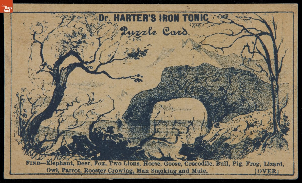
Trade Card for Dr. Harter’s Iron Tonic, 1875-1890. Trade cards were the most popular method for advertising patent medicines. This puzzle card for Dr. Harter’s Iron Tonic featured hidden figures within a drawing for customers to find. / THF214474
While there were hundreds of patent medicines created during this time, the most successful were the ones that were heavily advertised. Consumers encountered many advertisements and brand recognition became extremely important with so many patent medicines on the market. Trade cards of the era inform us who the major players were in the patent medicine industry. They also allow us to examine the advertising tactics used by patent medicine manufacturers to entice potential customers.
Foster, Milburn & Co.

Trade Card for Burdock Blood Bitters, Foster, Milburn, & Co., circa 1885. / THF215179
Orrin Foster and Thomas Milburn were patent medicine manufacturers and distributors. They organized their first business in the 1870s in Toronto before opening a distribution office in Buffalo, New York. The company’s best-known product was Dr. Thomas’ Eclectric Oil, which the pair had purchased from Dr. Samuel N. Thomas in 1876 and marketed heavily to the general public. The back of this trade card for Burdock Blood Bitters—another well-known product by the company—features a popular strategy for advertising patent medicines: testimonials. Testimonials provided prospective buyers with “first-hand experiences” of those who had tried the product. With praises sung by doctors, reverends, and members of the general public, testimonials instilled confidence in the products, persuading consumers to buy. Whether the testimonials were truthful or fabricated is up for debate.
Humphreys’ Homeopathic Medicine Company

Trade Card for Humphreys’ Witch Hazel Oil, Humphrey’s Med. Co., 1870-1900. / THF299894
Humphreys’ Homeopathic Medicine Company is an example of a patent medicine company that actually had a proprietor in the medical field. The company was founded by Frederick K. Humphreys in 1853. He graduated in 1850 from the Pennsylvania Homeopathic Medical College with a Doctor of Homeopathic Medicine degree and established a successful medical practice. Homeopathy is an alternative medical practice based in the belief that the same substances that cause disease in healthy people can be used to treat those who are sick with similar symptoms. According to the Federation of Historical Bottle Collectors, Humphreys helped “form the New York State Homeopathic Medical Society and became an important member of the American Homeopathic Institute.” In 1854, Humphreys began manufacturing and selling homeopathic remedies. Witch Hazel Oil—for curing itching, pain from cuts and burns, chapped hands and feet, bug bites, sunburns, etc.—became one of Humphreys' most popular products over time.
Lydia E. Pinkham’s Medicine Company

Trade Card for Lydia E. Pinkham’s Vegetable Compound, 1880-1890. / THF298977
Lydia E. Pinkham was one of the most prominent names in the sector of the patent medicine industry that catered to “female complaints.” Before entering the business, Pinkham was a teacher and mother. It is said that she was known among her neighbors for mixing her own herbal remedies, keeping a personal notebook she called “Medical Directions for Ailments.” Pinkham’s Vegetable Compound is believed to have been a secret formula given to Lydia’s husband as payment for money owed to him. The couple began producing the compound in 1875, thus entering the patent medicine business. Their sons, Will and Dan, were tasked with marketing the product. In 1879, Dan came up with the idea of using Lydia’s portrait in advertisements—the first woman’s likeness to be used in advertising. Attaching her likeness and signature to advertising was a huge hit, providing women with a friendly and “knowing” face, which instilled confidence in the product.
Carter Medicine Company

Trade Card for Carter’s Little Liver Pills, Carter Medicine Company, 1880-1890. Trade cards were generally printed as small rectangles but unique shapes, like the painter’s palette shape of this card, were also created and were a beneficial advertising tool. / THF297541
The Carter Medicine Company provides another example of a patent medicine manufacturer with a background in the medical field. Pharmacist Dr. John Samuel Carter began selling “Carter’s Little Liver Pills” out of his pharmacy in Pennsylvania for those with “digestive distress.” The product gained popularity throughout the 1850s and in 1880, Carter formed a partnership with New York businessman Brent Good to establish Carter Medicine Company. By World War I, "Carter's Little Liver Pills" had become such a staple in American households that the company remained in business despite a global economic downturn.
C.I. Hood & Co.

Trade Card for C.I. Hood & Co. with Hood’s Photos of the World, “Notre Dame Cathedral, Paris,” 1890-1910. Trade Cards from Hood’s Photos of the World series gave customers views of faraway places, providing a window to the broader world. / THF297455
C.I. Hood & Co. was one of the most recognized names in the patent medicine industry. In 1875, Charles Ira Hood opened his drug store, C.I Hood & Company, in Lowell, Massachusetts. Within a few years, Hood’s was one of the largest patent medicine producers in the United States. The thing that set Hood’s company apart was its state-of-the-art factory, which included its own advertising department. Hood’s factory produced all sorts of ephemera, including calendars, trade cards, and even cookbooks, which helped make it one of the most successful patent medicine manufacturers.
Dr. Seth Arnold’s Medical Corporation


Trade Card for Dr. Seth Arnold Medical Corporation, 1880-1890 / THF214532, THF214533
Seth Arnold worked in a series of industries before entering the patent medicine business in the late 1840s. Following a venture in hotel management, Arnold took several years off due to his health, beginning in 1835. He was said to have used this time to create a remedy for his illness, a medicine that came to be called “Dr. Arnold’s Balsam.” In the New England Union Directory of 1849, Arnold was cited as an “eclectic physician and patent medicine manufacturer” in Smithfield, Rhode Island, where he was also a physician for cholera. In addition to his balsam, two additional products were created—“Cough Killer” and “Bilious Pills”—to be sold by his company, known as Dr. Seth Arnold’s Medical Corporation. Dr. Seth Arnold’s Cough Killer was believed to be his most popular product, but the others were successful as well. If the testimonial on the back of the trade card above is to be believed, customers as far away as Nebraska used Dr. Seth Arnold’s Bilious Pills.
Sterling Remedy Company

Trade Card for “No-To-Bac” Tobacco Habit Cure, Sterling Products Co., circa 1894. / THF298541
Sterling Remedy Company provides an example of a businessman entering the patent medicine industry without any medical knowledge or background. H.L. Kramer was a self-made businessman who established a publishing and advertising company in Lafayette, Indiana, and held interest or managerial positions in the Humane Remedy Company and the Universal Remedy Company (both manufacturers of patent medicines). One of Kramer’s advertising clients was John W. Heath, a local Indiana banker who owned Sterling Remedy Company. Heath also consulted with Kramer on a project to develop a local health spring into a medicinal spa. Following Heath’s death in 1890, Kramer bought out his widow’s interest in the Sterling Remedy Company and the medical springs. By the mid-1890s, Kramer had launched the springs as a “fashionable Midwestern health resort” known as “Mudlavia” because of its specialty mud bath cures. Under Kramer’s leadership (and with thousands of dollars spent on advertising yearly), Sterling Remedy Company gained popularity. Universal Remedy Company’s “No-To-Bac,” a popular tobacco habit cure, was merged with Sterling Remedy Company’s product line. A common side effect of No-To-Bac was constipation, so the company produced Cascarets to help with this inconvenience. Cascarets became the company's most popular product. Despite success, Kramer sold the company in 1909.
Dr. J.C. Ayer & Co.

Trade Card for Ayer’s Hair Vigor, circa 1885. Ayer’s Hair Vigor became a popular hair restorative following its introduction in the 1860s. Examples of packaging for this patent medicine are on display at the J.R. Jones General Store in Greenfield Village. / THF297658
James C. Ayer was one of the most recognized names in the patent medicine industry. This is largely due to the fact that Ayer was an advertising genius, producing thousands of advertisements in the form of trade cards, almanacs, posters, and newspaper and magazine ads. Young Ayer apprenticed for several years at Jacob Robbins’ Apothecary Shop in Ledyard, Connecticut, and studied under Dr. Samuel Dana. Within a few years, Ayer purchased the apothecary shop and began manufacturing his own medicines, including Cherry Pectoral. His medicine was so popular that he was forced to find a larger manufacturing facility, moving operations to Lowell, Massachusetts. In 1855, Ayer entered into a partnership with his brother to form J.C. Ayer & Company, manufacturing patent medicines. Additional remedies created by Ayer since introducing Cherry Pectoral included Cathartic Pills in 1853, Sarsaparilla and Ague Cure in 1858, and restorative Hair Vigor in 1867. In 1860, the Philadelphia Medical University awarded Ayer with an honorary medical degree, leading to the addition of “Dr.” to the company’s name.
“Ayer’s American Almanac, 1907” / THF285177
While trade cards were certainly one of the most effective advertising methods for patent medicines, major manufacturers printed their own almanacs as well. Dozens of almanacs littered the counters of local general stores and urban pharmacies. In an average year, J.C. Ayer & Co. produced roughly 16 million almanacs. In 1889, Ayer’s distributed 25 million almanacs in 21 languages.
Federal Regulation
While the masses were content to self-prescribe patent medicines for themselves, there were some who questioned the effectiveness of the products and the legitimacy of their proprietors. As previously mentioned, relatively few restrictions were placed on the drug trade at this time and manufacturers were not inclined to provide a list of ingredients for their products. Some reputable doctors took it upon themselves to conduct studies to see what some of the most popular patent medicines were made of, and the results were often startling.
Many medicines were found to contain dangerous levels of alcohol. For instance, one study found that Lydia E. Pinkham's Vegetable Compound contained roughly 20% alcohol. Other remedies were found to contain morphine (like Dr. Seth Arnold's Cough Killer) and cocaine. With reports such as these making the general public aware of dangerous substances in some of their favorite medicines, and growing concern against the manufactured food industry regarding sanitation practices and food additives, the Pure Food and Drug Act was passed in 1906, placing federal regulations on these trades. For patent medicines, the passage of the act called for manufacturers to list any harmful ingredients on their containers and prohibited any false or misleading advertising.
Page from “Ayer’s American Almanac, 1907” noting that its products do not contain alcohol. / THF285178
Following the passage of the Pure Food and Drug Act, there was a significant decrease in the number of patent medicines on the market, but there were some companies that were able to remain in business. One of the most successful was Carter Medicine Company. It sustained its legitimacy even with the passage of the Act, and throughout the 20th century, the company diversified its products, leading to research in anti-perspirants and deodorant. The company is still in business today as Carter-Wallace, with well-known products such as Arrid, an antiperspirant and deodorant, and Nair, a hair remover for women.
Two other manufacturers previously mentioned—the Lydia Pinkham Company and Humphreys' Homeopathic Medicine Company (now Humphreys' Pharmacal, Inc.)—also remain in business today with their products available for purchase online.
Samantha Johnson is Project Curator for the William Davidson Foundation Initiative for Entrepreneurship at The Henry Ford. Special thanks to Donna Braden, Senior Curator and Curator of Public Life at The Henry Ford, for sharing her knowledge and resources on the patent medicine industry and for reviewing this content.
19th century, patent medicines, healthcare, entrepreneurship, by Samantha Johnson, advertising
“America’s Most Famous Dessert”

Recipe Booklet, “Joys of Jell-O,” circa 1962 THF294490
As Project Curator for the William Davidson Foundation Initiative for Entrepreneurship, I research objects within The Henry Ford’s collections that tell entrepreneurial stories. Most recently, I delved into the Recipe Booklet Collection, which includes recipe booklets and pamphlets from 1852-2006. In researching the many companies represented within the collection I became intrigued by the recipe booklets, and the entrepreneurial story, of the much beloved dessert: Jell-O.
Colorful drawings in the recipe booklet, “Jell-O, America’s Most Famous Dessert,” 1916 THF294400
For more than a century, Jell-O has been served at family gatherings, pot-lucks, and barbeques, becoming an American icon.
Jell-O is made with two primary ingredients: sugar and gelatin. Gelatin is made by extracting collagen from boiled animal bones, hooves, and tissue. Known for its binding capabilities, gelatin has been used as a recipe ingredient for centuries, particularly for molded desserts. Originally, gelatin dishes were most common in wealthy households where servants could be tasked with the time-consuming and unsavory work of making gelatin.
Gelatin is odorless and flavorless, always an added ingredient to a recipe and never a stand-alone dish. Advances in gelatin production eventually led to its packaged powdered form – an innovation that erased the time-consuming preparation and made the product available to nearly everyone. Still, sugar and spices had to be added by the maker. In 1897, Pearle Wait, a carpenter and patent medicine producer, combined fruit flavoring and sugar with gelatin powder to create a pre-packaged fruit-flavored dessert that just required boiling water and some time to cool and set. Pearle Wait and his wife, May, were amazed by the delicious result and the couple believed it would thrive in the packaged food business. May is attributed with having given the Jell-O name to the new product.
Insert within the recipe booklet, “Jell-O Ice Cream Powder: Doesn’t That Look Good?” circa 1910 THF294409
The name “Jell-O” followed a trend at the time of adding an “O” to the end of product names.
With a catchy name and what he thought was a product full of potential, Pearle Wait attempted to sell his new product door-to-door. Unfortunately, Wait lacked the resources necessary to market his innovation, let alone hire salesmen. Less than two years after creating Jell-O, Wait sold the rights to the product and name to a fellow patent medicine competitor, Orator F. Woodward, for $450.
As owner of the Genesee Pure Food Company, Woodward had already experienced success with his health drink, Grain-O. After acquiring the rights to Jell-O, Woodward quickly created advertising for the promising product, but he too struggled to make a profit. He was so frustrated by his lack of initial success that he offered the Jell-O rights to one of his employees for $35. The man refused, which turned out to be extremely fortunate for Woodward. By 1902, his struggling Jell-O business had become a quarter-million-dollar success.
Some believe that this slow start was due to the fact that homemakers prided themselves on their homemaking skills. Ready-made products, such as Jell-O, were looked down upon as too simplistic, requiring no skill. Ironically, the product owed its success to recipe booklets, which provided creative uses for this ready-made product. As early as 1902, booklets were distributed by finely dressed salesmen who went door-to-door on distinctive wagons drawn by well-groomed horses. Once every household in a given area had a recipe booklet, a salesman would go to the local grocer and advise him to stock Jell-O to meet the impending demand. The recipe booklets were a huge success. Jell-O became a household name as homemakers across the country marveled at the “magic” dessert that could be transformed into a colorful dish for any occasion.
Page from the recipe booklet, “Jell-O, America’s Most Famous Dessert,” 1916 THF294401
Jell-O booklets included recipes for a variety of desserts. Some recipes called for additional ingredients of whipped cream, or fresh or canned fruit, while others suggested homemakers use a gelatin mold or specialty serving dishes for a beautiful, sophisticated presentation. 
Recipe Booklet, “The Jell-O Girl Entertains,” circa 1930 THF294510
Jell-O introduced one of its most successful marketing strategies, the Jell-O Girl, in 1904. She helped reinforce the idea that children loved Jell-O and proved that it was easy to make – so easy a child could do it. In this booklet, the Jell-O Girl tells readers that she’s hosting a party and wants to serve her favorite dessert, Jell-O. The booklet includes the Jell-O Girl’s favorite party recipes and describes tips every hostess should know.
Back cover for the recipe booklet, “Polly Put the Kettle On We’ll All Make Jell-O,” 1924 THF294438
Heavy advertising contributed to Jell-O’s success. For some marketing campaigns, Jell-O enlisted prominent artists, including Norman Rockwell and Maxfield Parrish, who designed the image featured here. 
Page from recipe booklet, “Jell-O Secrets for the Automatic Refrigerator,” 1929 THF294522
Although Jell-O became known as “America’s Most Famous Dessert,” it was also suggested as an ingredient in appetizers, molded vegetable salads, and entrées.

Cover and page from the recipe booklet, “New Jell-O Recipes Made with the New Flavor Lime,” Circa 1930 THF294532
In 1897, Jell-O was sold in four flavors: Strawberry, Raspberry, Orange, and Lemon. By 1906, the Genesee Pure Food Company introduced Cherry and Chocolate, with Peach following soon after. Lime Jell-O debuted in 1930.
Page from the recipe booklet, “Polly Put the Kettle On We’ll All Make Jell-O,” 1924 THF294430. Jell-O became a sensation, with factories producing over 1,200 packages per minute by 1924.
By 1923, Jell-O sales had far surpassed the Genesee Pure Food Company’s other ventures, prompting the company to formally change its name to the Jell-O Company. Two years later, in 1925, the Jell-O Company Inc., was sold to Postum Cereal Company, Inc., which would later become part of the large conglomerate General Foods Corporation.
Samantha Johnson is Project Curator for the William Davidson Foundation Initiative for Entrepreneurship at The Henry Ford. Her favorite Jell-O recipe is for what her mother calls “Raspberry Fluff,” made with cottage cheese, Cool Whip, and a dry Raspberry Jell-O package.
making, by Samantha Johnson, recipes, food, entrepreneurship, advertising
Unpacking the History of Labels

Crate Label, “Far West Brand Pears,” circa 1930 THF293059
As Project Curator for the William Davidson Foundation Initiative for Entrepreneurship, I research objects within The Henry Ford’s collections that tell entrepreneurial stories. Most recently, I delved into the Label Collection, which includes labels from alcoholic beverages, cigar boxes, medicines, various food related items, and miscellaneous products. This blog post highlights the West Coast fruit crate labels and canned food labels.
Label Lithography
Can Label, “Defender Brand Tomatoes,” 1913-1918 THF293393
In the late 1800s, the preferred method of printing used to make image-centric labels like these was lithography. This process involved the transfer of an inked image from stone or metal plates to paper via a printing press. Skilled artists drew their images on flattened, smooth pieces of stone – traditionally limestone – to then be inked and transferred. Later, flexible, photosensitive metal plates were used on rotary and offset presses, making the lithographic process more efficient. The artists who worked in this medium were called lithographers. Some of the growers, as well as some of the packing and distribution companies, had their own lithography departments to produce labels. The majority, however, hired lithography companies to create their label designs.
The introduction of color into the lithography process, known as chromolithography, transformed the advertising industry. Multi-colored lithographs involved several transfers of the same image from multiple stones, or plates, each with their own color ink in the desired layout. The more colors included in the image, the more transfers (and stones/plates) required to produce the desired result.
Crate Label, “Atlas Brand Blackberries,” 1916-1930 THF113854
This label for Atlas Brand Blackberries is an example of single-color lithography and was produced through a single ink pass. The shading and variation seen in this image was created by the methods of stippling, linework, and applying different densities of the same color of ink to the page. The stippling method refers to the pattern of dots, which can be seen if you look closely at the fruit depicted on this label.
Can Label, “Holly Brand Peaches,” circa 1916 THF293047
To enhance the attractiveness of a label some lithographers incorporated metallic pigments and dimensional, embossed areas into their designs. Metallic pigments created the shiny golden appearance that can be seen along the edges of this label for Holly Brand Yellow Cling Peaches.
Fruit Crate Labels
Before the 1860s, East and West Coast markets were essentially isolated. Because of differing climates, certain produce was only available to consumers living in the eastern United States during specific seasons while most produce in the West could be grown throughout the entire year. When the transcontinental railroad opened in 1869, eastern markets were opened to the West Coast produce industry for the first time. The railroad, along with the growing canning industry, allowed consumers to enjoy fruits and vegetables year-round – encouraging the establishment of more growers and packing companies in the West to meet the high demand. By the turn of the century and into the early twentieth-century, California fruit growers provided an abundance of fresh fruit to the national markets, transforming the American diet.
With greater competition among growers and packing houses, the crate label became an important marketing tool. At the time, grocers were the link between customers and the products. Grocers obtained their goods from wholesale markets, choosing their products by price and intuition. The label had to stand out and appeal to the grocer who would then buy several crates of the product and sell it in his store. If the grocer heard that customers liked a certain brand over previous ones he’d supplied, he could make sure to purchase that particular brand again, using the crate label for identification.
These fruit crate labels are often stunningly beautiful – more like mini-posters with broad color palettes, incredibly detailed images, and clever brand names. A common feature of label design was an image of where the fruits and vegetables were produced. Customers became enamored with the shining groves of oranges in the West and came to identify certain places with the best produce. Other labels feature popular motifs of the time and allow us to explore the trends in graphic design.
Crate Label, “Orchard Brand Pears,” circa 1920 THF293065
California wasn’t the only state on the West Coast to produce delicious fruit. Washington was known for its many varieties of apples as well as other fruits, including pears.
Crate Label, “Bocce Brand Zinfandel Grapes,” circa 1940 THF293043
C. Mondavi & Sons’ “Bocce” label played up the family’s Italian roots, aligning its product with the quality grapes grown in Italian vineyards. This successful business was established by Cesare Mondavi, a Minnesota grocer and saloon owner who often traveled to California to select and ship grapes back home to make his own wine. After becoming enamored with the California climate, which reminded him of Italy, he moved his family to Lodi in 1923 to open a business growing and shipping grapes. His success allowed him to purchase a winery in 1946, which is still thriving today as C. K. Mondavi and Family.
Crate Label, “Santa Rosa Brand Ventura County Lemons,” copyright 1927 THF293109
This label features the sprawling lemon groves in Oxnard, California. It also features the “Sunkist” logo, which became a popular brand known for its high-quality oranges and lemons.
Canned Food Labels
The process of canning food has been around since the early 19th century, with products used as wartime provisions for French and British armies. Tin cans allowed food producers to safely transport their goods without fear of them breaking – as was common with glass jars and bottles – making cans a more economical container for foodstuffs. While canned foods were introduced to America by the 1820s, the demand for these products came four decades later during the American Civil War.
Unlike glass jars or bottles, which allowed consumers to view the product inside, cans required identification. At first, labels were simply a tool to inform the customers of the product they were buying, who produced it, and where it was produced. As railroad networks expanded in the late 1800s and competition increased, more elaborate labels were created to appeal to customers in new markets across the country. The label became even more important after World War I when customers began selecting products for themselves in self-service grocery stores.

Can Label, “Butterfly Brand Golden Pumpkin,” 1880-1895 THF113859
Can Label, “Butterfly Brand Golden Wax Stringless Beans,” circa 1885 THF113860
Using the same design for several different products became a strategy for helping customers find the brand with which they were familiar. Olney and Floyd’s Butterfly Brand products were easy to identify with their colorful, eye-catching labels and signature butterfly.
Can Label, “Bare Foot Boy Brand Tomatoes,” circa 1910 THF293079
Characters were a common feature in product advertising. The goal was to create an emotional or personal connection between the product and the customer – a practice that is still seen in marketing strategies today.
Can Label, “Lynx Brand Puget Sound Salmon,” 1880-1900 THF109742
As canned goods made their way across the country, certain states became known for specific products. Washington, for instance, was known for its salmon industry and canned salmon was shipped from the Pacific Northwest all across the United States. This beautiful label was created by the Schmidt Lithograph Company – one of the most well-known companies in the lithography industry.
If you enjoyed this small sample of labels, visit our Digital Collections to see other fruit crate labels and canned food labels in our collection.
Samantha Johnson is Project Curator for the William Davidson Foundation Initiative for Entrepreneurship at The Henry Ford.
shopping, by Samantha Johnson, advertising, communication, technology, printing, food, entrepreneurship
The Tale of the Nauga’s Hide

Naugahyde Advertisement in Life Magazine, October-December 1967. This image is not an original photograph and is a combination of two images created for illustrative proposes.
The Nauga, a colorful, horned, happy-looking creature native to the island of Sumatra, was once hunted to near-extinction. They were hunted for sport, but more often for their smooth and durable leather-like hide – Naugahyde, as it’s generally known. However, hunting a Nauga for its hide is quite unnecessary -- they painlessly shed their hide at least once each year for use in furniture, clothing, and more.
Wait a minute.
You’ve never heard of the Nauga?
All right, you’ve got me. The Nauga is a fictional creature. It was an advertising gimmick created to help Uniroyal Engineered Products promote their soft vinyl-coated fabric that feels like leather but is more durable. The product, Naugahyde, was used primarily as upholstery in the furniture industry, but also was used for clothing, shoes, accessories and other home goods. Its success spawned many imitators. In the mid-1960s, Uniroyal hired legendary ad-man George Lois and designer Kurt Weihs to craft an advertising campaign to differentiate their product from the competition. And what did Lois and Weihs create? The Nauga.
A humorous ad campaign featured the Nauga engaged with the world – as the life of the party, as a child’s play companion, adorned in splattered paint from a craft went awry, even as a vacationer readying for travel with golf clubs in hand. These advertisements emphasized the suitability of Naugahyde upholstery for all areas of life, claiming it could be indistinguishable from other fabrics like leather, tweed, or silk -- but “last about ten times as long.” An image of the Nauga found its way onto hang-tags that accompanied all genuine Naugahyde products. Many of the ad campaigns ended with this directive: “If you can’t find the Nauga, find another store.”
Naugahyde advertisement in Life Magazine, July-September 1967.
The advertising worked – at least in that it caused excitement over the mysterious Nauga creature. Allegedly, some people even believed Naugas were real creatures and became concerned about inhumane treatment as the use of Naugahyde boomed in the late 1960s. A New York comic, Al Rosenberg, invented a fictional character named Earl C. Watkins who spearheaded the “Save the Nauga” project to protect the species from extinction, adding that a “herd of Naugas is often mistaken for a roomful of furniture.'' The Nauga even made an appearance on The Tonight Show with Johnny Carson. Nauga dolls, like this one in The Henry Ford’s collection, were also produced to promote the brand. In fact, if you visit the Naugahyde website today, you can still “Adopt a Nauga,” which, according to the company’s webpage, are bred on a ranch outside Uniroyal’s headquarters in Stoughton, Wisconsin.
Uniroyal "Nauga" Toy, 1955-1975
It isn’t unusual for companies to go to great lengths to endear a product to the public. These efforts have often yielded highly creative and memorable results, like Oscar Mayer’s Wienermobile, the Heinz pickle charms and pins, or the Pets.com Sock Puppet, to name a few. While the Nauga creature has faded nearly into obscurity, the leather-like product it represents lives on…perhaps even as the upholstery of the chair you’re currently sitting on.
Katherine White, Associate Curator, Digital Content, at The Henry Ford, recently adopted a Nauga doll of her very own.
toys and games, by Katherine White, advertising, furnishings
Sign of the Times

Faygo Sign, circa 1950. THF 104923
Brightly-colored outdoor signs, mounted on poles or directly onto the walls of buildings, were intended to capture the attention of passersby. These metal signs, ranging from the 1920s through the 1960s, advertised products and roadside establishments through their clever combination of eye-catching colors, images, lettering, and contrast.
Explore some of the signs from The Henry Ford's collection, similar to those showcased in A Type of Learning, in this expert set.
A Look Back: The Souper Dress

No, this little number isn’t a masterpiece from Mr. Warhol, but the iconic artist was surely the inspiration for its recognizable print.
Back in the mid to late ‘60s, disposable apparel made of paper was all the rage, and everyone was doing it, from paper towel producers and pie makers to Hallmark and the Campbell Soup Company. For a couple of Campbell’s veggie soup labels and one buck, you could mail order the Souper Dress.

Too long? Just get your scissors and cut. Needs mending? Just grab the transparent tape, and pull, tear and repair. Stubborn stain? Just throw the dress away, tuck another dollar in an envelope and mail away for your next fashion fix. Most paper dresses made in the ’60s were actually 93 percent cellulose and 7 percent nylon.
By 1968, the paper fashion fad had fizzled, and the polyester leisure suit was next in line to pop.
For a modern-day, homespun take on the paper dress, check out Fashion by Mayhem.
Continue Reading

